Iconography design for Oppo ColorOS 7
Oppo is one of the world's leading smart device companies. Ramotion branding agency helped the team to create sets of icons for ColorOS 7 and connect the concept and the central vision of the company.
Who is Oppo?
Oppo is one of the world's leading smart device companies. Oppo started its work in 2004, and today it is a global innovation system that studies advanced technologies. During its existence, Oppo’s business has expanded to more than 60 countries and regions around the world.
The core idea behind Oppo's development is "Technology for Humanity, Kindness for the World". The company sees its mission as the desire to help people develop unique features and build a mutually beneficial and inclusive society.
Oppo icons development
Our work with Oppo included a lot of research, creating many concepts and moodboards, and developing various visual designs, after which we chose three main concepts — Water, Crystal, and Futura. These concepts were decomposed into certain metaphors, color schemes, and moodboards. Separately, we studied different shapes and styles. Our company also considered the nature of the concept, trying to understand how it can behave in different circumstances.
Experts of our team tested users' perceptions of three concepts and analyzed all the collected information. We looked at different color combinations within this concept and showed how it could work. As a result, we chose one — the idea which received the most significant approval and got positive feedback from the customers. We began to work in more detail with the Water concept and build the relationship between this idea and the central vision of the company.
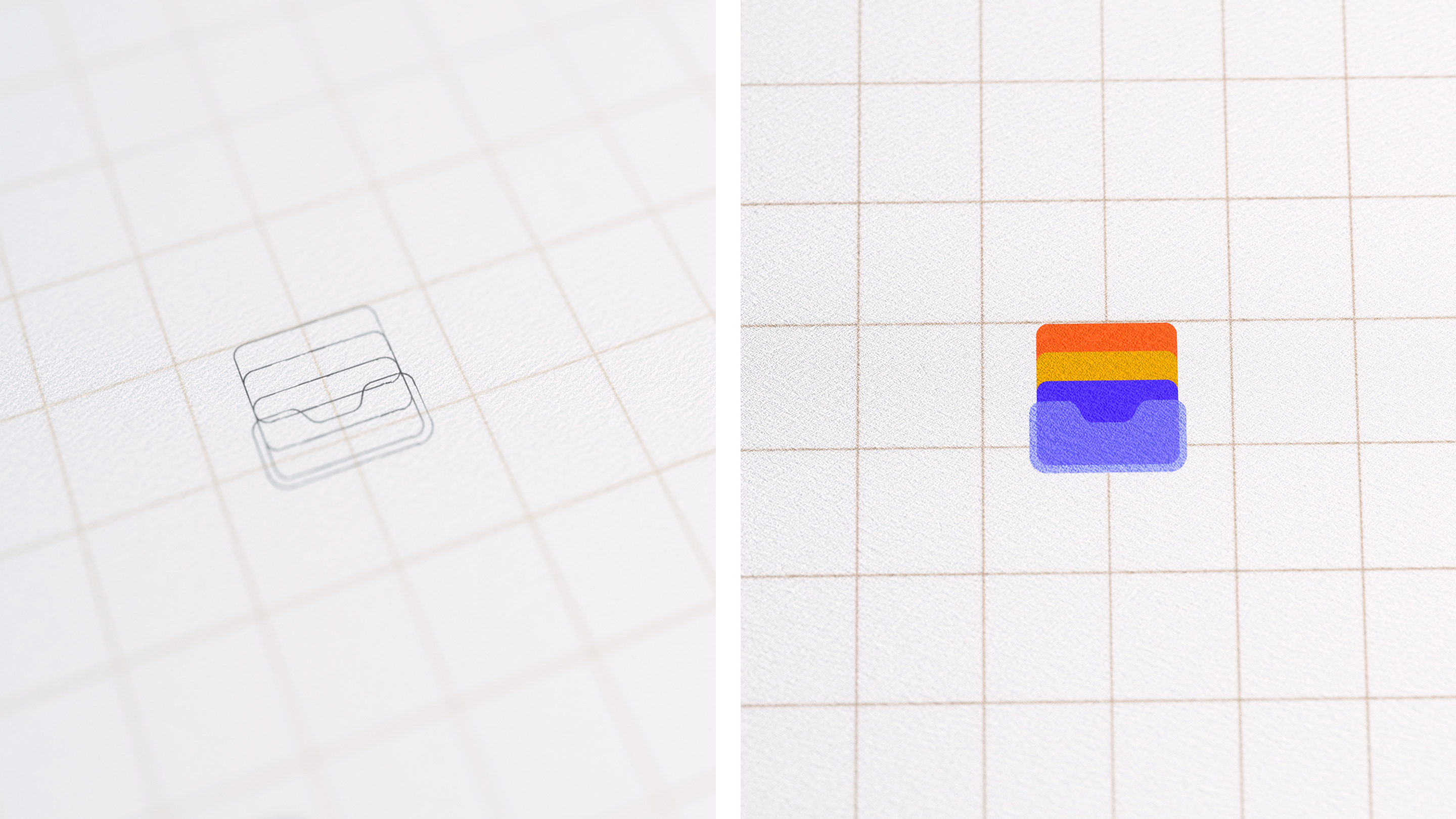
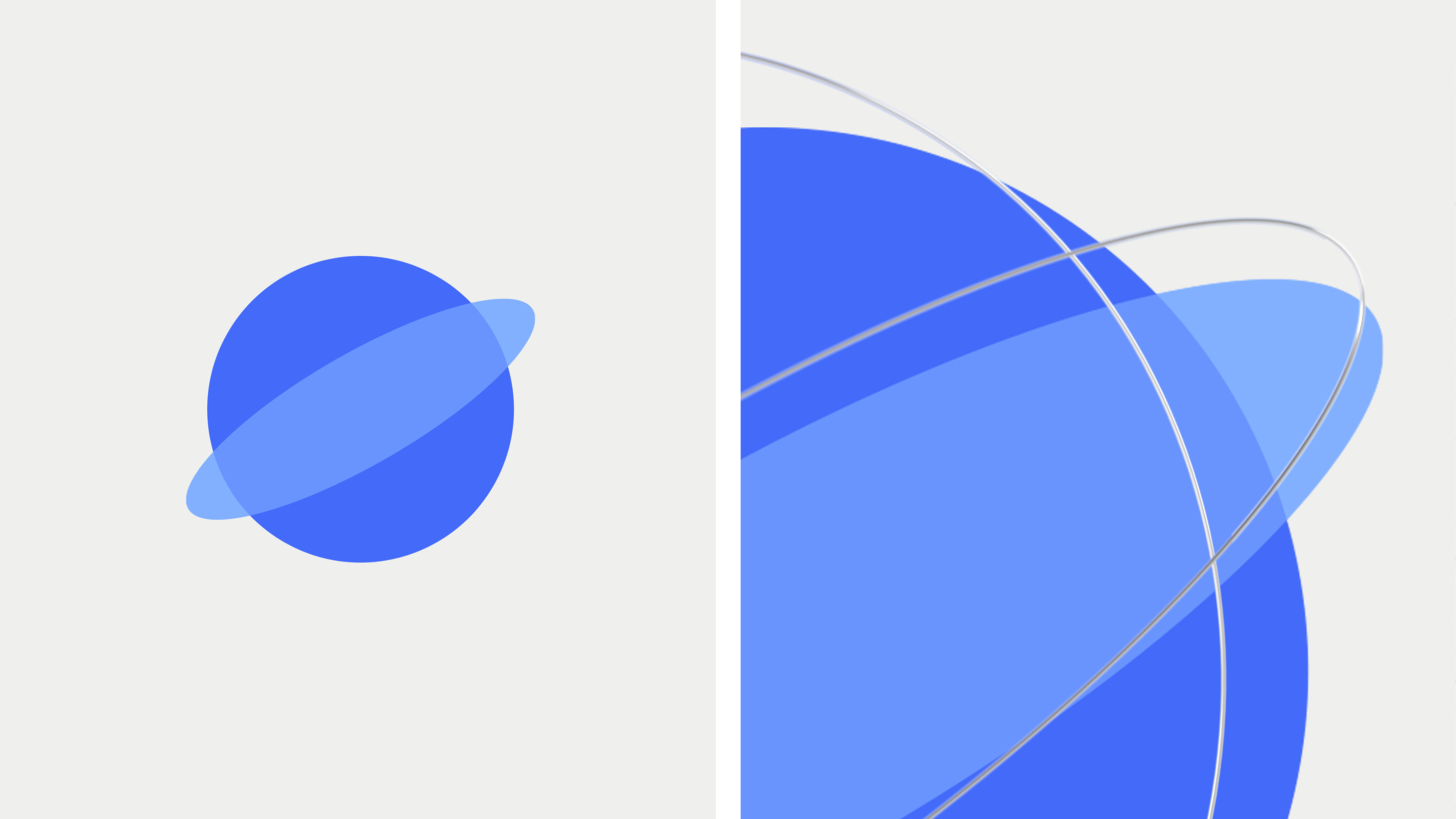
Our iconography design experts also analyzed the different forms of water. Its visual form can appear as a liquid or a crystal, as well as some other. We created different types of icons that reflected different states of water. We also observed the ability to change the icon's graphic representation — it could change its shape from more square to round. The concepts described above were transferred to the icons and designed in different color combinations.
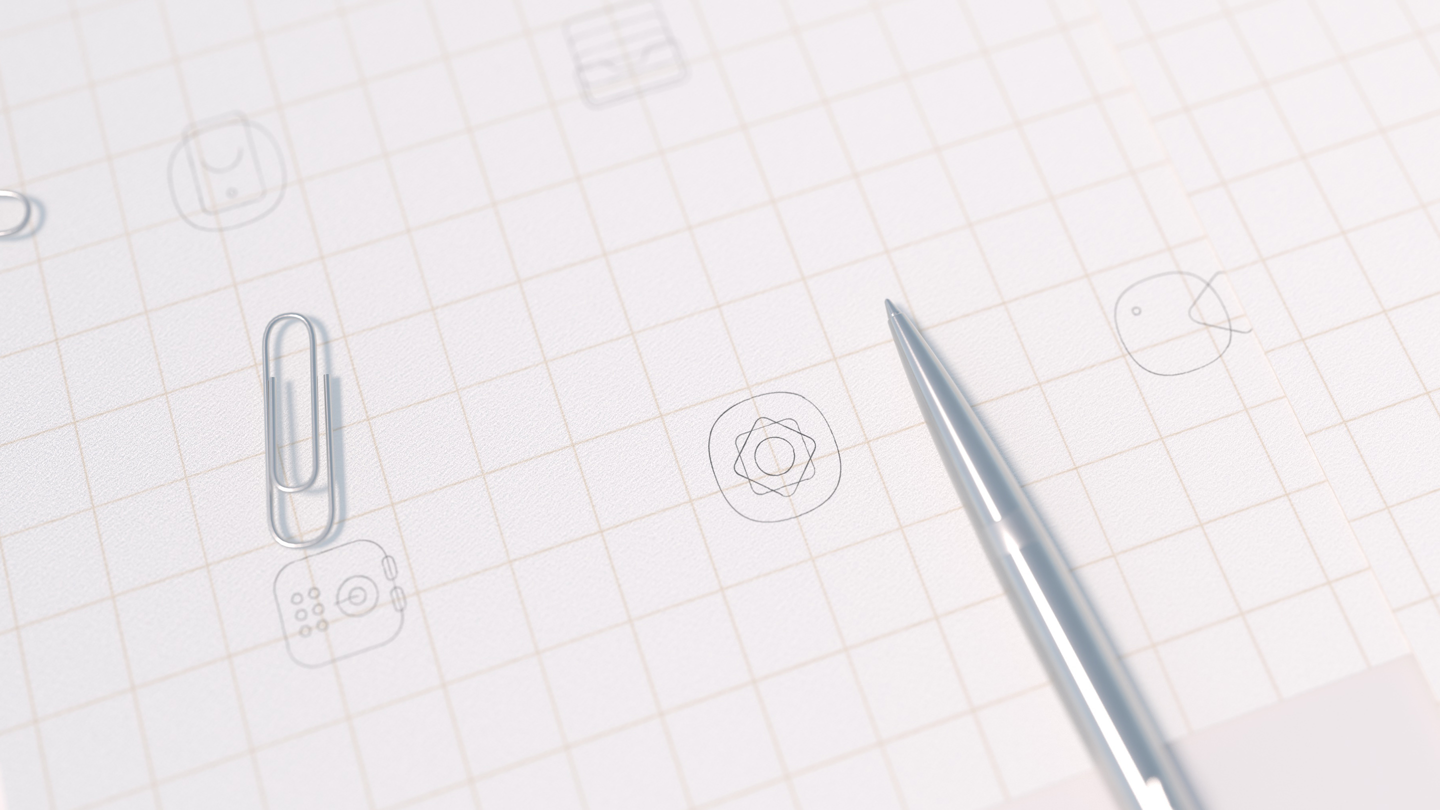
Icon research was based on three main icons — settings, compass, and contacts. We have depicted these icons in different versions and forms, shapes, colors, and sizes, depending on the style of the background of the screen. The style of the background also affects how icons are visually perceived. We drew a lot of sketches that reflected what we depicted in the graphics. As an intermediate result, we created different options for the main icons and a set of symbols.
We built some graphic grids that combined the previously mentioned Water concept with the idea of Oppo. In addition, we worked closely on the company logo — taking the image of the letter O as a reference for the oval when creating icons.
Ovals were the basis for building graphic grids for creating the case and internal icons. The style of icons was modified while working with the customer. We also researched 3D, flat and transparent images of these icons, all elements that we considered while working with Oppo.
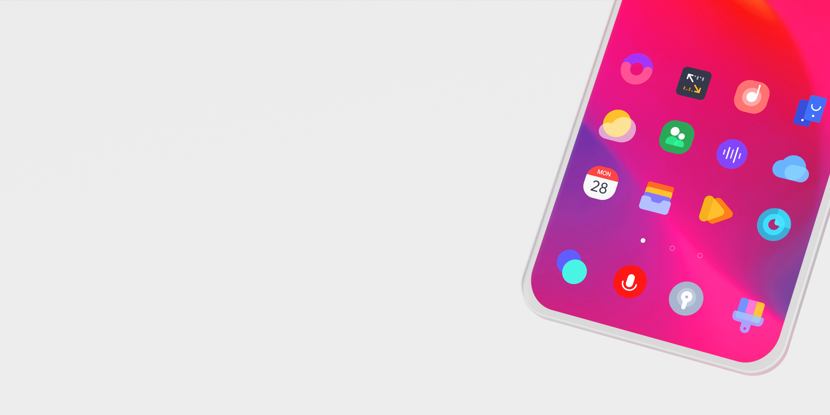
These icons are available on all Oppo smartphones running Oppo ColorOS 7 — a mobile OS of Oppo Electronics. The colors for the icons are chosen based on the color palette we developed. The sets are used the same way on the Oppo website.

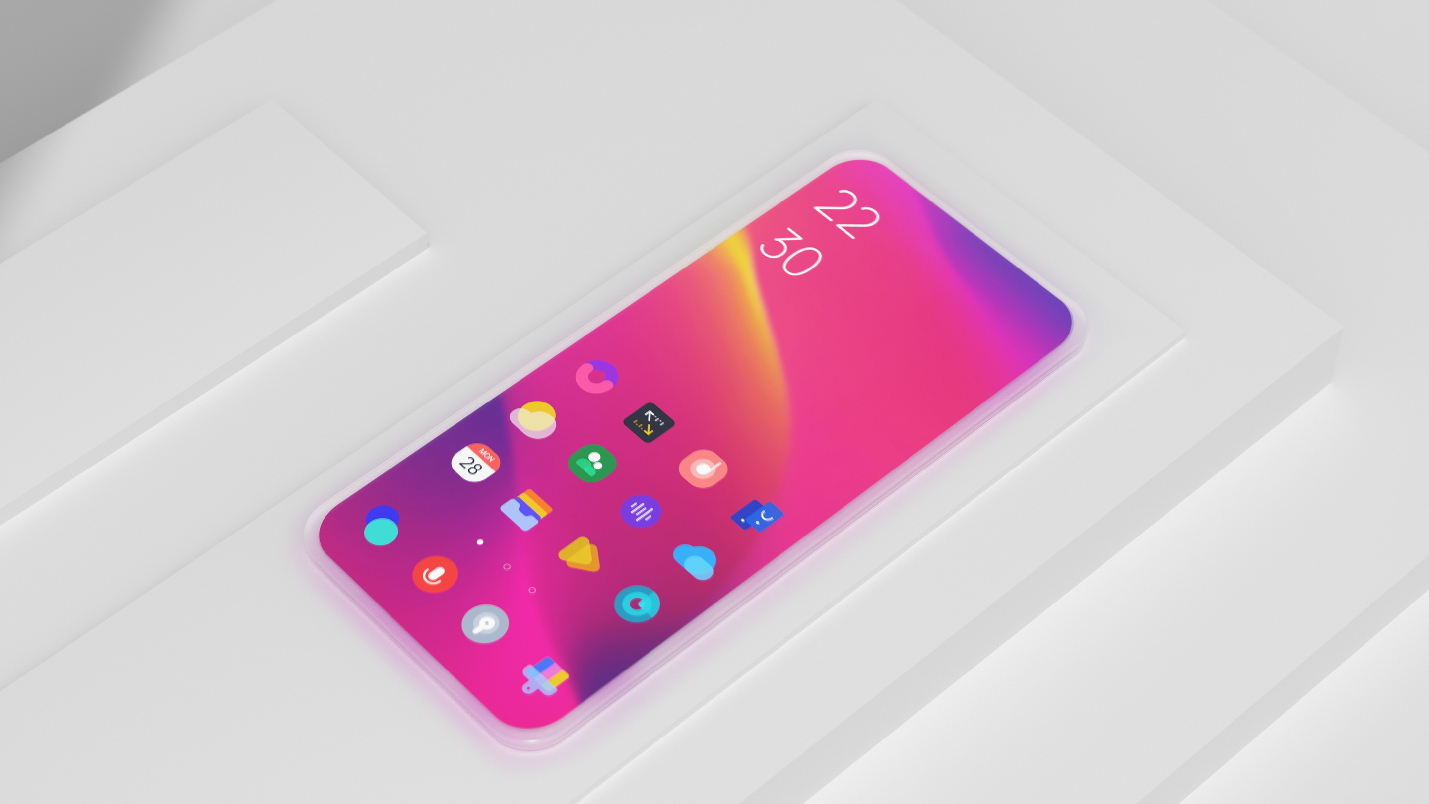
As a result of all this work, our team created the final concept and developed icons designed in two different styles. Each icon set has its own color palette. The user can choose the standard set and add one of the two additional sets to it for them liking. Icons created by our team are used on hundreds of thousands of Oppo smartphones around the world.
We greatly enjoyed collaborating with Ramotion to create an innovative icon set for our ColorOS design system.