Introduction
A design system is often perceived as a component library, because components are what people encounter most frequently in everyday work.
In practice, components are only the top layer. They do not exist on their own and cannot remain stable without more fundamental layers that define rules of form, behavior, and variability.
A strong design system is built as a multi-layered structure of decisions:
- lower layers define parameters and constraints
- upper layers assemble interfaces and scenarios from them
- the connections between layers are explicit, not based on “magic” or informal agreements
In this chapter, we will examine what a design system consists of and how its parts are connected so that the system can scale and remain predictable.
Structure as protection against divergence
When a system lacks a clear structure, different parts of the product begin to diverge even if a UI Kit exists.
A typical scenario:
- components look visually similar
- but use different spacing
- the “error” color is applied inconsistently
- loading and error states behave differently
The root cause is almost always the same: there is no clear connection between levels.
Designers and developers make local decisions because they do not know which parameters are considered systemic.
The structure of a design system is needed to:
- distinguish between levels of decisions
- understand what can be changed locally and what cannot
- maintain consistency through rules, not just appearance
The foundational layer of the visual language
The visual language is a set of parameters that shape the perception of the interface even before components appear.
It defines not specific elements, but fundamental characteristics: rhythm, density, readability, and the level of visual noise.
This layer typically includes:
- color
- typography
- grid and layout
- spacing and sizing
- iconography
- motion
Importantly, these elements are not just a “set of styles.”
They must be connected by rules: which values are allowed, how they can be combined, and where the boundaries of variability lie.
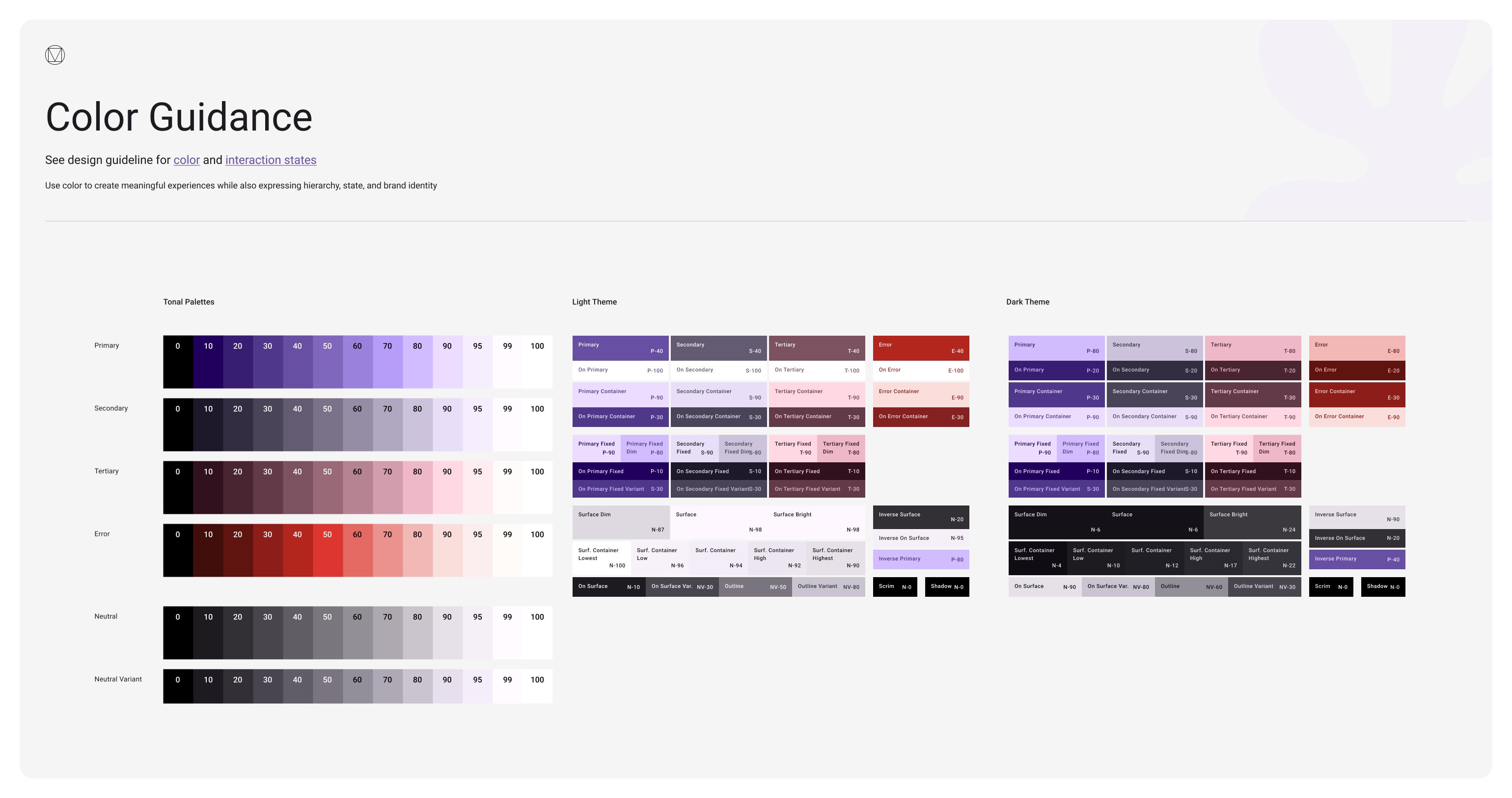
Color as a system of roles, not a palette
Color in a design system is not a list of shades.
It is a system of semantic roles: what color means and where it is applied.
A typical problem without structure:
- the same red is used for errors, warnings, and destructive actions
- in one place the error background is red, in another it is yellow
- links are blue on one screen and brand-colored on another
The system resolves this by separating levels:
- base colors exist as raw values
- interfaces use semantic roles rather than specific shades
Examples of semantic roles:
- primary and secondary text
- base and accent backgrounds
- borders and dividers
- states: success, warning, danger, info
When color is defined as a role, the system becomes resilient:
- shades can change without rewriting interfaces
- themes and modes can be introduced
- contrast and readability can be controlled at the system level
Typography as hierarchy and reading scenarios
Typography in a system is not a list of fonts and sizes.
It is a hierarchy and a set of rules that define how users scan the interface and how attention is distributed.
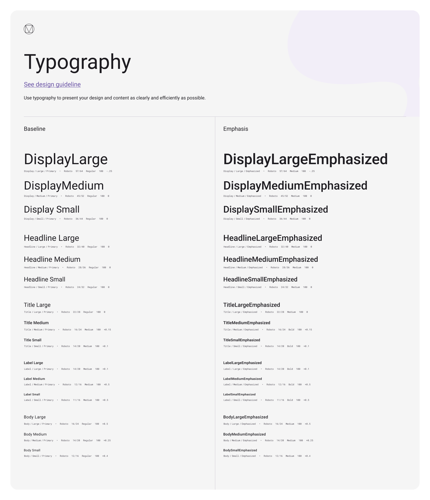
Without a system, typography tends to drift:
- headings of the same level look different
- text density varies from screen to screen
- dozens of “almost identical” text styles appear
The system fixes:
- hierarchy levels: headings, subheadings, body text, captions
- constraints: minimum sizes, line height, line length
- usage rules: where bold text is allowed and where it is not
An example of a systemic decision:
- the same type of information should always use the same typographic level, regardless of screen context
- a new text style is not created “for a screen” unless it represents a new type of content
Spacing and sizing as interface rhythm
Spacing is one of the most underestimated layers.
It defines the rhythm of the interface and the feeling of consistency.
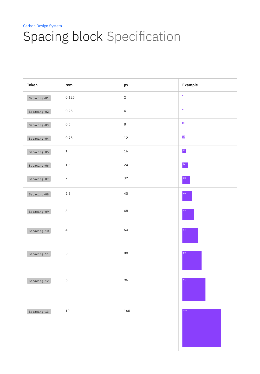
Without a system, spacing often turns into chaos:
- 16 between blocks on one screen
- 18 on another
- 20 somewhere else “because it looks nicer”
This quickly leads to two problems:
- the interface looks sloppy
- components stop being interchangeable
A systemic approach assumes:
- a limited set of spacing steps
- unified rules for vertical and horizontal rhythm
- a relationship between spacing and component sizing
For example:
- forms always have the same spacing between fields
- cards always use the same internal spacing structure
- new spacing values are not introduced for a single screen
Grid and layout as compositional constraints
A grid is not meant to make everything “snap to the grid.”
Its purpose is to constrain compositional chaos and make screens predictable.
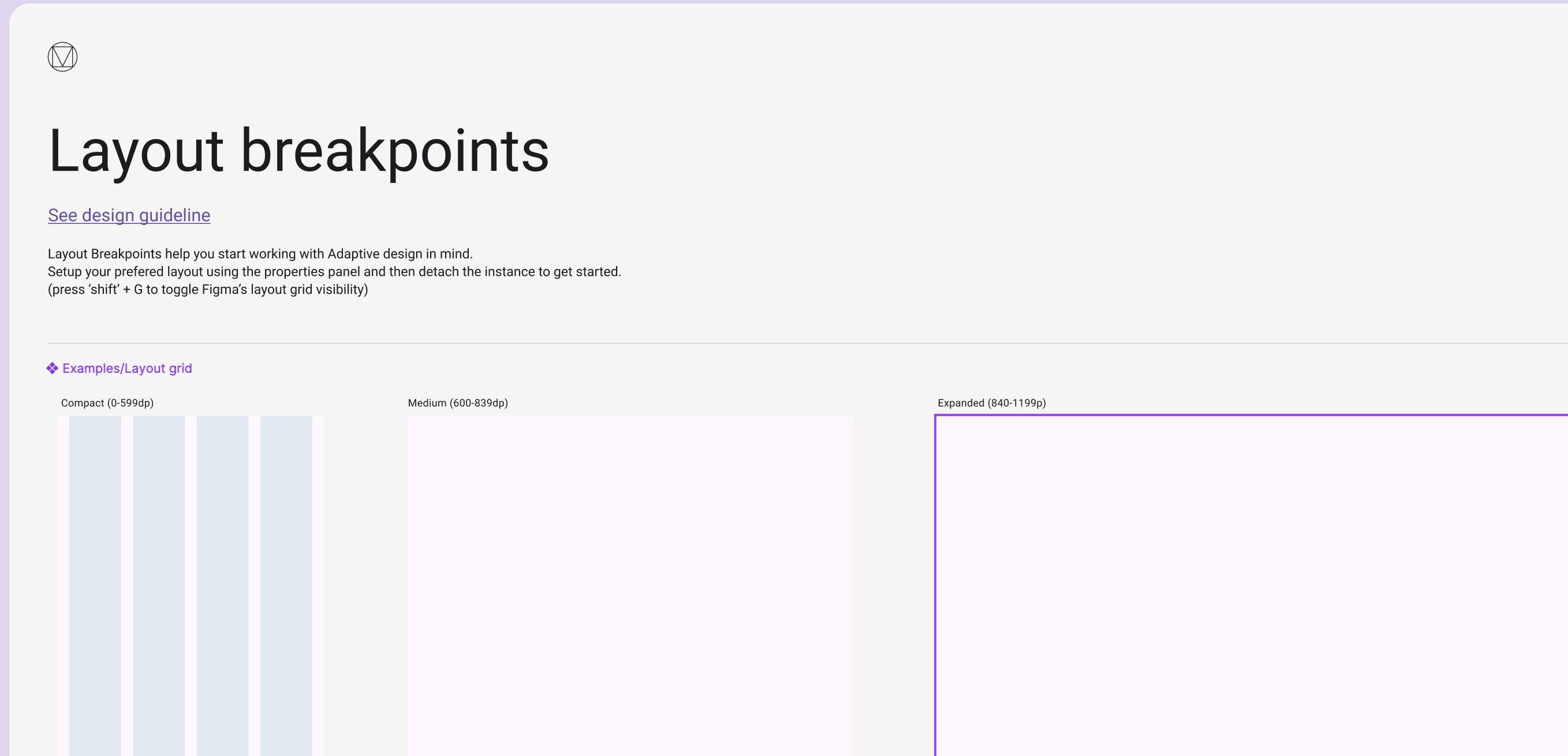
Systemic decisions here include:
- a base grid and column structure
- breakpoint rules
- allowed container widths
- principles of responsive composition
Without fixed layout rules, each team starts building pages differently:
- different content widths
- different alignment approaches
- different block densities
As a result, even identical components look like parts of different products.
Iconography as grammar, not a set of images
Icons are often treated as decorative elements.
In reality, they are part of the interface language.
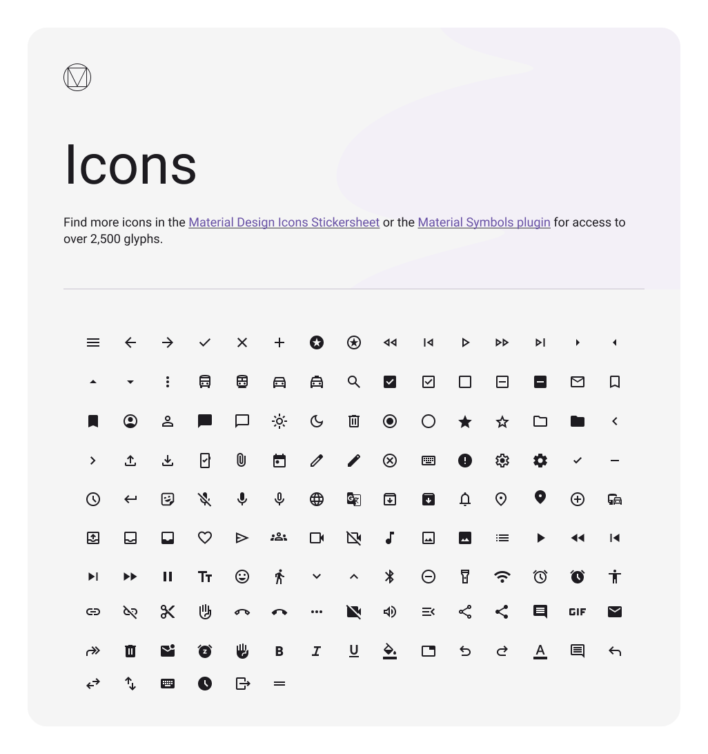
The system must define:
- a unified style: stroke weight, corners, proportions
- size and alignment rules
- where icons are required and where they are forbidden
- when an icon carries meaning and when it is purely decorative
A typical problem without rules:
- in one place an icon represents an action
- in another it represents a status
- in a third it acts as an illustration
and the user cannot tell what is expected.
Motion as systemic behavior, not animation for effect
In a mature system, motion is not about “pretty transitions.”
It is about rules that explain state changes.
The system defines:
- where animation is necessary for understanding
- which durations and easing curves are allowed
- which states must be visible
- which effects are forbidden because they interfere with perception
An example of a systemic decision:
- animation is used only to communicate the cause of a change, not to decorate
- identical states transition in the same way across all components
Components as the top layer of the structure
Components are where all lower layers are assembled into interfaces.
One example of a component:
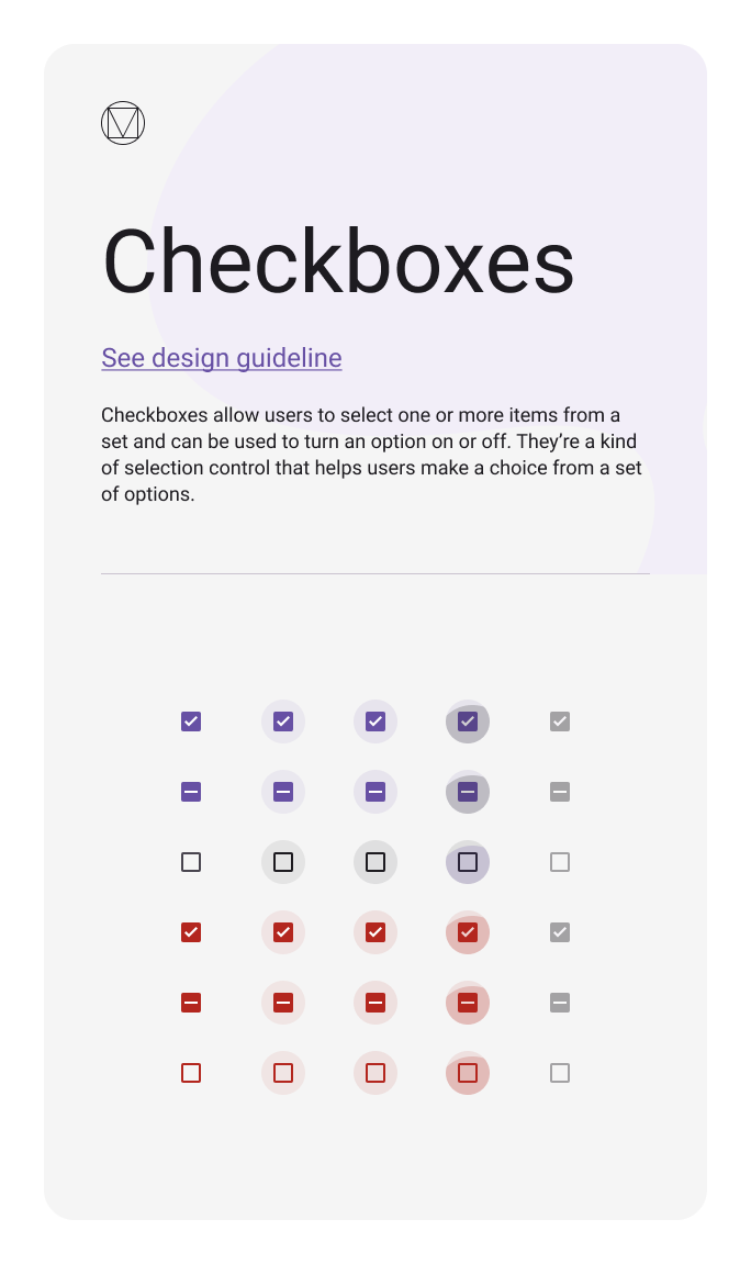
If lower layers are not defined, components start to absorb decisions that should be systemic:
- each component defines its own spacing
- each state is handled separately
- variability grows uncontrollably
When the structure is defined:
- components are assembled from fixed parameters
- states are repeated consistently
- the UI Kit does not grow chaotically
Connecting structure with tokens and implementation
The structure of a design system must be reproducible not only in design, but also in code.
That is why foundational layers must be formalized in a way that allows them to be transferred and validated.
In practice, this means:
- values from the foundational layer become system parameters
- parameters receive consistent names and structure
- changes become controllable
This leads directly to the next topic: tokens as a way to connect design and implementation.
Conclusion
A design system is not made of components, but of layers of decisions that make components possible and sustainable.
Color, typography, spacing, grid, iconography, and motion are not a set of styles.
They form a system of constraints and rules that define how the interface looks and behaves as it scales.
When the system’s structure is explicit, components remain interchangeable, the interface remains predictable, and change becomes manageable.
Feb 12, 2026

Drives the technical vision at Ramotion, uniting engineering excellence with design innovation to deliver scalable, secure, and user-focused digital solutions.