Test components where they live - not just on pages. A simple context matrix, eight high-impact manual checks, and fast fixes catch the defects that snapshots miss.
TL;DR
- Test component contexts, not pages.
- A simple matrix + 8 manual checks catch ~80% of real defects.
- Your specification is behavioral rules for container states not screenshots.
Context vs. Viewport: Where You Lose Money
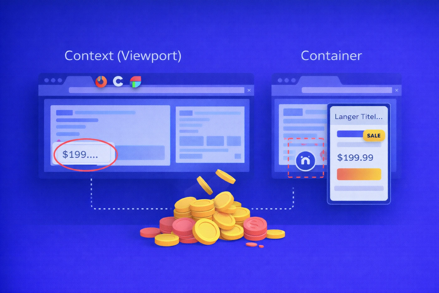
Media queries answer:
What happens at window width X?
Container queries answer:
What happens at container width X and style Y?
A viewport can be wide while a card inside it is narrow - in a carousel, sidebar, or CMS block. This mismatch is where real defects appear.
Typical failure patterns
- Overflow - long names, DE/TR locales, legal disclaimers.
- Slot collisions - badges, prices, icons when counts vary.
- Accessibility regressions - target < 24 px, hidden focus, broken reading order.
- Animation instability - scroll/view timelines destabilizing hierarchy in tight containers.
Cost of failure
- Hidden focus → 0% keyboard access.
- Cropped price → lower CTR.
- Jittery motion → worse INP and higher churn.
Container width, not viewport width, is where money is lost.
A 30-Minute Context Matrix
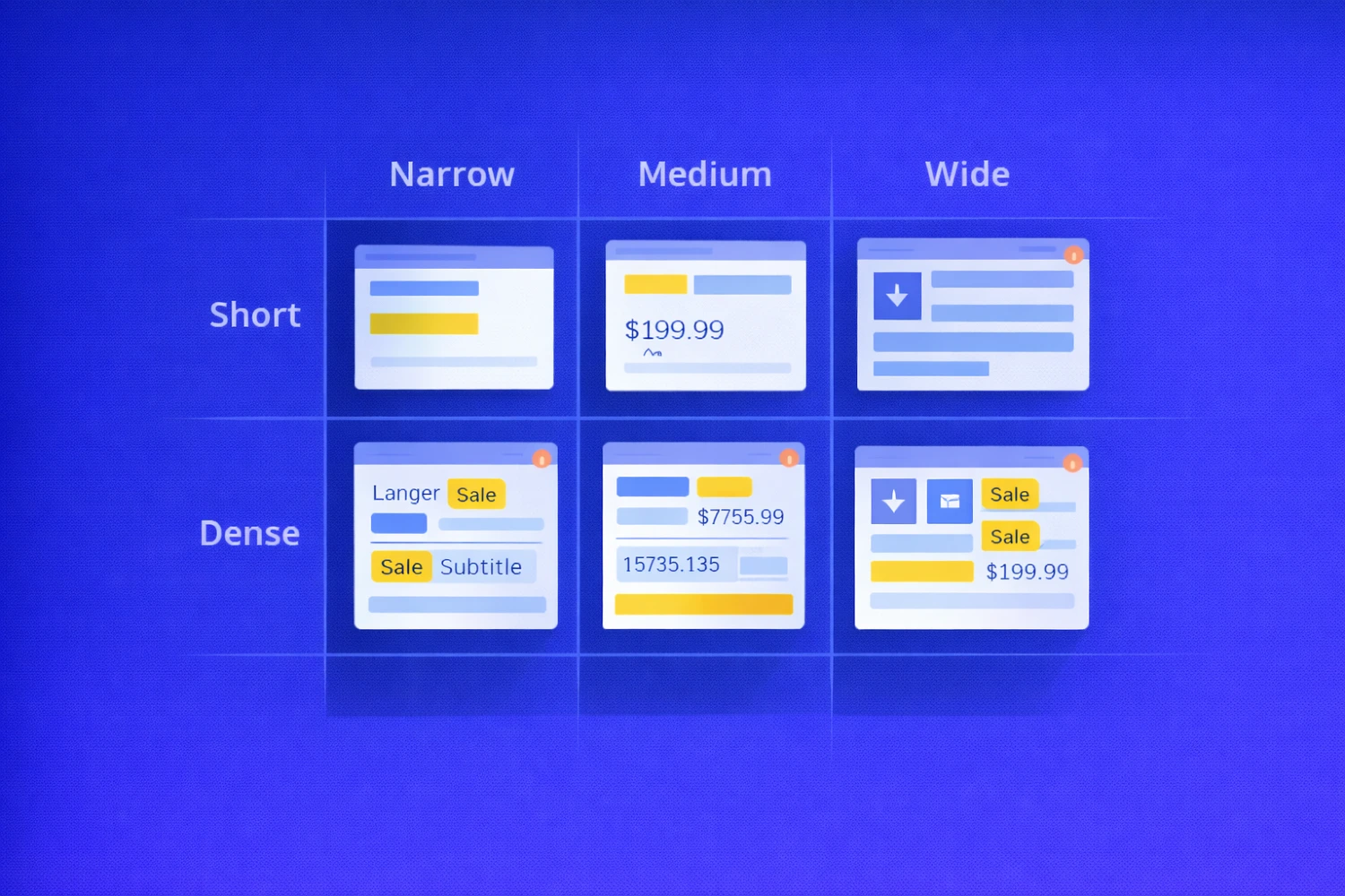
The new planning unit is context.
Each component should be tested across:
- Container width
- Content density
Example matrix
| Container | Short (1–2 lines, 0 badges) | Dense (3–4 lines, 2+ badges) |
|---|---|---|
| Narrow ≤ 360 | EN “Simple title” | DE/TR long words + 2 badges |
| Medium 361–540 | EN + price | EN + price + strikethrough old price |
| Wide ≥ 541 | EN + icon | EN + icon + subtitle |
Fast manual execution (30–90 minutes / 5 components)
- Pin parent width in DevTools.
- Inject heavy content (long locales, currencies, multiple badges).
- Navigate with Tab / Shift+Tab.
- Record a 5–7 second screen video.
This single exercise exposes most real-world breakages.
Mini Cases: What Changes in Practice
A. E-commerce carousel (Narrow = 340 px)
State: 2 badges, DE locale
Before
- CTA CTR −9%
- INP +110 ms
Fix
- Cap badges at 2 in Narrow
- line-clamp: 2
- Enable hyphenation
After
- CTA CTR −2%
- INP +15 ms
B. Landing page sidebar
Problem: Sticky header covers focus on third control → keyboard flow breaks.
Fix:
- scroll-margin-top on focusables
- Unified focus-ring token
Result: 100% keyboard traversal.
C. CMS 4:3 media slot
Problem: Faces cropped via object-fit: cover.
Fix:
- Crop presets + focal point in CMS
- Safe-area framing in UI
Result: 0 false focal-point cases.
The 8 Manual Checks That Find 80% of Bugs
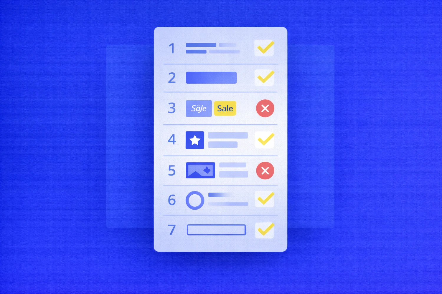
Each check includes: Condition → Expectation → Failure → Business Cost
1. Title Under Load
- Clean wrapping
- Line-height ≥ 1.3
- Max 2 lines
Fail → ellipsis hides meaning Cost → lower CTA CTR
2. CTA Under Stress
- Height ≥ 40 px
- Target ≥ 24 px
- Visible focus
Fail → dead clicks, hidden focus Cost → drop-offs
3. Badges + Price
Fail → badge overlaps CTA Cost → conversion confusion
4. Icon + Text Slot
Fail → 16 px clickable pictogram Cost → mis-clicks
5. Media Slots
Fail → cropped face/logo Cost → trust damage
6. Focus vs Sticky UI
Fail → invisible focus Cost → 0% keyboard access
7. Animations & Reduced Motion
Fail → unstable hierarchy Cost → INP / CLS degradation
8. Forms Inside Cards
Fail → layout shift pushes CTA Cost → abandonment
Six Anti-Patterns That Kill Conversion
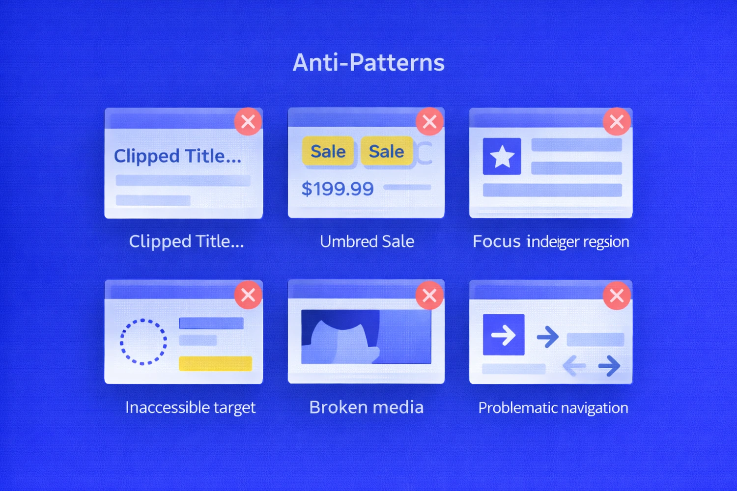
| Anti-pattern | Fix |
|---|---|
white-space: nowrap |
Allow wrapping + clamp |
| Unlimited badges | Per-state caps |
| Fake target via padding | Size inside component |
| Covered focus | System focus-ring token |
| Media without focal point | CMS focal + safe area |
| DOM reshuffle for animation | Preserve DOM order |
These are structural defects, not styling mistakes.
The Standard: Behavior Rules, Not Pages
Define rules at the container level:
- Width thresholds (≤360 / 361–540 / ≥541)
- Narrow typography tokens
- Slotting rules and reading order
- Badge caps (Narrow ≤2, Medium+ ≤3)
- Explicit focus tokens
- Media safe areas
- Localization presets
Behavior must be spec’d - not assumed.
Automation: A Smoke Shield

Purpose: stabilize behavior across container states.
Baseline suite:
- Screenshot sets (Component × 3 widths × 2 densities)
- Focus → scroll assertion
- Reduced-motion diff
Automation should guard behavior, not pixels.
Risk Heatmap: Prioritize Rationally
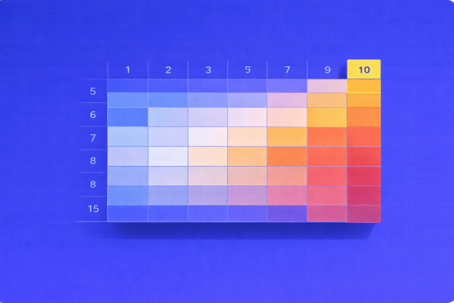
Score 0-3 per dimension:
- Overflow risk
- Accessibility risk
- Interaction risk
- Media risk
- Motion risk
Total score (0-15) defines urgency:
- 9+ → immediate
- 6–8 → current sprint
- ≤5 → backlog
Example: Product card with promos = 10 → test first.
Metrics That Keep It Real
- Context coverage ≥ 80%
- CTA accessibility ≥ 95%
- 0 critical overflow defects
- Median time-to-fix < 2 sprints
- Regression rate < 10%
Measure behavior, not screenshots.
What To Do This Week
- Select 5 high-impact components.
- Run matrix (3 widths × 2 densities).
- Capture artifacts.
- Codify anti-pattern fixes in design system.
- Ship three smoke tests.
Conclusion
Container queries shift focus from window width to place of use.
In this model:
QA is not a screenshot diff. It is behavioral verification inside real containers.
Page snapshots no longer protect you.
Context discipline does.
Feb 13, 2026

Drives the technical vision at Ramotion, uniting engineering excellence with design innovation to deliver scalable, secure, and user-focused digital solutions.