Bad UX Design Examples
How often does it happen that you log on to a website, and the navigation is so frustrating that you can’t even find what you’re looking for? Or you buy a really cool gadget, but there’s no way you can use it because it just doesn’t work the way you expect it to. From the moment you interact with a product, whether in the digital or physical environment, you have certain perceptions and expectations about it. For example, you would expect websites to have a main menu or navigation and the names of the items to be descriptive enough that you understand your options. If you don’t get it, it doesn’t take long to regard them as bad websites.
There is one common area of concern in all such physical and digital products that do not work well: bad user experience design. It all comes down to the needs, perceptions, and expectations of the target audience. If your design is giving the users what they want and helping them accomplish their tasks, then the overall experience will be positive and pleasing. However, if your design is only causing frustrations and is demanding a lot of time to perform even the simplest of tasks, then the users won’t be happy. Unhappy users are the number one indication of a poor user experience, and such designs can result in terrible losses.
It is important for UI/UX designers to understand the factors that make a design bad. It is by gathering such information that designers can learn about the things they need to avoid. Whether you’re working in a UX design consulting firm, a multinational company, or a freelance designer working on various projects, it is essential to look at some bad UX design examples and stay away from them.
In this article, we discuss this crucial topic in the field of UI/UX design. Read along as the article explains the meaning of bad UX design, followed by some examples of physical products and websites with bad usability.
What is bad UX design?
Before talking about some examples of bad usability, let's talk about the factors that make a design bad in the first place. What makes a design bad is the overall impact it leaves on the experience of a user. Just like a good experience cannot be narrowed down to a single point but is a combination of various small and unnoticeable interactions, a bad user experience is the holistic effect of small decisions and features in a product.
What is meant by a bad UX design?
Any design that does not help the users accomplish their tasks or hinders their progress when they interact with it is an example of bad UX. From overwhelming the users to being the cause of multiple errors, bad UX can be detrimental to a product or service.
One of the major reasons for a product, a website, or a mobile application to provide a bad experience is that it does not understand the target audience and, therefore, does not consider their needs throughout the design process. Moving away from the basic principles of design such as familiarity, simplicity, accessibility, and aesthetics can leave a significantly bad impression on the users, thus hurting the overall experience. When working on a design or evaluating an existing one, it is important to adopt a user-centered approach. Remember, your product or service is successful only when it is well-received by your customers.

Bad layout design or bad visual design can, in many cases, be the deciding factor between a successful and a failed design. From Norman’s doors to websites with the worst UX design, there are a number of bad user experience examples for designers to explore and learn from.
Bad user experience design examples
Once you start looking for bad interface design, it is surprising to see how many of these come from big companies with bad UX design. Even some of the leading organizations have made terrible mistakes in the past, and some continue to do so even today, frustrating their users and resulting in a bad user experience. Let us look at some of the bad usability examples, both in the physical and digital worlds.
Physical products
When we think of UI/UX design, the first thing that comes to mind is a website or mobile application. However, it is important to note that the quality of user experience is as important in physical designs as in digital products and services. Whether it is a door at the office or a stove at home, it is important that the design of everyday things is useful, usable, and aesthetically pleasing. Some of the bad interface design examples, when it comes to the physical environment, are discussed below.
Apple’s Magic Mouse
One of the recent bad UI design examples is that of Apple’s Magic Mouse. The mouse itself is wireless and does not have replaceable batteries. This means that the mouse needs to be charged before it is used. What if the charge runs out while you’re in the middle of something? A simple thought would be to charge the mouse and use it at the same time. However, the design does not allow you to do that. The charging port for Apple’s Magic Mouse is located at the bottom of the surface, which means that you cannot use and charge it at the same time.

The fact that you cannot use a device when and how you please can be detrimental to the user experience. One of the most important principles of UI/UX design — that of giving control to the users — is violated here. This is a classic example of not understanding the needs of the audience, even after creating multiple versions of the product.
Most parking signs
Finding a good parking spot is already a frustrating task. On top of it, parking signs are seldom helpful. There are several examples of terrible parking signs that add to the frustration of users. It is important to understand that when the users are driving and have to keep their eyes on the road, understanding complex parking signs becomes even more problematic.
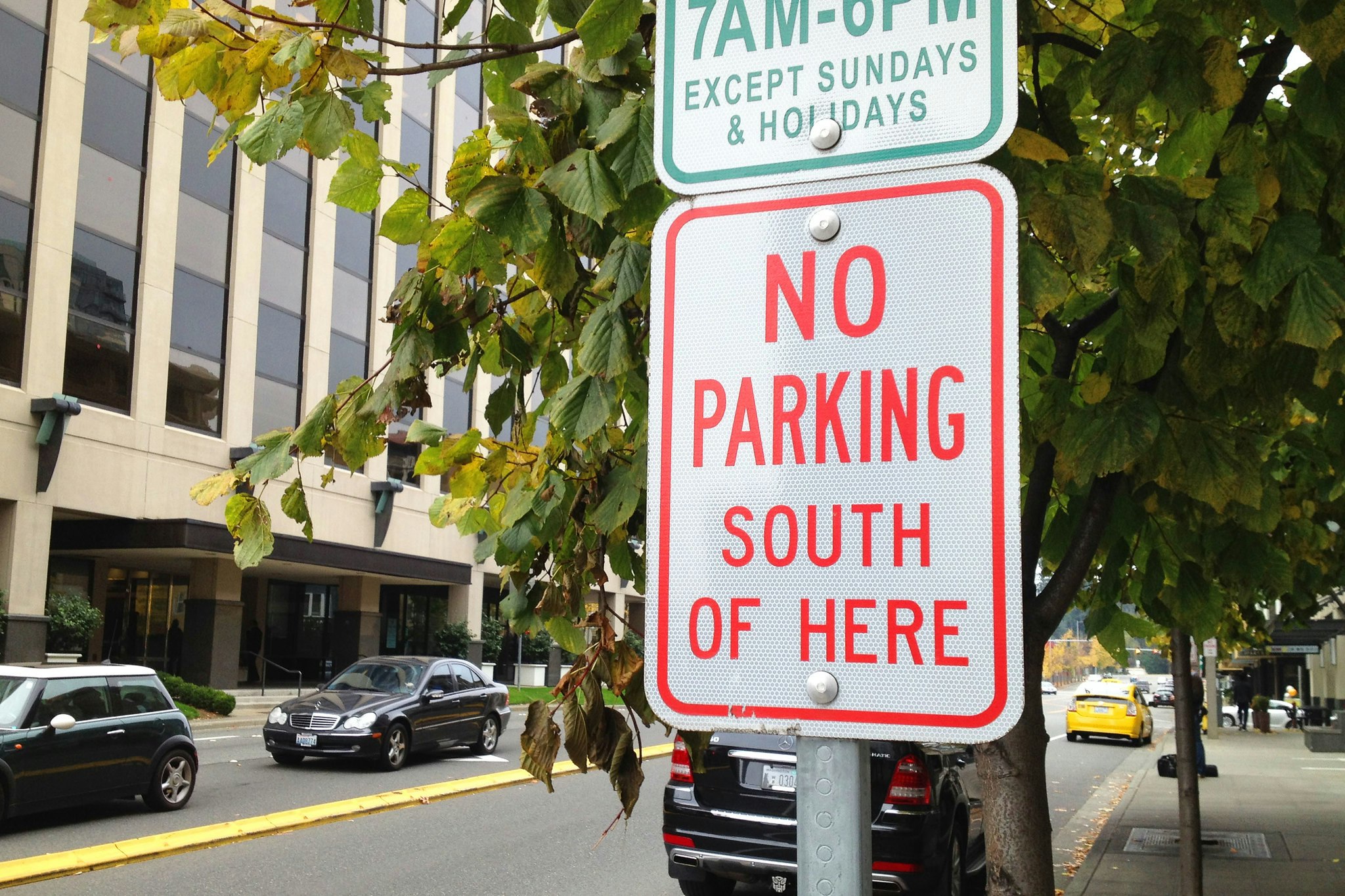
This is where some important principles of UX design seem to be neglected. One of the most important ones is simplicity. In order to make the design useful and helpful, parking signs need to be simplified so that the users can understand them in little time.
ATMs
How would you feel if you used an ATM, took the cash out, went back home, and later realized that you forgot to take the card out of the ATM? It is a frustrating but real experience for many users. Although there are some ATMs that give out the card first and then the cash to ensure that you don’t leave the card behind, there are some others that do the opposite. Once the user takes the cash, since that is the task they are there to accomplish, they forget about the card and leave.

Here again, it appears that the needs of users and their motivations are not given due consideration. In order to make the experience free of any such issues, the user journey needs to be mapped accordingly. This will help in understanding the priorities of the users and, thus, ensure that the process flows as per the users’ expectations.
Digital products
We interact with digital products and services every hour of every day. It is almost impossible to go through a single day without using some type of digital technology. If these designs are not as we expect them to be or if they don’t help us in performing our tasks, our entire experience is ruined. There are numerous examples of bad UX websites that drive the users away from them because of small choices that frustrate the audience. Additionally, several badly designed apps have lost to their competitors despite having unique features. Here are some examples of bad UI design in the digital realm.
Amazon Web Services: Overwhelming navigation
Amazon Web Services (AWS) is a pretty comprehensive platform with over a million users. The platform offers a number of unique features and services to its users. However, there’s one thing on the website that is frustrating. The main navigation of AWS is overwhelming, and there’s so much going on that it is hard to find the right information in little time. In fact, if a device with a smaller screen size is used, one has to keep scrolling to read all the options.
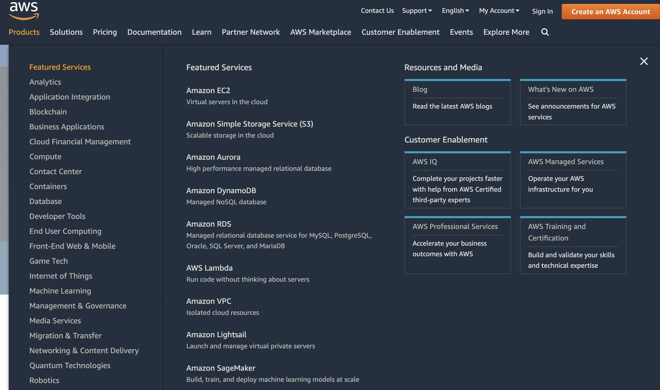
Such navigation can be confusing for the users as they may not be able to find their required information quickly. True that the design is aesthetically pleasing and the information is well-organized, but the overall picture presented leaves an overwhelming impression on the minds of users. If there is a lot going on in the navigation, the users will feel lost because of this information, thus resulting in a bad UI.
Media College: Long dropdown lists
How often do you come across long dropdown lists and have to keep scrolling to find the right option? And how often do you miss your preference and then have to start all over? This is what long dropdown lists do to the user experience. One of the best examples of this is the list of countries that appears when you’re filling out a form. When there’s no option to search for the choice, the users have to scroll up and down and find the right option. This takes up a lot of time and leaves a bad impact on the overall experience.

This is another example of not understanding the needs and priorities of the target audience, thus leading to a bad UI for websites. When creating a digital product or adding new features to an existing product, the needs of the audience and their time must always be prioritized. If the users have to spend a lot of time on a simple task, they’ll never be satisfied with the experience.
USA TODAY: Autoplay ads and videos
There are several websites that autoplay ads and videos the moment you log on to them. You open a webpage and then spend a few minutes confused, figuring out where the sounds are coming from and what you can do about it. This gets worse, even embarrassing when you’re in a public place and suddenly sounds start coming out of your device.

The UX design principle of control is violated here, creating bad usability and leaving a bad impact on the overall user experience. When designing a digital product, it is always essential to give maximum control to the users, particularly when they’re using your product in different settings.
How to avoid bad UX design
Being a UI/UX designer, you will come across several examples of bad design. From some of the most confusing websites to the bad mobile app design examples, you will get a chance to see it all. However, it is important that you think of these designs as learning experiences with the goal that you do not make these mistakes in your own projects.
How can you avoid bad UX design?
The best way to avoid bad design is to stick to the basic principles of UI/UX design. Remember that your audience, their needs, and their comfort should always be the top priority. If it works for your audience, then it is a great design.
Irrespective of the type of product or service you’re working on, the following are some key principles that can help you add value to your designs. Sticking to these basic principles will help you avoid websites with confusing UI and save you from finding your designs in the list of bad app design examples.
- Understand the needs of your audience. Remember that the goal of your design is to help the users and make their lives easier.
- Map out the user journey and highlight the touchpoints in your design. This will help you create your design while keeping the context in mind.
- Provide maximum control to your users and let them know that they have this control. Avoid restricting the users to a set of options. Instead, let them choose how they want to map their experience out.
- Make sure that your design is simple and aesthetically pleasing to look at. If the users get a bad feeling before even interacting with your product, your chances of success are already reduced.
Conclusion
When you start looking for bad UX design apps, websites, or physical products, you will find numerous examples around you. It is interesting to note that some of the worst UX apps have been around for so long and are still functional with the same issues. The job of a designer is to improve these designs and make them more user-friendly. From a simple gadget that you use every day to complex systems and technologies, the value of good UX design can never be overstated.
A good design not only helps your users accomplish their tasks with ease but also brings more business in the form of a loyal customer base. If you’re an aspiring UI/UX designer, you should always look at the designs around you from a critical angle to highlight the areas for improvement. This will add to your knowledge and also inspire you to make better, useful designs in the future.