Do you know that according to Campaign Monitor, whose team has conducted thorough research on how web modal may impact conversions, the well-designed modal window that appears on time can lead up to 60% conversions? It is one of the most viable ways to generate leads today, whether you need subscribers or sales.
And, you do not have to be a talented marketer to benefit from this small yet powerful extension on your website. The web is teeming with numerous ready solutions, from primitive HTML modals to standard modal dialogue to extravagant modal page. Even the non-tech-savvy person can handle it.
However, if you want to make the most out of it and achieve those staggering numbers, you need to hire the web design firm because only experts can define what the modal window should include and how it should look to resonate with the target audience.
In addition, you need to gain a good grasp of the basics to understand how to implement it without compromising user experience.
Let's find out what is a modal in web design, consider modal vs dialogue and modal vs popup, and mull over some great modal website examples made with the best web design principles in mind.
Modals Web Design
The modal web is our reality. Whatever website you visit, chances are the modal box with some useful or "appetizing" information will appear, drawing your attention and compelling you to take action. Some of them are unobtrusive; others are pushy; however one thing is for sure, they are an integral part of our web experience today.
Let's find out what modal and modal forms are.
What Is a Modal in Design?
A modal is a standard graphic control element that may contain all sorts of information. It deactivates the normal workflow and requires the user to interact with the content in the website modal to get back to the parent screen.

What is a Modal Form?
A modal form is a particular type of modal that features a form. It can be a miniature single-field form, like one that we usually see in subscribe box, or it can be an extensive form that asks users to fill in 3-5 fields like one that we typically see in consultancy or order modal web page.
Benefits of Modal Web Design
Modals in web design come with numerous advantages that may bring substantial benefits to the user experience and marketing campaigns. For instance,
- They provide fast contextual interaction.
- They draw overall attention.
- They are simple to interact with.
- They are flexible.
- They are modern and trendy.
- They are responsive and mobile-friendly.
- They are familiar to users.
- They provide extra space.
- They may improve usability.
Shortcomings of Modal Screens in Web Design
The most significant disadvantage of modal screens is interruption of the natural workflow and disruption of the user experience. This may cause frustration and confusion, especially when it comes to lightboxes that take up the entire screen. In addition, they may impose an additional cognitive load that causes visitors to forget what they were doing in the first place.
Another significant shortcoming is that most of them do not meet accessibility standards, creating roadblocks for screen readers or assistive technologies.
Finally, all modals require action. For marketers, it is bliss; for users, it can be a curse, especially when the modals are poorly made or do not have easy access to the "close" button.
These shortcomings should be taken into consideration since they can compromise all the benefits that this technology offers. Check out our list of the best practices for building unobtrusive yet effective modals in web design to nullify the disadvantages, avoid all possible confusion and misunderstanding, and meet the standards in such areas as accessibility and usability.
Role of Modals on Webpage
The primary purpose of the modal website is to get the audience's focus. And it does its job perfectly well - it instantly brings attention to the crucial piece of information and prompts readers to take action.
The great thing is, there are no restrictions: modals in web design can be anything you want. Some of them are small, while others are big. Some of them are dynamic, while others are static. Finally, some follow all the best web design practices and do not boss around, while others play dirty by hiding "close" buttons and pulling off psychological tricks. This freedom allows this technology to perform various roles. Let's consider the most popular of them. But first, let's define what is modal in webpage?
What Is Modal in Webpage?
Modal in the web page is not just a simple graphic element; it creates a mode that deactivates the parent screen and puts focus on the modal window placed above everything. It may include images, videos, forms, text snippets, links, buttons, and animations.
Roles of Modal Screen
When the modal screen is well-designed audience-targeted and appears on time, it can do magic with the decision-making process, influencing the user's behavior and assisting marketers in achieving their goals. Its scope of usage is vast; therefore, brands use it to perform different roles in a website. The most important of them are:
- Informative role: they may notify about upcoming events or new features.
- Warning role: they may warn and alert about errors.
- Entertaining role: they may show media like videos, images, illustrations, and animations without "eating" precious website space.
- Confirmation role: they may help users to avoid errors and successfully proceed with vital processes like a checkout.
- Functional role: they may provide instant access to the system by showing a sign-in form or being part of a multi-step process to avoid multiple loads.
- Advertising role: they may promote special offers and future discounts, thereby generating conversions.
- Retention role: controversial exit-intent popup may compel visitors to stay for longer.
- Influential role: they may influence the decision-making process with the help of marketing tricks.
- Last but not least, they can even play a legal role. For instance, cookie or GDPR notifications are created to notify users about using their personal information on the website and get consent so that the brand can work in the country legally.
Generally, modal windows in web design are used in these scenarios:
- Notifying about critical information.
- Getting consent to work legally.
- Collecting subscribers.
- Providing quick access to the service or platform.
- Advertising a new product or service.
- Generating conversions with offers and discounts.
- Breaking down complicated processes.
- Getting vital information for a marketing campaign.
Modal & Popup - Core Difference
Modals in web design come in all shapes and sizes. Thanks to numerous solutions and techniques, this technology offers various options. The most popular are:
- dialogue,
- popup,
- popover,
- overlay,
- notification,
- lightbox,
- fancybox,
- modal box,
- hovercard,
- growl notification,
- modal form.
While all of them are containers that float above the page, there are still differences in their design, realization, and purpose. Let's consider modal vs popup and modal vs dialogue – the two most confusing pairs.
What Is the Difference Between Modal and Popup?
Popup is a passive option that does not require users to deal with it right away. It just appears on the screen with information like notification, warning, or alert and waits for the user for dismissal. As a rule, it is relatively small and displays an announcement. Finally, it does not interrupt the workflow: the user can proceed with tasks without any interruption.
In comparison, modals are usually active options that generate the additional window above the parent screen, occupying the entire estate, interrupting the workflow, and compelling users to take some action.
What Is the Difference Between Modal and Dialogue?
As the nameplate states, the dialogue is a graphical control element that refers to a conversation between the website or system and the user. It often requires action or information from the user, for example, email address or feedback. It can also pull up data from third-party plugins and platforms. Finally, users can opt to ignore dialogue boxes because they allow them to change focus.
Whereas modals take the entire focus and require users to take action. In addition, they may include all sorts of information that does not necessarily require opening conversation.
Modal Website Examples
Let's consider two good website modal examples to see how they look in real life.
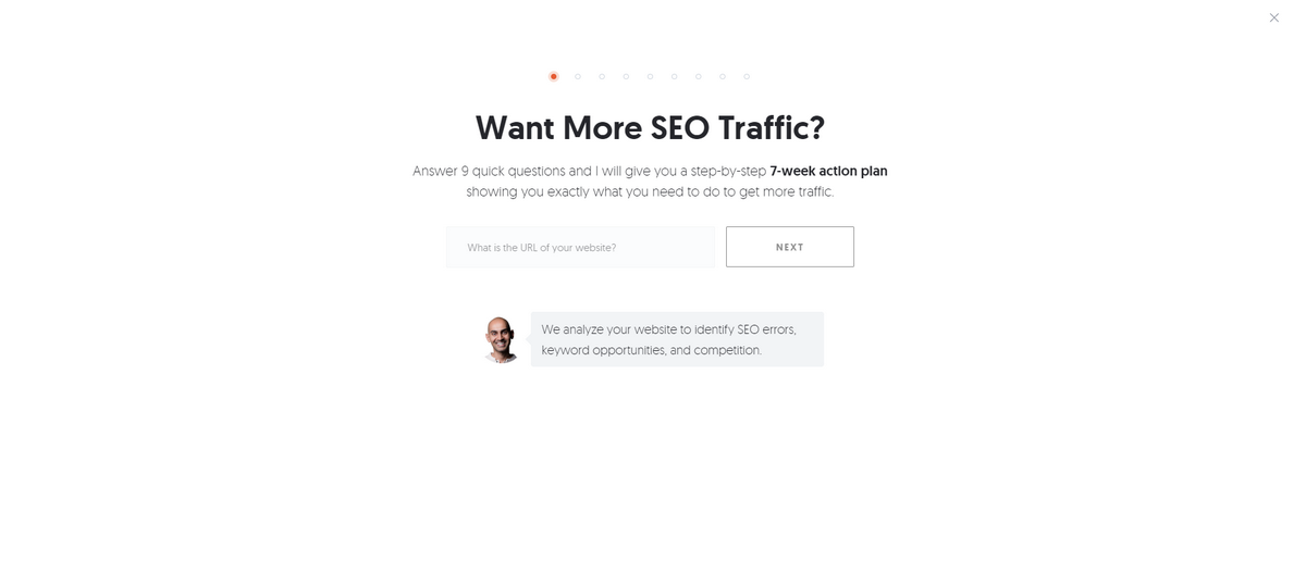
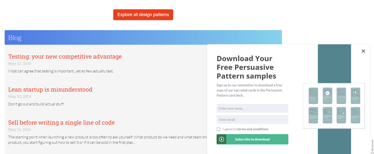
UI Patterns
The first modal window example is taken from UI Patterns. The team employs a classic popup that appears on the right bottom corner and offers users gated content. Note, it does not fade the parent screen, though it overlays it. This is because it is a modeless option. Thanks to this technique, users can keep their journey through the page, scroll up and down, read text snippets and return to the modal whenever they are ready—no pressure whatsoever.
The popup features a simple form and a beautiful supporting illustration. The call-to-action button is noticeable, whereas the "close" button is easily discernable. A pleasant design and a lovely illustration unobtrusively ignite interest and increase conversions.
The key feature of this solution is that it does not create tension. It just catches the user's attention, notifies them about the gated content, and offers visitors to fill in the form to get some useful stuff. It does not make everything about itself, prioritizing user experience and giving visitors the freedom to decide on their own. This non-pushing policy, in tandem with a great design, certainly achieves marketing goals.
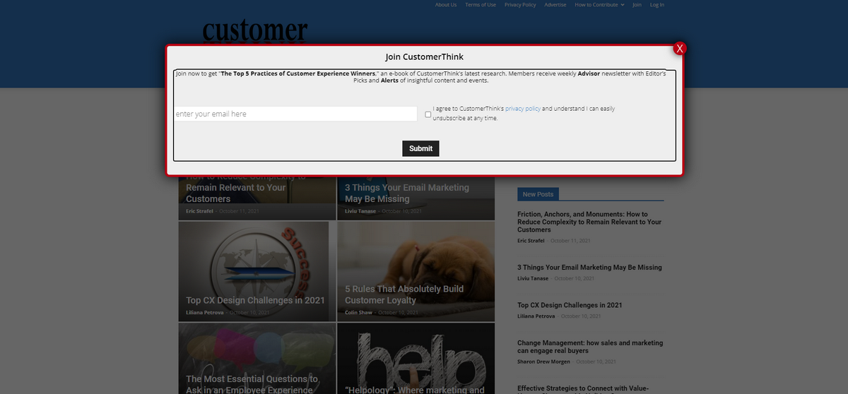
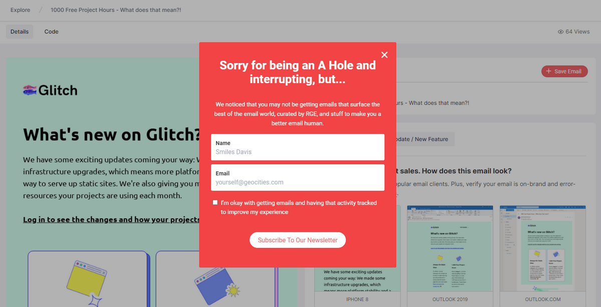
ReallyGoodEmails
ReallyGoodEmails shows us an opposite example. The team opts in favor of a traditional modal to collect subscribers. It occupies the entire screen, fades the background, and interrupts the regular workflow asking for some action from the user's side. Note, it appears once the page has loaded. This is not the best tactic. However, it is widely used, so visitors are accustomed to that. Furthermore, the exit strategy is well-thought-out: the team has included all possible ways to dismiss the modal.
The design of the modal box hits the essentials, yet still, it is nothing special. It is just a form with a title, clean solid backdrop, and regular typeface. However, two crucial factors help this solution win over the clients.
First, the team uses humor right in the title to lighten the mood, lessen tension, and get to the business right away.
Second, they have opted for a red color that naturally catches an eye and compels visitors to the action. It also echoes the logotype, strengthening the brand identity and making the modal look valid.
Best Practices for Building Unobtrusive and Effective Modals
Many users criticize modals in web design for all the wrong reasons. The deal is, the problem does not lie in the technology; it lies in realization and website owners who misuse them to derive benefits at all costs. This improper use that usually involves dirty tricks ruins the modal's reputation.
To turn a modal screen into a valuable and effective user interface widget that achieves marketing goals without sacrificing your relationships with the target audience and compromising user experience, you need to impose the best practices. Here are some of them:
- Use the correct modal. There are numerous options; therefore, make sure your choice fits the content and goal perfectly. For example, use lightbox for videos, modal form for registration, modal for advertising, popup for notification, or wizard for a multi-step process.
- Think through the exit strategy. The escape key and outside clicking should work all the time. Follow the conventions since it will be easier for users to dismiss the modal and get back to the interrupted task.
- Be careful with system-initiated modals. Pick the right time for them. Also, make sure they bring value to the user. Ideally, target the audience by their preferences and show them specific options.
- Keep modal window use to a minimum.
- Always consider alternative non-modal options.
- Do not lock messages so that users can dismiss them simply by clicking outside the container.
- Think through the design and position.
- Make the "close" button clear, evident, and in high contrast.
- Make the purpose of the modal apparent immediately.
- Do not include more than two offers in one modal.
- Do not include more than two actions in one modal.
- Do not include multiple steps, even if it is a part of the wizard.
- Make modal straight to the point.
- Make the title visible and clear.
- Always return the users to the screen that they were previously on.
- Never use modals during high-stake processes like checkout and complex decision-making processes.
- Avoid nested modals.
- Fade the background and add to the modal box the dimension to visually separate it from the parent screen.
- Use transition effects.
- Make modals responsive and mobile-friendly.
- Make modals accessible. Always place keyboard focus on the first element in the modal box.
- Always run A/B tests to define the best option.
Conclusion
Modals in web design always cause debate. Many users believe them to be user-experience killers. However, when done right, they turn to be quite effective tools that can improve usability, give spice to user experience, draw user's attention to important information, and most importantly, generate conversions. Follow the best practices, do not overdo, and test all the options to define the best one to unlock the potential of this technology.

Creates insightful, strategy-driven content that translates complex design and branding concepts into accessible knowledge, supporting Ramotion’s mission to elevate digital experiences.