Introduction
A website is much more than just an impressive picture, good copy, and interactive elements. It is a vast ecosystem with many levels going deep into the roots. When you strip off color, videos, images, icons, buttons, content, animations, interactivity, and chats, you will see a framework widely known as a web design layout.
The web design layout is the foundation of everything. As professional web design consultants agree, your web platform and digital brand's presence cannot exist without it. Therefore, it needs to be done and perfected eventually. It is increasingly powerful in what it can do. It may quickly destroy everything and nullify all efforts when done poorly and vice versa.
If you want your digital presence to feel intentional rather than accidental, partnering with a creative web design agency can help translate brand goals into a layout that’s clear, conversion-focused, and adaptable across devices.
Let us dive into its fundamentals, list its benefits, dig into its challenges, and reveal the main principles and best practices in this niche.
The Fundamentals of Web Design Layout
Web design layout comes in all shapes and sizes. From a rigid one-column structure that looks great on various screen sizes without much effort to a multi-column stripped base that uses modern techniques to adapt to numerous devices available in the market. In practice, this is often the first conversation when leadership is hiring or collaborating with external partners such as web design companies that will anchor discovery around layout adaptability before debating visual style.Let us get to its fundamentals to deepen our understanding of this concept.
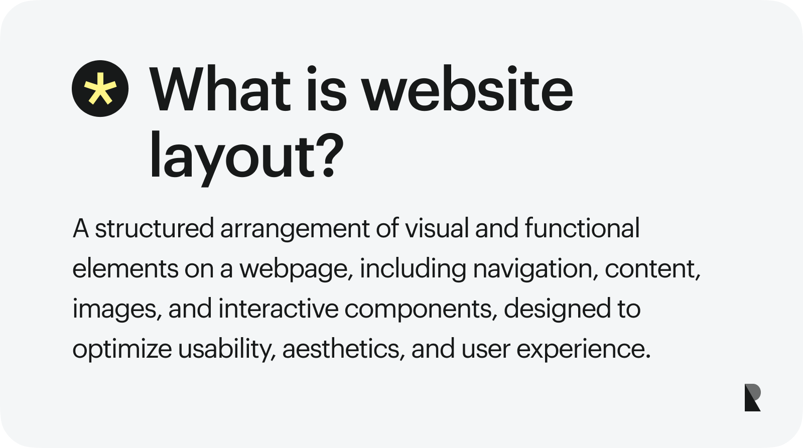
What Is a Web Design Layout?
Initially, the web design layout is a framework that defines the overall website structure. It is a skeleton with columns and rows and an arrangement of page elements.
It pursues several crucial goals:
- creates order out of chaos by arranging the content (both textual and visual) in a pleasing and easy-to-understand way.
- establishes an informational and visual hierarchy.
- realizes navigation.
- guides visitors around the website.
- highlights key points.
- supports overall content.
- puts the most critical elements of a website front and center.
- creates relations between sections and turns a website into a unified ecosystem.
Types of Web Design Layout
Web design layout has evolved dramatically. Today there are dozens of them in the wild. However, they can be classified into two huge categories: one-column and multi-column.
- The one-column layout is the oldest structure in the World. Tim Berners-Lee used it when he created the first ever website in the World on August 6, 1991. And it is still a valid and popular option, especially when creating mobile-first designs and landing pages.
- The multi-column layout is a successor of the one-column layout that has also been with us for ages. It underlies millions of web projects worldwide and considers being the top choice now.
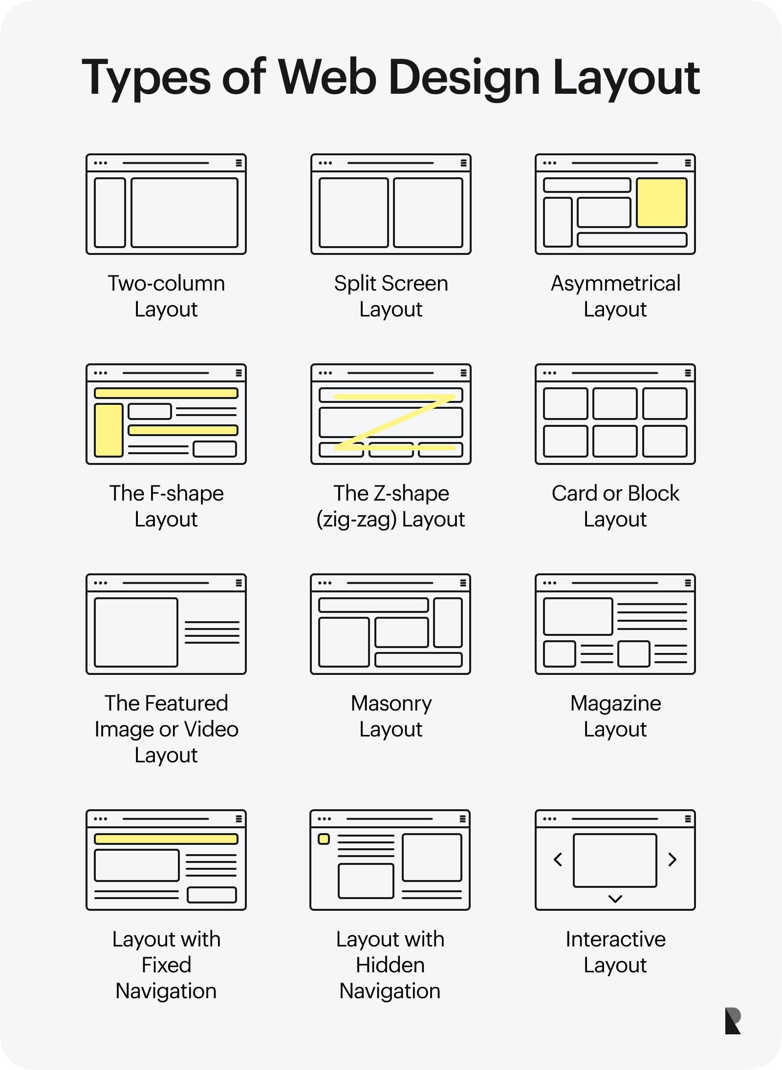
These fundamental structures come in various options. The most popular are:
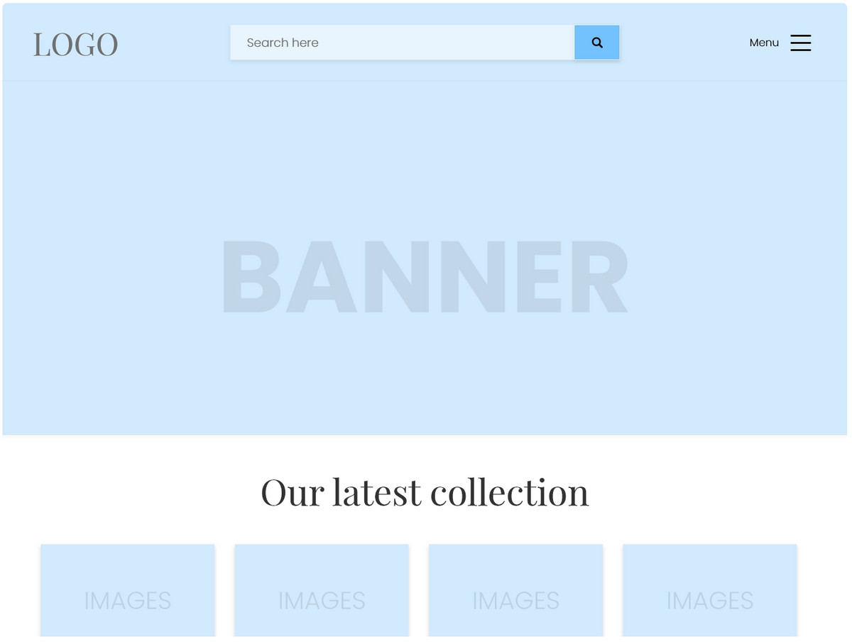
- Two-column layout. As a rule, it includes one massive area for displaying content and a sidebar for primary navigation.
- Split screen layout. It is a two-column structure with equal space between both sides of the screen.
- Asymmetrical layout. It is an imbalanced structure whose key feature lies in emphasizing a particular page area.
- The F-shape layout. It is based on well-known users behavior of scanning the web page, which implies visitors' eyes move across a page in an F-letter pattern.
- The Z-shape (zig-zag) layout. It arranges content in a Z-letter direction, another popular option for exploring web pages among website visitors.
- Card or block layout. It reminds a mosaic style where the screen is divided into numerous blocks that are tightly placed together.
- The featured image or video layout. It has a hero area with an image or video on a page.
- Masonry layout. It does not stick to a strict grid, though it has some organizational order. Here, the items in the following row rise to fill the gaps, thereby recreating an engaging Tetris-like effect.
- Magazine layout. It is a mishmash of several structures. At some point, it looks like a mess that has been tamed through various data-arranging techniques.
- Layout with Fixed Navigation. This option implies different skeletons: one-column, split, asymmetrical. However, its navigation is always fixed; it moves along the pace, staying at the same position all the time.
- Layout with hidden navigation. The so-called hamburger or slide-out menu became increasingly popular five years ago. It met popular demand caused by growth in the mobile web, carving its own niche. It may feature a one- or two-column structure where navigation is completely hidden at first. The latter slides out from one side and displays all crucial links to other pages and some other additional information.
- Radial symmetry layout. Rare, but it still exists. It sets a focal point on the center of the page and equally distributes area along the circle.
- Interactive layout. Highly entertaining and amusing, but exceptionally difficult to handle.
Last but not least. It is important to note that all the above-stated options are vertical layouts. There is another vast category - horizontal layouts. Although it is not very popular now (it had its time over five years ago), it is still a valid option for driving users' attention and drumming up interest.
Core Elements of Web Design Layout
The layout is a skeleton that consists of columns, rows, sections, areas, gaps, margins, and space. However, it is much more when it is applied to web design.
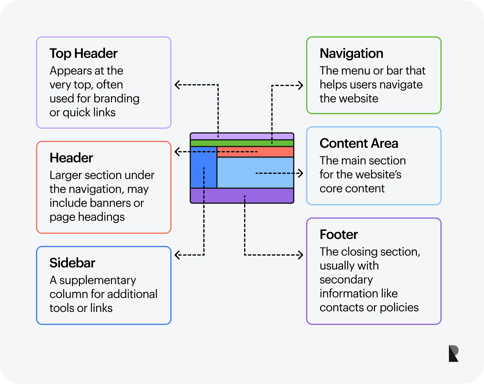
The web design layout is a framework with a skeleton and modules that build a visually appealing front-end to serve content and provide a solid foundation for functionality and user's experience. Core elements of web design layout are:
- Top header,
- Navigation,
- Header,
- Content area,
- Sidebar,
- Footer.
Each can be broken into smaller parts that play a crucial role in building an ecosystem.
Importance of Strong and Well-thought-out Web Design Layout
The success of a website depends on numerous factors; however, without a proper web design layout, it is simply impossible. The layout is vital for any web platform to exist. Underlying literally everything, it creates a solid base to build on. In a word, no layout – no website.
This is not the only reason a strong website layout is essential for every project. Recent studies show that users will not give you more than a few seconds of their time. The structure that delivers the right information at once ensures these seconds are not wasted in vain. It grabs this fleeting opportunity and compels people to give the project a chance that is crucial for any business in the digital World.
There is more. Consider why a good layout is essential for every website regardless of its niche, target market, and purpose.
- It gives the visitors easy access to valuable and important information.
- It clarifies the purpose behind the company's web presence.
- It encourages users to move along the pace and explore the project more deeply.
- It makes consumers come back.
- It determines how long visitors dwell on the website pages and how many web pages they browse.
- It creates the best user experience.
- It implements website accessibility principles.
- It directly correlates with the usability of the website.
- It influences overall performance.
- It affects various aspects of the marketing side, such as conversion rates, bounce rates, page views, etc. Plus, it underlies marketing campaigns.
- It aids search engine optimization strategy.
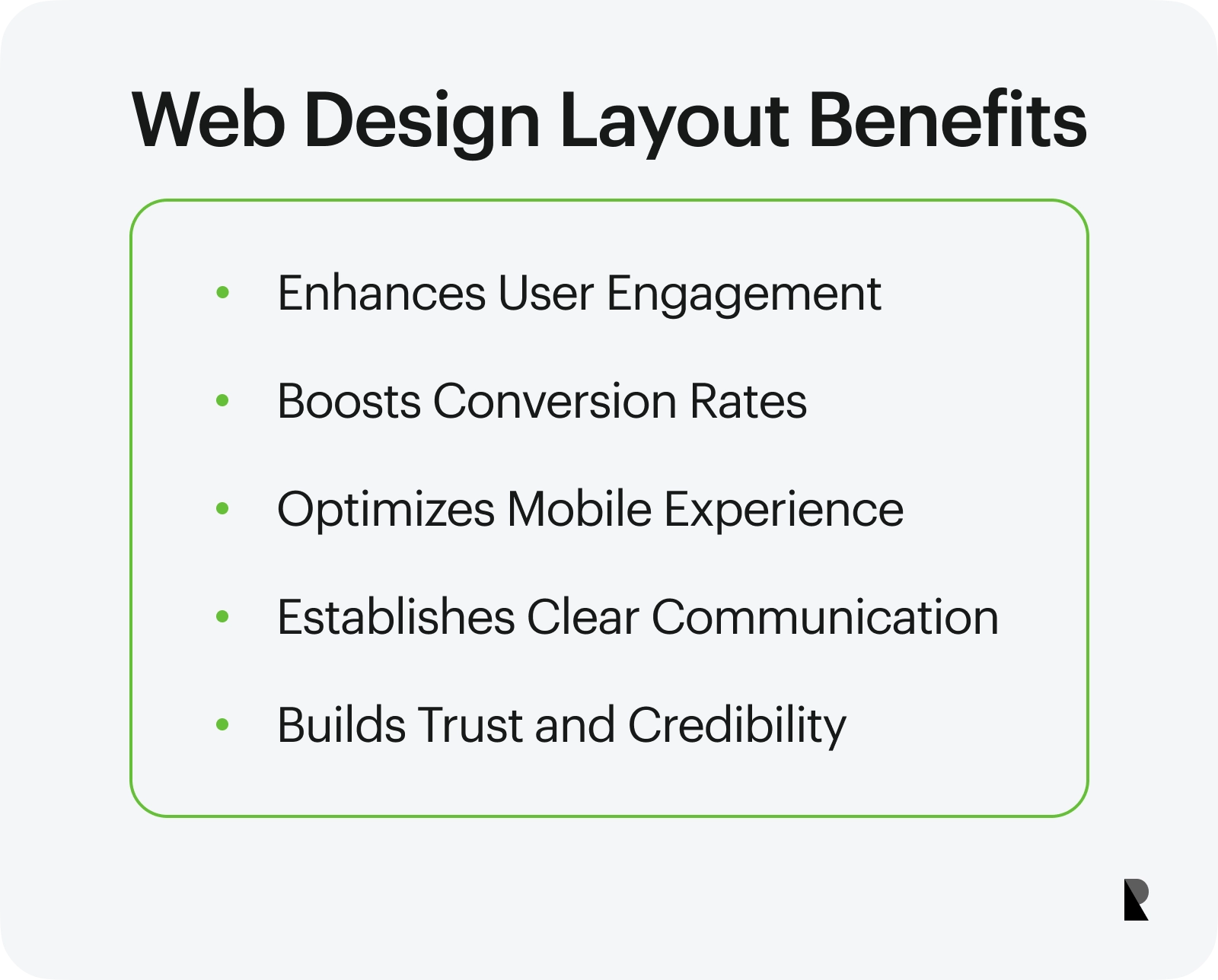
Benefits of Strong Web Design Layout
When the web design layout is thought-through and polished, it offers a range of benefits that affect the company's presence across various levels and verticals. Most of them are invisible to the naked eye; however, they are here. Let's consider what it can do for the company.
- It drives engagements. When the project is easily navigated, and people get what they need right here right now, they will tend to return for more because customers love easy ways of deriving valuable information.
- It escalates conversion rates. As they say, location, location, location. Much like in real estate, location plays a massive role in marketing campaigns' success. A good web design layout arranges things to lure customers into the sales funnel and guides them from key point to key point until the conversion is done.
- It increases mobile traffic. A good layout easily adapts to whatever comes its way, a gigantic TV screen or a tiny cellphone. It constantly and consistently delivers value to customers on mobile devices, encouraging them to visit the website and explore it until they reach their goals.
- It creates clear communication paths to convey necessary information and deliver the right message.
- It avoids visual overload. Users are bombarded with information every single day. Proper website structure prevents this cognitive overload, decreases the learning curve, and makes users feel comfortable on the platform.
- It cements the first impression. The image is worth a thousand words. However, one should not miss the crucial detail - a rigid structure that supports this secret weapon and presents it consistently across numerous devices at the right time.
- It sets the impression for customer service. A good web design layout stands behind superb usability and navigation. These two factors underlie a great foundation for building an excellent customer service experience.
- It qualifies the project. A strong website layout adds to the company's reputation extra points. Like it or not, people eat with their eyes. The proper arrangement of visual elements may easily qualify the project.
- It ensures consistency, creates a cohesive brand identity, and amplifies a unified experience for existing and potential customers.
- It builds trust and increases credibility. By providing consistency in web projects and producing a certain level of emotional connection, the web design layout meets the audience's expectations and amplifies the belief in the company.
- It makes it easier to analyze a website. The clean layout allows business owners to inspect the different elements of the front end much more efficiently and define the weak spots of the project right away.
Obstacles in Creating Strong Web Design Layout
Creating a perfect website layout design is a true challenge. Traditionally, several huge areas erect obstacles on this path. They are:
- Information and visual hierarchy. A layout defines the design elements' arrangement according to the unit's visual weight. It is tricky to determine factors that will correctly dictate the order and placement of blocks and modules.
- Responsiveness. Achieving flexibility of the web page layout in today's realm is challenging. First, there is already a sea of devices to take into account. Second, this market expands very fast, regularly presenting new items.
- Mobile-friendliness. Reproducing natural mobile-friendly behavior in a website requires from team to think small yet act big. They must handle mobile speed, optimization, heavy images, videos, typography, animation, and interaction.
- Accessibility. This area has numerous barriers to overcome since the layout builds a path for perceiving information. It needs to be logical, natural, and straightforward. On top of that, it should play along with assistive technologies. Quite often, developers must re-arrange blocks and reimagine the layout to meet this criterion. Plus, they need to consider web accessibility initiative in mobile devices that throw into the mix new challenges.
- Browser compatibility. Oldie but goodie. Dev teams still seek ways to guarantee that websites are compatible with various browsers and operating systems, including mobile versions.
- Readability. Whatever project you have in mind, readability needs to be polished and nailed. The layout should serve content in an understandable way for all readers.
- Scalability. The layout should have a scalable architecture that will meet future demands when the business starts to grow.
- Performance and speed. These two factors have high standards that are difficult to meet. The team should constantly find ways to optimize website units.
- Security. Last but not least. The layout may become a reason for the project's vulnerability because of poorly developed third-party plugins, components, and extensions used to create it.
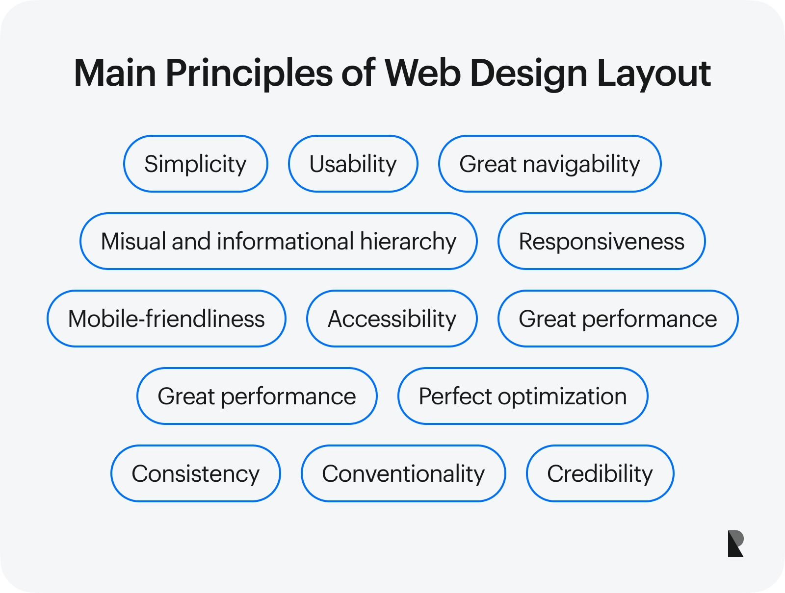
When addressing these issues, it is crucial to keep in mind 12 qualities that define a strong web design layout:
- Simplicity,
- Usability,
- Excellent visual and informational hierarchy,
- Great navigability,
- Responsiveness,
- Mobile-friendliness,
- Accessibility,
- Great performance,
- Perfect optimization,
- Consistency,
- Conventionality,
- Credibility.
Main Principles of Web Design Layout
Good website design layout follows trends, employs time-proven high-end techniques, and meets current requirements and standards. Many factors define its validity, but we will focus on the main principles at its core.
Simplicity
'Do not make users think.'
According to a study, consumers scan some text and click on the first link that catches their interest. Although some want to be entertained with animations or interactivity, nevertheless, content always comes first. Therefore, the layout must be straightforward, easily perceived, and digestible. Plus, with a simple skeleton, it is easier to build up and scale projects in the future.
Navigation
'Don't squander users' patience.'
People do not like waiting or seeking information; they want to get it right here, right now. Therefore, making the path to their goal as short as possible is a top priority. How to do this through website layout? Simple - realize it through navigation patterns.
When creating the wireframe of your future website, it is crucial to consider how users will explore the website. The layout should lead them from top to bottom through necessary details and components. In addition, it should have perfectly highlighted getaways so that users may jump from one page to another and return to the homepage without much effort.
Whitespace
Whitespace always stays overlooked and underestimated. However, as many professional web design teams agree, it is increasingly important. It only seems that it does nothing except for adding blanks. It does so much good for the project and user experience that you cannot even imagine. For instance,
- It creates harmony.
- It strikes a balance between multimedia and copy.
- It leads a reader from one element to another.
- It decreases cognitive overload.
- It contributes to the project's simplicity, making the interface look uncluttered and perfectly aligned.
- It improves reading flow.
Whitespace is quite powerful in what it can do. When messed up, it may ruin everything. Therefore, it is crucial to exercise caution when introducing it in interface and layout.
Visual and Informational Hierarchy
Much has been said about the importance of a well-thought-out visual and informational hierarchy. Let us recap the crucial points:
- It creates order out of chaos.
- It establishes the sequence of elements within a composition.
- It places importance on vital units.
- It defines and influences the order in which the audience views content.
- It impacts the comprehension and value of the project.
- It establishes focal points that help to introduce lead magnets making marketing campaigns effective.
In a word, it is everything for the project.
Quality and Credibility
Although people eat with their eyes, they still appreciate the quality and value they get. That is why, in the end, content is always more important than design.
The same goes for the layout that supports it. With a high-quality structure underneath, any website will increase trust and gain high credibility. Therefore, whenever you create a framework for your next web project, it is vital to use only high-quality, time-tested tools, like Flexbox, Bootstrap, Material Design grid, etc.
Performance and Optimization
According to recent studies, almost 80% of online customers will avoid a platform where they have experienced performance issues. Another survey indicates that user satisfaction plummets by over 15% with a one-second delay in page load time.
Performance, and ipso facto optimization, of web design layout is crucial for crafting a strong brand presence. It reduces bounce rate, drives engagement, secures first and the last impression, generates conversions and clicks, ensures better ranking in organic search, amplifies revenue, and prolongs brand and product life.
Improving performance requires some substantial steps that imply introducing enhancements across various verticals. For instance, when it comes to website layout, it is essential to adopt these practices
- Follow the best design guidelines.
- Employ only time-proven frameworks and grids.
- Choose minified versions.
- Write mobile-first code.
- Use a content delivery network when referencing third-party plugins and extensions.
- Avoid too many widgets and plugins.
- Hotlink images, videos, and other resources from fast servers.
- Optimize the overall application logic to prepare pages faster.
- Use fast and reliable servers.
- Optimize multimedia.
- Minify and combine CSS, JavaScript, and HTML files.
- Adopt monitoring techniques to eliminate issues and minimize drastic outcomes.
Responsiveness
A responsive design adapts to all screen resolutions and sizes to make the content flow freely across all platforms. It instantly responds to the environment in which it is viewed, providing the best user experience. With dozens of monitors and portable devices, this quality has become crucial for every project.
However, necessity is not the only reason to introduce it in the web project. Responsive behavior also comes with some key advantages:
- It gets higher search engine ranks.
- It reaches more customers.
- It keeps users engaged.
- It decreases the bounce rate.
When implementing responsiveness, you must play with media queries to re-arrange the layout. On top of that, it is crucial to ensure speed and performance stay at the top and define ways to optimize multimedia so it looks good in any size and dimension.
Today many tools help to bring it to life. From Flexbox to custom solutions, there is plenty to choose from. However, before making a final decision, it is crucial to test your solution because it may go wrong in some browsers and operating systems.
Mobile-Friendliness
Gone are the days when mobile friendliness was an option. It is a must-have for any project now. Just consider the recent studies. Mobile devices alone generated almost 60% of global traffic in 2022 and have permanently stayed on the top since 2020.
When introducing mobile-friendly patterns in the layout, take into account these vital tips:
- Mobile friendliness and responsiveness are two different things. They should be introduced in the project separately.
- Whatever cellphone screen might seem big, the two-column structure will still look tight, ruining readability completely.
- Navigation should occupy the entire screen.
- Tappable areas dictate the size of sections.
- Some sections should decrease in size, like the image-based hero area, whereas other units should increase in size, like buttons or tabs.
- Gaps between sections, margins, and paddings need to be reconsidered to secure a comfortable reading flow.
- No horizontal layout.
Website Usability Guidelines
Usability is the most crucial element of a website in 2022 for many good reasons. For instance,
- It is a mission-critical element of customer experience.
- It stands behind comfortable access to the platform.
- It produces convenient, easy, clear, and exciting website design that turns random visitors into regular clients.
- It helps to decide on most things, including the basics like color palette, to create associations with the brand and establish a strong bond with the target audience.
- It gains the trust of a user and strengthens the brand's positioning.
There is more. Recent studies indicate that online visitors no longer tolerate lousy navigation, poor website performance, or bad user experience. They just leave and never return simply because they can choose another vendor in this niche who will provide the same content, functionality, and service yet with higher standards. Therefore, usability occupies a top priority in the design process.
So, how to create one in your project? According to Jakob Nielsen, a famous web pioneer and father of this concept, simple, intuitive, pleasant, and safe interaction defines great website usability. To introduce it, at minimum, go by these basic rules:
- Follow the best web design guidelines.
- Establish a clear and simple navigation system.
- Improve search functionality. Note search bar is not enough to let your users locate information. You need much more than that.
- Optimize for mobile devices, tablets, and huge monitors.
- Strike the right balance between graphics and content.
- Use multimedia to support content and deliver the message.
- Improve performance.
- Maintain high loading speed.
- Stick to conventions.
- Stay consistent.
- Last but not least, adhere to the web content accessibility guidelines.
Website Accessibility Guidelines
Website accessibility has become a real thing. For those who are still unaware of this concept, it is all about providing users, including people with disabilities, with a decent user experience and easy access to information. And it is not a trend that comes and goes. It is a must-have for every web platform in the World, regardless of niche, target audience, goal, strategy, age, budget, and other factors that define the company.
The benefits of introducing website accessibility are not so evident at first glance; however, they are substantial for the community and business growth. Consider the most important ones:
- It provides equal access and opportunity not only to people with disabilities but also to people who experience temporary problems with health or devices. For instance, accessibility ensures people with slow internet connections get all the necessary information about your brand. This means the company secures its target market regardless of the circumstances.
- It builds the trust and credibility of the project and brand. Needless to say, what trustworthiness means for customers these days. Basically, it is the prime factor in choosing a company from the oversaturated market and sticking to it during crises and fluctuations in global economics.
- It turns regular visitors into brand evangelists. The more extensive base of loyal fans you have, the more opportunities you get to grow and forward your business. For instance, strong customer relationships allow companies to run campaigns successfully, introduce new products, and even raise prices. On top of that, the brand's enthusiasts are standing behind traffic growth and taking the brand's reputation to the next level.
So, how to ensure accessibility of the web design layout? Take these steps:
- First, get acquainted with WCAG conventions - visit their official website.
- Second, inspect your web design layout from various perspectives. Use assistive technologies to navigate through your project. Make a list of flaws and obstacles that occur on people's paths.
- Third, sort out issues with performance, speed, and cognitive overload.
- Four, never rely on images, animations, and interactive elements to deliver information. Use them only as supporting material.
- Fifth, introduce these vital improvements:
- Add keyboard navigationб make every calls to action significant, eye-catching, tappable, and reachable across all devices, ensure the layout follows the logic flow, add captions for media, including images, videos, and audio, use ARIA tags whenever it is necessary.
- Finally, benefit from web accessibility tools.
Last but not least. Remember that making your website accessible to people with disabilities will make it accessible to everyone. Therefore, do not leave it for later.
Website Design Layout Best Practices
Applying the above principles is half the battle for an excellent web design layout. Another part implies adapting to new realities, standards, requirements, and expectations by introducing improvements to the platform. Follow these website design guidelines and best practices:
- Inspect your target audience. The website needs to meet consumers' expectations, demands, and requirements.
- Explore competition. It will hint at what works best and inspire you to create something unique.
- Align the web design layout with the brand's goal, mission, and vision.
- Nail the core elements of website layout: header, website content, footer, sidebar, and menu. Not only should they accommodate all vital details but also look and feel perfect, meeting all standards, requirements, and expectations.
- Always keep visual hierarchy in mind when designing a layout and populating it with the content. Stick to rules and employ the best techniques in this niche.
- Avoid clutter and content-heaviness at all costs. These two factors may easily overwhelm and scare away visitors leaving a wrong long-lasting impression.
- Make the homepage not only impressive but also informative and valuable.
- Show all crucial getaways right away.
- Prioritize navigation and keep it above the fold. Let it occupy the best spot and unobtrusively remind itself during the website's exploration.
- Space out content. Leave areas blank to achieve harmony in reading flow, create a well-balanced structure, and introduce bite-sized paragraphs.
- Introduce essential yet crucial navigational elements: anchor menu, footer menu, and "Back to Top" button.
- Make the footer functional and informative. Add all essential links, search bar, and even call to action to support the marketing campaign.
- Employ "Visual Language" by following three basic principles: organization, which implies creating a consistent and clear structure; economy, which means using as few cues and visual elements as possible; and flexibility, which means matching the capabilities of users.
- Nail typography. The role of font families cannot be understated. They should be legible, functional, and readable. They exemplify the brand's personality, support information hierarchy, and improve readability across the boards.
- Do not be afraid of conventions. Although they may look and feel trivial, they do one crucial thing – reduce the learning curve. This is critical for online visitors because everyone wants to get what they need without thinking. Therefore, follow users' expectations and understand what they need and want from site navigation, text structure, and vital block placement.
- Think about the future. The day will come when your brand will hit its stride, and your web presence will be scaled. The layout needs to be ready for that. Make sure it has the capacity to meet new realities and accommodate all new elements.
- Monitor the website's performance, uptime, traffic, and all other factors responsible for its validity, functionality, and existence.
- Conduct regular tests. The sad truth is that things tend to go wrong with websites. Some of these are minor errors, whereas others incur quite heavy expenses. It is crucial to locate them in time and eliminate them before the situation escalates.
Conclusion
The web design layout is a fundamental element of every web platform in the World, figuratively and literally. Nailing it requires tight collaborative work of the dev team and web designers. They must ensure it meets current standards, requirements, market expectations, brand goals, and marketing strategy. At a minimum, this means it should be intuitive, usable, transparent, responsive, mobile-friendly, accessible, credible, flexible, scalable, highly optimized, and reliable.
On top of that, it should undergo constant improvements to secure its level of quality because the market does not stay still, and technologies constantly evolve.
Ensuring all of these principles is complicated and tricky work. However, it pays a lot in the end. A strong web design layout provides a solid foundation to build on. It brings numerous benefits to the project, starting with creating an excellent user experience, which makes potential customers return, and ending with strengthening brand reputation and ensuring marketing campaigns' success.

Creates insightful, strategy-driven content that translates complex design and branding concepts into accessible knowledge, supporting Ramotion’s mission to elevate digital experiences.