Do you know that over 2.8 million apps are available on the Google Play Store, and almost 2 million apps are available for download on Apple Store? The recent statistics of the mobile market have uncovered staggering numbers that prove to everyone that this niche is going strong each year. There is more. The app market is one of the most promising. According to studies, it is expected to generate over $935 billion in revenue by 2023.
Everyone wants to grab a piece of this million-dollar pie. However, that is not easy. Along with colossal popularity comes cutthroat competition that requires entrepreneurs to take extra measures like using professional brand design services or creating an eye-catching, memorable and unique App icon design by themselves. Why? Simple - it will separate the product from the radiant crowd and give the company a fighting chance to reach customers and win them over. How to do this? Follow our guide.
In this guide, we will get the essentials of an App icon stand, go through the basic steps of creating its design and get some great advice from professionals.
Essentials of App Icon Design
According to Wikipedia, the app icon is a pictogram or ideogram displayed on a screen of a computer, laptop, tablet, or cellphone to help the user navigate a system and activate a specific program.
The specialists believe it to be a visual anchor for a product, so to say, a "door" to the software that should instantly communicate the essence of the application. For brand leaders weighing whether to build in-house capabilities or collaborate with an external partner, reviewing top companies for brand identity design can help identify teams equipped to translate core brand meaning into compact, high-recognition assets like an app icon. Marketers think of it as a tiny yet crucial piece of branding that reflects the brand's identity and vision, looks attractive and stands out.
Surprisingly, the modern App icon term encompasses everything said above: it is a piece of brand identity that describes the essence of the program serving some crucial marketing roles.
Last but not least, it is vital to note that icons are not logos. Although both are identification pieces, still the logo portrays the company and its multitude of products, whereas the icon represents only one product.
Core Aspects of App Icon Design
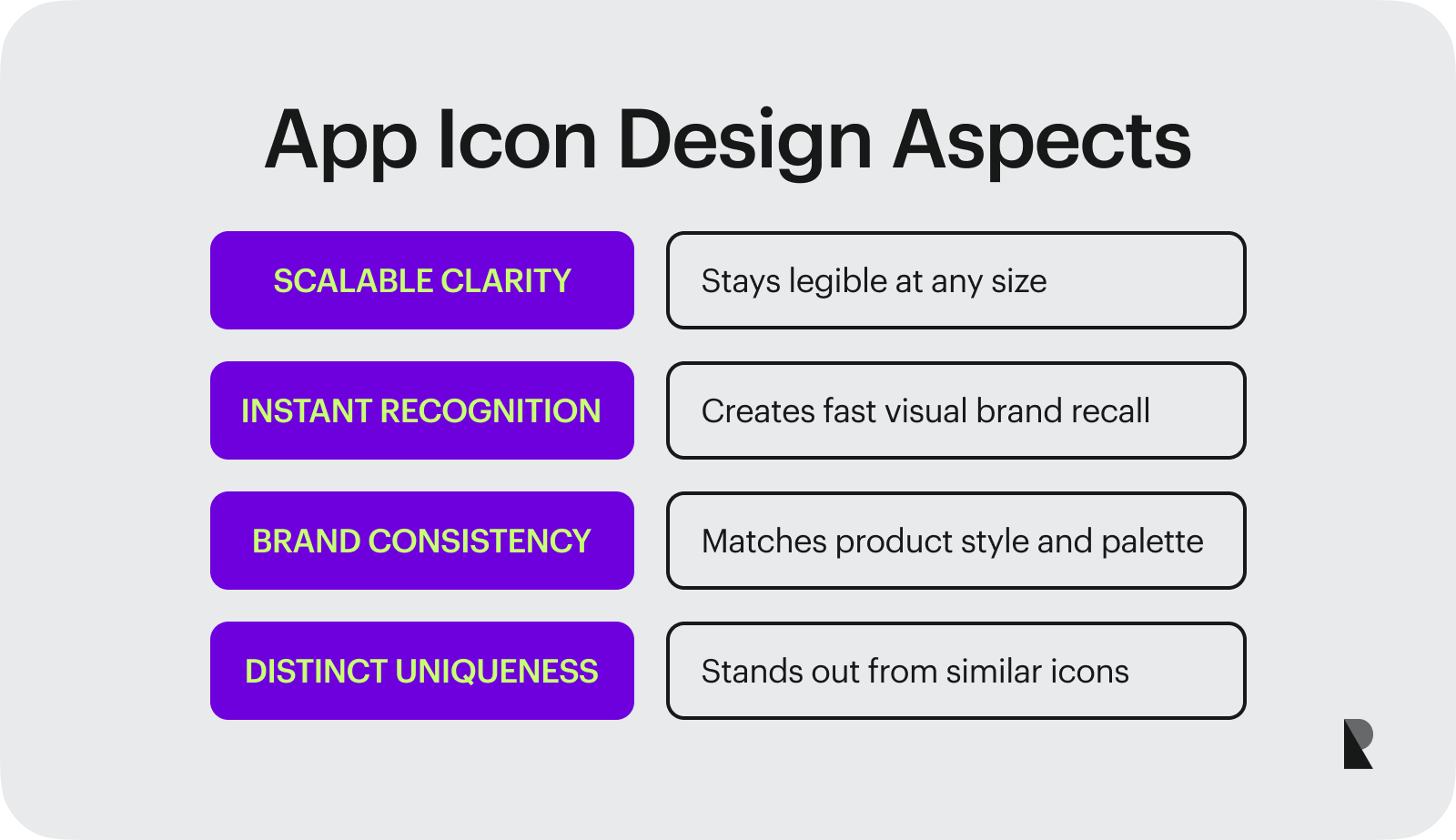
Despite the icon's small size and apparent simplicity, each successful piece owns four qualities. Let us consider closely these important aspects that everyone needs to instill in their icon designs:
Scalability
Whatever small or big, icon has to maintain its legibility and uniqueness – no questions asked. For this, it needs to be perfectly scalable. This is crucial because there are dozens of different contexts in which user and application meet: App Store, settings panel, and home screen, to name a few.
Recognizability
This aspect significantly impacts a product's success and lifetime because it establishes a functional and emotional connection. On top of that, it speaks the same language as the target audience, meets the prospect's expectations and preferences, and communicates the app's value.
Consistency
Staying consistent across the boards is rule number one for many niches: branding, marketing, and advertising. Creating an App icon design is no exception. There are different circumstances in which users and applications (and ipso facto brand) could meet. You need to show a unified image of your product - it has to stay in sync with app design and tell the same story to maximize the impact and strengthen the company's presence. Therefore, the color palette, design language, overall style, and theme should stay the same.
Uniqueness
Doing what everyone else is doing might bring about an App icon that will be swallowed up in a sea of similar solutions. Unique personality, charisma, and vision help the product and brand stand out from the crowd and ipso facto get a fighting chance to survive the competition and earn a place under the Sun.
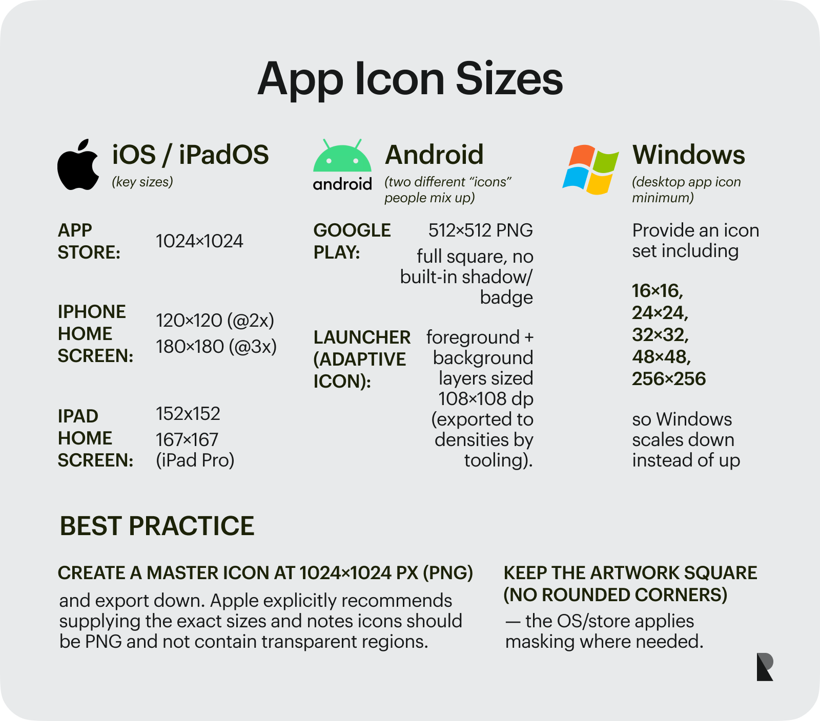
So, what to do? The answer is simple: create a set of PNG files in multiple sizes — from small to big with separate versions for popular operating systems to meet standard screens' dimensions and ensure the graphics scale without losing quality. At a minimum, designers must comply with size recommendations for famous manufacturers such as Apple and Google. Let us consider each one closely.
- Apple expects their ios icons to comply with some strict pixel recommendations because of their devices' varying screen resolutions and sizes. Standards sizes for ios app icons are: iPhone: 180px × 180px (60pt × 60pt @3x) and 120px × 120px (60pt × 60pt @2x), iPad (regular version, Mini and Pro): 152px × 152px (76pt × 76pt @2x), 167px × 167px, App Store: 1024px × 1024px.
- Google shares one of the most detailed icon style guides - Material design specifications. From corner shapes to opacity to icon size, the team has covered every inch of App icon design. For instance, the team gives these instructions: android app icons need to be 512px x 512px, 96px×96px, 72px×72px, 48px×48px, or 36px×36px and have a full square shape without shadows and badges. The product icon must be provided at 48dp, with edges at 1dp.
- Windows asks artists to provide at least these icon sizes: 16x16px, 24x24px, 32x32px, 48x48px, 256x256px. It is also allowed to make icons three-dimensional and shown in perspective or two-dimensional shown straight-on. In the smaller sizes, the icon needs to be changed from perspective to straight-on to provide a clear and crisp image.
To sum up. With a myriad of sizes, it is a challenge to cover everything. Start with creating an icon with 864✕864 pixels for Android devices and an icon with 1024✕1024 pixels for iPhone devices. This gives a solid foundation to move forward.
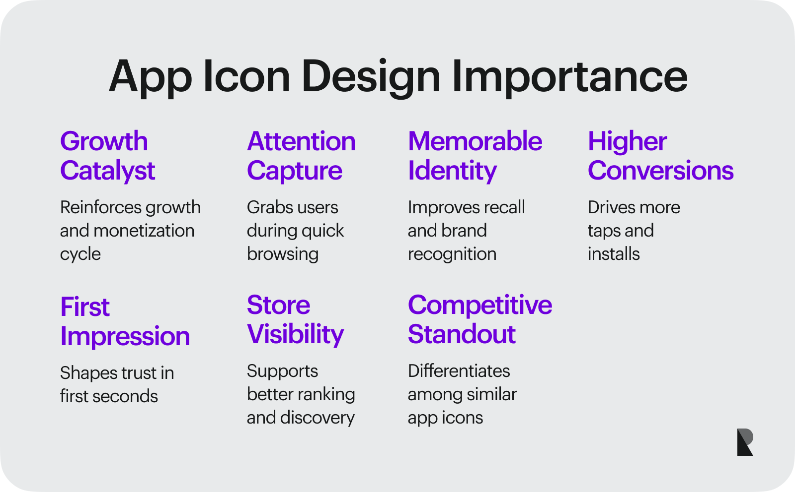
Last but not least perfectly valid argument why App icon design should not be taken lightly is that it helps the application fit the industry's vibe. It gives users the correct idea of your app and what to expect, as well as ignites interest, increases engagement, and expands the target market, thereby converting prospects into clients and clients into fans.
The Process of Making Application Icons
App icon design tremendously impacts the program's downloads and interactions. It stands behind significant engagement levels, high conversions, a good reputation, and a long product lifetime. It helps the user recognize the app among the others and generates interest in the app store. Therefore, it is crucial to create and perfect it.
Let us retrace the basic steps of developing App icon design. Though, before jumping into the routine, we are going to refresh in memory what qualities good app icon design has.
What Makes a Good App Icon Design?
The difference between good and bad App icon design lies in its qualities. As noted, every good icon should be instantly recognizable, consistent with a brand and style, scalable, and unique. On top of that, it needs to be emotive, functional, memorable, simple, and intuitive.
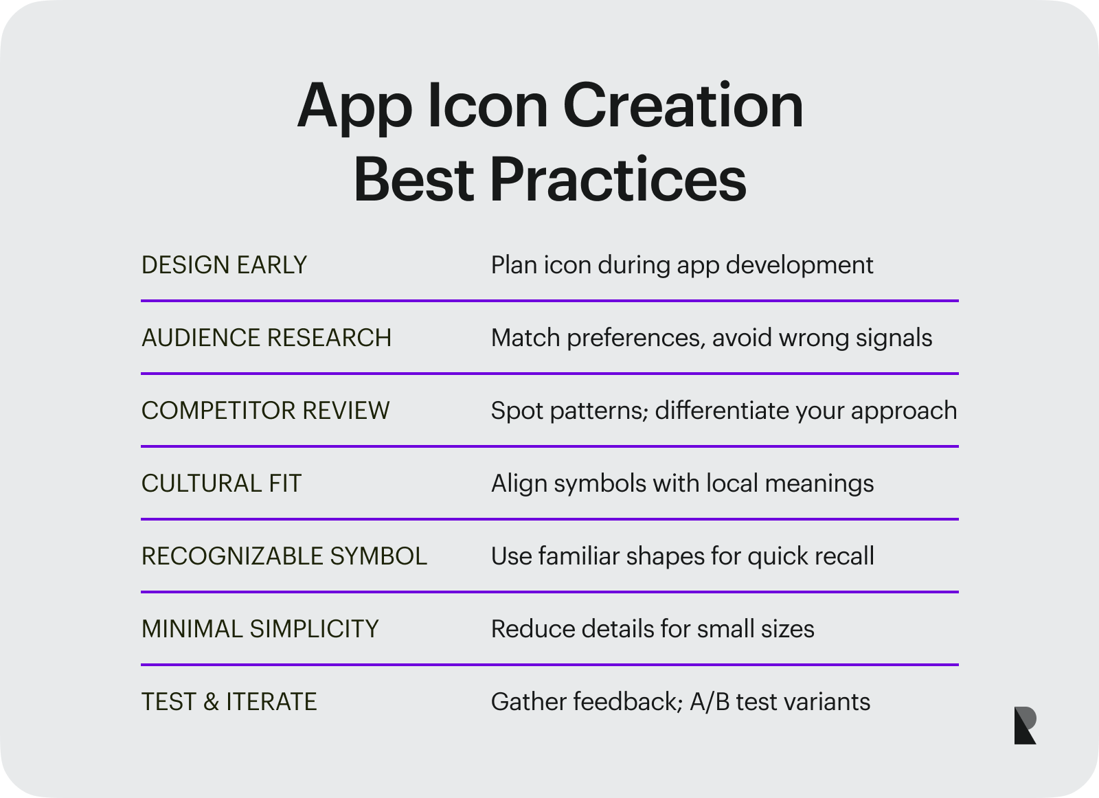
How to ensure this? Follow these basic steps.
Step 1 – Choose the Right Tool
This is the starting point for any design. It is crucial to equip yourself with programs that will streamline the process and give you all the capacity to bring your idea to life and meet all the standards, specifications, and requirements set by the community and manufacturers.
There are many software tools that designers can use. The most popular are: Photoshop, Illustrator, and Sketch. Plus, some fantastic web-based solutions like Vectr or Material Theme Editor exist. Based on the situation, expertise and goal, the designer needs to choose the perfect option.
Step 2 – Get Acquainted With Current Trends and Standards
It is always a good idea to follow design standards provided by Google, Apple, and Windows. This helps the solution feel cohesive and relevant to current trends. This generates more downloads and increases the product's popularity.
Therefore, start with exploring Material Design, an extensive set of guidelines by Google, and Human Interface Guidelines created by Apple.
Step 3 – Decide on the Way to Build an App Icon
This conceptual stage implies different approaches to the app's graphical representation. For instance, some designers try to develop a unique shape that encompasses what the application is all about; others create a vector version of a specific image that reflects the look and feel of an application. Some benefit from typography and the use of the first letters of the product set in a font family that conveys the mood and atmosphere.
Other good app icon design ideas to get inspiration are:
- using analogies from the application,
- communicating functionality,
- depicting the prize or goal,
- showing the main character,
- conveying action, movement, excitement, or fun like most game app icons do.
Step 4 – Research a Concept
The research stage is one of the most refreshing and inspiring. It starts with asking yourself these questions:
- What does your product do?
- How to capture the best app mission in a single image?
Inspect the competition and similar niches. This helps to get an idea of what traits your icon should have and what not to avoid going down conceptual dead-ends or producing work that is already there. Surf through Google, Dribbble, Behance, App store, and Google Play market – there is lots of inspiration in there.
Step 5 –Sketch an Idea
Oldie but goodie. It is here where the process of designing app icons starts. Professional artists recommend creating rough sketches to shape ideas generated during the previous phase. Do not try to make them beautiful and polished.
Sketching is all about crudely translating what is in your mind's eye. Include vital details and mention color, styles, and themes. Draw several concepts and then settle on two or three options.
Step 6 – Design and Render
Start with thinking through the options that you have settled. Which one excites you the most? Which one will resonate with the target audience the best? Define two options. Then export some clever templates and color schemes to the tool you will use. Prepare plugins, actions, and filters that may come in handy.
To get you started with the right dimensions, use App icon templates: there are dozens of them in the design resource platform.
After that, take a picture of the sketch and trace the shapes to create a foundation and building blocks for the future icon. Remember to follow the best practices in icon design:
- Mind brand guidelines.
- Maintain a balance in detail.
- Avoid too many details.
- Omit words.
- Stay away from images and pictures.
- Ditch overly complicated icons.
- Use 3D elements with caution.
End up doing a range of icons to choose from. Experiment with colors, details, positions, structure, themes, gradients, etc. Note that one version is not enough – it is common to try out several variations before finding the execution that meets the company's standards, requirements, and expectations.
App Icon Creation Best Practices
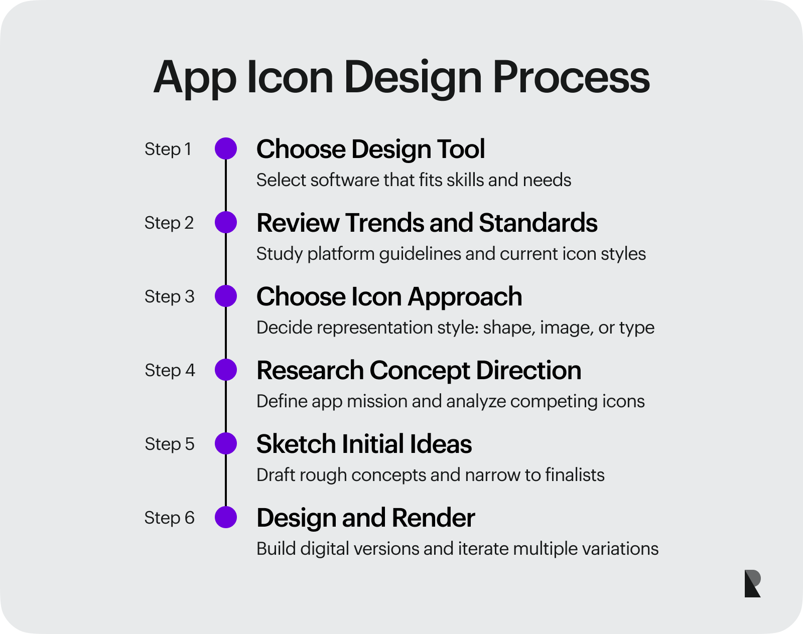
Designing great app icons involves more than a thorough understanding of the theory and following the basic steps. It is also crucial to apply the best practices shared by professionals in the field. They help to identify and fill knowledge gaps, generate creative and innovative ideas, enforce better decisions, polish the product, streamline the workflow, maximize productivity, and much more. Let us list the best of them:
- Originate App icon design from the app creation process. Do not treat it as an afterthought. Collect the info throughout the app development process, and shape the app icon accordingly.
- Know your audience. A thorough analysis of the target market helps artists understand customers' preferences and ipso facto make an informed decision. This also protects designers from solutions that may cause mixed feelings or bring the wrong message.
- Do competitive analysis. This gives valuable insight into popular design solutions, identifies the strengths and weaknesses of others, demonstrates the target audience's preferences, and helps the team create something unique.
- Understand the culture of your audience. If the company targets a local crowd, it may easily benefit from cultural aspects by communicating a better message, adding emotional attributions, and causing specific mood reactions.
- Use a recognizable shape or symbol. Conventions always bring benefits: they simplify the designing process, minimize the learning curve for viewers, and make the icon memorable.
- Ditch trivia. Although this sounds controversial, regarding the previous practice, nevertheless, using conventions and avoiding banality are two different things. You may easily follow conventions but use some unique shapes and symbols that will meet the product's identity and vision.
- Keep it simple and minimal. When it comes to iconography, less is always more. When you try to fit into a 32px width square a hundred details, the overall picture naturally looks cramped and messy, destroying the whole effect, and even conveying the wrong message. When the image is neat, simple, and minimal, it is hard to go wrong with assumptions. What's more, according to surveys, people naturally opt in favor of simplicity. Therefore, practicing minimalism and clarity in stylistic options and details is crucial.
- Avoid text and words. Users scan rather than read. Therefore, inscriptions are quite often left behind – do not rely on them.
- Maximize on contrast. High-contrast items travel to our brains quickly, winning customers' attention and retention. Therefore, brighter parts that stand in stark contrast to the background will do their job better and more efficiently. Use bright colors for foreground elements and pale colors for the background.
- Use bright colors to create a buzz. A bright tone is more likely to grab attention. Surrounded by a calm and neutral color scheme, a garish color palette quickly strikes an eye and separates itself from the others.
- Pick colors carefully. Every tone has a meaning or causes a particular gamut of emotions and feelings. According to color psychology, blue increases trust, green escalates natural vibes, yellow multiplies happiness, orange exudes confidence, red brings love into the game, pink feels sincere, purple looks royal, brown matches simplicity, black intensifies sophistication, and white sharpens the sense of honesty and innocence. Do not overlook that.
- Match brand's-specific guidelines and the style of an app. The icon should represent the company's mission, value, and goal and serve as a "door" to the application - it needs to be in tune with the app design.
- Optimize for specific themes, languages, and conditions set by the target audience, niche, and company's marketing goal.
- Ensure the icon meets the platform's specific guides.
- Make icons evoke powerful emotions. The positive range is increasingly popular. However, do not underestimate the power of negative emotions. As practice shows, icons that look outrageous or scary easily catch an eye and leave a clear footprint in customers' minds.
- Adhere to current trends. Although going off the beaten track may easily draw widespread attention, it will do more harm than good if you favor outdated styles like skeuomorphism.
- Ensure the icon looks good in different sizes, resolutions, browsers, and operating systems.
- Ensure the icon looks good against different backgrounds. Note the user may have a different screen and canvas settings. Whatever option they choose, the icon should not blend into the environment; it needs to stand out from the crowd, looks crisp and clean, and instantly catches an eye.
- Use professional tools. Professional graphic editing programs always make a huge difference. They increase productivity, provide new ways to shape ideas, save precious time and effort and guarantee a high-quality result.
- Collect feedbacks. Customers' recommendations are the most valuable and practical. Therefore, start by asking your friends and colleagues. Then, use professional platforms to garner user reactions.
- Do a thorough test. Believe it or not, such a small detail, like an icon, requires a comprehensive test stage. This is crucial to eliminate flaws. Generally, the icon should undergo different tests because there are a dozen criteria, standards, and qualities it should meet to emerge victorious.
- A/B test icons. Test your icon for performance among the crowd. Specialists advise creating at least two variants and testing them to see what option resonates best with the customers.
Conclusion
App icon plays a vital role in a product's success and life. It communicates its value, drives engagement, ignites interest, and serves as a "door" to the application that establishes a functional and emotional connection. The more attractive your app icon is, the more downloads and installs your app will get. With that said, it is crucial to put thought into the design and create and perfect App icon. For this, nail the essentials, follow the App Icon design process steps, and improve the outcome with the best practices.
