Introduction
The dark mode version is an alternative visual option where the device or application interface is designed with predominantly black tones or dark colors. Some users prefer dark mode due to its design appeal and its various advantages.
Dark UIs provide users with benefits such as reduced eye strain, lower energy consumption, and an improved experience for nighttime usage.
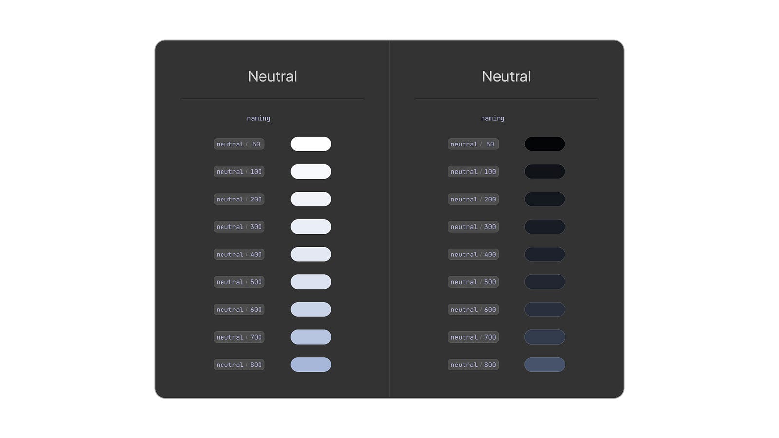
Color styles for dark & light modes
Dark UIs have become an essential factor for users as the days pass. Many applications and even operating systems now offer dark mode as a standard feature. Therefore, working with a skilled app design team is one of the most significant advantages of designing a dark mode.
Designing Dark UIs
Considerations for designing dark mode and combining dark and light themes
Designing dark UIs for mobile apps is more challenging than it may seem, and there are specific considerations to remember. Dark surfaces are hard to see and sometimes not accessible. For product teams partnering cross-functionally (or with external specialists), scanning how the best UI/UX design firms operationalize contrast testing and accessibility checks can help set a practical bar for delivery quality. Therefore, accessibility is crucial when designing a dark theme UI.
Since the black background color is in shades of black, the most crucial aspect to pay attention to in the design is the visibility of design elements. For example, ensuring the legibility of texts is achievable by maintaining a certain level of contrast.
Otherwise, users will need help to see the design elements, making it difficult to use the application. This leads to a poor user experience. It is essential to prevent this by using shades that stand out from the background in color selection.
When comparing dark mode and light mode, device brightness is also considered. Successful dark UI design provides easy visibility and legibility even in low-light conditions, while soft mode aims to offer easy visibility in high-light states. Brightness plays a role in preventing eye strain for users.
Tips for effective mobile app dark themes design
1. Careful color scheme selection
The color scheme is the first concern for designers creating dark UIs. In dark mode, no functionality changes, only the colors. As mentioned, only accessibility can vary in dark theme UI.
The darkest tones are used for the background, while the text within the application is used in lighter tones to achieve strong contrast. However, these lighter tones used in dark mode are not as light as those in light mode. It’s essential to use accessibility-compliant color combinations.
A complementary color scheme is a great tip to achieve a good contrast between the background and text. The dominant color’s complement, which is the color directly opposite on the color palette, is selected.
These two colors represent the primary color and the secondary color. International standards such as A11Y can be used to measure contrast ratios and accessibility color contrast standards.
The minimum color contrast ratio can be checked using applications that measure contrast. This ensures that the needed contrast is provided.
Contrast ratios should ensure the colors used are distinct enough against the background. Other design elements, for example, light text colors, should also stand out from the dark background.
To create good contrast, it is essential to consider the eyes' comfort and avoid causing eye strain. Therefore, the most common advice is to avoid using pure black (#000000) or pure white (#ffffff).
2. Visual hierarchy
In both light UI and dark UI designs, the visual hierarchy should be maintained. However, selecting design elements in dark UI design can be more challenging, as the dark mode primarily focuses on power efficiency and nighttime usage. So, a dark theme reduces battery usage.
While regular dark theme users are generally familiar with this structure, applying a visual hierarchy to design elements such as text, contexts, cards, and buttons can enhance the user experience and create an appealing interface design.
Using visual hierarchy can guide users toward the elements that need to stand out and create a visually appealing interface. Colors play a supportive role in establishing hierarchy. For example, button colors are often considered accent colors to enhance visibility and contribute to the hierarchy.
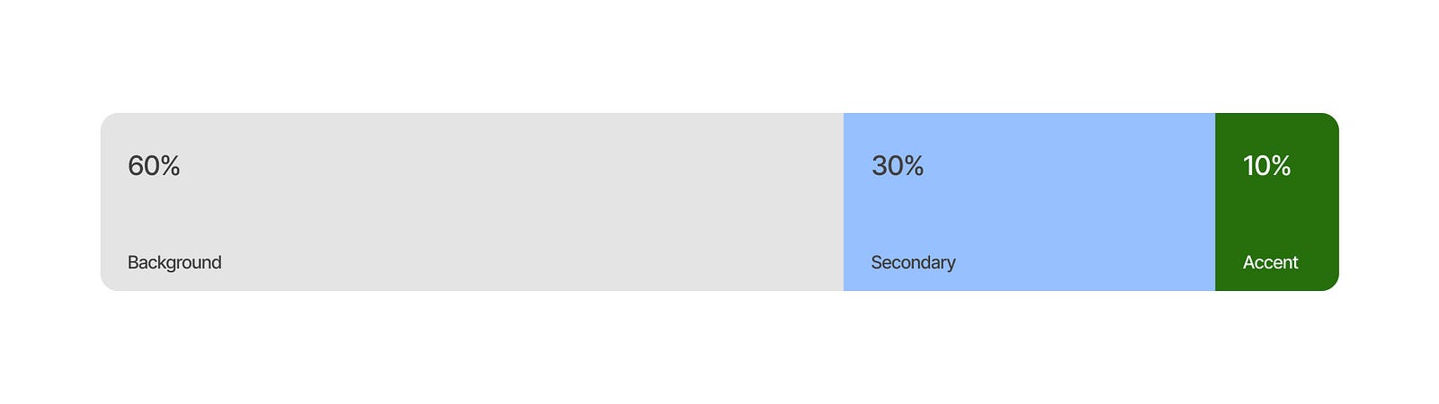
Another tip highlighting the accent colors is the 60–30–10 rule. In this rule, 10% represents the accent colors, 30% represents secondary colors, and 60% represents the background color in most cases. For example, a 60% ratio can be designated as the white background in light mode.
The most commonly used color for light surfaces is typically the background color. The accent color, the most eye-catching element in the design, is used in 10% of the design to draw attention to accent color.
3. Eye fatigue
Users adjust the brightness of their screen based on their environment, often relying on device settings or permissions.
In dark environments, having a too-bright screen can be uncomfortable for the user and may lead to eye fatigue after a while. You may use dark theme surface colors. Dark theme surfaces allow users to focus on the app without straining their eyes.
Similarly, if ambient light is high, having a dim screen can make it difficult for the user to see the screen or interact with it comfortably. Therefore, light mode in daylight and dark mode in low-light or nighttime conditions is recommended to reduce eye fatigue.
4. Interactive elements
Many design elements highlighted in the hierarchy and created with too high contrast using primary colors are clickable elements.
Like in light mode, clickable elements such as buttons and icons are visually emphasized using specific design techniques. This allows clickable elements to grab the user’s attention easily and ensures a high-quality user experience regardless of the surrounding light conditions.
Additionally, supporting elements like icons and symbols should maintain sufficient contrast to enhance their visibility, even if they are not directly clickable.
5. Animation and effects
The underlying reason for this topic is once again related to eye fatigue. Animations and effects can enrich the user experience. You can also utilize animations and transitions in dark theme design.
However, avoid excessive or fast transitions and opt for smooth, fluid, and non-distracting animations. Overly bright or rapid transitions can contribute to eye fatigue.
6. Consistency
Consistency within the application should be maintained. Dark mode, like light mode, requires a color palette. It is necessary to determine the revised primary color and its complementary colors. This color palette often differs from the color palette used in light mode to achieve the mentioned contrast.
For example, the primary color is saturated in light mode, while in dark mode, it is used in lighter shades for contrast. A separate color palette is explicitly created for dark-theme UIs.
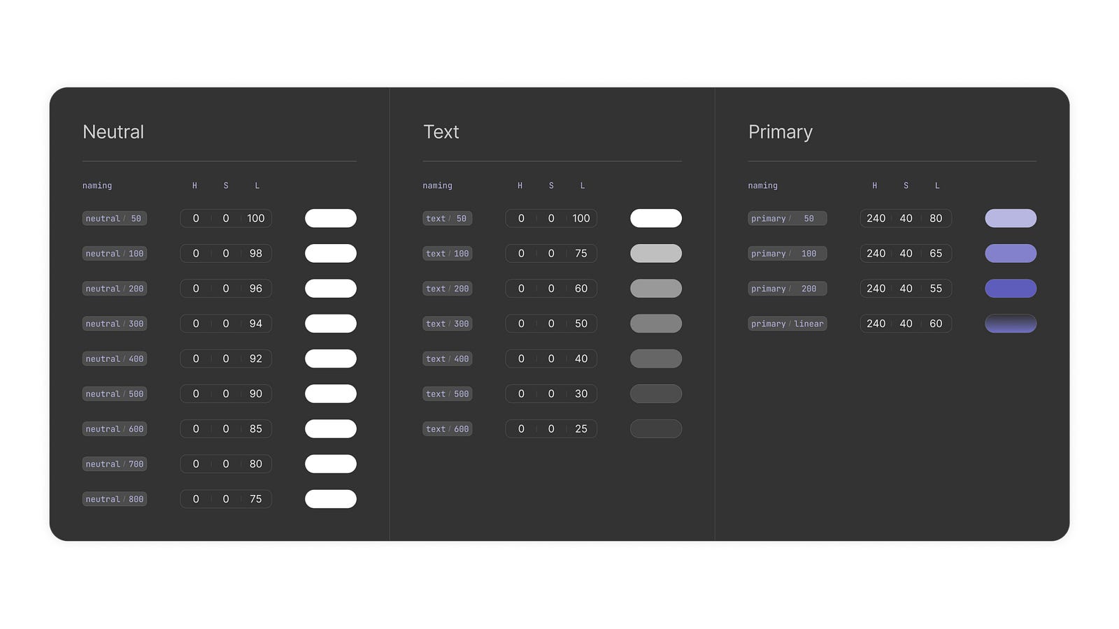
Simple color palette example
This allows for the flexibility to achieve low contrast and strongly contrasting colors when needed. The same style and color scheme should be used consistently across all screens and different sections within the application for dark mode. This ensures that users have a consistent experience throughout the app.
7. Allowing user preferences
It’s a simple yet essential consideration that is sometimes overlooked in certain applications. Users may prefer to use apps in either dark UI design or light UI design at different times.
Some user types may not want to deal with such settings and prefer to continue with the default mode set by their device. The preferences of each user type should be taken into account.
In an ideal scenario, the current mode is determined based on the device’s default setting after the app is installed. If users want to use a different mode, they should be able to change this setting in the app’s preferences easily.
The recommendation is to provide as much automation as possible while offering the choice to users who wish to have it.
Creating Dark Theme Layouts for Mobile Apps
How to reduce picture contrast, choose the right background, and combine dark and light themes?
1. Visual selection
The assets used in a mobile application are as important as the selected colors. These visual elements can include images, vectors, icons, and symbols. Images can sometimes have insufficient contrast within themselves since they contain their colors.
To ensure that images appear in dark tones or at least blend well with the screens in dark mode, the color saturation of the image can be reduced. Additionally, reducing the image's contrast prevents it from being too bright. This helps prevent the image from being visually disturbing on dark-mode screens.
Another recommendation, although only suitable for some applications is to rework the image according to the color palette used. It is natural to avoid using primarily gray and black tones since they may not align with the application, its target audience, and other criteria.
2. Background colors
As mentioned, the first and most important recommendation is the contrast between the background and other colors, such as primary color. It is using pure black (#000000) as the dark background color is not advisable.
However, this is not a strict rule, and you may come across popular applications that use pure black. Not recommending pure black is to enhance the user experience in low-light conditions.
When selecting dark background colors, avoiding colors close to white or light shades of gray is essential. While the hue value and saturation are essential, prioritize the lightness/brightness settings when choosing the dark background color from the dark color scheme.
The selected background color will influence the primary and all other design elements' colors. Readability and visibility are crucial as they impact the user experience.
After determining the background color, check the contrast of the other design elements that will be placed on the interface. Sparse color accent transitions can make it difficult to distinguish between colors.
High contrast in cards, buttons, and similar elements, except light texts, can hinder clear visibility and vibrate visually. Therefore, it is essential to maintain adequate contrast. Both excessive and insufficient contrast can result in a poor user experience.
3. Combination of light and dark mode
It has been mentioned that white mode positively impacts the user experience in daylight or under bright lighting conditions. Similarly, dark UI design is ideal for nighttime or low-light environments.
Both modes positively affect the user experience during different times of the day. Therefore, the perfect scenario automatically adjusts the mode (light or dark) based on the ambient light conditions.
However, this choice should ultimately be left to the user. User preferences can vary when it comes to customizable features like this. There will always be users who prefer either always using light mode or always using dark mode.
It is beneficial to allow users to choose their preferred theme, taking into consideration the experience of such users.
Benefits and Drawbacks of Dark UI Desing
Benefits
- Reduces eye fatigue. Predominantly dark surfaces reduce eye fatigue by providing reduced brightness and contrast. Especially in low light or nighttime usage, it offers users a more comfortable browsing and reading experience with less strain on their eyes.
- Saves energy. Devices with display technologies like OLED or AMOLED consume less energy in dark mode due to the complete blacking out of black pixels. This results in longer battery life during device usage.
- Can enhance focus. Dark mode can facilitate user focus. Compared to white or black backgrounds, black backgrounds make content more prominent and direct users' attention to the desired points within the application.
Drawbacks
- Readability issues. In dark mode, texts and other content may contrast less than light pixels. While this depends on the dark mode design, some users may experience difficulties in reading. Proper color and contrast usage in the design can help address this issue. Otherwise, an unhealthy dark mode design would be created.
- Color accuracy issues. Each device is unique, and despite designers’ efforts to account for this, certain challenges cannot be overcome. One of these challenges is the variation in device screens. These differences arise from factors such as the display technology and quality. As a result, the chosen color tone by the designer may appear differently on each screen.
Especially in dark mode, it can be challenging to display specific colors accurately. Users with color sensitivity may perceive colors differently from their original appearance. This can also contribute to the readability issues mentioned earlier.
Dark UI vs. Light UI
Dark and light modes have their advantages and disadvantages. When compared, it can be considered which one should be preferred. It is appropriate to make comparisons based on some subheadings.
1. Visual Comfort
The theme that is generally considered to be visually comfortable and allows for complete focus on the content is dark mode. It reduces eye strain compared to light mode, especially in low-light conditions and during night use, where it can create eye sensitivity.
However, it would be incorrect to claim that dark mode provides the best visual comfort. In high-light conditions, the light mode offers better readability.
2. Energy Efficiency
The dark mode is undoubtedly superior in this aspect. Even if its impact on device battery life is minimal, the light mode will consume more energy. As mentioned, it cannot be guaranteed a definite saving, but it can be seen as an advantage on compatible devices and screens.
3. Design Aesthetics
Providing dark mode design to applications has been a focus of developers and designers for a while. Therefore, offering users dark mode as a theme has become a common feature.
Dark mode provides some users with a premium look and a more visually appealing design. Light mode, on the other hand, has a broader user base.
4. Color Accuracy
In this aspect, the light mode has a clear advantage. Balancing the contrast in dark mode design is more challenging compared to light mode. The main reasons for this are the device and screen characteristics variations among users, as mentioned in this text. Achieving accurate color representation is more difficult in dark mode, whereas white tones tend to align more consistently across different devices in light mode.
5. User Base
Some users stick to the default settings of their devices, which typically come with light mode. Therefore, there are more light-mode users compared to dark-mode users. Some advanced users, however, prefer dark mode or automatic mode selection based on ambient lighting conditions.
Tips for Creating a Dark Theme
Best practices for designing effective dark theme layouts: right color palette, balancing contrast, and accessibility.
1. Color Selection
- Use dark gray tones: Instead of pure black, use a better dark tone. This improves the readability of text and content while reducing eye strain.
- Emphasize contrast: Use light colors for the main text to ensure good readability, use desaturated colors as primary colors, and dark colors for backgrounds. Saturated colors decrease readability.
- Avoid excessive use of colors: To prevent clutter, choose a limited number of colors and use them consistently in proportion.
2. Contrast
- Ensure text readability: It is essential to provide sufficient contrast for content readability. Adhere to the standards outlined in the WCAG (Web Content Accessibility Guidelines) to ensure adequate contrast between text and background colors.
3. Accessibility
- Text sizes: In dark mode, text sizes are as crucial as readability. Whenever possible, obtain text sizes from the device’s default settings to automatically accommodate the user’s preferences.
- Lights and brightness: Dark mode design is not only about interface and aesthetics. When determining contrast, consider users with high color sensitivity for accessibility. It is also essential to avoid designing an app that strains the human body.
- Freedom: Avoid imposing a specific theme on users. Respect personal preferences by providing the option to enable or disable dark mode.
4. Usability Testing
- Different users: User testing and feedback are valuable for assessing the quality of your dark theme design. Gathering input from various user types can lead to improvements in your app.
- Different devices: It has been noted that dark mode yields different results on various screens and devices. Measure the general conditions and test how your dark theme UI appears to users.
Conclusion
In summary, dark mode is an essential element in mobile app design. Factors such as the suitable color scheme, balanced contrast, and appropriate text sizes contribute to the effectiveness of dark themes.
Opting for dark gray tones and a gray palette ensures sufficient contrast and enhances content readability. Text sizes and color harmony are crucial for accessibility. User testing and feedback are valuable tools for improving the user experience of dark themes.
Consistency and coherence align dark mode with other interface elements. Dark mode reduces eye strain, saves energy, enhances focus, and provides an aesthetic appearance. You can create an effective dark theme UI by focusing on proper design principles and user needs.

Creates insightful, strategy-driven content that translates complex design and branding concepts into accessible knowledge, supporting Ramotion’s mission to elevate digital experiences.