How an interface can look “almost perfect” yet still feel wrong - and why QA engineers are the first to notice.

What are micro-failures
In today’s era of component-driven design systems, design tokens, and automated CI pipelines, “quality” is no longer about taste.
A product can match every spec - yet still feel off.
These imperfections aren’t bugs in the code or logic errors in flow.
They are micro-failures - the invisible flaws of perception.
A micro-failure is a subtle inconsistency that doesn’t affect functionality but disrupts visual rhythm.
Users can’t articulate what’s wrong - they simply lose trust.
Examples include:
- a text baseline slightly misaligned with an icon;
- a 23 px spacing instead of 24 px;
- a button shadow that’s 10 % darker;
- a heading using 19 px line-height instead of 20 px;
- mismatched corner radii across components.
Each one is insignificant alone - but together they fracture the sense of polish.
Why these flaws matter more than they seem
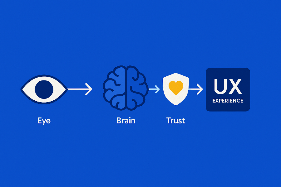
The human eye doesn’t measure; it compares.
Our brains constantly seek rhythm, alignment, and proportion.
When that pattern breaks - even by a single pixel - we feel tension.
The result?
Page that feels cramped.
Button that “looks wrong.”
Layout that feels somehow “cheap.”
Micro-failures don’t destroy usability.
They slowly corrode credibility - the feeling that this product was built with care.
The four types of micro-failures
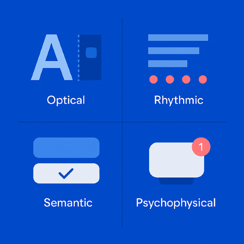
A. Optical
- misaligned text baselines and icons;
- inconsistent border radii;
- uneven stroke widths between icons;
- mis-centered visual elements.
B. Rhythmic
- uneven spacing (8 px / 10 px / 12 px mix);
- fractional pixels in Figma (255.33 px instead of 256);
- inconsistent spacing between cards or modules.
C. Semantic
- identical buttons with different behaviors;
- inconsistent color semantics for similar statuses;
- same states rendered with different contrast levels.
D. Psychophysical
- overly dense typography;
- harsh shadows and visual weight imbalance;
- abrupt animations without easing.
Where micro-failures come from
Even with design systems and tokens in place, micro-failures still happen.
Fractional pixels and rounding.
Figma rounds values visually, browsers render literally - resulting in subtle blur.
Component chain mismatches.
One outdated token creates inconsistencies across an entire library.
Auto-alignment without optical review.
Mathematically correct ≠ visually balanced.
Human adaptation.
Designers stop noticing small drifts after prolonged exposure.
How QA detects micro-failures
1. Layer-by-layer review
QA isolates each visual layer: icons, text, containers.
When viewed separately, micro-misalignments instantly stand out.
2. Pixel grid inspection
Using the pixel grid in Figma, QA searches for fractional values (e.g., 0.5 px).
Those half-pixels cause blurred edges and fuzzy text on screens.
3. Visual diff & AI comparison
AI-based visual diff tools compare mockups vs. live builds, highlighting deviations.
QA then filters out rendering noise and keeps only human-perceivable differences.
4. Optical compensation checks
Some shapes require perceptual adjustments — circles appear taller, letters hang lower.
QA ensures these optical corrections enhance rather than distort the overall rhythm.
5. Human perception
A trained QA can “feel” irregularity before measuring it.
That intuition - the optical ear - is a skill automation can’t replicate.
Case study: the two pixels that broke a brand
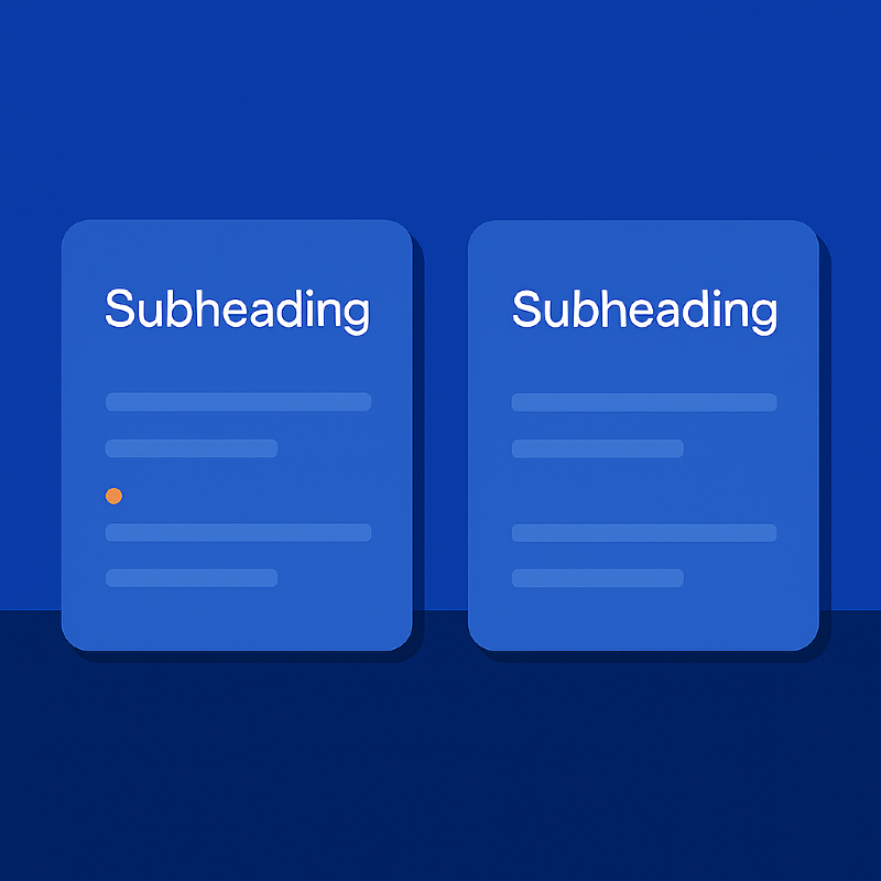
A client once delivered a flawless design handoff.
Everything matched - fonts, colors, grid.
Yet the production site felt… off.
QA discovered that subheadings used a line-height two pixels smaller than the standard.
The difference compressed the vertical rhythm, making the UI feel cramped and cheap.
After correction, the layout “breathed” again - elegant, calm, trustworthy.
Two pixels. Entirely different perception.
How QA proves micro-failures
QA’s role is not just to spot issues, but to prove them.
Annotated screenshots
Each issue is visually documented:
“Icon baseline offset by 1 px - breaks visual center.”
“Card spacing = 23 px, violates 8 px grid pattern.”
Qase.io
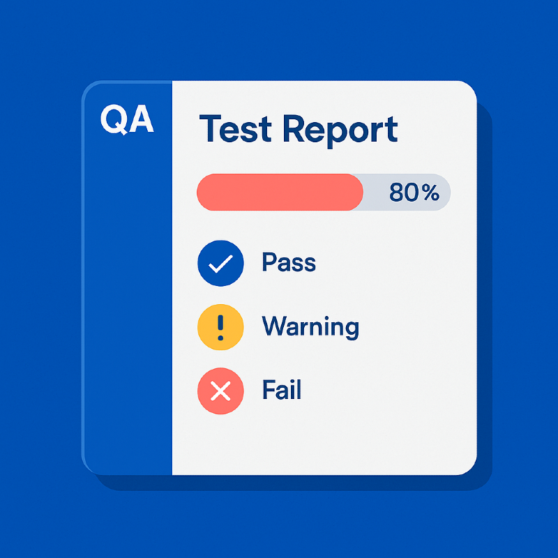
We use Qase.io as a centralized hub for visual QA test cases and reports.
It stores:
- reusable scenarios for spacing, rhythm, and color contrast;
- statuses (“Match”, “Warning”, “Critical”);
- traceable links to Figma node IDs and screenshots.
When clients challenge a note - “That’s subjective” - QA opens the Qase record.
Objective data replaces opinion.
Building micro-failure control into the workflow
Add optical QA to design checklists.
Verify baselines, grids, color tokens, contrast, shadows.
Automate pixel-perfect checks in CI.
Integrate Lighthouse, visual diffing, and AI snapshot analysis.
Adopt Figma tokens.
Centralize spacing and color to detect drift automatically.
Track everything in Qase.io.
QA is not only testing - it’s building institutional memory.
Run micro-reviews before every release.
A 15-minute ritual: QA and designer inspect typography, buttons, and layout rhythm.
Micro-failures as a mirror of trust
A product can be fully functional and still feel unreliable.
Every tiny misalignment whispers the same message:
“Something here isn’t cared for.”
QA is not a gatekeeper - it’s the guardian of perception.
They preserve the visual honesty that makes users believe the product was built with precision.

Conclusion
Micro-failures are like dust on a polished lens:
almost invisible, yet they ruin the clarity of vision.
Design QA isn’t about finding mistakes.
It’s about nurturing awareness - noticing where design loses balance and restoring it.
QA engineers tune interfaces like musicians tune instruments -
pixel by pixel, until everything feels harmonious.
That’s not perfectionism.
That’s respect for the user’s trust.
Feb 6, 2026

Drives the technical vision at Ramotion, uniting engineering excellence with design innovation to deliver scalable, secure, and user-focused digital solutions.