Logos are living brand assets that evolve with your business. And in today’s competitive market, people crave authenticity, personality, and accessibility.
While there’s no single recipe for creating a logo, following universal logo design principles cuts across styles and industries. Read on as we unpack each one and share practical ways to elevate your brand logo.
Logo Design Principles
Let the following principles of logo design guide you in creating an asset that communicates your brand effectively and endures the test of time.
- Originality. Stand out from the crowd with a logo design that is unique to your brand. Veer away from common symbols and elements, but ensure your design remains relevant to your brand identity and industry.
- Simplicity. Keep your logo distinctive yet simple. A clean and memorable logo is easy to reproduce across platforms, from billboards to tiny phone screens.
- Versatility. A versatile logo is easy to scale and can serve its function in full color, black and white, and monochrome.
- Brand-appropriate. Select colors, symbols, wordmarks, and fonts deliberately as they can shape audience perception. They must align with your brand’s meaning, industry context, and strategic goals.
- Timeless. Don’t chase trends. Design a logo that reflects your underlying purpose or values as you evolve, ensuring visual harmony even as aesthetic tastes change over time.
Practical Logo Design Tips
So, how do logo principles translate into concrete actions? Check out some tried and tested tips from brand professionals.
Start with a logo concept
Creating a logo can be overwhelming, but it is important to anchor it in a central idea that encapsulates what the brand stands for. Look at old symbols, art, and architecture for meaningful shapes. Weave in clear brand cues so the logo reflects what you do, not just who you are, creating associations that boost recognition and improve recall over time.
Sketch: make it exist first, make it look good later
Translate your logo concept into as many sketches as you can, exploring different logo types. Doing so forces you to move beyond the obvious and find the best creative direction for your brand. Do not obsess over details. Sketch tiny and fast, and compare them on a single page to weed out the bad.
Design for your audience
Learn about your audience—age demographics, which platforms they use, and their aesthetic tastes. Analyze brands they follow and the images they share to see if they prefer candid or stylized photos. Use these insights to choose a visual language for your logo that meets your audience's needs and expectations. A good logo should feel familiar and credible.
Use the 5-second logo test
Show your top logo design to your potential customers for five seconds, ask which company it represents and what feelings it evokes, then compare answers to your intended message. Repeat the test across sketches, contexts, and iterate based on mismatches.
Pick colors last
Colors should amplify the concept, not replace it. Meaning that even when colors are stripped away, the logo’s values, shape, and other design elements can stand on their own and still convey the intended meaning. Choose colors with cultural and psychological awareness, and keep the palette simple.
Logo Design Checklist: What to Look Out For
Avoid trendy details
Stay current without chasing fads. Centuries-old logos endure because they use foundational shapes and clear symbolism, giving the logo the flexibility to age gracefully as styles evolve. That said, prioritize legibility, simplicity, and meaning.
Keep logos legible at any size
The best way to ensure your logo reads easily at any size is to design for small and large sizes. Create variations that can fit everything from app icons to posters and billboards. Doing so allows you to assess which elements need simplifying—such as strokes and spacing—to ensure that visual marks and/or text remain legible.
Make the brand message clear
People often look at a logo for a few seconds and process what they see. So, it’s essential to lock down on a key message your logo must embody.
Use typography with one personality. Choose a simple shape that strongly conveys your message. And test whether the logo’s perceived message changes with context.
Design for motion and digital
Today’s audiences move in a digital ecosystem, so logos must work online and offline. Create key versions: a primary lockup for major uses, a simplified mark for mobile headers and small banners, and an icon-only symbol for apps and tabs.
Keep motion minimal and apply consistently for brand recall. When you’re working with a partner, reviewing the best agencies for brand identity design can provide a practical benchmark for motion discipline and repeatability. Don’t forget to test animations across devices and platforms to ensure clarity, feel, and overall recognition.
The Logo Design Process
There’s no single rule in logo design. It is an iterative process that involves in-depth research, brainstorming, testing ideas, and refining. Here’s how.
1. Conduct your research
Make sure the logo functions, holds, meaning, and conveys the core brand. You can achieve this by learning about your audience, industry, and competitors. Ask, What’s the story behind the brand? Why should people choose you over other brands? How do you want people to feel when they see your logo?
Analyze competitor logos and note what works, what’s missing, and opportunities you can explore to stand apart. Finally, define success criteria from the get-go so you can evaluate designs objectively.
2. Find inspiration outside the category
Staying within your category usually produces predictable, forgettable logos.
Expand your horizon and look at art, architecture, and unrelated brands that express attributes you want. If you want to evoke a sense of security, consider integrating impenetrable figures and symbols, like a fortress wall or an armadillo’s protective shell.
Go beyond the obvious.
3. Create an inspiration board
Gather images, type samples, sketches, and color swatches that capture your brand’s energy. Organize them by category and test contrasting combinations to refine direction.
Remove anything that dilutes the concept and choose only the strongest visuals. You can share the board early with your team to see whether others perceive the intended tone.
4. Translate inspiration into visual ideas
Anchor the visual moodboard to language by picking at least 15 words you want the logo to communicate. Cluster them into three tiers: primary (non-negotiable), secondary (supportive), and tertiary (nice-to-have).
For each word, list visual properties that relate to it. For example, the word ‘organic’ can relate to something that looks natural, freeform, and has earthtones. As you build your word bank, create a separate ‘avoid list’ of cliché visuals.
5. Iterate, test, refine
Sketch your strongest ideas in multiple creative directions, then distill to 2-3 variations. Turn them into vectors and build a logo system to see how they look in different versions.
Test across sizes, backgrounds, colorways, and real-world applications (apps, signage, print) to assess whether the logos still work. Solicit feedback from your team and other non-designers and assess whether they understand your vision at a glance.
Refine with the feedback in mind until you can no longer iterate—or you’re absolutely sick of it—and people finally “get it” without explanation.
Work with a professional brand identity company to kick off your logo design process.
Logo Types
Your choice of logo design can impact how people feel about your brand. Let’s go over each type and see which one is right for you.
Wordmark logo
Text-based wordmark logos feature the company name, often using a branded font to add character to the design. Think Coca-Cola, FedEx, Netflix, and Google.
Coca-Cola evokes nostalgia with its script font, while Google uses different colors to portray playfulness across boring tech companies. Netflix commands attention in bold red font, and FedEx keeps it professional yet creative with the clever use of an arrow in its logo—a symbol that suits a company that prioritizes speed and precision.
Coca-Cola wordmark logo via Brandfolder
FedEx wordmark logo on a plane via FedEx Newsroom
Bold, red wordmark evokes authority. Image via Netflix
Playful and colorful logo via Brandfetch
If you are looking for a high-impact, memorable logo that introduces your company at a glance, give wordmarks a go.
Pitfall: A generic brand name in a wordmark logo is easily forgettable.
Lettermark logo
Of course, not every company can use a wordmark, especially for hard-to-remember names.
A lettermark logo uses a company’s initials or the first letter of its name. It’s minimalist, easy to scale, and stands the test of time despite changing aesthetic tastes. Some of the most popular examples of lettermark logos are IKEA, Louis Vuitton, and Pinterest.
The overlapping letters L and V in Louis Vuitton’s logo are the initials of its founder. It’s timeless, authoritative, and elegant, conveying a sense of exclusivity that has endured for centuries. Similarly, IKEA stands for its founder’s name and hometown. Pinterest stylizes its logo as a pushpin, reflecting what the platform offers—a place where users can collect, pin, and organize images that pique their interests to their mood boards.
Lettermarks work best for companies that want a badge-like, typographic logo that leaves an impressive mark.
Pitfall: Avoid unclear letterforms in small sizes.
Popular Swedish brand logo design via IKEA
Louis Vuitton logo via Brandfetch
Letter P in script font within a red circle via Pinterest
Icon logo
An icon or a logo mark is easy to process and connects with the brand even without words.
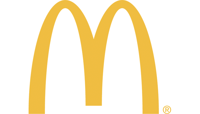
Children instantly smile at the sight of McDonald’s golden arches. The half-bitten apple reminds people of the innovative tech company, Apple. Adidas’ three stripes, resembling a mountain, is a simple yet versatile logo mark that evokes endurance and strength–fit for a global sports brand.
These logos serve as visual shortcuts, prompting people to feel something before reading any copy. That instant recognition helps brands travel across cultures and languages, making icon logos ideal for companies aiming to go global.
Pitfall: Avoid overly detailed icons.
Golden arches via McDonald’s
Apple logo via Unsplash
Official performance logo via Adidas
Abstract logo
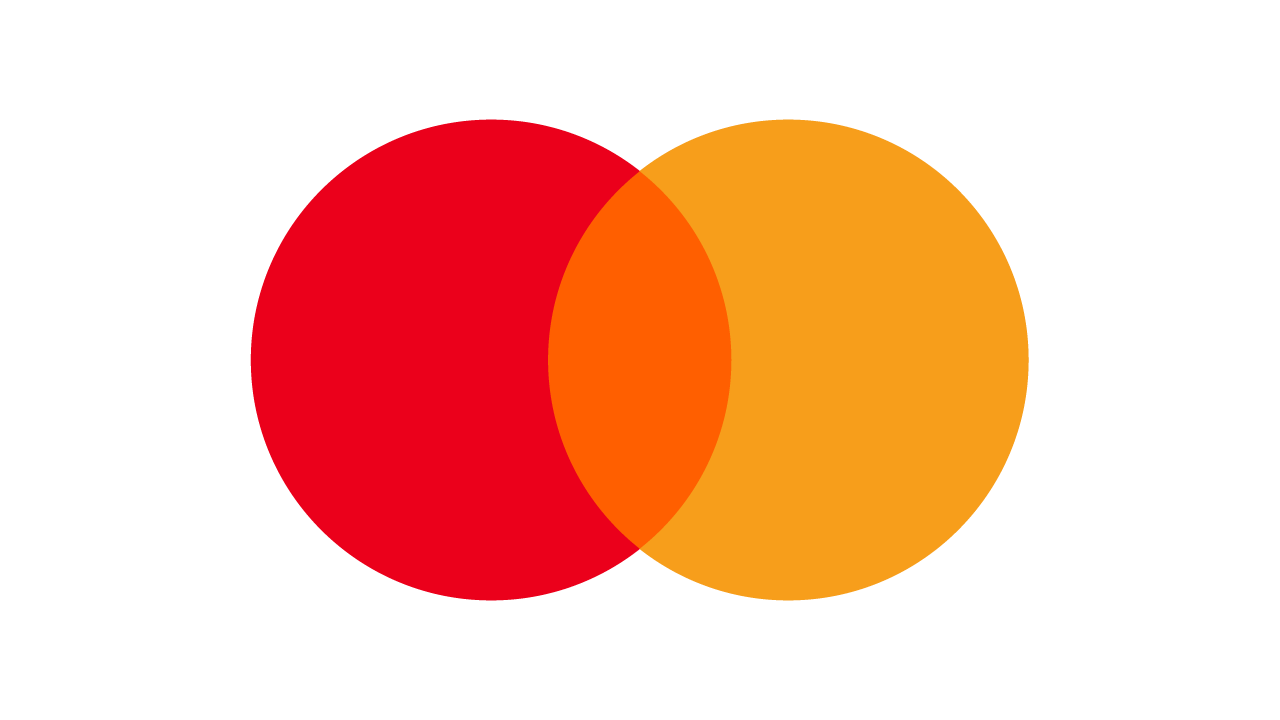
An abstract logo is a type of icon logo that avoids literal forms and instead uses color and conceptual shapes to suggest a brand’s philosophy. Microsoft’s window doesn’t literally depict computers. Mastercard’s overlapping red and yellow circles imply connection and partnerships. And Spotify’s curved lines within a green circle symbolize sound waves.
Microsoft’s multicolored window icon via Unsplash
Interlocking abstract logo via Mastercard
Soundwave abstract logo via Spotify
Abstract logos suit brands without a clear visual metaphor, or those seeking a more creative representation of complex values or long-term identity goals.
Pitfall: Inconsistent brand application can blur logo meaning and confuse people.
Mascot logo
A mascot logo is a character with human-like qualities used by brands like KFC and Michelin, as well as by sports teams like the Chicago Bulls and the Boston Celtics.
Personality-driven mascot logos humanize a brand by giving it a relatable face and traits that build emotional bonds. They’re ideal for brands seeking a friendly vibe, especially if they cater to families, children, or communities.
The famous Colonel Sanders as a brand mascot. Image via KFC
Bibendum, Michelin’s brand mascot. Image via Michelin
Keep mascots expressive yet simple, so they remain recognizable even at small sizes and from a distance. Ensure the design evokes the emotions you want customers to feel when making a purchase.
Pitfall: A mascot logo risks being overly complex, making it unscalable.
Combination mark logo
You don’t have to choose one logo design type. Combination mark logos pair a wordmark or lettermark with an icon or mascot, blending the best of both worlds.
They boost recognition by displaying your name or initials alongside an identifiable visual, as seen with Volkswagen, Amazon, and Burger King. Ideal for companies building awareness, they let you later condense to an icon-only mark nce recognition is strong.
Pitfall: Poorly integrated combination logos may hinder transition to icon-only design.
VW inscription via Volkswagen
Wordmark sandwiched between two burger buns. Image via Burger King
Emblem logo
Emblem logos convey authority, trustworthiness, and reverence for tradition—traits prized by luxury brands like Rolex and Hermés. Their seal-like marks communicate prestige and an enduring brand heritage that signals legacy and exclusivity. This is probably why emblem logos are favored by brands that want to reinforce a premium perception and inspire lasting customer loyalty.
Pitfall: Emblems can be heavily ornate, making it impossible to see clearly at small sizes.
Crown logo via Rolex
Hermés’ Duc Carriage logo via Unsplash
3D logo
Add depth to your design with shadows, textures, and other realistic elements, creating a modern, lifelike 3D logo. Toyota’s 3D logo of a “T” suggests movement and precision. Notion uses shadows and highlights to elevate its simple black-and-white logo.
3D logo that looks like a steering wheel via Toyota
Cube logo via Notion
Ideal for tech and gaming brands, 3D logos look best on screens where the tactile illusion is fully appreciated and invite interaction online.
Pitfall: 3D details can become blurry in smaller formats and do not adapt well to some marketing materials.
Animated logo
Animated logos use movements to capture attention, set the mood, and tell a story. They help brands convey playfulness, professionalism, and other traits associated with brand personality.
For instance, Pixar features the Luxo Jr. lamp, hopping into frame to form the “i” in its logo. Google’s colorful logo spins and morphs into several related icons. Similar brands that primarily live on screens benefit the most from animated logos, using motion to showcase their creative spirit and personality in just seconds.
Pitfall: Animation that changes the logo's silhouette reduces recognition.
Pixar animated logo via Tenor
Google animated logo via Tenor
Create a Logo That Grows With You
Following core logo design principles creates a logo that effectively conveys a single brand message and adapts to your company's growth. When you design with originality, audience, and future scalability in mind, the logo remains relevant across platforms, formats, and trends. Put simply, a principled design turns a logo into a strong brand asset that supports progress, evolving brand purpose, and long-term loyalty.
Feb 3, 2026

Creates insightful, strategy-driven content that translates complex design and branding concepts into accessible knowledge, supporting Ramotion’s mission to elevate digital experiences.