In mobile app design, adopting the basics of patterns very good takes the design to a different point and raises the perception of quality. The mobile app navigation design pattern, which you can see in almost every app, has a special place in the design. At scale, especially across multiple products, executives often evaluate which partners can consistently operationalize pattern libraries, and lists like top UI/UX design companies can be a useful starting signal during that assessment. They form the basis for the user to navigate through the app. It allows you to fix as many errors as possible right from the design stage.
Impact of Mobile App Design on Business
The number of mobile users is much higher than the ratio of desktop and tablet users. Now, beyond websites, it is very significant to move your business to mobile apps -if possible- in terms of awareness. When the user downloads your app to their phone, you have started to create value. Two things are notable here; Get to know your customer and a well-designed mobile app. Since mobile devices have little screen space, the use of space in mobile design is important. If you want a well-designed mobile app, you have to work with an experienced mobile app design agency.
With the mobile app, it is much easier to send push notifications to users’ phones and to keep them on the network. Checking mobile notifications is much easier than checking web notifications.
What are the mobile app patterns?
The definition of mobile design patterns is simple; It is the solution in the interface of the design problems that the users frequently encounter or may encounter in the mobile app. This is where human computer interaction comes into play. User interaction with the mobile app is only possible with a good UI design.
Designing a mobile app is a process. If the type of apps changes, processes, user audience, user personas, problems to be solved and many other metrics differ. However, a system is needed to set up and manage these processes correctly for all apps. Although the apps diverge from each other, there are common problems that need to be solved. For example, you need to think about how you will onboard the user. This is a valid process for almost all mobile apps.
In the next step, you may need to get some information from the user. Some data such as email, password, and full name may be requested for login. At this point, some situations need to be considered;
- Is the user logging in for the first time,
- Are they returning users,
- Could he/she have forgotten his password,
- Is the password strong enough -or does it have to be strong-
- Is there an internet connection.
Of course, experienced designers consider all of these states, but these questions might be forgotten to ask. Each state should have an equivalent in the interface design and the user should be able to use this interface with his/her cognitive habits. How tiring and time-consuming to think about them every time, isn’t it? Mobile design patterns are the whole of the solutions produced to the errors you may encounte
What are patterns used for/why is it important to use them correctly?
First of all, knowing mobile app design patterns means anticipating potential problems. It creates a roadmap and speeds things up, instead of starting with a blank canvas.
Besides, there may be platform-specific patterns. Gesture based navigation design patterns on iOS are a good example of platform-specific patterns. Specific details will make apps more user-oriented.
Users act with the experiences they have gained from other apps when using your app. Knowing this makes your job easier in the design process. Because you can get inspiration from other apps when designing the user experience. The source that will provide you with this inspiration is, again, the mobile design patterns.
Note: Beautiful design does not mean a great user experience. But users often fall into the misconception that good design is more useful. In other words, when considering mobile design patterns, pay attention to the visuals. A bad user interface will lead to the user making mistakes, and an undesirable user experience even if you pay attention to all design patterns.
Mobile design patterns are also divided into sections within themselves. The rest of the article touch on the parts of the mobile design patterns. Then, the mobile navigation design patterns will be detailed that you can encounter in almost every app.
List of Mobile App Design Patterns
It is possible to categorize patterns according to their functions and actions in apps.
- Action patterns
- Content patterns
- Communication patterns
- Data patterns
- eCommerce patterns
- Finance patterns
- Form patterns
- Navigation patterns
- Onboarding patterns
- Social patterns
- User collection patterns
The most familiar and common mobile design patterns are listed above. You may see different naming and categorization in different sources, this is completely normal.
Mobile app navigation patterns
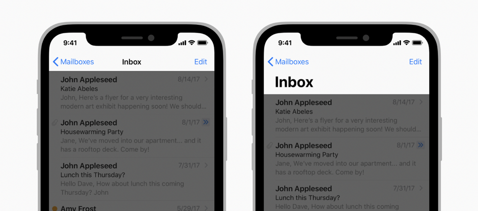
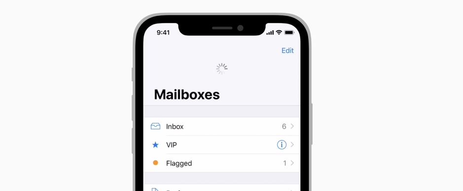
Mobile navigation patterns are a set of actions aimed at navigating and guiding users within the app’s navigation. It guides the user. Mobile navigation patterns find their place in almost every app. It is important in terms of user experience. In the mobile app, a navigation bar is a group of links given to the main screens that are, the most important screens in the app.
Tab Bar
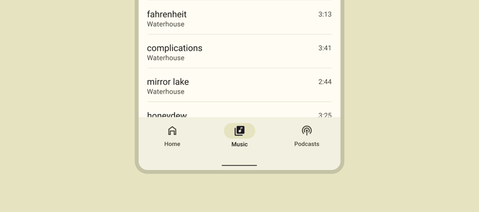
The tab bar is a component that guides the user to the most important screens in the app. When the user tries to explore the app, they will first interact with the tab bar. The screens directed by the tab bar are where users will spend most of their time. If we associate it with web design, the tab bar will replace the header menu or full screen navigation.
When designing tab bars, try to present only the most important screens. Usually, you can see 3 to 5 screen layouts on app designs. Sometimes it’s okay to offer 2 tabs. But offering more than 5 tabs is not recommended. When considering mobile screen sizes, the following problems will occur; Difficulty clicking the tab, cramped interface, and poor user experience. Increasing complexity increases the time it takes for the user to interact with the screen. It is necessary to make it easier for users to make decisions and show them only the most important screens.
Another issue that should be considered in the design of the tab bar is that the user can understand where he/she is in the app. There is a simple method for this; Separate the tab screen the user is on from the rest. Users will be able to easily distinguish between tabs that are different (von Restorff effect). At the same time, using the icon and naming the tab creates a roadmap for the user. The icon provides a mental model, and naming the tab is helpful when just the icon is not enough. If the icons are clear enough, the user will be familiar with the app and can provide intuitive navigation. Designers make their designs for users.
Search Bar
If the app you are going to design is content-heavy and it is difficult for the user to find the content just by browsing, then you need a search bar. Due to user habits, the search bar is usually located at the top. There may also be a separate screen for searching.
The scope of the app determines how detailed the search bar will be. When you design the search results following the visual hierarchy rules, the user will easily find what he/she is looking for. Users expect to see the visual hierarchy.
In an eCommerce app, the search bar is essential. Because visitors try to find products by searching. The search bar is as detailed as the product detail. If there are many products under different categories, categorizing the search results will help the user. This design used in search screens is one of the information architecture methods, grouping according to categorization.
If you take social media platforms as an example, visitors may want to search for content, topics, categories, and hashtags. The most frequently used method here is to divide the search results into detailed tables.
The last example is a music streaming app. In the search detail, results such as songs, playlists, singers, and users can be found. At this point, the content most relevant to the search text is ranked at the top. And as users scroll down, other content that the user may have searched for is listed in categories.
It may be nice to give a technical detail; Autocomplete the text entered in the search bar — if technically possible — provides a great user experience.
Drawer
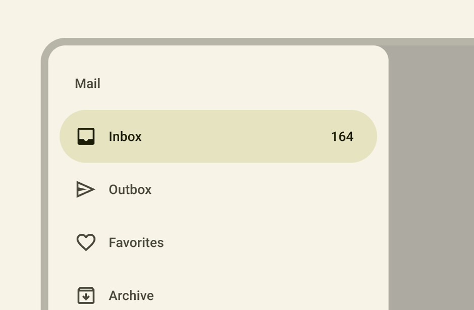
The drawer should not be compared with the tab bar and the navigation bar. But it has similar features. It is like a hamburger menu in the mobile view of websites.
It is a mobile design pattern that can be preferred if there are many important screens, which are called the main screens. The drawer usually appears in Android apps. It’s not mean that you will never see it on iOS, but it is usually possible to see it in custom, cross-platform apps. While iOS does not add the drawer menu to the guideline, on the Android side it shows its use with the Material Design navigation drawer name.
Finally, there are many navigation options that will guide the user. But be careful not to use the tab bar and the drawer menu together.
Pagination
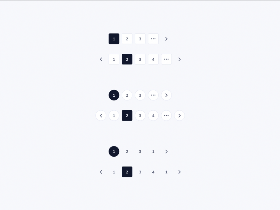
It is a sort of filtering method. Imagine that there is a lot of content on the main screen of the mobile app. The user will scroll constantly to see the contents and a lot of content will be loaded at the same time. This may cause the user to miss content or not be able to see content they are interested in again. From a technical point of view, loading all the content at the same time will significantly increase the load time.
Using pagination is the solution to these problems. Dividing the content into pages can only allow a certain number of content to be loaded at a time. In this way, users will not miss content and will not wait for long loading times.
Infinite Scroll
It is similar to pagination. The only difference is the user does not decide to load the page. Loading of new content is scroll-based. It has been a matter of debate whether the infinite scroll is a dark pattern or not. It is discussed that it is a method used to keep users in the app, especially in social media apps.
Ethics comes into play here. If infinite scroll offers a better user experience, give it a try. Otherwise, it will be difficult for you to care about users’ time and ensure that they reach what they want as quickly as possible. The concept of ethics should be important.
Navigation Bars
It is the most distinctive mobile pattern between Android and iOS. In short, it allows you to move between pages. Here is the point needed to pay attention to; As a mobile pattern, the navigation bar is separate from the header on websites. In addition, the mobile navigation bar has different functions, although it resembles the tab bar and drawer structure.
Looking at the default iOS navigation bar, the navigation bar has more functional features. It can show the user’s position in the app, switch between pages and, if necessary, take action on the elements.
The default Android navigation bar, unlike iOS, is located at the bottom of the app. What they can do is limited; Allows switching between pages.
In the custom design, you can get a much more capable navigation bar by using both Android and iOS features with the navigation bar.
Dropdown
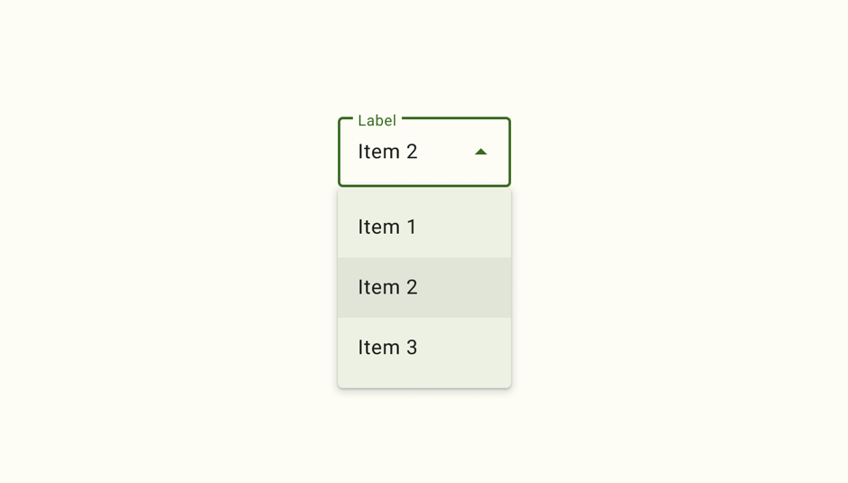
It is a pattern you can see in a multi-functional app. The dropdown menu is frequently used on websites, however, it may appear with limited designs in mobile apps.
While designing apps take care to categorize, separate them into titles and arrange them instead of presenting all the features on the screen. When the dropdown menu opens, we display a series of lists -according to the design decision-.
The scrollable list offered in the dropdown does not have to be just categories and lists that you specify. It can also contain predictable content such as date, country, and time.
Modal
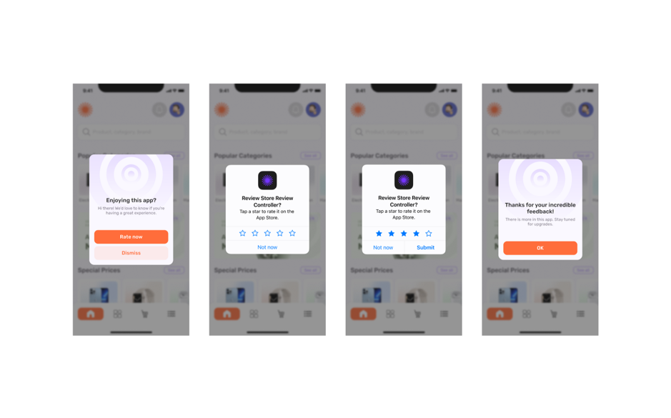
It is the box that appears on the screen when the user needs to take an action. It provides the user with critical information or assists at some point in the app. The user cannot continue the app without interacting with the modal. The content of this pattern can be alerted, to push notifications. The modal concept is named dialogs in Material Design. Apple, on the other hand, preferred naming action sheets, activity views, and alerts.
The modal should only be used when necessary, as it takes up the whole screen and requires action, so repeated use will detract from the user experience.
Modals can contain warnings, if there is a problem with the app or something went wrong, state it clearly in the modal. Don’t see your user as a designer or developer. Express the error that occurs in a user-understandable way, technical terms can be confusing. Remember, the modal structure is to inform the user.
Table
Ideal for sorting, grouping, and presenting data. Mobile navigation patterns are based on presenting the data to the user in the cleanest form. Depending on the navigation hierarchy, the table designs on the screen where the user is located may change.
Pull to refresh
Also known as refresh content controls. It is a gesture based navigation pattern with dynamic content that can be seen mostly on social media. The interface on the web allows us to refresh the current page. In mobile apps, this action is achieved with gestures. The user can make the screen refresh by slightly moving his finger from top to bottom on the screen.
While the screen is being refreshed, a loading icon appears on the interface. Actually, this loading icon is another pattern. This pattern, called progress indicators, shows the user on the interface that the screen has been refreshed and the operation is currently being performed.
Ethic
Knowing/learning user behavior in design comes with responsibility. While designing a mobile app, it is necessary to direct the user to his benefit. Using Dark UX is unethical. Also, it is not ethically correct to present dark patterns under the name of marketing.
One of the examples is purchasing steps in eCommerce apps. If you find yourself about to purchase a product by mistake, you too have been exposed to the dark pattern.
Or if you have spent 20 minutes trying to “unsubscribe” on a platform where you give your card information, this is also a dark pattern.
Another example is in games: when you log into mobile games, you will see a primary button that encourages you to play. Then, the button in the same style leads you to the game with incentives such as “let’s start” for you to start the game. When you win the game, the same button style is used to move on to the next level. Or when you lose the game, the “restart” button is also primary and has the same style.
After a while, you unconsciously become familiar with the button and start clicking without reading the content. Because that button is now a button that takes the next step for you and puts the game into action. And suddenly you click on the primary button with the same style in the modal that pops up, but what is that? You have “accidentally” bought something in the game. That button wasn’t the game start button this time, it was the buy button. Here is an obvious dark pattern.
Conclusion
In short, designing a mobile app is a detailed and intensive process. A planned design process from the beginning will both produce a better design and minimize errors. Design patterns are the key point that will soften this whole process. Designs will certainly be user-oriented when it is understood how the problems that users may encounter are solved with design patterns.

Creates insightful, strategy-driven content that translates complex design and branding concepts into accessible knowledge, supporting Ramotion’s mission to elevate digital experiences.