Of course, the only purpose is not to provide information. Onboarding is like a guide.
Contrary to popular belief, the app onboarding process is not just a few screens that present information. The aim is to give users a positive start to the app. At the same time, it is to explain the core steps so that they can use the app most effectively. In some cases, mobile onboarding is a must. Sometimes it is just an unnecessary and annoying step. This difference depends on the type of app, its interface, and its working principle. As expected, it is an ethical criterion not to waste the user’s time. Users are often not ready for delays and learning something new. Wasting time and delaying the user’s browsing through the app means a bad user experience.
Defining Mobile App Onboarding
When it comes to the onboarding process, the first thing that comes to mind is not only the onboarding of digital products. Even in digital products, onboarding is not only a mobile app-specific feature. Onboarding a user to a mobile app is different from onboarding a website. The so-called landing pages on websites are usually landing pages; It provides a guide that tells users what they can find on the website, its features and how to use it.
The situation is slightly different in mobile app designs. It is very beneficial to work with experienced people for user experience and interface design. If you are not a designer, it is recommended to work with a mobile app design agency or a designer.
Common Mobile Application Onboarding Design Steps
In mobile app designs, user journey scenarios help a lot with user onboarding flow. Because onboarding design patterns and onboarding elements may vary according to the needs of the apps. When internal design capacity is limited, collaborating with one of the best UI/UX design firms can help translate those scenarios into an onboarding flow that fits the product’s constraints and the expectations of each persona.
In some mobile apps, it is sufficient to present short info, and inform users. Sometimes it may be necessary to get input from the users. The app can differentiate the features it offers to the user according to the user persona.
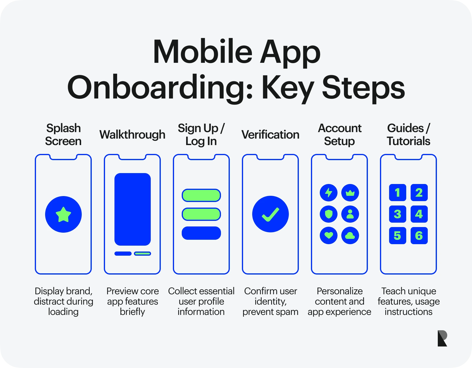
Splash Screen
It’s the first screen you’ll see when you enter the app for the first time — and every time you enter it. It’s not the first process, it’s the very first screen. It is called the splash screen. It’s like saying “welcome, this is app x” to the user.
The splash screen is important for several reasons; It distracts the user until the app is ready. It also ensures that the user is clicking on the correct app. Generally, most apps prefer to add the brand logo to the splash screen with simple animation. Some apps also use designs to cover the entire screen with the primary color of the brand. On rare occasions, creative welcome screens can be seen; A good example of this is Netflix.
The use of animation is risky. Because every time the app is loaded, the Splash screen will appear and the user will wait on the screen. In apps like Netflix, these animations can be risk-free; because a user who enters the Netflix app will probably spend some time in that app and an animation that lasts for 3 seconds is unimportant for the user, it is worth the wait. However, in apps that will not spend much time in the app — for example, chat apps — an animation lasting 3 seconds will very likely disturb the users and make them impatient.
Walkthrough
As one of the onboarding patterns, first-time users are offered the most crucial features in the app. The criterion to be considered here is really to offer the most prominent features in the app. Because users can’t remember everything — they don’t have to .
Most apps offer 2 to 4 features in the walkthrough pattern. It is better not to confuse walkthroughs with tutorials. This pattern only presents the features of the app, it gives a preview to the user. Information on how to use it is collected under the guide & tutorials pattern (it will be mentioned later in the article).
Sign Up & Log In
Depending on the needs of the app, it may be necessary to receive input from the user. One of the common requests is for the information the app needs to create the user’s profile. If the app needs a profile from a technical point of view, new users also need to create a profile. This profile is stored to be able to re-enter the app later or to keep user information in the database.
For security reasons, on the sign screens, the contact number, e-mail address, or both are required. If the app needs it, name, age, and similar personal information can also be queried.
Verification
Verification; It is to check that the users are not a robot, that they are real people, and that the information they provide to register for the app is correct.
Verification is requested for two main reasons; Security and spam. There are apps such as banking and chat where security is prioritized. Since these apps are much more personal than others, app developers have to ensure the security of the user and the profile created by the user. App stores where the app will be published also prioritize user safety.
Another reason; is spam. If users are not asked for verification, users may commit security breaches. Or the user who created the account may not be a real person. A human-impersonating malicious software may have the urge to harm the app.
Account Setup
It is the onboarding pattern that makes the app experience more personal. These screens usually allow the user to pre-determine the content that may be of interest to the user within the app. Thus, the user can find unique content in the app. For example, in a news app, the types of news that the user wants to follow can be determined in the account setup pattern. Or, in a social media app, the user can be asked the category of content they want to see.
This step is invaluable considering the time spent on the app. If the app is truly personal, the user will use the app for longer if they are viewing content close to him. Then the frequency of visiting the app also increases. And now they are loyal users.
Guide & Tutorials
If the designed app has a different structure from standard apps, it may be necessary to provide simple and fast training to the user. This tutorial explains how to use your app whose interface is different from the standard. For example, if the interface is unusual, it should be explained how the user should use the interface.
After the app interface is loaded, guiding the user with the help of the tooltip is also included in the onboarding step. As mentioned in the titles above, the walkthrough and the guide step are close to each other and therefore can be confused. There are no strict rules for sequencing or the use of patterns in the onboarding screen. For the sake of note and not to be confused. While the walkthrough describes the prominent features of the app, the guide describes how to use the app.
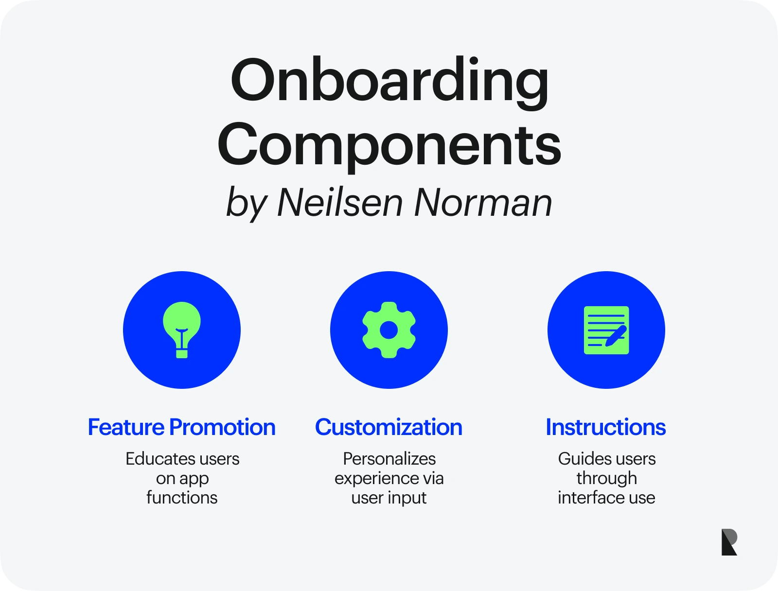
A similar classification method was made by the Nielsen Norman Group. It divides the onboarding process into 3 components.
- Feature promotion: It tells what the app does by educating the user.
- Customization: It is the onboarding step offered to differentiate the user experience and to receive input from the user.
- Instructions: It is interface oriented, it educates the user about the interface.
Impact of Mobile Application Onboarding on App Design
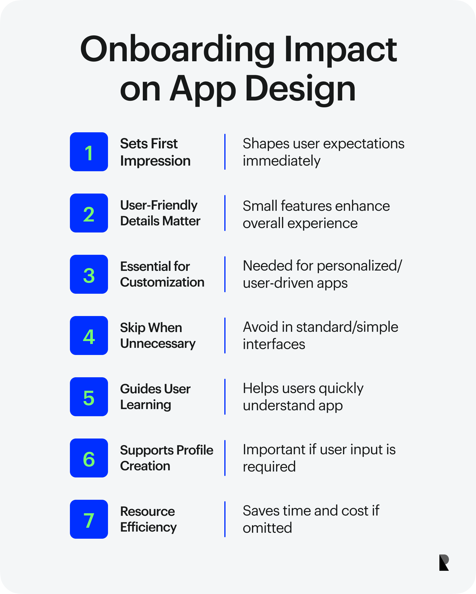
Onboarding screens isn’t always a basic need for apps. There are many more important details to consider before onboarding. But when the whole app is considered, every detail like this creates a whole to create a good effect. Small parts come together and form the whole. If the details are user-friendly, then a positive effect is created for the user.
When the app is considered as a whole, onboarding is considered the first part of this whole. It is the first interaction and acquaintance. From this step, the user creates an idea of how the next processes will be. Whether you’re a designer or a user, you unconsciously form positive or negative thoughts about the app. This is measured by the user experience the app offers. In short, onboarding is an opportunity to make an impressive start.
If your app provides a standard interface and user experience, it is recommended to skip the onboarding step. Because it is unnecessary to show something that the user knows to the user again. This means an extra cost in terms of both time and money. Even if a skip button is added in the onboarding step of the app, an action must be taken.
However, if the app can be highly personalized, an onboarding step is needed. Apps like the sample habit tracker app, health app, and music are highly customizable. Likewise, if it is necessary to receive input from the user, onboarding should be included in the app. Every app for which a user profile is created can be an example of this. If the onboarding process can be carried out well, it can solve the training phase very effectively. It is necessary to give users a certain amount of time to learn the app. Otherwise, Onboarding will disrupt the usual standard app experience of users.
The conclusion to be drawn from here is; Whether onboarding can make a difference depends on the features of the app. Onboarding can have an incredibly positive effect if it has a positive effect on the ease of use of the app, better adapts the user to the app and provides the necessary information quickly to get started. Otherwise, it should be kept in mind that if it is not designed well, it will only cause extra effort and cost in practice.
Design Tips for Great App Onboarding
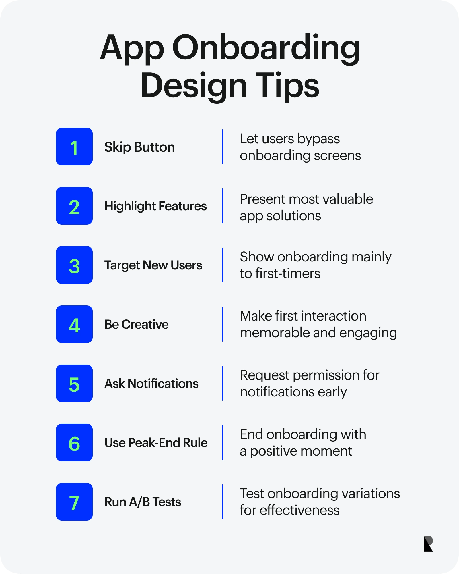
Although it is stated that there are no rules and limits in onboarding, there are tips that will work in most apps. Here is the most useful onboarding checklist.
1. Skip button
The skip button provides a very good onboarding experience if app onboarding is offered. The user feels as if they have taken control. Nobody wants to wait for a long time on a screen that they cannot interfere with.
Imagine a scenario like this; You have a mobile app that offers a payment system. The user meets your mobile app for the first time to pay during physical shopping. While waiting to download the app and pay, users are greeted by onboarding. If they can’t skip onboarding, they will panic and get impatient at checkout.
Another scenario is as follows; A user waiting outside to go home downloads a car-hailing app. The interface and experience of car-hailing apps are similar. For this reason, the user transfers the experience gained from other car-hailing apps to your app. If they can’t skip app onboarding, they can’t wait to go home and had a bad experience.
2. Presenting the features
Highlight the most important features. The actual target audience of your app pays attention to this. When designing a mobile app, it is necessary to set out to solve a problem. Showing how the app solves which problem guides the user. Apps that find solutions to problems easily gain loyal users. Therefore, transfer the most critical solutions in the onboarding step. If the app solves multiple problems and has many features, it is more rational to include the most valuable ones. Describe every detail creates a cognitive load and is not memorable. Details only complicate the work.
3. New users
Your app is published in app markets and users download it to their devices. A particular device can receive data whether the app has been downloaded before by a particular profile. Thanks to this data, you can offer a nice tip. You can choose to show the user the onboarding step only once. Even if they deleted and reinstall the app, they may not need the onboarding step. In other words, onboarding may not be shown to users who delete and reinstall the app and to existing users. If you have to use onboarding, it is recommended to show it to first-time users.
This preference depends entirely on the app’s features. It can be useful to show the onboarding again if the user needs to be re-informed, or if major changes have been made while the app is not installed on the user’s device. The onboarding step should not be confused with loading; A loading screen may appear every time the app is loaded, but onboarding is only shown to the user when the app is loaded for the first time.
4. Be creative
Users discovered your app. They went to the app store and searched for your app. Maybe they downloaded your app to their device after a little hesitation. The process up to this point is already one of the most challenging processes within the scope of marketing.
But another unknown point is this; Users rarely use many apps on their devices. In other words, the fact that the user has downloaded your app to their device does not mean that they will use it. The most difficult processes are already considered if you give your app an opportunity and click on it.
Now the user is almost in your hands, all the conditions are ready to be a loyal user; don’t miss it. Being creative on the first interaction of the app is a huge advantage to getting a loyal user in the final straight. Measure your app abandonment rate during the onboarding step, if needed.
5. Notifications
Sending a notification allows you to remind the user of your app. And before you can send notifications to the user, you must first get their permission. Most apps offer the notification option at the onboarding step. This is very logical. It lets you send notifications if you have made an impressive start and the user thinks they will need the app. In addition, notifications are one of the beginning methods of user retention.
In apps that provide online activities, such as an instant messaging app, notifications motivate the user to enter the app. So these notifications become reminders for your app. But make sure to leave 100% to the user whether to receive notifications or not. It is recommended not to use dark UX. In addition, stores have very strict rules on these issues.
Considering that apps are usually used at default settings, it is assumed that non-advanced users will not change their notification settings later. In other words, it is advantageous to influence the user during the onboarding step and to ensure that they receive notifications.
6. Peak end rule
At the end of past experiences, one usually remembers the best/worst moment of the experience intensely. And it’s up to the moments they remember to make a positive or negative judgment about the incident. This means that whenever users experience the intense feeling, they remember it and make a decision about the app.
If the parts that users will feel positive about are at the end of the experience, users will end the experience with positive feelings and remember the whole experience positively (even if they had a bad start). This rule is called the peak-end rule.
Onboarding is an advantageous time to use the peak-end rule. Especially in the walkthrough pattern, where app features are presented, critical features can be brought to the fore and users can feel positive. The user is motivated to continue the app.
7. A/B Tests
A/B testing is important sometimes. These tests are important especially if users have differences in using the app. There is a way to measure this; customer segmentation. It helps to increase the registration rate in onboarding, although it is a marketing tactic.
How To Design Impressive?
As a designer, you can be inspired by other designers. You will find sample designs in the next heading. To understand the relationship between designers and developers, it would be useful to examine a few coded onboardings. As an example, you can review the open-source Paper Onboarding design by Ramotion for both Android and iOS. It’s time to show a few tips.
Use animation & Illustration
Animated images, illustrations, and GIFs can be more expressive in describing a feature. It can be given a chance if the app’s design language is conducive to it.
Provide new tutorials when needed
It was mentioned that it is not preferred to teach users every information from the beginning. It is one of the best ways to provide tutorials when users need them. Some screens are rarely used in mobile apps; perhaps only advanced users will browse. If there’s a feature to learn on those screens, it’s fine to show it only when that screen is entered. This information can be provided with tooltips.
Don’t bash the vision and mission
Users are often not concerned with vision and mission. It doesn’t matter who you are most of the time — unfortunately- Let the information given to them be useful information for them.
Provide campaigns
If the app is convenient, it is interesting to present a campaign to the user while starting the app, to give them a special advantage. They see this as an opportunity and it is more attractive for them to start it now. Remember the peak-end rule. You can do this with the help of a card or slide elements.
Make it fun
If you have a lot of information to ask for and therefore the onboarding has to take a long time, making the process fun and fluid is essential. Showing the stage of the process will also motivate the user. You have frequently encountered examples of which stages have been completed with the checklist and which stages are in the queue. In an onboarding step that they do not know how long it will take, users may get bored and leave the app. As mentioned, the user trying to register is very valuable.
Notify at the verification step
In industries like banking, verification is required at the onboarding step. The verification step requires waiting for a while, and it is generally not desirable to wait for the user in this step. The information that it is in the validation phase and that it should come back to the app and check it later is shown on the interface. Since these steps are manual on the user’s side, the user may forget to check. If the verification result is sent to the mobile device instantly with a notification, the motivation of the user to re-enter the app will increase.
Gamification
Gamification is one of the elements that motivate the user to continue in the onboarding step, saves onboarding from being boring, and increases the registration rate. You can incorporate gamification into your app design along with the details mentioned in all the other steps. Reward systems form the basis of gamification.

Creates insightful, strategy-driven content that translates complex design and branding concepts into accessible knowledge, supporting Ramotion’s mission to elevate digital experiences.