Rebranding can change how people see your company, open new markets, and prompt bold strategic shifts. But it only works when it’s rooted in research, clarity, and careful execution. For companies navigating growth, category shifts, or M&A, collaborating with brand identity design agencies can add a disciplined outside lens, connecting research, narrative, and design governance so execution doesn’t drift. Do it right, and you unlock growth. Do it poorly, and you risk confusion and losing your market share.
This article explores well-framed case studies and other best rebrands, followed by a step-by-step playbook.
Successful Brand Relaunch Case Studies
A rebrand must successfully clarify who you are and why you matter, build cohesion, and establish long-term trust.
Energizer brand modernization
First on our list of rebranding examples is Energizer.
Energizer is a household name in batteries, but even iconic brands must roll with the times. The notable 2016 rebrand campaign has seen the familiar cartoon mascot transformed into a modern, furry, more lifelike pink bunny, and the slogan trimmed to the confident and concise “Still going.”

New modern bunny mascot via Energizer
Why it worked
That change kept the brand’s core promise of endurance and reliability while simplifying its voice for a modern audience. More recently, Energizer translated that same balance of continuity and progress into product and packaging. In 2025, the company introduced 100% plastic-free packaging in response to growing sustainability concerns.
As Energizer Executive VP Shambro put it, "With a legacy of pioneering innovative solutions that benefit consumers globally, advancing the sustainability of our packaging was a natural next step on our responsibility journey.”
The Lesson: Smart rebrands honor the past while streamlining form and message to meet current expectations.
Airbnb brand transformation from transaction to belonging
Airbnb began as a simple booking site for cheap rentals. Ready for a new image and scale globally, Airbnb introduced Bélo, a new logo meant to symbolize belonging and connection. The brand identity overhaul paired the logo with the tagline “Belong Anywhere” and a bold, vibrant visual system that supports immersive storytelling.
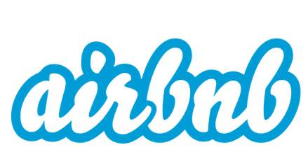
Airbnb’s old logo via Company Logos
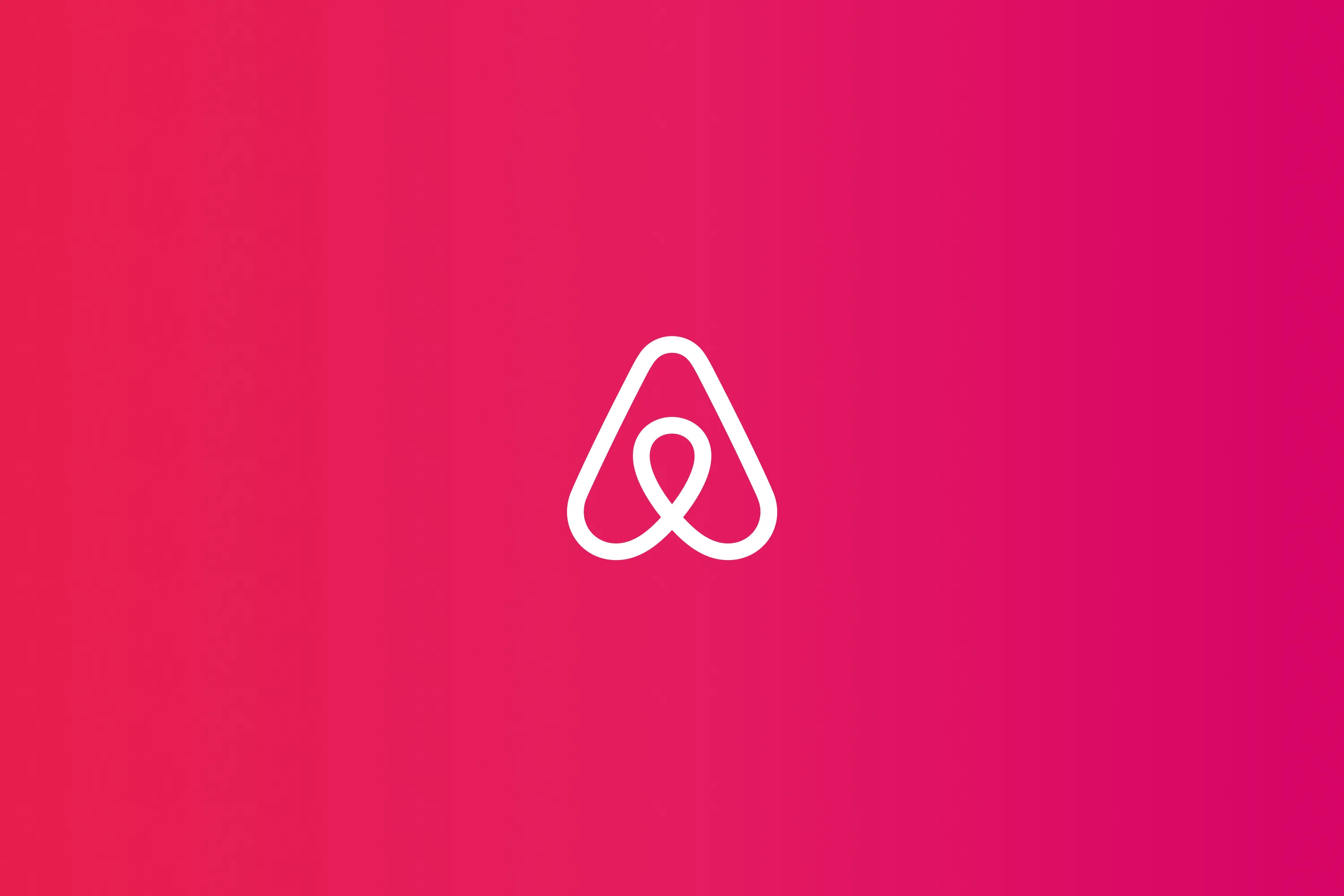
Bélo logo via Airbnb
Why it worked
More than good looks, the rebrand marked a big change in direction, from transactional lodging to a lifestyle platform centered on community and personalized experiences. Airbnb’s products expanded accordingly with exciting local activities, design-forward listings, and messaging that focused on creating human connections.
The result? Airbnb repositioned itself as a global travel and lifestyle brand rather than a budget option.
The lesson: Rebrand only when visuals, messaging, and product direction move in the same direction.
Dunkin’ brand name simplification
Many of us grew up knowing Dunkin’ Donuts. But in 2018, the brand dropped “Donuts” to become Dunkin’. The change conveyed a strategic shift, prioritizing beverages (especially coffee) while keeping donuts on the menu.
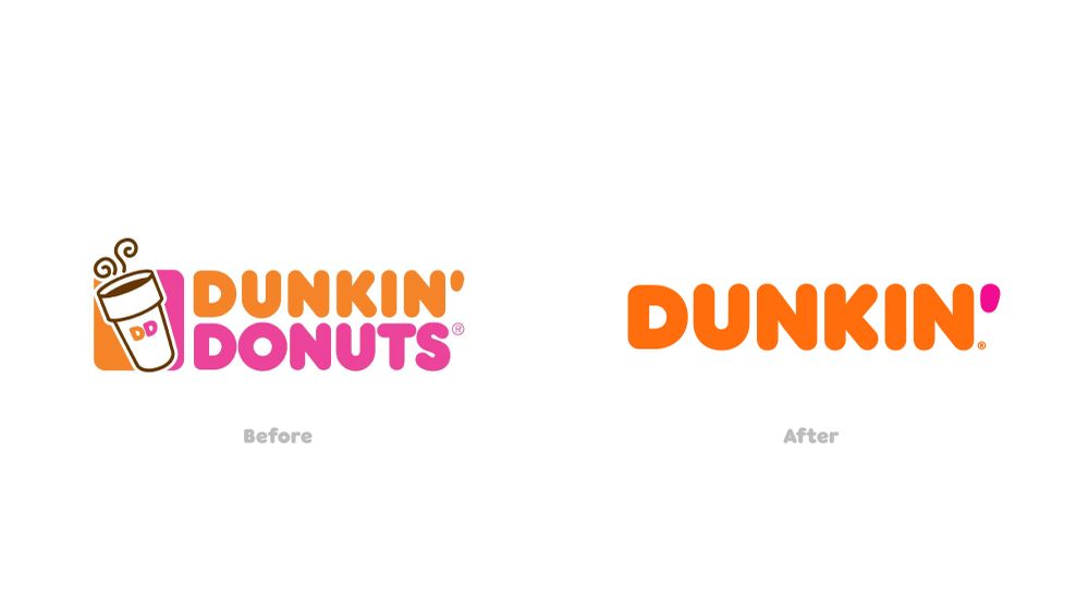
Past and present logo via Dunkin’
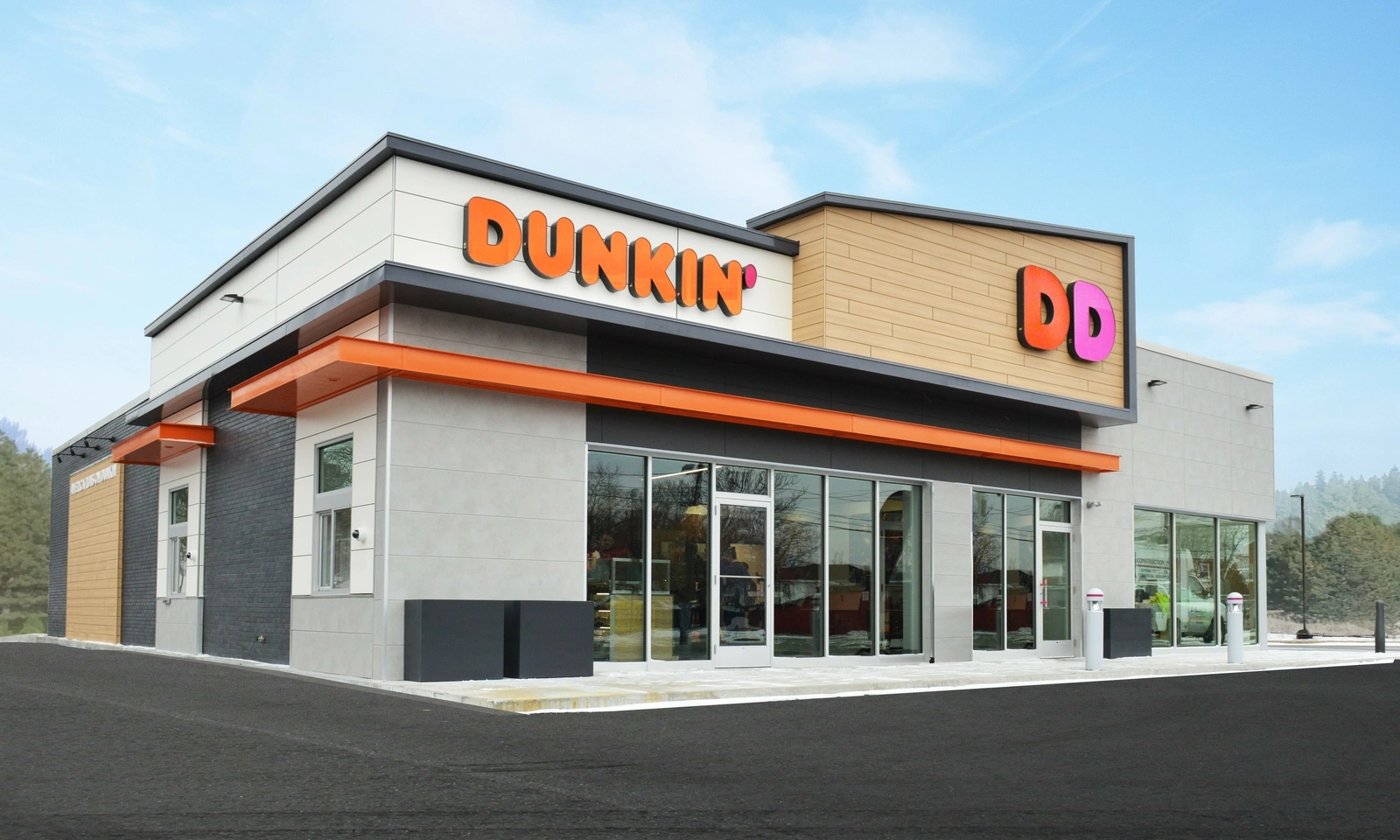
Newly designed shops reflected the rebrand via Dunkin’
Why it worked
The new typeface and refreshed store design, along with mobile-order pickup and drive-thrus, reinforced convenience and modernity for its on-the-go customers. The shorter name freed the brand to broaden its product line and appeal to younger customers without abandoning its origin.
The lesson: A name change is powerful but risky. Use it to cement a real strategic shift, not just to make some noise.
Stella Artois brand repositioning
Stella Artois leaned into its century-old heritage while leaving dated cues that tied it to middle-aged binge-drinker stereotypes.
The relaunch modernized the crest and typography by retaining the cartouche and signature elements while simplifying the forms for a premium, modern look. The brand also rethought the beer can packaging by tilting the brand name to the side to create an eye-catching shelf presence. Photography and art direction shifted toward stylish, fashion-inspired imagery of younger adults enjoying beer in social settings.
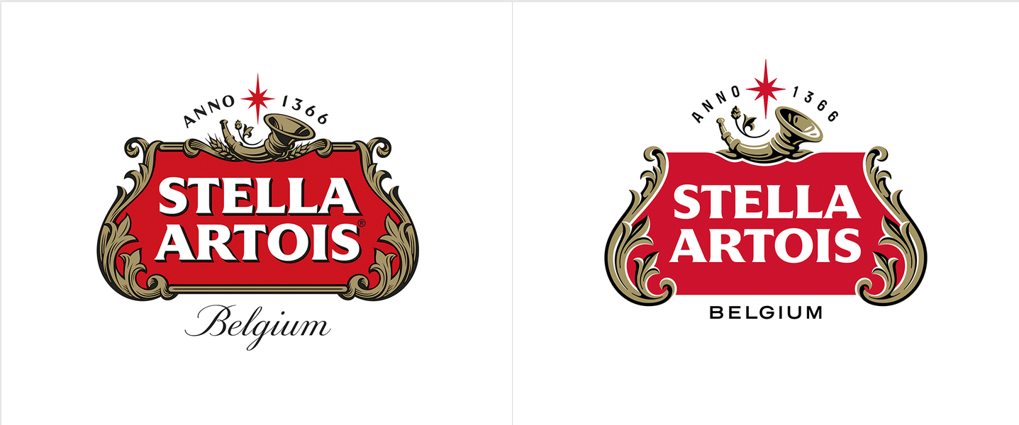
Old and new logo of Stella Artois via Under Consideration
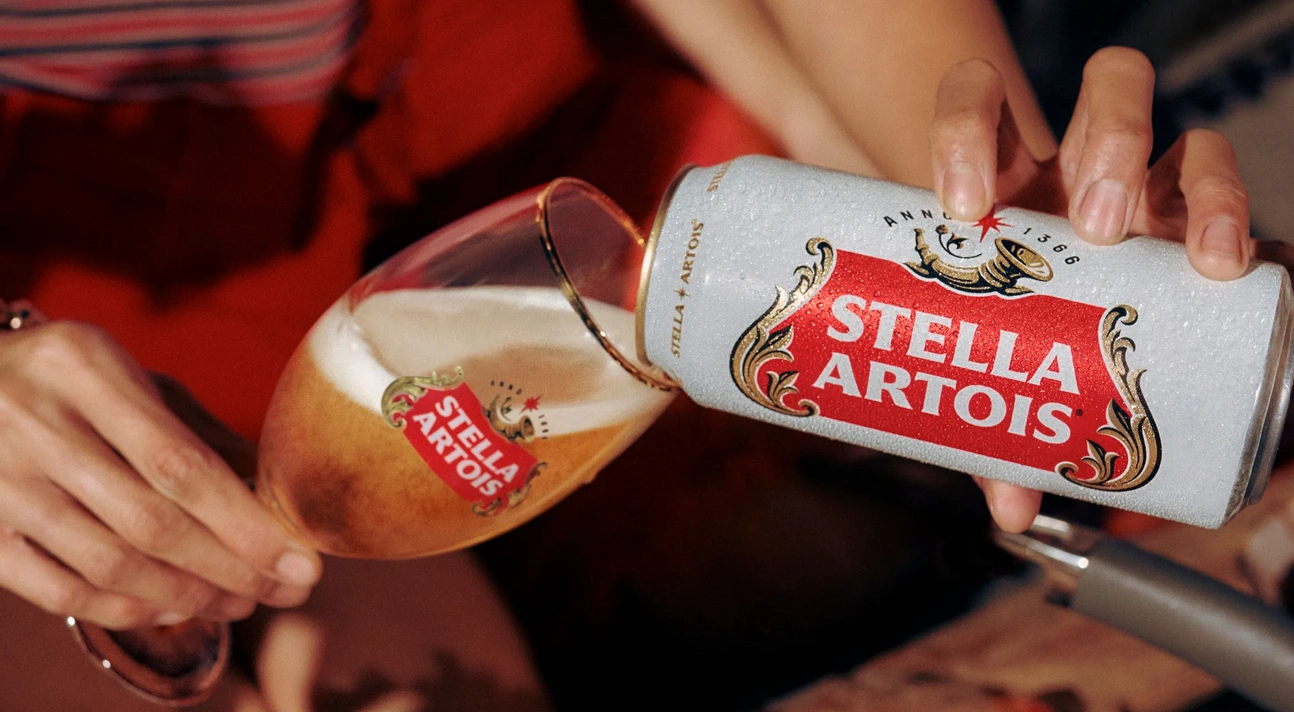
New Stella Artois can design via D&Ad
Why it worked
The rebrand recast Stella Artois as an aspirational lifestyle choice. It preserved the perception of Stella Artois as a quality product while adapting to contemporary tastes, helping the brand gain relevance among younger drinkers.
The lesson: Repositioning can change how consumers justify a purchase, especially for premium brands expanding to new markets. The rebrand also elevated the brand and made it relevant again.
More rebranding examples to inspire you
A major rebrand is recommended for maximum impact. But companies can also do it partially, refreshing visuals, messaging, or product architecture while preserving core identifiers. This approach fits brands with strong equity by outdated execution, expanding product lines, or entering new segments where continuity matters. Let’s look at more rebranding examples.
Fast company rebrand
AI and cultural polarization shifted the media landscape, prompting Fast Company to rebrand for its 25th anniversary in 2019. The relaunch helped the brand better resonate with readers and adjust to evolving business realities.

New magazine redesign via SPD

Old and new logo of Fast Company via 1000 logos
*What changed? *
- Visual identity: Sophisticated, playful, and gender-neutral typography (Grifo and Centra) with curated colors and images for accessibility and inclusivity.
- Strategic evolution: Updated design built on a prior refresh to avoid alienating readers.
- Recognition programs: reinforced relevance and built deeper connections with businesses through awards, like the Most Innovative Companies, World Changing Ideas, and Innovation by Ideas.
Rolls-Royce brand evolution
For years, Rolls-Royce patrons averaged 56, but in the early 2020s, buyers are as young as 40. To remain relevant, Rolls-Royce rebranded to honor its heritage while appealing to younger, affluent customers.
Rolls-Royce Pentagram partner Marina Willer shares, “It was essential for us to ensure that the brand's new identity reflected this shift. We needed to present Rolls-Royce in a forward-facing, fresh and relevant way - speaking to new audiences while respecting the company’s loyal clients."

The Spirit of Ecstasy via Rolls-Royce
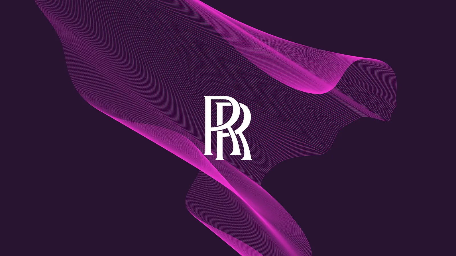
From blue to purple via Rolls-Royce
*What changed? *
- Modern virtual emblem: The Spirit of Ecstasy was simplified into a minimalist, digital-friendly mark. This maintained the symbol’s heritage while ensuring a consistent look online and offline.
- Color update: Midnight blue shifted to royal purple to signal contemporary opulence.
- Black Badge models: Spectre, Ghost, and Cullinan target younger buyers with darker styling and thrilling driver engagement.
Medium platform rebrand
Medium is a global platform where writers and readers share ideas and earn via membership. To support growth, Medium redesigned its brand identity to be more flexible and scalable while avoiding being pigeonholed as a blog.
What changed?
- Logo evolution: From a straightforward “M” to an ellipsis in 2020—a rebrand that confused users—then to a cut-off “Me” that teases the mind to fill the gap. The latest logo also echoes the platform’s first-person content.
- Motion: A splash animation creates a memorable entrance, reinforcing the brand each time users engage with the app.
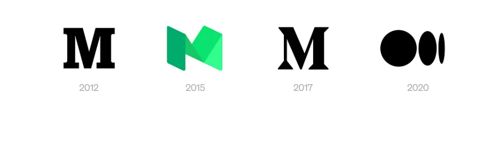
Evolution of Medium’s logo design via Medium
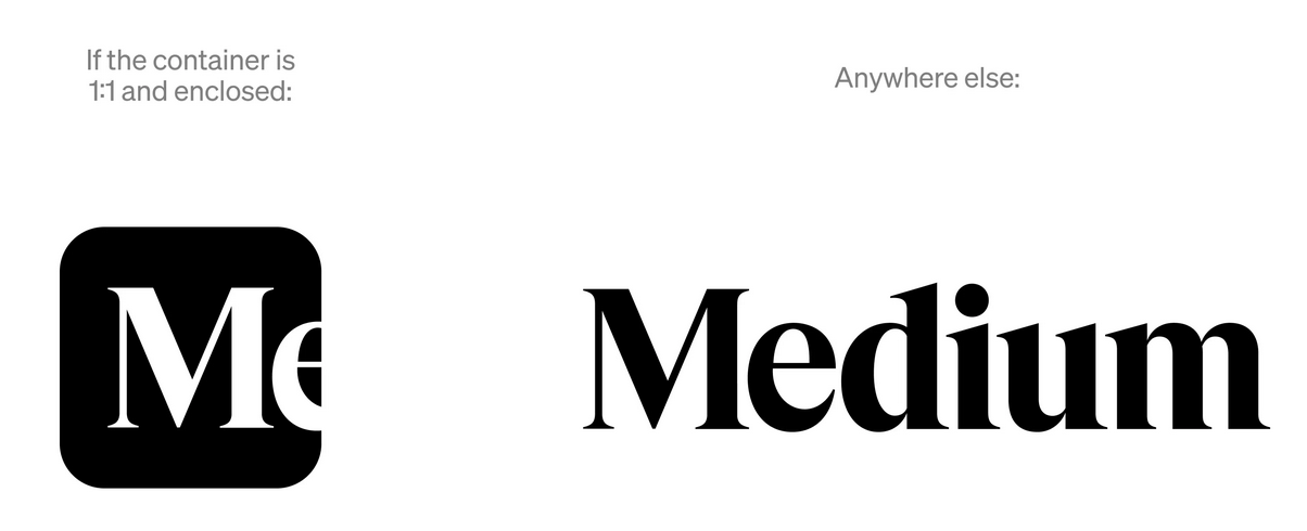
Logo update via Medium
GoDaddy brand maturity shift
Next on our rebranding examples list is GoDaddy.
GoDaddy repositioned itself as an all-in-one platform for entrepreneurs. In addition to being the go-to web host and domain registrar, the platform now includes website templates, eCommerce, social and email marketing tools, and security services to help small businesses grow online. The rebrand positions GoDaddy as a more professional and supportive partner for creators and small- to medium-sized businesses.
What changed?
- Visual identity: GoDaddy ditched the cartoon logo for the clean “Go” mark. Its heart-shaped logo represents humanity, joy, and entrepreneurial spirit.
- Product and positioning: GoDaddy expanded beyond domains/hosting into easy-to-use business tools, reframing GoDaddy as a modern platform for entrepreneurs.

The Go logo via GoDaddy
It’s easy for businesses that reach maturity to become sterile and anonymous. But GoDaddy’s successful rebranding proves otherwise.
Intel brand unification
Intel has long led the computer industry, but admittedly lagged in innovation and messaging. Its rebrand seeks cohesion, which is essential for a company managing 60+ sub-brands, positioning Intel as a modern, vibrant, and future-ready brand.
What changed?
- Logo: Intel dropped its oval logo for a clean wordmark centered on the “i”; its square dot became “The Spark.”
- Color palette: Intel Blue was retained, but withan expanded color palette for a more vibrant color system, moving away from a monolithic look.
- Simplified brand system: Intel simplified product naming to reduce confusion. Intel processors are now identified as Core 3/5/7/9. The brand also introduced Intel Core Ultra, separating premium products from the entry-level.
Mailchimp brand expansion
Mailchimp, long known for email marketing, rebranded to reflect its expansion beyond email while preserving its quirky brand identity. The update lets Mailchimp expand into new product categories and modern platforms while supporting clearer, more consistent visual storytelling everywhere.

Old and new brand mascot of Mailchimp via Brand Master Academy
What changed?
- Brand mascot: Freddie, Mailchimp’s brand mascot, was simplified from a detailed 3D illustration into a clean 2D mark, integrating seamlessly into layouts and allowing a more geometric, iconic system.
- Font and color: A custom font type (Cooper Light) and bold Cavendish Yellow became primary assets, adding warmth that demystifies tech and signals Mailchim’s growth without losing familiarity.
How to Rebrand Successfully
Step 1: Define the core business problem
Knowing the “why” behind a rebrand forces you to identify the core problem. Among the common core business problems that call for a rebrand are:
- The brand identity no longer resonates with the audience and current trends.
- The brand is expanding, and its message no longer aligns with its goals.
- The brand is lost in a crowded market.
- The brand suffers from a poor reputation, typically from a scandal, poor product quality, or other negative associations.
- The brand is about to merge with or be acquired by another company.
Step 2: Conduct brand and market research
Planning a rebrand goes beyond a trendy look. You must gather evidence and information—quantitative and qualitative data— to back every decision.
Run surveys to see how your market perceives you. Conduct blind tests to ensure your visual brand identity communicates as intended. Complement these with social media sentiment analysis, cultural and trend immersion research, and in-depth one-on-one interviews for firsthand insights that guide a strategic relaunch.
Step 3: Identify a clear brand strategy and positioning
Decide how extensive your rebrand should be based on an equity analysis. Run a comprehensive audit of your current branding, its strengths and weaknesses, and the external factors affecting growth. This builds a strong foundation for mapping your strategy.
Anchor brand positioning in your unique value proposition (e.g., a shoe brand emphasizing sustainable materials). More importantly, center your brand strategy on your brand’s beliefs and purpose to create emotional resonance and consistent expression. These are key to a cohesive brand identity and direction.
Step 4: Translate strategy into brand identity
Translating strategy into brand identity turns your gameplan into what people see and feel. Choose visual elements that convey emotions and associations.
A logo distills your promise; colors, fonts, and voice add personality. The new identity should resolve strategic tensions and guide audiences away from old perceptions toward the intended ones.
Rebranding isn’t just a new look; it conveys what you stand for, what you offer, and who you serve as you step into a new chapter.
Step 5: Align internal teams early
Your internal teams are vital in implementing your rebrand, so keep them informed about what’s changing and why.
Orient and involve staff early by holding workshops, sharing scripts for customer interactions, and soliciting feedback from frontline employees. Provide a clear brand toolbox with guidelines, new brand assets, templates, and training.
Employees equipped with practical tools and understanding are far more effective at delivering consistent messaging during a rebrand.
Step 6: Plan and execute a structured rollout
A messy rebrand can send the wrong message to customers and make your company look incompetent. That’s why you need a foolproof plan by mapping a phased schedule (pre-launch, launch, post-launch), building detailed task lists, and assigning clear ownership and deadlines.
Prepare a contingency plan that outlines potential problems, assigns responsibilities, and provides scripts for customer service to handle issues consistently.
Test everything before going public and perform QA checks. Iterate on feedback and scale the rollout only once core systems, messaging, and support workflows are proven reliable. Communicate updates with your team and customers to maintain trust.
Step 7: Measure results and optimize
Measure a rebrand by tracking sentiment, engagement, and long-term impact. Did everything launch accordingly? What are customers saying about your brand? Did the rebrand impact web traffic and sales over time?
Use social-media sentiment analysis, Google Analytics for traffic and branded search, time-on-site metrics, regular surveys, and direct customer feedback.
Expect shifting results as some improvements appear slowly, and public sentiment can evolve as more people interact with the brand. Monitor these indicators continuously, report trends, and iterate using real-time data.
Partner with a professional rebranding agency to create a stronger brand identity that delivers results.
Key Lessons From Successful Rebrands
Successful rebranding requires a solid strategy. Visuals without a strategic foundation create noise, not value. It is also important to align the product and brand, and to preserve what matters without alienating your existing customer base.
Remember that rebrands are not one-offs. So, always plan for scale and future-proof your strategies. Involve your internal teams to reduce rollout frictions, and be consistent in measuring results and iterating strategies.
Jan 22, 2026

Creates insightful, strategy-driven content that translates complex design and branding concepts into accessible knowledge, supporting Ramotion’s mission to elevate digital experiences.