In a world where people barely have the time to finish a paragraph or analyze in-depth what is in front of them, you can count on visual communication. It's how traffic signs keep us safe with visual warnings that our brains can process in seconds when traversing the streets. Or how emojis, like a smiley or a sad face, can sum up how we feel in a chat.
In branding, visual communication or visual language can influence your audience invisibly or subliminally, appealing to their subconscious as you relay your brand’s message. And when unlocked, it can be instrumental in leaving a lasting impression.
So how do you effectively do this?
Well, you can start by establishing a visual brand language to build a successful brand. As you scope the work, it helps to decide whether you’ll build it fully in-house or collaborate with specialists and scanning an impartial roundup of the best agencies for brand identity design can clarify what strong external partnership support looks like.
Defining Visual Brand Language
In essence, visual brand language consists of imageries, shapes, and other brand attributes perceived by sight to communicate who you are, what you do, and how you can benefit the consumers. Done effectively, it can result in an immediate attraction to your brand and create a connection with your audience. Thus, turning into genuine interest and converting into a purchase. However, visual brand language is not a mishmash of simply beautiful or catchy assets.
It is a carefully curated collection of well-designed and strategic visual assets that reflects your brand personality, brand image, brand values, and brand identity, among others. That said, a reliable design team and a design system or a set of rules that governs your design process are must-haves. Or, you can always tap professional designers from a reliable visual brand agency to catapult your brand to success.
Why Is Visual Brand Language Important?
Visual brand language is vital as it creates a dynamic experience when communicating with your audience. Simple yet creatively executed brand imagery can do wonders to cut through the noise or amplify your brand message.
Visual brand language also transcends borders as they are often globally understood. People from diverse cultures are familiar with Microsoft's colorful and wavy window logo. Or the iconic silhouette of a glass soda bottle already brings Coca-cola to mind. Hence, visual branding helps you pivot to different markets.
And finally, your visual identity serves as your foundation for creating a memorable brand. When the visual elements are flexible and reflect your brand personality and uniqueness, you can ingrain your brand in the minds of your consumers and withstand the test of time.
4 Essential Elements of a Visual Brand Language
Here are the essentials to get you started on your brand's visual language: brand mark, brand color palette, imagery, graphic visuals, and typography.
1. Brand Mark or Logo
The impact of a brand mark or a logo knows no bounds. A child gleams with joy at the sight of bright yellow arcs that resemble the letter M. A half-eaten apple reminds many of the tech brand Apple instead of the fruit. A curvy check mark or a swoosh brings stylish sports shoes to mind. Your brand mark becomes a crucial element of your overall branding.
Delve into why the business exists, what challenges it wants to address, who it caters to, and how it wants to be perceived. Getting into the core of branding can serve as your compass when formulating a logo that is highly relevant, impactful, and stands out among the competition.
2. Brand Color Palette
Selecting your brand color palette goes beyond which ones are harmonious or complementary. Again, we go back to tapping the subconscious by using colors to influence the mood of those who see them. For example, opt for pastel color schemes like mint, baby pink, or lilac for a calm vibe.
Furthermore, strategize according to where your visual assets will appear—online and offline channels—and identify which colors to use. If a platform's UI is predominantly blue, try to integrate colors within your brand guideline that makes your brand pop.
Tip: Segregate your colors into primary and secondary brand colors, with the former being central to your visual identity and consistently used at all times.
Car brand Kia has rebranded with black and white as it embarks on reinventing itself. However, its iconic red color is still present—albeit less noticeable—in all marketing and branding collateral as a nod to its roots.
3. Brand Imagery and Graphic Design Assets
Identifying images and graphic illustrations to be used on your branding collaterals goes beyond perfect-picture product shots. An effective way to have on-brand imagery is by keeping your audience in mind. Learn what appeals to them and tugs their hearts. The way you present them also affects the visual impact you create. Some prefer static images, while others respond more to GIFs, clips, and animations.
To narrow down what works, conducting tests is your safe bet. Run an A/B test, presenting different versions of your visuals to see what appeals to which audience segment. Create polls and encourage your social media followers to participate. Or, directly ask for feedback from your customers, too.
You can also track their behavior in physical stores when shown different packaging designs of your product. Were they able to identify your brand quickly despite changes in your packaging, logo, or colors?
Moreover, consistency is needed. An example would be the toothpaste brand Colgate. In every ad, they always show happy people with brilliant smiles. In addition to showing how the product works effectively in whitening teeth, the images connect a positive disposition to the brand.

Colgate evokes a happy vibe through its images via Ads of the World
4. Brand Typography
Like colors, your brand’s chosen typeface can impact the personality and identity you want to convey to your audience. It's what your voice would look like if it were a visual element.
For instance, chunky texts with soft and rounded corners are deemed friendly and approachable. Thin and edgy typefaces, or what is referred to as serif fonts, reflect a clean, simple, or even formal vibe. While elegant cursive typefaces are seen as feminine and gentle, making them popular for brands that highlight opulence.
When combined with other design elements, it must enhance your overall visual branding. No wonder countless brands invest in bespoke typefaces, like Adidas, Vogue, and Calvin Klein. Even without the brand names spelled out, the fonts make them highly recognizable.
With the fundamentals of visual brand language in mind, let’s look at awe-inspiring examples you can learn from.
Examples of an Effective Visual Brand Language
1. Yeti
The popular drinkware company Yeti embodies the wild side of life—and by this, we mean the outdoors with rough terrains, extreme weather, and wild animals, in pursuit of exhilarating experiences. They cater to adventurers, explorers, and hobbyists looking for drinkware or "ramblers" that can withstand harsh environmental conditions. A cooler that can last for years and years despite daily use.
And for twenty years, the brand delivered on its brand promise. It’s why despite being one of the priciest coolers out there, they remain among the top go-to brands of Americans.
Despite the brand evolving over the years, the same commitment is seen in its visual language. It uses wild animals like a bear and a stag in some of its product designs to represent the sturdy quality of its products. Photographs depicting extreme yet fun nature adventures pepper its social media posts and other ads.
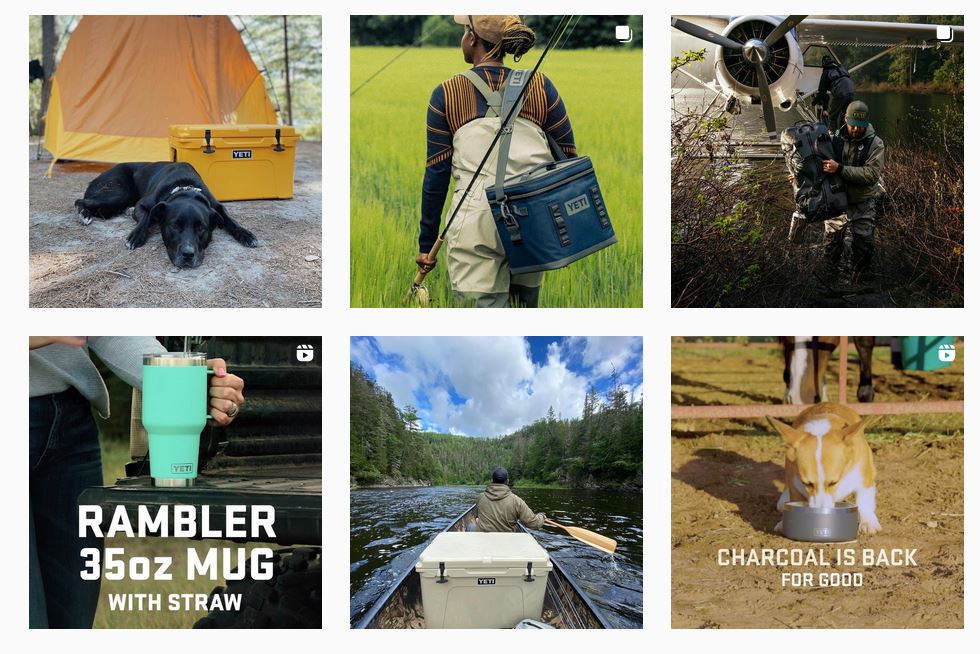
Yeti stays consistent with its wild side as illustrated in its ads and social media posts via Instagram
As its loyal fan base grows, it has rewarded them with the ability to customize its products. Customers can engrave their names on the rambler upon order, for instance. However, it retains visual elements that remain authentic to Yeti, like its simplicity in design. It's a no-nonsense approach, balancing aesthetics and function while celebrating the rawness of its materials.
2. Duolingo
Picture this: a wide-eyed owl mascot with bright green feathers peers behind a wall at the corner of your eyes. Will you recognize which brand it belongs to?
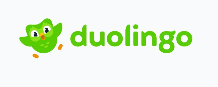
Duolingo’s iconic owl makes it easily recognizable across the globe via Duolingo
If you’re among many who have attempted (albeit mundanely for some) to learn a foreign language via an app, then you may recognize Duolingo’s infamous owl mascot. Such is the visual brand impact of the gamified language learning platform Duolingo that it has become a meme on the internet akin to a schoolmarm that randomly pops up to check on its students.
Thanks to its effective visual branding, it has become an icon among millions of global users despite hundreds of language learning platforms available in the market. It also helps that visual language is at the core of the app’s teaching method. With diverse users from different countries in their database, the brand manages to break language barriers through visual elements.
The brand illustrates diverse animated characters on its app that represent users from different backgrounds, making it highly relatable. It has also created an iconic logo with versions that depict different moods, like a happy owl, a sleepy owl, or an upset owl that pops when using the app. Moreover, the brand has a bespoke typeface, present on its logo, called the ‘Feather Bold,’ that evokes friendly and approachable qualities.
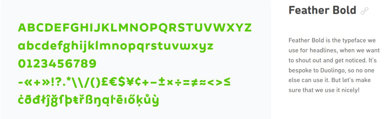
Bespoke typography via Duolingo
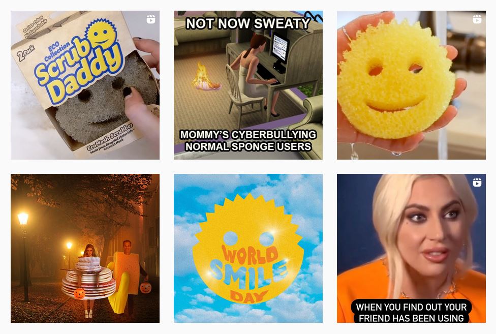
3. Scrub Daddy
Who would have thought that a kitchen sponge would become popular on the internet? Scrub Daddy is even dubbed “America’s Favorite Sponge.”
Sure, its high-performing product design is a huge factor in gaining loyal customers, but the smiling sponge design and the commitment to authenticity added appeal. Suddenly, doing house chores is not as stressful when you see the sponge smiling back at you, aside from the product working well!
It also helps that photographs used in their visual content depict everyday kitchen struggles that people encounter. Additionally, the smiley sponge has become a comedic inspiration for funny social media content. Since its inception, the startup brand has gone global.
via Instagram
4. Oreo
Did you know that cookie-brand Oreo is already a hundred years old? While the brand attributes its success to many factors, its strategic visual branding is key in establishing it as the “World’s Best Selling Cookie.”
To put it in perspective, a walk down the cookie aisle presents products that may taste better or similar to Oreo, yet Oreo managed to top them all because of its timeless visual identity.
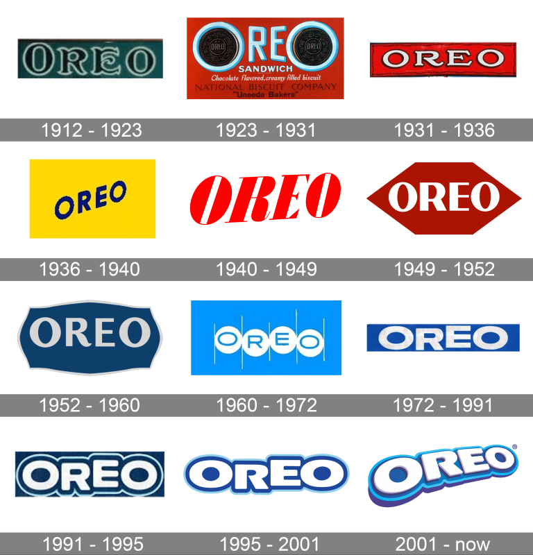
Oreo’s brand mark evolution
The brand also released iconic campaigns that rely on playful visual presentations. Who could forget the “Twist, Lick, Dunk” campaign, showing customers how to best enjoy the cookies through creative illustrations and tv ads? Or how about illustrating different characters and scenarios using the famous cookies as Pacman or tic-tac-toe play pieces? The brand’s color palette and 3D logo design on its packaging also never fails to make it recognizable, even if Oreo is translated and localized in some countries to adapt to different markets.
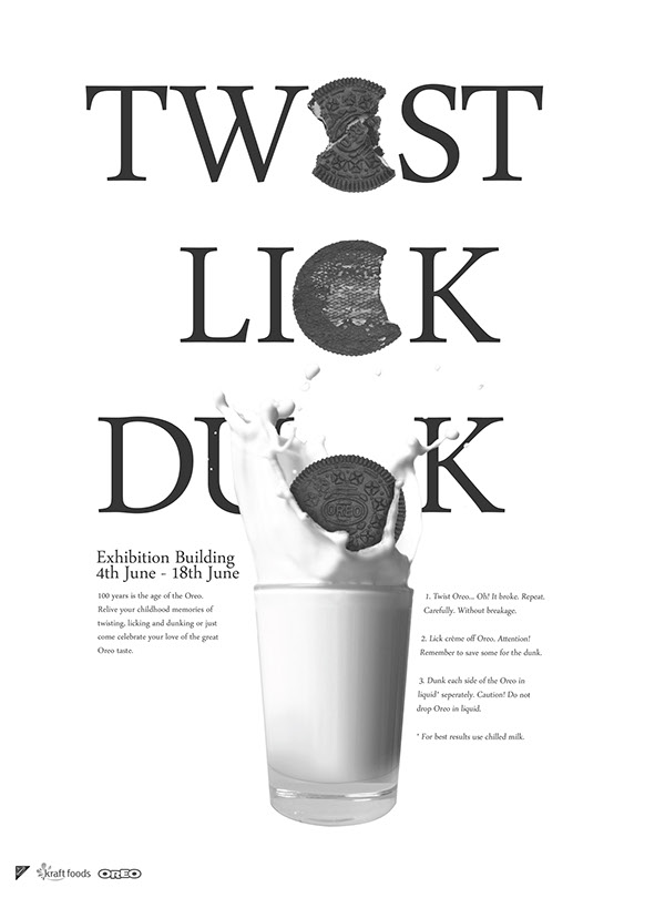
Twist, Lick, and Dunk instructional ad via Behance
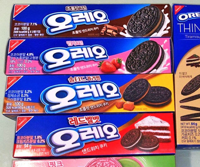
Japanese Oreo packaging via thisiswhyimbroke
5. Sonos
Sonos is one of the most sophisticated brands for home audio needs. With 20 years of presence in the market, Sonos has gone through several visual brand iterations.
In its latest revamp, the brand goes back to basics, highlighting simplicity and commitment to quality and design principles. It also pays homage to its humble beginnings in Santa Barbara, California. The brand's visual language moves away from the typical sleek and modern look to something warmer and homey. It embraces a seasonal palette, which also reflects Santa Barbara, including rose, rust, sand, and pine hues.
In its brand imagery, the brand combines 2D images and hand-drawn illustrations backdropped with the new color palette to demonstrate features. The result? A more approachable brand language that veers from the traditional without feeling too unfamiliar to its loyal customers. And with global offices, Sonos unifies its identity through its latest visual language.
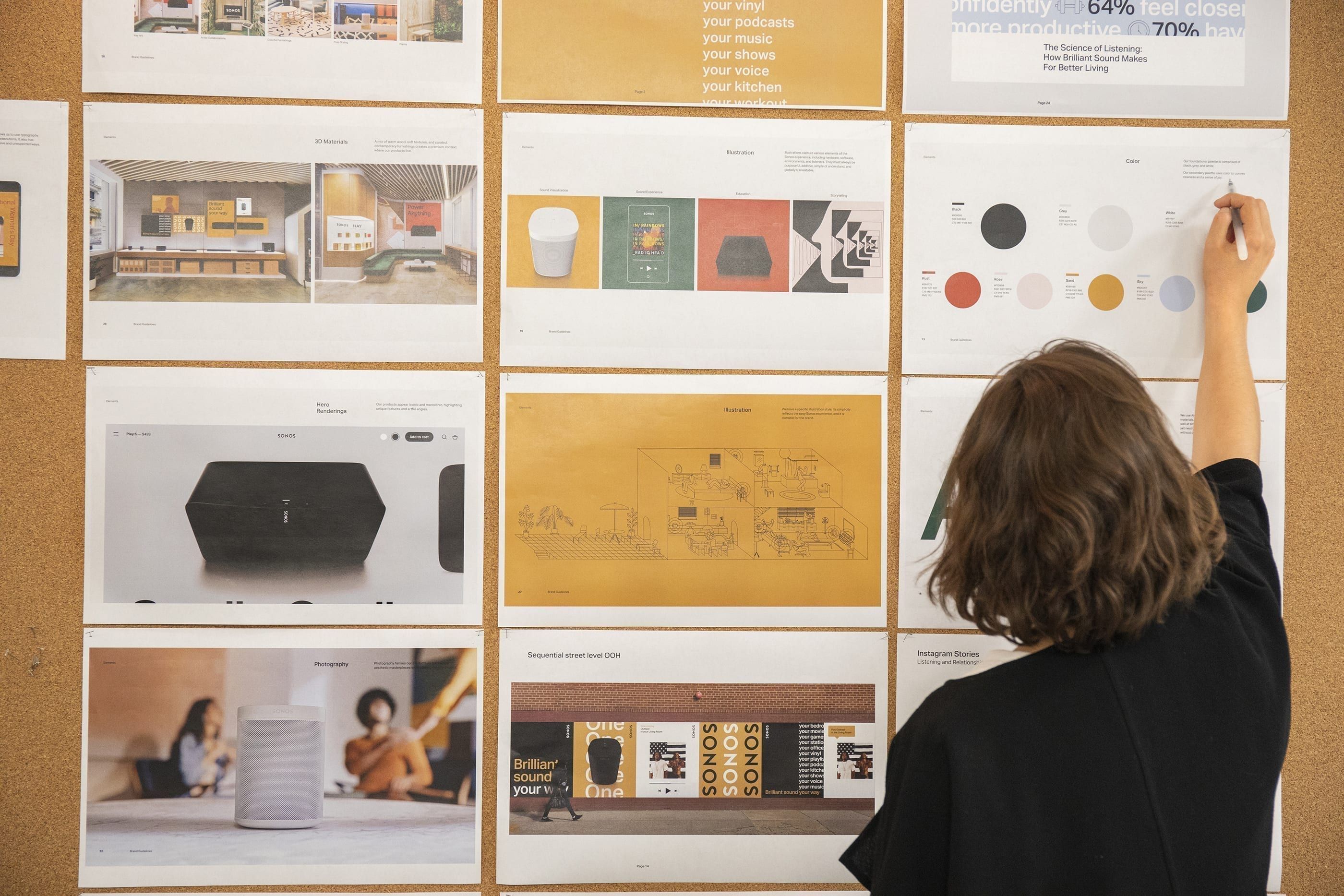
Sonos launches its new visual brand design via Sonos
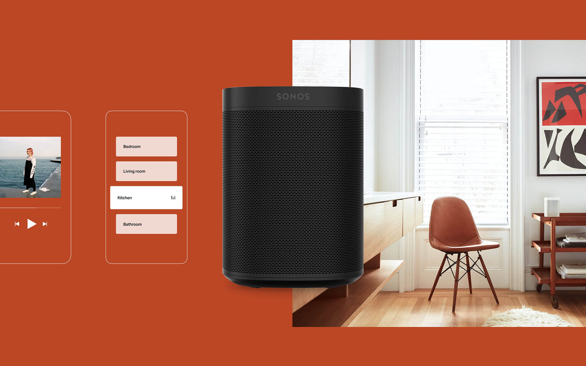
Sonos embraces a warmer look via Edward Yeung
A Visual Brand Language That Works
Establishing brand recognition entails so many components, like visual brand language boosting the brand experience. And it can be complex to figure out what works to create a strong brand, especially when you're only at the beginning of your journey. It takes a lot of trial and error, failures, and a dose of genuine curiosity to get it right.
Consider your overarching brand strategy as you build your visual identity, unifying essential brand elements. Also, don’t be afraid to iterate even if your visual language works. People are constantly looking for something fresh, hence, consistent visual language development is vital to your brand growth.
And finally, do not alienate your loyal customers who strongly identify with your brand. You can do this by retaining some visual design elements that work while still adding a twist that excites your audience.

Creates insightful, strategy-driven content that translates complex design and branding concepts into accessible knowledge, supporting Ramotion’s mission to elevate digital experiences.