Fintech Landing Page
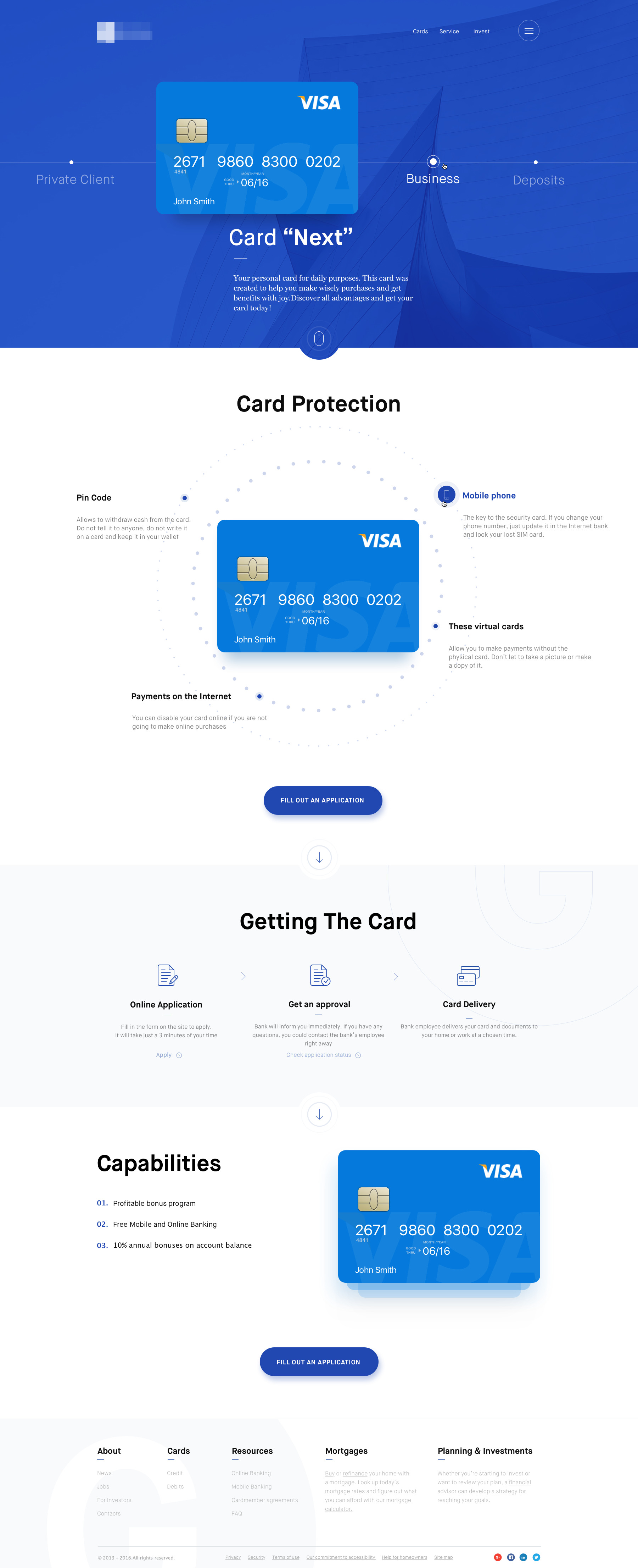
Our seasoned website designers craft the fintech landing page web design concept to showcase a Visa credit card, emphasizing security and user benefits. It leverages a structured layout, clear CTAs, and a trustworthy color scheme to facilitate customer conversions.
Functionality
The landing page is designed to provide users with a clear pathway to obtaining a Visa credit card, named "Card Next."
It highlights the card's features, such as Card Protection, the application process, and capabilities.
The page is intended to be informative, reassuring potential customers about the security features and benefits while providing a straightforward means to apply for the card directly through the website.
Design Essence and Elements
- Color Scheme: The color scheme primarily uses blue, often associated with trust, security, and stability, which is particularly fitting for a financial services provider. The varying tones of blue, from deep to light, create a dynamic yet harmonious visual hierarchy, guiding the viewer's attention through the page. White is used as an accent color, offering a contrast that enhances the readability of text and the standout of critical elements like call-to-action (CTA) buttons. Subtle grays are complementary colors for less critical text, softening the overall look and reducing visual fatigue.
- Layout: The layout adheres to a structured grid system, which establishes an orderly flow of content, facilitating a logical narrative through the website. Sections are divided, often by changes in the blue background tone, which helps users to categorize the information presented mentally. The design achieves visual balance through symmetrical arrangements and strategic use of negative space, emphasizing the most essential content without overwhelming the user.
- Typography: A deliberate approach to typography creates a clear hierarchy, with bold headings that signal new sections and lighter text for details, making it easy for users to skim through content. Line spacing and font size are carefully chosen to optimize readability across devices. A consistent font family is used throughout, maintaining a cohesive visual identity and reinforcing brand consistency.
- Imagery: High-quality images of the Visa credit card are prominently featured, instantly communicating the product offering. The card images are realistic and detailed, reinforcing the product's tangible benefits. Background graphics use soft, abstract shapes and lines, implying a connection with technology and security without distracting from the main content.
- Call-to-Action (CTA): CTAs are highly visible, utilizing contrasting colors to draw attention immediately after informative sections. The text on these buttons, such as "Fill Out an Application," is action-oriented, encouraging users to take the next step. The CTAs are strategically placed at points on the page where users will likely have gathered enough information to be interested in proceeding.
- Information Hierarchy: Information is presented top-down, starting with an introduction to the card and then detailed features, benefits, and the application process. This sequence ensures a smooth user experience, guiding them naturally towards decision-making. The design avoids clutter by using ample white space, focusing the user's attention and reducing cognitive overload.
- Iconography: The iconography on the page follows a flat design aesthetic, matching the modern and clean feel of the site. Icons serve a dual purpose: they complement the text, making the information more digestible, and they visually break up the content, adding interest and aiding in navigation. A consistent set of icons is used throughout the landing page, contributing to the overall visual harmony.
- Navigation: The top navigation bar is clear and intuitive, with labels that are easy to understand and click on, crucial for desktop and mobile users. The footer provides secondary navigation, offering additional resources and corporate information, a standard practice for ensuring that users can always find what they're looking for.
- Interactive Elements: Interactive elements such as hover effects for buttons and links provide subtle visual feedback to the user, enhancing the page's interactivity. Additionally, the design allows smooth scrolling between sections, creating an engaging and uninterrupted experience as users navigate the content.
- Responsiveness: The design is responsive, ensuring that the layout and content adjust to fit different screen sizes, essential for accessibility on various devices. The navigation and CTAs are optimized for touch interaction, accommodating the increasing number of users who access websites via mobile devices.
- Branding: The presence of the bank's logo is balanced and noticeable but manageable, which helps maintain brand presence without distracting from the content. The overall messaging is consistent with the brand's values and mission, reinforcing the identity and message that the financial institution wishes to convey to its users.
Each of these elements works in concert to create a fintech landing page that is visually appealing and functionally effective, designed to guide potential customers through learning about and signing up for a new financial product with ease.
Likely Benefits
The landing page likely increases customer engagement and conversion rates by utilizing a focused and user-friendly design. The clear presentation of features and benefits and the direct CTA for the application minimize user confusion and decision-making time, leading to a streamlined user journey from information gathering to application submission.
Application by the User
A potential customer would visit the landing page, absorb the information regarding the card's features and security measures, understand the application process through the visual roadmap, and then proceed to apply for the card by clicking on the CTA buttons. The process is designed to be seamless and requires minimal navigation.
The design concept applies the principles of clarity, trustworthiness, and ease of use to encourage users to apply for a credit card. It's tailored to the user's needs for quick information and a fast application process, addressing rational (features, benefits) and emotional (security, trust) aspects of the decision-making process.