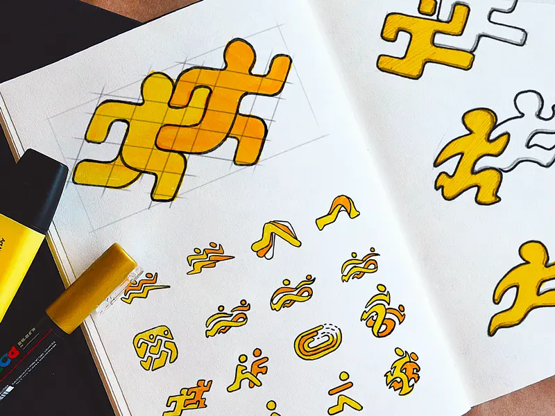
Fitness icons
Embark on a brand transformation journey with the best branding design agency, creating a fitness icons branding design concept that epitomizes strength and agility.
Functionality
The concept of functionality is rooted in versatility and clarity. These icons are designed to be intuitively understood across different platforms and devices, ensuring a seamless user experience. Their adaptability makes them ideal for various fitness branding applications, from mobile apps to print materials.

Design Elements
- Dynamic Figures: Each figure is crafted to convey motion and activity, representing various exercises. The fluid lines and sharp angles combine to suggest movement, central to the fitness theme.
- Bold Color Scheme: A vibrant yellow against a stark contrast creates a high-energy impact, capturing attention and evoking a sense of vitality synonymous with fitness.
- Consistent Theme: The puzzle piece motif unifies the set, symbolizing interconnectivity and the idea that each exercise is a piece of the giant fitness puzzle.
- Simplicity in Design: With a focus on minimalism, these icons translate complex movements into simple, abstract forms. This ensures legibility and recognition at a glance.
- Scalability: Designed to maintain their integrity at various sizes, these icons are versatile for digital and print mediums, from tiny app icons to large-scale advertisements.
- Customizable Elements: While consistent in style, each icon is distinct, allowing customization and adaptation to specific brand needs or campaigns.
- Innovative Perspective: Isometric projection for the central figure introduces depth, making the design stand out in a market saturated with flat icons.
Likely Benefits
Integrating this fitness icon branding design concept can significantly enhance brand recognition and user engagement. The energetic and clear visuals are likely to resonate with a health-conscious audience, fostering a brand identity that's both memorable and motivational.
Application of the Design Concept
In application, these icons can serve as the cornerstone of a user interface for a fitness app, providing immediate recognition and a cohesive aesthetic.
They can also be used in marketing materials, offering a visual shorthand for the services and values of the brand. In fitness wearables, these icons can denote different activities or goals, enhancing the user's interaction with the device.
For branding purposes, these icons could be the basis for an entire visual identity system, extending into merchandise, signage, and online presence. The adaptability of the design allows for a consistent brand experience across all customer touchpoints.
Overall, this concept delivers a fresh, modern approach to fitness branding. It invites users to engage with the brand on multiple levels, offering a clear and attractive shorthand for the energy and dynamism the best branding design agency strives to embody in every project.