MetaSpark
About
Increasing the visual and product potential via brand identity, website design and the product UI. As a result - MetaSpark now has a firm stance among the global market competitors of task managers.
Impact
40%Workday recovery enabled for clients
What is MetaSpark?
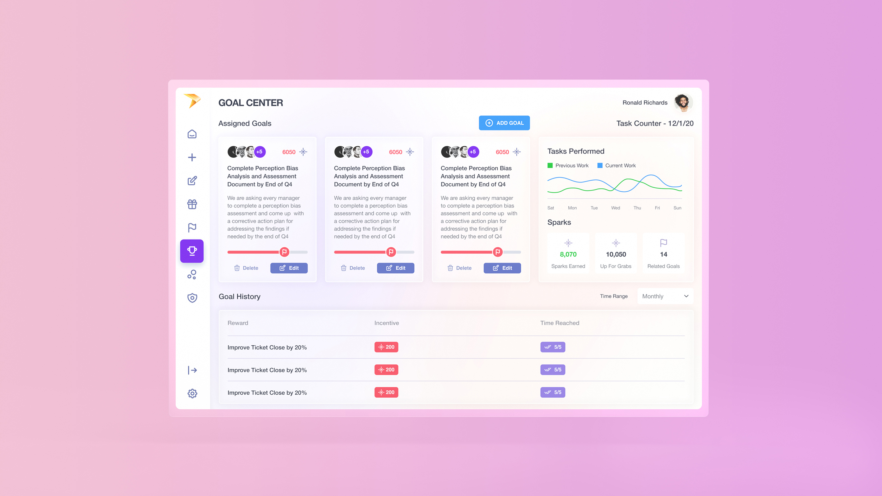
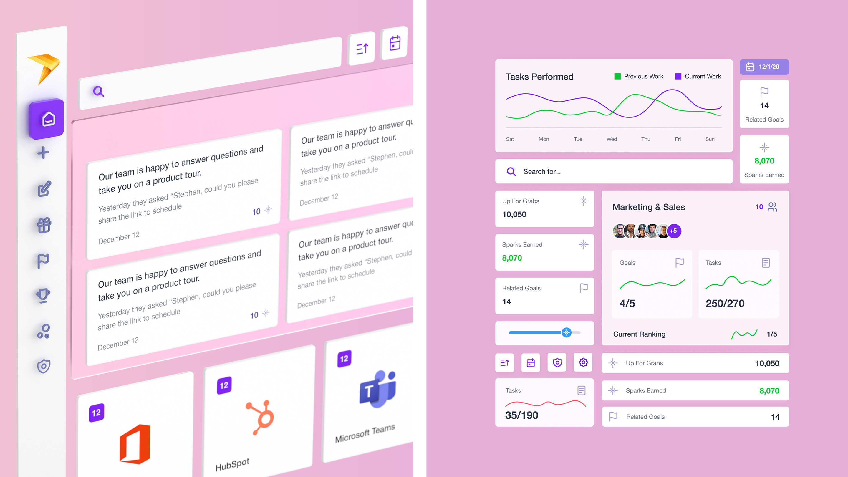
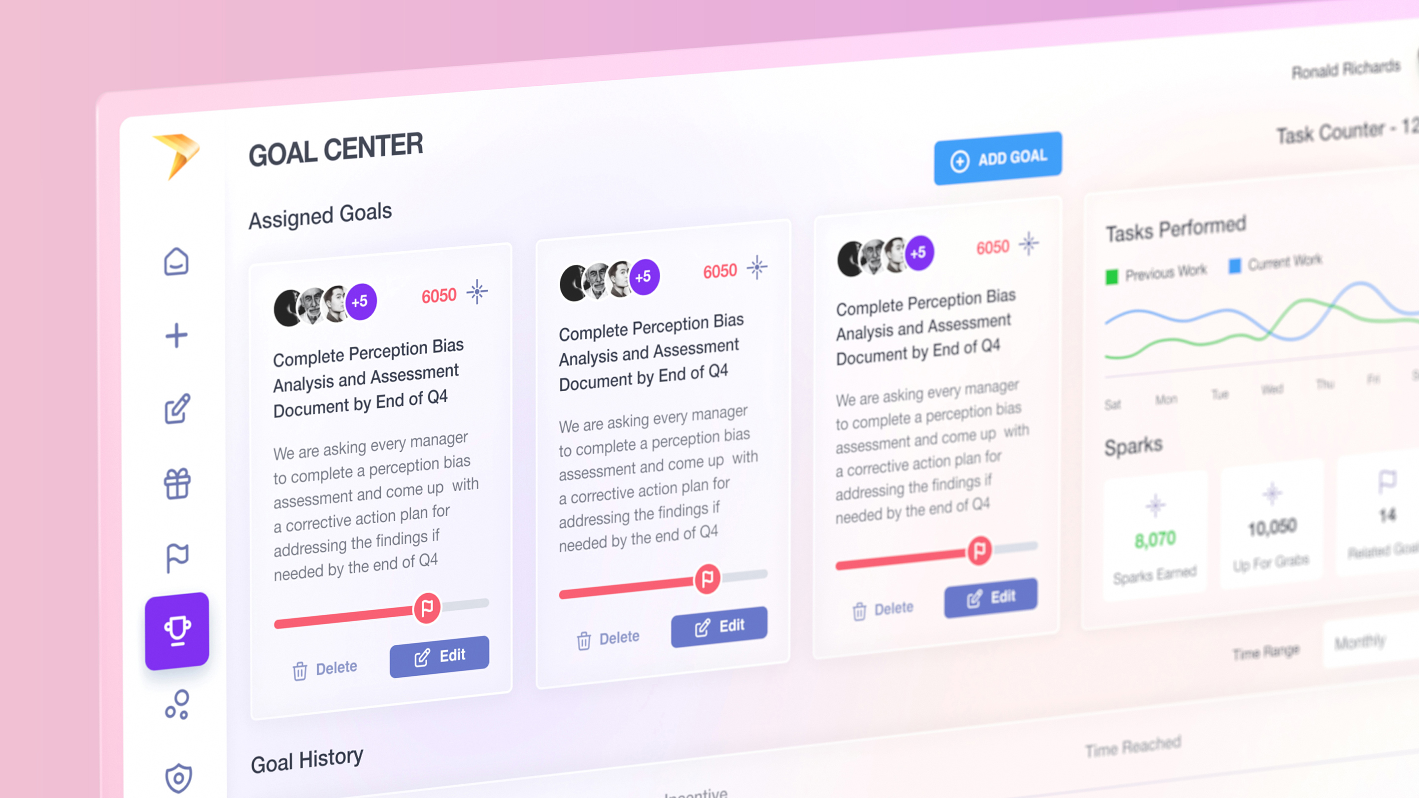
MetaSpark is a SaaS software developed with AI and machine learning technologies that act as task management and combine all essential employee tasks across different systems into a single and flexible dashboard. MetaSpark provides AI-driven statistics on the performance of every employee and easily connects people through other platforms while tracking down accomplishments of people's work.
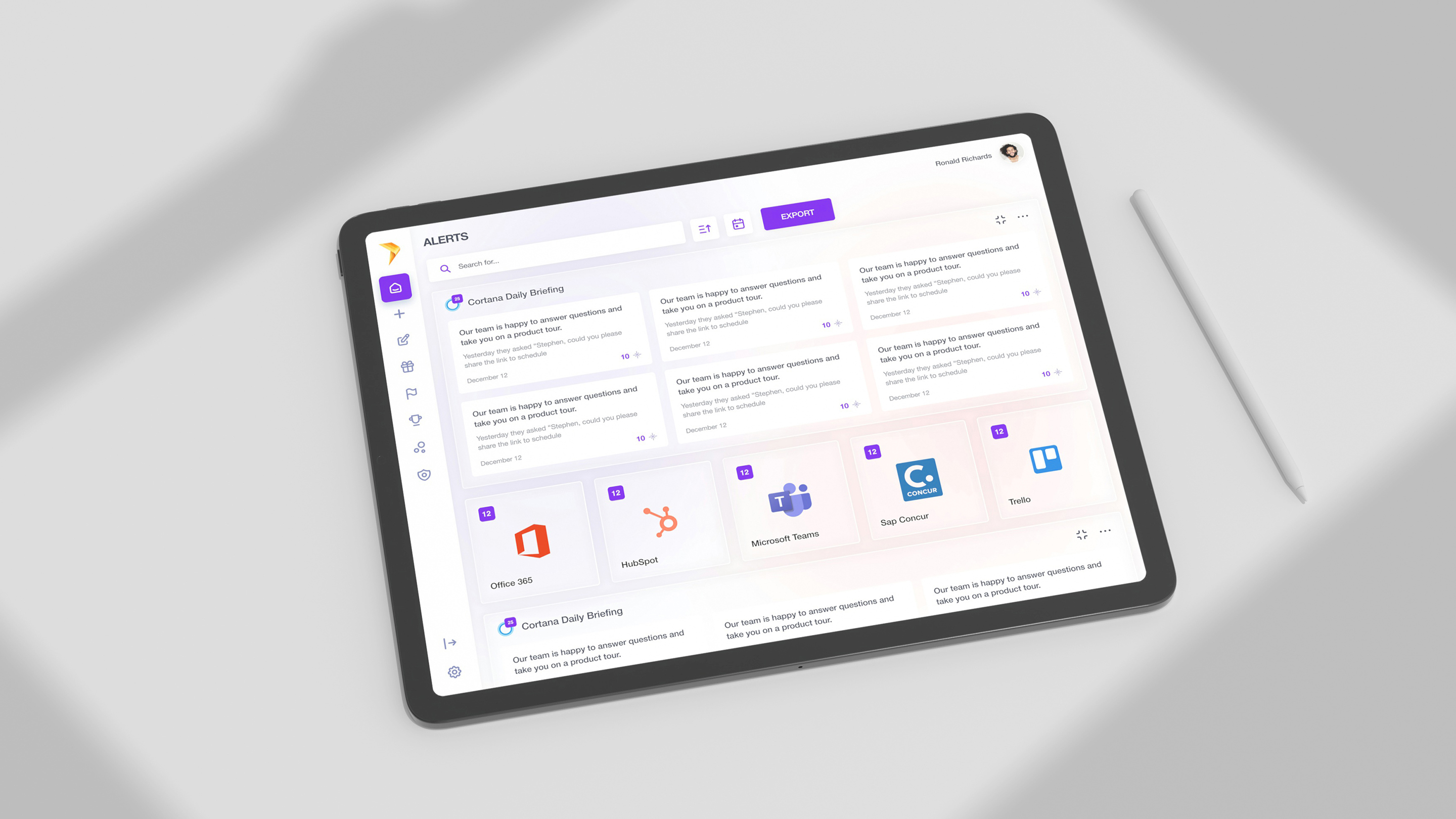
Main features
As mentioned previously, MetaSpark connects various business operations and tasks across company teams. Their product can be easily compared to Asana or Basecamp. However, instead of providing the same experience, they demonstrate a new approach. They unite all core business operations and present them in a single dashboard.
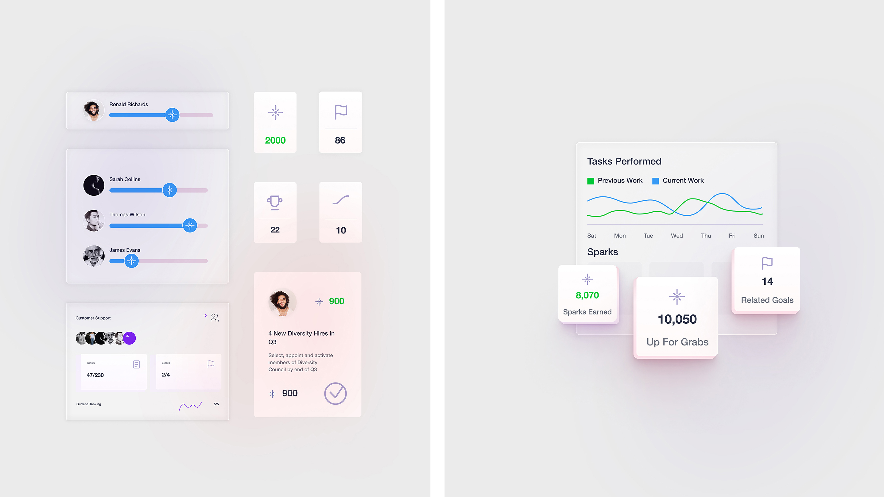
One of the main features is the “Team Performance” metric which shows how many tasks a single employee has accomplished. Moreover, this entire approach is made in a gamification format.
MetaSpark has a unique rewards system for those who go beyond the scope of their work. With enough earned Sparks (another prominent feature of MetaSpark that serves as an in-app currency), those employees who have completed more tasks within a certain period can receive bonuses. In addition, these Sparks can be easily exchanged for gift cards from various stores and shops.
Brand identity development
When our branding experts began working on their brand visual identity, we were looking for a unique idea that could bring a new and fresh image into the existing market of task managers. One of the early directions we wanted to go in was to transform the chaos of multiple windows of a simple worker into a straightforward digital space. We wanted to portray that users won't have many different program screens on their desktops.
The second concept was based on their gamification system. As we mentioned previously, MetaSpark has a reward system connected with task accomplishment and task tracking, based on “Sparks“. They motivate workers and lead them towards productivity and achievements during their typical daily routine. That concept was new and could be compared to the discovery of the first flame. It brings a new vision of employee engagement and motivation to the market of task managers.
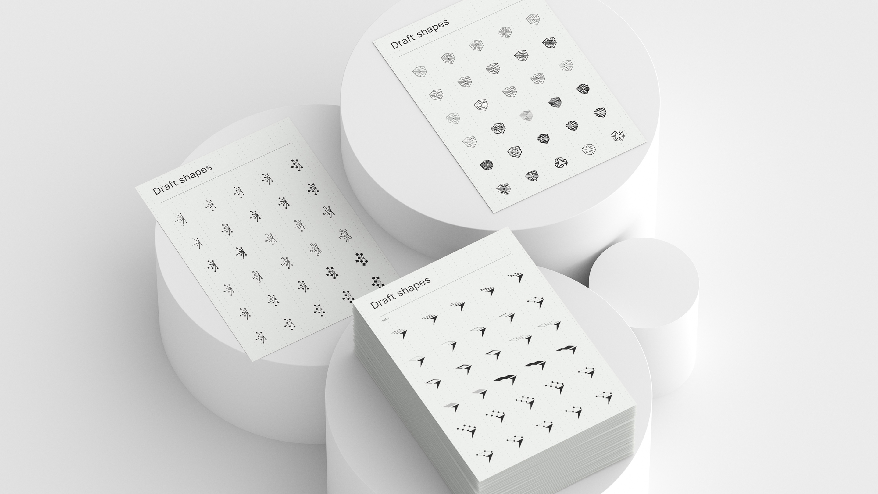
Once our branding experts had outlined the initial concepts, we made a lot of sketches during the first drafts phase. There were a lot of different design directions in terms of concepts and integrations. We had torches, sparks, prismatic elements, various geometrical shapes, stars, and other interconnected symbols. Simply speaking - we had a lot of options to examine. We continually explore until we find a direction that resonates with a company and our branding team. That way, during one of our discussions, we all decided to explore volume elements and shapes.
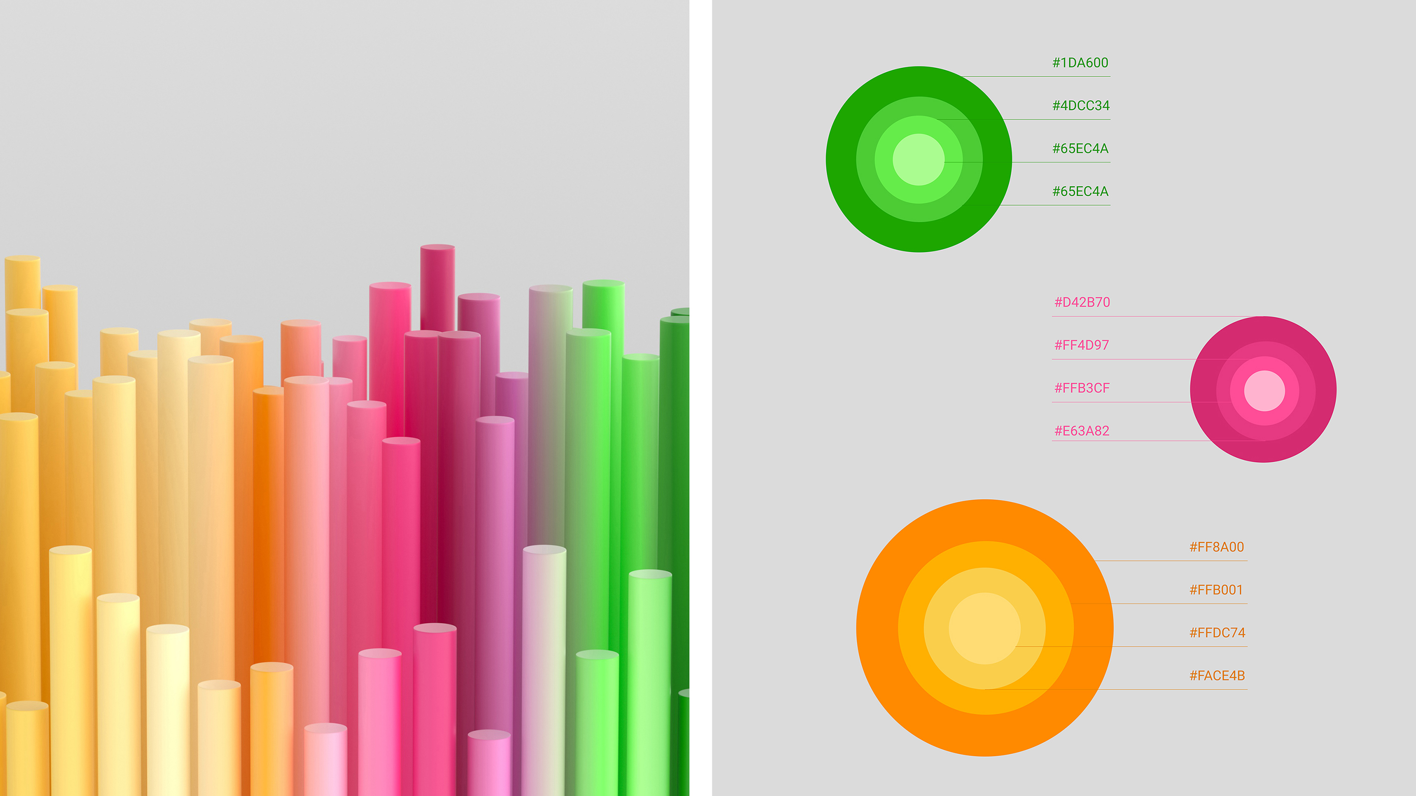
As a result, we all preferred a 3D direction concept and were excited to explore it further on, as volume and thick elements could land an immediate impression. And as our experts found the matching palette and colors, we focused on the torch concept more than the other options.
If you recall the story of Prometheus: he gifted the flame to the people as a measure to warm and defend themselves. Our team took that concept throughout the interface and the website design, applying the brand elements and bright accents to its visuals. Thus, as Prometheus carried the fire, our team has given MetaSpark and its customers a new identity.
Marketing website development
After all of the brand identity development steps were completed, our team began developing their marketing website design. Considering all of the features that a company has in its product, there were a lot of directions we could take in terms of web design and app development.
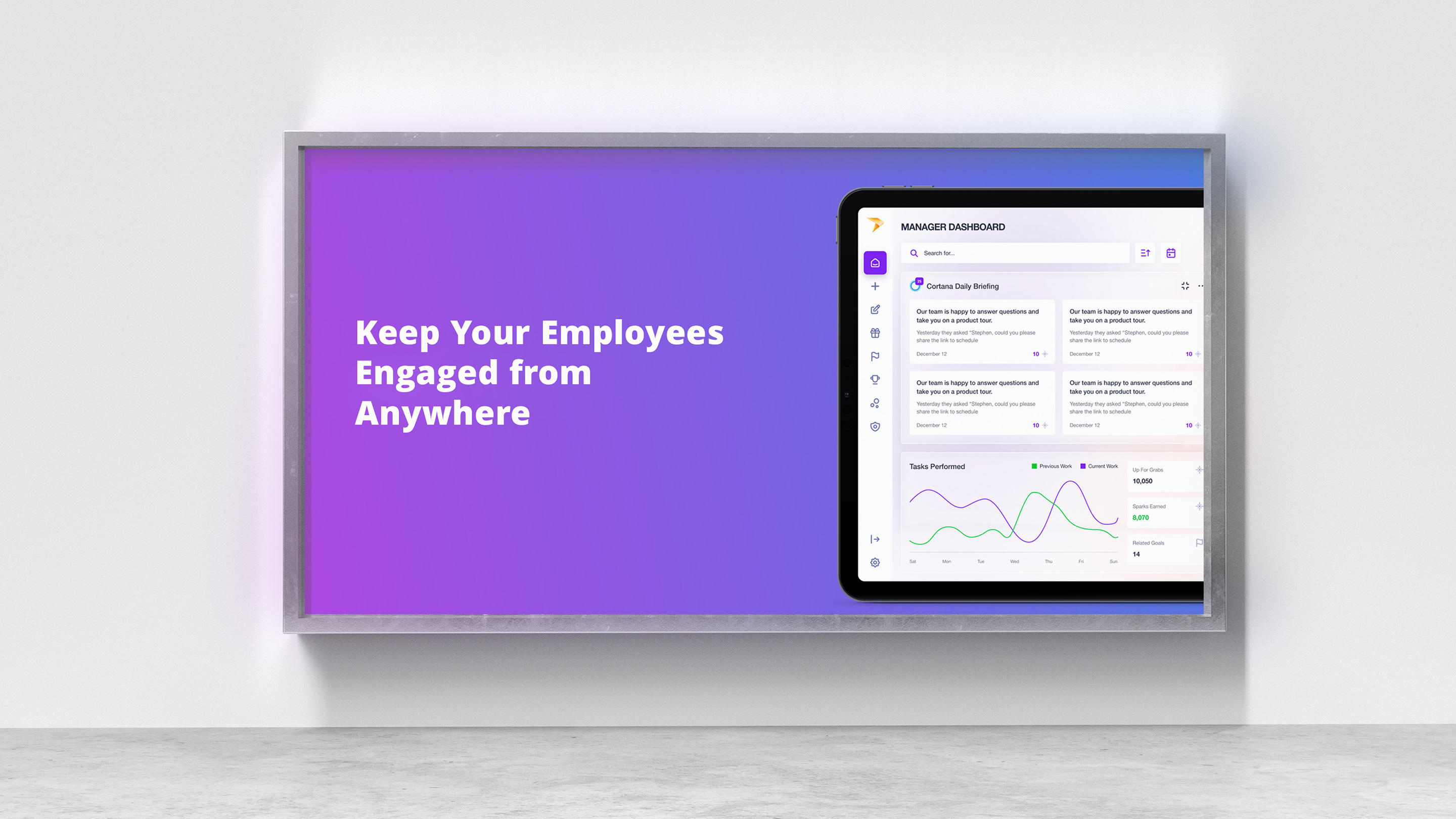
At first, we decided to implement some of the unique volume animations with some illustrations. It was a complex and time-consuming process as we tried to stick to the concept and have a clean website with the elements of the volume interface and bright accents. The focus on 3D elements was suggested by our client, as they were inspired by Pitch.com visuals. We demonstrated the platform's transparency as glass rectangles scattered across the entire landing page. Each metaphorically holds a sense of easiness and availability for every active user.
Our team was focused on a very light and clean style while implementing some of the product interface sections. Once our team accomplished that task, we prepared illustrations and used them on the MetaSpark website. As a result, the client's team decided to use this visual to evolve their interface.
Our UI/UX design experts applied 3d and motion graphics to the website layout while developing it with Webflow. With the glassy background, we tried to show the transparency of MetaSpark work while saying that their solution is light and accessible. Later we finalized the overall design, fixed a few bugs, and passed the final website version with all analytics to our client.