Proemion
About
Proemion is a technology firm that develops infrastructure to connect mobile machines with humans, the cloud, and each other.
Impact
200K+Devices enhanced through design transformation
Website
proemion.comProemion is a hardware manufacturing firm that delivers industrial IoT devices, industrial applications, and connectivity solutions for various industrial robotics applications. Initially, Proemion and our UX/UI design firm cooperated to design the visual identity and work on their online presence’s various design aspects. Gradually, our partnership evolved, and we started to develop their brand strategy, marketing website, the company product, various design assets and their visual language. Even today, the Proemion branding is constantly being polished while our corporate branding agency efficiently manages its development.
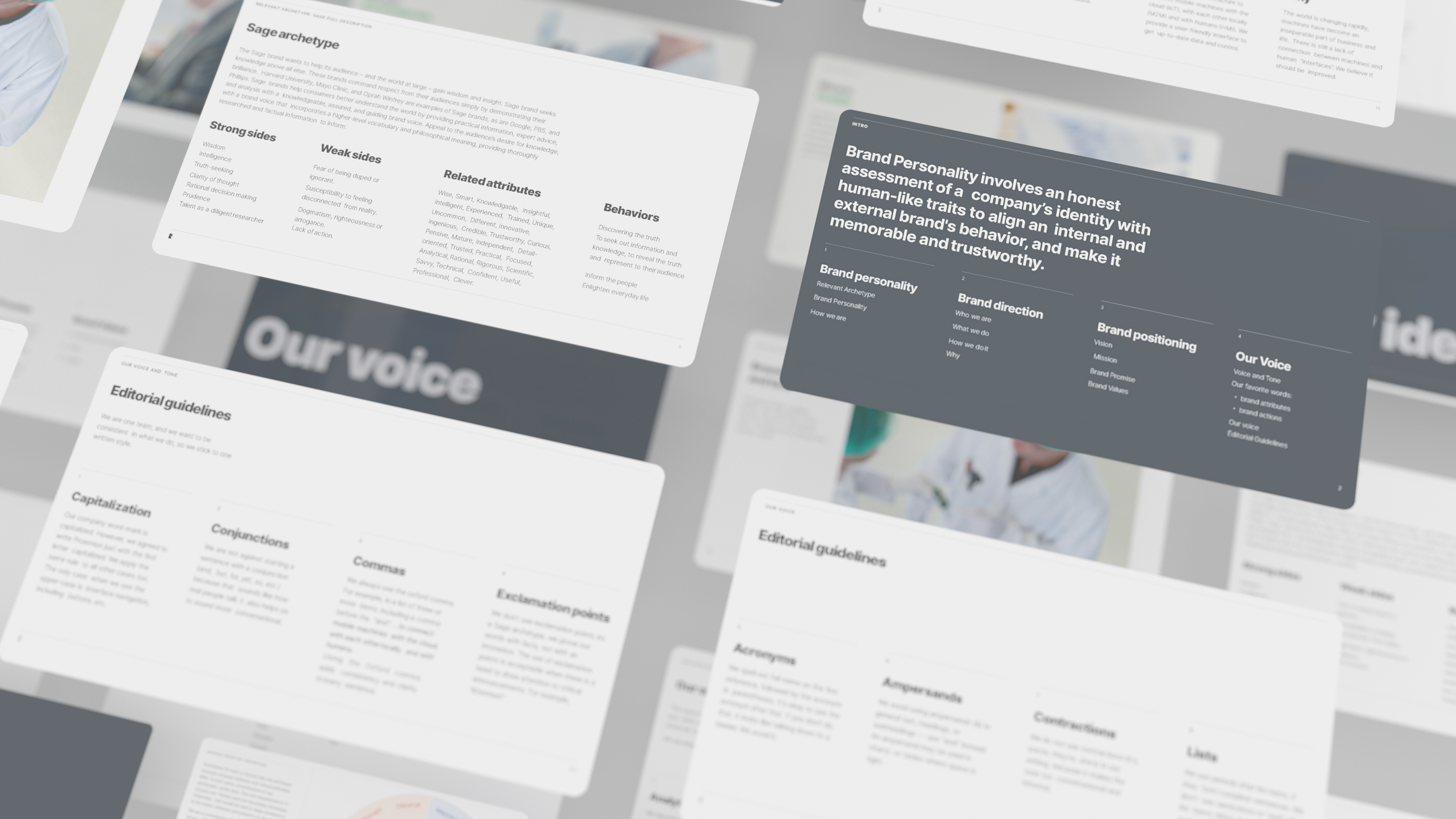
It all begins with a brand strategy
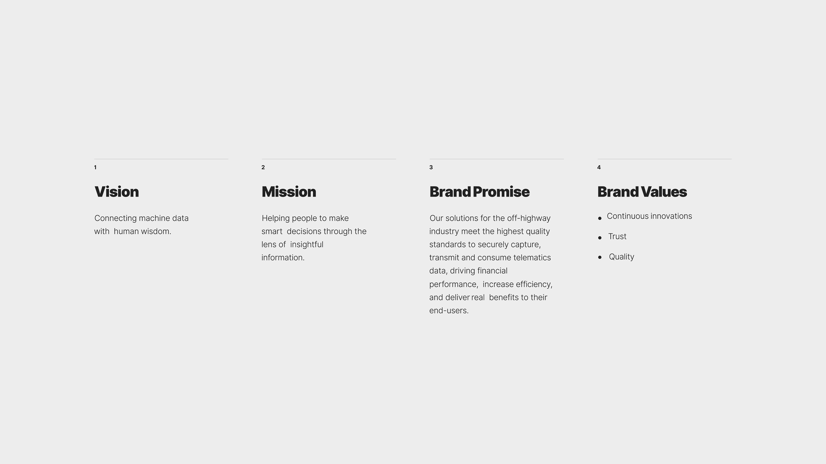
Any brand strategy is vital for further design tasks, company scale, and understanding how the company will represent itself inside and outside. We have developed integral brand components: personality and positioning. These two led to a specific brand vision, mission, promises, values, and other essential elements of the company that you can see today. Each of these components will set how the company will communicate externally and internally.
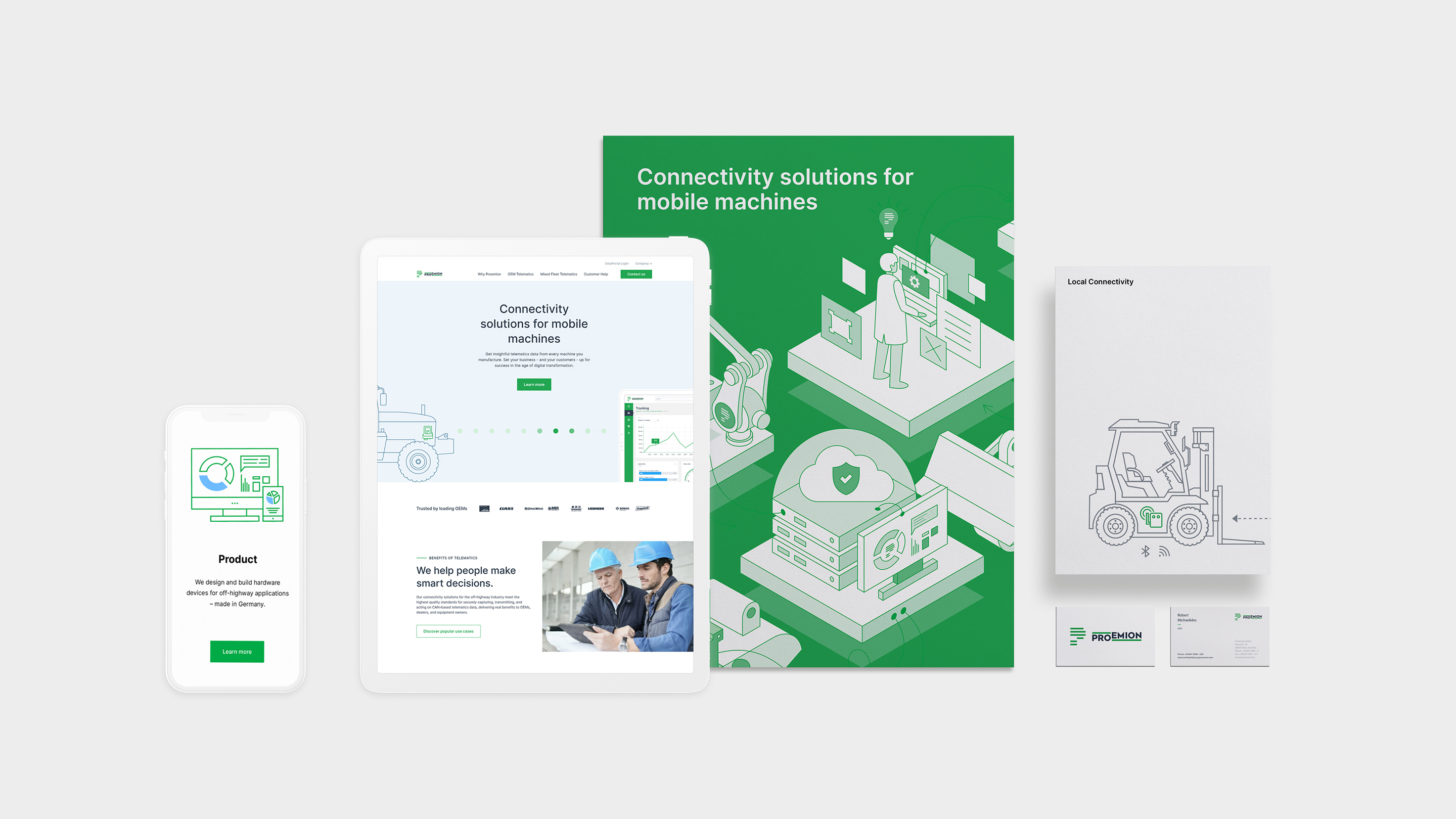
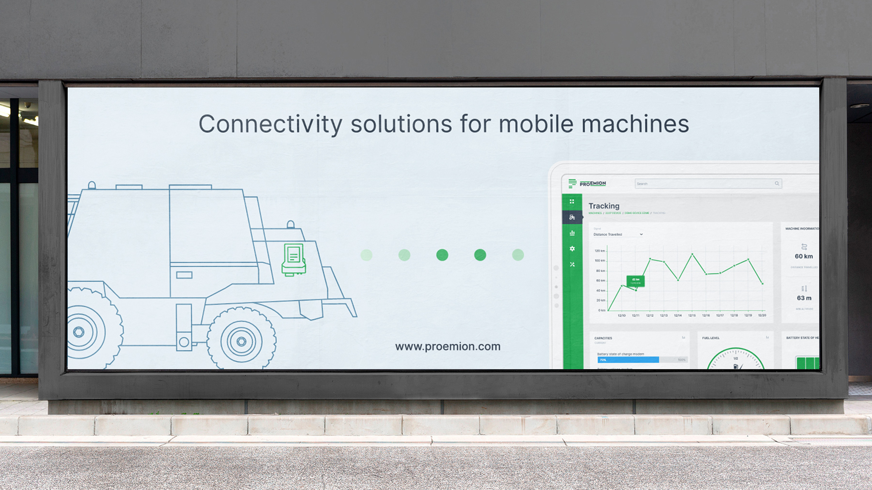
Above is a combination of various digital assets that our interactive web design agency produced for their industrial website and mobile application of the Proemion digital product. Some of the demonstrated design assets were also used for the outdoor materials, brochures, and business cards that represent how the brand can evolve.
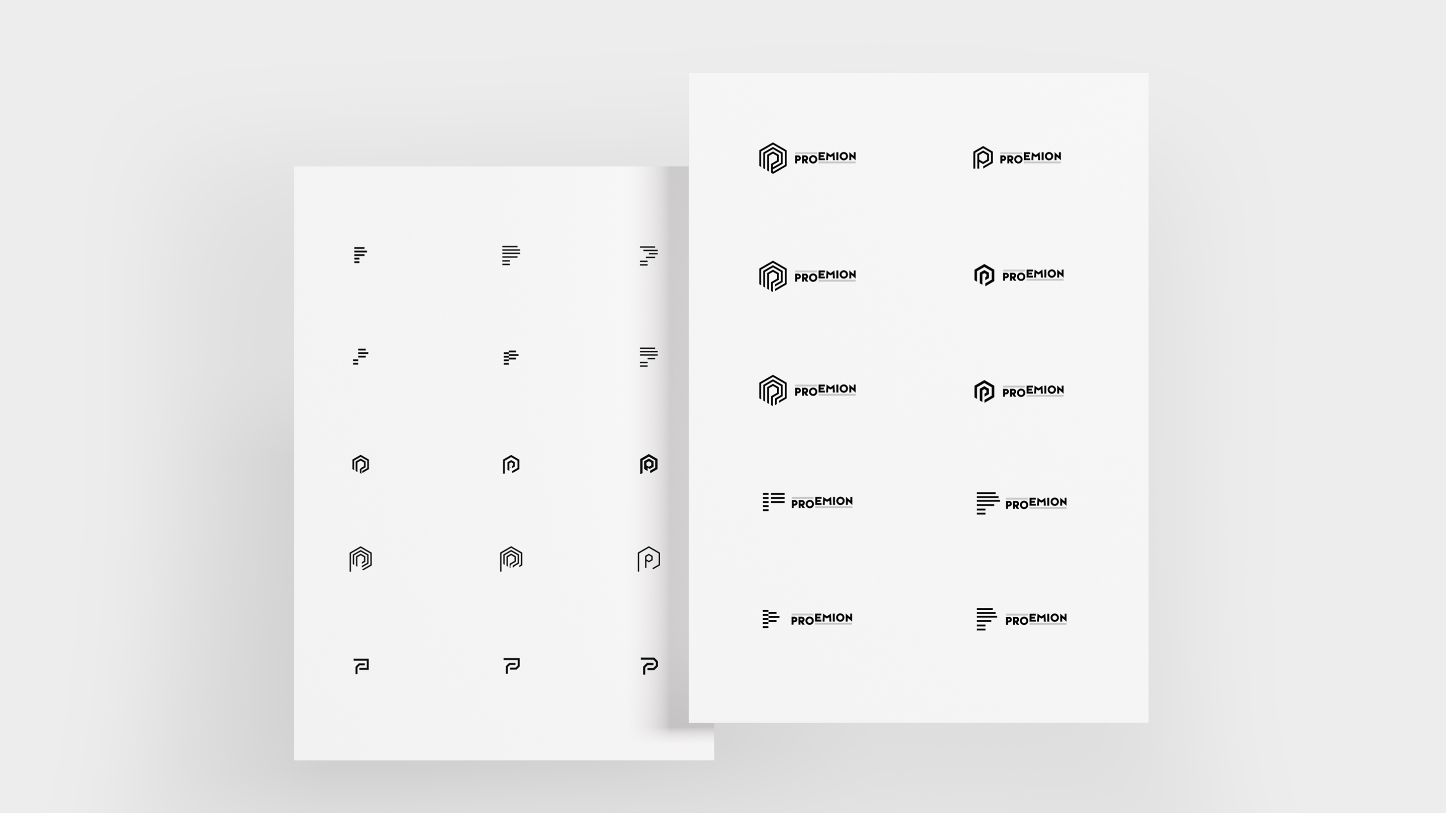
Proemion logotype
A polished and quality brand logotype is one of the core essentials that clearly distinguishes a competitive company in the market space. To develop one for our partners at Proemion, our team went through several iterations and research processes. Below are some of the core iterations of the Proemion brand logos taken straight from the sketching phase.
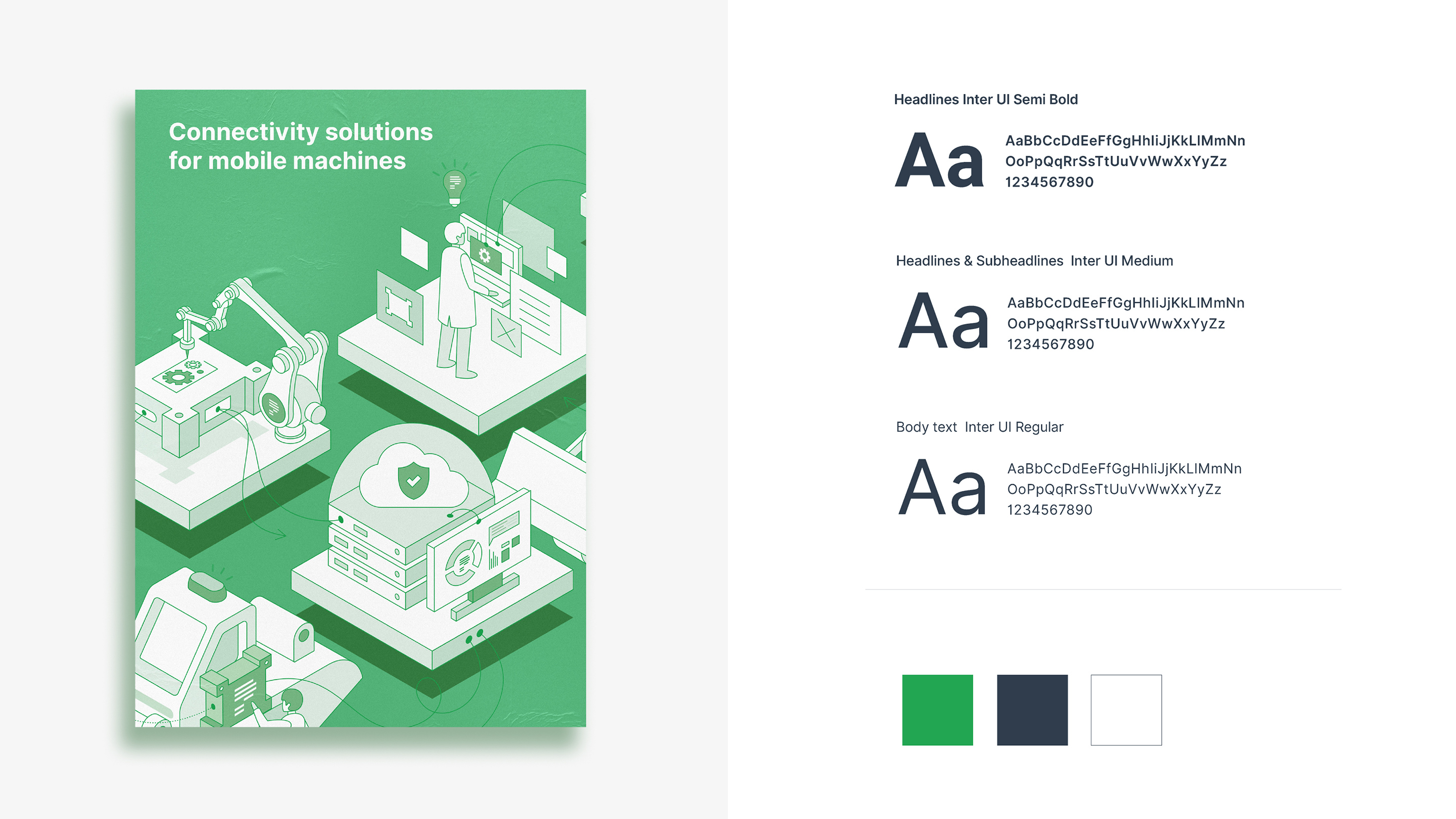
As a result of the collaborative and joint cooperation between our team and our client, we have produced several brand assets that were firmly incorporated into the final stage of the Proemion brand product. Above we presented some of the essential brand colors and font families that our designers chose to go along with.
Developing the brand iconography
One of the integral parts of the company brand is the icons, which our team has developed for the Proemion industrial website. Some were integrated into the mobile application, while others made their way to the product dashboard design. All of them were based on our design principles, which led to the complete and interconnected design language.
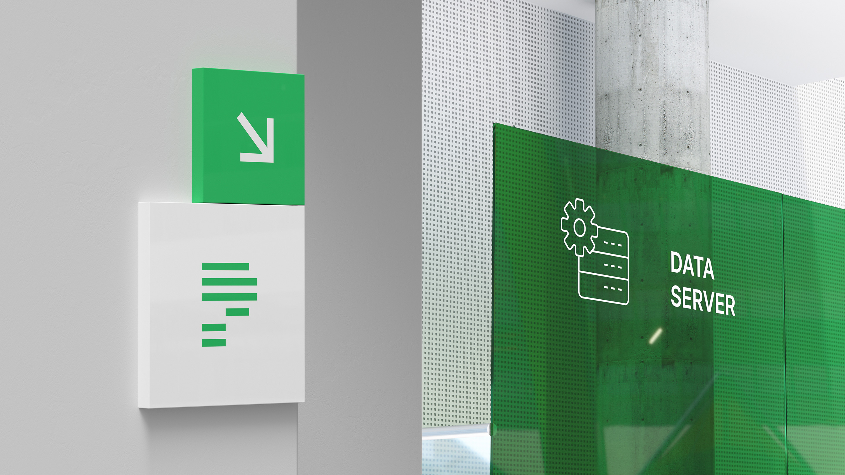
Here are some visual examples where we tried to apply the Proemion iconography and observe how they live in the natural environment. Even though the rendered image is not a final variation, it still clearly demonstrates a sense of comfort inside an office that brims with the energy flow with the essential brand components.
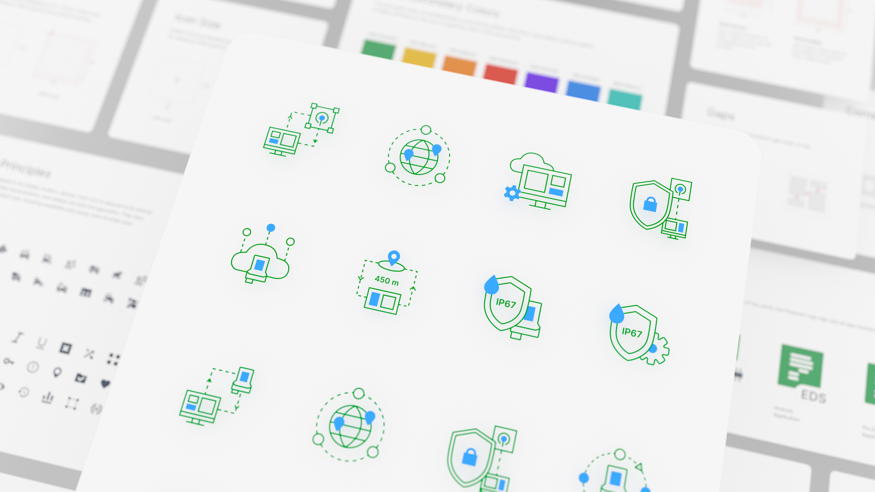
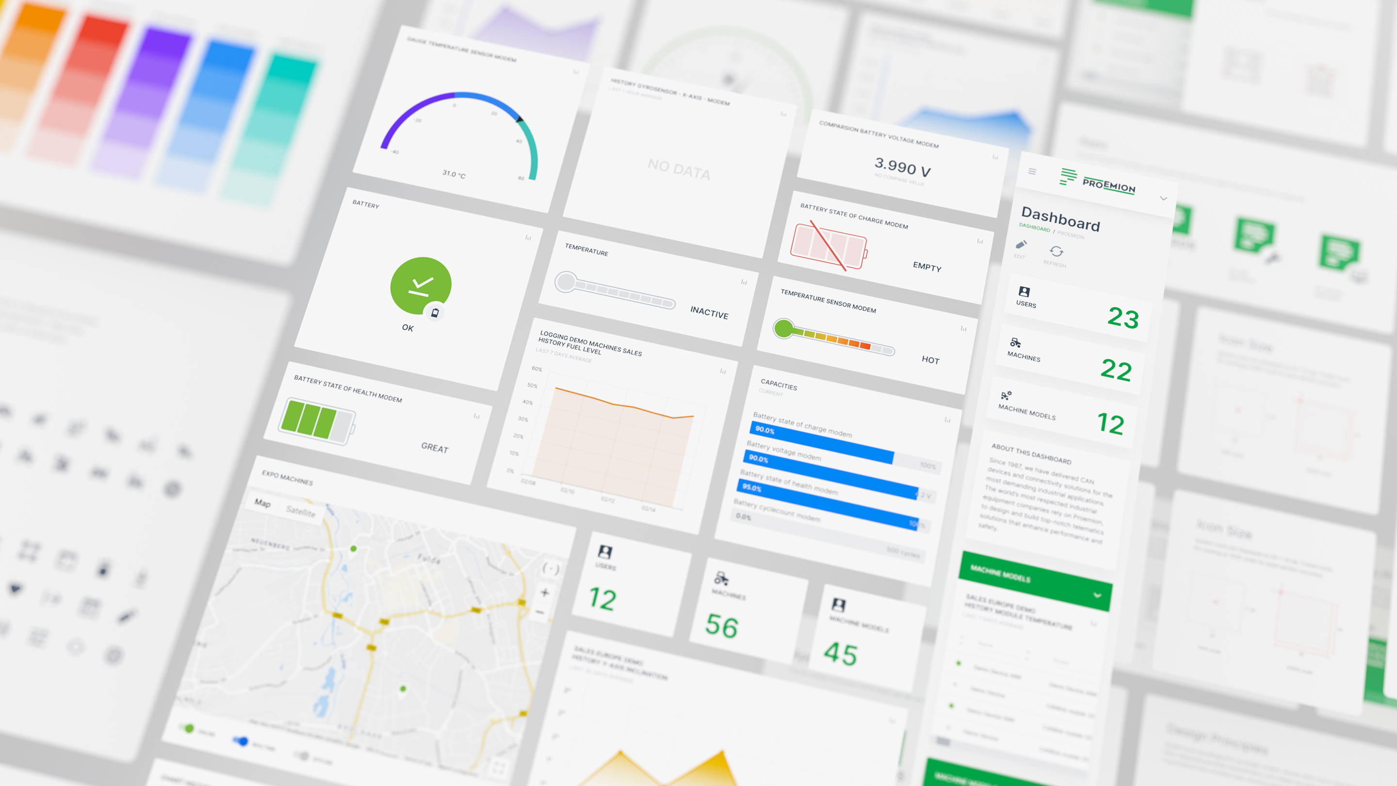
Apart from the previous set of iconography, there is yet another tier of icons our UI/UX team has developed. These were used differently, as the latter was applied to the web and mobile versions of the Proemion product. This iconography set can be implemented as reusable design assets for creating new illustrations of the Proemion brand identity.
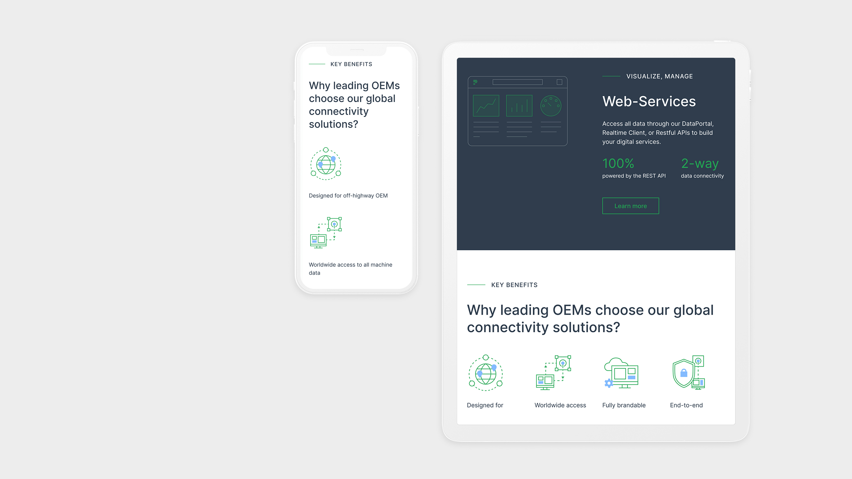
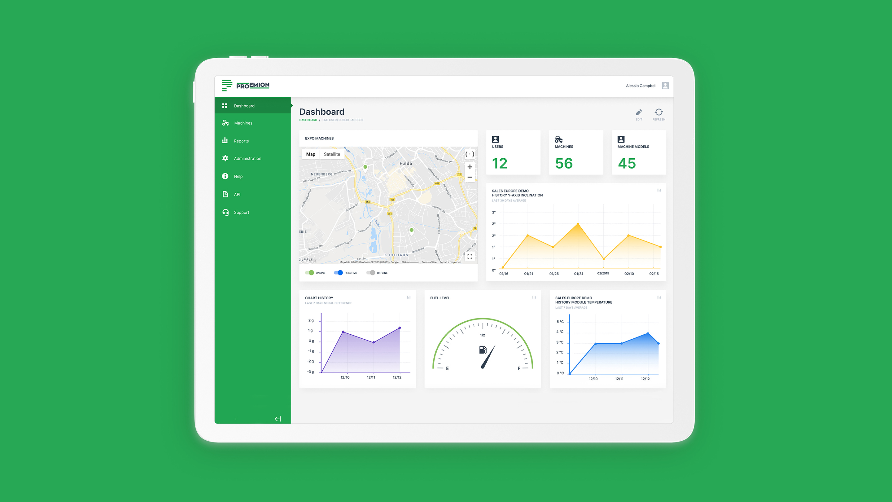
Another shot of the Proemion website demonstrated how different users could view and interact with their digital product on various devices. Even though it might seem that the integrity of the design components varies on each screen, they do relate to each other. They connect and make up a global design language that distinguishes Proemion from similar solutions.
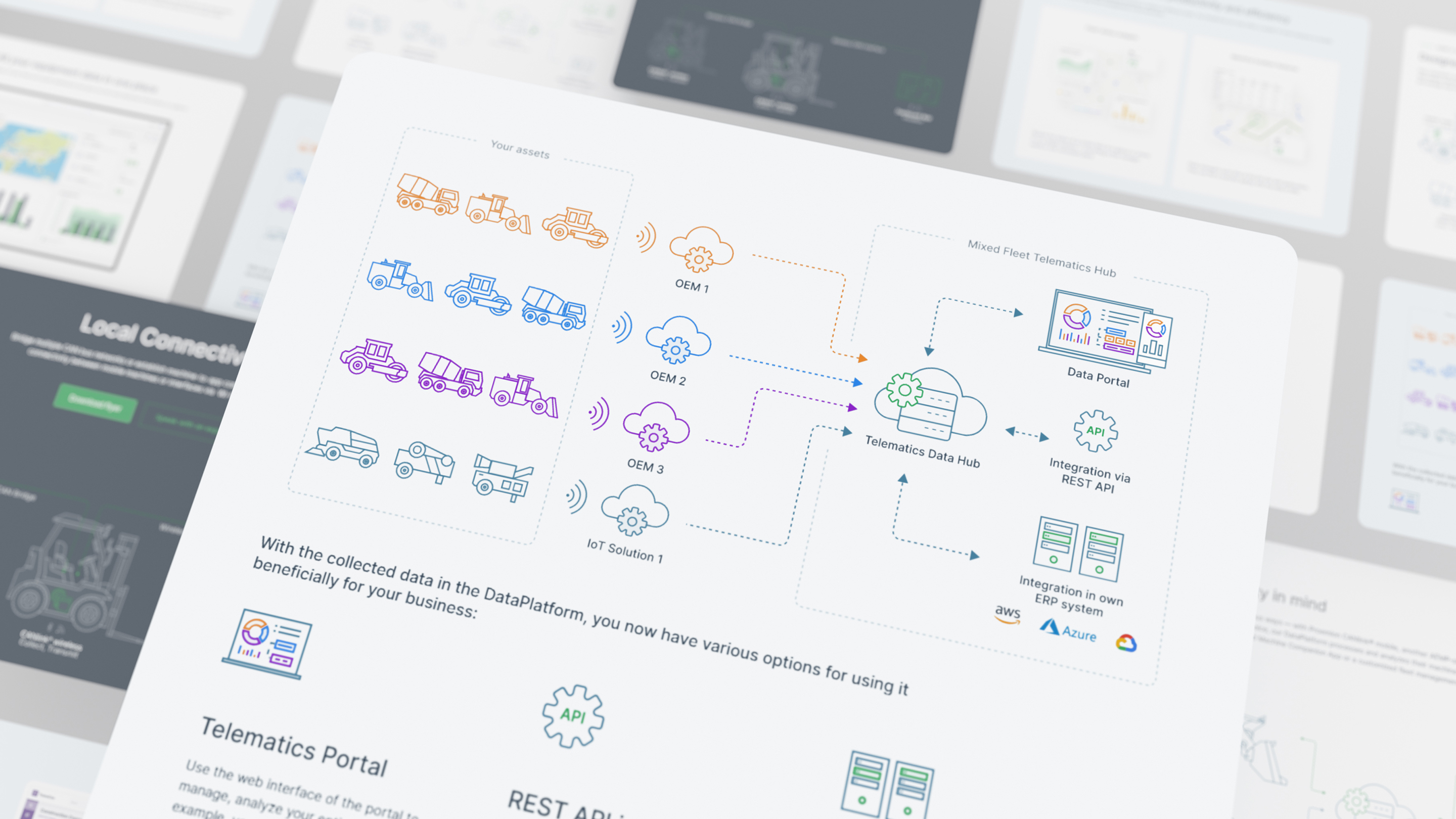
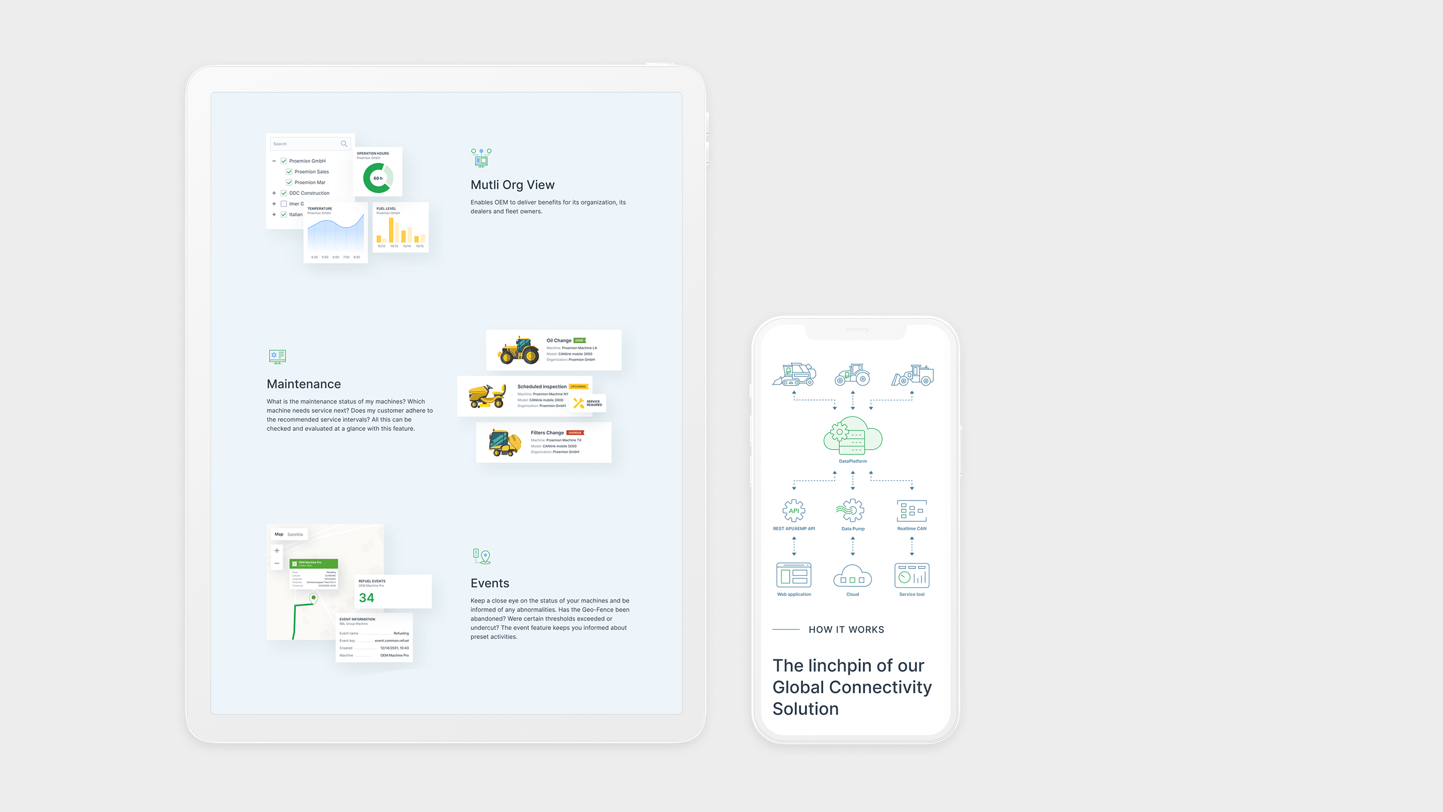
Our team illustrates an entirely new set of iconography implemented, an essential part of the design language. Since we worked closely with their product, these icons depict and educate users on how the Proemion technology works. It does have a significant impact on the interactivity and design level of the digital product and its users.
The product guidelines
Usually, after the brand identity stage is complete, our team begins to apply new and visible components to different correlated points of the product. The same goes for the Proemion product dashboard that now consists of various interconnected brand elements. It does hold some of the icons, core brand colors, and special guideline rules that connect with the Proemion target audience.
All in all
Our team provided quite a lot of services and assistance to the Proemion team. Above, we’ve just highlighted the significant parts of this digital project. If you consider and examine each task individually, you will see how much effort and time we have invested into this unique and ambitious project.