Stable
About
Stable is a modern company shaping a foundation for electric cars destined to come in the future world. Located in San Francisco, they have plans to grow across the entire US.
Reach
50,000+Active EV chargers under analysis across the US
Tech stack
TypeScript, Next.js, Protocol Buffers
Website
stable.autoStable is focused on a core challenge in EV infrastructure: understanding which sites will actually perform before capital is deployed, and how to improve performance once they are live.
Its platform models expected utilization and translates that into energy usage, revenue, and cost at the site level. This gives teams a clear view of whether a location is likely to be viable and how different factors such as pricing, demand, and local conditions impact returns.
For existing networks, Stable provides visibility into how sites are performing across utilization, pricing, reliability, and revenue, helping operators identify underperforming assets and prioritize improvements.
By connecting upfront forecasting with real-world performance data, Stable helps reduce uncertainty in both investment decisions and day-to-day operations.
Brand identity challenge
The challenge was to build a brand that could communicate a complex, data-driven product with clarity and credibility.
Stable operates in a space where decisions are high stakes and often based on incomplete information. The brand needed to reflect rigor, trust, and practical insight, while remaining accessible to a range of stakeholders across the EV ecosystem.
Working closely with the founding team, the goal was to create a visual and verbal identity that could support both technical depth and clear communication as the company scaled.
First steps
Whenever we get our hands busy developing and forming a concrete brand identity, we start with its positioning. More specifically, we try to identify which niche does it take and what value does it hold. After conducting a discussion with the Stable team and going through some key questions, our branding agency experts began analyzing their industry competitors.
In the meantime, we outlined core brand attributes that resonated with their customers’ emotions and could deliver a joyful experience. Additionally, we defined the tone of voice, character type, and the overall mood, Stable brand identity should have.
Next, our team narrowed down the research process. We stressed out the elements that correctly resonated with the company image by using adjectives to describe it. Simple, durable, friendly, and agile, these were the ones that personified the brand. Next, we formed the first visual representation (mood boards) after connecting both the adjectives and the inspiration sketches. They guided and inspired further our team to create the correct brand identity while providing quality results.
“Funnel” filtering
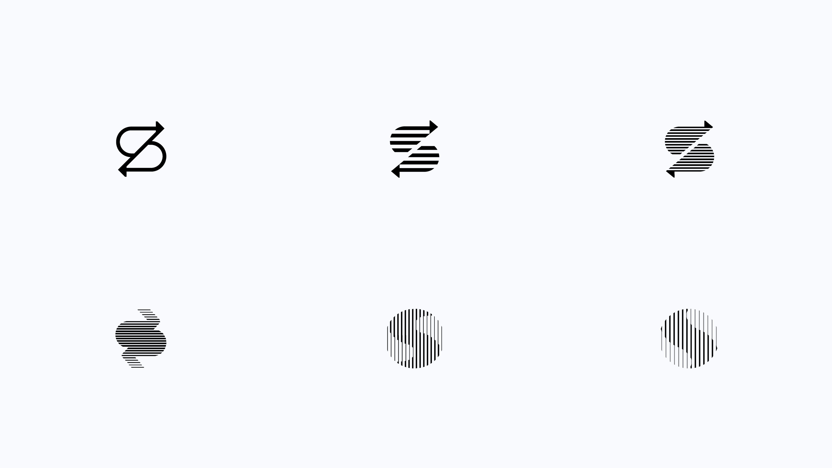
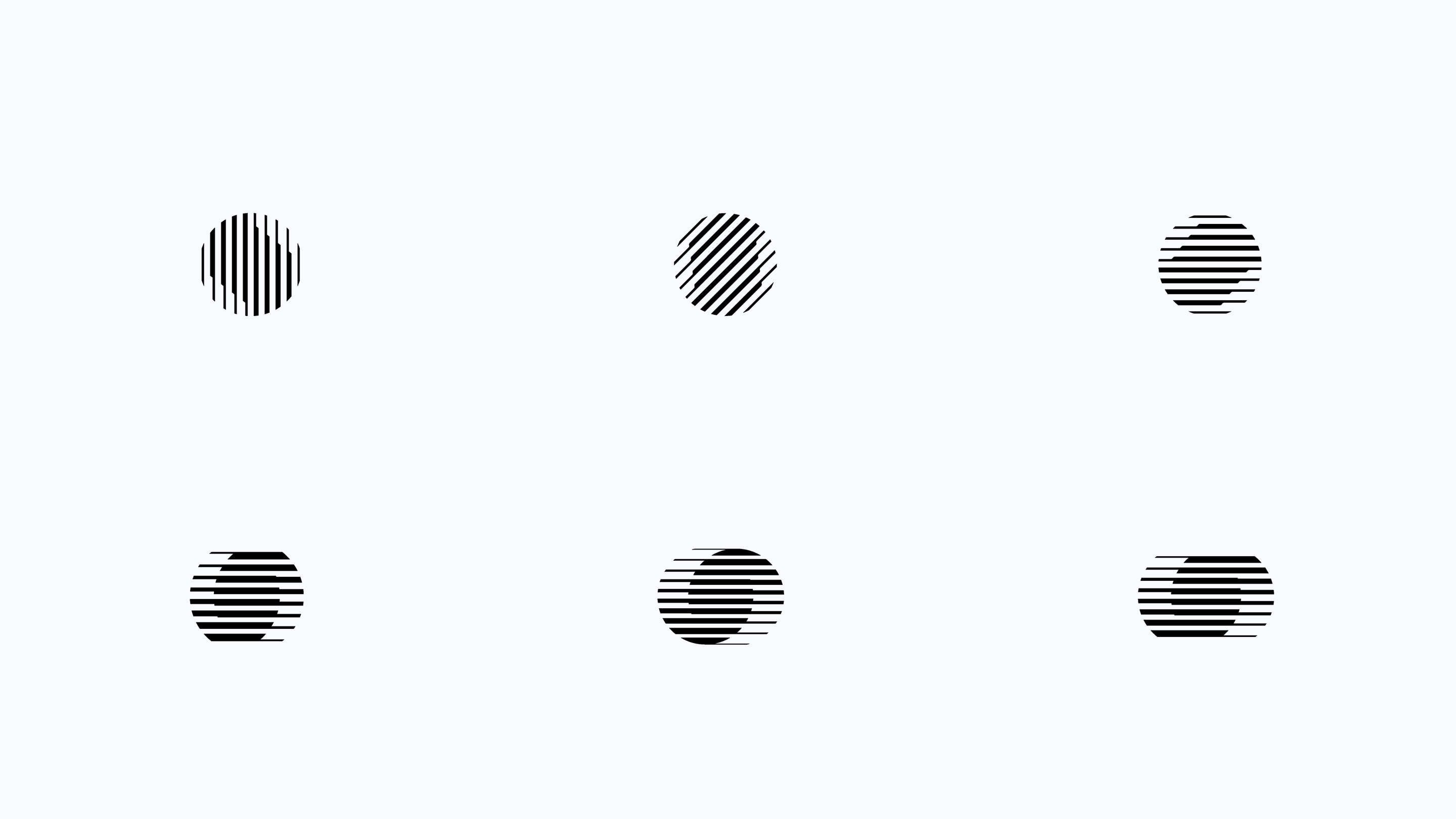
After establishing the core concept, we started to create lots of sketches and simple drawings. Every single one of them had a clear impact on the further development work. Only the most prominent ones raised closer to the final output.
This process started with a simple task: drawing figures and sketching the lines. Our design team explored additional inspirational directions based on the produced results, the company requirements, and its goals. We guided our client through each iteration, discussing and weighing down every single design approach.
Passing the final verdict
As the filtering iteration was coming to an end, we finalized several designs that our team has produced. It is the so-called “design funnel.” Our team and the client reduced the number of options, choosing only the ones that are likely to be the final output. In parallel, we discussed each produced variation altogether.
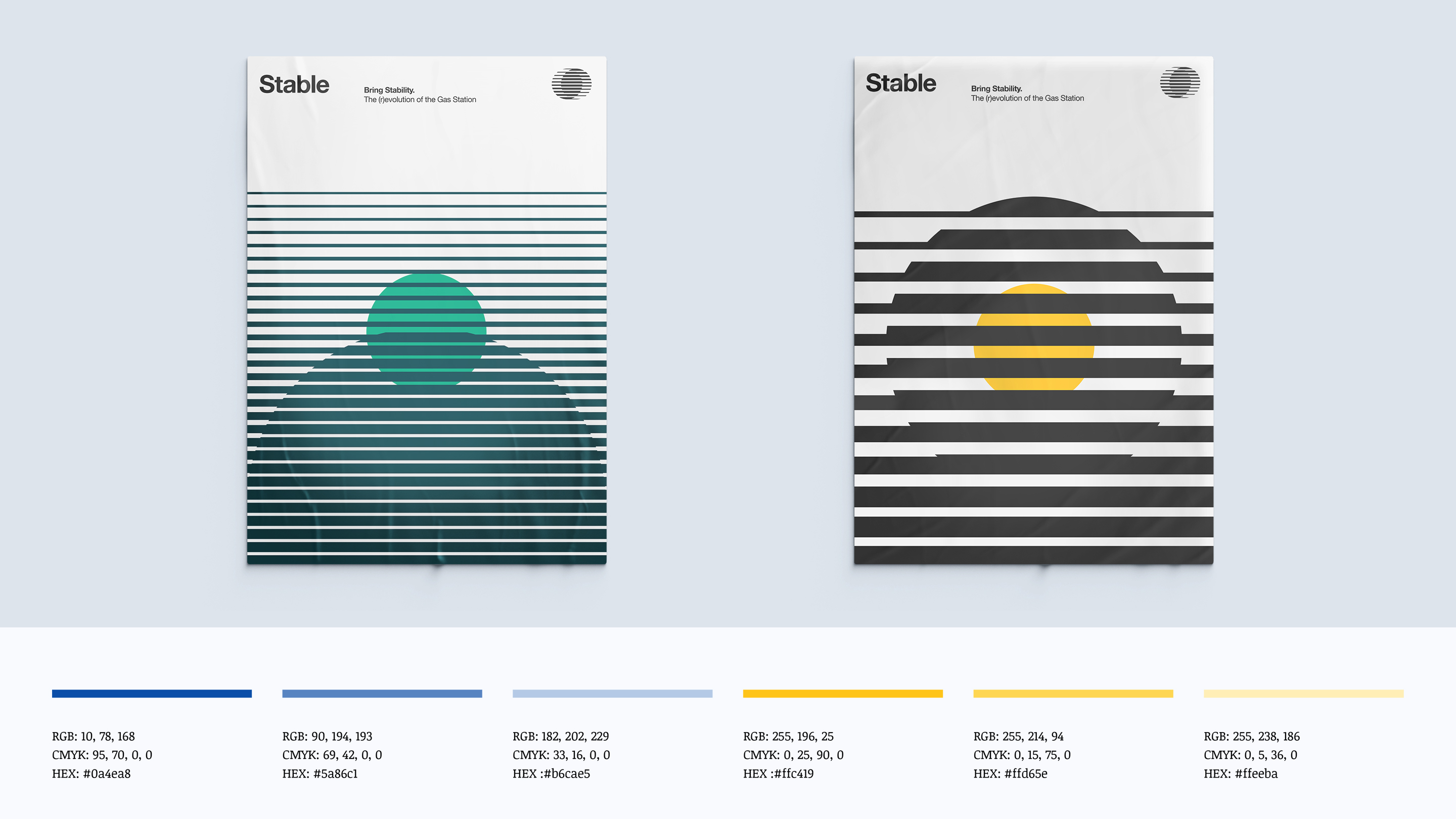
The process of creating a Stable brand got finished by the time our team enhanced all of the selected options with concrete detail. Once finalized, we added more elements to it. For that, we detail it and add colors, making the final logo look more appealing and attractive to the targeted audience.
Source of inspiration
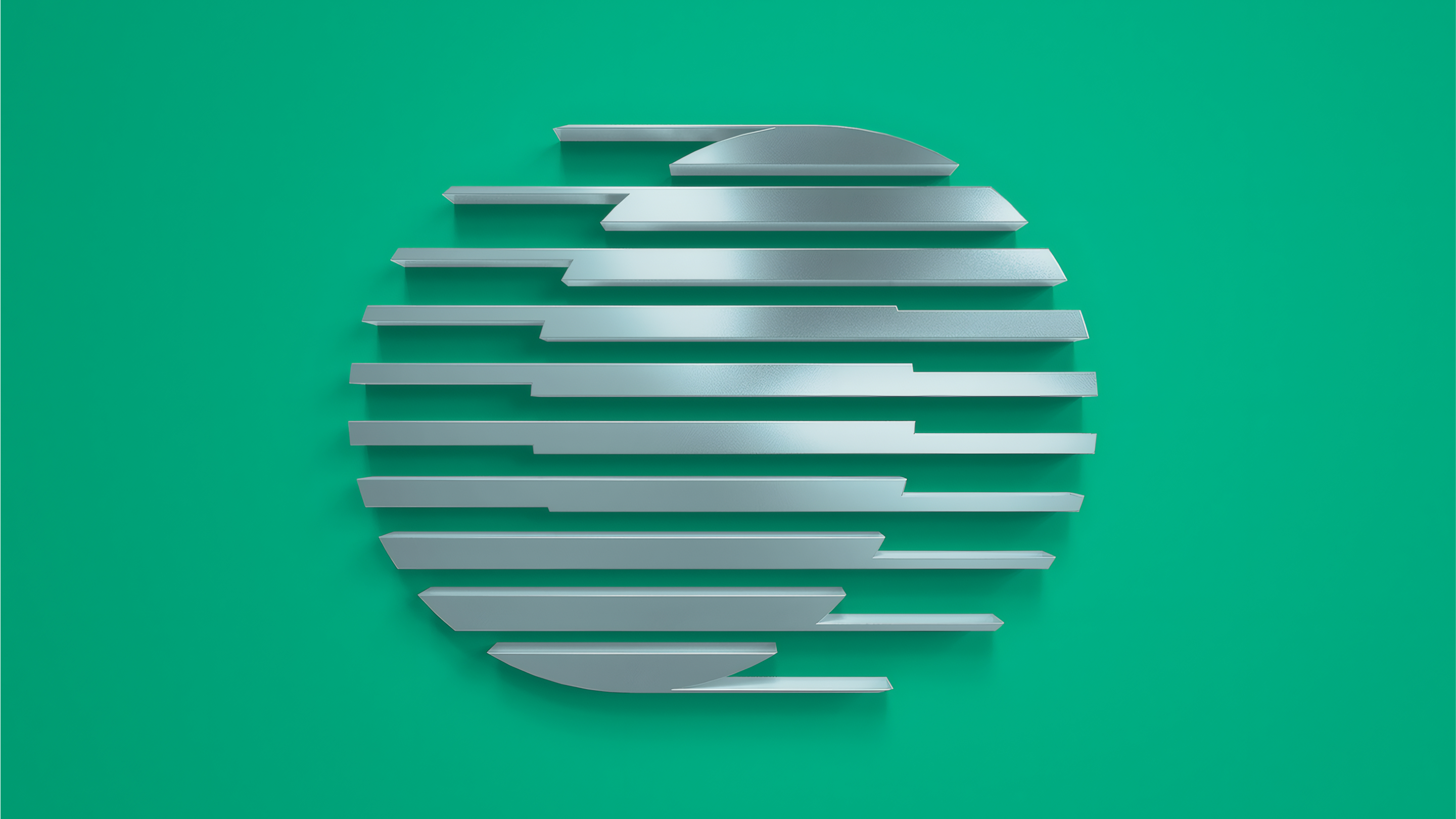
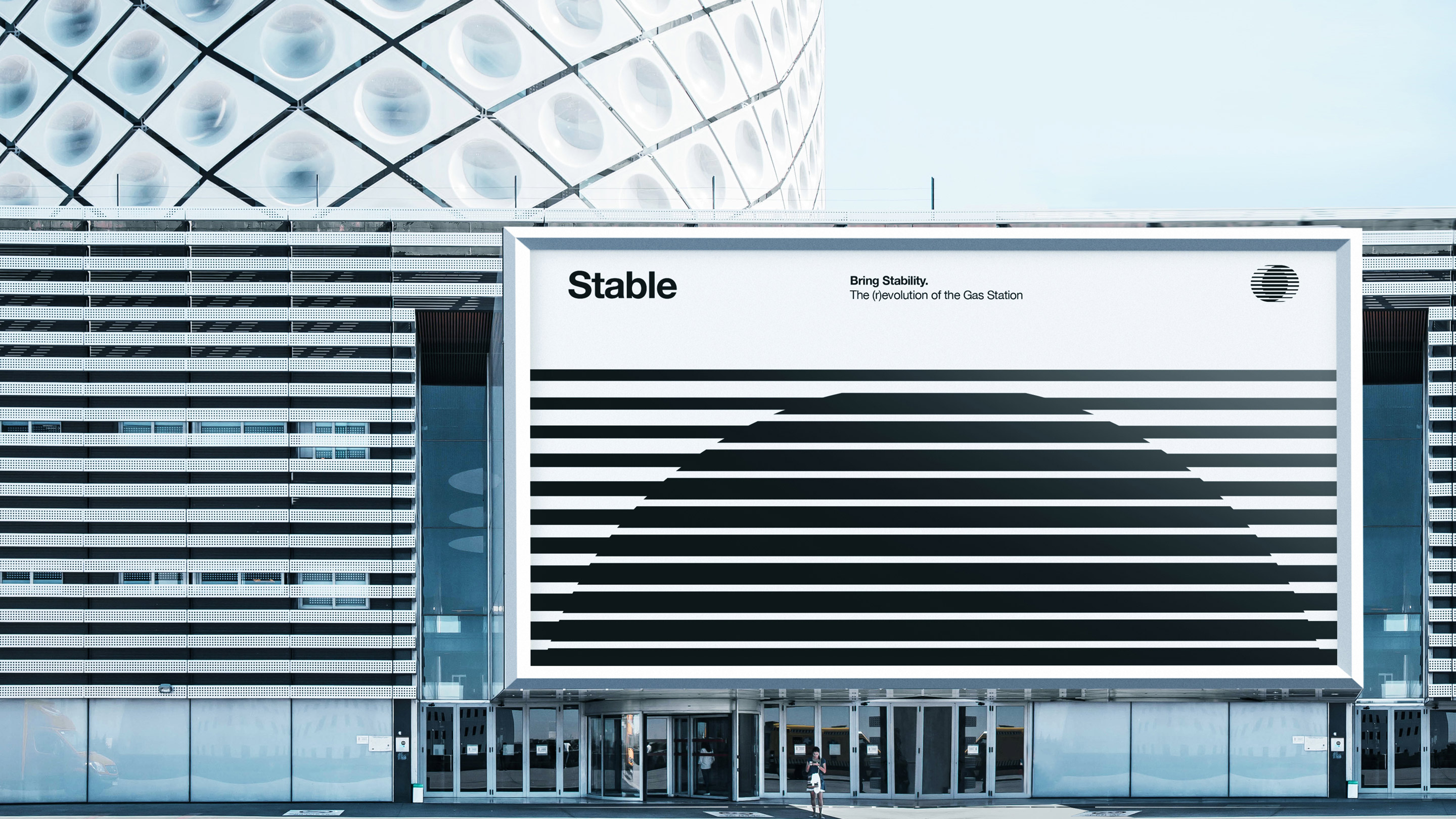
Most of the results and other significant design snippets metaphorically represent various road directions, highway paths, and broad panoramas, connecting to a car trip. Others got inspired by abstract and conceptual elements, like the ‘S’ symbol, which is the first letter in the project’s name. At the same time, it connects to the word “synergy” relevant for the project’s industry and the product our client produces: charging stations.
The collaboration continues
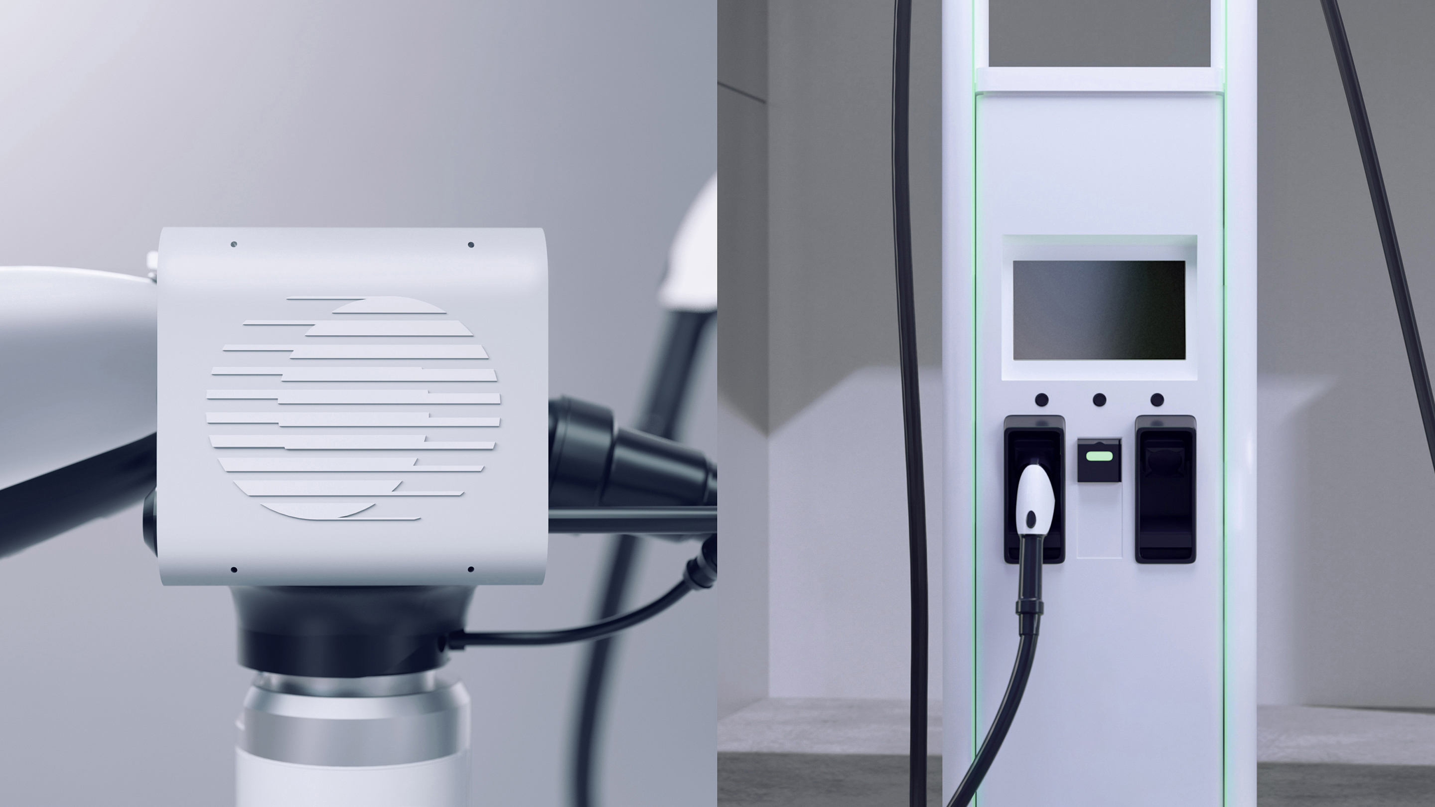
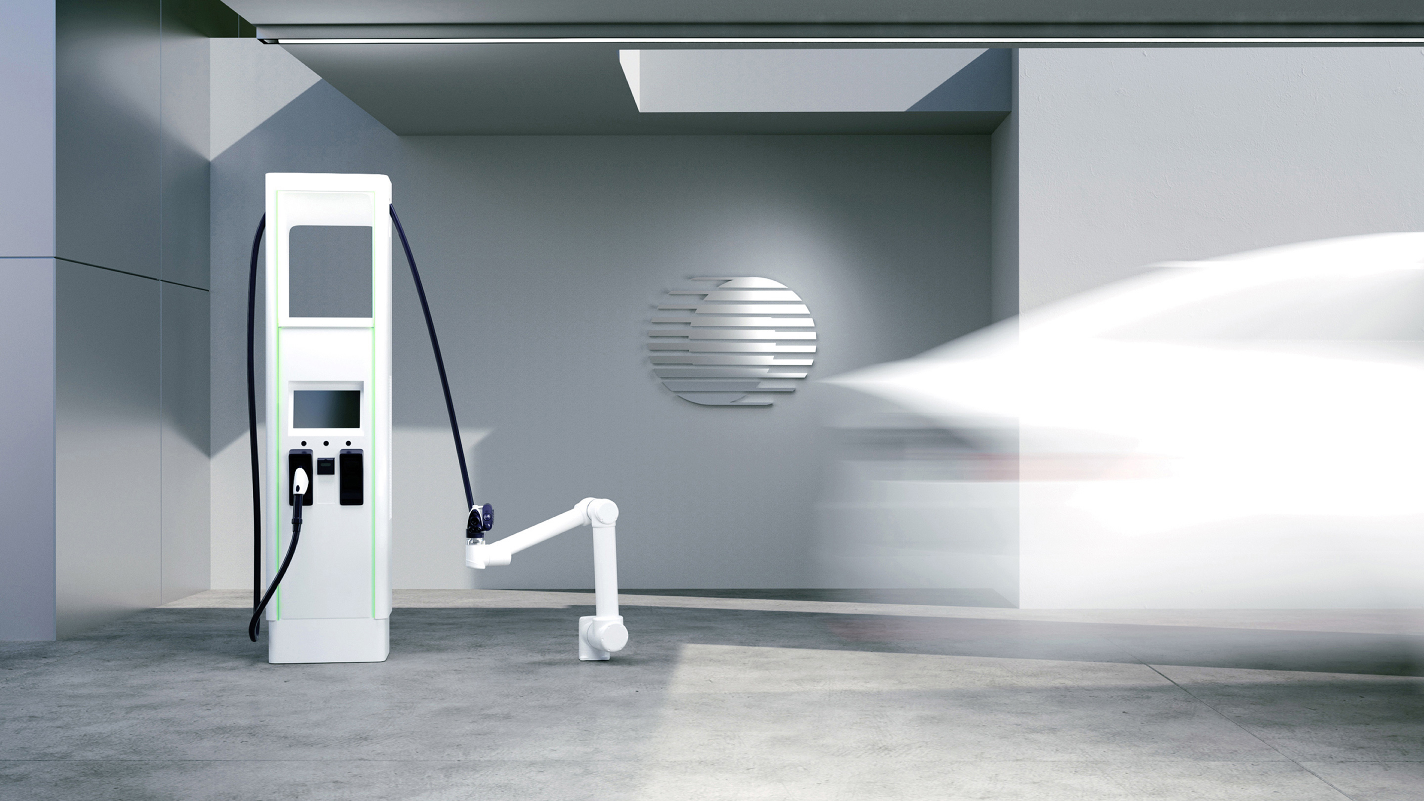
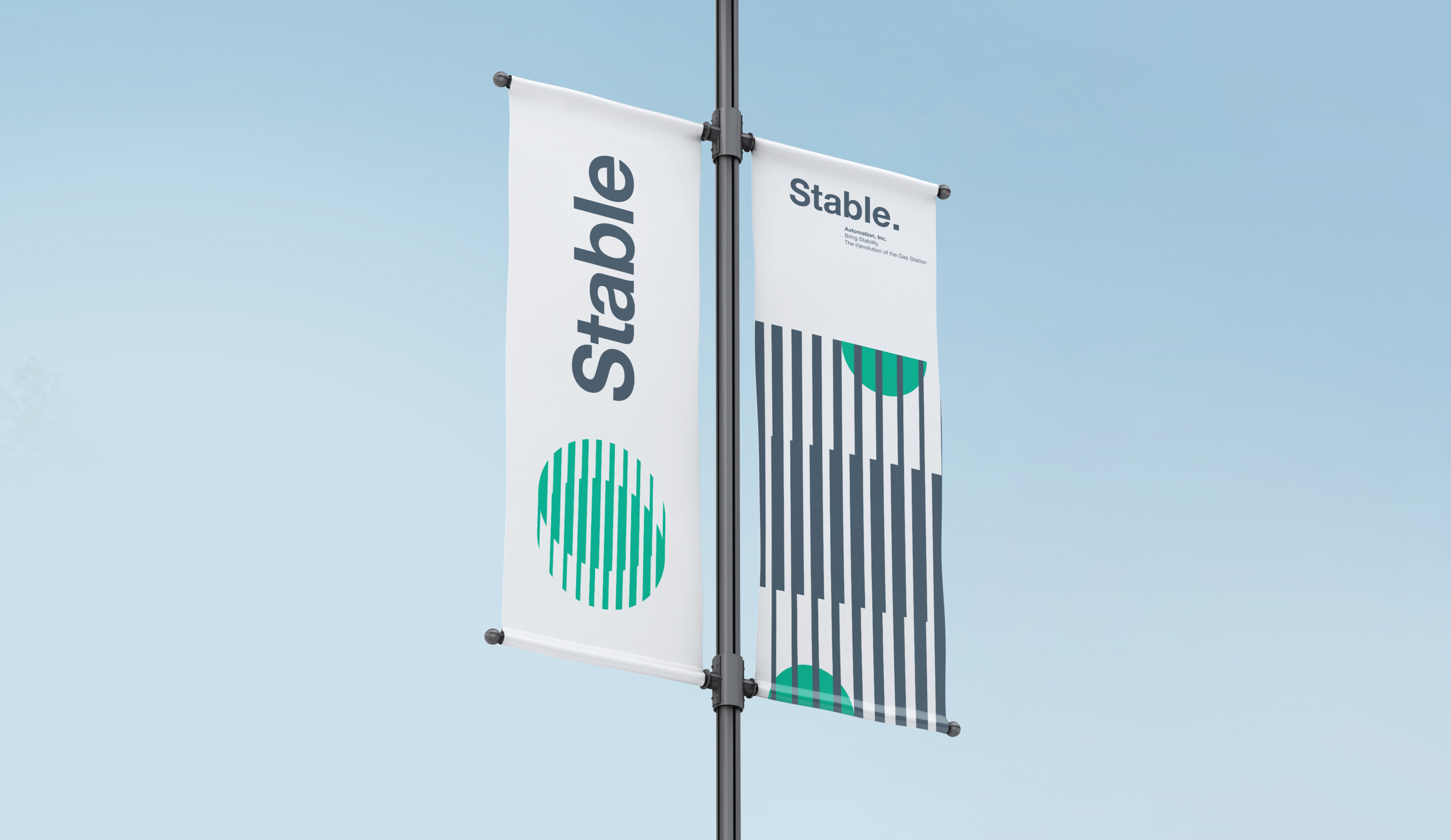
In the end, as we have progressed through this huge funneling process, our team has successfully delivered a solid brand identity. And to show its applicability and the potential experience that a Stable customer may have, we prepared a few composite shots of charging stations. It has also allowed our client to understand the correct logo placement and the aesthetic feeling it is radiating.
Together with the Stable team, we created a visual foundation for further brand development and gave a solid basis of how and where the brand logo should belong. Be it an offline environment or an online testing platform, Stable’s brand identity will change as the company continues to grow.
Feedback
We partnered with Ramotion from the earliest days of building our company, when we were just a small team, to define our brand voice and visual identify. Their team is very professional and worked impressively fast in close collaboration with us. By the end, they understood our customers so well that we even collaborated on UI design and web app development, which was an unexpected but significant benefit.
Several years later, we have become the trusted brand in EV charger deployment, with a visual identity that has remained largely unchanged from what we originally created—a testament to Ramotion’s skills. We are confident that our brand will endure for many years to come.