
The results of a recent A/B test conducted by HubSpot found that changing the color of a CTA button increased conversions by 21%. The key finding was not that one color is superior to others. Instead, it was the realization that small decisions, such as button colors, can have a significant impact on user experience and conversion rates.
When it comes to digital platforms, buttons might be seemingly small elements, but they play a crucial role in shaping experiences. However, buttons are seldom reduced to decorative practices, styling call-to-actions, or sticking to a color palette. Good buttons guide users throughout their journey.
Top UI/UX design agencies always pay close attention to buttons when designing digital experiences, thus creating a bigger impact and increasing their chances of getting hired. On the one hand, buttons help reduce hesitation and ensure intuitive interactions. On the other hand, good button design practices also provide clarity and improve accessibility of a design. Whether it is signing up for a newsletter, making a purchase, or navigating a website, buttons are involved in every step of the user journey.
In this article, we will explore the fundamentals of button design, along with the types and states of buttons. We will also look at some common mistakes and real-world examples of buttons that work well.
Read along as we explore the fascinating world of buttons in UX design.
Clickable Button Basics
When interacting with a website or a mobile application, before users even click a button, they need to recognize that the interaction is possible. Buttons play the role of signifiers that tell the users when and where an action is possible.
At the most basic level, button design is about signaling an action and directing users toward possible actions. Buttons communicate interactivity through visual cues, such as contrast, shape, size, padding, and placement. For example, a button with strong contrast and padding would stand out, telling the users where to click.
The appearance of a button should be such that it is easily distinguishable from the surrounding content. The choice of colors, text, and the overall design of a button should ensure that it doesn’t blend with the body text, hyperlinks, or section headings.
In digital interfaces, it can sometimes be difficult to differentiate buttons from links. Designers should follow this simple but effective rule: actions should look like buttons, and navigation should look like links. If users are expected to complete a task, such as submitting a form or adding an item to a cart, the interface should include a button. Navigation, on the other hand, should rely on links, guiding users between pages or sections.
Button Priority and Hierarchy
A unique feature of good interfaces is that they do not simply present options to users. Instead, they guide the users in their journey, making their interactions effective, efficient, and useful. This is where good button design can be valuable. Clear buttons help users make quick and correct decisions.
Buttons also add a layer of visual hierarchy that is critical to any digital experience. Different button designs and appearances help users identify high-priority actions from low-priority actions. If all buttons are designed the same way, they will then compete for attention, leading to confusion and a frustrating user experience.
Primary, Secondary, and Tertiary Buttons
Primary buttons represent the most important actions. These are the buttons that lead users on their journey. Whether it is completing a purchase, submitting information, or confirming a decision, the users click primary buttons to keep moving forward.
Secondary buttons are there to support the primary action. These buttons often include options such as “Cancel” or “Save for Later”, thus providing users with flexibility and control. Tertiary buttons, on the other hand, stay visually quiet and are typically used for optional interactions. It is important to note that the secondary and tertiary buttons should not compete with primary buttons.
Designers apply the principles of visual hierarchy where they leverage color, contrast, size, and placement among other physical attributes. When different levels of buttons are designed similarly and are equally dominant, this can lead to confusion, making it difficult for users to identify the next action.
Buttons vs. Links
The primary role of a button is to help users complete an action. These actions could include saving content, submitting information, or confirming a choice. The design of a button should clearly indicate the action.
Links, on the contrary, are there to aid users in navigation. In digital experiences, such as when navigating a website, links take users from one page or section to the next. Links also help connect external resources, thus playing a key role in user flow.
When creating the experience, designers should always choose consistency. This means that the purpose of buttons and links should be clearly defined, and these elements should then be used consistently. The goal is to create a familiar experience for users so they can efficiently complete their tasks.
Button Placement and User Flow
Buttons should be placed carefully in the user flow. The natural appearance of a button is at the point where users are completing a task or making a decision. Well-placed buttons support the user flow and make interactions feel intuitive.
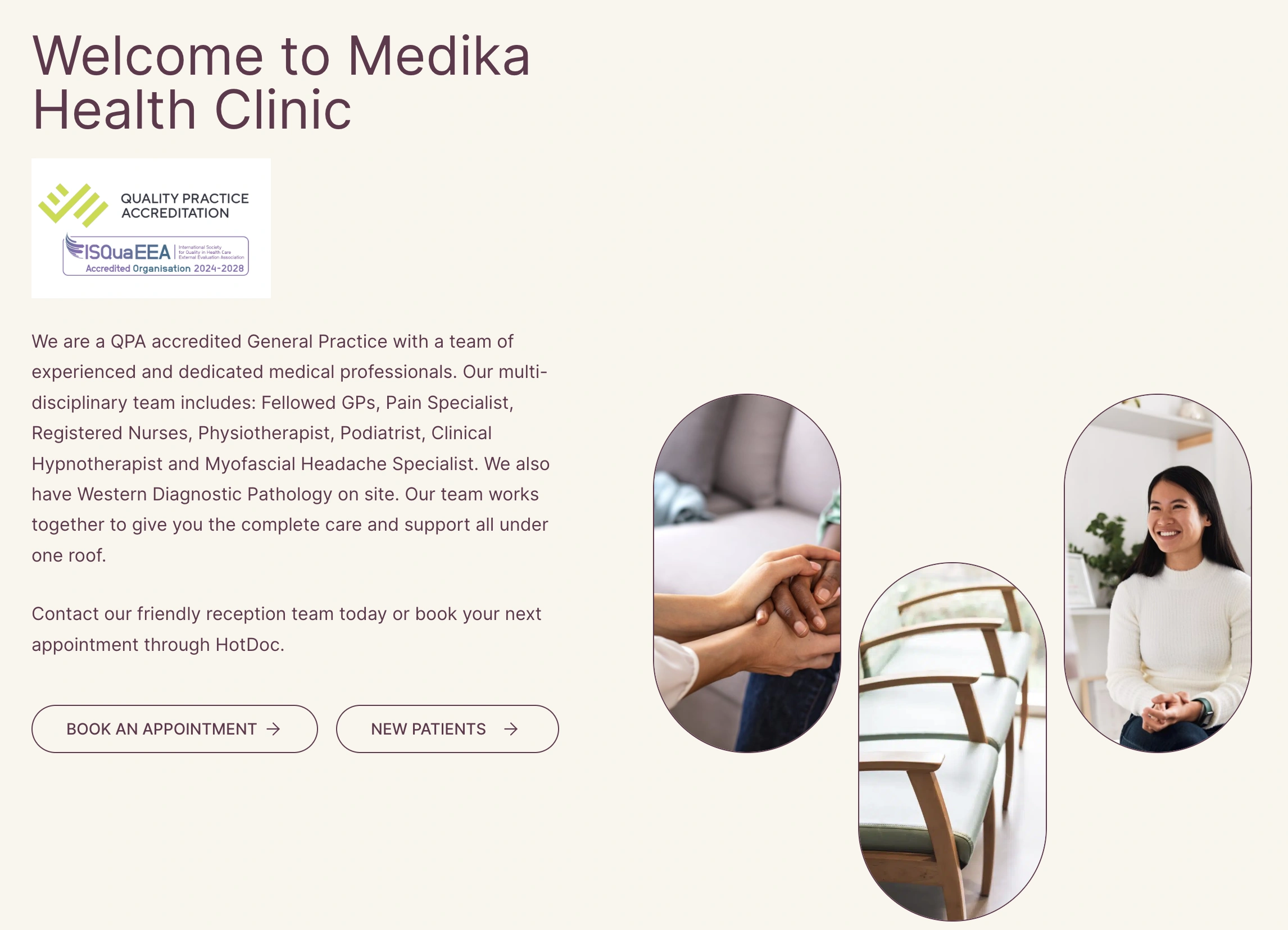
Button Placement on the Homepage
Buttons used as CTAs are most effective when they stay close to the form, content, or step they belong to. For example, a “Submit” button placed immediately after a form would create a clear relationship between the input and the next action. This proximity would help users understand context quickly.
If buttons are separated from their content and context, it leads to friction and frustration in the user journey. For example, if a “Confirm” button is too far away from the task, the users will not be able to see the connection between the information and the action. Careful button placement enriches the interface and supports decision-making.
Essential Button States
A button is not just a static feature on a digital interface. Therefore, it should feel as such when users interact with the buttons. Effective button designs are the ones that feel responsive as users make their way through the journey. This can be achieved by understanding and assigning meaningful states to buttons.
Button states are not decorative details added just for visual appeal. Instead, they provide instant feedback to the users by confirming interactions. A good website or mobile application considers the different types of interactions, including edge cases, to provide quick and helpful feedback to the users.
Default, Hover, and Pressed States
The default state of the button is what users see before they interact with it, thus making it an important design moment. Default states of buttons should be designed and presented in a way that they get users’ attention and appear clickable. This can be achieved with the help of contrast, colors, spacing, and text.
Hover state is what users see when they have their cursor on the button but haven’t clicked it yet. This state provides feedback and reassurance to the users that the button can be clicked. Subtle changes in color, shape, opacity, and highlights can help design the hover state.
The pressed state of a button is one that confirms an interaction in the form of a click or tap. This is the state that confirms the action. Designing pressed states differently for the web tells the users that their action has been registered.
Focus, Disabled, and Loading States
Focus states for buttons are critical for accessibility and keyboard navigation. When users tab through a website, visible outlines, shapes, or indicators help them understand where they are in the interface. This awareness of the current state ensures that interactions are meaningful and helpful.
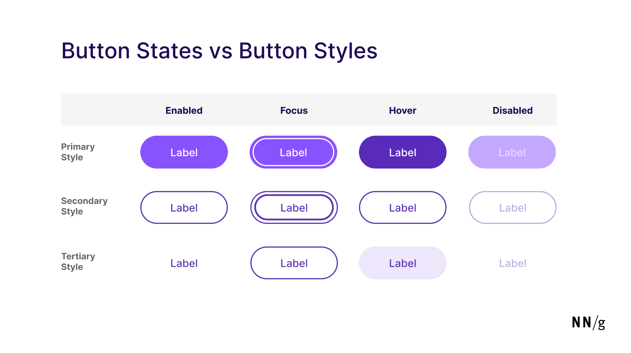
Button States and Styles (Image Source)
The disabled state is used for a button when an action is unavailable to the users. This state restricts the users, thus serving as a disaffordance. Disabled states should be used with extreme care, as their overuse can confuse.
Loading states help users understand that their interaction is registered, but the request is being processed. The utility of the loading state lies in the fact that it prevents repeated clicks and taps. Indicators such as a simple spinner can make an interface feel more reliable.
Clear Button Feedback
One of the most effective ways to ensure that users get feedback without confusion is the use of microinteractions. These small transitions, in the form of a subtle animation or a quick confirmation message, can reassure users that their interaction is recorded without interrupting their flow.
When it comes to microinteractions, it is important to avoid busy and slow animations. The goal is not to decorate the interface but to help the users where they are in the journey. Designers should only include microinteractions that are subtle, fast, and purposeful.
Button Copy That Reduces Hesitation
Buttons are not all about visual design. A big part of creating effective buttons involves the words that go on a button. Even well-designed buttons can be confusing if the labels are unclear and ambiguous. The labels with buttons help guide the users and add to their satisfaction level throughout the experience.
Good button copy focuses on clarity, specificity, and expected outcomes. The choice of words should be simple but specific to the task, so the audience can interpret the meaning quickly.
What are the best button copy practices that reduce hesitation?
Some best button copy practices that reduce hesitation are as follows.
- Short, specific labels
- Say what happens next
- Highlight risky action labels
When it comes to good button copy, some of the best practices are as follows.
Short, Specific Labels
The best action button labels do not include unnecessary details. Instead, they are short, specific, and action-oriented. Button labels work best when the focus is on a clear, strong action verb, such as “Download”, “Save”, “Cancel”, etc.
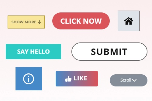
Describe Actions with Text (Image Source)
When writing text for a button, avoid wordy, sentence-length labels. Such long labels slow the users down while increasing the risk of ambiguity. When it comes to websites and mobile applications, the goal of button copy is to ensure quick understanding of the action.
Say What Happens Next
Another strength of effective buttons is to reduce confusion by telling the users exactly what will happen when they click or tap. Labels such as “Submit”, “Continue”, or “Next” are vague as they do not tell the audience what will happen or what to expect.
Good buttons provide specific information. For example, strong labels would tell the users to "Download Report”, “Create Account”, “Book Demo”, or “Save Changes”. This specificity becomes even more important in forms, checkout experiences, and multi-step flows. Meaningful, action-driven button copy creates a smooth user experience.
Risky Action Labels
One of the key usability heuristics is error prevention, and buttons can play a critical role here. When an action is destructive or irreversible, the label should deliver the message directly. Labels such as “Delete File,” “Cancel Subscription,” or “Remove Account” make the outcome explicit and reduce errors.
Vague confirmation text creates unnecessary risk. A button that simply says “Confirm” or “Proceed” does not highlight the consequence, thus increasing mistakes. Good button design prioritizes transparency, especially when decisions carry irreversible outcomes.
Common Button Design Mistakes
Designers and researchers should always be careful when creating buttons and writing labels. Many button problems seem minor at first glance, but they can create hesitation in important moments. If users pause and think where to click, do not get feedback, or struggle to complete a task, the website experience suffers more than expected. It is critical to note that even small button mistakes can significantly impact the overall user experience.
What are some common button design mistakes?
Some common button design mistakes are as follows.
- Having too many primary buttons
- Designing buttons that don’t look clickable
- Writing vague labels and weak feedback
- Buttons with small targets and low contrast
Some common button design mistakes are discussed below.
Too Many Primary Buttons
One of the most common mistakes is associating multiple actions with the same visual priority. When multiple buttons compete for attention without a distinct visual hierarchy, the user journey can become frustrating.
When designing buttons, make sure to communicate one specific action with each button. When highlighting supporting actions, use secondary or tertiary buttons that don’t overshadow the primary ones. Clear hierarchy improves usability and helps users move forward with confidence.
Buttons That Don’t Look Clickable
Another common mistake is to design buttons that do not look clickable. Overly minimal or abstract buttons can make interactive elements difficult to recognize. Although a clean and simple design is a good idea, it is important to have enough visual cues that the users can identify the clickable elements in the interface.
It is important that interactive elements, such as buttons, look and feel interactive at first glance. Designers should use contrast, spacing, and borders to signal action without explanation. A simple usability test can help understand whether the users are locating buttons easily.
Vague Labels and Weak Feedback
Button labels, as mentioned above, play a significant role in button design. Labels that do not explain the action or outcome create hesitation and overwhelm the users. Generic labels can make users stop and think, thus slowing them down.
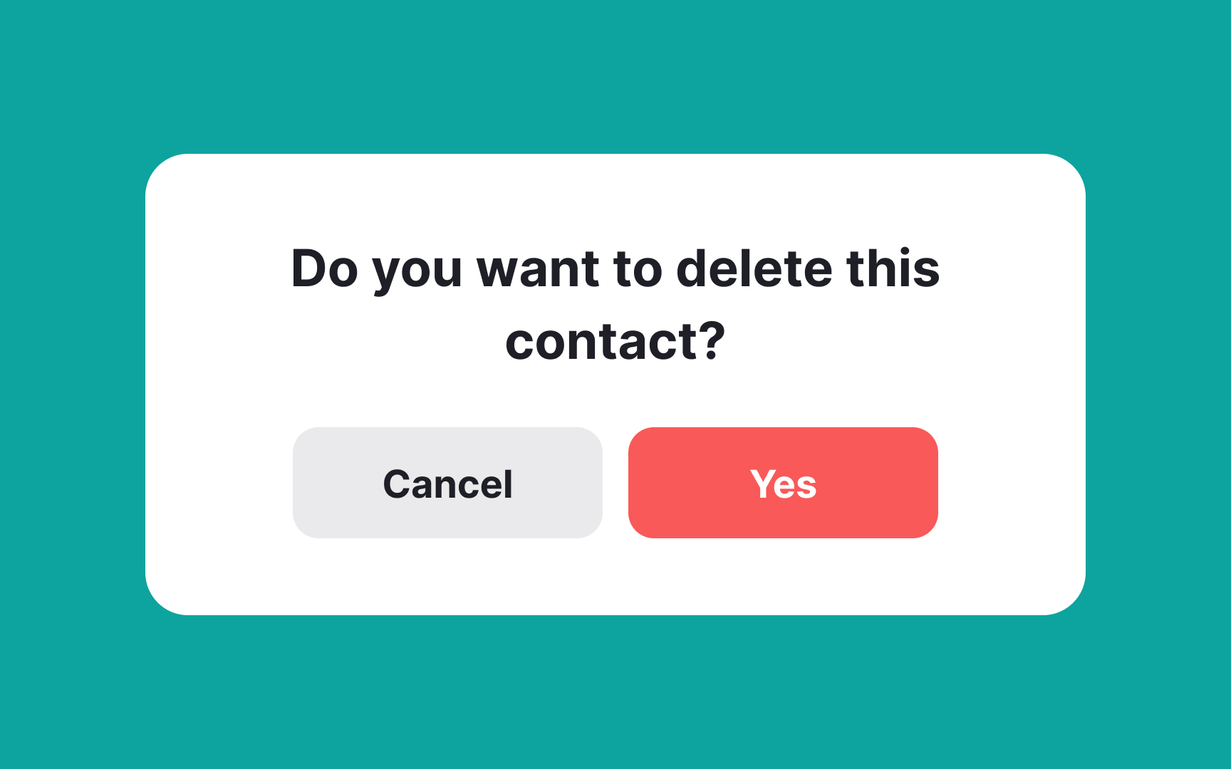
Buttons with Vague Labels (Image Source)
Additionally, visual feedback can signal whether the users’ actions have been registered or not. A small color change, confirmation message, or a loading indicator can be reassuring for the users. Without feedback, users may click repeatedly or second-guess whether the system responded in the first place.
Small Targets and Low Contrast
Designers should also ensure that the buttons are easy to tap. When it comes to smaller devices, such as mobile phones, where precision is limited, and a small tap can lead to different actions, it is important to create large target areas with enough clear space for buttons. Small touch targets often lead to missed taps, particularly when users are interacting quickly or on smaller screens.
Another key issue to consider is contrast in the interface. Low contrast between text, backgrounds, and other elements reduces usability. Buttons should be visually distinct and have enough spacing around them to feel clear rather than cramped.
Button Design Examples
Now that we know the best practices of button design and which mistakes to avoid, let us take a look at a few practical examples. The examples below show how visual hierarchy, placement, copy, and brand expression work together to create buttons that feel intuitive and easy to use.
Oddit
Oddit is an excellent example of tactile buttons where the buttons show depth, shadows, and strong contrast to create a physical look and appeal. These buttons do not blend into the interface but appear more pressable, as they would on a physical device or machine.
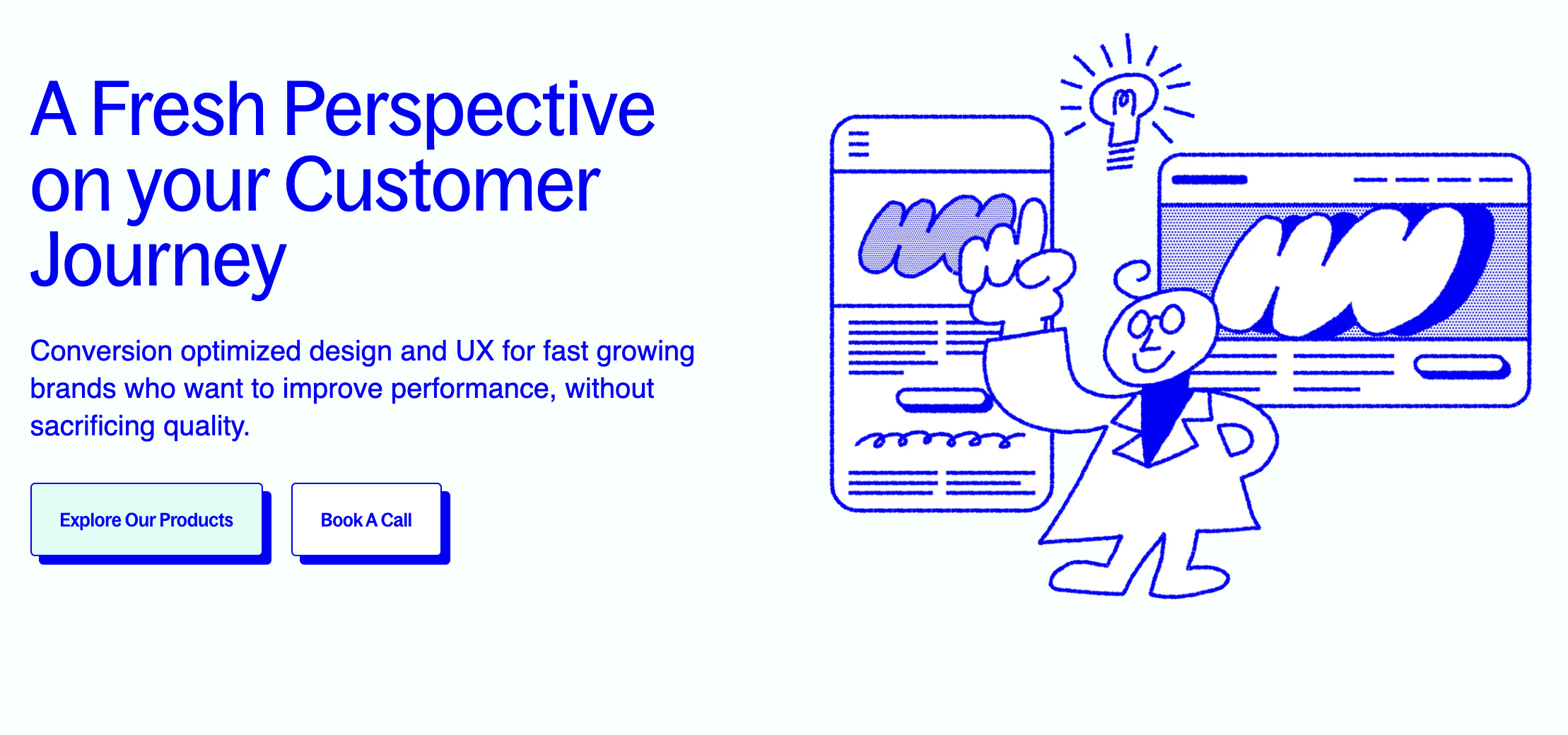
Oddit’s Physical-Looking Buttons (Image Source)
The approach by Oddit reinforces that visual affordance still matters in modern interfaces. It also highlights how physical-looking buttons can invite clicks from users without being overwhelming.
Darkroom
Darkroom relies heavily on high contrast when it comes to buttons being used for CTA. In Darkroom’s interface, the buttons clearly stand out because of the clear contrast between the background and the button colors.
- Use as a reference for high-contrast CTA design.
- Show how color creates clear visual priority on a minimal background.
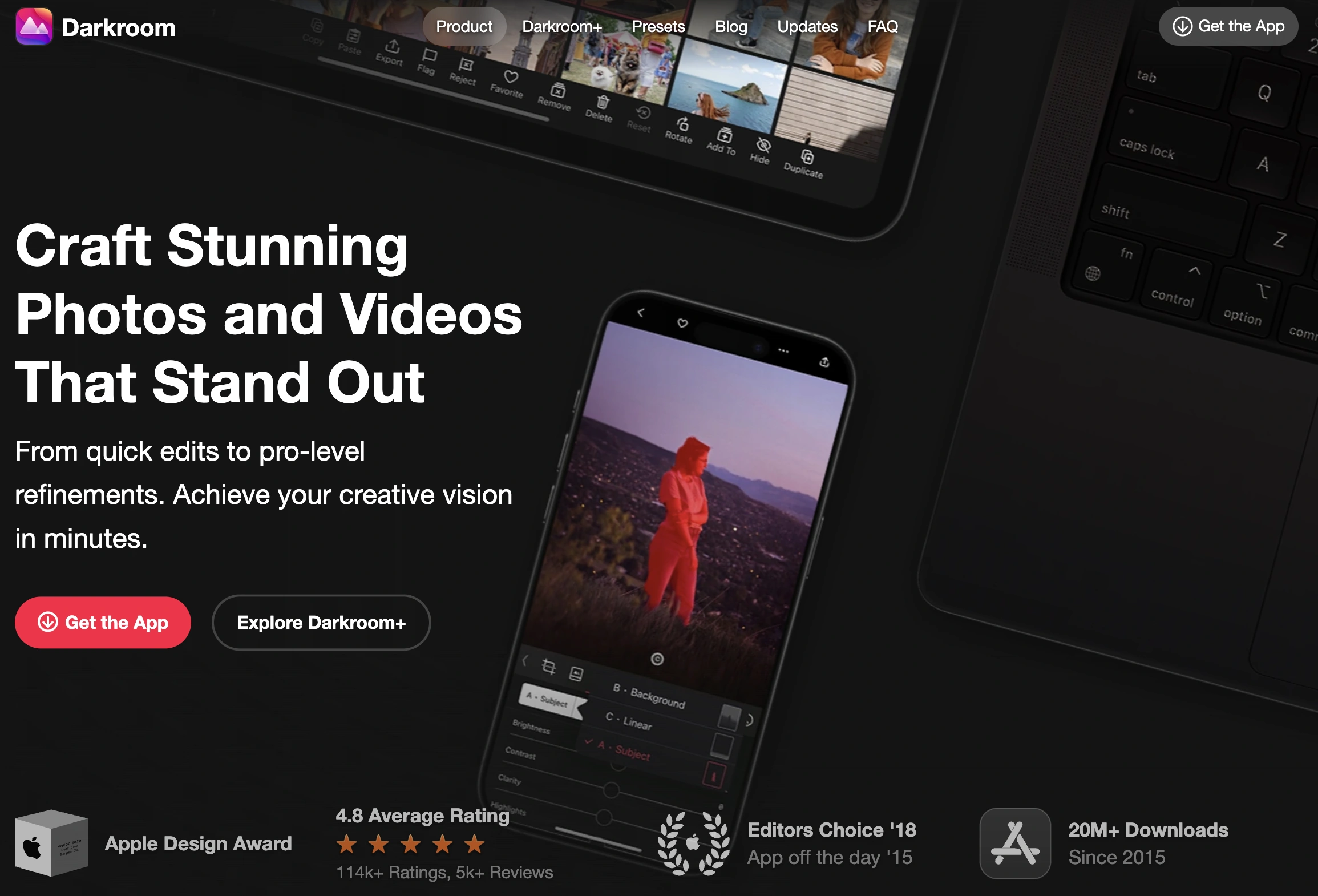
High-Contrast Button Design by Darkroom (Image Source)
This example highlights how color can establish a clear visual hierarchy on a minimal background. Now, different elements are not competing for attention and, therefore, the CTA becomes an obvious focal point.
WorkMade
WorkMade presents a useful, practical example of cases where the background is busy and visually rich. Although the hero section of the homepage has a strong background, the buttons are not competing for attention. Instead, they are simple and use clean styles to ensure clarity and accessibility.
- Use as a reference for restrained buttons in visually rich layouts.
- Highlight how a calm contrast can work inside a busy hero section.
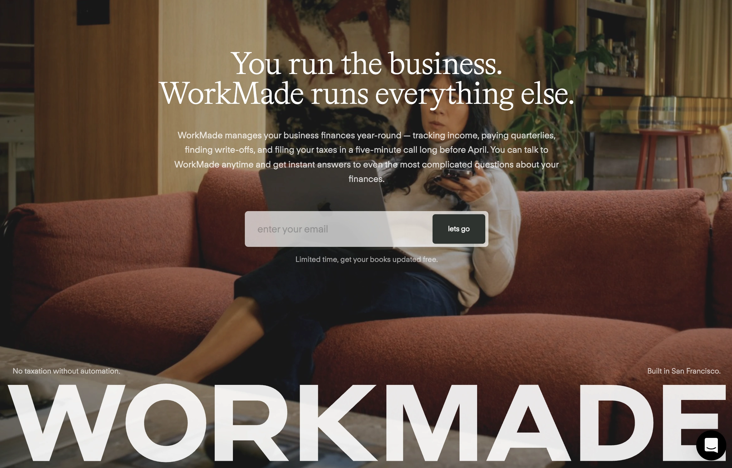
Restrained Buttons in Rich Layouts (Image Source)
This approach indicates how calm contrast can work effectively when the background is busy. In such cases, instead of using bold contrast and flashy buttons, it is a good idea to use simple designs and integrate them into the experience.
Monad
When it comes to using different states of buttons, particularly the hover state, purposefully, Monad serves as an excellent example. The hover state gives quick feedback to the users without any dramatic movement or animation. The design, therefore, feels responsive without distracting users from the rest of the page.
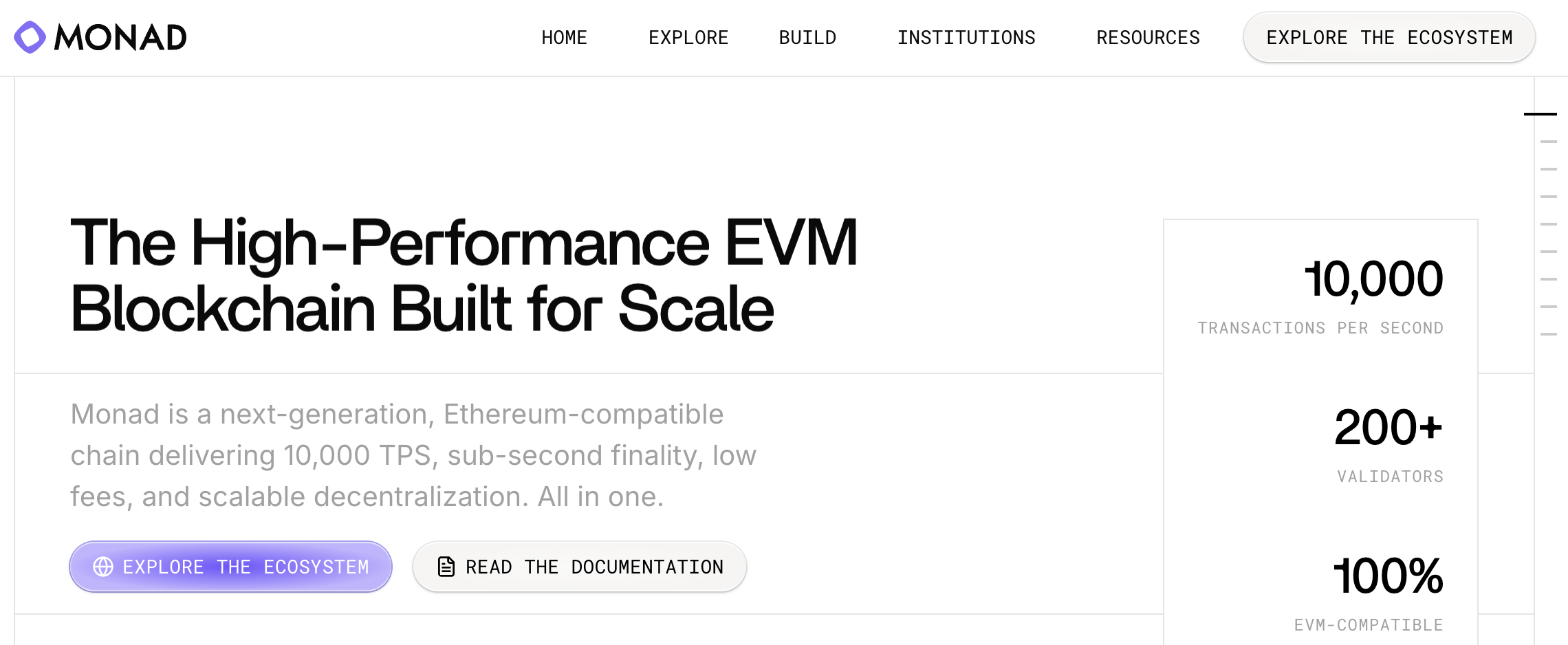
Effective Hover Effect by Monad (Image Source)
Monad’s button design strategy shows how motion in hover states can strengthen button design. The effect emphasizes the intended action, helping users recognize where to click without overwhelming the interface.
Distributional
Distributional is an example of color-driven button visibility, where CTAs stand out because of the vibrant color choice. It is important to note that the choice of color for buttons does not disrupt the interface. The buttons stand out through contrast and clear visual hierarchy.
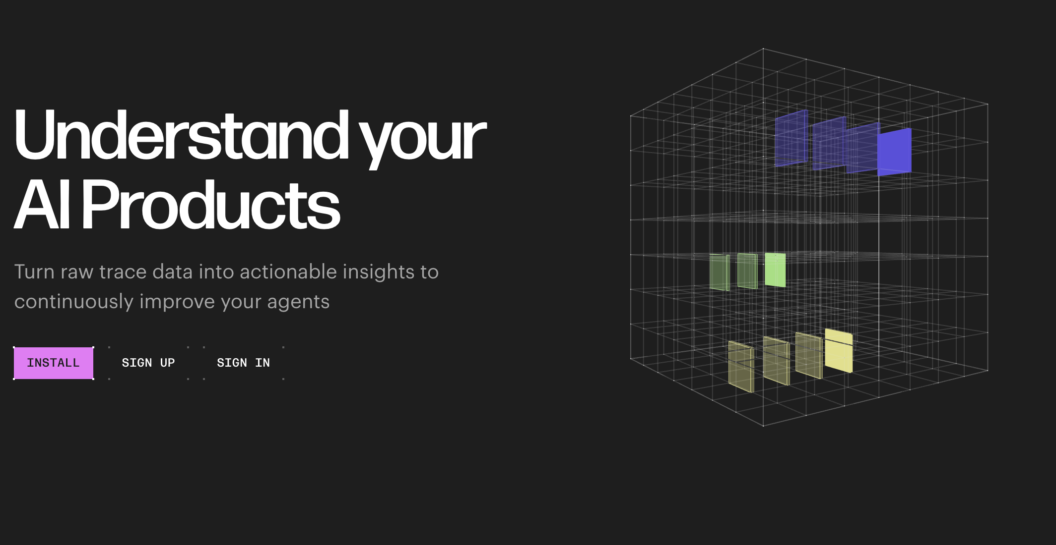
Drawing Attention to CTAs (Image Source)
Distributional’s website highlights that CTAs do not need to overpower the interface to be effective. With careful and consistent selection of buttons, it is possible to create a seamless user experience.
Airborne Studio
Airborne Studio is an interesting example to look at when branding is a priority in designing interfaces and buttons. The buttons and their states on Airborne Studio’s website are closely tied to the brand identity.
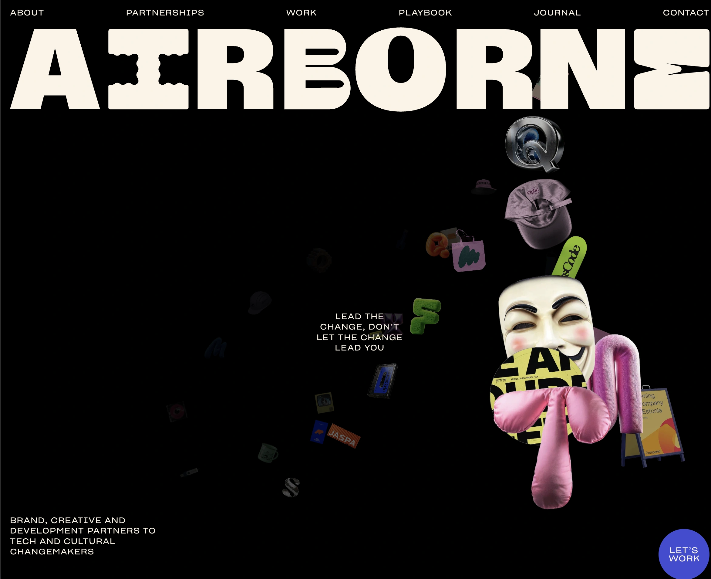
Branding and CTAs (Image Source)
The site also shows how unconventional placement can be memorable while still supporting usability. The design and placement of CTAs feel a little less predictable than other layouts, but it is not overwhelming for the users.
TechTO
TechTO is a useful example for simple button designs that are then enhanced by hover effects and light animation. The buttons themselves are simple and minimalist, but small interaction cues give them the action-button feel.
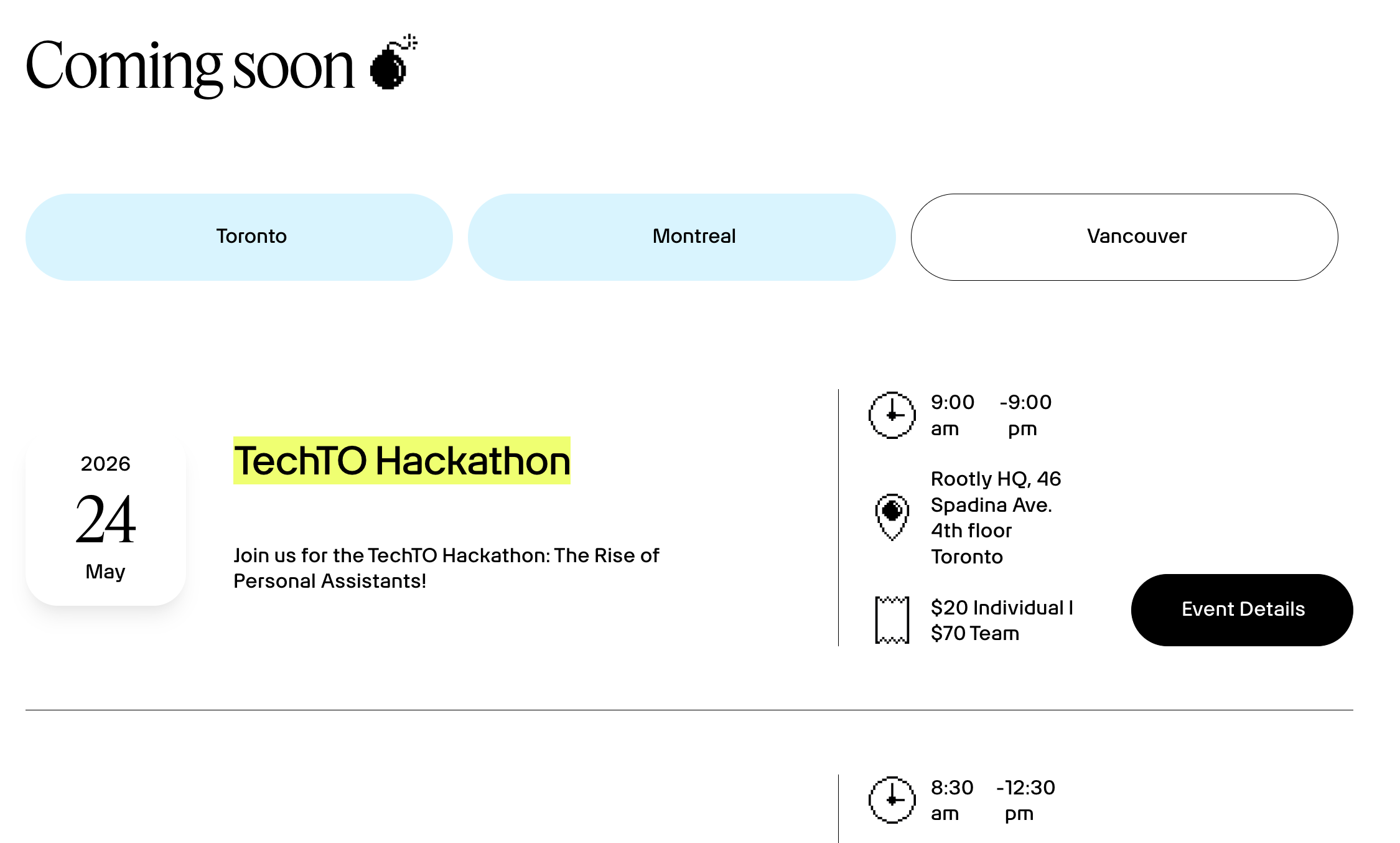
Buttons that Highlight Interactions (Image Source)
The approach used by TechTO highlights how small motion can make the buttons stand out without impacting the overall user experience.
Conclusion: Good Buttons Make the Next Step Easy
Good buttons are not just visually appealing. They help users understand what to do next confidently and satisfyingly. When buttons are designed with care, they reduce hesitation, clarify decisions, and make interactions seamless. Small details in button design can have a meaningful impact on how users move through a product or service.
Effective buttons rely on a few key principles working together. These include clear hierarchy, responsive states, clear copy, and reliable feedback. When these elements come together, users feel supported throughout their interactions. Ultimately, the best buttons feel obvious, trustworthy, and require minimal effort from the users.

Creates insightful, strategy-driven content that translates complex design and branding concepts into accessible knowledge, supporting Ramotion’s mission to elevate digital experiences.