
Do you know that the email channel is still one of the most effective ways to communicate with your clients? Despite all the hustle around social media and AI-powered assistance, the traditional approach to reaching your target audience through a digital newsletter remains financially successful, delivering a remarkable $36 in return for every $1 spent.
Given that over 4.7 billion users worldwide send and receive over 395 billion emails daily (according to recent studies), this is a natural outcome. People love digital correspondence: 99% of us check our inboxes every day and spend at least 10 seconds, resulting in average open rates of 21%-25% across all industries and CTRs of 2%-4%, generating solid revenue for businesses.
Let's dive a bit deeper into email design: what it is, how it differs from the website, what mistakes to avoid, and how to take it to the next level using examples from popular brands.
What Is Email Design?
Email design is a strategic process of shaping a company's message that not only delivers the key point but also provides real value to recipients. It involves close collaboration among the advertisers, marketing team, email designers, and the branding squad, who ensure the message supports the company's mission, stands out in the crowded inbox, and builds trust and reputation. In some cases, it is a tool that assists with important routines such as transactions, returns, and problem-solving interactions.
At its core, email is a well-formatted, properly structured HTML layout enriched with multimedia that meets rigorous web standards, accessibility principles, and laws. It is brand consistent, fully responsive, mobile-friendly, accessible, and informative.
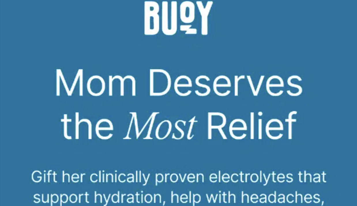
Email Design vs. Web Design
Email design is not just a minified or revised version of web design, even though they have a similar core built with HTML and CSS. Dealing with numerous limitations such as restricted space, short attention spans, tricky rendering across browsers and operating systems, tough competition, and strict ESP policies, digital newsletters balance functionality and design to achieve their goals.
The main differences between these two instruments can be seen in the following areas:
- Technical constraints: Email design cannot leverage the full power of HTML and CSS, resulting in nested tables and outdated stylesheets.
- Size: Email design is usually limited to a width of 600px. Even though it can be as long as you want, it is highly recommended to avoid excessive scrolling, as subscribers and ESPs do not like that.
- Rendering: Email design is subject to inconsistent rendering because web browsers and operating systems tend to interpret HTML and CSS styles differently.
- Dynamics: Email design cannot entertain viewers with web-like animations. It can use only small effects and animated pictures.
Therefore, email design requires a comprehensive approach that leads to a carefully balanced structure with lightweight multimedia, clear message delivery, time-tested, entertaining elements, a client-safe environment, accessibility features, and ESP-approved qualities, all within a small amount of space.
This could be challenging to achieve, yet with the help of the best agencies for brand identity design any company regardless of their skills and experience may succeed.
How to Structure an Email People Read?
Do you know that people get from 50 to 120 emails per day on average? Recent studies have shown that email volume has reached unprecedented levels, with 395 billion messages sent and received daily. Even though the number of messages an individual receives depends on many factors, such as work, location, or personal preferences, this data still indicates tough competition in the inbox. This means your email design needs to be not just valuable but also perfect across boards to stand out from the crowd. Here are several professional recommendations for cutting through the noisy mailbox by building an effective core structure and design.
Clear header and opening message
As in web design, the header is one of the most critical elements of a digital newsletter. Not only because it is the most-viewed part, but also because it makes the first impression and provides arguments that help viewers decide whether to move forward with the email or abandon it right away. Therefore, it must be informative, impactful, valuable, compelling, and engaging.
Here is what you can do to instill these qualities.
- Show the value right away. Remember, your subscribers do not have much time; use their short attention span smartly. Focus on your mission and make the value clear.
- Make the header branded. A company's trustworthiness and credibility are vital factors for viewers and decision-making. Demonstrate the logotype or slogan immediately, and incorporate branded colors, typography, and multimedia.
- Produce a powerful first impression. Impress with your offer, establish a positive atmosphere, and do not forget to provide visual cues to move forward.
Strong visual hierarchy
Visual hierarchy is the cornerstone of great design and overall engagement. Even though, as a purely compositional arrangement, it does not look as impressive or impactful as a hero image, for instance, it still plays a crucial role in guiding readers through the copy and "feeding" them the information they need to engage. It ensures the key message and critical details are perceived and understood.
To make an email easy to scan and navigate viewers along the reading flow, try these best practices:
- Use scale to focus the user's attention on the crucial aspects. Introduce heading and short copy blocks.
- Employ spacing smartly. Even though digital newsletters are limited in space, the design need not feel cramped. Play with margins, padding, and whitespace to make the reading flow more comfortable.
- Create a logical section order. Stick to the progressive disclosure to ensure information is served in easily digestible bites.
Clear and visible CTA
The call-to-action button is the primary driver of conversions. Whether you want to direct readers to a new page or sell them a product right away, the email newsletter is the key element of the marketing strategy.
The rule of thumb is to have one impactful CTA for email. Use action words. Add dynamic effects and align them with the message to provide readers with a clear visual cue on what to do next.
Email Formats and Design Priorities
Producing an effective, high-converting, and impressive digital newsletter requires email designers not only to create a solid structure but also to align the information with the marketing goal and strategy. It is vital not to treat emails the same way, as they fall into several categories, each playing an important role in the company's successful presence in the channel. Here is the breakdown of the three main types of digital newsletters.
Promotional emails
Promotional emails do not need an extra introduction as they are ubiquitous. They do what they say: advertise the brand, product, or special offer. As a rule, they are designed to produce a quick yet powerful visual impact or deliver ultra-value that compels readers to take action.
The key characteristics of the promo emails are:
- The one key message that is reinforced throughout the reading experience.
- The concise yet straight-to-the-point arguments.
- The dominant CTA that appears throughout the copy.
- The clean layout and proper structure.
Newsletter emails
Newsletter emails are intended to be informative. They might draw attention to new releases, lay the groundwork for upcoming sales, or reinforce brand identity by offering expert insights on the subject. These emails are well-curated. They are not just a list of links or random information. They stick to one topic and deliver it to recipients through various editorial approaches spiced up with brand identity. Often, they have a clear rhythm, a strong visual hierarchy, carefully selected multimedia, and engaging copy.
Transactional emails
Transactional emails are the workhorses of email marketing and digital sales, enabling effective, productive, and comfortable communication between websites (systems or applications) and clients. Great examples in this category include password recovery emails, shipment data, and welcome-on-board notifications.
These digital newsletters prioritize key information and provide readers with the tools they need to achieve their goals. They are not overloaded with multimedia or decorations; they feature only the data needed to move to the next step and improve comprehension.
Mobile-Friendly Email Design
Mobile email open rates have reached staggering levels of 60% among Generation Z and Millennials. Optimal performance across screens has become not just fundamental for high conversions and interactions, but also imperative for keeping up with trends and meeting the highly demanding expectations of your subscribers, giving your brand a chance to reinforce its position in the market and build a strong brand through email marketing. Here are several practical recommendations.
Mobile layout and tap-friendly buttons
Every email starts with a mobile-friendly layout. While in web design it is usually achieved through flexbox, in email design, everything is primitive because mobile browsers do not support advanced CSS features. To create a layout that works well across mobile platforms, coders have to use single-column layouts with basic tables.
Additionally, email templates must adhere to accessibility and ergonomic principles. This implies using readable, legible text sizes to improve reading flow, eliminating unnecessary decorations and multimedia, adding enough spacing, and making tappable areas (buttons, visual cues, and navigation) large enough so users can easily reach and activate them without zooming.
Images, copy, and white space
When it comes to mobile email design, unfortunately, there is no space for lavish decorations, overly impressive hero images, or lengthy text blocks. No one likes scrolling through their emails endlessly and spending precious time finding the necessary information.
If you want to make the most out of subscribers' attention spans and behavioral patterns, it is crucial to balance visuals and copy to provide a comfortable, engaging, yet informative and valuable reading experience. Email designers should add enough breathing space and avoid image-heavy sections that not only distract from the key message but also slow down the newsletter and raise suspicion with ESPs.
Accessibility, dark mode, and footer
This trio is often underestimated, but, along with the header and key message, it plays a crucial role in subscriber engagement and the overall success of the email marketing campaign and strategy.
The principles of accessibility help companies create digital newsletters that not only provide information for people with disabilities and other restrictions but also comply with applicable laws and regulations. They include supplying necessary images with alt text, ensuring optimal readability and contrast, employing dark modes, and, most importantly, treating the footer as the main tool for introducing regulations, such as pinpointing the unsubscribe button, adding a link to preferences, or featuring business information.
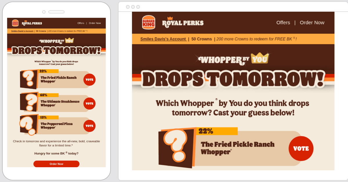
Email Design Mistakes to Avoid
Even though email design is pretty compact and a single-column layout seems unlikely to go wrong, in practice, coders and marketers still make mistakes. Here are several faux pas that regularly occur in digital newsletters, ruining not only the overall impression and message delivery but also the sender's reputation and the brand's authority.
Too much content
Too much content is perhaps one of the biggest mistakes that email marketers make. It is always tempting to show subscribers as many offers, data, and visuals as possible. But bombarding recipients with information never does any good.
On the contrary, not only do overly heavy emails fail to convey the key message, but they also overwhelm readers and scare them away, resulting in poor conversions. Therefore, try to minimize the use of messages in the template, blocks, CTAs, and CSS elements such as sliders, tooltips, and dynamic effects. Build the email design around one idea to keep the reader's focus.
Too many images
Along with information-heavy solutions, image-intensive emails top the list of the most popular mistakes made by marketers. Even though multimedia is one of the most reliable ways to reinforce the message, drive engagement, and leave a lasting impression, it can easily ruin everything when used in a small space.
Additionally, email templates enriched with multimedia could slow performance, cause inconsistent display, and raise suspicion among ESPs, resulting in rejection or blocking.
To avoid this mistake, go slow and low with multimedia, stripping excessive decorations. Select your pictures carefully, prioritizing those that support the message, and always add alt text for screen readers.
Weak CTA hierarchy
A weak CTA hierarchy is one of the trickiest mistakes to catch right away. It is caused by an ill-considered structure, poor reading flow, and a navigation system that fails to guide users through the copy and lead them to the call-to-action button. It is also intensified by vague wording, too many buttons, poor navigation cues, and flat design solutions. This error is closely related to low conversion rates and click-through rates.
The bad news is that this faux pas is difficult to catch. Only A/B tests might reveal it. Therefore, it is highly recommended to follow these best practices: stick to a single CTA, support the primary button with secondary, "quieter" links, make the main button design prominent, and use strong action words.
Neglected footer
Footer always comes last, and for many, it is an afterthought. However, this is a big mistake. The last section of the e-newsletter is crucial, as it must include the vital information required to comply with the laws and regulations governing legal operation in the country.
The standard-aligned footer should include business information, contact information, disclaimers, an unsubscribe button, and important links to adjust preferences and visit the Privacy Policy page.
Omit this part, and not only might you have issues with the regulatory bodies, but you also make the email untrustworthy and diminish your reputation and authority in the eyes of recipients and ESPs.
Therefore, never treat a footer as an afterthought. Give it a thorough attention. Make it clear and include all the crucial data. Use it to support your brand identity, comply with the laws, build trust with the clients, and increase credibility.
Email Design Examples to Save
Great email design can be seen across industries. Here are several examples to give you hints at how to create an effective newsletter in your niche.
Fenty
Fenty takes a traditional approach to delivering key messages, combining well-thought-out copy with well-supported visuals that don't feel cluttered. The layout is intentionally broken into sections to create a comfortable, meaningful, and engaging reading experience. The digital newsletter is clean, clear, and cohesive. It creates the impression of the women's empowerment that the brand is after.

Apple
Apple's digital newsletters are a great source of inspiration for those who want not just to run email marketing campaigns, but also to establish a strong brand identity and build healthy relationships and communication with clients. Along with the brand-aligned design, their emails consistently reflect the brand's ideology, mission, vision, and current strategy.
The key takeaway is that you do not need to reinvent the wheel – all you need is to be authentic and cohesive in your communication, whether it is on a huge screen via a website or on a small smartphone via an e-blast.

Jeni's Splendid Ice Creams
Jeni's vibrant brand identity is evident across its marketing campaigns, and its email channel is no exception. Their digital newsletters are cheerful, bright, energetic, crisp, and attention-grabbing yet without feeling overloaded, overwhelming, or intensive. The team boldly uses colors, imagery, and decorative elements inherent to their brand personality to foster a positive attitude among subscribers.

Uber
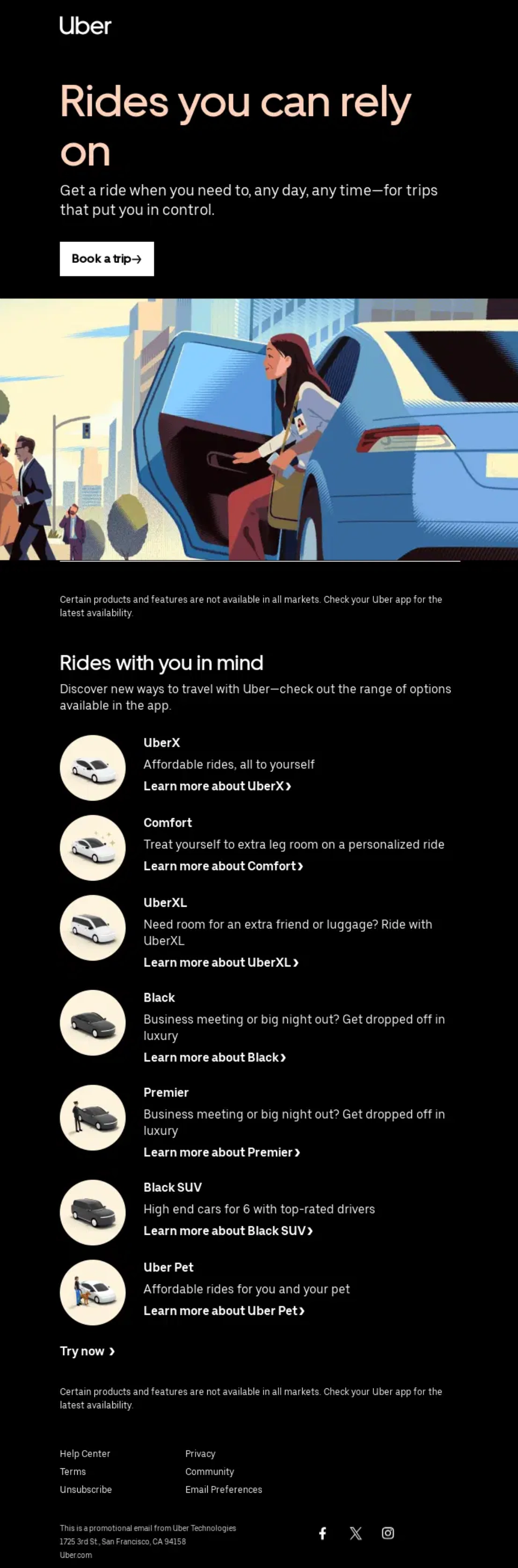
Uber is all about simplicity and efficacy in providing its transport services. The same philosophy is applied to their email designs. Their digital newsletters are crisp, clean, and intentionally minimal, prioritizing crucial information for delivering true value.
The team effectively achieves its email marketing goals without needing extra copy or visuals. They rely heavily on simple data visualization tools, a well-organized layout, and sparse entertainment elements to support the brand's main mission.
Cuyana
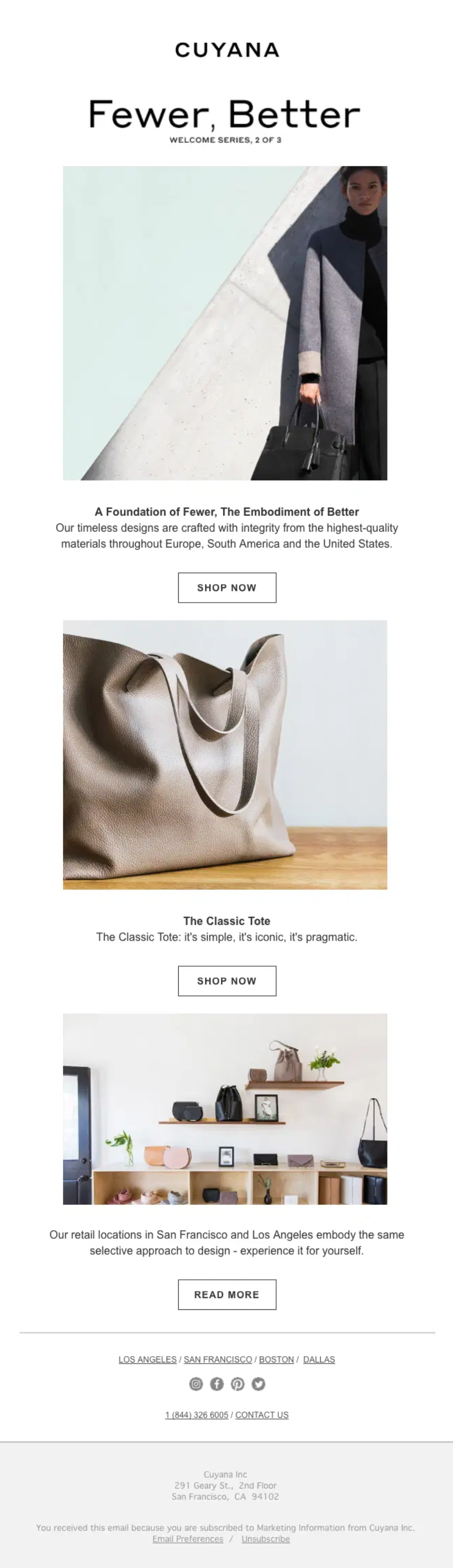
Cuyana is an epitome of the stripped, clean email designs that impress from the first second. Their digital newsletters are sleek, stark, and straight to the point. The team has successfully embraced minimalism, delivering an exceptional reading experience enriched with meaningful, engaging brand messages.
The key features of their emails are refined CTAs, focused promotions, ample whitespace, handpicked visual media, short text blocks, and a well-thought-out, impeccable information hierarchy.
AURA BORA
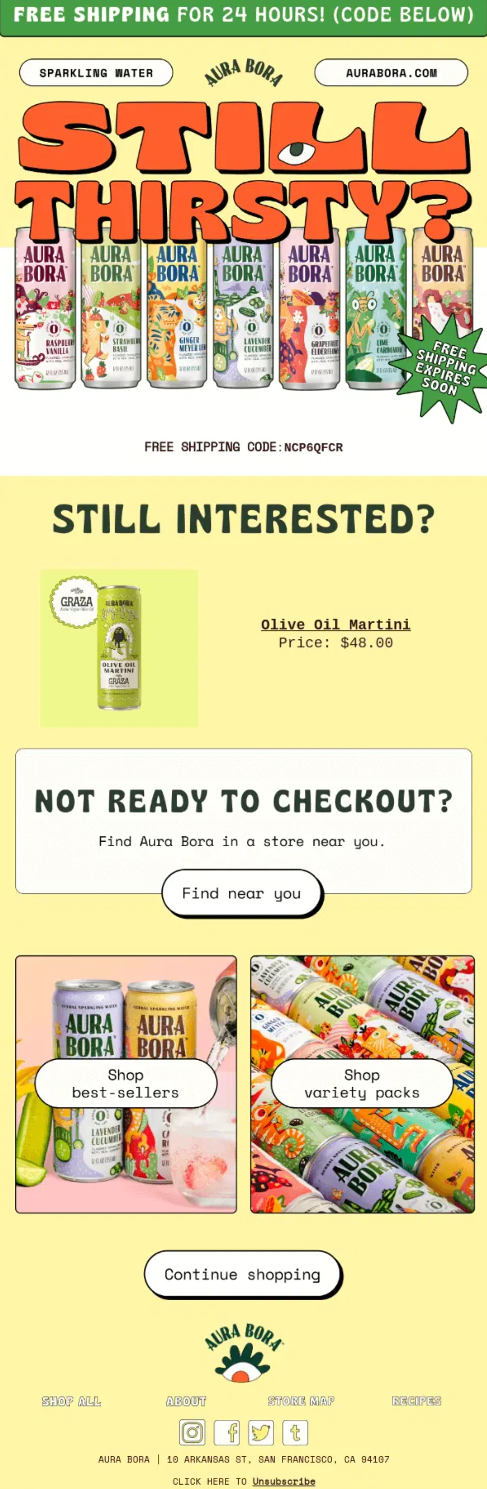
Bright and whimsical are the words that best describe the majority of Auro Bora's email designs. Though this should not surprise you, as this kind of atmosphere is what email marketers want to convey in their communication with subscribers. Their eblast is expressive and valuable, effectively supporting the brand's identity, naturally distinguishing the company from competitors, and reinforcing its market position.
Feastables
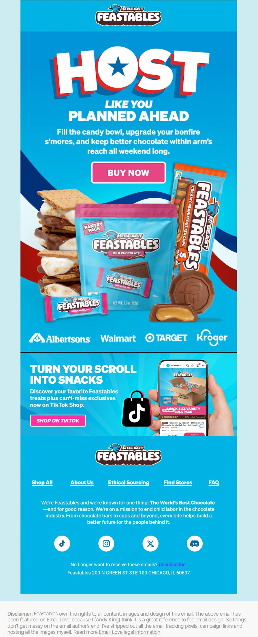
Much like Mr. Beast's unique personality, Feastables newsletters stand out from the crowd with their increasingly positive tone and cheerful atmosphere. They are memorable, impressive, meaningful, and entertaining.
Consider how the team has used vibrant colors and multiple images, resulting in an eye-catching, eye-pleasing solution that not only perfectly supports the brand's mission but also stands on its own.
Conclusion
Email design offers great power for direct communication, but also carries a great responsibility to turn it to your advantage. The door to your subscribers can be easily closed by ESPs, marketers' mistakes, and just recipients' regular changes in behavior, mood, or demands.
It is crucial to take email design seriously, as only a well-thought-out, effective, valuable, and standards-compliant digital newsletter can maintain the communication channel open and reach your target audience, giving you a fighting chance to achieve your marketing and branding goals.
Many qualities define effective email design, but first and foremost, it is the digital newsletter that delivers not just a key message but value, leaving a positive impression. In terms of design, it has a clear structure, easily noticeable CTAs, accessibility features, mobile-friendly behavior, a balanced amount of copy and multimedia, and a recognizable brand identity.

Creates insightful, strategy-driven content that translates complex design and branding concepts into accessible knowledge, supporting Ramotion’s mission to elevate digital experiences.