
Think of a time you were navigating a website, and you ran into a 404 error. It is frustrating, to say the least. Errors are an unavoidable part of digital interactions. Irrespective of the nature of the interaction, users are bound to run into some errors, roadblocks, or issues. However, the way a product responds to errors can significantly shape the user experience.
Therefore, designers need to focus on error handling UX to reduce frustration, avoid interruptions, and save users from spending time and energy on the same tasks. If these issues occur frequently, users will begin losing trust in the product.
Effective error message design is one that turns roadblocks and frustrations into opportunities. A well-designed error message explains what went wrong, saves users’ time, and provides actionable guidance for recovery. This is one reason that when businesses hire leading UI/UX design agencies, thoughtful error handling should always be considered in the overall digital experience.
In this article, we describe UX error messages and explain the principles behind effective examples. We also share specific examples to highlight key patterns in UX error messages.
Read along as we explore how to turn errors into opportunities for a better experience.
What Are UX Error Messages?
UX error messages refer to the feedback users receive from an interface when something goes wrong during the interaction. For example, when an action fails or a user enters invalid data, the journey is interrupted. UX error messages appear in such situations to inform, help, and guide the users.
What are UX error messages?
Error messages in UX design communicate issues to users when something goes. These are interface notifications that explain the problem, highlight the reason behind the issue, and guide how to fix the situation.
A good UX error message design does not just tell the audience that something isn’t working. Instead, it helps users understand what happened and tells them what they can do to resolve the issue so they can resume their task.
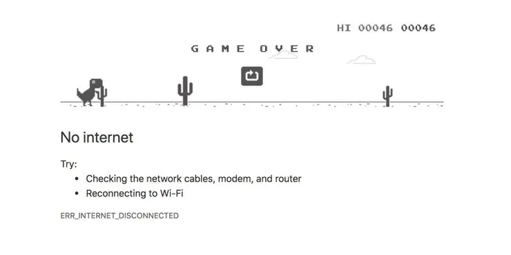
Error Messages Notify Users (Image Source)
Therefore, effective error handling depends on several key elements working together. On the one hand, clear copy explains the problem. On the other hand, the placement and timing deliver the right message at the right time. Additionally, good visual design ensures that users see these messages without getting overwhelmed.
Error Messages vs. Other UX Feedback
Errors are inevitable in user experience and user journey, which is why error messages are important. However, error messages are not the only type of interface feedback. When working on error handling UX, designers often need to distinguish between errors, validation messages, warnings, confirmations, and empty states based on their timing, severity, and required user action.
The following table provides a summary of the comparison between these different types of feedback messages.
Error Messages: Before and After
| Feedback type | When it appears | Severity | User action |
|---|---|---|---|
| Error message | After or during a failed action | High when it is a blocking error | Fix the problem before continuing |
| Validation message | During or after an action where confirmation is needed to proceed, e.g, data entry | Low to high | Correct or review the entered information |
| Warning | Before a potentially risky action | Moderate | Review the risk; user may still proceed |
| Confirmation | After an action is completed successfully | Low to moderate | Usually no action required |
| Empty state | When no content or data is available | Low | Optional action to add, find, or create content |
Anatomy of a Good Error Message
Effective error message design is critical to the overall user experience, as it gives the audience the information they need to understand a problem and, potentially, recover from it. A useful message typically explains what happened, why it happened, what the user should do next, and what happened to any work already completed.
The exact information necessary for the users depends on the context, severity of the problem, and available recovery options. According to a report by the Baymard Institute, 94% of e-commerce sites do not use specific or adaptive error messages, thus failing to meet the specific needs of their target audience.
What are the key elements of a good error message?
The key elements of a good error message are as follows.
- Context and description (What happened)
- Reason and explanation (Why it happened)
- Recovery and correction (What to do next)
- Transparency and clarification (What happened to the user’s work)
The key elements of good error message design are as follows.
What happened
A good error message is one that clearly identifies the failed action or interaction, and, therefore, highlights the specific problem. Whether designers are writing validation messages for a form or a system error message, clarity and specificity always help users understand what went wrong.
Vague wording, such as “An error occurred”, gives users little information about the problem. Instead, the message should identify the issue as precisely as possible, such as explaining that a payment failed or a required field is incomplete.
Why it happened
Another important element of an effective error message is that it tells the users the cause of the issue whenever possible. This is most important when knowing the reason(s) can help users recover. For example, telling users that a file exceeds the maximum upload size gives them information they can immediately use.

404 Error Example from FlippingBook (Image Source)
It is important to consider that not every error requires a detailed explanation. Additionally, such details should never include highly technical or complex information. For example, information such as technical codes, internal system information, and security-sensitive details should be omitted when they do not help users resolve the problem.
What to do next
One area where error messages can be really helpful is recovery. An effective error message should provide a clear recovery action whenever possible. This could involve correcting input, retrying an action, requesting access, or choosing another method or mode to accomplish the task.
Designers should avoid leaving users at a dead end when there is a realistic path forward. Specific instructions can help turn errors into opportunities where they can add value to the user journey.
What happened to the user’s work
Errors can be particularly frustrating when users do not know what happened to their data or previous work that they’d already completed. The users need confirmation and reassurance about the preservation of their work. This is where the interface should clearly state whether entered data was saved, lost, or only partially processed.
If users need to repeat an action or provide information again, the message should make that clear. Preserving user input whenever possible, and communicating its status, reduces unnecessary effort and uncertainty.
Choosing the Right Error Pattern
Effective error message design is not just about writing short and clear messages. Instead, it requires good all-round thinking from the designers, where the placement and modality of an error message also becomes critical. Additionally, aligning the message delivery with the source, scope, and severity helps users quickly connect the feedback to the problem.
Designers should not only understand the different types of error messages, but also when and how to deliver them. For example, inline validation and form error messages work well for input-related problems, while banners and toasts can communicate broader issues without interrupting the task. Modals and full-page errors should generally be reserved for problems serious enough to block the workflow.
Inline error messages
Inline error messages are most useful when inline validation is required for a specific field. Some common examples include the format of email addresses and mandatory information in a form. These error messages should appear close to the affected input so users can immediately identify what needs attention.
When designing inline error messages, it is important to define and establish clear relationships among the field label, input, error text, and focus state. When an error summary is also present, it should connect users back to the same affected field, creating a consistent experience.
Form error summaries
In cases where there are multiple form error messages, summaries can come in handy. Several error messages can be consolidated into a summary. This approach is particularly useful for long forms and accessible workflows, where finding individual errors might require a lot of effort.
It is important to note that each item in the summary should identify the problem and direct users to the relevant field. Well-designed form error messages can include links to help users identify the issue and navigate the summary, making it easy to review and correct the errors.
Toasts and banners
Toasts and banners are useful when dealing with broader, page-level issues. These errors are typically not tied to a single input or item, but they also do not completely block the user journey. For example, a banner can communicate a temporary connectivity problem or inform users that a certain feature is currently unavailable.
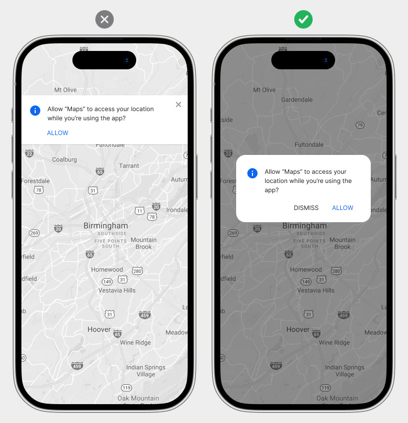
Banners to Highlight Errors and Issues (Image Source)
When working with toasts and banners, designers should be careful with the transient nature of the messages. A disappearing toast is not helpful when it is important for users to read, remember, or correct something because the message may vanish before they can act on it.
Modals and full-page errors
Modals and full-page errors should be used for critical errors as they block the user journey. These errors should be reserved for issues such as expired sessions, unavailable services, or workflows that cannot function until the situation is resolved.
When deciding on the error pattern, designers should be careful about the severity of the interruption to determine whether a modal or full-page error interruption is necessary. If users can safely continue working despite the problem, a less disruptive pattern will generally provide a smoother experience.
When to Show Error Messages
Along with the clarity of the message and the choice of the right pattern, the timing of an error message can also impact how quickly users identify and resolve an issue. In error message UX, showing the right message and providing feedback in the form of validation is helpful for users. There are three common approaches to providing validation.
- Validation on blur can provide timely feedback once users have finished interacting with a field.
- Validation on submit allows users to complete the form before identifying problems.
- Real-time validation can speed up correction for required elements, such as password strength or formatting, but frequent feedback can also interrupt users and make an interface feel unnecessarily demanding.
When showing error and validation messages, designers should avoid displaying errors before users have had a reasonable opportunity to provide a valid input. For example, marking an email address as invalid while the user is still typing creates unnecessary, premature feedback that can be confusing for users. The best timing gives users enough space to complete an action while still presenting errors early enough for efficient recovery.
Writing Effective Error Microcopy
Writing effective error messages has a lot in common with good UX writing. Therefore, the basic principles of clarity, conciseness, and specificity are equally important in error microcopy. Additionally, it is important that error messages are respectful, action-oriented, and consistent with product voice.
Designers should prioritize the information users need to understand the situation and recover from it to ensure user-friendly error messages. Additionally, it is important to avoid blaming users, relying on unexplained technical jargon or generic wording, and adding unnecessary humor that can make a frustrating situation even worse.
Error message formula
Although there is no set rule on error message design, as the practice is quite context-dependent, the following formula can help draft effective messages.
Error Message = Affected action or item + Clear problem + Next step + Saved-work status (when relevant)
Note that not every message needs all four elements, but this structure helps designers provide enough information for users to understand the error and decide what to do next. Take a look at the following error message examples using the same formula.
Google Ads creative studio
The “File size is too large” error message reads, “Reduce the file size below the maximum supported size for the asset type and try to upload again”. This can be broken down as follows:
Breaking Down Google Creative Studio Error Message
| Affected action or item | Clear problem | Next step | Saved-work status |
|---|---|---|---|
| A particular large file | File size is too large | Reduce the file below the supported maximum and try to upload again | Upload the file again |
GOV.UK
The specific error message on the GOV.UK website, “The security code has expired. New code sent.”, is another example that identifies the affected item, explains the problem, and communicates the recovery action already taken by the system. It is a strong example of giving users enough information to understand what happened and continue without unnecessary effort.
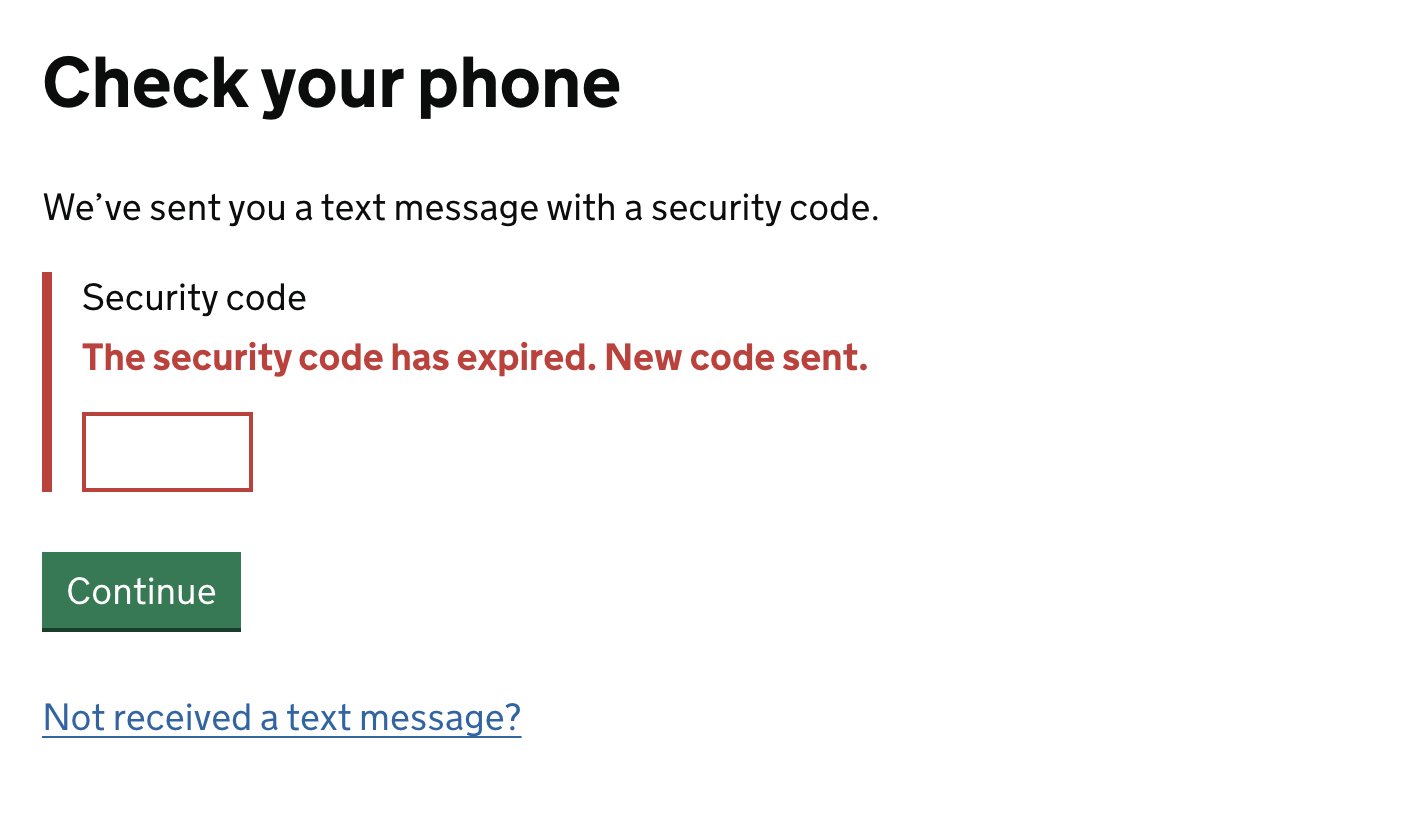
Error Message Formula in Practice (Image Source)
Error Message Examples: Before and After
When writing error messages, small changes in error microcopy can make a significant difference in understanding and resolving the issue. These guidelines by Nielsen-Norman Group can come in handy when reviewing and improving error messages.
The following before and after error message examples can help understand the difference between good and bad writing.
Error Messages: Before and After
| Type | Before | After | UX principle improved |
|---|---|---|---|
| Form | “Invalid input.” | “Enter a valid email address.” | Identifies the affected input and explains what valid information is required. |
| Login | “Login failed.” | “Email or password is incorrect. Try again.” | Explains the problem without revealing unnecessary account information and provides a next step. |
| Payment | “Transaction error.” | “Payment failed. Try again or use another card.” | Names the failed action and offers clear recovery options. |
| Upload | “Upload error.” | “File is too large. Choose a file under 10 MB.” | Explains the cause and gives users a specific way to correct it. |
| Network | “Connection error.” | “You’re offline. Check your connection and try again.” | Uses understandable language and provides an actionable recovery step. |
| Permissions | “Access denied.” | “You don’t have access to this file. Request access to continue.” | Explains the restriction and provides a path forward. |
| Destructive action | “Are you sure?” | “Delete this project? This action cannot be undone.” | Clearly communicates the action and its consequences before an irreversible decision. |
| Session | “Error 401.” | “Your session expired. Sign in again to continue.” | Replaces technical terminology with a clear explanation and recovery action. |
| Save action | “Save failed.” | “Changes weren’t saved. Try again.” | Clarifies what happened to the user’s work and tells them what to do next. |
Error Messages for Common Scenarios
A consistent error message UX system can adapt to different situations without changing the fundamental way a product communicates problems. By following the basic principles of design and UX writing, while keeping the users’ needs in mind, error messages become more effective. Copy, visuals, and error recovery behavior can vary according to risk and severity, but user-friendly error messages should always prioritize clarity and help users continue their tasks with minimal disruption.
Form validation errors
Form errors typically include issues related to required fields, incorrect formatting, values outside an accepted range, duplicate information, password requirements, or problems within multi-step forms.
In such cases, error messages should identify the specific field and explain what users need to change for resolution. When part of a form is incorrect, it is helpful to preserve all valid information already entered by users, so they can only revisit affected fields and quickly complete the task.
Authentication and account recovery
Authentication errors cover issues such as expired sessions, too many login attempts, failed authentication, and account recovery. When writing error messages for these scenarios, it is important to share helpful guidance with the users, along with the error descriptions. The users should know whether they need to sign in again, wait before retrying, reset their credentials, or use another method to recover their account.
However, when sharing guidance, the security requirements must always be considered. Sensitive account information and credentials should be left out of the error messages, as these could create a security risk.
Payment and transaction errors
Similar to authentication errors, payment and transaction errors are both sensitive and critical. These errors require particular clarity because users need to know whether a transaction succeeded before attempting another payment. The interface, therefore, should clearly communicate transaction status and, where appropriate, explain safe retries, prevent duplicate payments, and provide alternative payment methods.
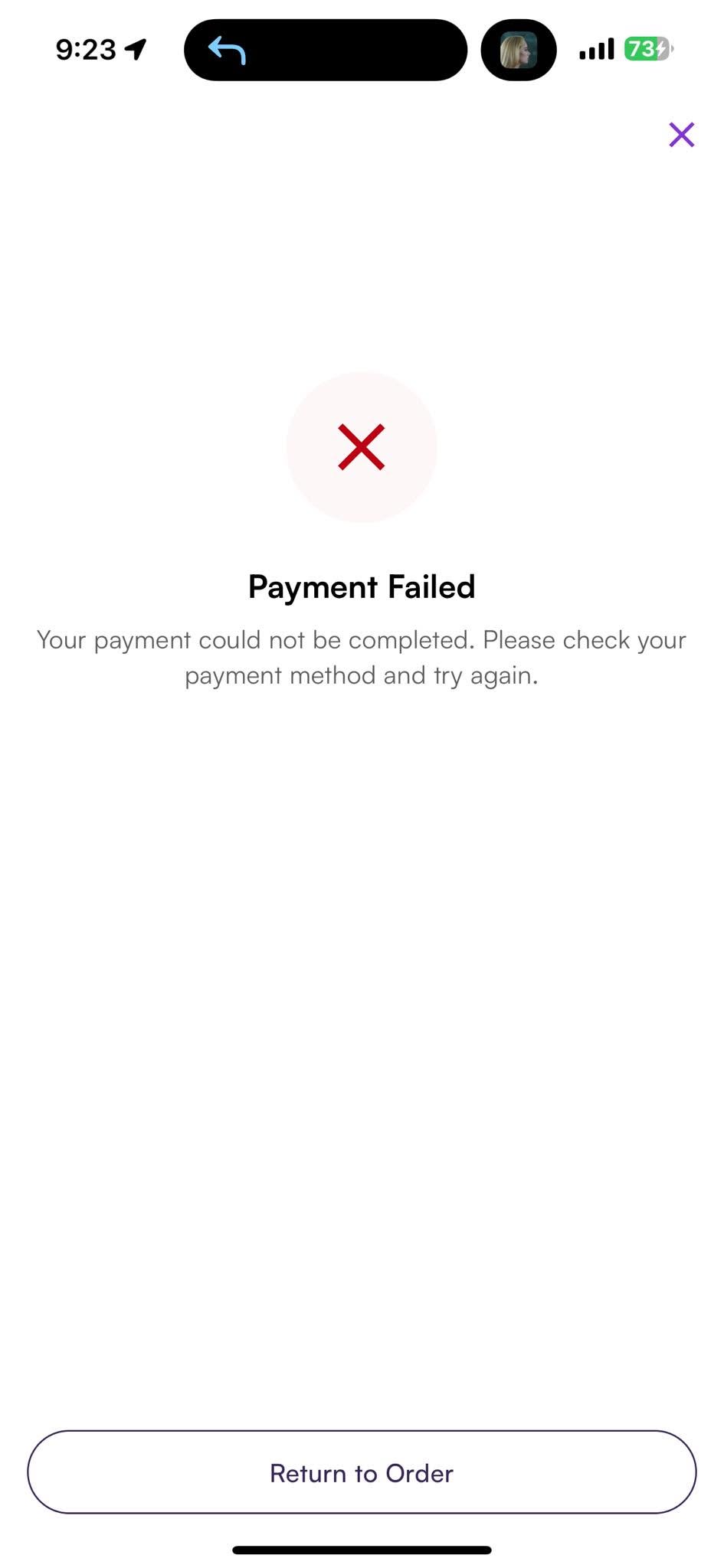
Payment Failed Error (Image Source)
In this particular case, providing a quick and easy way to contact support is always helpful. Additionally, error recovery should be made clear and explicit for these high-stakes interactions. Users should never have to guess whether they were charged or whether clicking a payment button again could result in a duplicate transaction.
Network, server, and offline errors
Network-related errors can result from situations such as connection loss, timeouts, planned maintenance, service outages, or server failures. When useful and appropriate, the message should explain the specific situation rather than presenting everything as a generic connection or system error.
A retry option should only appear when retrying is safe and meaningful. Designers should be careful when an interrupted request may already have been processed, as repeating it could duplicate a purchase, submission, or another important action.
Permission and access errors
Permission and access errors should explain what type of access is missing. These messages should also identify who or what action can resolve the restriction. Depending on the context, this could mean requesting access from a document owner, obtaining a particular user role, or completing an approval process.
It is important to avoid generic messages such as “Contact administrator”, as these provide little help when users do not know who the administrator is or how to reach them. Contextual instructions and direct actions, such as a “Request access” option, create a clearer recovery path.
Error design and accessibility
Accessibility is another important aspect of user-friendly error messages. Accessible error message design requires careful attention to placement, proximity, visual hierarchy, contrast, visibility, and responsive behavior. Icons can reinforce meaning, but they should not be used alone. Pairing icons with text provides better context and helpful information to the audience.
Additionally, errors should also work effectively with keyboards and assistive technologies. Proper focus management can direct users toward affected fields, and appropriate screen-reader announcements ensure that feedback is communicated without requiring users to visually locate it.
Designing for error recovery
Delivering the right error message to users is only part of the error message UX system. It is also important to guide the users so they can recover or resolve the issue. Good error recovery reduces the amount of work users have to repeat after something goes wrong.
For example, when forms preserve input information, it saves users’ time and effort. Similarly, providing appropriate options such as undo, retry, an alternative route, or a clear way to return to the interrupted task can add value to the user journey.
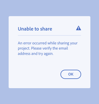
Guiding Users Regarding the Next Steps (Image Source)
In cases where recovery takes time, the interface should communicate progress and current status so users know the system is responding. It should also prevent repeated clicks or actions from creating duplicate submissions, transactions, or destructive operations.
User Messages vs. technical logs
When working on error message design, one key distinction is between user-facing messages and technical logs. These are two different types of information, serving different audiences. Therefore, user messages should be kept separate from technical diagnostic information.
Users need clear, concise, and simple explanations along with recovery guidance, while developers may require detailed logs to diagnose the underlying problem. A support reference ID or ticket can help connect a user-reported problem with diagnostic information when necessary. However, stack traces, internal file paths, secrets, system details, and sensitive data should remain in secure logs rather than appearing in the interface.
Localization and error tone
Another key aspect of effective error messages is localization. When writing and designing error messages, designers should always consider the localization aspect, thus accounting for text expansion, grammatical differences, localized dates and numbers, and cultural expectations. Layouts should be flexible enough to accommodate translated messages without compromising readability and overall usability.
Localization should also preserve the complete meaning and intent of the original message instead of translating isolated UI fragments. Across locales, user-friendly error messages should maintain the same standards of clarity, accessibility, respect, and actionable guidance.
Auditing an Error Message System
Now that we’ve discussed error messages, along with their anatomy, types, and examples, it is also important to think about creating a consistent error message UX system. Additionally, like any other UX design practice, an error message system requires constant iteration and improvement. This is where auditing comes in.
Auditing UX error messages is a research-focused and analytical approach that begins with understanding where and why errors occur throughout a product or service. Design teams begin with an inventory of existing errors and classify them according to their source, severity, presentation pattern, and recovery path.
The audit also evaluates whether UX error messages remain consistent across the design. This includes reviewing terminology and tone, reusable UI components, and accessibility requirements. Additionally, ownership of errors and error messages is also helpful in keeping everyone on the same page.
Two important tools help in the auditing process: analytics and customer support data. These help teams determine which errors have the greatest impact on users. Frequent errors, repeated failed actions, and common support requests can reveal where improvements are most valuable, allowing teams to prioritize changes based on user impact.
Analytics can also help understand whether error messages are performing well or not. If the users are recovering quickly and following the expected journey with fewer failures, this would indicate a better error UX system.
Auditing an error message system, thus, helps in identifying the gaps and suggesting improvements that can then positively impact the user journey.
Conclusion
Effective error messages do not just tell the users that something is not working; they do a lot more. On the one hand, a good error message UX system clearly explains the problem. On the other hand, it provides a safe, practical path toward recovery, while maintaining as much data and context as possible.
Creating this experience consistently demands attention to detail, where design, content, engineering, and product management teams work in collaboration. The goal is to build and maintain a robust system that communicates clearly across different scenarios, helping users recover from problems with minimal disruption.

Creates insightful, strategy-driven content that translates complex design and branding concepts into accessible knowledge, supporting Ramotion’s mission to elevate digital experiences.