Web design has come a long way from its humble beginnings. What was once a digital landscape of simple black-and-white websites with barely any images and boxy, pixelated icons has evolved into interactive sites that offer unique and diverse experiences today.
The web design industry has changed remarkably as phones have gotten smarter. Sleek, modern designs have replaced those boxy and pixelated icons of the past, reshaping the very foundations of our digital space.
The success of a web design also depends on the machinery you have. Partnering with a reputable web design firm can help ensure your digital presence not only keeps pace with evolving web design but also positions your brand for long-term success in the ever-changing online landscape.
But how did we get to this point? What key milestones paved the way for web design to evolve into the rich, immersive medium we know and enjoy today? And what does the future hold for this rapidly changing field?
Read on as we explore the history of web design.
Origins: The Static Web Era (1991-1995)
The creation of the World Wide Web started with a single purpose: to facilitate information sharing among scientists at CERN, a laboratory dedicated to nuclear research.
From the labs to the world
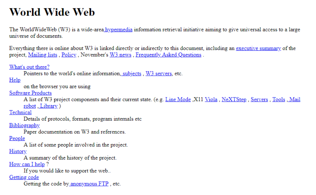
Tim Berners-Lee spearheaded this effort in 1989, showcasing a text-based and straightforward website that could be navigated using HTML (Hypertext Markup Language). The first website featured clickable links that took you directly to other pages. There were no fancy icons, fonts, or images, but an open space allowing free information sharing. This invention made history, earning him the title of the father of the World Wide Web.
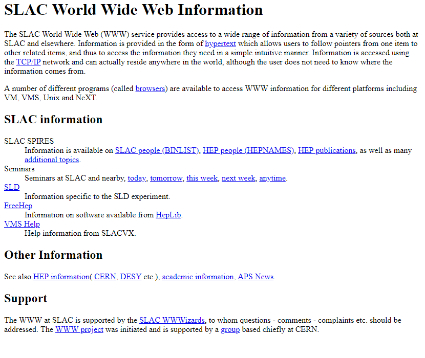
SLAC WWW web page via Web Design Museum
Since then, the World Wide Web has gone beyond CERN and into the global arena. With users seeking various information, websites mushroomed from different corners. In that sense, choosing and partnering with web design companies is often a strategic information-architecture decision as much as a creative one, because findability and clarity become harder to maintain as audiences and content expand. This boom has made it difficult to organize information, which has led to a need for a web tool to facilitate searches.
Aliweb: the first search engine
The first search engine in history, Aliweb, was introduced in 1993. It enabled users to find websites more easily through categorized but very basic hyperlinks.
Web admins assign keywords and descriptions for their websites, which Aliweb manually sifts through. Web admins also had to update the system, notifying it whenever there was new information. This has influenced how web design will evolve regarding indexing methods and content management.
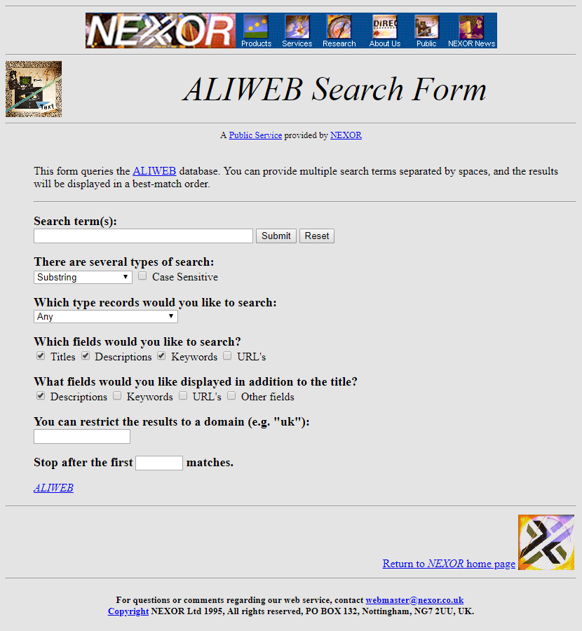
Aliweb was the first search engine designed for the World Wide Web service. Image via Web Design Museum
Launch of online advertising
By 1994, popular websites like Yahoo, AOL, and Netscape dominated the web as the internet seeped into the life and work of people. This year also saw the introduction of the first web banner ad, marking the beginning of online advertising in the history of web design.
It was an ad placed on the HotWired website for three months to promote AT&T. Users who clicked on the ad were led to the brand's landing page, which allowed them to explore and discover what having an internet connection can do.

A banner ad that leads to a landing page. Image via The First Banner Ad
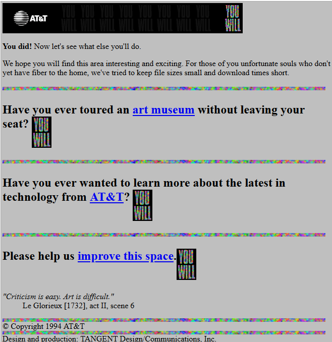
AT&T landing page via The First Banner Ad
Rise of Visual Design: Flash and Table Layouts (1996-2001)
Designers sought more engaging ways to organize and present content as website traffic grew. The black-and-white aesthetic of early web pages gave way to a new era of visual design, with the help of GIFs, Flash, and table-based layouts.
Staying organized with HTML table layouts
Leveraging HTML, designers integrated tables to make pages look organized, similar to magazines or newspapers. This enabled them to place content and other web elements in specific spaces on the page and allowed pixel-perfect control.
Pyramid-shaped table layout via Dev
Interactive GIFs, games, and icons
Animated GIFs, blinking texts, and moving icons became popular. Adobe Flash lets designers add games and cartoons, injecting fun into websites. Websites started using JavaScript to customize interactive menus and create pop-up ads.
Of course, back then, things would load much slower than today. Eventually, Cascading Style Sheets (CSS) became a primary tool to speed things up and elevate web design slightly. Websites also looked visually consistent.
dot-com boom
However, what left an impression during this period of web design history was the early rise of e-commerce. People started buying things online as websites like Amazon, eBay, Yahoo Store, and PayPal popped up everywhere. Some would call this phenomenon the Wild West of online shopping.
Soon, websites added login forms, shopping carts, and feedback pages to their designs. While the dot-com crash wiped out many websites, those who survived—Amazon and eBay—shaped the future of modern web design.
Web 2.0 Movement: UX and Simplicity (2002-2010)
After a decade, the World Wide Web entered a new era called the Web 2.0 movement. Website design became more experimental, using shiny buttons and gradients to make websites look sleek, fancy, and modern. Round corners were more popular than sharp edges.
A good example of this trend is Microsoft's Windows Vista glass-themed design. Everything was see-through and covered in glossy effects, dubbed the Aero Glass. It made computers look elegant, from translucent title bars, menus, and windows to buttons and icons that look like polished gems.
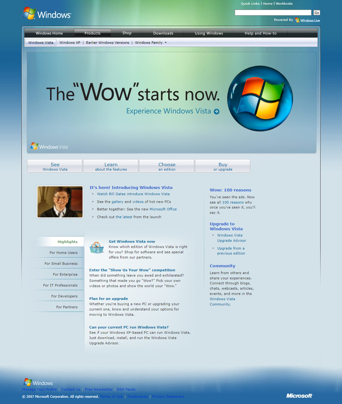
Windows Vista website in 2007 via Web Design Museum
Another example is the colorful website redesign of the virtual pet website Neopets. Pink, blue, purple, and green dominated the color palettes. The website also features 3D icons, hover effects, and animated banner ads that are hard to ignore.
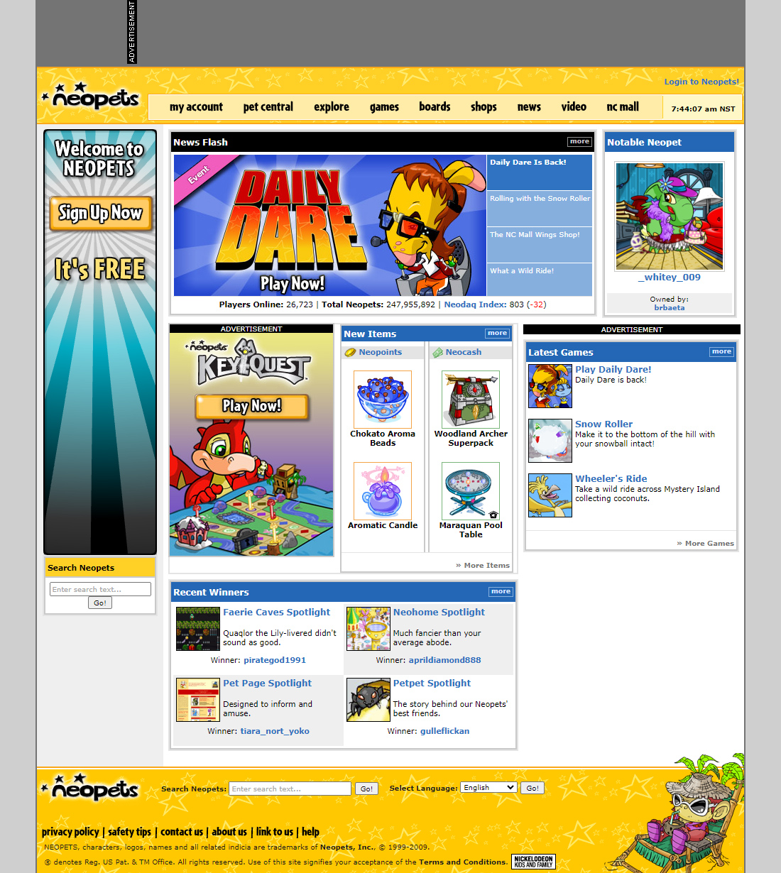
Neopets website in 2009 via Web Design Museum
Social media on the rise
Thanks to forums, people could upload blogs and share comments online, eventually building communities. People can now talk back to websites instead of just sourcing, scrolling, and absorbing information.
Social media, such as Facebook, YouTube, and Twitter, became popular. People are sharing multimedia content like photos and videos across the globe, and short messages via tweets spread like wildfire at the click of a button.
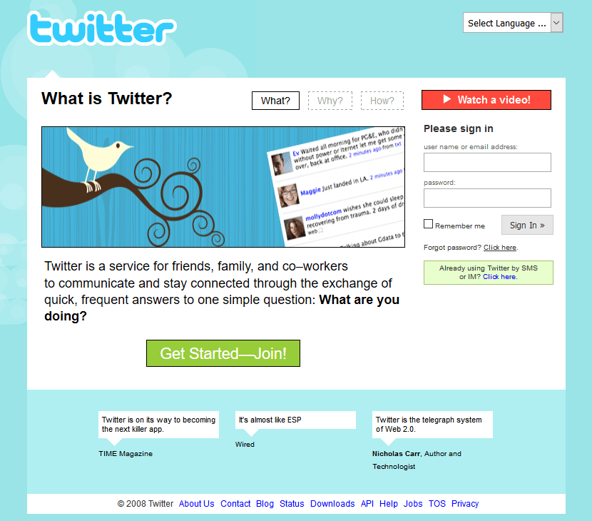
Twitter page in 2008 via Web Design Museum
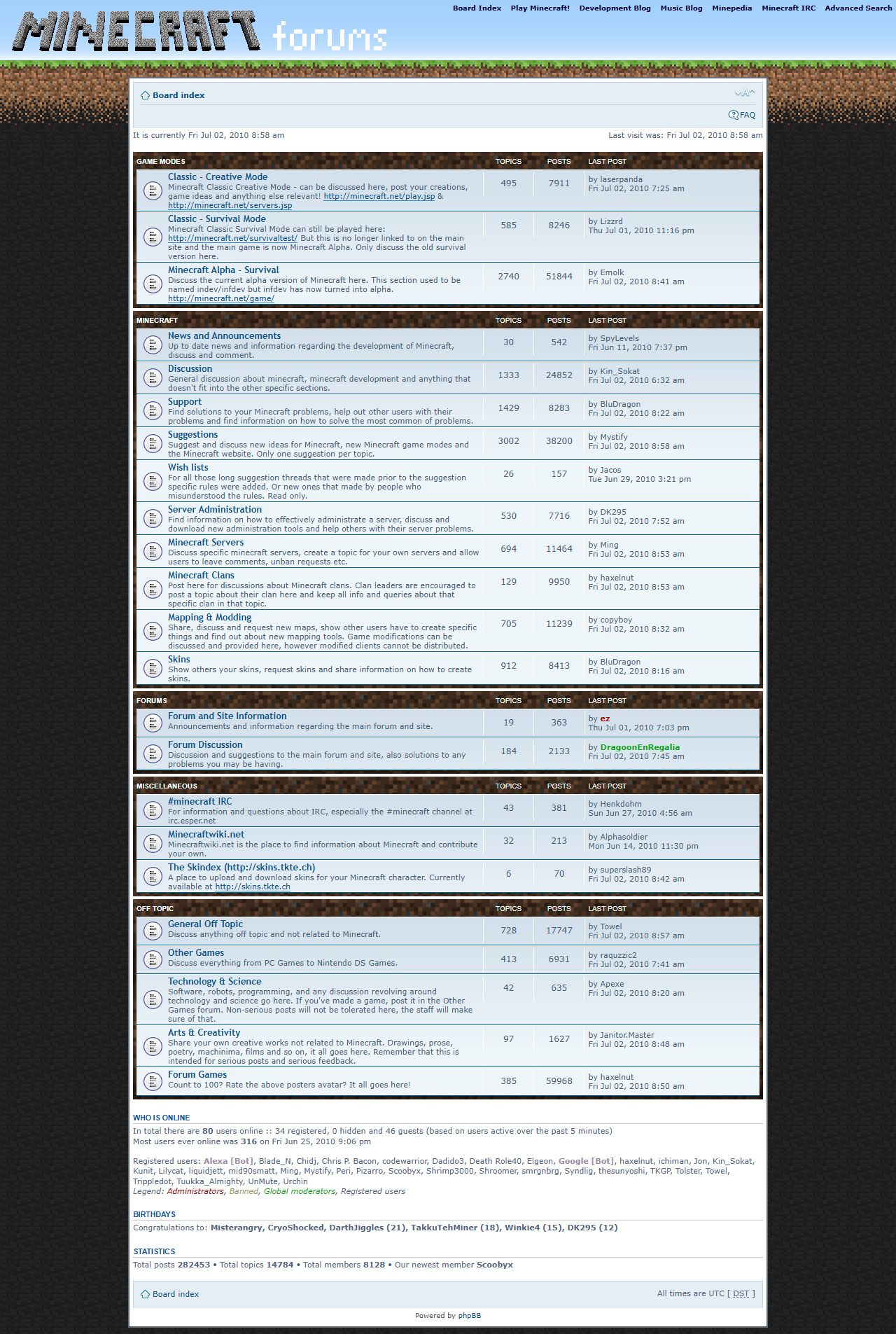
Minecraft forums page in 2010 via Web Design Museum
Increasing demand for personalization
Everything was advancing quickly.
People have become more engaged, seeking features that allow them to customize their profiles on social pages. AJAX (Asynchronous JavaScript and XML) made web pages faster, allowing portions of them to load updates instead of the whole page. This cut the waiting period even further, which satisfied many users. User experience was repositioned, making it an integral element of website success. Put, web design became interactive, colorful, customizable, and social.
The birth of mobile-friendly websites
Then came smartphones, led by the launch of the first iPhone in 2007, marking a pivotal change in web design. As people became more dependent on their smartphones, websites realized the need for mobile-friendly websites. They could no longer rely on the desktop-centric layouts of the past, often leaving users struggling to view content on tiny, zoomed-in screens.
This mobile-first mindset revolutionized web design. Rather than treating mobile as an afterthought, designers made it the forefront of their process early on.
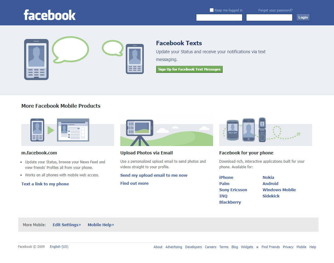
Mobile version of Facebook in 2009 via Web Design Museum
Flat Design Era: Mobile-First and Minimalism (2011-2016)
Web design evolved significantly between 2011 and 2016, dramatically shifting to minimalism, prioritizing and developing user experience, and creating an intuitive user interface.
Minimalism over maximalism in flat design
The flat design era embraced minimalism as a response to the cultural shift towards simplicity. Websites favored uncluttered and aesthetically pleasing user interfaces with more precise navigation and straightforward interactions.
Flat design uses two-dimensional elements without gradients, shadows, or three-dimensional effects. It is defined by three characteristics: simplicity, minimalism, and usability. It often features bright colors and simple shapes and leverages negative space, allowing users to find what they need quickly.
This design approach allowed for faster page load times while maintaining an engaging user experience.
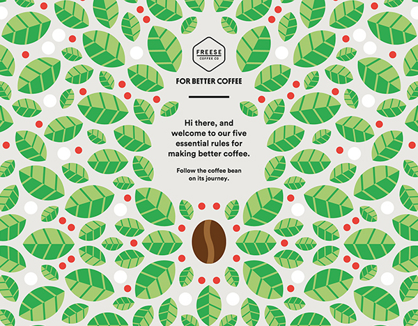
Flat design website for For Better Coffee via Graphic Design Junction
Responsive, mobile-first web design
Responsive web design ensures websites adapt seamlessly across devices. Flexible grids and media queries allow visual elements to resize fluidly, preventing awkward stretching or cropping.
This provides an optimal viewing experience whether accessed on desktop, tablet, or smartphone. Responsive design has become essential as more people use smaller devices to browse the web, driving increased website traffic.
Google introduces material design
Furthering the focus on user-centric design, Google introduced Material Design in 2014. This comprehensive design system was created to unify the user experience across Google's various products and platforms.
Material Design mimics real-world materials and textures to create a more natural-looking and intuitive user interface. This means interface elements like buttons and cards are designed to look like they have physical depth and weight, casting realistic shadows and responding to touch and motion.
Before Material Design existed, many web designers applied skeuomorphism, which made digital visual elements look overly realistic and cluttered. Material Design simplified this by creating an organized look that feels familiar to the users. The design system also emphasized the importance of smooth animations and micro-interactions to guide users through tasks.
One of the notable websites in 2016 that successfully implemented Material Design was Airbnb.
According to Google Design, "Essential tasks are satisfied through precise design, routing users clearly and briskly from sign-in to browsing to booking a reservation. By neatly segmenting larger goals into smaller steps, Airbnb can sidestep the appearance of complexity, making the overall experience feel comfortable."
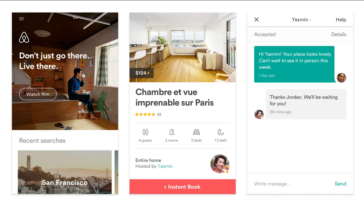
Material Design implemented by Airbnb. Image via Google Design
Modern Era: Animation, 3D, and Microinteractions (2017-2023)
From simple and functional design, web design has moved to interactive and engaging experiences, prioritizing user interaction and personalization.
Improved personalization through AI integration
Thanks to AI, machine learning, AR/VR, and other technological advancements, web designers can gather and analyze consumer data and create designs accordingly. For instance, AI can assess challenges and predict user behavior through heatmaps and other AI analytics tools. These aid designers in ensuring websites are more inclusive and present solutions.
With AI, designers do not need to start from scratch. It can generate design templates based on the requirements, significantly speeding up the process.
Responsive design became a must-have
Responsive design has become a must-have instead of a good-to-have. It has become more sophisticated with new tools and techniques like CSS Grid and Flexbox. There were also better ways to optimize performance with lazy loading and responsive images to speed up loading time and reduce data usage.
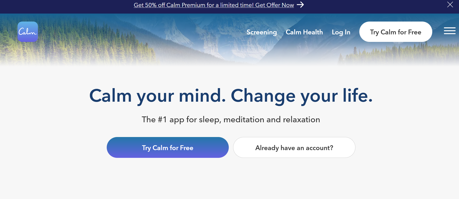
Calm website on desktop via Calm
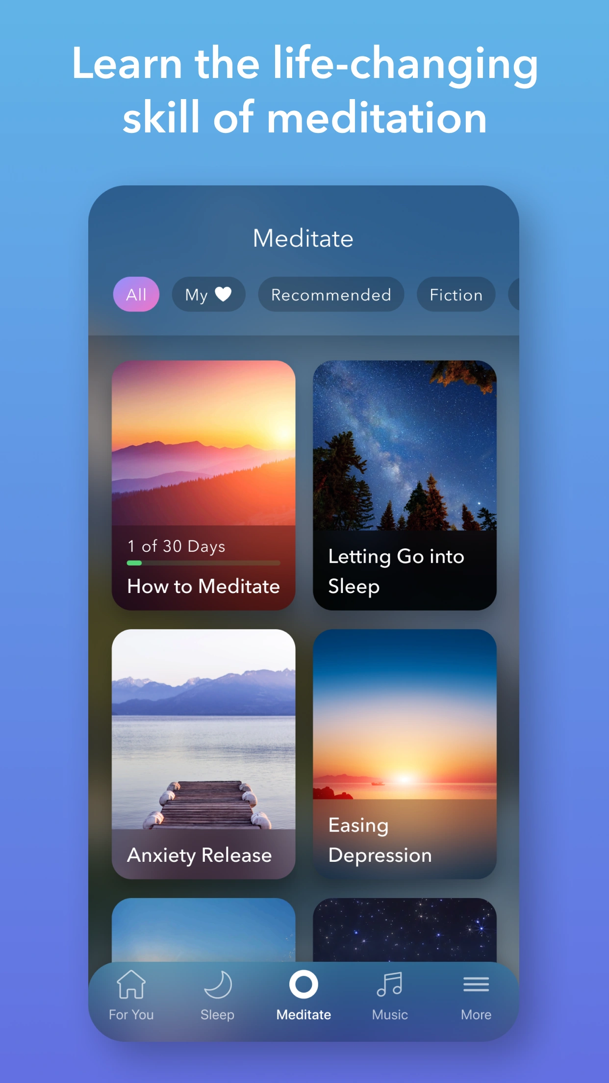
Calm mobile app via Google Play
Videos and animations dominate the web
Another notable development in web design is the increase in website videos and animations. Whether they're used as backgrounds, pop-ups, or educational materials, websites leverage them to grab and retain user attention.
For instance, a business page selling cars might have a video playing that showcases its latest car models on the road, making it more engaging than static texts or images. They are so effective that 88 percent of companies use videos to improve digital marketing performance.
Video background for a website via Masthead Magazine
Accessibility features reach more users
Accessibility has become a priority, ensuring websites are usable by everyone. It follows the established Web Content Accessibility Guidelines (WCAG), making content perceivable, operable, understandable, and robust. This means ensuring readable text, alternative descriptions for non-text content, clear and concise layouts, and easy-to-see and hear content.
Web designers are also increasingly implementing assistive technologies like voice recognition, text-to-speech, captions, and screen readers. These enable visually impaired users to access information with alternative input methods. To further enhance accessibility, websites are scrutinized for compliance with the Americans with Disability Act (ADA).
Stronger visual storytelling
While storytelling has always been an integral element of successful web design, it was emphasized more strongly from 2017 to 2023. In addition to video backgrounds, web designers integrate personal narratives that resonate with users, enhancing emotional engagement. This trend illustrates a shift to building dynamic and meaningful connections with the audience.
Where Are We Now? 2024 and Beyond
Going against the grain with brutalism
Minimalism has reigned supreme for over a decade, but that has changed with the rising popularity of brutalism. Unlike the previous era's clean, flat, and simple web design, current web designs lean towards a raw, natural, and unpolished look, almost like art. Chalk it up to a nearly monotonous style that dominated the web, users are now looking for an unapologetic style that stands out among templated designs.
Brutalist web design is also significantly less bloated than its predecessors, positively impacting SEO. Finally, it poses an anti-consumerism stance, an artistic statement that reflects the current cultural climate and user behavior in a rather tumultuous time.

Brutalist design and minigame via Awwwards

Contact page with a brutalist design via Awwwards
Value-driven UX
User-centric design remains a key component of developing user experience. However, a push exists to prioritize user needs and deliver tangible benefits through AI. This results in more meaningful and personalized interactions that align with users' expectations.
More websites are also weaving in AI-driven conversational interfaces where users sound more human-like than robotic.
Web design goes green
Eco-friendly practices have seeped into web design by integrating strategies that have minimal environmental impact. As consumers become conscious of the global implications of their decisions, many are going green.
For instance, designers optimize code and simplify website elements through compression to help create fast-loading pages. Navigation is also designed to lessen the number of clicks to access information. Implementing dark mode saves energy on OLED screens. These efforts lower carbon footprints during data transfer. A response to the growing call for commitment to protecting our environment while enriching our digital landscape.

Furbellow & Co’s web page only weighs 830kb. The average web page weight is 2.1MB. Image via Furbellow
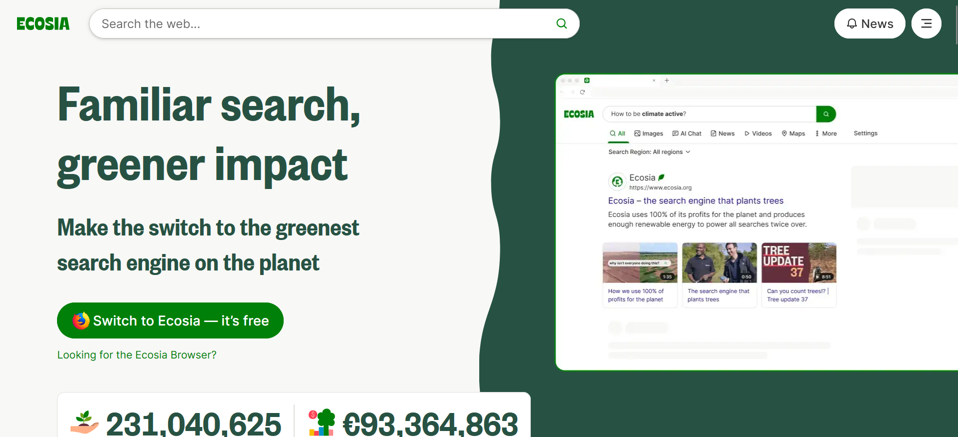
Search engine goes green via Ecosia
The Bottomline
From the static web era to responsive designs and the integration of AI and animation, web design is poised to continue its rapid progression in the digital timeline.
Emerging trends like brutalism, value-driven UX, and eco-friendly practices suggest a push to create beautiful, meaningful, and sustainable digital experiences that resonate with users. These enhancements further engage users as web design aligns with the changing expectations of the online world.
Aug 5, 2025

Creates insightful, strategy-driven content that translates complex design and branding concepts into accessible knowledge, supporting Ramotion’s mission to elevate digital experiences.