Branding is no longer centered solely on a company's identity. It extends far beyond personality, character, mission, and core values. As a comprehensive embodiment of the business's existence and activity, it encompasses multiple aspects that help it to fulfil its role.
Among all the brand identity elements, the logotype is considered one of the most important. It is a visual facet with transformative power to take businesses to an entirely new level by generating the correct associations, evoking emotional resonance, and driving engagement. It fosters brand recognition, customer trust, and a competitive advantage.
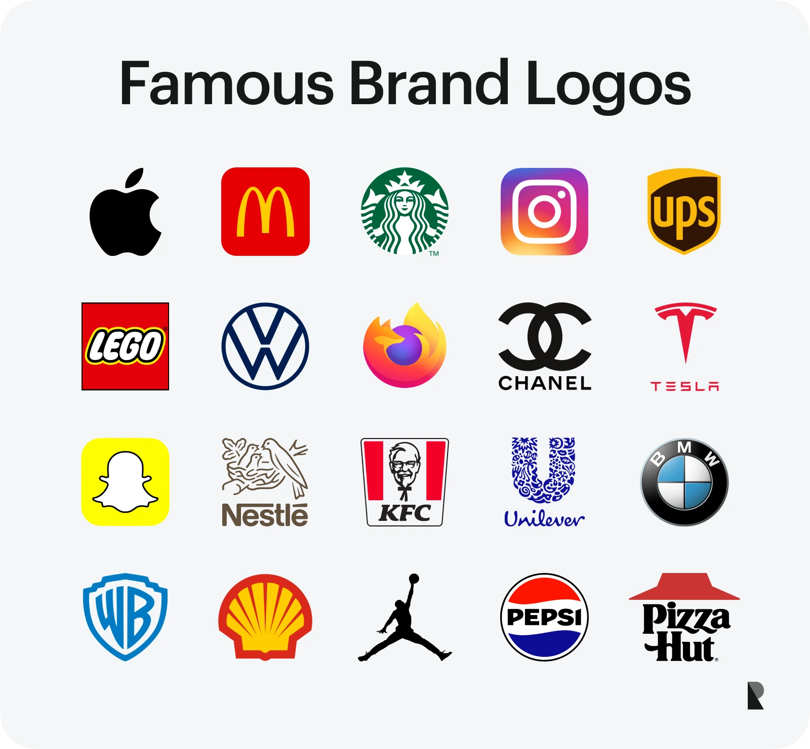
Over 45 examples of iconic brand logos and their unique stories demonstrate the importance of wordmarks and the value of hiring a professional agency to create one for your company. For many companies, working closely with a brand identity agency ensures that the strategic foundations behind the logo positioning, messaging, and visual language are developed in tandem with the mark itself.
Iconic Brand Logos and Their Unique Stories
Famous brand logos represent their companies and have a global cultural influence, encouraging other brands to stay true to their missions while meeting the market's ever-changing demands, expectations, and preferences. Consider 48 inspiring examples.
1. Apple
We will begin with Apple and its iconic logo. Operating in the IT industry for almost five decades, the corporation has one of the most recognizable logos in the world. It is the epitome of creativity, genuineness, and simplicity—qualities that Steve Jobs, the late co-founder, adored and sought in his surroundings.
Created in 1976, the Apple logo was originally an illustration of Isaac Newton reading under an apple tree. However, it was not that simple and distinguishable. Therefore, a year later, Steve Jobs hired Rob Janoff, who ingeniously played on the computer term "byte" and created an iconic "bite Apple", naturally separating it from the others. To this day, "bite Apple" is a symbol of innovation, simplicity, clarity, and minimalism, much like any product produced by the company.
2. Nike
Generating over $50 billion in revenue, Nike is one of the most iconic brands in the activewear industry. It is renowned for its inspiring slogans and collaborations with celebrities, encouraging everyone to push beyond their limits.
Their "Swoosh" logotype is legendary. Like Apple's brandmark, it symbolizes the company's vision. It was created in 1971 by Carolyn Davidson, who drew inspiration from the Greek goddess Victory. It is clean and straightforward, but naturally conveys success, dynamics, motion, and victory, complementing their "Just Do It" tagline and serving as a foundation for storytelling experiences.
3. McDonald's
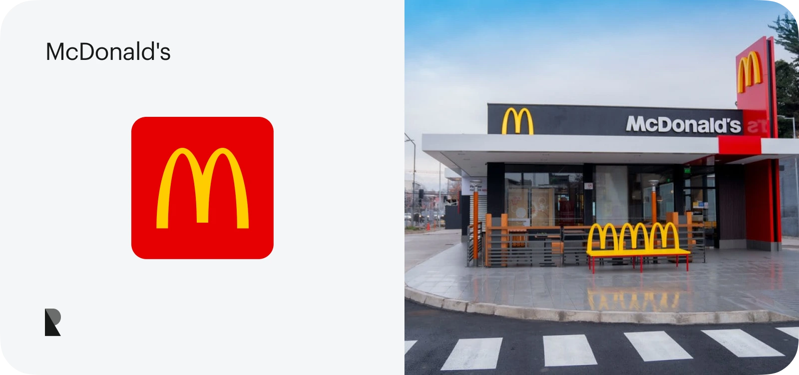
Ray Kroc, a spunky salesman from Illinois, was a true visionary in the marketing World. He turned a tiny hamburger restaurant into a global giant. With his creative approach and deep understanding of the importance of branding, he needed a logo to tell a story. The McDonald's logo was officially introduced in 1968. It was and still is a large yellow stylized "M" formed by two golden arches. It has many interpretations. For some, it represents two brothers who founded the restaurant; for others, it symbolizes stability due to its golden color. Some believe it reminds the long, thin French fries for which the company is famous. In either case, its memorable shape and metaphorical meaning helped the company gain global recognition and secure its place in the international market.
4. Coca Cola
Available in over 200 countries and territories, Coca-Cola is the most widely distributed beverage manufacturer globally. It has a significant market share in almost every country and ranks as one of the most popular choices among people of all generations.
Like its iconic taste, the company has an iconic logotype. Unlike previous examples, it is not graphics—it is just the written word, the company name. Its swirling, looping, intricate linework acts as a brand identifier, whose handwritten style creates a sense of familiarity and conveys love and passion.
5. Google
With a market capitalization of $2 trillion, Google is rightfully considered one of the most profitable companies in the world, securing the number eight ranking on the Fortune 500 list. The company has earned a strong reputation as a thought leader, providing quick and accurate access to information globally, whose logotype plays a crucial part in its branding, marketing, and advertising campaigns. Just remember, Google doodles that connect the company with people's cultures and traditions unobtrusively.
First created by Sergey Brin in 1997, the co-founder of Google, it was the company's name styled in a shadowed, multi-colored sans serif typeface. Later, it was re-imagined by Ruth Kedar, who changed the typeface and introduced the distinctive color pattern of blue, red, yellow, and green, with the latter breaking the primary color sequence to symbolize the company's unconventional and innovative nature.
6. Adidas
Adidas, the largest sportswear manufacturer in Europe, is a long-established leader in the niche. It is famous for its impeccable products and memorable branding campaigns, with the logotype being one of the most recognizable identity elements not only in the industry but worldwide.
Trefoil was introduced in the early 70s. Twenty years later, it was transformed into three bold stripes to resemble a mountain and mark the brand's expansion into the sportswear market. Both versions were designed to represent dynamism, sportiness, and eagerness to overcome all obstacles and challenges that metamorphic mountains may pose.
7. Starbucks
Founded over 50 years ago, the Seattle-based coffee bean wholesaler has become one of the most recognizable multinational chains of coffeehouses and roastery reserves worldwide. It specializes not only in espresso and lattes but also in teas, pastries, and light bites.
Heavily influenced by Seattle's maritime heritage and seafaring tradition of coffee trading, the Starbucks logo represents the company's core values and personality. It features a white siren set against a green background, which epitomizes the captivating and irresistible nature of coffee, premium quality, and a sense of good time. Although the logo has evolved, it has retained its soul and symbolism intact.
8. Amazon
Capitalizing on a customer-centric approach, continuous innovation, and strategic diversification, Amazon has become the second-largest company in the United States, trailing only Walmart. Although it is a young company, its brand identity is one of the most powerful.
The Amazon logo is as legendary as the company itself. It has undergone several redesigns reflecting the company's evolution. Today, the Smile logo represents the brand's meaning, vision, mission, and a wide range of products (from A to Z). It has become a core part of Amazon's marketing vehicle that easily stands alone.
9. BMW
Bayerische Motoren Werke AG, widely known as BMW, is a vehicle and motorcycle manufacturer ranked 46th in the Forbes Global 2000 last year. It has a rich and distinguished history of producing exceptional products.
The BMW logo is a stylized spinning propeller based on the colors of the Bavarian national flag. Although it has undergone changes during its 100-year history, representing the company at various stages of its evolution, it always remains connected to its aviation heritage. Today, it is the symbol of daring drivers and race-junkies.
10. Mercedes-Benz
According to Forbes, Mercedes-Benz is the seventh most valuable brand globally, with a market capitalization of $56.4 billion. Its history spans over a century and has had its ups and downs, as it was Hitler's beloved motor brand. Nevertheless, its continuous pursuit of excellence in automotive engineering and design, along with a total commitment to quality, innovation, and luxury, has made its name and reinforced its position.
Their logotype indicates their vision and mission to deliver transport excellence to their clients. It has two main elements: a three-pointed star, which represents the company's ambition to conquer land, sea, and air, and a circle, which conveys the unity and strength. It has evolved, but not dramatically, introducing only one new element—the laurel wreath, denoting victory and honor.
11. Pepsi
Last year, Pepsi ranked 45th on the Fortune 500 list. However, it is more than just a company that produces refreshing beverages. It is a vast conglomerate that includes Pepsi, Frito-Lay, Gatorade, and Quaker.
The long-standing rival of Coca-Cola, Pepsi, is also famous for its iconic logo. The company's flagship beverage brand boasts of having nothing less than a Globe as its official visual identity element. Its bright red, white, and blue colors originally channeled American patriotism during World War II. Today, it represents a whole World and a company that is an integral part of the community.
12. Samsung
Samsung is the world's largest smartphone and television manufacturer, consistently on the Fortune 500 list, with a market capitalization exceeding $500 billion. It offers diverse products and services, driven by its inspiring mission to create the future and enrich people's lives.
The largest Korean conglomerate's logotype skillfully embodies its brand's vision of a powerful and enduring company and its mission to improve people's habitat. It features the name, "three stars" in Korean, enclosed inside a blue oval that conveys global outreach and commitment to innovations, perfectly supporting the company's technological leadership and creativity.
13. Disney
Magic, wonder, and innocence are three main qualities that describe the largest producer of captivating, outstanding, meaningful, and memorable storytelling experiences found in TV and the real world through their engrossing amusement parks and merchandise.
Walt Disney's logotype is an ingenious creation. It features his legendary signature and a stylized castle, which can be seen in every animated movie's opening.
The master's handwritten font, combined with the enchanted palace, creates a sense of fairy-tale magic. It represents a world of dreams and happily-ever-afters that demonstrate the company's vision, mission, and activities.
14. IBM
A major player in the technological sector, IBM is ranked 7th in revenue among its competitors. Although its sphere of expertise primarily lies in technological inventions, it boasts one of the most prominent and recognizable brand identity elements that distinguishes the company from its competitors.
The IBM logotype is relatively modest – it consists of just three letters and is designed with horizontal stripes. Nevertheless, using style and color, it aptly represents the company's core values of reliability, trust, and innovation. Thus, the stripes, reduced from the original 13 to 8, symbolize speed, dynamism, and modernity, while the light blue coloring stands for stability and credibility.
15. Shell
The British multinational oil and gas company is ranked 9th on the Fortune Global 500 list. Generating a revenue of over $300 billion, it is the largest company in Europe, trailing only Volkswagen.
The Shell logo is one of the most famous images of marine bivalve molluscs. The brand's choice for a scallop was not accidental – it has historical roots, as Shell originally was a company that imported and exported seashells. As the brand evolves, so does the logotype. Today, it is a stylized pecten, whose shape epitomizes the brand's values of energy, innovation, and global presence; whereas the yellow and red colors convey optimism and warmth.
16. FedEx
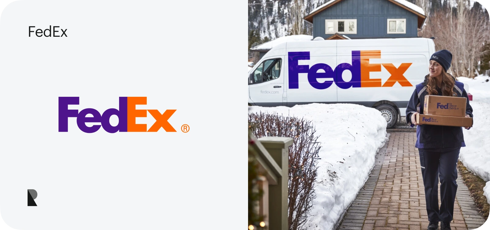
If you seek a good example of creatively hidden meaning in visual brand identity elements, then the FedEx logo is your ultimate stop. Much like Amazon, which conceals its mission of selling products from A to Z in its wordmark, the FedEx logo skillfully incorporates the company's heritage, vision, and mission into a meaningful and memorable visual identity.
Their logotype, present on every box, delivery truck, or employee uniform, is a combination of two words: "Federal" and "Express." What makes it unique is a hidden arrow created by the negative space between the letters "E" and "X." It reflects the company's precision, speed, reliability, and forward movement.
17. Chanel
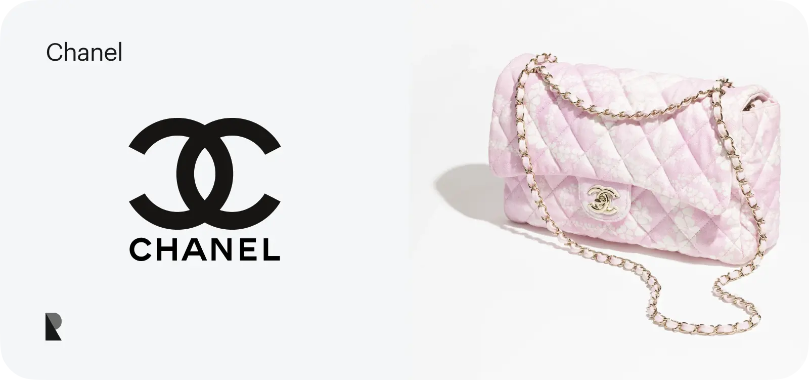
Exuding an image of timeless elegance, sophistication, and women's beauty and independence, Chanel has a rich legacy of innovation in fashion and fragrance. Although the brand is famous for being accessible only to higher society, its impeccable and stately reputation is known by everyone.
Coco Chanel created the logo of the "Chanel 5" fragrance producer in 1925, initially representing the first letters of her name. Thanks to her reputation and continuous success, the interlocking of two C letters through their backs has acquired a sense of luxury, perfection, exclusivity, and timeless appeal.
18. Visa
With over 1.2 billion credit cards in circulation and processing 234 billion transactions, Visa holds the top position in the niche, establishing itself as a thought leader with high trust, reliability, and credibility.
The Visa logo emphasizes the company's qualities and global accessibility, ensuring payment availability and lifestyle freedom. It features a stylized letter "V", the first letter of the company's name, along with blue and gold coloring. Blue evokes a sense of reliability and stability, whereas gold, which originally represented California hills, conveys prosperity and trust.
19. Lego
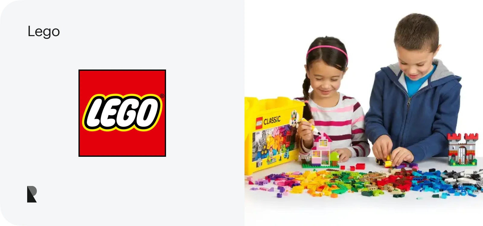
Lego, the beloved children's constructor that has outgrown its original purpose and become a sought-after instrument for creativity and innovation among adults, has been catering to creative builders of all ages.
Much like their visionary personality, their logo bears a unique sense of imagination and artistry. It strongly relies on the "less is more" ideology that proves to everyone that all ingenuity is simple. With its red square background, a visual nod to the iconic Lego brick shapes, vibrant colors, and smooth, bold handwritten typeface, it naturally evokes playful and colorful childhood associations with positive pastimes and creativity.
20. MasterCard
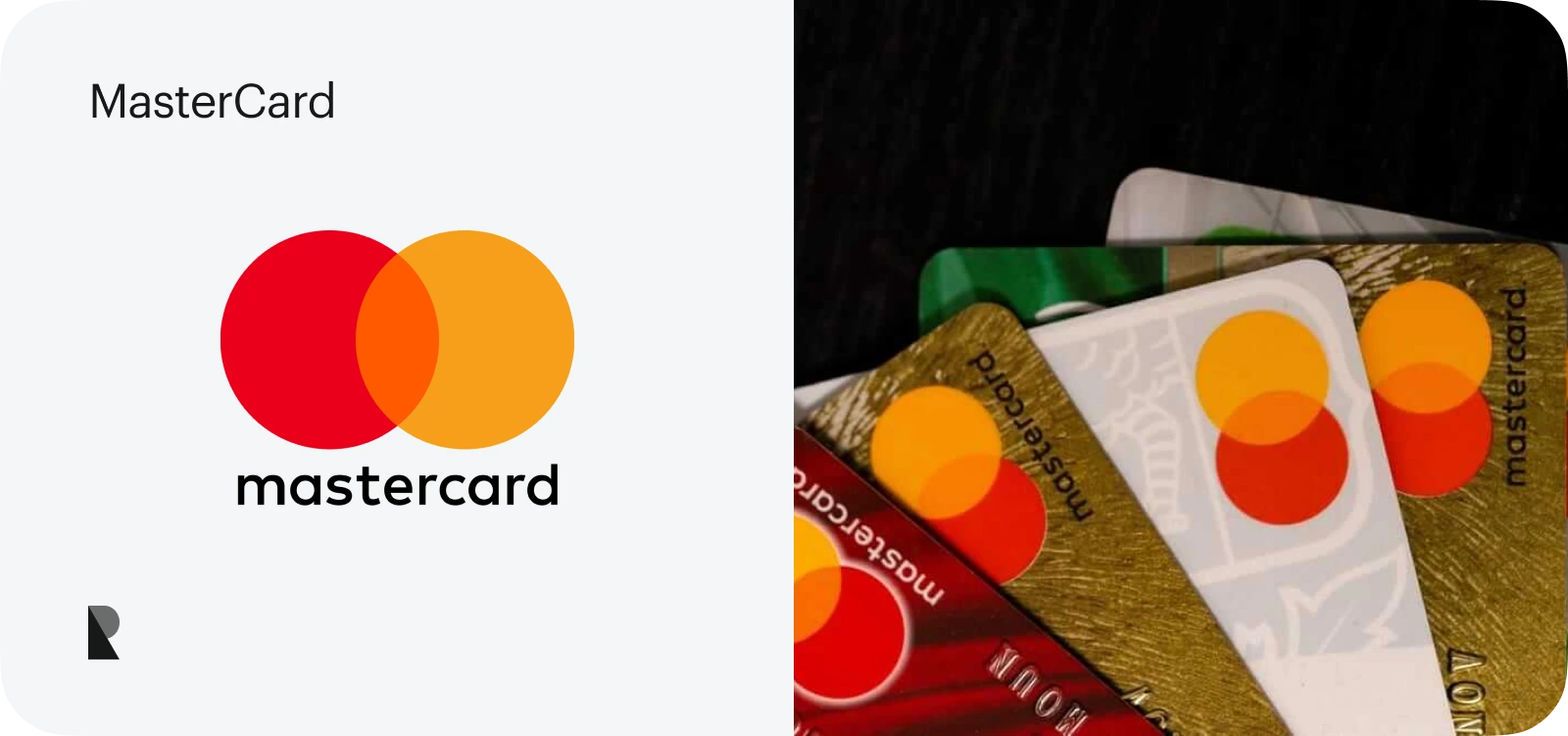
From the very beginning. MasterCard has established itself as a reliable and trustworthy partner for financial institutions, operations, and payments. Its brand identity is simple, clean, and straightforward, ensuring friendly delivery of its brand's mission and vision to customers regardless of their nationality, language, or traditions.
The forward-thinking Mastercard logo features two interlocking circles in red and yellow. This intersection illustrates global connectivity, accessibility, and seamless collaboration. Red evokes a sense of vitality and energy, while yellow exemplifies happiness and prosperity.
21. YouTube
YouTube, the father of video streaming, has marked a new stage in Internet evolution, providing users with an instrument to share knowledge, experience, thoughts, and creativity through video.
Established just a few decades ago, this IT giant has one of the most recognizable brand marks in the world. It is a red rectangle with a white play button that epitomizes the core functionality. The play button symbolizes video playback, whereas the red rectangle represents the television screen.
22. Ford
Founded in 1903, Ford became a thought leader in the automotive world due to its revolutionary approach to car manufacturing. The company has experienced ups and downs throughout its long history, but its branding has remained consistent, personifying its mission to help people move freely.
Their logo has remained essentially unchanged since its inception. Introduced in 1927, the company's name is placed inside the blue oval. It conveys reliability, unity, forward movement, and association with the automotive industry. The coloring (blue and white) and traditional font, which was inspired by Henry Ford's signature, produce an image of familiarity, trustworthiness, and credibility.
23. Nike Air Jordan
As one of the most valuable sports brands by market capitalization and revenue, Nike has been the leader in the niche for decades. It supplies people across generations and nations with high-quality activewear and equipment for their sporting endeavors. Nike is famous for collaborating with celebrities, especially Michael Jordan, whose silhouette has become a brand mark.
Nike Air Jordan is a line of sportswear shoes, apparel, and accessories marketed under the Jordan Brand name. The sub-brand Nike logo was first introduced in 1985 and gained huge success, making the legendary Chicago Bulls shooting guard famous in basketball and across various sports activities. His silhouette, used as a logotype, represents sports, stamina, an unbreakable spirit, and eagerness to push the limits.
24. Mozilla Firefox
Gaining immense popularity for its speed, security features, and customizable interface, Mozilla Firefox was the top choice for web browsing in the late 90s and 2000s. Although it has experienced a decline in recent years due to tough competition, it remains one of the most prominent names in web history, with a logotype that everyone knows and adores.
Their iconic logotype is a stylized red panda encircling a globe. It has been refined over the years, primarily through stylized details and texture changes. It represents the platform's global availability, accessibility, and high speed.
25. Playboy
Founded in 1953 by Hugh Hefner, Playboy is a men's lifestyle and entertainment magazine that gained fame for its centerfold models. It played a significant role in the sexual revolution and carved out quite a niche.
Their brand mark is a black, smooth silhouette of a rabbit head with a bow tie. It was chosen for its wide association with playfulness, fun, carefree sensuality, vivacity, and high reproduction. It evokes a sense of youthful, sexual energy that, thanks to a tie, has a touch of elegance and sophistication.
26. Volkswagen
Volkswagen is one of the biggest multinational groups operating in the automotive sector. It has successfully met the population's demand for reliable vehicles with its wide range of products, from the small Polo to the luxurious Porsche. They also sell Currybockwurst, the finest German currywurst, producing over 8.5 million sausages yearly.
Their logotype personifies German roots, in particular love and adoration for practical, handy, and reliable things. It includes two intertwined letters ("V" and "W") enclosed in a circle. The letters represent the brand's name, "Volkswagen," which translates to "people's car" in German, and reflect the company's mission, personality, and vision.
27. Rolex
Over $11.5 billion in revenue last year, Rolex solidified its dominance in the luxury watch market, proving again that it is one of the most demanded accessories among the rich and famous.
Their logo, like their brand's image, is a posh yet tasteful element that naturally draws attention and demonstrates the company's mission, vision, and commitment to precision and excellence. It is a five-pointed crown widely associated with the five fingers of a watchmaker's hand. It is a tribute to craftsmanship and a symbol of royalty, achievements, and high quality.
28. Harley-Davidson
Born-to-be-wild Harley-Davidson conquered the United States and the world within the last century. It symbolizes freedom and speed, appealing to daring and bold personalities.
Founded in 1903, the company's logo remains the stylized name. While its style has undergone some changes, it has consistently conveyed its unique, bold charisma and spirit of the open road. Today, it is the same shield with the words "Harley-Davidson," yet adorned with a V-shape that highlights the company's 50th anniversary and represents stability and strength.
29. Puma
Puma is one of the world's largest manufacturers of activewear. Together with Adidas and Nike, it serves billions of people, providing them with footwear, apparel, and accessories necessary to achieve their sports goals.
Much like the brand name, the Puma logo reflects the company's identity and vision as a performance sportswear company. It is the name with the beautiful silhouette of a puma leaping through a "D" letter, representing Rudolf Dassler, the company's founder. It denotes speed, agility, and power.
30. Adobe
Behind an era of Photoshopped magazine covers and bombs, Adobe is a thought leader in the tech industry. It offers a diverse range of products used by creative professionals, businesses, and individuals across various endeavors.
Their logo is an excellent example of embracing simplicity and versatility. It features a stylized "A" within a red square with a mountain peak. The letter represents the company's name, whereas the mountain peak hints at the company's aspiration for technological advancement. Together, they emphasize creativity and innovation.
31. Pizza Hut
Popularizing pan pizza with a thick, crispy crust in the United States, Pizza Hut has become a global phenomenon over the last several decades, establishing itself as a true competitor to McDonald's, Domino's, and other leading fast-food chains.
Their logo is simply the company name with a red roof. However, it perfectly represents the brand's value and mission to bring family together and make their evenings warm and cozy. Thus, the red roof evokes a sense of comfort, warmth, family happiness, and togetherness; whereas the name is associated with traditions and cultural heritage.
32. Dell
"Turn the world on its ear, and sell computers directly to consumers" was a daring ambition of Michael Dell, the co-founder of one of the most influential high-tech companies in the world. His dream to disrupt the computer industry and get a computer to every home has become a reality, making his company one of the richest in the sector.
Their logo perfectly supports this ambition. Initially, it included the brand name with the letter "E" to be a little tilted. The current version also has a circle demonstrating global presence and reliability. Together, they symbolize intelligence, elegance, and ambition, which are reflected in their official tagline, "The power to do more."
33. Audi
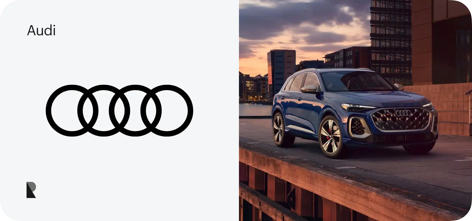
Known for its Quattro all-wheel-drive system, sporty performance, and luxury vehicles, Audi has been serving customers globally, generating nearly 69.9 billion euros in revenue last year. It is responsible for introducing innovative technologies and luxurious interiors in vehicles, providing the means to ride and enjoy the road and journey.
Their logo features four interlocking rings, representing the merger of four German automobile manufacturers. These rings signify unity and the combined strength of Audi, DKW, Horch, and Wanderer. The logo demonstrates the interconnectedness and shared history of the companies, bringing an image of unified reliability.
34. Prada
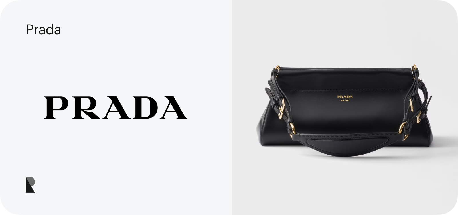
"Devil Wears Prada" - the most recognizable Italian luxury fashion house, Prada, is the one to copy, fear, and admire. It holds a high status as a quality leather goods manufacturer, selling handbags, travel accessories, and shoes with distinctive designs, clean lines, and minimalist aesthetics worldwide.
Their logotype is an iconic triangle with the Prada name and the crest (House of Savoy's coat of arms and a knotted rope). The latter demonstrates the company's relationship with the Italian Royal Family, whom they supplied with accessories in the early days. Today, their iconic logo exudes an image of quality, craftsmanship, and luxury.
35. Nescafé
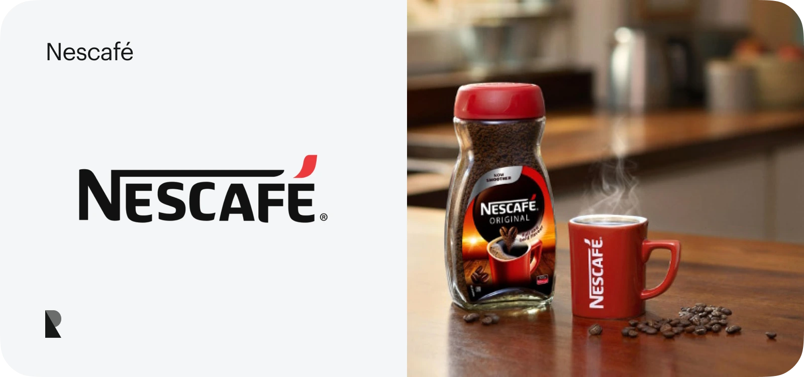
Successfully operating under the Nestlé brand, Nescafé has carved out its niche in the industry and become one of the most prominent coffee suppliers worldwide. It is sold in over 190 countries, capturing a significant market share.
Their logotype skillfully capitalizes on morning ritual associations, evoking a sense of coziness, enjoyment, and cheerfulness. Introduced in 1938, the wordmark has not undergone significant changes – it still features the company's name, with a capitalized "N" and a red swoosh. It demonstrates the company's commitment to tradition and ambition to empower people in the morning with their beverage.
36. Colgate
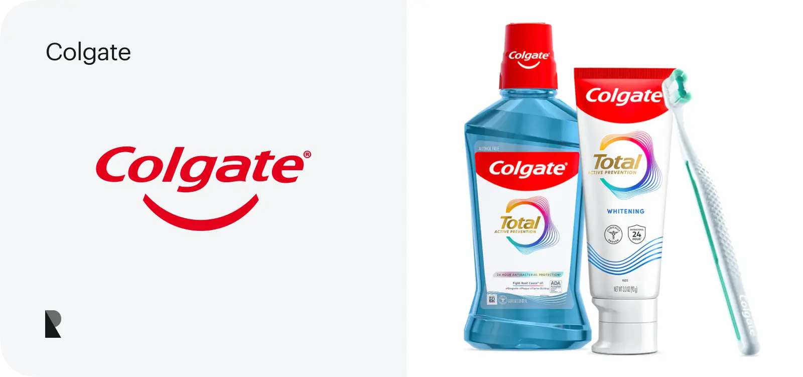
Strongly associated with oral care, Colgate occupies the top position in the niche, serving people across five continents. It also holds a significant number of patents that improve oral hygiene. It has a revenue of over $20 billion and a capitalization of almost $75 billion.
Appearing in the late 19th century, the company's logotype has undergone constant changes to support brand evolution. Today, the company's name is featured in a distinctive bright blue and red color scheme. The uppercase letters convey strength, whereas the coloring evokes a sense of freshness and cleanliness.
37. UPS
A major player in the package delivery, logistics solutions, and supply chain management industry, United Parcel Service operates in over 220 countries. It has a revenue of $90 billion, establishing itself as a trustworthy partner with a large community and loyal fans.
The UPS logotype has evolved dramatically. Initially, it was a shield with an eagle carrying a package—the company wanted to demonstrate the reliability and speed of its services. Almost 50 years later, it was transformed into a shield with a bow-tie design. Today, it remains the same brown and gold shield, yet with the first letters taken from the company name, symbolizing protection, reliability, and versatility.
38. Instagram
Over a decade ago, Instagram took the web by storm and became one of the most popular free, online social networking services with photo and video-sharing functionality. It has 2 billion monthly active users, trailing only behind Facebook and YouTube.
Although the platform has been with us for only 15 years, its main visual identity piece has seen several incarnations. Started as a detailed illustration of a Polaroid camera, it has evolved into an oversimplified, abstract camera-like shape icon with a gradient of colors. It symbolizes the company's commitment to the industry and demonstrates its mission and vision.
39. Tesla
Making it a recognizable brand in both the automotive and energy sectors, Tesla is famous not only for its electric cars, which feature autopilot and futuristic navigation panels, but also for its energy storage solutions, which generated a staggering $96.77 billion last year.
The logotype of Elon Musk's company is simple. It thrives on minimalism, avoiding overly complicated designs. It is just a stylized "T" inside a shield. Nevertheless, it perfectly captures the brand's personality and vision, creating proper associations with technology and innovations.
40. Nestlé
Nestle is a multinational food and beverage company with a long history and millions of fans worldwide. Its vast sub-brand portfolio covers various sectors, including confectionery, bottled water, pet products, healthcare products, and frozen foods.
Their logo is an illustration of a nest with birds. It was chosen intentionally, as the company's name means "little nest" in German. Adopted in 1864, Henri Nestlé, the founder, not only connected the brand mark to his heritage but, most importantly, instilled a sense of tradition, care, and family values into the brand.
41. Heineken
Heineken is one of the oldest brewery companies in Europe. It is renowned not only for its beverages but also for its pioneering approach to quality control and innovative brewing techniques. Its revenue exceeded $32 billion last year, solidifying its position in the niche.
Their logotype, like their bottles, is iconic. Everyone can easily recognize the company behind the green bottle with red stars. The brand mark features two distinctive traits: a star and the brand name, with a "smiling" letter "e." It evokes associations with tradition and quality and a sense of friendliness and approachability.
42. Warner Bros.
Movie franchises, classic films, TV series, and animations spanning different genres – Warner Bros. has made a vast contribution to the entertainment industry. Operating in the industry since 1923, it has been behind numerous cinema masterpieces.
Their logotype is as famous as the company, as the iconic shield and "WB" monogram are recognizable to anyone. Over the years, the logo has been refined to support the company's growth. Started as a rough, black and white version, today it has a bold, streamlined design with a golden touch that catches the eye and evokes a sense of tradition and good times at first glance.
43. Reebok
Reebok is all about high-quality athletic footwear, apparel, and accessories that combine great performance with modern design to fit the customer's lifestyle. The company holds a strong position in the fitness and sports sector, with a global royalty income of $276 million.
Their logo has a long and rich history of incarnations, used to demonstrate the company's evolution. Initially, it featured a British flag, then it transformed into a vector design with stripes. The current version has a delta symbol and a triangle of three red lines. They emphasize a dynamic, sporty spirit and mental transformations during sports activities.
44. Snapchat
Snapchat's core features include disappearing messages, a camera-first interface, and ephemeral content. This messaging app has become increasingly popular among the young, securing the company $5.361 billion in revenue last year.
Their logotype cleverly represents the platform's mission, vision, and core functionality. Designed by co-founder Evan Spiegel, it features a ghost against a solid yellow background, representing the disappearing nature of messages shared on the platform. Thanks to the yellow color, it has a friendly and playful nature.
45. Canon
As a major player in the printer market, Canon has established itself as a thought leader in the industry. From professional-grade to customer-friendly options, it offers a wide range of products to meet customers' demands and expectations. The company generates over $29 billion yearly, and photography is on the rise.
Their logotype has always been integral to their branding and marketing strategy, so it has had various versions. It started with an image of the deity (the Buddhist Goddess of Mercy). Then, it transitioned into a more international-like option featuring the letter "C" that stood for the company's name. The modern version, with its distinctive red emblem, was introduced in 1955 and symbolized a commitment to quality, precision, and global presence.
46. KFC
Successfully challenging the established dominance of the hamburger, KFC (Kentucky Fried Chicken) has diversified the market and carved out a niche for itself, occupying the top position in the fast food restaurant sector. Its global revenues exceeded $33 billion the previous year.
Like iconic "Original Recipe" fried chicken, the company's wordmark is legendary. Centered around Colonel Harland Sanders, the late founder, it features a portrait of the colonel in his signature white suit, black string tie, and glasses. It represents home-cooked quality and commitment to hospitality.
47. Yahoo!
The main rival of Google, Yahoo!, is a powerful search engine system with a vast portfolio of services, including Yahoo Mail, Yahoo News, Yahoo Finance, and Yahoo Sports. It was an internet pioneer whose website was one of the most popular in the USA at the beginning of the internet era.
Since the company's founding in 1994, the logotype has seen three prominent incarnations. Initially, it was a stylized, jumping "Y" character on a blue globe. Then it was replaced by a wordmark in a modified version of the Able font, often in purple. The current version was introduced in 2013 and had a more modern and streamlined look. Nowadays, it reflects the company's name and playful, energetic nature, encouraging users to discover new information.
48. Unilever
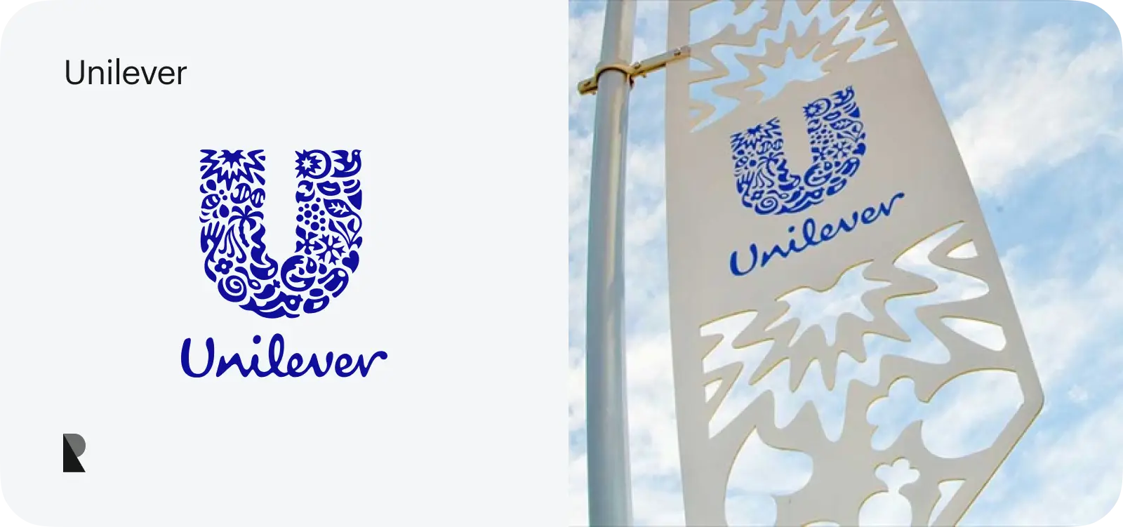
Unilever is a large multinational conglomerate with one of the broadest product portfolios. It serves numerous market segments, offering services and products across various categories, including beauty and wellbeing, personal care, home care, nutrition, and ice cream. Dove, Axe, Hellmann's, Knorr, Lipton, and Ben & Jerry's are some of its prominent sub-brands.
The Unilever logo is a unique brand mark, as it is composed of 25 icons merged into one letter, "U." Each pictogram symbolizes a different aspect of Unilever's business and sustainability efforts. You might find the sun, hand, flower, and even a bee there. Together, they reflect the company's mission and identity.
Key Elements of the Best Logos
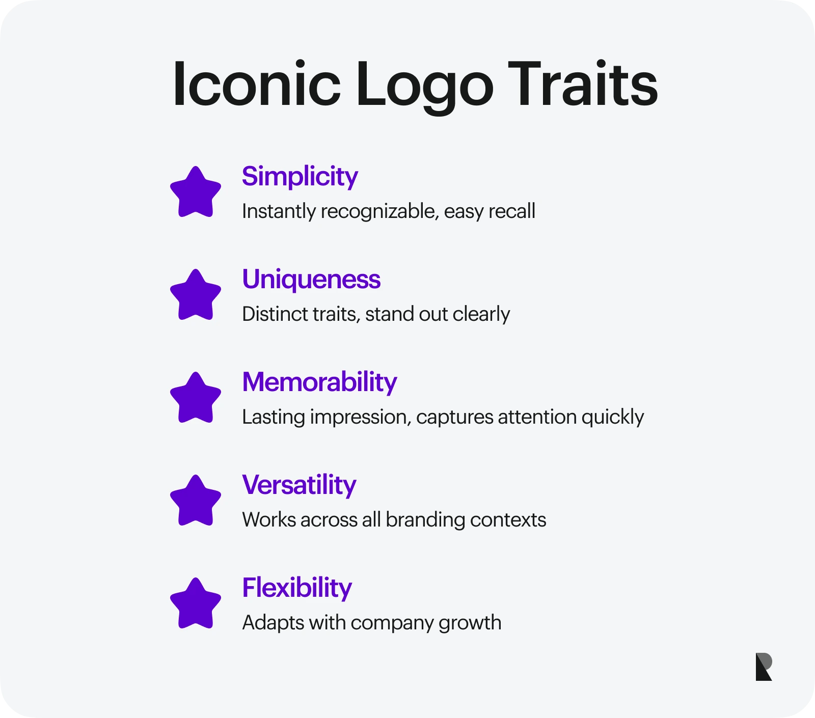
Although the brands presented in our list operate in different niches, serve various market segments, and have unique missions and visions, their logotypes share many commonalities. Every successful company logo adheres to design principles and incorporates key elements that make it meaningful, memorable, and attention-grabbing.
Here are the essential characteristics of the most iconic logos:
Simplicity. Simple shapes, ideas, and concepts do not require a complex thought process. They are instantly recognizable, versatile, and memorable. Good examples of brands that capitalize on this are Apple, Shell, and Playboy.
Uniqueness. A logo must be distinctive and unique as an integral part of branding. It should have distinctive traits of the company's personality. Good examples include Dell, KFC, or Starbucks.
Memorability. With an attention span comparable to that of a goldfish, customers often skip branding elements. A successful logo draws attention and leaves a lasting impression, like the ones that McDonald's, Nike, and FedEx have.
Versatility. A logo is integral to branding, marketing, advertising, packaging, and other communication and customer interaction. It must be versatile to support the company's efforts. Examples of companies with versatile wordmarks are Amazon, YouTube, and BMW.
Flexibility. As the company evolves, a successful logo must be able to accommodate its growth, presenting the current state of the company. UPS, Google, and National Geographic thrive on this feature.
Conclusion
Apple, Unilever, FedEx, and other industry giants know that their logos are crucial in customer relationships and their ability to stand out. Not only do they invest their money and devote their efforts to branding, but most importantly, they delegate this task to professionals, who know how to shape the company's vision and mission into a brand mark that is unique, flexible, versatile, meaningful, memorable, and simple.
Whether you are a start-up or a well-established company, you need a logo that embodies your values, personality, vision, and mission and hits all the essentials. Therefore, hiring a professional design agency is crucial. When choosing among brand design firms, ensure they meet your criteria and have relevant experience in your niche.
FAQs
How often do big brands change their logos?
The frequency of updating logos largely depends on the company's marketing and branding strategy and ultimate goals. Generally, industry giants do not succumb to short-lived fads, opting instead for stability. However, as practice shows, they refresh their brand marks every decade.
How does color affect brand recognition?
Color significantly influences brand recognition as it is the simplest and fastest way to deliver information. It could increase recognition by 80% or ruin the overall impact. Based on psychological aspects, it is a powerful branding, marketing, and advertising tool.
How much do companies typically spend on logo design?
Logos vary in price, from free options to custom and personalized ones. When you hire a professional design agency, expect to pay between $300 and $5,000. The final sum largely depends on the staff's expertise, experience, and the project's complexity.
Jul 31, 2025
