
A fintech platform can pack every feature imaginable, but a clunky dashboard drives users away. AppFlyer’s 2025 report found roughly half of apps are uninstalled within 30 days, underscoring that first impressions and consistent clarity and performance matter. Today’s customers expect a fintech dashboard design that highlight the right metric right away, show fresh data, and offer clear next steps.
This article discusses effective fintech dashboard patterns—what to prioritize, how to strengthen trust, and which interaction models help users act confidently—so you can create a UX/UI design that boost retention and task completion.
What Makes a Fintech Dashboard Effective?
An effective fintech dashboard answers three user questions at a glance: what’s happening to my company funds, where is it going, and what should I do next. It delivers accurate information without overwhelming the user and makes the next steps clear. That said, design with clarity by focusing on three things.
Prioritizes the primary metric
The primary metric is the number that answers the user’s most important question when they view the dashboard. For a freelance designer waiting on a client payment, that’s whether the payment was received, delayed, or still processing. The dashboard’s job is to confirm that and act if something’s wrong, but the metric itself is just the status. Tracking, retrying, or contacting support come after.
Shows data freshness and status
Financial decisions rely on timely, verifiable facts, so it’s crucial to display a last-updated timestamp next to key metrics and use visual indicators when data is stale or incomplete. Financial data visualization dashboard that’s easy to access also increases the credibility of the platform. Status matters just as much: a payment marked pending, completed, or failed tells the user whether to wait, act, or investigate.
Connects real-time financial data to safe actions
Each metric should lead logically to an appropriate next step, like freezing a card, reporting an illegal transaction, or initiating a transfer. High-risk actions, especially ones involving money movement or anything irreversible, require confirmation steps, permission checks, and clear consequences. Lower-risk actions should be quick and contextual. If users can’t move from insight to a safe action, they’ll mistrust the platform.
Hire one of the top UX design firms in tech industry to help you create a fintech dashboard your users will love!
Comparing Financial Dashboard Design Archetypes
There are four fintech dashboard archetypes according to user needs: payments and revenue, spend management and business banking, investing and wealth, and risk, compliance, and infrastructure.
Let’s compare these archetypes based on the following aspects:
- User role: who the dashboard primarily caters t
- Primary section priority: what the dashboard should answer at a glance
- Financial data visualization density: how much information should be on the dashboard
- Trust mechanism: indicators that the real-time financial data is reliable, like timestamps, audit trails, etc.
- Key action: the primary task the dashboard is designed to enable
| Dashboard design archetypes | User role | Primary section priority | Data density | Trust mechanism | Key action |
|---|---|---|---|---|---|
| Payments and revenue | Finance teams, merchants, operations | Payment status and volume | Upper medium | Transaction-level indicators | Resolve failed payments, followup on disputes, manage payouts |
| Spend management and business banking | Finance teams, founders/owners | Available cash and spend control | Medium | Permissions, policy context, budget vs. actuals | Approve or flag payments, move funds, set budget limits |
| Investing and wealth | Individual investors, advisors | Portfolio value and performance | Low-medium | Performance context, cost basis | Trade and adjust goals |
| Risk, compliance, and infrastructure | Analysts, developers, compliance teams | System status and issues | High | Auditability, diagnostics, documentation | Review cases, resolve errors |
So, how do these archetypes apply across different segments? Let’s explore the following financial dashboard design examples.
Payments and Revenue Dashboard Design
Payments and revenue dashboards must include authorization rates, decline reasons, and failed-payment trends so teams can differentiate between checkout errors, fraud, or dead cards. They should also show whether a payment succeeded and when funds will actually arrive by mapping expected arrival dates against payout history.
Stripe: layered payment operations
Stripe’s dashboard offers a top-level view where each summary expands into a transaction list and then into individual payment details. Status labels sit next to amounts so charged versus available funds aren’t confused. Built-in dispute, refund, and failure-resolution paths work in context as users drill down.
*Design Pattern: Layered/progressive detail *
Key features:
- Layered flow: overview, transaction list, and individual payment
- Payment status labels next to amounts
- Built-in dispute, refund, and failure resolution paths
- Drill-downs that preserve action context
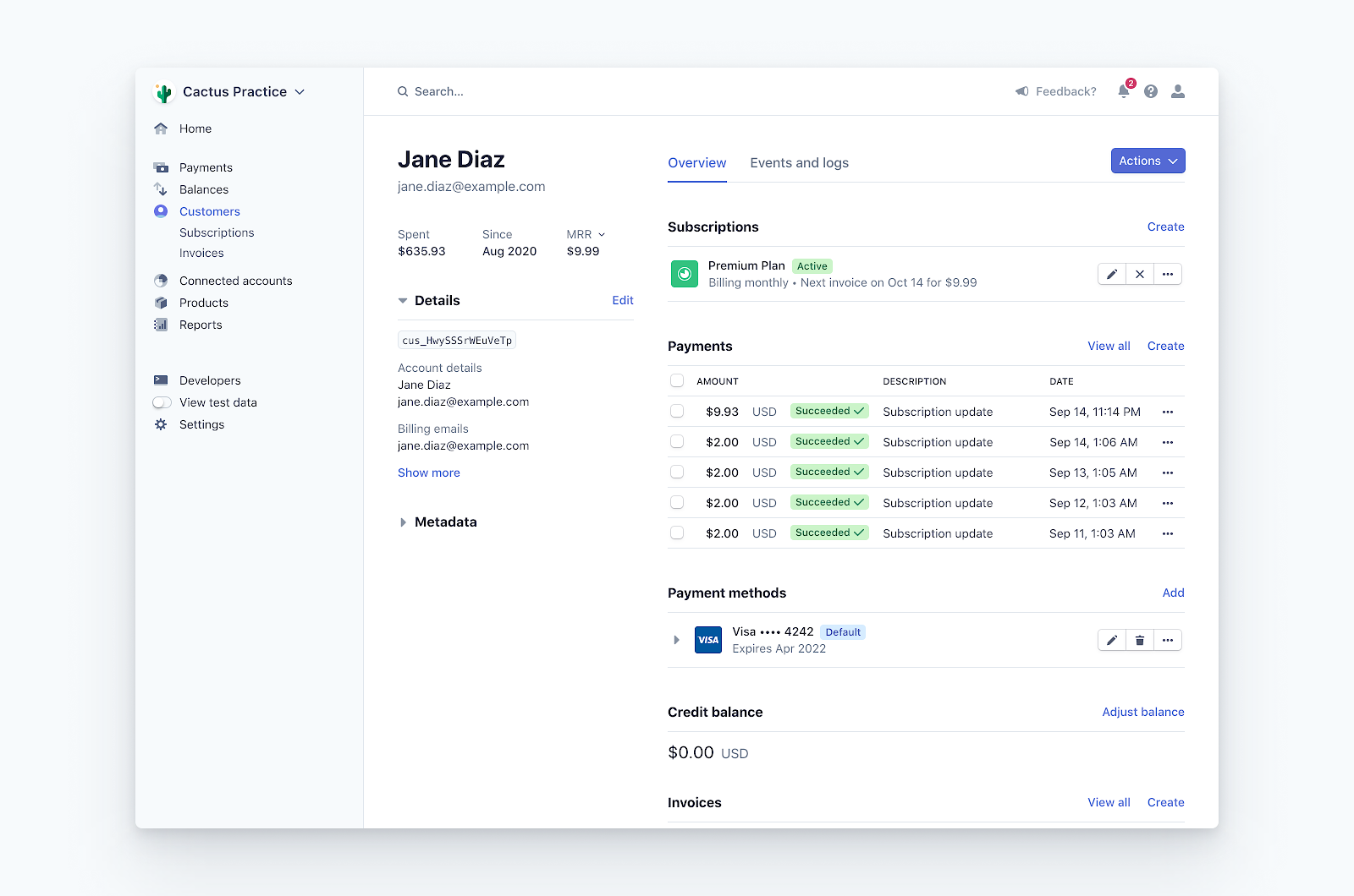
Customer information and payments dashboard via Stripe
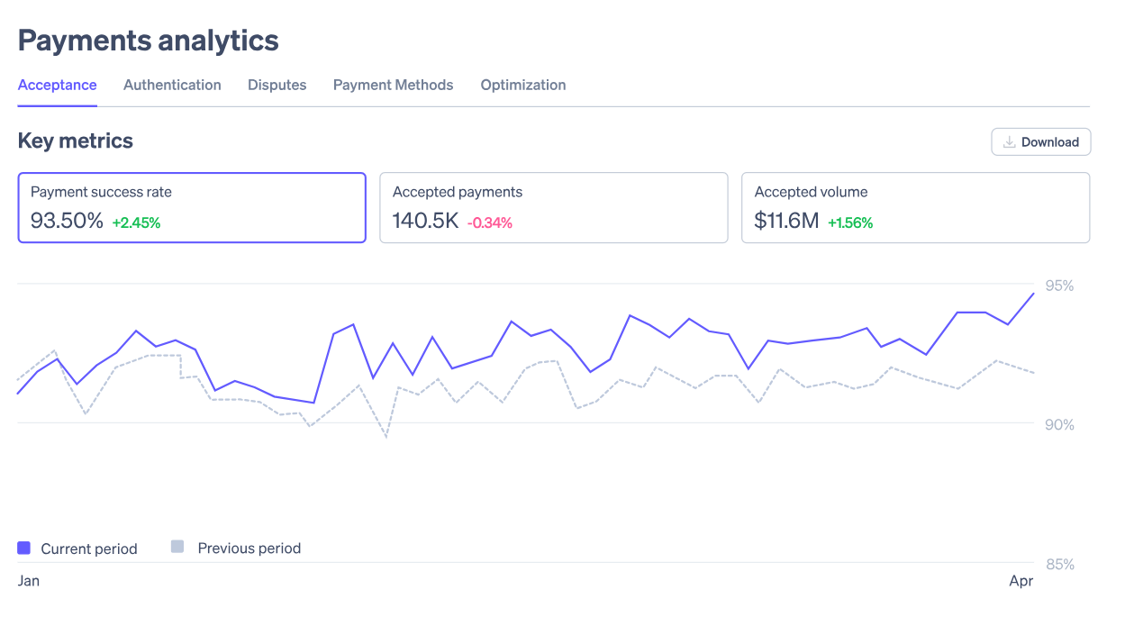
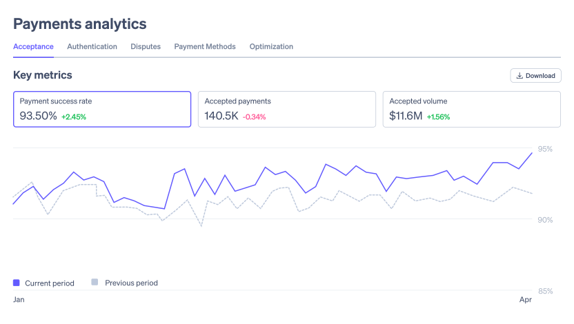
Payment analytics via Stripe
Adyen: enterprise payment visibility
Adyen is built for scale. Payment-method, regional, and channel breakdowns appear on the main screen so teams can monitor multi-market performance at a glance. A side-by-side view of processed versus settled volume makes reconciliation gaps obvious. Dense data let large merchants investigate mismatches while retaining the global picture, all in the same workspace.
Design Pattern: Side-by-side settlement
Key features:
- Payment method, region, and channel breakdowns on the main page
- Multi-market performance comparison
- Side by side overview of processed vs. settled volume
- Drill-downs that maintain global context
- High information density for enterprise users
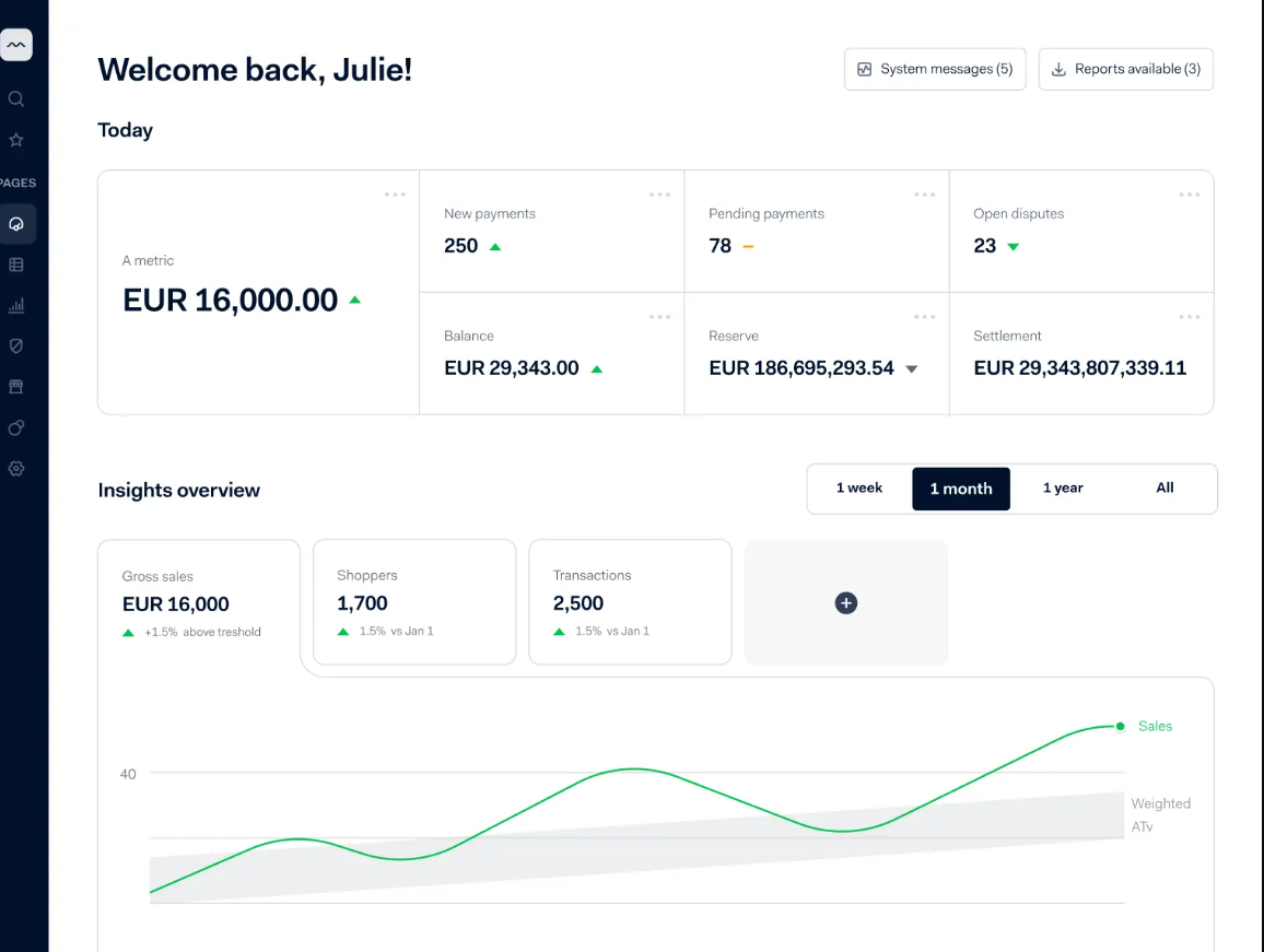
Payments overview via Adyen
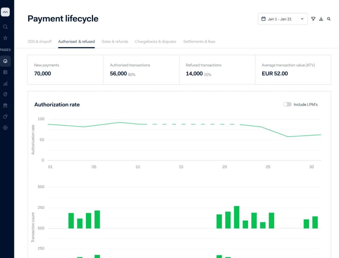
Payment lifecycle via Adyen
Square: small business sale overview
Square is the go-to payment management platform for many small and mid-sized enterprises, combining card processing with POS, invoicing, and payroll. The dashboard emphasizes quick operational checks so owners can confirm daily performance without digging into detail. Low data density and clear labels build trust through clarity rather than complexity.
*Design Pattern: Simplified health check *
Key features:
- Day’s sales and next payout as headline metrics
- Simplified trends and business health status
- Sales broken down by category and source
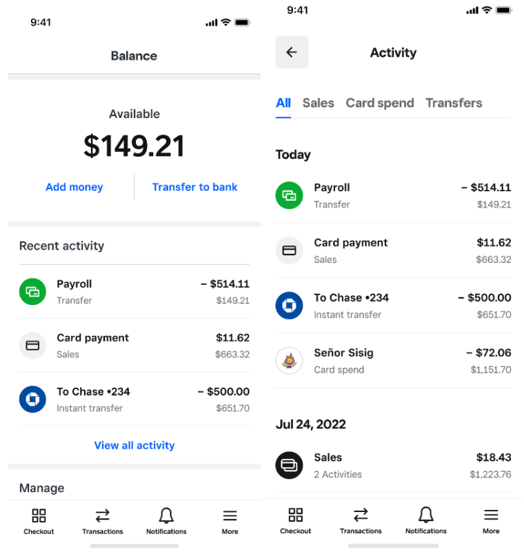
Balance and activity mobile dashboard via Square
Spend Management and Business Banking Dashboard Design
Spend management and business banking dashboards let organizations control where money flows while allowing teams to act within policy. Core features include budget vs. actual spending, approval queues, card-level limits, and role-based permissions that change what each user sees and can do. What sets the business spend management and banking dashboard design apart is governance across the lifecycle of a spend—before, during, and after the transaction.
Ramp: spend control and actions
Ramp focuses on preventing unauthorized spend at the point of transaction. Its dashboard provides real-time card controls, merchant and category blocks, and enforced limits so transactions are stopped or flagged before they clear. Users can zoom in from a total spend summary into individual transactions with their own receipt, coding, and approval status. Ramp also uses AI to flag anomalies and suggest savings, turning the dashboard into an active cost-management tool.
*Design Pattern: Control at the point of transaction *
Key features:
- Card-level controls enforced at transaction time
- Spend summaries of individual transactions
- AI-generated savings recommendations
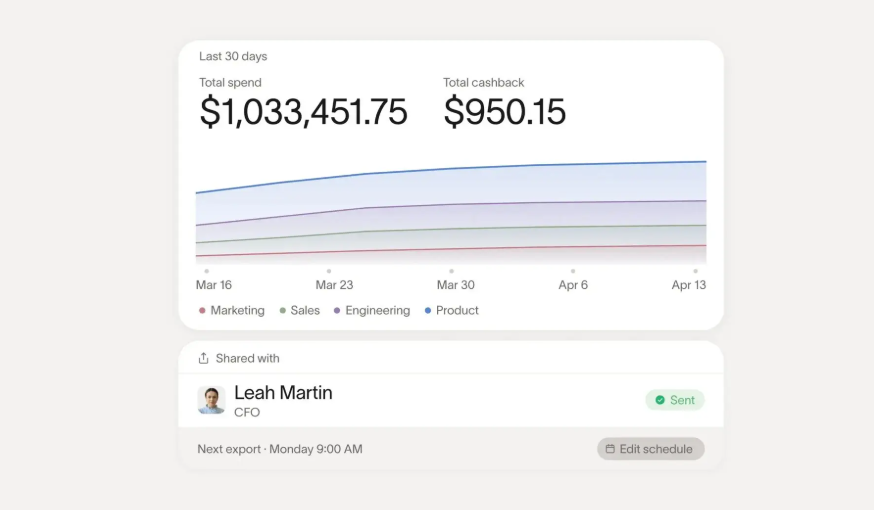
Spend report via Ramp
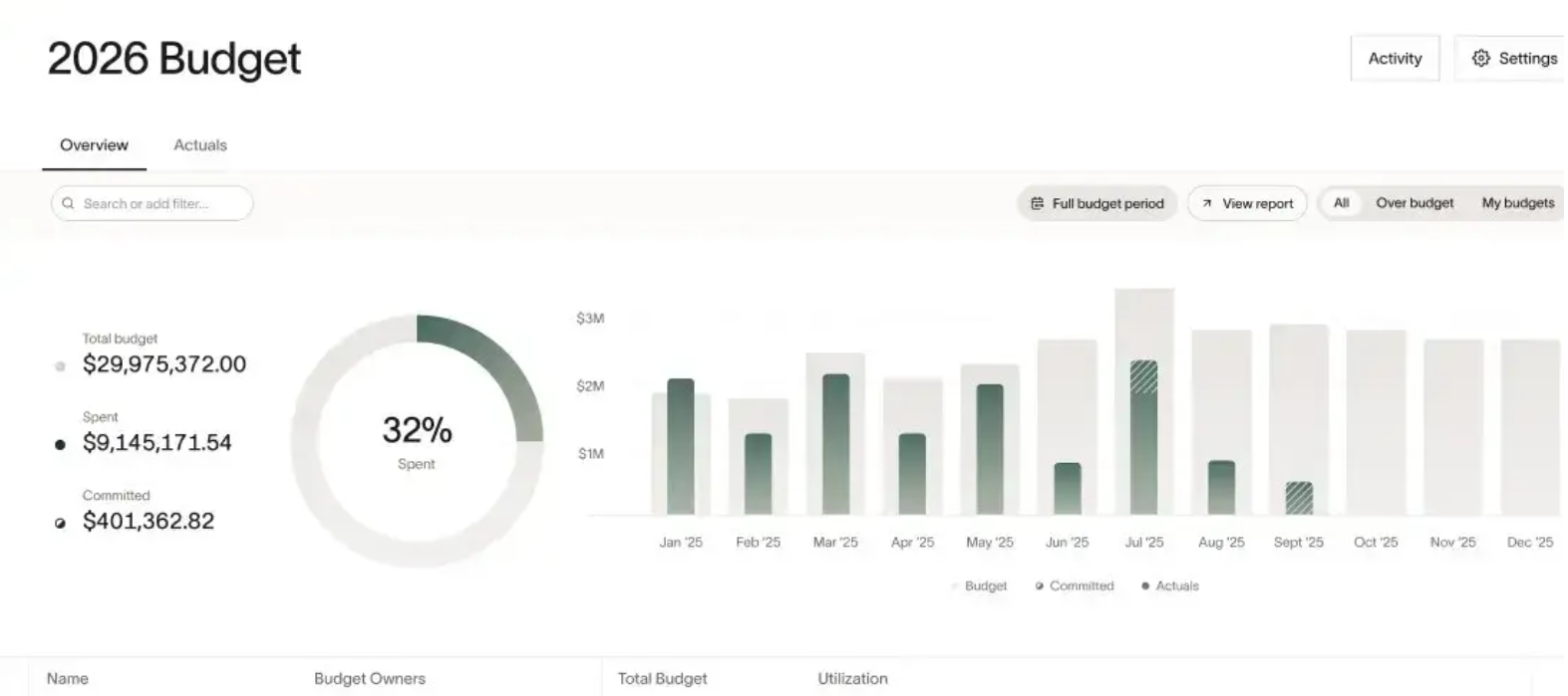
Budget overview via Ramp
Mercury: startup cash management
Mercury’s dashboard prioritizes cash visibility, placing a snapshot of available funds and cashflow at the top, with everything else branching from there—cards, invoices, etc. Automation (scheduled transfers, receipt matching) reduces manual reconciliation. Role-based controls ensure founders and the finance team see the right level of detail and can approve or move funds without issues.
Design Pattern: Single snapshot of cash
Key features:
- Top-line available cash and runway
- Automated bill and receipt workflows
- Permissioned controls
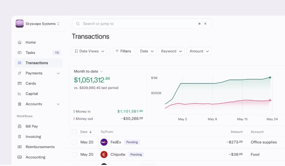
Cashflow dashboard via Mercury
Wise business: multi-currency dashboard
Wise Business treats balances by currency as first-class subjects. Meaning, each balance shows local account details for receiving funds, current exchange rates, and transfer status. The interface simplifies conversions and reconciles multi-currency activity with accounting tools.
Design Pattern: Currency as the primary object
Key features:
- Per-currency balances
- Visible exchange rates
- Automatic accounting sync
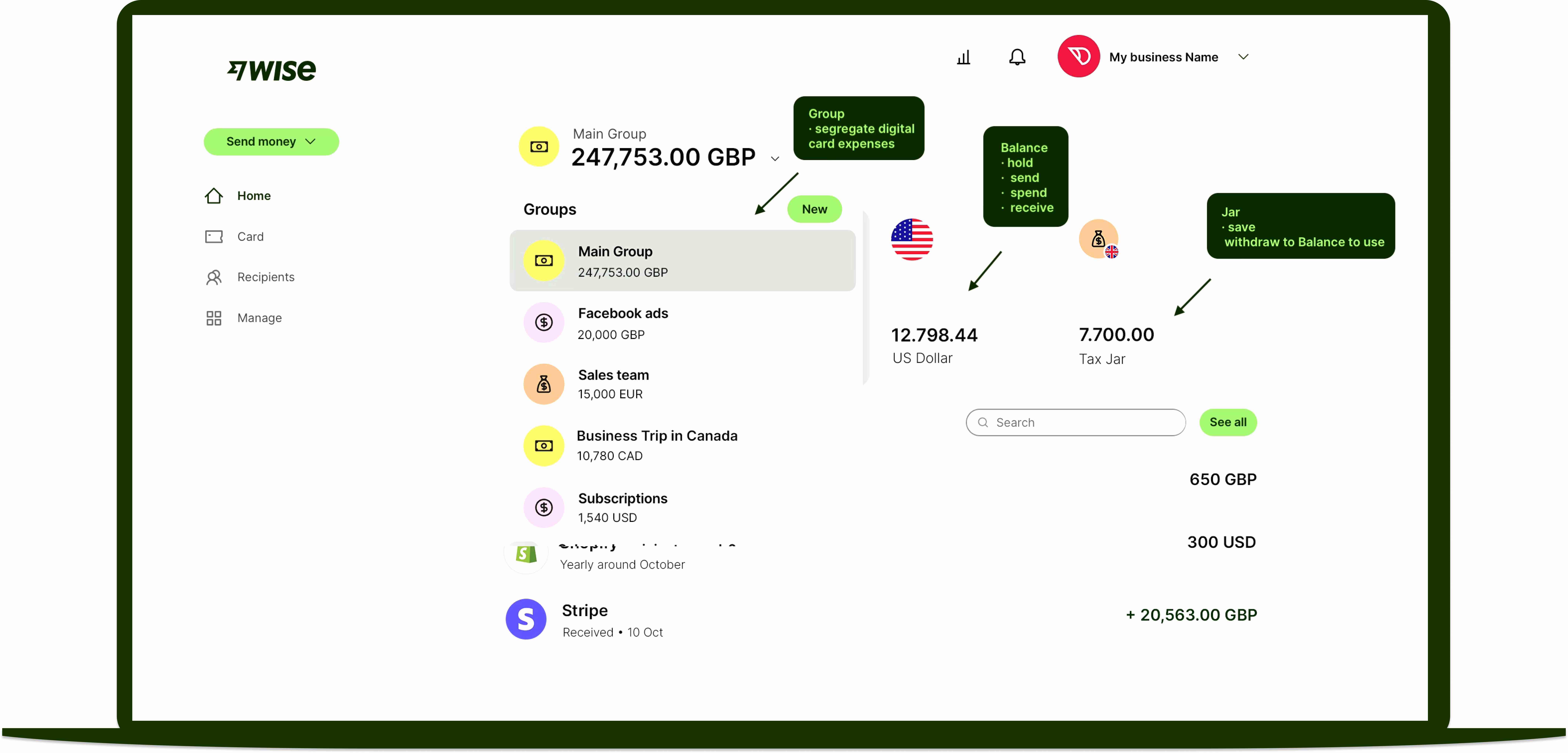
Multi-currency dashboard via Wise
Investing and Wealth Dashboard Design
Investing and wealth dashboards communicate portfolio value, returns, and risk so users make informed decisions rather than impulsive trades. They serve self-directed investors, advisors, and anyone tracking net worth. Choose the pattern that matches your user’s primary question (trade now, understand everything, or reach a target) and show just enough context, timestamps, and risk framing to keep decisions rational.
Robinhood: fast portfolio overview
Robinhood is a beginner-friendly investing app, prioritizing speed for mobile-first, self-directed investors. Its dashboard puts portfolio value and a performance chart front and center, followed by watchlists and quick buy/sell actions. The fintech UX design favors fast scanning and immediate execution while keeping information concise.
Design Pattern: Speed over information depth
Key features:
- Portfolio value and performance chart at the top
- Watchlists with quick access to buy/sell actions
- Fast scanning designed for mobile use
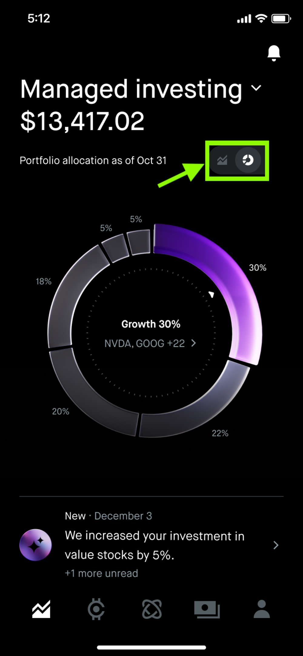
Portfolio allocation via Robinhood
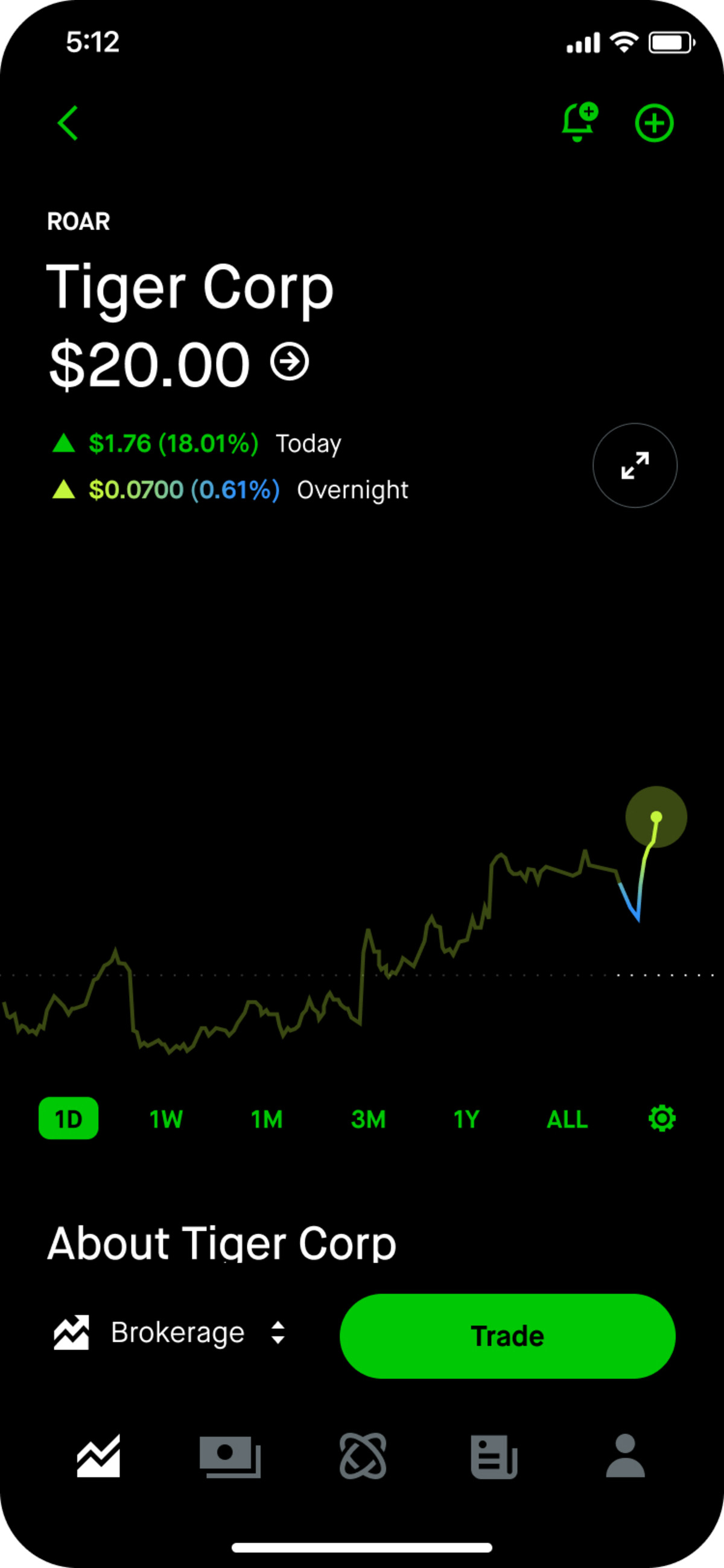
Trade chart dashboard via Robinhood
Kubera: whole-portfolio tracking
Kubera is a portfolio and net worth tracker for investors with assets spread across brokerages, wallets, private funds, etc. As opposed to Robinhood, its dashboard assembles everything the user owns and owes onto a single balance sheet. Two of its defining features standout: (1) it tracks returns separately from contributions, and (2) the product is read-only, which makes the dashboard an intel tool to understand investing position.
*Design Pattern: Read-only balance sheet *
Key features:
- All accounts and asset types on one balance sheet
- Returns separated from contributions, benchmarked against an index
- Investment allocation split by class, entity, and currency
- Daily snapshots with recap of changes
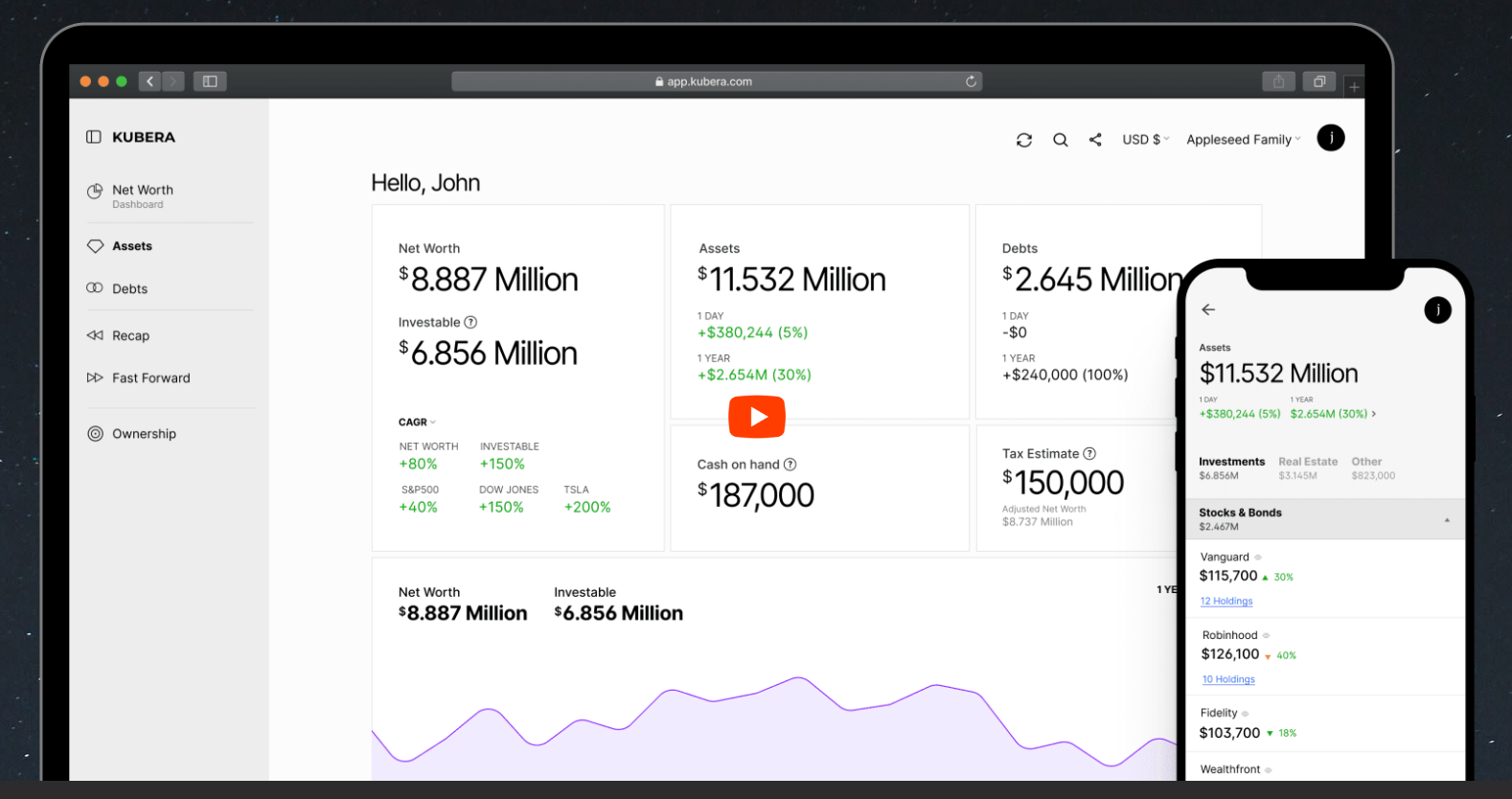
Portfolio tracker via Kubera
Betterment: goal-based investing
Betterment frames investing around goals. Each dashboard view emphasizes progress toward specific goals, showing current value alongside projected outcomes from tweaks to contributions or risk settings. It encourages users to keep investing even if market is volatile.
*Design Pattern: Goal-framing first *
Key features:
- Progress tracking keeps users stay on the course
- Projections and contributions show together with current performance
- Automated rebalancing, dividends, and tax-loss harvesting
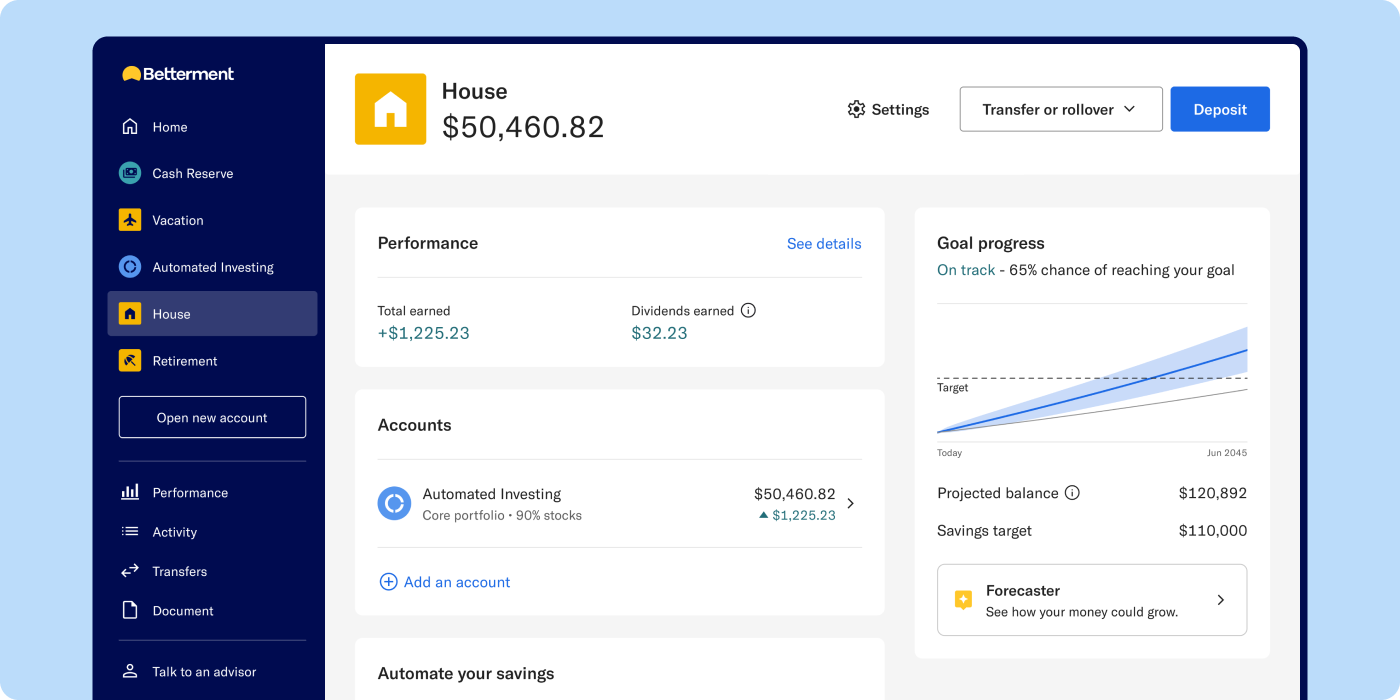
Goal-oriented dashboard via Betterment
Risk, Compliance, and Infrastructure Dashboard Design
What makes risk, compliance, and infrastructure dashboards different from other fintech dashboard UX design archetypes is their diagnostic focus: users review, escalate, and troubleshoot rather than transact. These dashboards prioritize system state, transaction history, and auditable trails so teams can investigate without losing context.
Each case should include attached evidence, clear source and status indicators, and queue-based decision states so reviewers always know the next step. Logs must be timestamped and traceable to the action that generated them.
Below is an assessment of risk, compliance, and infrastructure financial dashboard examples.
Plaid: developer operations visibility
Plaid connects apps to bank accounts and its dashboard serves developers and risk teams who need to see what’s happening across those connections. Search and pattern-detection tools spot anomalies quickly, and investigators can convert findings into no-code rules to automate responses. For compliance, the same workspace handles identity checks and AML screening, with a running record of reviews and status changes over time.
Design Pattern: Unified investigative view
*Key features: *
- Centralized risk indicators
- Search and AI-assisted pattern detection
- Rule creation from investigation findings
- Integrated compliance workspace
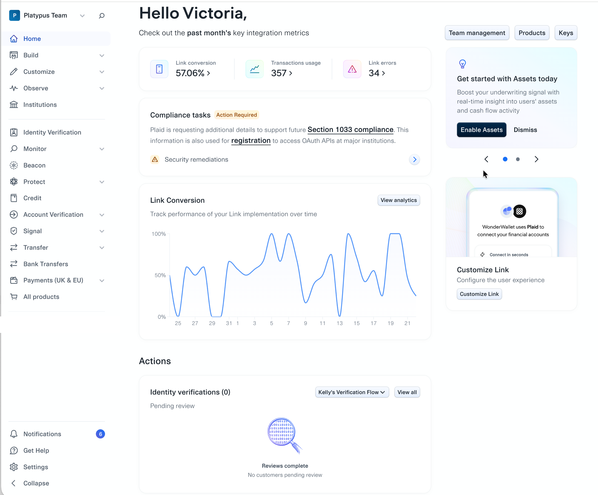
Developer dashboard via Plaid
Alloy: risk review workflows
Alloy supports queue-driven case reviews for onboarding and ongoing monitoring. Each applicant or case pulls evidence from multiple sources into a review workspace that shows decision state, supporting details, and required actions. The system captures every reviewer action and rationale to ensure auditability and regulatory defensibility. In comparison to financial dashboard designs aimed at consumers, Alloy’s dashboard UI design is highly dense and complete.
Design Pattern: Queue-based case review
Key features:
- Evidence from multiple sources attached
- Audit trail capturing every review action
- Workflow configuration for different risk policies
The next section will explore a hypothetical example of how to choose the right dashboard design patterns to apply on a new fintech platform.
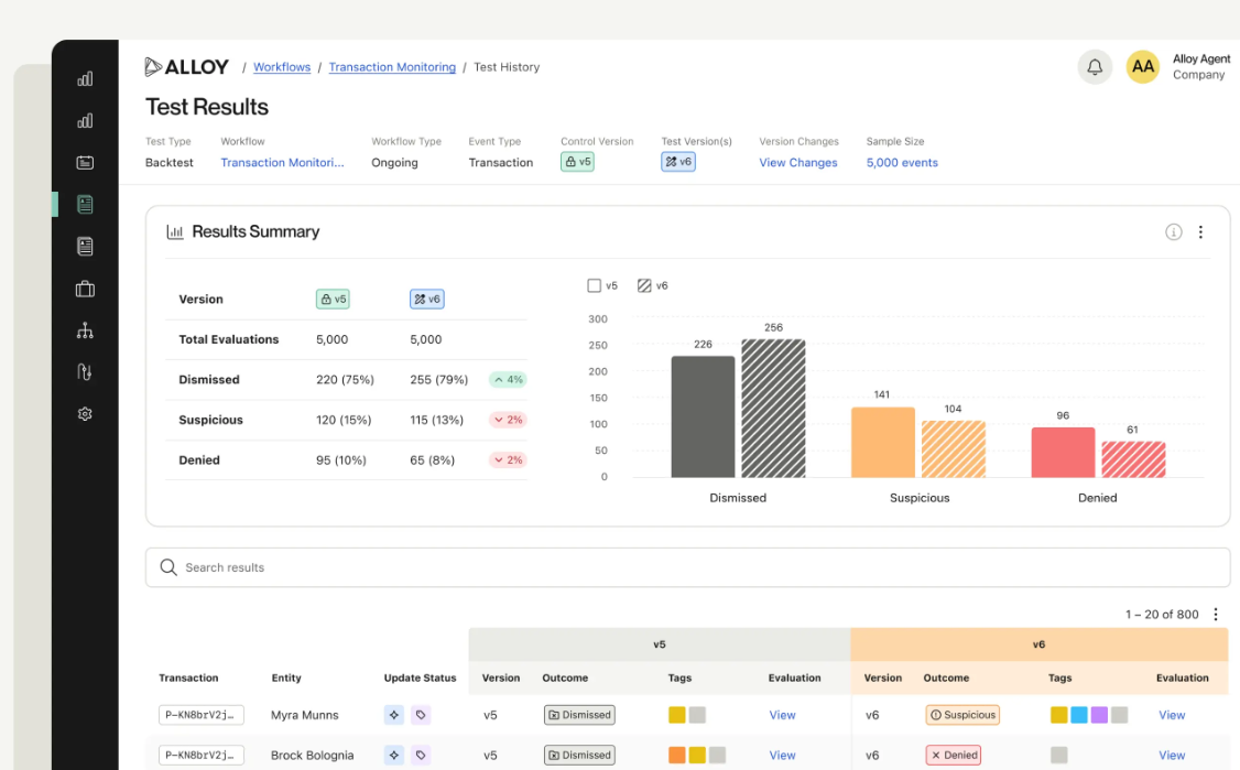
Workflow test via Alloy
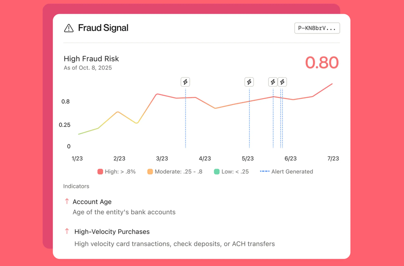
Risk alert via Alloy
Choosing Financial Dashboard Design Patterns
Designing the payroll dashboard for Everyone Gets Paid, a payroll platform, starts with Bowen, an office manager for an animation studio with 20 employees. He runs payroll every two weeks, and he needs to be confident everyone will get paid and fix problems before payday.
Below are five qualifying questions that can guide you in deciding which fintech dashboard patterns to apply.
- *What is the user’s primary question? * Will this payroll run succeed?
- *Who is the user, and how often do they do this? * Bowen is an office manager who needs to do payroll every two weeks.
- What must the user see first, and what can wait? Payroll run status and blockers.
- Where do the primary problems appear, and do they appear together? Missing bank details, failed payments, and flagged accounts can all block the run.
- *What happens if the user gets it wrong? *
Employees aren’t paid.
From these responses, the primary metric becomes payroll status, and supporting ones are the next pay date, the total amount due, which employees have missing details, and whether any payments have failed. The dashboard should make possible conditions (also called states) explicit—scheduled, processing, completed, failed, and needs attention—because each one tells if he needs to wait, try again, or escalate.
What dashboard design patterns to adapt: Layered detail, unified investigative view, and goal-first framing.
The layered detail pattern fits because Bowen doesn’t need everything all at once, just the right thing at the right depth. For example, he sees “5 employees need attention,” clicks to see which five, and opens one to find what’s wrong. Each step answers the previous user question.
The unified investigative view pattern helps Bowen see the whole problem in one pass and knows what to fix first. A missing bank detail, a failed payment, and a flagged account all block the same payroll run, so splitting them across screens forces him to spot the whole problem.
Finally, the goal-framing first pattern works because it meets him where he is: he opens Everyone Gets Paid, and the dashboard confirms if he has accomplished paying the employees’ salary.
Testing a Financial Dashboard Design Dashboard
Before launching your fintech dashboard, test it first to ensure data integrity, confirm security standards, work out feature kinks, and see if it can handle high transaction volumes and fluctuating network conditions. Use realistic scenarios and relevant user roles, but protect confidential information with synthetic or anonymized data.
Functional testing: does the dashboard work as it claims?
Functional testing verifies features, calculations, and interactions. Run unit tests for components, integration tests for end-to-end data flows from backed to UI, workflow tests for common tasks, and load/stress tests to confirm behavior under peak transaction volumes and intermittent network conditions.
Security testing: can unauthorized users see or do something they shouldn’t?
Security testing confirms permissions and safeguards. Validate role-based access, session and authentication behavior, input validation, and protections around high-risk actions. Simulate attack patterns such as privilege escalation, unauthorized data access, and CSRF/SQL-injection attempts. Finally, review audit logs and encryption in transit and at rest.
Usability and accessibility testing: can a real person, including those with disabilities, actually use the dashboard?
Usability and accessibility testing ensures real people can complete tasks. Run moderated usability sessions and task-based metrics, check WCAG compliance for screen readers and keyboard navigation, and test localization for currencies, dates, and translations. Use A/B testing and analytics to refine design layout and wording, and only launch when tests show accurate data, secure controls, and accessible user journeys.
Remember to run tests post-launch and schedule periodic reviews to ensure the dashboard UI design works seamlessly.
Conclusion
Fintech dashboards attract and retain more users when they lead with the most important metric, display fresh status, and connect insights to safe next steps so users can act confidently. That’s why it’s important to choose dashboard design patterns based on user role, core question, and task cadence. For instance, layered detail suits investigation, a simple snapshot suits quick checks, and one shared workspace suits compliance work.
Avoid clutter, stale data, and screens that show actions easy to take, and adjust what each role sees. Get these right, and users will trust the product, act without hesitation, and keep coming back. Maybe you’ll even earn a referral or two!

Creates insightful, strategy-driven content that translates complex design and branding concepts into accessible knowledge, supporting Ramotion’s mission to elevate digital experiences.