
When organizing and presenting content, designers need to ensure that users receive the relevant information clearly and efficiently. The use of tables is one such way to organize information, especially when users need to scan values or compare data across categories. However, designing a table for a mobile interface is different from designing one for a desktop screen.
Table design can become difficult and complicated when it comes to smaller screens where space is limited, and users interact differently with content. In the absence of careful design, the tables might force users to scroll a lot, hide important columns, or make comparison difficult as important information is not easily accessible.
Therefore, table design for mobile screens requires care, attention, and mobile-specific design practices that help users understand the content as well as the context.
Effective table design is not just about shrinking a desktop table until it fits. Instead, designers need to choose the right data pattern that preserves important information, relationships, and actions for the mobile context. For complex products and designs, working with experienced UI/UX design companies can also help teams determine which mobile table patterns would work best for them.
In this article, we discuss the challenges associated with mobile table design and the patterns that can help design better tables. We also share best practices and examples to provide both inspiration and guidance with mobile tables.
Read along to learn more about mobile tables and how to design effective tables for smaller screens.
Why Mobile Tables Are Challenging?
Mobile tables are challenging to design. One of the biggest concerns when designing tables for mobile screens is ensuring that all the information fitting on a wide desktop screen is brought to narrow mobile screens without losing value. A desktop table can display multiple columns at the same time, but mobile screens cannot accommodate the same amount of information without reducing text size, hiding content, or introducing horizontal scrolling.
The lack of space also impacts readability, particularly when users have to compare values across columns. Horizontal scrolling is not the best solution as it might hide header columns with identifying information. It is important to ensure that users know which values they are looking at and how they relate to a particular row.
Another challenge to consider is the inclusion of interactive features in a table. Actions, such as sorting and filtering, can make table designs complicated, thus introducing more factors to consider for designers. It is important that these interactive features and actions do not compromise the quality of data or the readability of content.
An adaptive table can resolve some of these issues by reorganizing information and prioritizing content for smaller screens, while keeping the message intact. However, the questions of accessibility, readability, and context must always be addressed in the design process.
When to Use Tables on Mobile
Tables work best on mobile screens when users need to compare multiple items across consistent attributes. For example, order numbers and details, transactions, inventory records, and reports would be better understood if presented in the form of a table.
In all of these cases, organizing content into columns helps users identify differences and patterns, thus ensuring a quick skim. The goal of a table is not to display every single column immediately. Instead, the columns should retain and present information that is the most relevant and important for comparison.
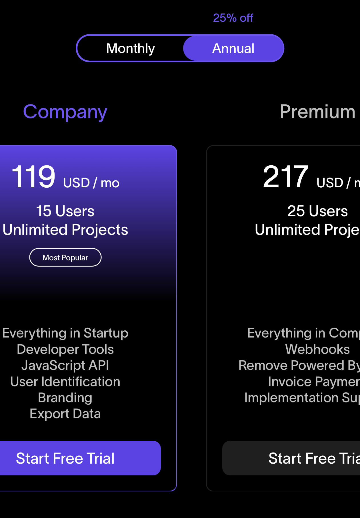
Comparison Tables on Mobile Screens (Image Source)
The answer to every data-related problem, though, is not always a table. Other formats, such as cards and lists, can come in handy in different situations. For example, when users are more interested in browsing individual items rather than comparing values across columns, cards, simple lists, or dedicated detail views may provide a better experience. It is important for designers to understand these patterns and choose the ones that meet the needs in the given context.
Mobile Table Design Patterns
When designers work on mobile tables, they have to take some critical factors into account. Elements such as scrolling, readability, simplicity, consistency, and accessibility are impacted by every row and column decision. Designing compact tables begins with prioritizing information to ensure that the most important content is always visible. Approaches such as the use of cards, list tables, and headers can also change the presentation.
What are some of the key design patterns for mobile tables?
Some important design patterns for mobile tables are as follows.
- Horizontal Scrolling
- Stacked Rows
- Card-Based Tables
- Priority Columns
- Expandable Rows
When it comes to adaptive and responsive tables for mobile devices, there are several patterns to consider that can improve the overall user experience. Some key patterns are discussed below. The right approach depends on the context and the needs of the target audience.
Horizontal scrolling
Horizontal scrolling is the pattern that keeps the original table layout intact. In this table pattern, users can move across columns and view all the content. Horizontal scrolling is particularly helpful when preserving the entire dataset is important, and where removing information can end in loss of context or misinterpretation of data.
However, this layout can be overwhelming, and users can get lost in the massive dataset. Therefore, when choosing horizontal scrolling, it is helpful to freeze the first column and make each row identifiable. This can be achieved by using different colors, introducing a subtle fade, or adding other visual cues to help users navigate the table easily.
Stacked rows
A stacked layout is one that transforms each table row into a vertical group of field labels and corresponding values. In this pattern, instead of presenting information across horizontal columns, the table presents each record in a format that fits naturally within the available screen width.
Stacked rows can work best for small datasets where readability matters more than comparison of values. Since each record takes up more vertical space, stacked rows can pose a challenge when users need to scan a large table or make frequent comparisons.
Card-based tables
A card-based table treats each row as a card. In this pattern, designers create a separate card for each row, containing the relevant fields and actions. Information that would normally appear across multiple columns can be grouped vertically with a clearer hierarchy.
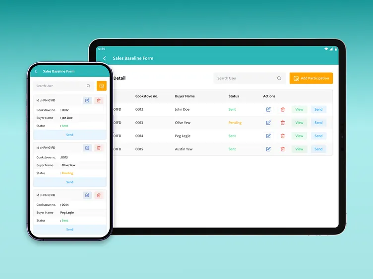
Card-Based Tables Design (Image Source)
Cards are useful when the focus is on individual items, and not the entire dataset. For example, orders, user profiles, products, tasks, and other similar records can be presented effectively using card-based tables. This pattern also provides more space for contextual actions without overcrowding the table columns.
Priority columns
When creating tables, all columns might not carry equal importance. Therefore, mobile table design can be more focused on priority columns. In the priority columns design pattern, the table displays only the highest-priority columns by default. The low-priority fields are still available if the users want to view them, e.g., in a detailed or expanded view.
This pattern works particularly well when the table has a clear hierarchy between primary and supporting data. Prioritizing columns can help reduce the table width while preserving the information users need most for scanning, comparison, and decision-making.
Expandable rows
Using expandable rows is another pattern in table design for mobile devices. In this pattern, the essential table information is visible in a compact row while placing secondary details inside a collapsible area. Users can scan the primary columns across multiple records and expand an individual row when they need additional context.
This approach helps preserve table density without permanently hiding useful information. It is especially effective when users are looking to scan the information first and then look at the details. When dealing with large datasets, collapsing information can help provide a quick overview of the content.
Choosing a Mobile Table Layout
Choosing the right layout for mobile tables starts with an understanding of the data, users’ needs, and the context. Once the designers know the users’ priorities and they have a good understanding of the data itself, they can compare different layouts and choose the best one for the context.
It is also important to take into account factors such as the number of columns, the need for cross-row comparison, data priority, row volume, row-level actions, and whether users need frequent access to filtering or sorting controls.
There is no single approach to make tables work across every mobile interface. Effective responsive tables adapt differently depending on whether users need to scan many records, compare specific columns, inspect individual items, or access detailed information on demand.
The following table provides a summary of the comparison between different layouts for mobile tables and the cases in which they work best (or not).
Table title: Comparison of Mobile Table Layouts
| Pattern | Description | Best for | Main drawback |
|---|---|---|---|
| Horizontal scrolling | Maintains the table structure and allows users to scroll through additional columns. | Dense datasets requiring comparison across columns | Users can lose context while scrolling |
| Stacked rows | Converts each row into a vertical sequence of labels and values. | Smaller datasets where readability is the priority | Uses considerably more vertical space |
| Card-based tables | Presents each table row as an individual card with key fields and actions | Records that users review individually | Makes cross-row comparison more difficult |
| Priority columns | Shows essential columns first while making secondary data available on demand. | Tables with a clear hierarchy of important fields | Hidden data requires additional interaction points |
| Expandable rows | Keeps primary information visible and reveals additional fields when a row is expanded. | Dense tables with occasional need for detailed information | Expanding multiple rows can make the table difficult to scan |
| Column toggle | Lets users choose which table columns are visible on the screen. | Data-heavy tables where users’ needs vary | Requires users to configure the table |
| Responsive reflow | Rearranges table content into a mobile-friendly vertical structure as screen width decreases. | Tables that need to adapt automatically across screen sizes | Can weaken the visual relationships between columns |
Mobile Table UX Best Practices
Now that we know about the different layouts for mobile tables, let’s dig a little deeper into creating better, effective tables. Good mobile table UX starts by focusing on the reduction of complexities. It is important to think about ways that can help reduce cognitive load and clutter, such as removing low-value columns, keeping headers concise, and using sticky headers or columns to provide context, especially when working with responsive tables.
It is also important to ensure that the tables are comfortable to interact with by providing touch-friendly controls and keeping sorting, filtering, and important actions accessible. The table experience should account for loading, empty, error, and other states, so users receive clear feedback even when data is unavailable or something goes wrong.
What are the best practices for mobile table UX design?
Some best practices for mobile table design from the UX perspective are as follows.
- Keep Key Data Visible
- Make Table Actions Touch-Friendly
- Simplify Sorting and Filtering
Some of the best practices for designing mobile tables are as follows.
Keep key data visible
When designing tables for mobile devices, it always helps to start by identifying key columns, i.e., the fields users need the most when scanning or comparing records. Depending on the dataset and context, these might include a name, status, amount, date, owner, or another primary metric that helps users quickly understand each row.
Keep these high-priority fields and columns visible whenever possible, instead of keeping them hidden behind an expansion, horizontal scroll, or additional tap. Secondary information can always be revealed without interfering with the primary, high-priority data.
Make table actions touch-friendly
For mobile tables, understanding and designing for touch-based interactions also becomes critical. Buttons, menus, checkboxes, and other row actions need sufficiently large tap targets and enough spacing to prevent accidental selections. This becomes especially important when several interactive controls appear within a compact table.
Avoid relying on small standalone icons that may be difficult to recognize or tap accurately. Focusing more on clear labels, familiar controls, and appropriately spaced actions can help make tables easier to operate on touchscreens.
Simplify sorting and filtering
Sorting and filtering are some of the major tasks users perform when interacting with a table, particularly as the rows increase and the tables get bigger. For complex datasets, these controls should be easy to discover and access so users can find the information they need the most.
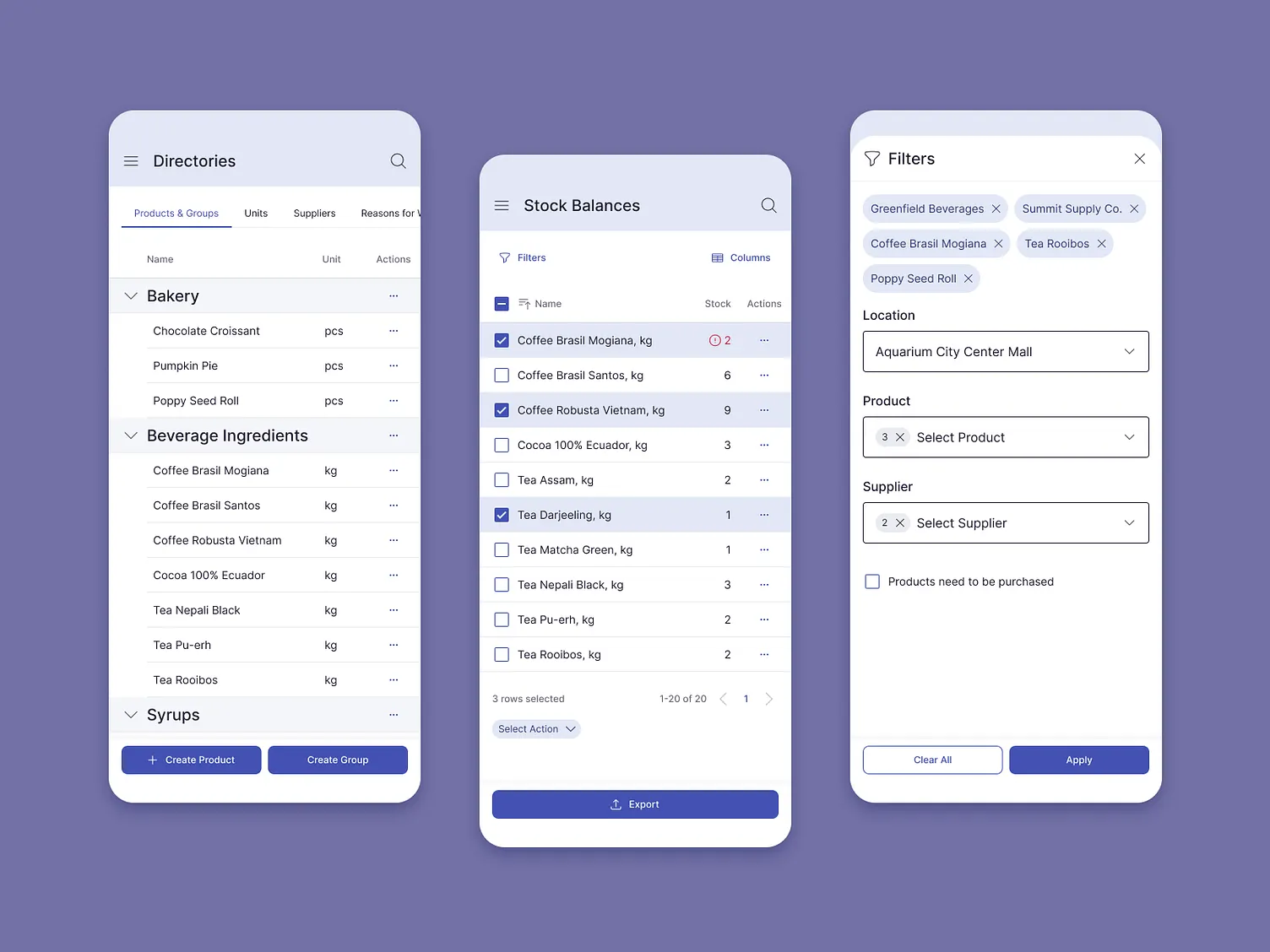
Filtering and Sorting in Mobile Tables (Image Source)
When dealing with multiple filtering and sorting options, advanced controls can be moved into a bottom sheet, drawer, or compact mobile-friendly panel. This keeps the primary table interface intact while still giving users access to sorting and filtering tools if needed.
Mobile Tables vs. Cards
One question that designers often struggle with is the choice between tables vs. cards. It is important to note that this choice depends on several important factors, including but not limited to the dataset, the context, and the needs of the target audience. The most important factor, arguably, is the way in which users need to engage and work with the data.
A table is generally stronger for comparison because consistent rows and columns align related values, making it easy to identify differences across multiple records. Card UI design serves a different purpose where individual records are grouped, and comparison is not the priority. This typically works best when users need to review one customer, order, product, or task at a time.
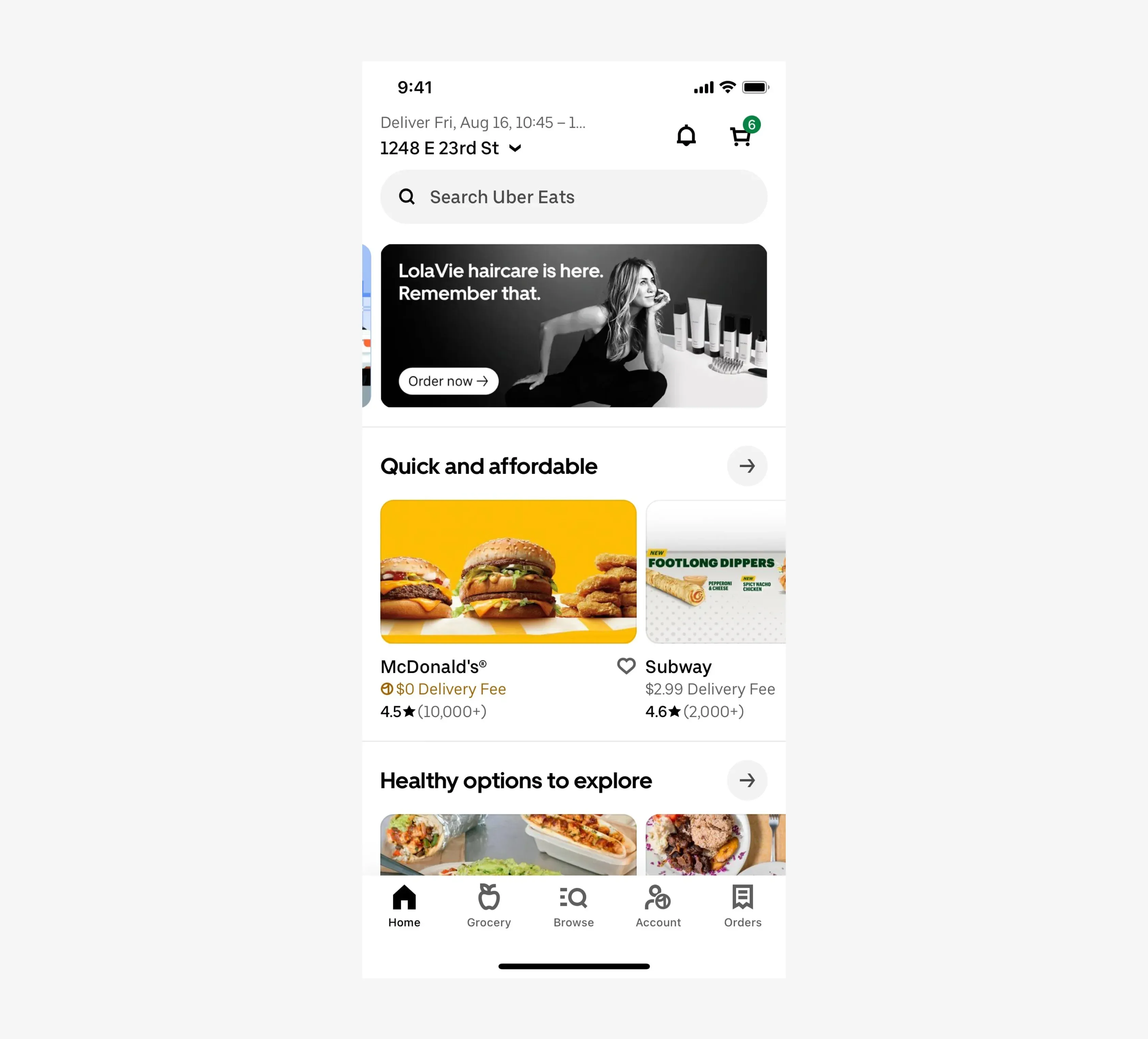
Cards are Different from Tables (Image Source)
However, cards become less efficient when users need to compare many values quickly. Repeating labels and arranging fields vertically can increase scrolling and make values harder to scan side by side, while a well-designed table preserves those relationships through consistent columns.
Mobile Table Design Examples
Different types of data require different approaches to mobile table design. The following examples show how designers can adapt rows, columns, and interactions based on users' needs to prioritize their goals while ensuring responsive designs.
Transaction tables
Transaction tables organize records of financial activity, typically showing information such as recipients, amounts, dates, and payment statuses. On mobile devices, transaction tables can be designed such that the initial table view prioritizes the recipient, amount, and status, as these fields help users identify and understand transactions quickly.
- Prioritize recipient, amount, and status in the initial mobile view, with date or secondary details shown as needed.
- Demonstrate how expandable rows or priority fields can keep transaction lists compact and scannable.
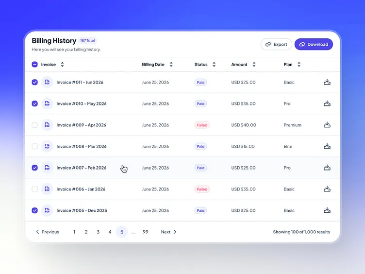
Transactions Tables Design (Image Source)
Secondary details, such as the dates, payment methods, and reference numbers, can appear when users expand a row or open the individual record. Combining priority columns with expandable rows saves the long transaction history while also making the tables scannable and, hence, less overwhelming.
Pricing comparison tables
Pricing comparison tables are frequently used to help evaluate plans, products, or packages by displaying prices, features, and other key differences in a consistent structure. These tables, with the bulk of information they have, can exceed the available mobile width.
Therefore, for mobile screens, plans can become individual pricing cards or appear in a switching interface that lets users move between options without navigating a large table. Important features and limits should still remain accessible, so users can compare the differences when making a decision.
Admin dashboard tables
Admin dashboard tables organize operational records such as users, orders, requests, accounts, or content for monitoring and management. These tables often combine record information with statuses, filters, selection controls, and actions, thus making their mobile layouts quite cramped and constricted.
To create better admin dashboard tables for mobile devices, designers should prioritize essential information while making row controls accessible. Less frequent information can move into an overflow menu, preventing controls from overcrowding the available columns.
Product specification tables
Product specification tables organize technical or descriptive attributes such as dimensions, materials, and other product details. Unlike comparison tables, these interfaces provide in-depth information about a specific product or service.
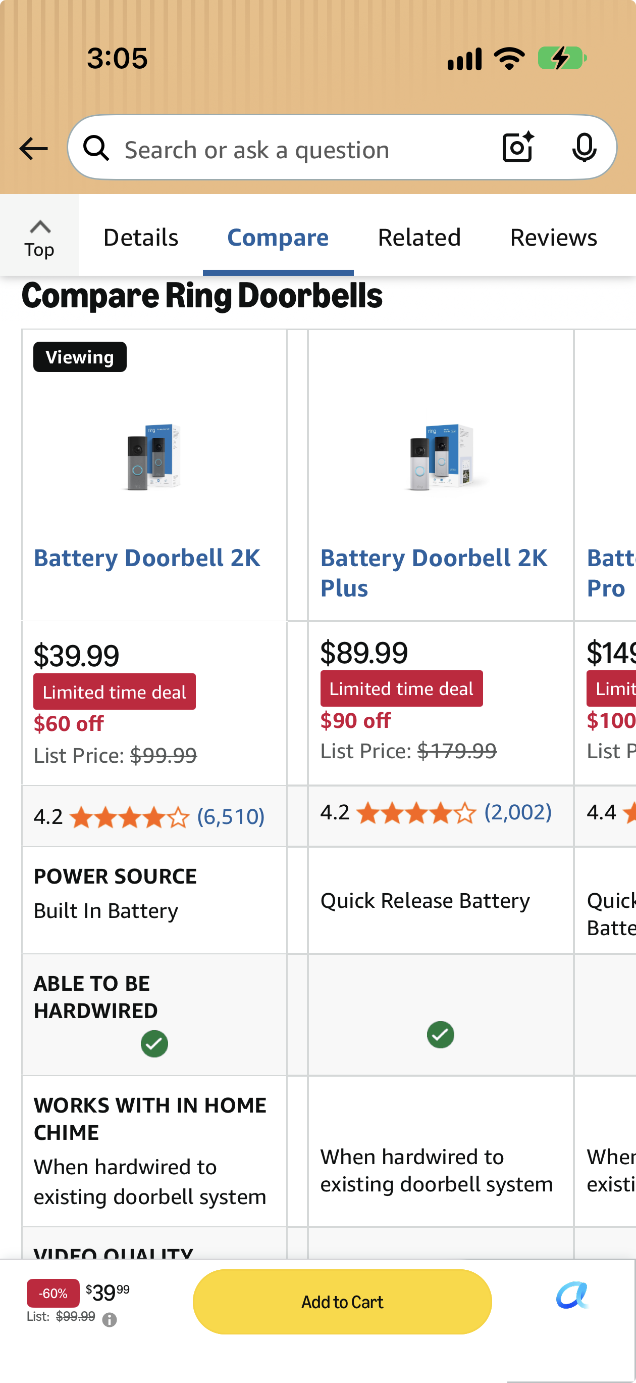
Comparing Products with Tables (Image Source)
On mobile screens, specifications can be organized into collapsible groups or stacked label-value rows instead of a wide, multi-column table. Prioritizing readability and navigation makes detailed specifications easier to explore without forcing users to navigate a dense, multi-column layout.
Common Mobile Table Mistakes
Creating tables for mobile interfaces can be complicated as designers need to balance several factors, such as data density, readability, and interaction on smaller screens. Avoiding some common mistakes, as listed below, can help create a clean and efficient user experience.
- Forcing Too Many Columns Onto the Screen: Trying to fit every desktop column into the mobile table can result in overcrowded layouts and excessively small text. Prioritize important columns and make the secondary data available if needed.
- Hiding Critical Data or Scroll Behavior: Removing important information simply to save space can hinder and frustrate users. Similarly, a horizontally scrollable table without a visual cue may leave users unaware that additional columns are available.
- Using Small Controls or the Wrong Layout: Small buttons, checkboxes, and action icons can make a table frustrating to use on a touchscreen. Cards can provide more room for controls, but converting every table into cards can make comparison harder.
- Ignoring Important Table States: A mobile table should account for different states. Design clear loading, empty, error, and no-results states so users understand what is happening and what they can do next.
Conclusion
Effective mobile tables are not simply the compact versions of desktop tables that are scaled down to fit smaller screens. They require restructuring data, columns, and interactions around the tasks users need to complete in a mobile environment. Before choosing a table pattern, designers should determine whether users need to compare values, search for records, check statuses, edit information, or inspect details. Understanding these priorities makes it easier to select a mobile table layout that keeps important data accessible while supporting efficient interaction.

Creates insightful, strategy-driven content that translates complex design and branding concepts into accessible knowledge, supporting Ramotion’s mission to elevate digital experiences.