Parallax scrolling is one of the most popular visual effects in web design. It happens when background and foreground elements move at different speeds as users scroll through a website. This creates a 3D sense of depth and a more engaging scrolling experience that users do not usually see on a typical static or flat website.
The parallax effect has been used in animation and film since the 1930s and 1940s, and later in 2D video games. The technique later found its way into web design, with the first implementations being mostly JavaScript and CSS animations. Today, modern tools such as GSAP, Spline, Framer, and AI-assisted development tools like Cursor have made creating engaging parallax scrolling effects easier and faster.
In practice, web designers use this technique not just to make websites look good but to achieve their main purposes: to add a sense of dimension and depth, to guide a visitor's attention toward important content naturally or calls to action as they appear on screen, and to make storytelling feel more dynamic than a static layout allows.
In this article, we’ll take a look at everything about parallax scrolling, understand what the effect is, how the mechanics work, the different types you can implement, practical design tips for getting it right, common mistakes that ruin the experience, and real-world website examples that inspire visitors and leave a strong impression.
What Is Parallax Scrolling?
Parallax scrolling is a web design technique that uses multiple layers of website elements and moves them at different speeds to create the illusion of depth on a flat screen.
The word "parallax" comes from the Greek word “parallaxis” which means apparent displacement or change in the position of an object when viewed from different angles. The same principle was applied to website design to produce the illusion that 2D or 3D elements are moving at different speeds relative to each other.
Generally speaking, parallax works by separating the content into foreground and background layers, with each layer moves at a different speed. It can also mean breaking long pages into story-driven sections that make information and offerings easier to digest and act upon.
The more meaningful elements you put in the foreground, the more depth and visual impact you will have.
What Parallax scrolling is not
Parallax effect is sometimes associated with scroll-based animation, leading to a misunderstanding of the technique and what it entails. The important thing to understand about parallax scrolling is that it’s not like the typical scroll-triggered animations that create motion but don’t really create a sense of depth.
Many modern websites use animations such as text fading into view, elements sliding across the screen, or content appearing as users scroll. Since these effects respond to scrolling, users frequently group them under the term "parallax," but that is not always accurate.
Most of these are actually scroll-linked animations that focus on timing and visual transitions. They can work alongside parallax effects and help strengthen the overall experience, but on their own, they do not create the layered movement that gives parallax its sense of depth.
So how do we get real parallax scrolling? The answer is quite simple. True parallax is when foreground objects like blocks of text, illustrations, icons, background colors and images move at different speeds when the user scrolls.
How Parallax Scrolling Works
Parallax scrolling mimics how we perceive movement in the real world. As we move, objects that are closer to us appear to move faster than those farther away, creating a natural sense of depth. (Image Source)
At its core, parallax scrolling is basically an attempt to mimic the real-world experience of moving in a vehicle. Things that are closer to you seem to move faster than things that are further away.
For example, when riding through a city, things along the roadside and nearby buildings seem to rush by very quickly, while distant buildings or mountains seem to move much more slowly. Your brain interprets that difference in movement as a difference in distance: faster looks closer, while slower looks farther away.
Translating Parallax into web design
Just like the real world scenario, the same idea applies to a website: different movement speeds create the perception of depth on a flat screen.
By default, when you browse a static website, everything exists on a single visual plane with little or no sense of depth. Parallax scrolling creates that effect by separating page elements into multiple visual layers and assigning different scroll speeds to each one.
Foreground elements, much like roadside objects or nearby structures, move faster, while background elements move more slowly. This emulates the way people naturally perceive depth in real life.
Consider the following scroll speed and depth effect for each layer:
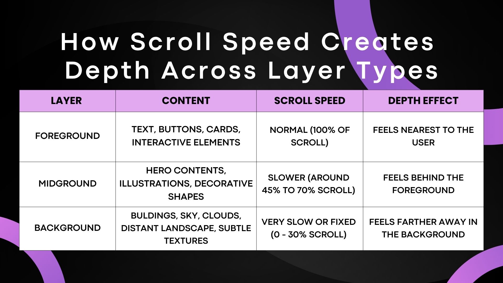
The table shows that different visual layers move at varying speeds. Foreground layers typically move faster, middle layers move at a moderate pace, and background layers move slowly or may appear almost stationary. These differences in motion create the illusion of depth on a flat screen. (Image Source)
As seen from the above table, whenever users scroll down, all the visual layers move up and down at different speeds. Foreground layers typically move faster, middle layers move at a moderate pace, and background layers move slowly or barely move at all. This difference in movement creates the illusion of spatial depth on a flat screen.
In essence, parallax scroll effects can be created in different ways depending on the type of visual result or experience you want to create:
1. Pure CSS
Parallax scrolling is usually achieved with CSS techniques.
The most common one is the background-attachment: fixed. This CSS3 property keeps the position of the background image relative to the viewport while foreground content scrolls over it.
Even more advanced approaches can be done using CSS transforms such as translateZ() within a 3D context, usually combined with perspective to simulate layered movement.
2. JavaScript
While CSS3 can let you create smooth parallax scrolling animations, you are limited in terms of how you can control the behaviour of layers or elements.
The usual way to track scroll position is with JavaScript methods like window.scrollY; updates are applied inside a requestAnimationFrame() loop to maintain smooth performance.
If you don’t want to build everything from scratch, you can also use JavaScript libraries like GSAP (GreenSock Animation Platform), ScrollMagic, Locomotive Scroll and Three.js that can help you create or improve parallax scroll effects.
3. Visual web design tools
Modern web design tools make it easy to add parallax scrolling effects without writing a single line of code by hand.
Using popular tools and platforms, designers can now create scroll animations with tools like Webflow, Framer, Elementor and Spline using visual panels and timelines. New AI-assisted development tools such as Cursor and the nascent “vibe-coding” workflow are also helping speed up the process of building interactive web experiences.
Common Types of Parallax Effects
There are various types of parallax scrolling effects. Each appears in different patterns and offers distinct trade-offs between complexity, performance, and creative flexibility. (Image Source)
There are various types of parallax scrolling effects. Each appears in varied patterns and cover many of the styles we see in modern web design today.
Each strategy provides a distinct trade-off between complexity, performance and creative aspect, but the objective is the same, to create depth, guide the user's attention and make the browsing experience more engaging.
Let’s take a look at some of the most common ones:
1. Background Parallax
The most classic and commonly used parallax scrolling effect as seen across many modern websites. This takes effect when a background image or color section moves more slowly than the foreground content scrolling over it, or remains visually fixed while content passes on top through CSS or scroll-based positioning.
This effect is often achieved with "background-attachment: fixed" to give a sense of depth by making foreground content appear closer than the background itself.
Background parallax is used in image-heavy or graphic-centric website designs, particularly in hero sections and large background content areas where designers want a little visual depth, but without the use of powerful motion effects.
2. Layered Parallax
Unlike background parallax, this approach relies on several visual elements, each moving at its own speed, to generate a multi-layered depth effect.
As you scroll, background images, text, pictures and other foreground objects will each have their own movement behavior, creating a feeling similar to cinematic sequences, hand-drawn animation cells or an almost 3D storybook diorama. This style works especially well for storytelling websites and landing pages.
Despite its advantages, it needs careful composition as poor coordination between the moving elements can create visual chaos and certain users can be disoriented or experience motion discomfort.
3. Reveal, fade, and zoom effects
Parallax scrolling effects don't exist with only background or multi-layered movement alone. In most cases they are paired with other motion effects like reveals, fades and zoom animations that help to enrich the overall scrolling experience in many modern web design projects.
As you scroll past it, a background picture or graphic element could zoom in or fade into view, a heading could slide upward as it appears, or a card could scale down and disappear. These effects are commonly attributed to parallax, however they are part of a wider motion choreography of movement beneath the experience rather than individual effects.
4. Mouse-based and horizontal Parallax
Both of these are considered less common variants of the general parallax effect family and extend beyond regular vertical scrolling behavior.
Mouse-based parallax is not linked to scrolling instead to the movement of the cursor. The position of the pointer dictates the animation of the elements, closer elements generally move more significantly than items further away. This works well to create a sense of engagement and playfulness to a design without having to rely just on scrolling.
Horizontal parallax uses horizontal movement instead of the traditional vertical scroll direction. As the page moves from left to right through swipes, trackpads, or horizontal navigation, foreground and background layers move at different speeds. The horizontal parallax effect provides you a panning, story-board type of feel as the content panels glide in from the side. It is commonly seen in storytelling websites, product shows, galleries and portfolios sites for smooth walkthroughs and more compelling visual stories.
How to Use Parallax Without Overdoing It
Parallax effects can create a more interactive and memorable experience by adding a sense of depth to the visual presentation of content or projects. Having said that, the experience can quickly lose its appeal when the effect starts competing with the content it is meant to support.
In fact, research from studies conducted by researchers at Penn State and Purdue has shown that parallax can influence user engagement and scrolling behavior, but poorly balanced motion can also affect how users interact with content and process information on a page.
Using parallax on a website should always be subtle and intentional, not overly busy. Too much of this can add visual clutter, distract readers, and make the interface hard to use.
The four principles below can help keep parallax effects intentional:
1. Choose one moment for depth
Website animations can be an essential tool to provide interaction and visual appeal. But the benefits can be outweighed if a parallax effect is applied everywhere. When every section moves, nothing feels exceptional and the page feels crowded rather than planned.
Choose sections where visual depth can fulfil a certain purpose in the content. Parallax works well in areas such as hero sections, portfolio transitions, or storytelling moments where movement can enhance the story.
2. Use motion to guide attention
According to Eilan Digital, motion can be used to draw attention to critical aspects and influence where users focus, enabling designers to regulate user focus across an interface and help solve low engagement and short attention spans
This demonstrates that movement can be one of the most powerful visual cues for directing a reader’s attention. Whether it is a headline, product image, call-to-action button, or another important message, parallax on a website should always be used intentionally and treated as part of the website's visual hierarchy rather than as random decorative motion.
3. Keep content readable
Parallax effects are intended to improve user experience. However, too much motion, large animations, or overlapping elements make content difficult to read.
To ensure readability, avoid animations or movement that distract visitors while they are reading. This includes moving content and animated backgrounds that make text harder to see or reduce contrast.
Prioritize readability and comprehension over visual spectacle.
4. Plan for performance, accessibility, and mobile
Most parallax websites look perfect on large screens and powerful devices, but you still need to test them across a range of devices, viewports and performance conditions.
More complex animations can look fine on high-end devices but will feel slow or inconsistent on lower-end gear. When dealing with a website that uses parallax, accessibility and mobile-responsiveness are crucial aspects of the user experience that should not be neglected. Design all your animations with accessibility in mind and create a simplified version so the experience feels comfortable for all users
Watch out for touch scrolling features on mobile performance as parallax effects can sometimes feel a little awkward or sluggish on smaller screens. In many cases it is recommended to disable or simplify the effect on phones using CSS media queries, prefers-reduced-motion, or JavaScript can be the better option.
Common Parallax Mistakes
While parallax effects are absolutely popular and visually engaging, some website designers avoid them for SEO, performance, and accessibility reasons, usually because of a few common mistakes.
To avoid these common mistakes, hiring one of the leading UI/UX design agencies can be extremely helpful, especially for projects that rely heavily on motion and interactive design.
Here are the main ones to watch for.
1. Using Parallax everywhere
Just because it's cool to have scrolling animations on your website doesn't mean you should apply them everywhere.
Many new designers have the common idea that constant movement produces a more visually striking design, but in reality, it is easily forgotten when everything moves. Constant movement can affect readability and diminish the impact of the sections meant to stand out.
Parallax works best in selective areas of a website, and limiting it to specific sections helps preserve its value.
2. Letting motion overpower the message
The cliché saying goes, "Content is still king," and animation alone will never replace it.
Website visitors come to websites for the content and animation should be used to enhance and reinforce communication, not overshadow it. Your website message (most often in headlines, key sections, and calls to action) should be clearer and more memorable than the animation itself. Keep motion subordinate to communication, not vice versa.
3. Ignoring mobile and accessibility
One common mistake many designers make is to build parallax websites that look great on high-end desktops with the default mouse-wheel-triggered feature and then assume they would perform the same on mobile devices, tablets, or for users with motion sensitivities.
These factors can affect the overall experience for users on older mobile devices, those with slower internet connections, and people with disabilities (see W3C Accessibility Standards Overview for more information). More importantly, users with vestibular disorders may experience dizziness, nausea, or headaches from uncontrolled parallax motion.
Parallax Scrolling Examples
Now that you have a better understanding of how parallax can improve a website’s visual experience, let’s explore seven website examples that demonstrate different ways and styles of using it effectively.
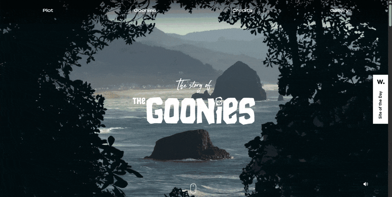
1. Firewatch
Firewatch parallax website demonstrates that depth isn’t just for aesthetic purposes but can be a great tool for atmosphere in website animations. (Image Source)
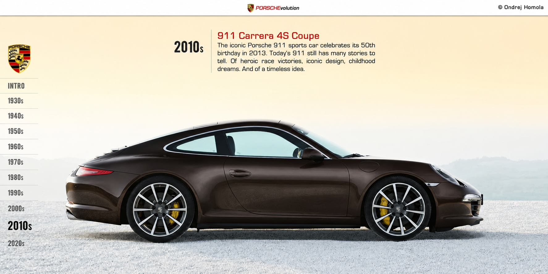
PORSCHEvolution demonstrates narrative-driven parallax by telling the history of Porsche in one continuous scroll. (Image Source)
This website uses parallax scrolling to demonstrate narrative-driven parallax scrolling effect by telling the history of Porsche in one continuous scroll.
As the user scrolls, automobile silhouettes, technical drawings and timeline backgrounds move around the screen at staggered speeds.
This example shows how parallax can transform a historical timeline into an enjoyable visual journey rather than a series of disconnected sections.
At the time of writing, the website is now offline.
3. The Boat
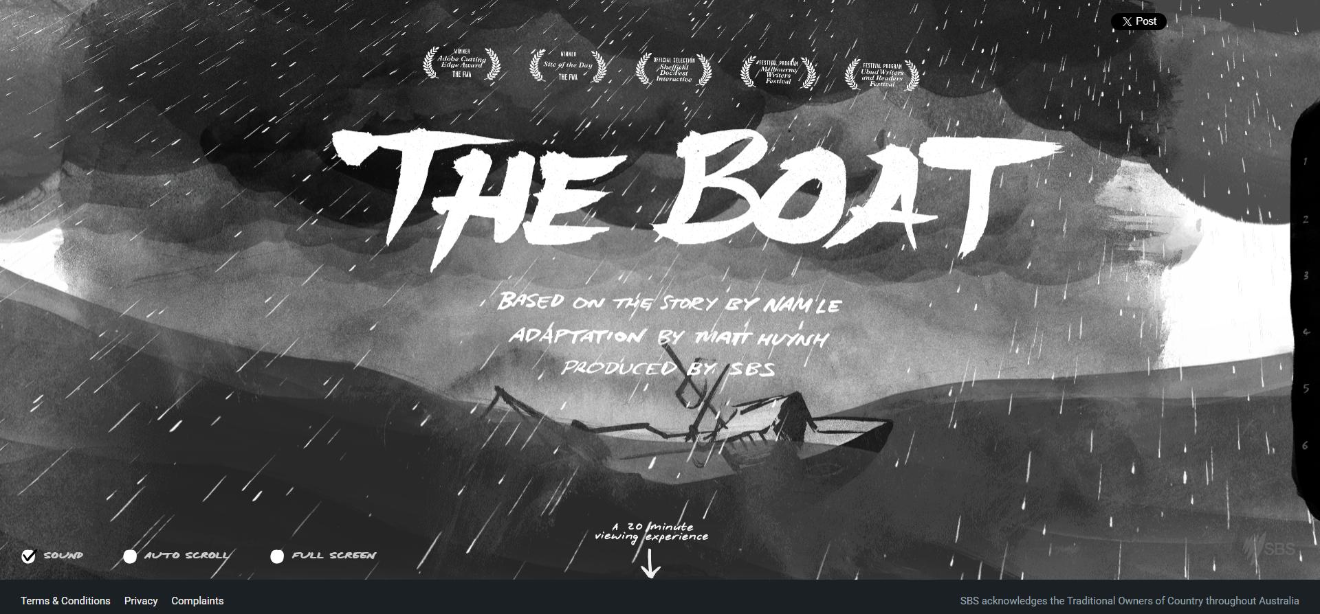
The Boat is a compelling example of long-form parallax storytelling. It combines text, sketches and paint-like graphics that move at different speeds as the waves and weather conditions change throughout the page scroll. (Image Source)
The Boat is has been praised by Awwwards as a great example of long-form parallax storytelling. This graphic novel adaptation of Nam Le’s short story makes scrolling an central part of the narrative, with motion, music, and pacing all tied to the user’s progress down the page.
It is a combination of text, sketches and paint-like graphics that move at different speeds as the waves and weather conditions change throughout the page scroll.
This example is a very good illustration of how scrolling can be more of a storytelling technique than just a navigation movement.
4. Madwell
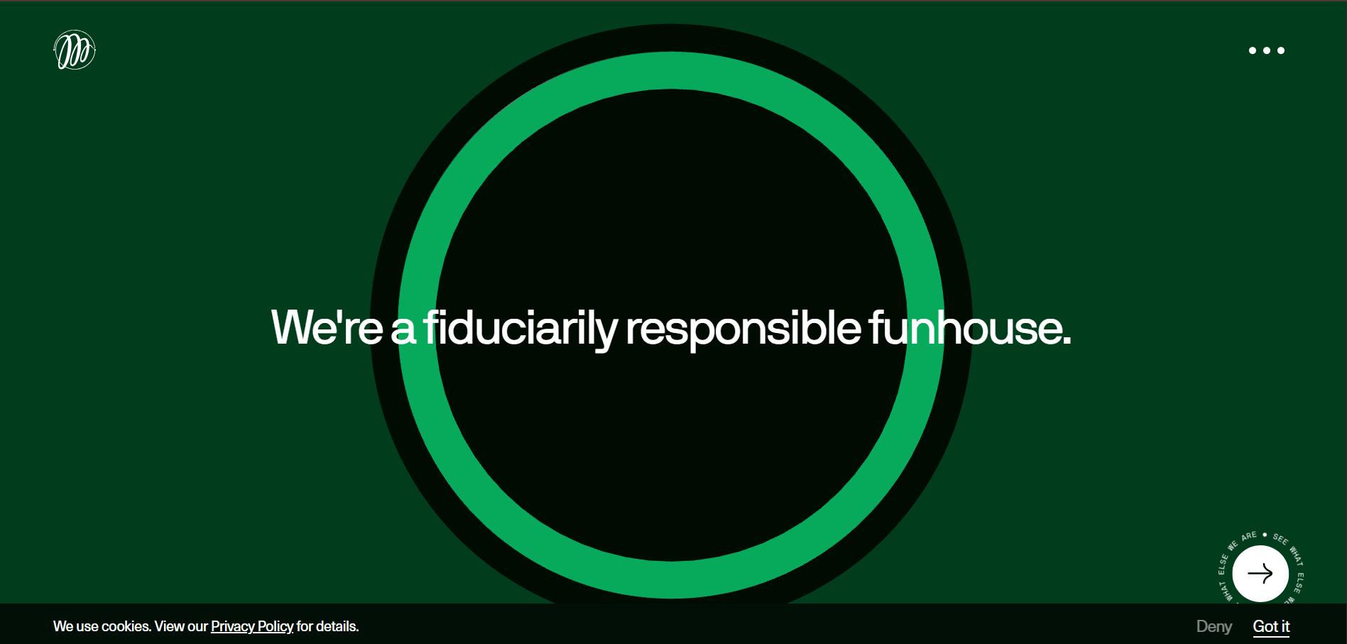
Madwell parallax agency portfolio website has a subtle depth with restraint, and it does not overwhelm the content with too much excessive motion. (Image Source)
This parallax agency portfolio website has a subtle depth with restraint, and it does not overwhelm the content with too much excessive motion.
Madwell creates a depth and responsiveness through the use of parallax effects that users can feel but not constantly be aware of.
It may not be immediately obvious, but as you scroll down the page it adds a premium feel to the experience without detracting from the focus on the website’s main content and messaging.
5. Garden Studio
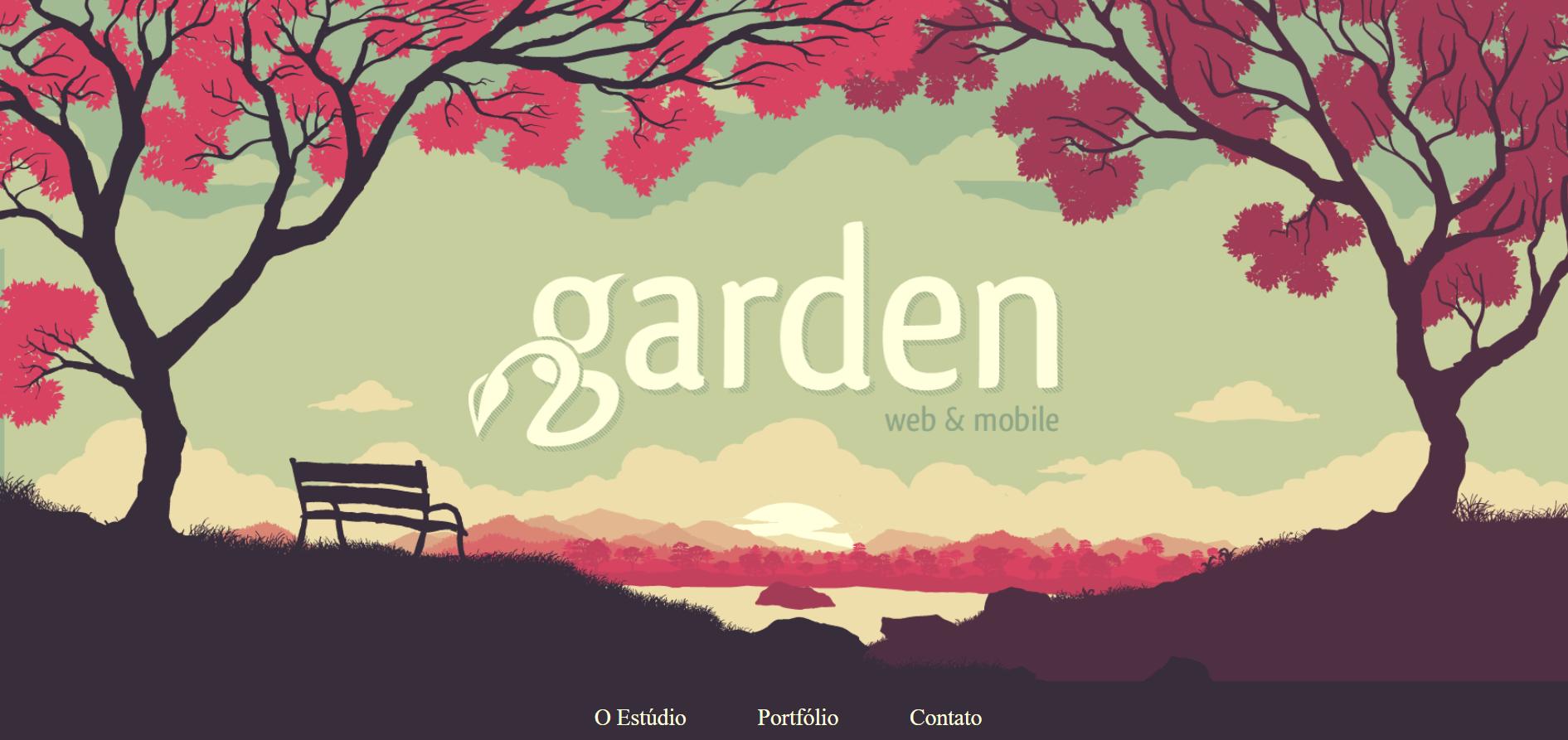
Garden Studio demonstrates a portfolio-style application in which project thumbnails and case-study transitions move at slightly different speeds as users scroll through previous work. (Image Source)
This parallax example demonstrates a portfolio-style application in which project thumbnails and case-study transitions move at slightly different speeds as users scroll through previous work.
When compared to dramatic storytelling-focused parallax designs, the Garden Studio website is more of a storytelling-focused parallax design. Each project transition feels like another layer of expertise being uncovered, making the browsing experience smoother and the changes feel less abrupt.
6. Every Last Drop
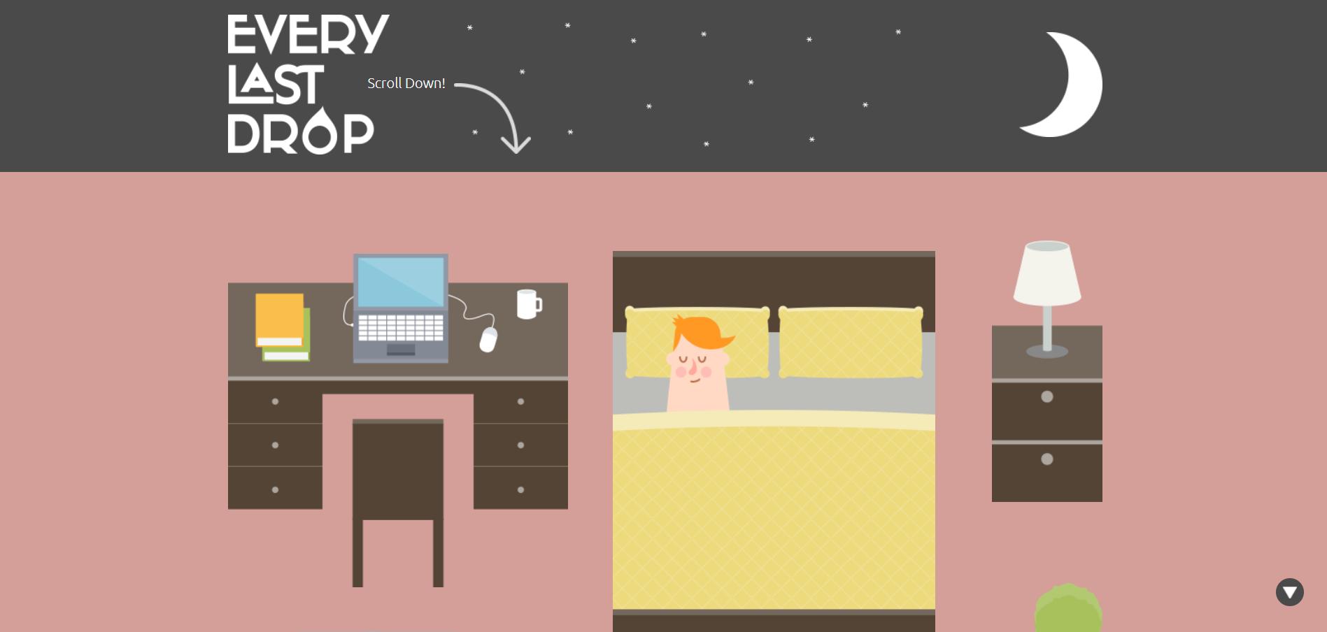
Every Last Drop is an excellent example of parallax-driven educational storytelling. It uses motion and interactive visuals to present water consumption data in a more engaging and accessible way. (Image Source)
Every Last Drop is a strong example of educational storytelling through parallax, using motion to present water consumption data in a more engaging way as users scroll through the page.
As users move downward, a dripping tap, showerhead, and lawn sprinkler animate at different speeds while water usage statistics fade in and out throughout the experience. The motion effects make the information feel more memorable and easier to absorb, turning otherwise dry statistics into a more interactive learning experience without making it feel like a classroom presentation.
7. Jess & Russ
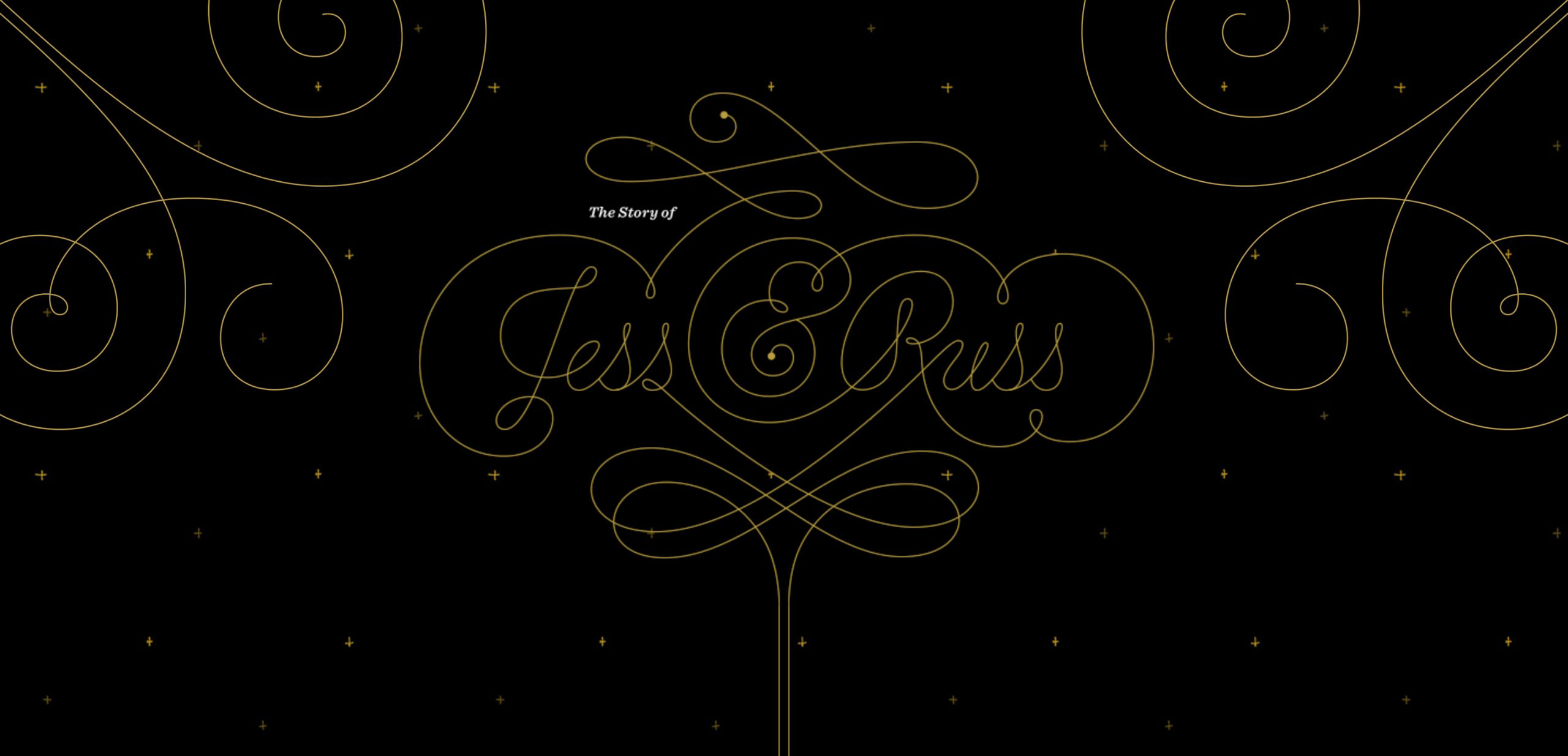
Jess and Russ parallax website takes a personal wedding narrative to another level. It guides visitors through the couple’s journey in a fixed sequence, using parallax pacing to structure each chapter of the experience. (Image Source)
Another great example of a parallax website takes a personal wedding narrative to another level. It guides visitors through the couple’s journey in a fixed sequence, using parallax pacing to structure each chapter of the experience.
The movement helps to reimagine the story’s evolution, while changing scroll speeds break up each part so the narrative doesn’t feel like one long wall of text.
Jess & Russ clearly showcases how parallax scrolling can be utilized as a visual chapter marker that improves narrative cohesion, emotional flow and naturally directs viewers from one part of the story to the next.
Unfortunately, as of the time of writing, this website has been redesigned or gone off-line.
Conclusion: Parallax Should Support the Story
Parallax scrolling is one of the most powerful ways to add visual depth and engagement to a website, but it’s more effective when used with a purpose. When used thoughtfully it can elevate the visual experience and help create a more engaging, delightful and memorable visitor journey.
Many modern websites take advantage of the parallax scrolling effects to create more immersive and memorable experiences. With the right place, timing and style, it can support storytelling, highlight crucial content and give the interface a greater sense of movement and interactivity.
Keep in mind that good parallax supports the story you are telling rather than competing with the message itself. Style for its own sake fades fast and gets forgotten. The story and message will always be what people remember.

Creates insightful, strategy-driven content that translates complex design and branding concepts into accessible knowledge, supporting Ramotion’s mission to elevate digital experiences.