Do you know that over 50 different graphics display resolutions are in common use these days? From the smallest dimension of 640x360 to popular full HD 1920 × 1080 to gigantic TV screens 17280 × 4320 (16K), display standards come in all shapes and sizes. And that is not all. The smart gadgets industry throws new resolutions and dimensions into this mix every year, making this area diverse and engaging but simultaneously challenging to handle.
How can websites keep up with this ever-changing number of screens? Is it even real, or some sort of magic is involved? The answer is that anything is possible when responsive website design is applied.
So-called adaptive design that was developed and regularly improved by leading responsive web design experts tackles this challenge successfully. It handles every screen resolution naturally, providing online visitors with an excellent user experience across multiple devices and browsers. There is no magic: just skillfully developed technology that we are going to crack today in this guide.
Let us get to the basics of responsive website and mobile layout. We are going to start with its importance in the modern World and the benefits it brings to the digital platform. Then move to a guide on how to implement it in practice. In the end, we will examine some fantastic examples of responsive layouts.
Defining Responsive Website Design
The definition of a modern responsive website is pretty simple and straightforward. You do not have to be a rocket scientist to get to its basics. The approach is straightforward, so even the non-tech-savvy person may easily understand how it works and how it should be built to fulfill its function. However, implementing it in practice requires some specific dev skills and a wealth of experience in this niche because this approach has obstacles to overcome.
Though, first things first – what is responsive web design?
What Is a Responsive Website Design?
Responsive website design is a technique of building web pages that keeps information hierarchy in place but reshapes structure to provide a comfortable user experience across multiple devices. In other words, modern responsive design adapts to browser window size, re-builds its multiple column layout skillfully accommodating bigger and smaller screens, and maintains consistency and coherence.
The Essential Elements of Responsive Web Design
Creating a fully adaptive mobile-friendly web platform that works great on every screen size requires hitting all the essentials. In practice, dozens of scenarios need to be addressed. Therefore, it is crucial to ensure the core features are in line because they create a firm foundation that meets the challenges of different devices. Consider four key elements that are the main pillars of this approach.
Optimized navigation
Navigation is vital in every niche and activity. Digital World is no exception. Web navigation is a top priority in website design creation – it allows people to access information and reach their goals as quickly as possible. On top of that, it contributes to user experience, increases visit duration, improves search engine optimization, and even amplifies conversion rates.
Regarding mobile devices, it is crucial to saving all the qualities and benefits it provides. For this, web designers develop optimized navigation that does not take up much space but still carries out its duties.
Responsive images
Can you imagine a website without multimedia? I bet you cannot. Websites are filled with them. Flexible images are fundamental elements of responsive design. Therefore, they have to render and adapt to device width (as well as its screen resolution and dimension) correctly; otherwise, they will ruin everything.
Unlike body copy, which generally requires manipulations with font size, pictures, illustrations, icons, and all sorts of graphics call for special attention. This is often where partnering with a forward-thinking web design development company becomes valuable, especially when designing systems that must anticipate new device classes and pixel densities. Visuals have to get scaled down on smaller screens and scaled up on bigger screens and still stay sharp at a minimum and maximum width. In addition, they need to be optimized to load faster.
Adaptive grid
An adaptive grid is a pillar of a responsive website. It creates structure, shapes visual and informational hierarchy, and helps the content to resize, stack, and flow to accommodate a wide array of screen sizes.
At its core, it is a basic CSS grid layout – a skeleton with rows, columns, sections, gaps, and spaces. It has CSS styles, rules, and properties that let it react correctly at browser width.
CSS Media Queries
Applying CSS media queries has become a standard approach and a fundamental element of a responsive website. It allows building multiple layouts using the same HTML document and CSS file. Based on the user agent's features, mainly the browser window's size, and orientation, it selects the block with rules and properties and applies it to the layout and its elements, making quick adjustments.
On top of that, web designers use it to target browsers by specific characteristics, features, and user preferences, and ipso facto makes certain parts of design behave distinctively by adding CSS rules to particular breakpoints.
Last but not least
Along with getting fundamental elements in line with general standards, it is crucial to ensure the web platform owns the qualities of an effective, responsive layout. They are:
- Consistency of visual elements and functionality. This ensures platforms work harmoniously across all parts and helps users to carry out tasks quickly and efficiently by improving the usability and learnability of the website.
- Coherence with the brand's identity, vision, and mission.
- Compatibility. The web page needs to be scrutinized across all relevant platforms, making information accessible to users regardless of software and operating system.
- Even and harmonious scalability because the browser window will expand or contract regularly during the session.
- Optimal balance between content and whitespace to offer a comfortable user experience.
- Excellent readability.
- Optimal accessibility level.
- Progressive enhancement. It allows responsive web platforms to extend functionality when the new browser appears without sacrificing the work done with the foundation.
Importance of Responsive Design
As we have already noted, there are over 50 widely-recognized screen resolutions in the World. And this number does not stay still – it grows. Many organizations treat responsiveness as a strategic capability and either hire for it or work with specialists; a current view of top website design companies can help map the partner landscape before committing budget, timelines, and ownership
Every year, the gadget industry replenishes with new TV screens, tablets, gadgets, phones, and portable consoles that throw in the mix new screen sizes and resolutions. It is impossible to follow this stream because thousands of manufacturers want to win over their customers with something special.
So the problem occurs – how to meet all these extravaganzas and ensure consumers get a well-built, good-looking, perfectly functional web platform to help the business stay afloat in the digital World? The only way out is to adopt a responsive layout and introduce mobile friendly behavior. This approach allows the content (including text, multimedia, navigation, and even ads) to flow naturally across all screen resolutions and sizes, making the interface render and look good on any device coming its way.
To sum up, it is crucial to favor responsive website design to keep up with the fast-moving industry and meet the target audience whose preferences in using the device to surf the web change during the day. Though, there is more to that. There are other valid reasons why introducing a responsive approach to the web platform is important. For instance,
- It allows covering over 4 billion online users who prefer to browse the internet on their smartphones.
- It is cost-effective. An alternative to a responsive approach is creating a dual-version or even multiple versions of a website to meet different popular screen sizes. When you make just one responsive layout, you save lots of money and effort.
- It implies a faster development process at lower costs.
- It reduces the cost of on-site content management and lowers maintenance needs.
- It provides an improved offline browsing experience since HTML5 Application Cache can be easily implemented on a responsive base.
- It simplifies conducting and running SEO, marketing, and advertising campaigns. You will get more time and effort to invest in improving strategies for better results.
- It gives the easiest and most accessible way to support the latest devices keeping away the company from the constant tasks of redesigning a web page and its structure.
- It provides an excellent user experience. All the best practices that responsive layout implies improve the web platform from various perspectives, thereby creating a comfortable environment where users can get the most out of the platform.
- It increases the visibility of a web platform on the web and social media.
- It provides ease of management. With a responsive approach, your team has to handle only one version. This amplifies productivity and efficiency and removes the stress of managing a website.
- It provides ease of analyzing and tracking the activity of a website.
- It ensures consistency that strengthens the brand's presence in the digital World.
- It increases the reach of customers across all devices and browsers.
- It stands behind future scalability.
- It generates more visitors and sales. A responsive layout makes the content accessible and easily shareable, bringing in more potential customers.
- It helps to stay ahead of the competition because over 40% of websites are not ready to accommodate mobile gadgets and tablets.
- It introduces some crucial accessibility standards and contributes to the World without borders.
Benefits of Introducing Flexible Layout in a Web Platform
A responsive website is a prerequisite to staying afloat, meeting the target audience's expectations and preferences, growing business, and attracting new customers. Not only is it a necessity, but it is also a solution that comes with numerous benefits, such as:
- It ranks higher in search results because Google prefers mobile-friendly websites the most.
- It promotes link sharing across multiple devices.
- It improves the usability and speed of a website.
- It increases users' satisfaction with the platform, which translates into engagement, higher conversion rates, and a better brand reputation.
- It builds a trustworthy brand.
- It drives more engagement.
- It decreases bounce rates.
- It boosts revenue.
Obstacles and Flaws of Responsive Design
Some say responsive design is overrated. People who believe that have stumbled upon some real obstacles on their path to getting the most out of this technology. As a rule, they have made some common mistakes such as:
- Failure to analyze and understand customer and visitor behavior.
- Focusing only on the desktop-first approach.
- Omitting thorough tests across multiple devices and gadgets.
- Avoiding conventions.
- Creating complex navigation.
- Using poorly optimized multimedia.
- Creating mixed reading paths.
- Hiding content for mobile users to make the responsive page size smaller.
- Prioritizing the entertaining part over functionality and content.
- Supporting only one image resolution.
- Not serving for retina screens.
- Not meeting accessibility standards.
Avoiding these mistakes is crucial to enjoying the benefits of a responsive layout. On top of that, it is also essential to mitigate and minimize the flaws of this approach, which are:
- Possible inconsistency in look and feel of a website across devices. It is almost impossible to serve every viewport width in the World. As a rule, web designers create rules for the most popular ones leaving the fate of other resolutions to algorithms. Sometimes this does not work as intended; therefore, users may end up with an inappropriate experience.
- Ruined content flow and information hierarchy because of resized advertisements or banner ads.
- The distorted appearance of background, images, videos, icons, and graphics.
- Poorly optimized multimedia.
- Different usage between desktop and mobile versions.
- Web browser compatibility.
- Serving to old web browsers like Internet Explorer 8 and lower and those that do not support media queries.
Steps to Make Your Website Responsive
Before making a responsive website, it is vital to understand how this approach works. The good news is that everything is simple - a responsive website applies an alternate set of CSS files to web pages depending on the device and screen width used to access the site. However, implementing this in practice requires taking some crucial steps. Let us consider them closely.
Step 1 – Analyze your target audience and general market segment
Companies constantly overlook this stage, making a huge mistake. Although the logic dictates using breakpoints of the most popular mobile devices, tablets, and computer screens, the sad truth is that your target audience may have unique gadgets to surf the web platform.
When thoroughly analyzing the market segment, the team understands what resolutions they need to cover first. They may add some specific breakpoints, or vice versa, delete some popular ones because they are not in use.
The same goes for device features like orientation and browser preferences. For instance, if your target audience is generation Z, who have never used Internet Explorer 8 or lower (the most problematic browsers), you do not need to waste your time, effort, and money on creating solutions to handle them.
Step 2 – Set appropriate breakpoints
A breakpoint is the "point," or, to be more precise, pixel value or values that describe a specific screen size. It may feature the range from min to max width or the exact size. When the responsive web platform encounters it, certain CSS rules are applied to transform the interface to accommodate this dimension and provide users with a comfortable experience.
After analyzing your target audience's needs, requirements and preferences, the time has come to set responsive breakpoints (media query ranges). Make sure they meet these two criteria:
- They comply with the unique needs of your target market sector and design.
- They cover some popular options because you never know what will come your way.
So, create a list of the target audience's breakpoints and then add to the mix some or all of the listed below popular options:
- 360 x 640 and 360 x 720 px for small mobile phones;
- 375 x 812 px for iPhone series;
- 768 x 1024 px for tablets;
- 1366 x 768 px for laptops;
- 1920 x 1080 px for high-res laptop or desktop;
- More than 1200 px for large screens.
Plus, you need to cover screen orientations like portrait and landscape.
Step 3 – Cater for web browser needs
Responsive design is not just about "making everything fit" in specific screen sizes. It is also about adapting to the capabilities of the device. Therefore, it is essential to consider the web browser as well.
To decide what to focus on, consider the recent survey that has inspected web browser market share. It states that Google Chrome occupies the top position serving half of all Internet users. The runner-up is Safari serving up to 15% of the market. UC browser and Firefox are in the third position, with less than 10% of the global share.
Make sure you meet their limitations.
Step 4 – Decide on the approach
There are two common approaches to building responsive websites: mobile-first and desktop-first.
The mobile-first approach implies addressing the mobile design head on and working towards the desktop version prioritizing design and user experience on small devices like cellphones and tablets.
The desktop-first approach implies designing for the big desktop screens and then adapting the structure to the small devices.
Both practices have their merits and flaws. When you design for desktop first (what has been for decades), you enjoy a lot of real estates and have an opportunity to let your imagination run wild and come up with some incredible design and user experience.
However, there is a catch. When you start scaling down, you realize that it is a true challenge to replicate everything on the small screen. You do not have much space. On top of that, there are some limitations of mobile browsers. Therefore, you need to minimize or eliminate some blocks and sacrifice effects or impressive details. At some point, the mobile version may feel like an afterthought than an actual finished product.
When you design for mobile first (which has become a general practice recently), you cannot enjoy a lot of real estate. However, you get a lot more freedom in the way you can adapt your designs. When you scale up, you add rather than cut elements. On top of that, you do not sacrifice usability since essential and critical features in mobile-first approaches are prioritized and have already occupied their places.
Step 5 – Choose the proper foundation
Layouts come in all shapes and sizes. However, they can be broken into several general categories: responsive, adaptive, fluid, and fixed. The latter provides the worst user experience across multiple devices. Therefore, we will not consider it. Let us take a look at the first three.
The adaptive grid detects the device and its screen size and pulls the appropriate static layout from a library that consists of templates assigned for each popular width. It is a popular option for sites that already have a desktop build.
The fluid grid does not analyze the device and does not have fixed units. It employs relative units for components of the design. As a result, elements take the same percentage of space no matter what screen users view the site on.
A responsive grid detects device characteristics much like an adaptive design. It activates specific rules in CSS files to adjust the structure to fit the available space depending on screen size. It is the most popular option these days, which even Google appreciates.
All three practices have their pros and cons. Depending on your project, target audience, marketing campaigns, and brand strategy, you may benefit from one or another approach.
Step 6 – Optimize multimedia
As we have already noted, it is hard to imagine a website without multimedia. Images, graphics, and videos are integral to every web platform. They bring diversity, enrich content, and enhance reading and user experience.
However, they create a massive obstacle to effectively implementing responsiveness. First, they are heavy, which makes the mobile version load slowly. Second, they occupy too much space on small screens. Third, they may ruin the reading flow. Finally, at some point, they may contradict accessibility principles.
So, what to do? The way out is to optimize multimedia. At a minimum, this means using responsive images and scalable vector graphics, introducing optimization solutions, and eliminating multimedia when it is excessive.
Step 7 – Adjust UI elements to touch screens
Not only do cellphones and tablets have touch screens; today, even some laptops offer their owners this feature. Therefore, it is crucial to create a design that considers this.
The problem is that responsive design does not calibrate itself for being accessed via touchscreens by default. It is for web designers to decide how UI elements should look and behave to accommodate the needs and requirements of people using this technology.
Step 8 – Adapt the best practices
Professional web designers share a dozen tips and practices to improve responsive designs. We are going to feature the most important ones:
- Prioritize essential elements such as navigation, service, content, buttons, etc.
- Hide content that does not add value.
- Enlarge clickable areas for buttons and controls.
- Cater for 'extreme' viewport sizes.
- Think about what happens between breakpoints.
Step 9 – Employ accessibility principles
Both responsive design and accessibility are concepts that help make a site more flexible to end users. However, often, the first approach leads to accessibility issues, like poor color contrast or inappropriate balance between text and visual, or too small size of typography or touch points.
It is crucial to ensure these two concepts co-exist harmoniously and create a productive user experience where all people have an opportunity to enjoy the content, use the service and functionality, and reach their goals without sacrifices.
Step 10 – Test everything
Last but not least. Doing thorough tests is crucial for every web project, especially for a responsive platform. The deal is that it comes with issues, like browser compatibility, which calls for serious manipulations with CSS styles and experimenting with various solutions and techniques to achieve consistency.
Therefore, do not overlook the necessity to test designs in real user conditions.
Great Responsive Website Examples
Getting some real-life examples of responsive websites does not require "cover miles" of the digital landscape. Take any popular platform on the Internet like Instagram, Facebook, Pinterest, Dropbox, and Amazon, and you will see this approach in action. Let's consider five fantastic examples from different niches to see how responsive design is realized in practice.
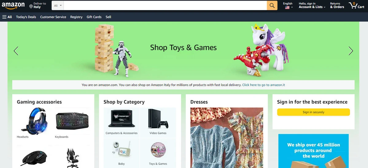
1. Amazon
We will start with one of the most crowded and content-heavy designs in the World – an online supermarket. Amazon is a global leader in this niche and a representative example that we will consider closely.
When you visit the website on a desktop, you may see dozens of products carefully assembled in one place. The team uses the Cards layout that manipulates lots of data without ruining the user experience. As a result, everything looks and feels great.
As for smaller versions like tablets and mobile phones, the team has adopted the best practices in this niche, like introducing a slide-out menu and making the search field occupy the whole screen width. The thing to note here is the structure. Regarding ultra-small screens, Amazon pages have just one column structure. However, when it comes to tablets, users may enjoy one or two-column structure with carefully introduced cards-based widgets.
This solution is tricky but rewarding.
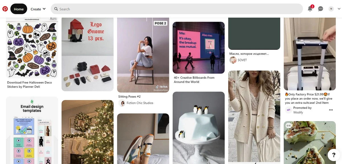
2. Pinterest
Pinterest is a typical image-sharing and social media service. It meets online visitors with a mosaic-style layout. Everything is well-balanced and organized. All visuals occupy their spot creating great reading and visual experience.
The key feature of this design is that the layout adapts to screen width and increases or decreases the number of columns to occupy the entire space. Users who surf the web on the big screen may see 8 to 10 columns, whereas tablet users may enjoy only two to three columns. As for mobile visitors, they see only a single-column structure.
This very elegant solution naturally caters to the user's needs.
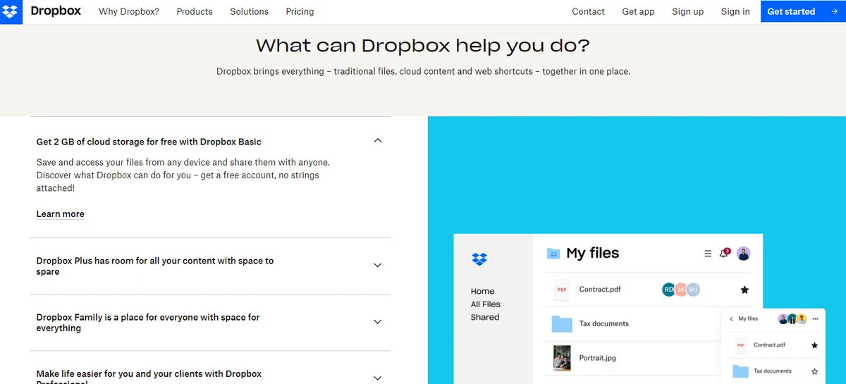
3. Dropbox
Dropbox is a typical representative of the SaaS niche. It serves millions of users every single day across multiple devices. On the desktop, the platform benefits from the split layout that naturally flows into a single-column structure.
On mobile, it conforms to the single-column standard and minifies gaps between sections so that users do not scroll much to get the necessary information. This allows for preserving a fragile balance between content and whitespace and securing good usability and reading experience.
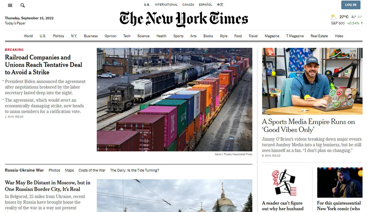
4. New York Times
New York Times is one of the most popular daily newspapers with a worldwide readership. It bases on a typical online magazine layout that feels cramped and content-heavy. Nevertheless, it works, and many digital publication platforms have adopted the same approach. Let's break it into pieces to get some hints.
The desktop version has a complex multicolumn structure that accommodates a bunch of content, including text and visuals. However, due to proper organization, solid construction, and well-established information and visual hierarchy, online readers may enjoy news and find valuable information pretty efficiently. It also breaks content into sections that lazy load not to overwhelm users with too much information at once.
As screen size scales down, the design undergoes some drastic changes—first, the number of columns decreases. Second, images shrink to occupy the space that they have. Third, content blocks get more priority. Finally, the design receives extra whitespace and gaps to ensure an optimal reading experience.
Everything is well-thought-out here.
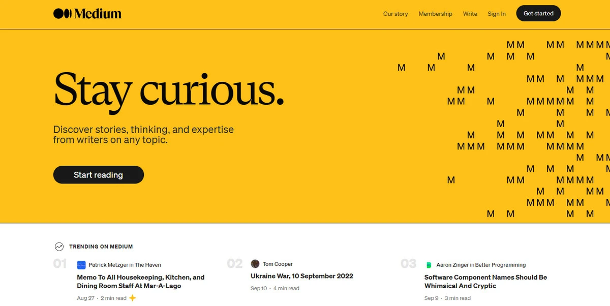
5. Medium
Medium follows a content-first approach with its homepage and all inner pages, maintaining the reading experience across multiple device rendering programs and screen widths at a high level.
The main page has a traditional two-column structure with an impressive header and functional footer. It works excellently on mid-sized and big screens hitting all the essentials of a great user experience.
The inner pages designed to tell the story stick to a single-column format that looks and works great on every viewport meta tag. The team has not reinvented the wheel ending up with an elegant and error-proof solution that speaks directly to its users no matter the device being used.
It is a safe option, but it perfectly complies with the needs of the modern market and does not take much money and time to be realized.
Conclusion
Since 2010, when Ethan Marcotte introduced responsive website design to a large crowd, it has become the right way to build websites.
On the surface, it may seem like nothing special – it is just a technique to resize and reshape the structure to accommodate different devices. But it goes way beyond that. It is a ground-breaking approach that has transformed the digital landscape and made it appropriate for new realms. Even now, it continues to evolve and follow the pace of the gadget industry and the ever-changing preferences, needs, and expectations of online visitors.
If your website is not responsive, it is high time you make it now because you lose a golden opportunity to engage with 4 billion people and get your business to new levels.

Creates insightful, strategy-driven content that translates complex design and branding concepts into accessible knowledge, supporting Ramotion’s mission to elevate digital experiences.