
Search is a critical element of almost all digital products and experiences. Whether it is browsing an online shopping platform, skimming through software documentation, or finding the next TV show to watch, users frequently use the search feature to find relevant information. A well-designed search experience can help users accomplish their goals efficiently and effectively.
However, creating a good search experience requires careful considerations. It does not mean just adding a search bar. Instead, every part of the search journey should be designed such that it prioritizes users’ needs.
In this article, we discuss what is search UX and what the best practices are to design effective search experiences for your target audience. We also share examples and steps to improve the overall search UX.
Read along as we dive into the world of search, search bars, and learn how to design better experiences.
Introduction to Search UX
Over the years, search has become one of the most useful ways to navigate websites and mobile applications, especially the ones that are content-heavy. Instead of endless scrolling and reading every single thing, users can just type their query and find the relevant information. The search feature has proven its worth in the design of ecommerce websites, documentation platforms, and analytical dashboards, among numerous other digital products and services.
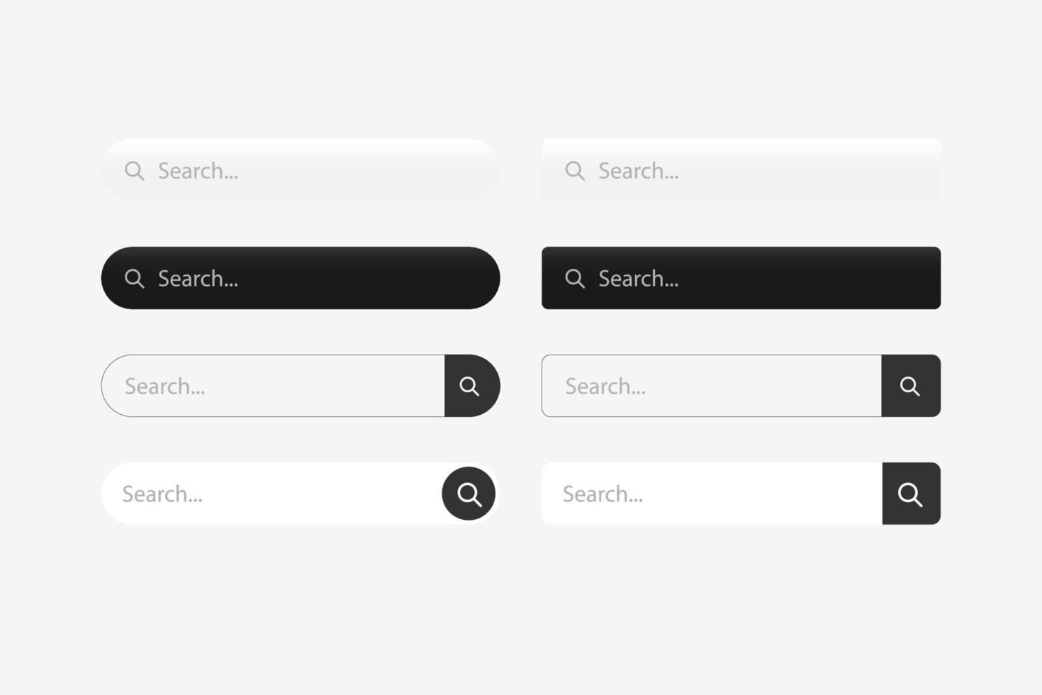
Search Bar UX (Image Source)
However, it is important to design the search experience to help users instead of hindering their progress. Good search UX is not restricted to the design of a search bar alone. It goes beyond the appearance of a search bar, where the goal is to help users formulate effective queries, find relevant results, and guide them toward the next steps with minimal effort.
This is one reason organizations looking to hire leading UI/UX design agencies often prioritize expertise in search experience design, especially for digital products with large or complex content ecosystems.
Defining Search UX
Search UX refers to the entire user experience of looking up – and finding – relevant information in a digital product or service. This type of user experience focuses on creating a simple, intuitive, and satisfying way in which the design can help users find relevant information or complete their tasks.
What is search UX?
Search user experience, or search UX, refers to the design of the search experience when users interact with a product, service, or platform. Good search UX helps users find information quickly by providing good suggestions and an intuitive layout.
A well-designed search experience does not solely focus on the appearance of a search bar. Instead, it combines several key elements, working throughout the user journey. Some important elements include search input, autocomplete suggestions, search results, filters, sorting options, and loading and empty states. These elements give timely feedback to the audience and help them find information quickly.
When Search UX Is Needed
Search functionality is a must-have for digital products and services. Websites and mobile applications that manage large amounts of content or present several types of information to the audience need to provide a way for users to quickly find the relevant content. Some common examples of products and services that rely heavily on effective search UX include ecommerce websites, SaaS platforms, online marketplaces, media libraries, documentation portals, knowledge bases, and data-heavy tools.
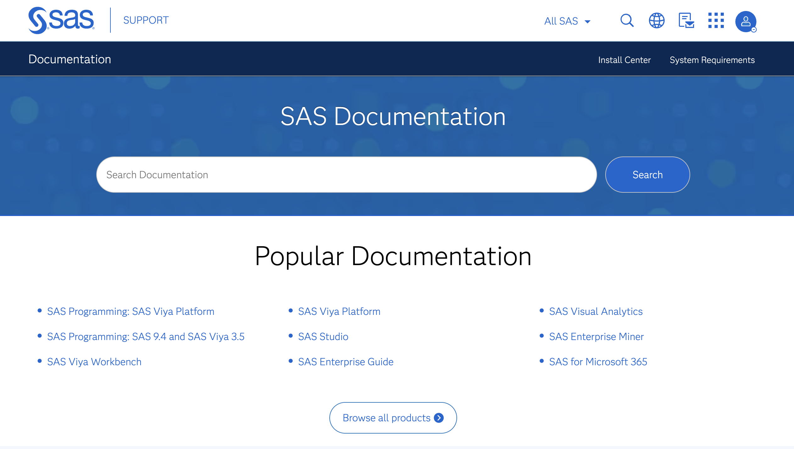
Search Bar for a Knowledge Base (Image Source)
It is important to note that the purpose of search UX is to support navigation. Designers cannot – and should not – use search as an add-on to cover up for poor information architecture or confusing navigation. Search UX goes hand in hand with good design, thoughtful information architecture, and intuitive navigation. When navigation and search work together, users can choose the path that best matches their needs and goals.
Search UX Anatomy
Search UX design covers the entire user journey where a series of interactions lead users to their required information. There are several steps involved in the search experience. From locating the search bar and entering a query to reviewing suggestions, scanning results, and refining the search, each step impacts the overall experience. Together, these microinteractions shape the overall quality of the search journey.
The key components of search UX design are discussed below.
Search bar design
When using the search functionality on a website or mobile application, users first try to locate the search bar. This makes the search bar one of the key components of search UX design. Designers should ensure that the search bar is findable, accessible, and recognizable regardless of the platform or device.
In order to help users begin their search without hesitation, the search bar should be placed in a familiar location and differentiated from the other content by using visual cues, such as size and color. Additionally, a recognizable search icon, placeholder text, visible focus state, and a wide input field encourage users to interact with the search bar, thus helping them in their journey. It is also critical to note that the designers need to adhere to the fundamental digital design principles to ensure usability and usefulness of the search bar.
Autocomplete and search suggestions
When users are typing their query in the search bar, autocomplete can be of great help. It helps users formulate queries quickly by predicting search possibilities. Autocomplete is helpful as it suggests possible steps to the users, reduces typing effort, and minimizes spelling errors, thus making information search faster and more accurate.
When designing autocomplete, it is important to ensure that the suggestions are relevant and easy to scan for the audience. The strength of autocorrects and search suggestions lies in their dynamic nature. This means that the suggestions change and keep on getting updated as the users type their queries. However, the layout of available options should always be easy to scan and review so the users can make an informed decision.
Search results page
Once the users type their queries in and hit the “Enter” or “Return” key, they then see the results on the search results page. The design of this page should be such that the results provide enough context for users to evaluate the results without opening every single option. This can be achieved by making useful information, such as titles, descriptions, categories, snippets, dates, or other metadata, visible on the search results page.

Search Results Page Design (Image Source)
When dealing with a lot of content on the search results page, users also need a way to control what they see and be able to categorize the results. This is where filters, sorting options, and pagination come in handy. These options allow users to narrow down large result sets and navigate them without feeling overwhelmed.
Search empty state
Sometimes users search for some content only to find nothing as a result. This is not an unusual situation. However, search UX design should still provide a helpful user experience even though the results page is empty. Empty states can be used to provide quick feedback to the users, telling them that no matching content was found while reassuring them that the system is functioning as expected.
Additionally, an empty search page can also suggest the next steps, such as double-checking or correcting spellings, broadening the query, removing filters, or exploring related topics.
Search Bar Design Best Practices
An effective search bar helps users accomplish their tasks with confidence and little effort. By following some established search bar UX best practices, designers can ensure that the search interface is easy to engage with and that the users get the best experience.
Some important search bar design best practices are as follows.
- Focus on the principle of familiarity: Place the search bar where users naturally expect to find it, and keep it visible to help navigate the interface.
- Make the search bar visible: Use a recognizable search icon, a descriptive placeholder, and an obvious focus state to invite interaction.
- Provide enough space in the input field: Design the input field with sufficient width so users can comfortably enter and review longer search queries.
- Do not hide the search field: Avoid hiding the search field behind a search icon in search-driven experiences where users are likely to use the functionality frequently.
- Ensure consistency in design: Maintain consistent placement and styling across pages to create a familiar and predictable search experience.
Autocomplete UX Best Practices
Along with the design of the search bar, autocomplete and search suggestions also play a critical role in the user experience. Well-designed autocomplete can help users formulate better queries, reduce typing effort, and find relevant information quickly.

Autocomplete and Suggestions in Search Bar UX Design (Image Source)
Some autocomplete UX best practices include the following:
- Responsiveness: Make autocomplete responsive so it gets updated as the users type, so they can receive relevant search suggestions along the way.
- Grouped suggestions: Group suggestions into meaningful categories to improve scanning and help users discern different types of results.
- Highlighted queries: Highlight the matching query terms within suggestions so users can identify and select relevant options.
- Accessibility and navigation: Support keyboard navigation, such as the arrow keys and the Enter/Return key, to make autocomplete more accessible and efficient.
- Conciseness: Keep the suggestion dropdown concise and uncluttered to avoid overwhelming users with too many choices.
Search Results UX Best Practices
When users press the Enter/Return key or click the search icon to find relevant results, the next step is to provide relevant information in the form of search results as efficiently and effectively as possible. Good search results help users scan the possible options before they evaluate individual items.
It is helpful to display the entered query and the number of results on the search page. Additionally, highlighting matching terms can be reassuring for users that their query is being interpreted and understood by the system. A search results page should also help users filter and sort the results, clear previews, and compare results based on their needs.
Table 1 – Search Results UX Best Practices
| Element | Why it matters | Best practice |
|---|---|---|
| Search query | To confirm what the system searched for | Display the entered query clearly above the results |
| Result count | To set user expectations and make the page less overwhelming | Indicate the total number of matching results |
| Result preview | To help users evaluate results quickly | Include a descriptive title, snippet, and relevant metadata |
| Filtering and sorting | To narrow down the results and make large result sets manageable | Offer meaningful filters and logical sorting options |
| Highlighted matches | To ensure quick and effective result scanning | Emphasize matching keywords within titles and snippets |
Filters, Sorting, and Search Refinement
When looking for relevant information, narrowing and refining the search is one key step in the user journey. Filters, sorting, and other search refinement tools help users narrow down large sets of results without starting their search all over again.
Designers can make search refinement easy for users by providing built-in categories, sorting, price or date ranges, tags, and quick filters. Such features help users locate and reach relevant content without spending too much time.
Filtering and refining the search becomes even more important for websites and apps where the users are dealing with a lot of content. For example, ecommerce websites, product catalogs, documentation and knowledge bases, and complex SaaS platforms often deal with hundreds or thousands of results. This is where selected filters and categories can simplify the user journey.
Designers should make sure that users can easily find ways to refine the results. Search results and refinement options should always remain visible, and users should be able to modify them individually as needed.
Mobile Search UX
Most users interact with digital products and services on smaller screens, i.e., the screens of their mobile devices. Additionally, mobile applications are becoming more and more popular. Therefore, designers need to pay attention to mobile search UX design.
When designing for mobile devices, elements such as speed, comfort, and seamless interaction become even more important. The search field should be easy to locate so the users do not have to spend a long time finding the search option itself. Additionally, the search field should be large and sensitive enough to tap accurately.
Another important aspect to consider is the on-screen keyboard. When users are typing the search query, the keyboard should not block important actions, suggestions, or search results during the interaction.
When including options such as filters and sorting, it is important to ensure visibility and accessibility without overcrowding the interface. Additionally, the inclusion of features such as voice input and large touch targets can make the search experience faster and more convenient for mobile users.
Common Search UX Mistakes
When designing an effective and satisfying search user experience, it is important to prioritize the needs of the audience and adhere to the fundamental principles of UX design. When designers overlook the basic principles, it adds to users’ frustration. Many search UX issues are a result of small design decisions, making search slower, less effective, and more difficult.
Some common search UX mistakes include the following.
- Hiding the search bar or using vague placeholder text makes it difficult for users to locate the search feature and to recognize how they can start the search process.
- Missing suggestions and autocomplete provides little guidance to the users as they are going through the journey of finding relevant information.
- Returning weak or irrelevant results confuses and frustrates the audience, and might end up driving them away from the website or application.
- Excluding loading indicators or helpful empty states does not provide any feedback to the users, thus making the system appear unresponsive or broken.
- Resetting filters unexpectedly, failing to highlight matching terms, or ignoring common spelling mistakes forces users to work extra hard when finding information, thus adding unnecessary steps in the journey.
- Providing an unclear search scope makes users unsure whether they are searching products, articles, documentation, or the entire platform.
Search UX Examples
When designing digital search UX, it is important to understand the type of product and service along with the users’ goals to create a useful, effective, and seamless experience. It is always helpful to look at some examples and take inspiration from existing products. The following examples highlight some good search UX design practices for different types of products and services.
Ecommerce search UX
When it comes to ecommerce platforms, Amazon and ASOS are two great examples of ecommerce search design. Both designs help users quickly locate products, brands, and categories while also referring to popular or predicted queries. The search experience, thus, reduces browsing time by guiding users toward relevant products before they finish typing.
Additionally, once the results are displayed, Amazon and ASOS provide helpful refinement tools to help users in the decision-making process. Filters for price, size, color, availability, customer ratings, and brands help narrow large catalogs and compare products efficiently.
SaaS and dashboard search UX
SaaS platforms and dashboards, such as data and analytical platforms, often have a lot going on, where it is necessary to design a user-friendly search experience. Two excellent examples to look at are Notion and Asana, where the search is not just about finding information; instead, it helps navigate the entire workspace. Users can search across projects, tasks, documents, settings, and other resources from a single interface, making collaboration easier.
Several modern SaaS products also incorporate command search for a more efficient experience. For example, Linear combines search with keyboard-driven commands, allowing advanced users to locate information and perform actions without leaving the keyboard.
Content and documentation search UX
Another type of product where search UX comes in handy is when users are navigating documentation. The documentation websites of Stripe and Prettier are strong examples that make users’ lives easier. Their search experiences help users quickly find API references, guides, tutorials, and documentation pages instead of reading every webpage.
Categories, descriptive snippets, highlighted keyword matches, and quick links to relevant sections within longer documents help users identify the most useful resource before opening a page. Additionally, the autocomplete feature and search suggestions for both platforms are responsive and helpful, thus adding value to the overall experience.
How to Improve Search UX?
Now that we’ve learned about the best practices and looked at a few relevant examples of search UX design, let’s take a quick look at the steps to improve the search experience for users. It is important to note that search UX design requires designers to focus on the target audience and pay attention to each step in the user journey.
Some important steps to follow when improving search UX are as follows.
- Audit search behavior: Review real search queries, frequently occurring user scenarios, failed searches, and common pain points.
- Assess ata quality: Check whether content, metadata, categories, and indexing support accurate and relevant results.
- Improve search entry: Refine the search bar, placeholder text, visibility, focus states, and overall accessibility.
- Optimize support during search: Add or improve autocomplete and search suggestions to guide users.
- Refine results and filters: Strengthen result previews, sorting, filters, highlighted matches, and empty states.
- Test with users: Conduct usability tests and observe real users to identify where they hesitate and run into issues.
- Iterate and improve: Use testing insights and search analytics to make ongoing improvements to the experience.
Conclusion
Search UX is not just about designing a pretty-looking search bar on a webpage or digital product. It is about designing the entire user journey, beginning with entering a query and guiding users with the help of refinement tools. The goal is to help the audience accomplish their tasks quickly and effectively.
A well-designed search experience should complement a product's navigation. When navigation and search work together effectively, users benefit from faster discovery, make clearer decisions, and move through digital products and services with greater confidence and efficiency.

Creates insightful, strategy-driven content that translates complex design and branding concepts into accessible knowledge, supporting Ramotion’s mission to elevate digital experiences.