
The similarity gestalt principle explains why users see visually alike elements as connected. When interface elements share the same color, shape, size, typography, or style, people read them as part of the same group. This matters because users rarely inspect every detail. They scan, compare, recognize patterns, and act based on what the interface suggests.
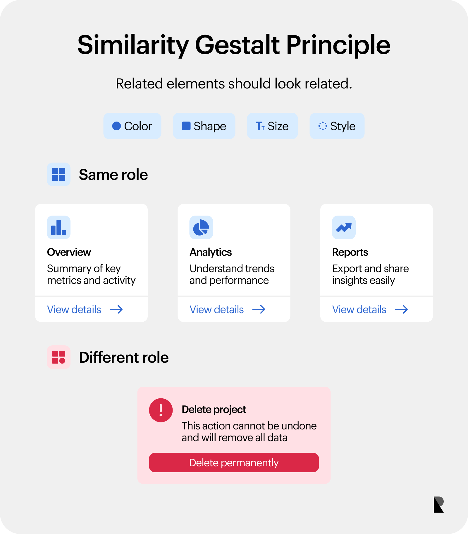
Gestalt principles describe how people organize visual information into meaningful patterns. For designers, they help shape perception through navigation, cards, buttons, forms, and other repeated elements.
Similarity is especially useful because it can override spacing. Two elements placed far apart can still feel related when they look alike. A row of blue links, repeated product cards, matching form inputs, or consistent CTA buttons all signal a shared role. In brand-led interface work, that consistency makes the product feel clearer, more considered, and easier to trust.
What is the Gestalt Principle of Similarity?
The principle of similarity says that users perceive similar-looking elements as connected, even when those elements are separated by space or surrounded by other content. In UI, that connection can imply shared function, category, status, or priority.
A simple example is a set of buttons. When several buttons use the same background, radius, label style, and height, users expect them to perform related actions. When one button looks different, users assume it has a different role. That difference could mean primary action, secondary action, danger, selection, or disabled state.
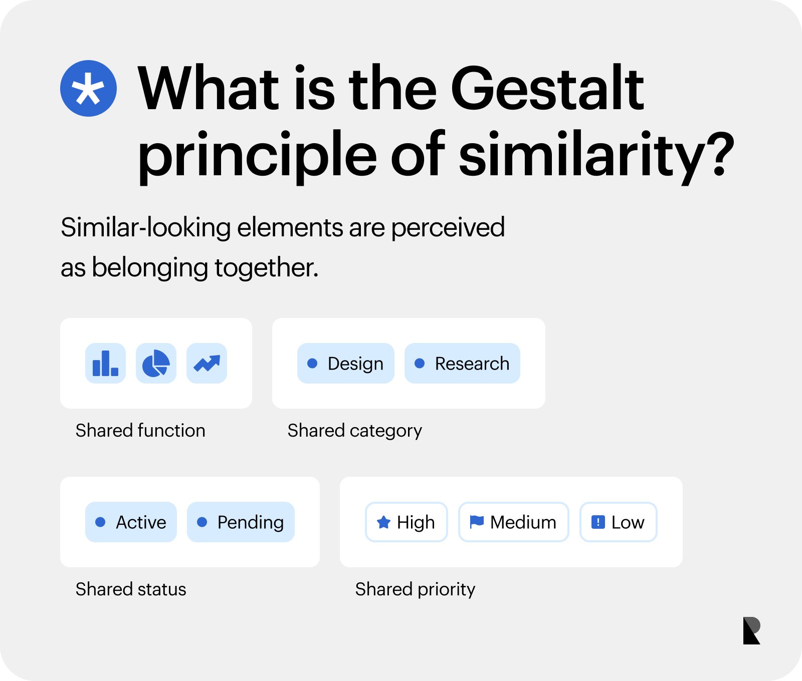
The same pattern appears across cards, icons, labels, inputs, tabs, menus, status badges, filters, and pricing tables. Shared appearance creates a visual promise. If that promise holds, the interface feels predictable. If the promise breaks, users have to pause and reinterpret what they are seeing.
This is why similarity belongs inside a design system, not only inside individual screens. A product becomes easier to use when repeated components keep the same visual behavior across flows, pages, and states.
Why Similarity is Crucial in UI Design
Similarity helps users scan faster because it turns scattered elements into recognizable groups. Instead of reading every label from scratch, people learn the visual grammar of the interface. A matching card format means “compare these.” A consistent input style means “fill these in.” A repeated link color means “this is clickable.”
That pattern reduces cognitive effort. Users spend less energy decoding the interface and more energy completing their task. A site overhaul that gave every “Contact Us” element the same color, shape, and size led to a 40% increase in inquiry form submissions, showing how consistent visual cues can turn recognition into action.
Clear similarity also supports brand trust. A digital product that treats related elements consistently feels more intentional and mature. This is especially important for companies with complex offerings, where users need to understand categories, compare options, and move through the experience without getting lost.
In web design, consistent visual patterns shape how people understand structure. Navigation, page sections, content modules, and calls to action all benefit when visual relationships match functional relationships.
How Similarity Works in Visual Perception
The brain groups objects by shared traits. Color, shape, size, typography, stroke, texture, alignment, and icon style all influence what users perceive as connected. Designers can use gestalt principles to guide that perception deliberately, turning visual choices into interface logic.
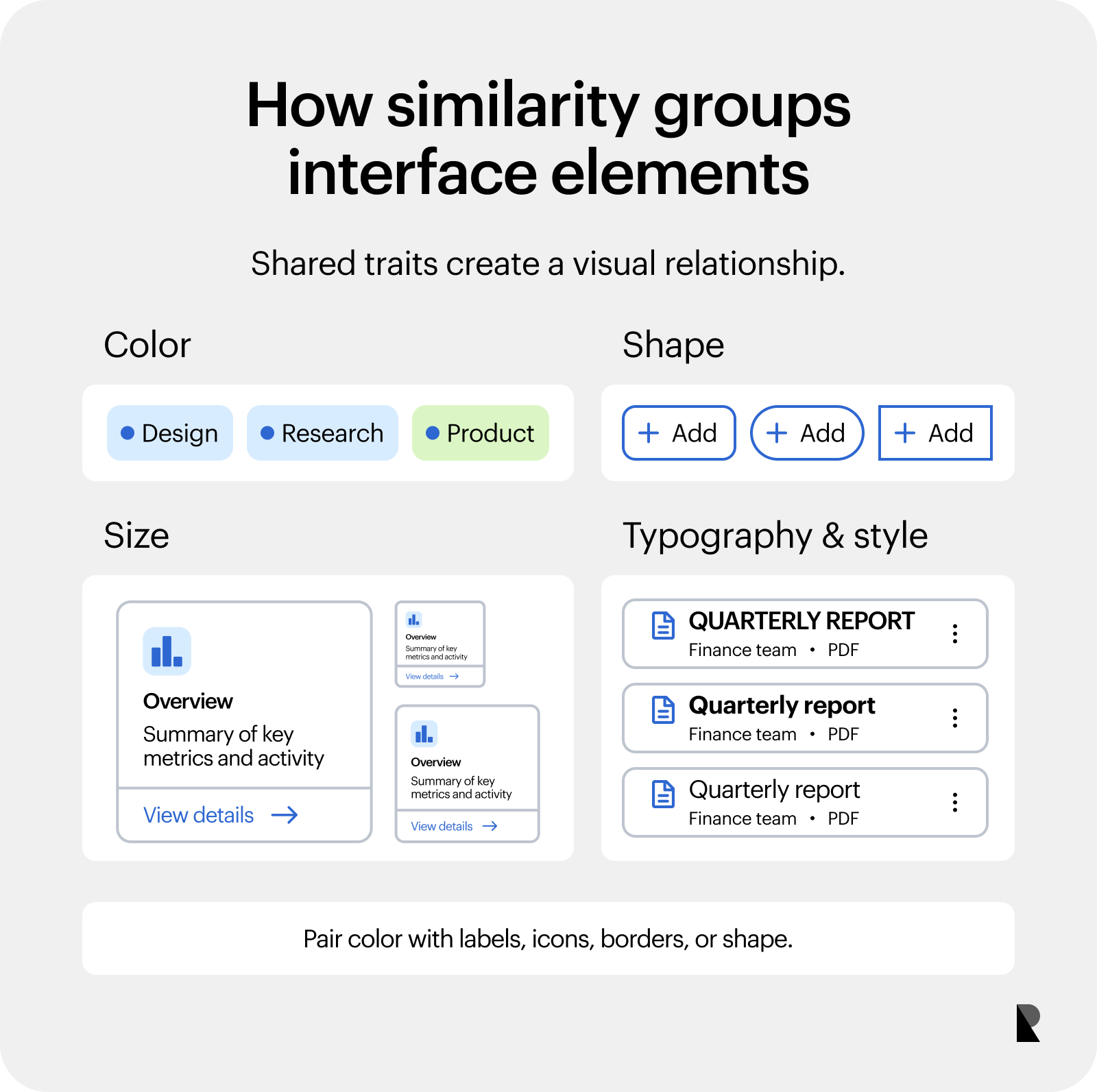
Let’s try to break the idea into a few, practical traits. Each one can strengthen clarity when used with intent, or create confusion when applied randomly.
Similarity by color
Color is one of the fastest ways to signal relationship. Matching colors can show that elements belong to the same category, perform the same action, or share the same status. Links often use one color. Active navigation items use another. Status labels might use green for completed, yellow for pending, and red for error.
The risk comes when one color carries several meanings. If blue means link, selected filter, informational alert, and secondary button all at once, users have to guess from context. That slows the experience and weakens the interface language.
Color should support meaning, not carry it alone. Accessible systems also use text labels, icons, borders, or shape differences so users can understand status and action even when color perception varies.
Similarity by shape
Shape helps users identify element types. Repeated rectangles with the same radius can signal buttons. Cards with matching containers can signal comparable content. Pills can signal tags or filters. Circular icons can signal profile images, tools, or compact controls.
Shape consistency matters because users remember patterns quickly. When every primary button shares the same shape, the action becomes easier to spot. When a form input suddenly looks like a button, or a tag looks like a CTA, the interface introduces unnecessary doubt.
Button design depends on this distinction. Primary, secondary, tertiary, and destructive actions need enough visual difference to communicate hierarchy, while buttons with the same role should stay visually consistent.
Similarity by size and style
Size, typography, weight, outline, shadow, and icon treatment also create visual grouping. Headings are a familiar example. When every H2 uses the same size, weight, and spacing, users understand where sections begin. Body text, captions, labels, and metadata each need their own stable style.
This creates hierarchy. Larger text signals importance. Repeated label styles signal supporting information. Matching card titles help users compare a list. Consistent icon stroke creates a unified toolset.
Visual hierarchy gives those choices structure. Similarity helps users recognize what belongs together, while hierarchy helps them understand what matters first.
Similarity vs Other Gestalt Principles
Similarity works alongside other perception rules. In interface work, the practical value comes from knowing when each rule shapes the user’s reading of the screen. The comparisons below keep the focus on everyday UI decisions, where layout, grouping, and recognition affect usability.
Similarity vs proximity
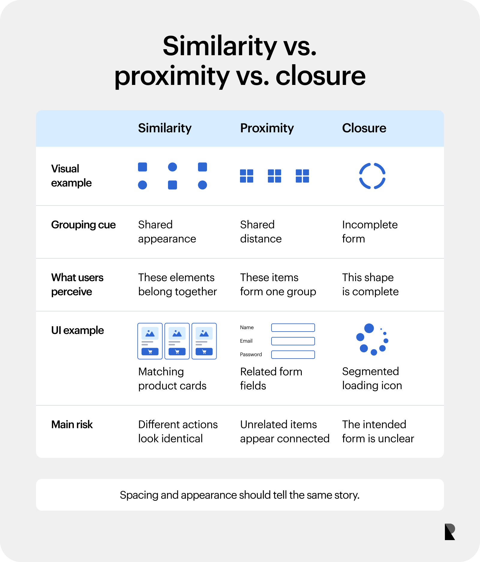
Proximity groups elements by distance. Elements placed close together feel related because they occupy the same visual area. Similarity groups elements by shared appearance. Elements can sit far apart and still feel connected when they look alike.
The two principles often reinforce each other. A pricing table becomes easier to scan when related data sits close together and each plan card follows the same structure. They can also conflict. If unrelated elements sit close together and share a style, users could assume they perform the same function. Strong UI design uses spacing and appearance to tell the same story.
Similarity vs closure
Closure makes users mentally complete an unfinished shape. A broken circle can still read as a circle because the brain fills in the missing piece. Similarity works differently. It connects elements because they share visible traits.
A simple visual example would be a loading icon made from partial segments for closure, compared with a group of matching product cards for similarity. One asks the brain to complete a form. The other asks the brain to recognize a relationship.
Psychology in UX design is also important, as it covers how these perception rules influence product interaction, especially when users need to interpret a screen quickly.
Examples of Similarity in UI and Web Design
Similarity becomes most useful when it improves scanning, comparison, and recognition. In practice, that means the interface repeats meaningful patterns and reserves visual differences for real differences in function. These patterns show how teams can apply similarity gestalt principles across common website and product components.
Navigation menus
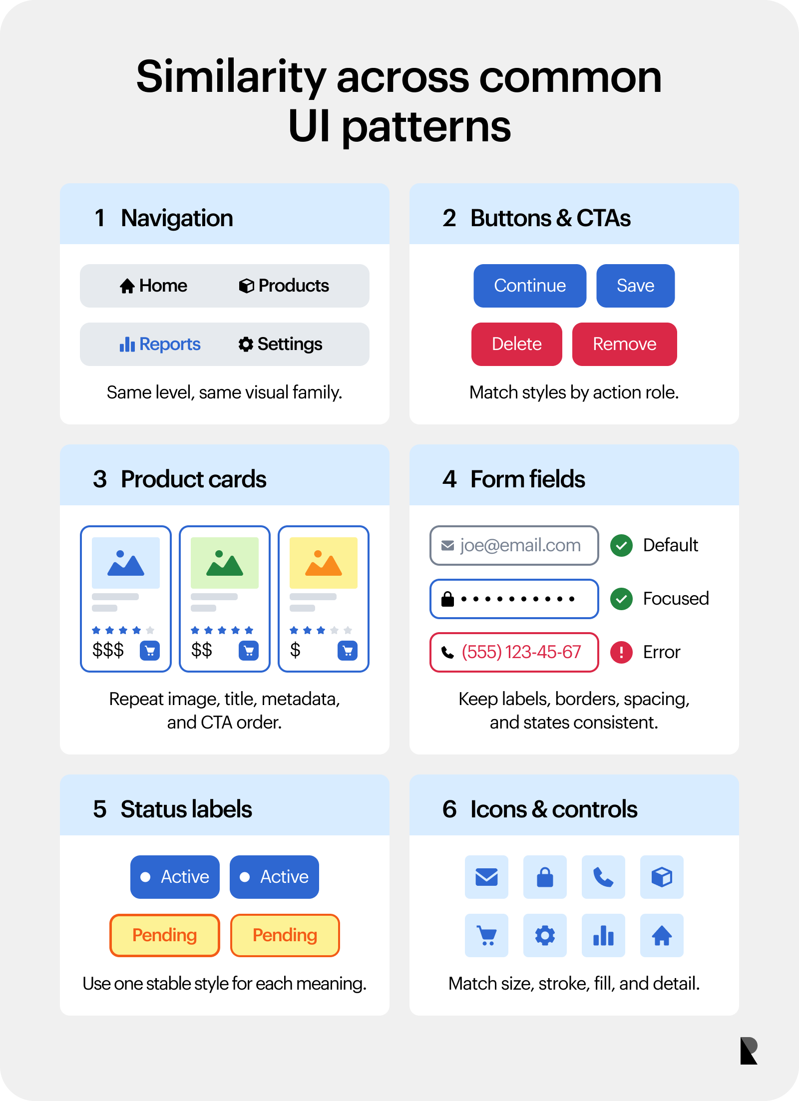
Navigation items at the same level should look related. Matching typography, spacing, color, and alignment help users understand that these links belong to one menu. The active item can still stand out through weight, underline, background, or color, as long as it remains part of the group.
A common mistake is making the active item so different that it looks like a separate component. The better approach keeps the family resemblance intact while giving users a clear “you are here” signal.
Buttons and CTAs
Similar buttons imply similar action types. A product interface might use one style for primary actions, another for secondary actions, and a clearly distinct treatment for destructive actions. That visual system helps users act with more confidence.
The law of similarity becomes especially useful when calls to action repeat across a long landing page. If every demo request, contact link, or checkout CTA shares a recognizable treatment, users learn what to look for. Elements that appear similar are often perceived as a pattern, so users expect them to behave the same way. Matching color, shape, and size for related actions helps reduce confusion and supports predictable interaction.
UX design patterns rely on this behavior because patterns only really work when users recognize them from one context to the next.
Product cards
Repeated card structure helps users compare products, pricing plans, articles, case studies, or portfolio projects. The image size, title position, metadata order, description length, and CTA placement should follow a consistent rhythm.
Card UI design works because the container sets expectations. Once users understand the pattern, they can scan across options instead of relearning each block. This becomes valuable for marketplaces, SaaS pricing pages, resource libraries, agency portfolios, and product grids.
A useful example is a case study grid where every card includes an image, client name, service category, short outcome, and link in the same order. The consistency lets users compare work quickly while still allowing each project to feel visually distinct through imagery and content.
Form fields
Form fields should follow one consistent visual system. Labels, borders, spacing, help text, validation messages, and input states all shape how users understand the task.
When one field looks different without a clear reason, users can read it as special, optional, broken, or risky. A different border, unusual color, or unexpected label placement can introduce friction at the exact moment the interface needs trust.
The same rule applies to error states. If an error field uses red text, red border, and a clear message in one area, that pattern should repeat everywhere. Consistent form behavior helps users recover faster.
Status labels and tags
Status labels need clear visual relationships. Active, pending, error, and completed states should each have a stable color, shape, and label format. Users should be able to recognize them at a glance across tables, cards, dashboards, and detail pages.
The main risk is assigning one style to multiple meanings. If a yellow pill means “pending” in one area and “warning” in another, the interface weakens its own language. Similarity should create confidence, not force users to memorize exceptions.
Icons and controls
Icons in one set should share size, stroke, corner treatment, fill style, and detail level. A mixed icon set can make even a strong interface feel random because the visual language keeps changing.
Controls need the same discipline. Toggles, dropdowns, filters, search fields, checkboxes, and pagination should follow a coherent system. Digital product design depends on these small recurring decisions because they shape how polished and trustworthy the interface feels.
Common Similarity Principle Mistakes
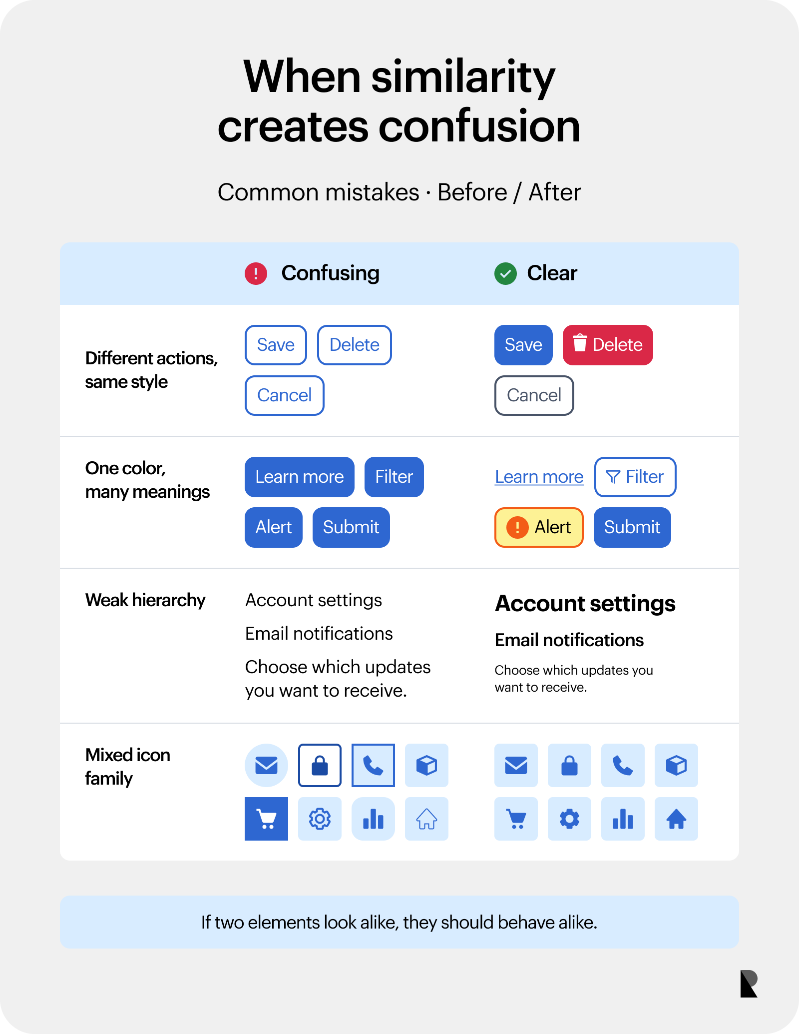
The most common mistake is making different actions look identical. If “Save,” “Delete,” and “Cancel” all use the same button style, users have to read carefully every time. Visual difference should reflect functional difference, especially when an action has higher risk.
Random color use creates another problem. A product that uses the same color for links, filters, alerts, selected states, and buttons asks users to interpret meaning from context alone. The interface feels less reliable because the visual system keeps changing the rules.
Weak hierarchy also breaks clarity. When headings, labels, descriptions, and metadata look too similar, users struggle to scan the page. Everything competes for the same level of attention.
Icons create their own traps. A filled icon next to outlined icons can look active, even when it is not. A larger icon can look more important. A decorative icon can look interactive when it shares the same style as functional controls.
The sharpest test is simple: if two elements look alike, they should behave alike or belong to the same category. If they behave differently, the design should make that difference visible.
How to Use the Similarity Principle in Design
Use shared style for related elements and distinct style for different functions. This sounds basic, but it becomes harder as products scale. New flows, experiments, campaign pages, dashboards, and feature releases can slowly introduce small inconsistencies until the interface loses its rhythm.
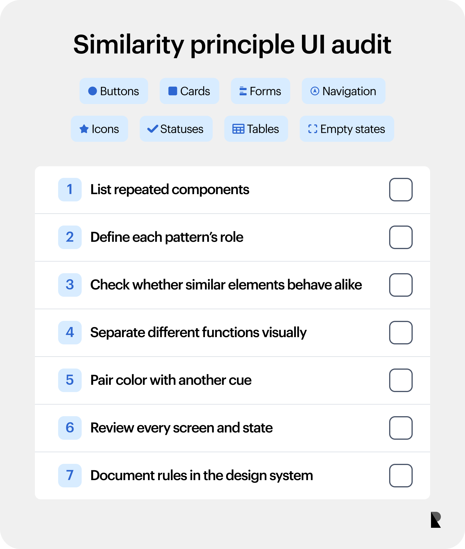
A practical audit should look across buttons, cards, forms, navigation, icons, status labels, tables, and empty states. Ask whether each repeated pattern has a clear role. Then ask whether visually similar elements behave in similar ways. Any mismatch deserves attention.
Designers should also avoid relying only on color. Accessibility needs contrast, labels, structure, and visible states. A selected filter can use color, but it should also include a shape change, checkmark, label, or border. An error state can use red, but it also needs text that explains the problem.
For teams working across brand and product, similarity should connect visual identity with usability. Brand colors, type, motion, and illustration style can make a product recognizable, while component rules keep it understandable. The strongest systems do both. Well-defined principles of design help teams turn that discipline into a repeatable practice rather than a one-off styling choice.
Conclusion
The similarity gestalt principle gives designers a clear way to shape how users understand digital interfaces. When related elements look related, users can scan faster, compare more easily, and act with greater confidence. Consistent colors, shapes, sizes, typography, icons, and states all help turn a screen into a readable system.
For brand-led products, similarity carries extra weight because every repeated pattern teaches users how the product works and what the brand values. A consistent interface feels intentional, calm, and easier to trust. A scattered one makes users work harder than they should.
The practical takeaway is pretty straightforward: use similarity deliberately, consistently, and accessibly. Make related things look related. Make different functions visibly different. When choosing a partner, review UX design agencies with that same standard in mind: the right team should know how to build visual systems that support brand recognition, product clarity, and everyday usability at the same time.

Creates insightful, strategy-driven content that translates complex design and branding concepts into accessible knowledge, supporting Ramotion’s mission to elevate digital experiences.