
Did you know that over half of the first impression is based on appearance? According to studies, 55% of the impact of the first encounter comes from a look. This is true not only for people but also for products, as we tend to judge a book by its cover, despite our tendency towards tolerance. We form our initial, foundational opinion within the first seconds of interaction with the product based mostly on demeanor.
Professional marketers and branding agencies widely use this fact to reinforce the app’s market position, win over fierce competition, and maintain strong relationships with the target audience. How? Simple – they hire one of the leading UI/UX design agencies to create a memorable, impressive, and meaningful splash screen.
What is a splash screen? How does it differ from an onboarding screen or loading page? What benefits does it bring to the application and company? We are going to address all these questions and inspect 10 outstanding examples to gain real insights into this powerful concept.
What Is a Splash Screen?
A splash screen is a fancy gateway to your digital product, whether it is an application, website, or software. It is an introduction that announces the utility's appearance. Technically speaking, it is the first screen that users see when they launch an application. It precedes the onboarding screen and login routine, welcoming users to the digital product’s environment.
Generally, the splash screen lasts just a few seconds to complete several important tasks. First and foremost, it indicates the successful launch. Second, it testifies to the product manufacturer, ensuring viewers that they have activated the desired product. Third, it produces the first impression. Finally, it warms up the audience and drives engagement, transiting users from nothingness to the meaningful surroundings.
Splash screens are fleeting but information-packed; yet, this information is not presented as traditional text snippets. As the introductory page has only a few seconds of the user’s attention, it relies heavily on visual impact to convey the message quickly and effectively. Marketers employ graphical elements (logos, mascots, app names, brand colors, and illustrations) along with dynamic effects to achieve their marketing and branding goals.
Why Splash Screens Matter?
A splash screen lasts just a few seconds, quickly appearing and disappearing, but that is enough to make the most of the user’s short attention span and not only deliver the brand message but also reach several important goals.
When well thought out, the splash screen can reinforce brand recognition. Serving as the first touchpoint, enriched with brand identity elements such as a logotype, brand color palette, or typography, it unobtrusively builds cognitive familiarity, offering a friendly welcome to existing users and a powerful introduction to newcomers.
Quick, impressive, and effective, the splash screen creates a positive impression of the successful product launch. This elicits a positive reaction from users, making an application appear trustworthy and reliable.
This positive response increases credibility and trust as well as meets the user’s expectations before the app’s interface appears. During the first seconds, the introduction page shapes the user’s perception of the product, aligning expectations with reality. Moreover, it offers a smooth, polished, and optimized transition to the utility’s main interface, underlying a solid foundation for productive collaboration.
Finally, a splash screen produces a powerful first impression. Capitalizing on the Halo effect, the first-ever screen of the product leads to a meaningful and memorable reception, leaving a strong, lasting impact and positive assumptions about the product's competency and reliability.
All these tiny tasks that the splash screen manages to accomplish make it crucial to the product’s success and to the company’s image and reputation.

Splash screen by DuckDuckGo
Splash Screen vs. Launch Screen vs. Onboarding Screen
When creating an application, you might hear a lot about splash screen, launch screen, and onboarding screen. All of them precede the application's main interface. But how do they differ? Here is the breakdown of the main distinctions among these vital concepts.
Technically speaking, the splash screen is an introductory screen that includes branding information and notifies users about the product’s readiness to address needs. Its task is to deliver the brand message, set the right expectations, make the first impression count, and warm up the audience. It lasts just several seconds.
The launch screen is a page designed to mask the loading process, which, for some applications, can take time. Its mission is to ensure that the user knows the product has loaded successfully. It appears immediately after clicking the app icon and disappears as soon as the application is ready, taking as much time as needed. Unlike a splash screen, it might last longer than several seconds as it waits for the libraries to be uploaded.
The onboarding screen stands in stark contrast to the splash screen and launch screen; its showtime largely depends on the user and their ability to understand the application functionality and routine. It is obligatory for newcomers and optional for regular users, with the ability to be dismissed. It appears after the splash screen, serving as an intermediate point between the introductory page and the main interface.
Another big difference between the onboarding screen and the splash screen is that the former is much more informative. It includes instructions, supported by images and animations, to teach users about the product and how to interact with the interface.
Finally, while the splash screen and launch screen appear all the time, as they mask background processes and represent brand identity, the onboarding page might be shown only to newcomers or to users who still do not feel comfortable with the interface and require further assistance.
To sum up, while at times these concepts share similarities, they serve different roles and cannot be replaced or excluded from the routine. They appear in this order: first the launch screen, afterward the splash screen, and only then, if required, the onboarding screen.
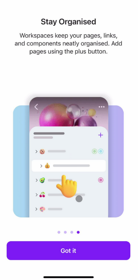
Onboarding from Microsoft Loop
Key Splash Screen Design Elements
Running after the initial preparation stage, the splash screen is designed to deliver the brand message, set the right expectations, warm up the audience, and make a first impression without clutter, information overload, or confusion. This is not a simple task; therefore, it has several time-proven tools - such as logo, background, colors, typography, animation, and an optional loading indicator - to play its role and ensure simplicity, quality, and efficiency.
Logo and brand mark
The logotype is the main driving force and primary visual anchor of brand identity on the splash screen. Despite its small size, it has great power for instant recognition, familiarity, and credibility. It inspires trust and fuels strong relationships with the users. It is the foundational design asset that can be seen almost in every launch page.
When including the logotype on the introduction app page, prioritize it so it can serve its purpose without overwhelming or confusing viewers. Here are several professional tips for that:
Simplify logotype
It might sound controversial, yet according to usability principles for small-screen devices, all branding visual identity units must be stripped of complexity. This concerns not only details but also color and background. A minimalistic approach allows for minimal cognitive overload and high speed.
Make the logo recognizable
In continuation of the previous tip, simplifying does not mean eliminating details – it means stripping unnecessary aspects in favor of the key ones. It is crucial to include elements that not only make your brand recognizable but also convey your key message and personality.
Center the logo
Positioning the logotype at the heart of the splash screen gives it prominence, capturing overall attention and ensuring the brand mark is not missed.
Background and color
Background and color are two key elements of every design, even though they seem invisible. Their power lies in their ability to set the atmosphere, evoke emotions, and support elements in the foreground.
On the splash screen, they have a tremendous visual impact as they, along with the logotype and loading indicator, are the only graphical assets. It is important to use them with caution so as not to overwhelm viewers. Here are several practical tips:
- Select a backdrop that contrasts with the foreground elements to ensure readability.
- Make it neutral yet linked to branding.
- Avoid busy, complicated, and vibrant backgrounds as they might distract attention from the brand mark.
Loading indicator and animation
Loading indicators and animations are popular choices for splash screens because they serve important functions that enrich the user experience. The first asset masks the necessary preparation on the backend and brightens users' time, while the second asset supports the brand identity, entertains users, and reinforces the first impression.
Since these units significantly impact the overall impression, it is highly advisable to adopt these professional tips:
- Use a loading indicator or animation only when necessary, as they can overcrowd the space and overload the experience.
- Keep loading indicators short and lightweight so they do not distract from the logotype or slow down app launch.
- Stick with oversimplified versions, getting rid of unnecessary details, color, and effects.
Splash Screen Design Best Practices
A splash screen comes with many advantages. It produces the first impression, reinforces brand image, sets expectations, and entertains viewers, generating an initial positive reaction. However, not every introduction is made equally since it is not enough to include just a logotype, a beautiful background, and a loading indicator. To enjoy the full power of this concept, it is vital to follow best practices that maximize its potential. Here are two ground-breaking rules that should help you.
Be minimal but not oversimplified
Mobile applications are infamous for their limited space. They do not give you enough room for creativity and self-expression, as any large or intricate item can easily overwhelm and scare away viewers.
When designing for the introduction page, it is crucial to remember that it must stay simple, visually clean, and quick. It should not have excessive text, images, illustrations, or dynamic effects.
But this does not mean being oversimplified. Adding prominent brand identity elements along with short yet eye-catching animation hit the mark and naturally capitalize on the introduction page’s ability to win over users.
Test for better usability, readability, and accessibility
Even the shortest prelude must meet rigorous web standards. It should be responsive, usable, readable, accessible, and consistent with the brand identity. This way, users get the best experience.
To achieve this, it is highly advisable to follow recommendations on usability, responsiveness, accessibility, and branding at every stage of mobile development, from drafting to post-production, as the splash screen is an integral part of the overall mobile environment.
In addition, introduce tests into the routine to identify flaws and weaknesses. At minimum, inspect contrast, responsiveness, interactivity, accessibility, speed, and consistency across screen sizes and mobile operating systems.
Splash Screen Examples
Following practical tips and avoiding mistakes is a great way to reinforce the splash screen, but getting insights from real-life examples is even better, as they show recommendations put into action. Here are a dozen introduction screenshots taken from industry leaders to demonstrate the practical application of design principles.
Airbnb Splash Screen
Airbnb's splash screen embraces minimalism and capitalizes on the brand's identity. Their introduction is nothing more than a clean, spacious layout with a pure white background featuring just one detail – their iconic logotype. It sits at the heart of the screen and instantly draws attention, connecting the dots for customers.
Airbnb needs no introduction as it has one of the strongest brand identities in the market. A clean composition with just a logotype is enough for the company to forge a direct mental link between its name and application mission.

Booking.com Splash Screen
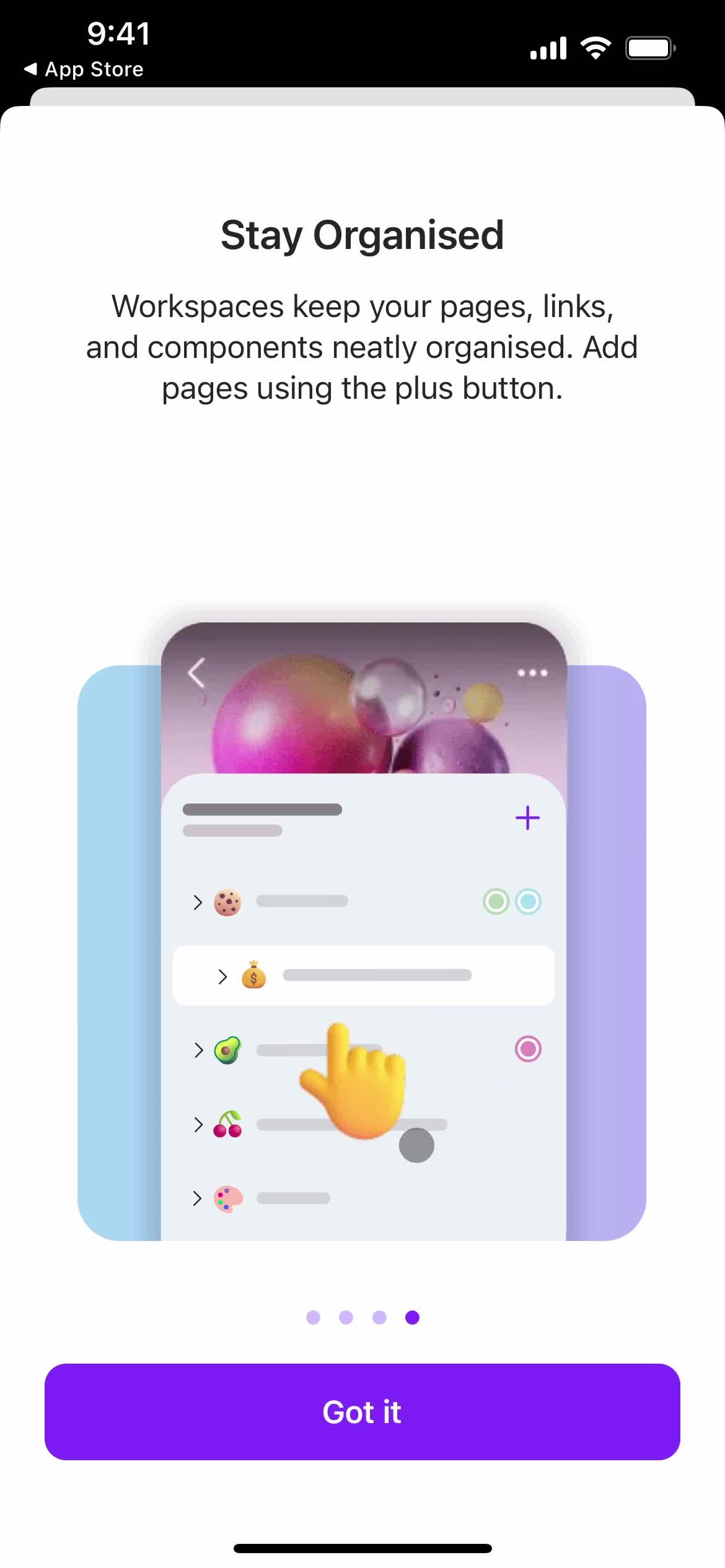
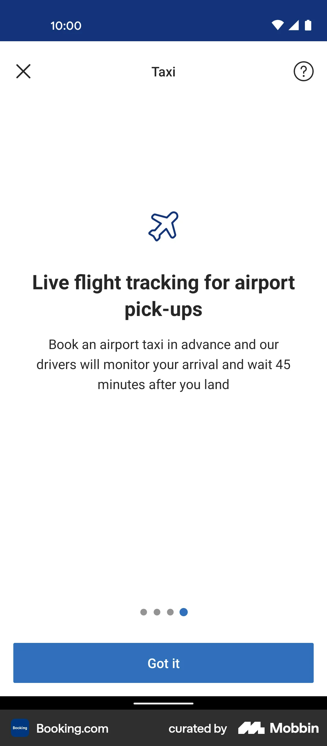
Booking offers a good example of a splash screen smartly integrated into the onboarding routine. It does not overload with information nor overwhelm with visuals. It has four slides, minimal graphics, and instructions that remind users how to make the most out of the application.
In terms of design, the introduction leverages the brand's blue as the primary visual element. It creates a connection between the application and the company, leading to immediate visual recognition.
Netflix Splash Screen
Netflix's splash screen serves as a brief yet captivating and engaging cinematic buffer that preludes the application launch. It demonstrates how contrast can easily draw attention to the key brand message and intensify it.
Using their iconic bright red logo against a clean, pure dark background, the intro offers a dramatic contrast while meeting accessibility standards. It also creates a connection between the product and the entertaining experience.

Spotify Splash Screen
Spotify's splash screen is the epitome of minimalism, featuring nothing more than a clean black canvas and an iconic green logotype placed right in the center. Yet there is more to it than just compact composition. It serves as a loading page, captivating the user’s attention during the initial app preparation stage.
The dev team has preferred recognizability through branding over decoration to make a positive impact and let the brand’s identity speak louder than words.

Etsy Splash Screen
Targeting artists and the audience who are up for unique handcrafted products, Etsy's splash screen reflects its creative personality through warm colors and an iconic logotype. It instantly sets the right mood and connects the application to the design sphere. Much like the majority in our list, this splash screen thrives on the company's powerful brand personality and image.

Uber Splash Screen
Uber's splash screen takes a smart, concise visual solution. It capitalizes on speed and simplicity to ensure users receive the brand message instantly and reach the interface without wasting their precious time. This decision works well for utility services, as it optimizes perceived performance, addresses customers’ issues promptly, and reminds them of the brand's mission.

Discord Splash Screen
The Discord splash screen strongly relies on the feelings most closely associated with their product – playful, communicative, and efficient. It employs a cheerful visual system with recognizable illustration and coloring, revealing its personality without clutter or information overload.

Dropbox Splash Screen
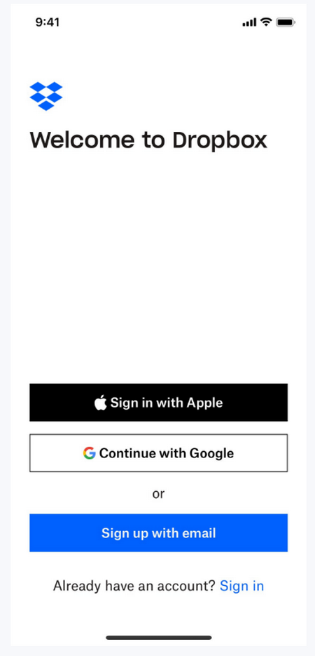
The Dropbox splash screen is skillfully combined with the welcome page. Along with the brand logo, which instantly catches the eye and evokes a sense of familiarity, it offers a login functionality via carefully placed buttons at the bottom.
Despite relatively few details, the screen does not feel cramped. It looks clean, neat, and comfortable thanks to the generous amount of white space, well-organized composition, and features that meet web standards.
YouTube Splash Screen
Creating suspense and enhancing the user's experience, YouTube's splash screen knows how to make the first impression count, making its branding work for it. The team uses a single symbol that requires no introduction to effortlessly demonstrate its identity and personality. The red play logo, which is one of the most recognizable icons in the World, sits against a simple, clean background. Serving as the main visual asset, it effortlessly does all the heavy lifting.
Twitch Splash Screen
Although an illustration may delay the launch, Twitch's splash screen boldly employs it to infuse the page with an artsy feel and add a vibrant touch of its personality to the first seconds of interaction.
This approach makes the most of their iconic purple color and widely recognizable logotype, instantly separating the product from the competition. It also immediately connects the product and its purposes, supporting it with the manufacturer’s trust and credibility.
Common Splash Screen Design Mistakes
A splash screen is a powerful tool that benefits the product in many ways, from brand building to masking backend routines. It is not easy to handle. There are several challenges that app designers and developers need to overcome to ensure it works as intended. Here are three main mistakes that can easily drag down the concept's performance and overall impact.
Cluttered layout
It is always tempting to add many beautiful branded elements to reinforce the first impression. However, for digital mobile products, quantity does not mean quality. On the contrary, the fewer units you have on your splash screen, the better, as any text snippet or graphical detail draws attention and conveys a message, which can cause informational, visual, or emotional overload.
Inconsistency
As the prelude for the mobile application, the splash screen has a great opportunity to reinforce a connection between the brand and the product. Unfortunately, many app developers miss this chance by focusing solely on the appearance. This negligence of the brand’s coherence might generate confusion and mixed feelings.
To avoid this, it is highly advisable to base the splash screen on the main design system and instill brand personality in key features to demonstrate a sense of belonging.
Heavy and slow
It might seem that such a short, minimalistic splash screen cannot compromise the application's speed and performance. But in practice, it could easily slow down the launch and scare users away. Note, if it lasts more than 7 seconds, it might easily compel clients to delete the application, according to Google studies.
Any text snippet, button, low-quality graphics, rich photos, animations, visual effects, or functionality adds weight. Therefore, strip out unnecessary details in the sake of a fast, simple, and engaging experience.
Conclusion
A splash screen is not just a screen saver that precedes app launch. It has a great potential to accomplish important goals, such as producing a strong first impression, setting the right mood, meeting users’ expectations, reinforcing brand identity, and creating a smooth transition to the utility. When well thought out, it might also improve recognition, set the product apart from the competition, and increase perceived app quality and credibility.
To unlock those benefits, it is not enough to create an introduction page and play it right before the main interface appears. It must be designed with best practices in mind and aligned with the brand’s personality, as it lasts only a few seconds to capture the user’s short attention span. Therefore, create a clean, creative, on-brand design, which meets web standards; draw insights from real-life examples; and always test to improve performance.

Creates insightful, strategy-driven content that translates complex design and branding concepts into accessible knowledge, supporting Ramotion’s mission to elevate digital experiences.