
Typefaces and fonts are often used as if they mean the same thing. For designers and non-designers alike, mixing them up is common. But knowing the difference helps you communicate clearly, fix technical issues faster, and reduce confusion.
If you’ve ever used these terms interchangeably and wondered why it matters, this article is for you. It covers the definition of typeface vs. font, and offers a beginner-friendly guide on choosing the right ones for your project.
What Is a Typeface?
A typeface is the visual design of a set of characters that share a consistent style and personality. It’s essentially the design family governed by aesthetic rules that make the characters look like they belong together.
Times New Roman has a formal, newspaper-like feel with its sharp serif and narrow proportions. Arial is clean, neutral, and rounded, built for clarity on screens. Helvetica is precise and even, prioritizing uniformity and legibility above all else.
Common Typeface Categories
Typefaces fall into families: serif, sans serif, script, and decorative—each with different strengths and uses.
Serif typefaces
Serifs are small strokes or “feet” at the end of letterforms or strokes. They guide the eye along lines of text and can lend authority and tradition to a design. These traits make serif typefaces a favorite for publishing books, newspapers, academic works, and some luxury branding.
When to use:
- Long-form printed text (books, reports)
- Formal documents or brands that need an authoritative tone
- Elegant or premium brand identities
Serif typeface examples: Times New Roman, Bodoni, Liberation, Baskerville, and Georgia
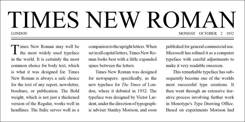
Times New Roman via Adobe Fonts
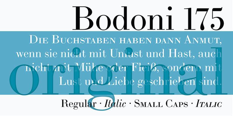
Bodoni via Adobe Fonts

Liberation via Adobe Fonts
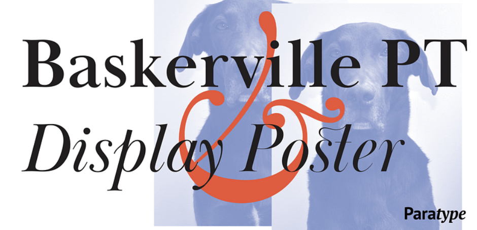
Baskerville PT via Adobe Fonts
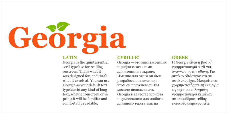
Georgia via Adobe Fonts
Sans Serif typefaces
Meanwhile, sans serif is the opposite. Sans serif typefaces do not have feet and tend to have more uniform strokes. Their clean, minimalist appearance works well across digital interfaces and modern branding.
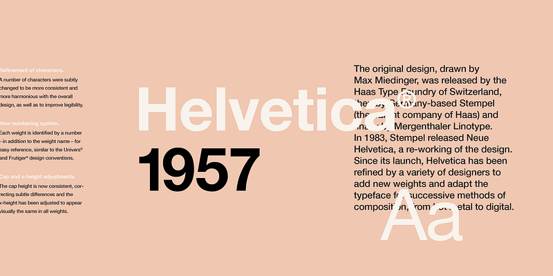
Helvetica via Adobe Fonts
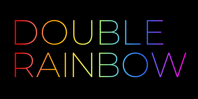
Montserrat via Adobe Fonts

Open Sans via Adobe Fonts

Ubuntu via Adobe Fonts
Script and decorative typefaces
Script and decorative typefaces emphasize personality and aesthetics. They range from refined handwriting styles to highly stylized typefaces. Because they prioritize appearance over sustained readability, they’re best used sparingly.
When to use:
- Logos and headlines that need distinction
- Invitations, packaging, or designs that evoke nostalgia, elegance, or craftsmanship
- Thematic or cultural treatments (art deco, retro)
Script and decorative typefaces: Milk, Fabiola, Confiteria, Quotes
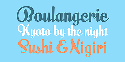
Milk Script via Adobe Fonts
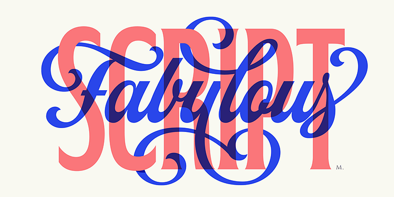
Fabiola via Adobe Fonts
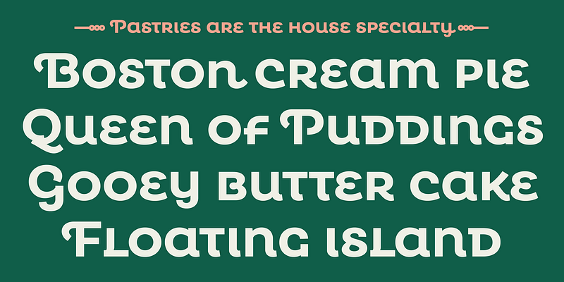
Confiteria via Adobe Fonts
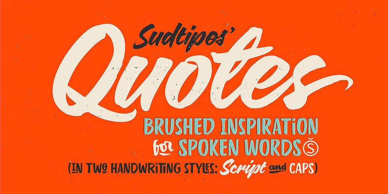
Quotes via Adobe Fonts
What Is a Font?
A font is a specific implementation of the typeface. It’s the downloadable digital file that translates the typeface into something usable, including text weight, size, and format. Times New Roman Bold in 12-point is a font. *Helvetica Italic *in 10-point is another font.
Font Variations Within a Typeface
A single typeface usually includes multiple fonts with variations that let you create hierarchy, emphasis, and tone.
Weight and size
Weights (light, regular, medium, bold, etc.) change visual emphasis. Bold weights draw attention to headings and calls to action; regular weights suit long-form body text. Meanwhile, size interacts with weight to create visual hierarchy. For instance, a bold heading at 24 points gets the first look compared to a lighter weight at 12 points. This combination naturally guides the eyes, reducing cognitive load.
Style
Sometimes, variations in weight and size are not enough to convey emotions or highlight key points. And this is where style comes in handy, controlling the tone where weight and size fall short.
For instance, writing foreign words in italics creates a subtle distinction that tells readers, “This word is different. Pay attention.” Or in a story, a character’s inner monologue is often italicized to indicate that what they’re reading is a thought, not a spoken dialogue. It’s this subtlety that makes style so useful, adding a layer of meaning while maintaining a seamless experience.
Width
Width variation (condensed, normal, extended) controls how much horizontal space characters occupy. Condensed fonts help fit long copy into tight columns while extended fonts can fill wide spaces without increasing word count.
Used strategically and thoughtfully, weight, style, and width let you emphasize content, guide reading order, and create rhythm across a page or screen for a satisfying reading experience.
Typeface vs. Font: Core Differences and Why They Matter in Design
The distinction between the two matters because they operate at different levels in typography and solve different problems, which can significantly inform design decisions. Below is a summary of how a typeface and a font differ in terms of scope, functionality, scale, and goals.
| Key aspects | Typeface | Font |
|---|---|---|
| Scope | It encompasses the entire visual identity and design system of a character set. | It determines how specific pieces of text look when rendered, printed, or embedded. |
| Functionality | It establishes visual identity and ensures consistency through defined features. The typeface gives your text its personality. | It handles the technical execution of a typeface so the text appears as intended across different devices and platforms. |
| Scale (At what level does it operate?) | Operates at the project, brand, or system level. | Operates at the individual text element level. |
| Goals | Aims to communicate the right tone and personality for the content. | Aims to ensure the text is legible, functional, and technically sound. |
But, where did the confusion begin?
Why Typeface and Font are Often Confused: A Little History
For centuries, print publication was done physically using individual metal blocks for each character. Printers would arrange these blocks into words, coat them with ink, and press them onto paper. To produce a single page of text, they needed dozens of tiny metal blocks, all carefully organized in trays called cases.
Shift from physical to digital
There was a clear, physical distinction between what a typeface and a font are. A typeface was the design, while the font was the complete set of metal characters needed to print a specific style, size, and weight. If you wanted to print in 12-point Times New Roman, you needed a different font. Same typeface, different font.
As the printing process turned fully digital, the clear delineation between a typeface and a font vanished. Suddenly, everyone’s interchanging both terms, thinking they refer to the same thing.
Design education gap and everyday language
Most people first encounter the word “font” in school, in the workplace, or through friends. No one corrects them because the distinction doesn’t really matter for non-designers. This impacts how software is created, with many adapting the term ‘fonts’ over ‘typefaces’ to match the everyday language of its users.
If you’re on Google Docs and you hover over the typeface box, it actually is labeled as “Fonts”. From a software company perspective, it needs to use everyday language that users understand on its interface for a better product experience.
Common Mistakes When Using Typefaces and Fonts
1. Using too many typefaces
More typefaces don’t equal more creativity. In fact, multiple typefaces can make a design feel fragmented and visually chaotic. Think of it like wearing all the colors of the rainbow to a party with a totally different motif. You get the attention, sure, but for the wrong reasons.
Stick to a limited palette—one primary plus two complements—and use font variations to create contrast and emphasize hierarchy.
2. Style over readability
Prioritizing aesthetics might look striking, but can be a huge turnoff for readers. For instance, if you use a decorative typeface for long-form text, readers may have to squint and re-read sentences. The message is lost.
A typeface can be both beautiful and functional. So always ask yourself, “Will this sacrifice readability for aesthetics?” If the answer is yes, choose another one.
3. Skipping legibility tests on devices
Typefaces and fonts may register differently across various devices. Your copy may read well on a print ad, but not on a smartphone’s tiny screen, making legibility tests extremely crucial before finalizing design choices.
These tests examine typeface design, font size and weight, display polarity, and other technical variables. Understanding the findings of these tests can help select typefaces that work best in your typography instead of just relying on personal preferences.
Work with one of the top agencies for brand identity design and avoid these mistakes.
How to Choose a Typeface and a Font
1. Identify the goal and context
Define what the design must achieve and where it will be seen. If you’re building a website for an e-commerce brand, what is its primary purpose (inform, guide, entertain), who is the audience, where will they view it?
Answering these questions can help you formulate your goal. In this instance, the goal could be to use elegant headings that match high-end products, while keeping price tags and sizes clear and highly legible.
2. Choose typeface to match brand identity
The next step is to identify the typeface that best embodies your brand identity. It helps to go back to your brand persona to better understand which typeface fits you. Ask yourself:
- What mood or emotions should the typeface convey?
- How can the typeface support the brand’s tone of voice?
- What typeface categories best reflect the brand?
- How will the typeface look across different applications?
Say you’re a sports brand anchored on an identity that evokes power, competitiveness, and endless energy. If you’re working on a mobile app, you want a typeface that captures the athletic feel of your brand without breaking mobile UI grids, like Barlow.
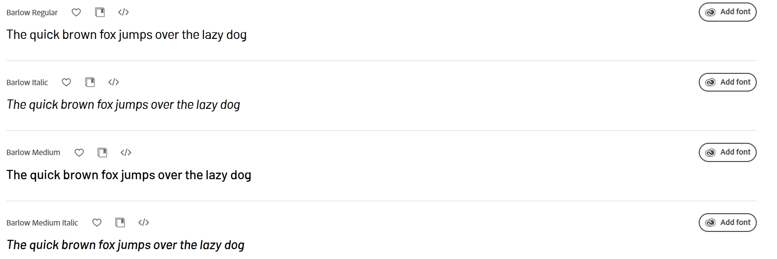
Barlow typeface via Adobe Fonts
3. Define the typeface palette (typeface + fonts)
A typeface palette is a set of typefaces and their specific fonts to create a cohesive visual identity. It includes a primary typeface (the foundation) used for headings, subheadings, and body text; a secondary typeface used for contrast, quotes, or labels; and an accent typeface strictly for aesthetic purposes.
Establish your primary typeface before proceeding to secondary and accent typefaces. In fact, the last two are optional. Consider where the palette will be applied (digital, physical, or both) and establish clear usage rules.
4. Test and refine in context
Test your chosen typeface and fonts on actual medium—print, web, mobile, etc. In fact, test in context by creating mock-up applications as they may behave differently when surrounded by other visual elements.
Check the typeface at its intended sizes and ensure they remain readable across all sizes. Finally, consider how typefaces and fonts affect loading speed and ensure you have all the right licenses for their intended use.
Refining typefaces and fonts is an ongoing process. Gather feedback from users and refine them according to readability, tone, and hierarchy.
The Bottom Line
A typeface is the overall design of characters—a strategic choice that emulates what the brand should feel like. A font is a specific implementation of that typeface using a particular weight, style, or width to build hierarchy, emphasize messages, and ensure technical consistency.
Knowing the difference between typefaces and fonts saves time and money. You commit fewer mistakes, create clearer design briefs, and have smoother handoffs between designers and developers.
Start with a small but flexible typeface palette that balances personality and legibility, and iterate it deliberately as your brand grows.

Creates insightful, strategy-driven content that translates complex design and branding concepts into accessible knowledge, supporting Ramotion’s mission to elevate digital experiences.