
Modern web applications are an essential part of how businesses operate, people work and communicate, and manage information. From project management platforms to e-commerce dashboards, users expect digital products that are intuitive, responsive, and easy to navigate.
A well-designed interface plays a major role in meeting those expectations. Unlike traditional websites, web applications are built for continuous interaction. Users complete tasks, manage data, collaborate with teams, and make decisions through the interface every day.
This makes web app UI a critical factor in productivity, user satisfaction, and long-term product adoption.
Businesses planning to build or improve a web application often evaluate top web app design agencies to find partners with the expertise to create user-focused, scalable interfaces that support both business goals and user needs.
In this article, we explore the fundamentals of web app UI, essential design principles, common interface patterns, and real-world examples of successful web application interfaces.
Read along to learn how thoughtful UI design helps users complete tasks faster, reduces friction, and creates digital products that are both intuitive and effective.
Web App UI Design Basics
A web app UI is the user interface that enables users to interact with a web application and complete specific tasks. It includes all the screens, menus, forms, buttons, and interactive elements that guide users through the app.
Effective app design goes beyond visual appeal by making every interaction intuitive, efficient, and easy to understand. Unlike a website, which is primarily designed to share information, promote a business, or sell products, a web app is built around user actions.
Instead of following a linear journey, users repeatedly interact with different features to accomplish tasks, making usability and interaction design essential to the overall experience. Common tasks users perform in a web application include:
- Managing and organizing data
- Creating and editing content
- Tracking projects and workflows
- Setting up accounts and preferences
- Collaborating with teams in real time
Since users rely on a web app regularly, its user interface must be clear, consistent, and task-focused. A well-designed interface reduces friction, minimizes errors, and helps users complete their work more quickly, resulting in a more productive and engaging experience.
What Is Web App UI?
A web app UI is the app interface that enables users to interact with a web application and complete tasks efficiently. It acts as the connection between users and the system, helping them navigate features, enter information, access data, and perform actions with ease.
A well-designed interface makes every interaction intuitive, allowing users to achieve their goals with minimal effort. A typical web app UI is made up of several components that work together to create a smooth and consistent experience, including:
- Screens and page layouts
- Navigation menus and toolbars
- Forms and input fields
- Tables and data views
- Loading, success, and error states
- Notifications and alerts
- Buttons and action controls
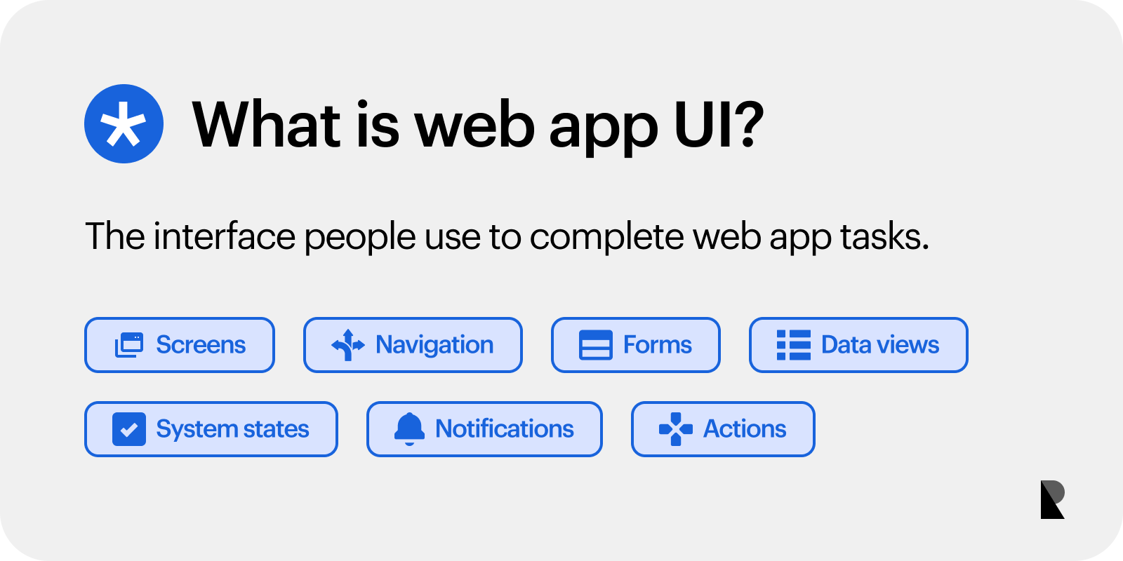
Web app UI connects users with screens, navigation, data, system states, and actions.
Beyond its visual appearance, an effective app interface is built around interaction logic. It defines how users move through the web application, how information is displayed, and how the system responds to every action.
By focusing on user workflows rather than visual styling alone, the interface becomes more intuitive, efficient, and better suited to everyday use.
Web App UI vs Website UI
Although websites and web applications are both accessed through a browser, they are designed with different goals in mind. Understanding this application vs website distinction is essential because it influences how the interface, navigation, and overall design are planned.
A website is usually built to guide visitors through a linear journey, such as reading information, exploring services, or making a purchase. In contrast, a web app is designed for continuous interaction.
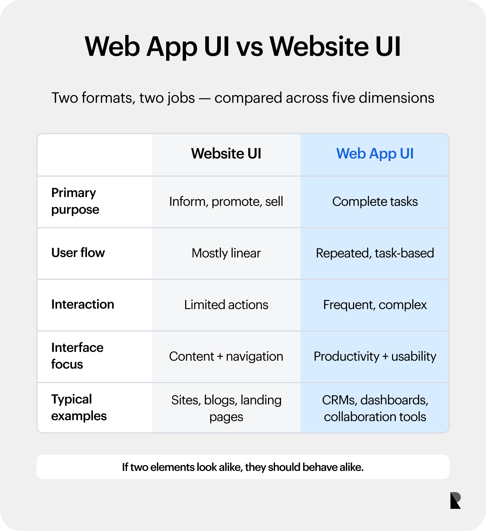
Websites emphasize content journeys; web apps emphasize repeated task workflows.
Users return regularly to complete tasks, manage information, collaborate with others, and perform workflows that require multiple steps. As a result, web app design prioritizes usability, efficiency, and task completion over simple content presentation.
| Feature | Website UI | Web App UI |
|---|---|---|
| Primary purpose | Inform, promote, or sell | Help users complete tasks |
| User flow | Mostly linear | Repeated, task-based workflows |
| User interaction | Limited actions | Frequent and complex interactions |
| Interface focus | Content and navigation | Productivity and usability |
| Typical examples | Company websites, blogs, and landing pages | Project management tools, CRMs, dashboards, and collaboration platforms |
The differences between a website and a web application go beyond appearance. A successful web app interface is designed to support ongoing user actions, reduce friction, and help users complete tasks quickly.
This makes thoughtful app design essential for creating productive and intuitive digital experiences.
Why Web App UI Matters
A powerful web application can still be difficult to use if its web app UI is poorly designed. Confusing navigation, unclear actions, inconsistent layouts, and complex workflows make even feature-rich products feel overwhelming.
When users struggle to complete simple tasks, productivity decreases, frustration increases, and overall satisfaction declines. An effective interface simplifies every interaction by making actions clear and predictable.
Good app design reduces the effort required to complete tasks, minimizes user errors, and lowers the need for training or customer support. As a result, users can work more efficiently and with greater confidence.
A well-designed web app UI also has a direct impact on business outcomes. Users can complete tasks faster, adopt new features more easily, and continue using the product over time.
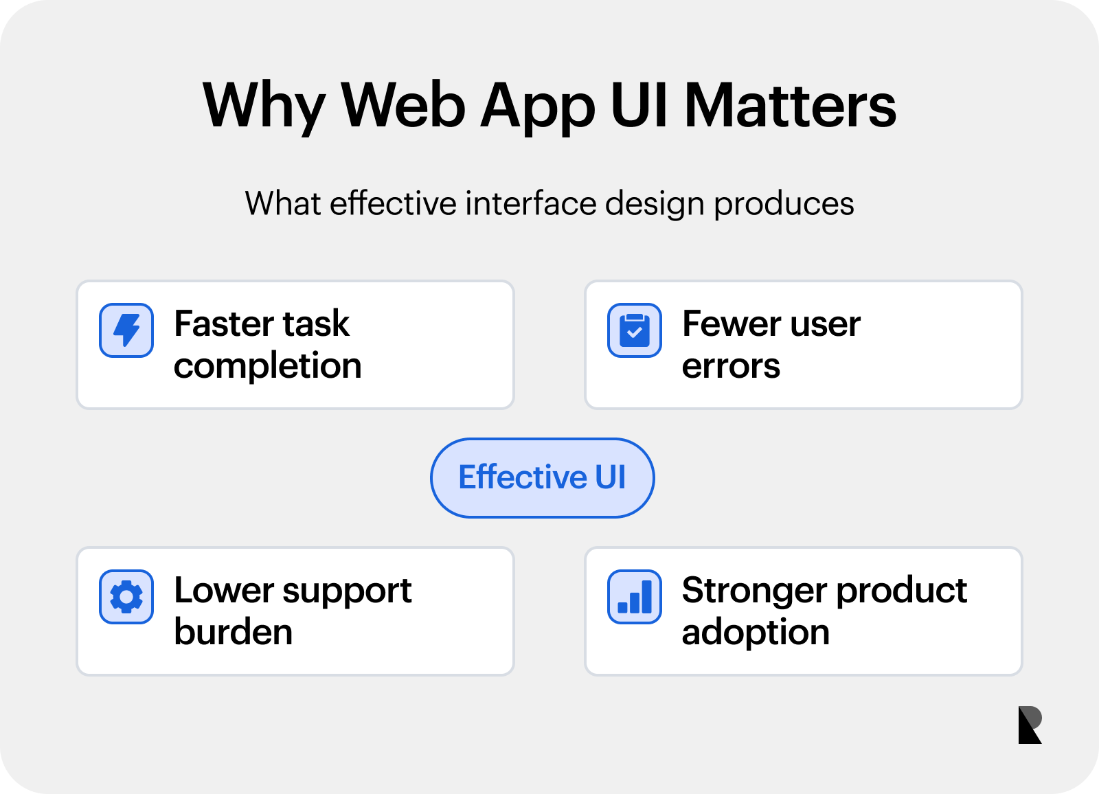
Good UI can reduce effort and errors while improving confidence and adoption.
By focusing on usability, consistency, and intuitive workflows, organizations create digital products that are easier to learn, more enjoyable to use, and better suited to long-term user needs.
Core Web App UI Elements
Every web app is made up of interface components that help users complete specific tasks. These elements should not exist simply to fill the screen. Instead, each part of the interface should support a user action, improve navigation, or make information easier to understand.
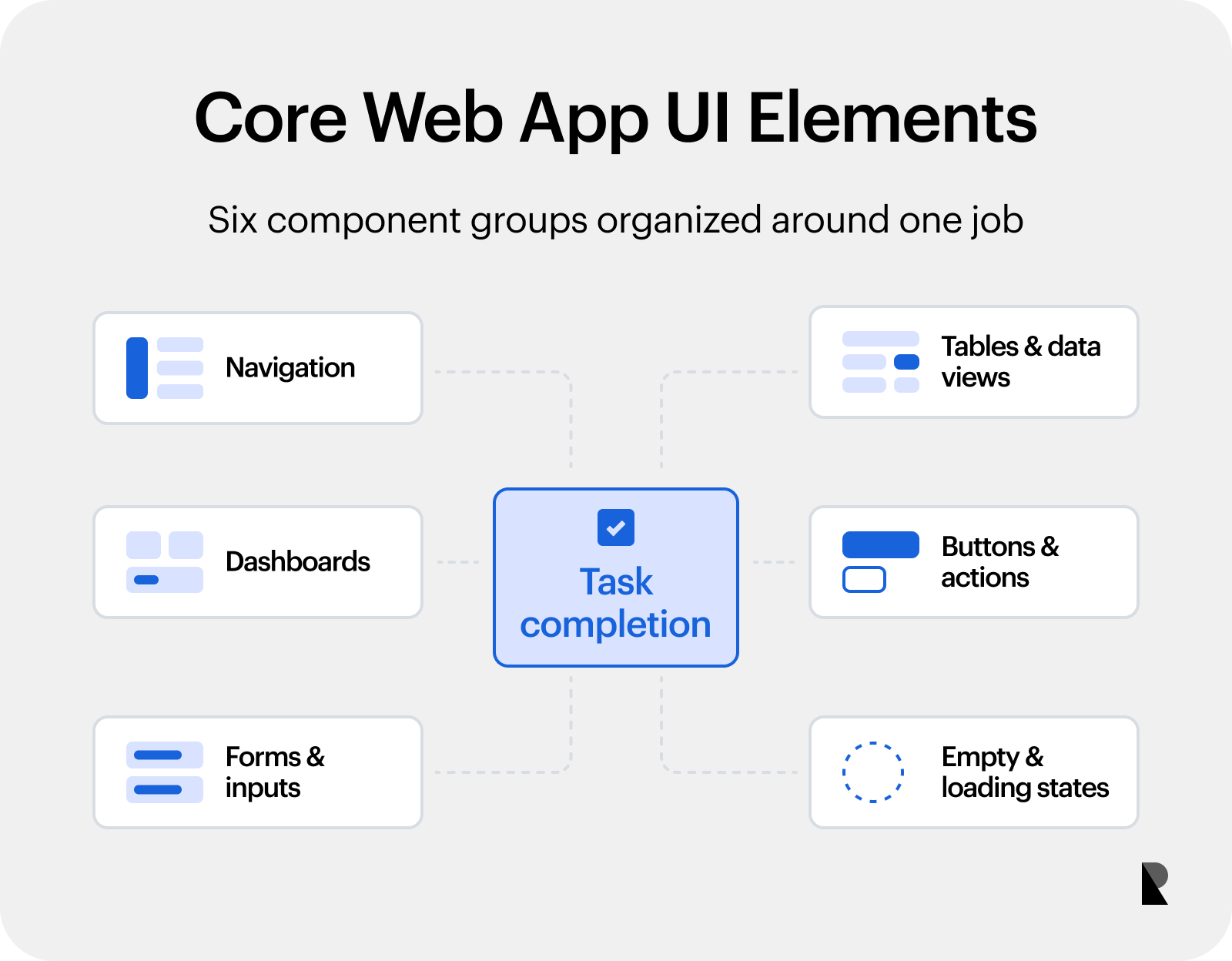
Navigation, dashboards, forms, data views, actions, and system states work together.
When combined effectively, these elements help teams create web apps that are intuitive, efficient, and easy to use. Let us take a closer look at the core web app UI elements.
Navigation
Navigation helps users understand where they are within the app and where they can go next. A clear navigation system reduces confusion and allows users to move between features with minimal effort.
Common navigation elements include sidebars for accessing major sections and top bars for global actions and account settings. There are also tabs for organizing related content, search bars for finding information quickly, and quick actions for frequently used tasks.
This creates a well-structured navigation system. This keeps users oriented and helps them reach the next relevant action without unnecessary clicks.
Dashboards
A dashboard provides an overview of the most important information in a web app. It gives users a quick snapshot of product status so they can understand what needs attention at a glance. Dashboards typically display:
- Key metrics and KPIs
- Pending tasks
- Notifications and alerts
- Recent activity
- Status updates
The goal is to highlight the most valuable information first. Overloading the initial screen with excessive data can make the interface difficult to scan and use.
Forms and inputs
Forms are one of the most common interaction points in web applications. Whether users are creating accounts, entering information, or updating records, forms should be simple, clear, and easy to complete.
A good form design includes short and logical layouts with input validation and helpful tooltips. The form also provides autocomplete, where appropriate, with clear and actionable error messages. Reducing this friction during data entry helps users complete tasks faster while minimizing mistakes.
Tables and data views
Tables are a core component of many business applications because they organize large amounts of information into a structured format. Well-designed data views help users locate information and take action more efficiently. Useful table features include:
- Search functionality
- Filters and sorting options
- Status indicators
- Bulk actions
- Customizable views
These capabilities make it easier for users to find relevant data, compare records, and complete tasks without unnecessary effort.
Buttons and actions
Buttons guide users through important actions within the application. They should communicate their purpose clearly and establish a visual hierarchy based on importance. A good interface distinguishes between:
- Primary actions for the main task on the page
- Secondary actions for supporting tasks
- Destructive actions such as deleting or permanently removing data
Primary actions should stand out, while secondary actions remain less prominent to keep users focused on their main objective.
Empty states and loading states
A good web app is designed for more than just ideal scenarios. Users also encounter situations where data is loading, there is no content, or an error prevents an action from being completed. These states should provide clear guidance by:
- Explaining first-time experiences
- Showing meaningful empty states when no data is available
- Displaying loading indicators during processing
- Providing clear error messages and recovery steps
- Reassuring users during long-running operations
Instead of leaving users uncertain, these states should explain what is happening and suggest the next step. This creates a smoother experience and helps users continue working with confidence.
Web App UI Design Principles
A successful web application is built on principles that make the interface functional, intuitive, and efficient. Good design is not just about creating attractive screens. It helps users complete tasks quickly, reduces confusion, and builds confidence with every interaction.
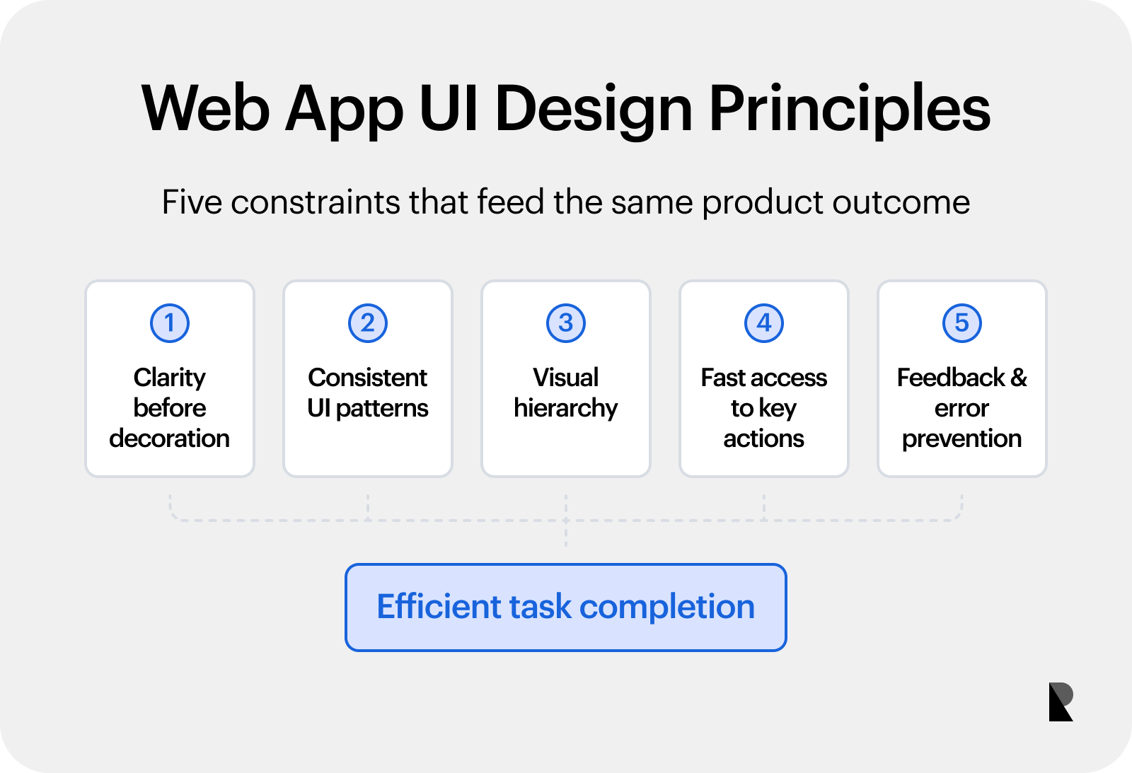
Five principles for clearer, more predictable and efficient web app interfaces.
These principles form the foundation of an effective web app design process and help teams build products that are easy to learn and use. Below is all that you need to know about these.
Clarity before decoration
Every screen should communicate its purpose immediately. Users should understand where they are, what they can do, and what to do next without relying on visual effects or unnecessary animations.
Clear labels, meaningful headings, and straightforward instructions improve usability. After every action, the interface should provide feedback so users know whether an action was successful or if additional steps are required.
Consistent UI patterns
Consistency makes a web app easier to learn because users do not have to relearn interactions on every screen. Buttons, labels, layouts, icons, and system states should behave consistently throughout the product.
Maintaining consistent UI patterns also simplifies the design process and creates predictable experiences. When similar screens follow the same interaction model, users can complete tasks more confidently and efficiently.
Visual hierarchy
Visual hierarchy guides users toward the most important information first. It uses size, spacing, contrast, and grouping to organize content and reduce cognitive effort.
Primary actions should stand out clearly, while secondary options remain less prominent. A strong hierarchy makes the interface easier to scan, helping users locate important information and complete tasks faster.
Fast access to key actions
Frequently used actions should always be easy to reach. Reducing unnecessary clicks and navigation allows users to maintain their workflow and complete repetitive tasks more efficiently. Common approaches include:
- Quick action buttons
- Keyboard shortcuts (hotkeys)
- Command menus
- Context menus
- Pinned or favorite actions
These features improve productivity, especially for users who interact with the web application regularly. If my goal is to build my own web app, designing around common user workflows can significantly improve the overall experience.
Feedback and error prevention
Users should always know the result of their actions. The interface should confirm successful actions and provide timely feedback whenever something changes within the system.
For actions with significant consequences, such as deleting data, processing payments, publishing content, or changing permissions, the system should display clear confirmation prompts before proceeding.
When errors occur, messages should explain what went wrong, why it happened, and the exact steps users can take to resolve the issue. This reduces frustration and helps users recover quickly without interrupting their workflow.
Common Web App UI Patterns
Modern web app design relies on proven interface patterns that help users complete tasks quickly and consistently. Rather than creating a new interaction for every feature, designers use familiar patterns that reduce the learning curve and improve efficiency.
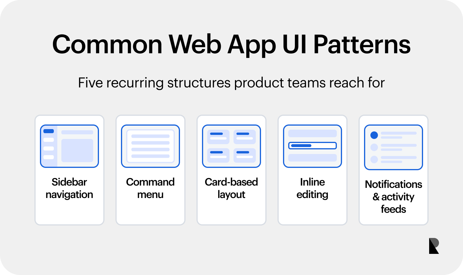
Choose interface patterns according to workflows and user needs.
The right pattern depends on the type of web application, the complexity of user workflows, and the actions users perform most often. Below are some of the most common UI patterns used in modern web apps and the situations where they work best
Sidebar navigation
Sidebar navigation is one of the most common patterns in web app design for products with multiple sections, tools, or workflows. It provides persistent access to the main areas of the application, allowing users to switch between tasks without losing context.
A well-structured sidebar helps users understand where they are and where they can go next. This makes it ideal for project management platforms, CRM systems, analytics dashboards, and other complex web applications where continuous navigation is essential.
Command menu
A command menu is a searchable interface that lets users quickly find actions, pages, settings, or commands from a single location. It is especially useful for power users and professional tools where speed and efficiency are priorities. By reducing the number of clicks needed to complete a task, command menus improve productivity and simplify navigation. Many modern web apps also support keyboard shortcuts, allowing users to perform frequent actions even faster.
Card-based layout
A card-based layout groups related information into individual containers, making content easier to scan, compare, and organize. This pattern works best when users interact with separate items rather than long lists of information. Common uses include:
- Projects
- Tasks
- Documents
- Templates
- Campaigns
- Files
Cards create a clean and flexible interface that helps users identify key information quickly while keeping the layout visually organized.
Inline editing
Inline editing allows users to update information directly on the current screen instead of opening a separate page or dialog. This keeps workflows uninterrupted and reduces the time spent switching between views.
It is particularly effective for tables, task lists, documents, and settings where quick edits are common. By minimizing unnecessary page transitions, inline editing helps users work faster and creates a more efficient web application experience.
Notifications and activity feeds
Notifications and activity feeds keep users informed about important updates, completed actions, and ongoing changes across the application. They provide timely feedback without requiring users to manually check different sections of the interface.
To remain useful, notifications should be prioritized by relevance and urgency. Important alerts should be easy to notice, while routine updates should stay unobtrusive, helping users stay informed without creating unnecessary distractions.
Web App UI Mistakes to Avoid
Even a feature-rich web app can become difficult to use if the interface is not thoughtfully designed. Common UI mistakes create friction, slow users down, and reduce productivity. Addressing these issues early in the design process helps create a smoother and more intuitive user experience.
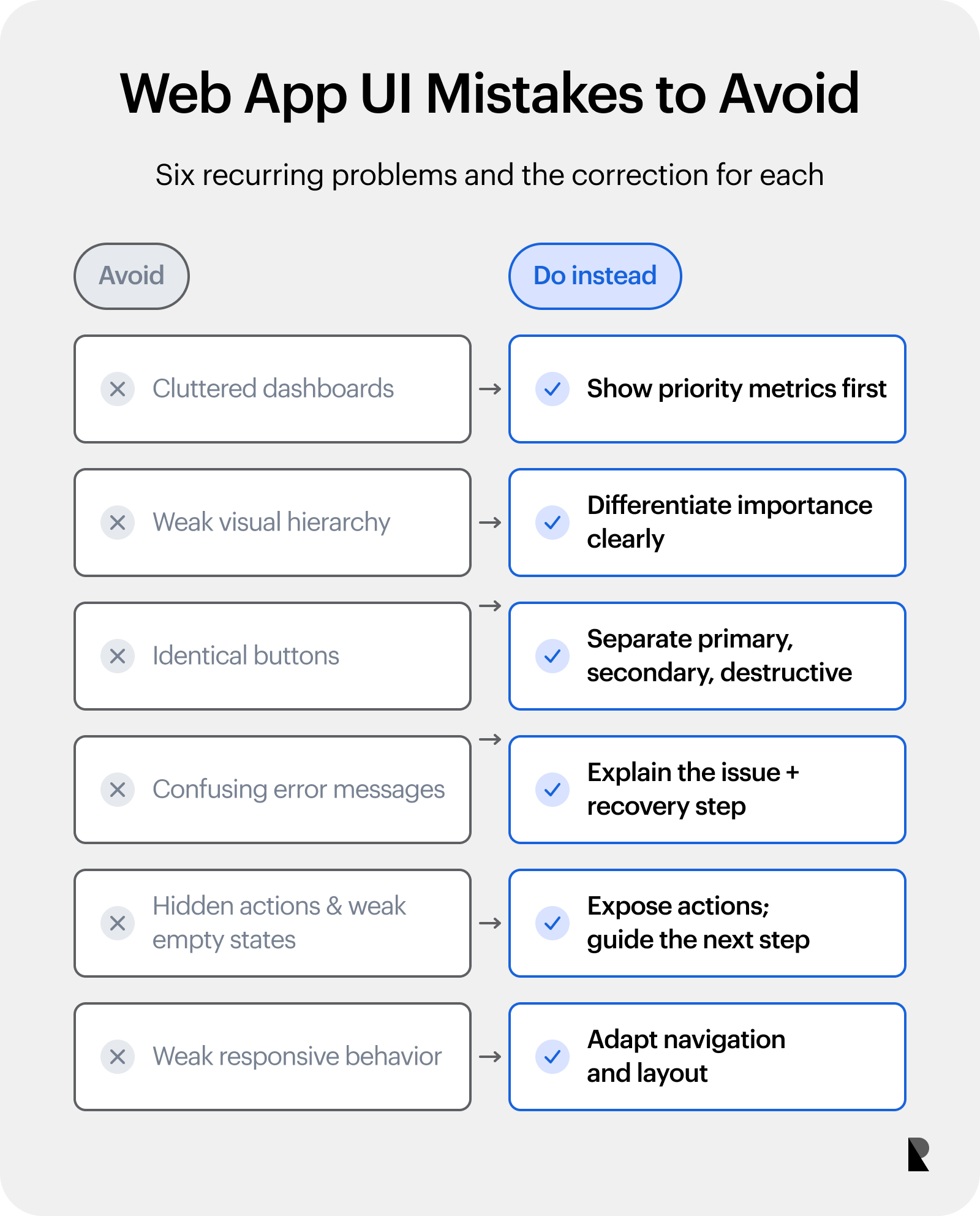
Correct common interface problems by simplifying hierarchy, actions, feedback, and responsiveness.
Cluttered dashboards Overloading the first screen with too much information makes it difficult for users to focus. Display only the most important metrics and actions, and reveal additional details as needed.
Weak visual hierarchy When every element looks equally important, users struggle to know where to look first. A clear hierarchy directs attention to key information and primary actions.
Identical buttons and unclear actions Using the same style for all buttons makes important actions harder to identify. Differentiate primary, secondary, and destructive actions to reduce confusion and prevent mistakes.
Confusing error messages Generic messages provide little guidance when something goes wrong. Explain the issue clearly and tell users how they can resolve it.
Hidden actions and poor empty states Important features should be easy to find without unnecessary searching. Empty states should explain why no data is available and guide users toward the next step.
Weak responsive behavior A web app should deliver a consistent experience across desktops, tablets, and mobile devices. Poor responsive layouts make navigation difficult and reduce usability.
Avoiding these common mistakes results in a cleaner interface, a better user experience, and a more effective design process. Even small usability improvements can significantly increase user satisfaction and product adoption.
Best Web App UI Examples
Studying successful web app design examples is one of the best ways to understand what makes an effective interface. Rather than focusing on product features, these examples highlight design patterns, navigation, visual hierarchy, workflows, and interaction logic.
This can help web app users complete tasks efficiently. Let us study some key examples in depth.
Linear UI
Linear is a strong example of a clean and focused web app interface for task and product management. Its sidebar navigation, clear visual hierarchy, and quick actions make it easy to move between projects without feeling overwhelmed.
The interface minimizes distractions and keeps the focus on the current task. As a result, even complex workflows feel fast, lightweight, and easy to manage.
Figma UI
Figma demonstrates how a professional design workspace can support complex creative tasks without becoming cluttered. Its canvas, toolbars, comments, and file navigation are organized to keep collaboration and editing within a single workspace.
The interface supports multiple workflows simultaneously while maintaining clarity. This makes it easier for teams to design, review, and collaborate without visual chaos.
Notion UI
Notion combines documents, databases, templates, and navigation into one flexible workspace. Its modular layout allows users to organize information in ways that suit different projects and teams.
The interface balances freedom with structure, making it simple to create personalized workflows without sacrificing usability.
Airtable UI
Airtable presents structured data through familiar interface patterns such as tables, cards, forms, and multiple views. Filters, sorting options, and customizable layouts help users organize large amounts of information efficiently.
This approach makes database management feel approachable, even for users without technical expertise.
Stripe dashboard UI
Stripe Dashboard is designed for financial and operational workflows where clarity and accuracy are essential. It uses clean tables, clear statuses, filters, and carefully designed actions to help users manage payments and transactions confidently.
Its interface reduces errors by making sensitive actions easy to understand and difficult to perform accidentally.
Shopify admin UI
Shopify Admin manages a wide range of business functions, including products, orders, payments, customers, automation, and settings. Despite its extensive capabilities, the navigation keeps related features logically grouped.
This organized structure helps users move between business operations without feeling overwhelmed by complexity.
GitHub issues UI
GitHub Issues is built around structured collaboration for software teams. Task lists, statuses, filters, discussions, custom fields, and project views help users organize and track work efficiently.
Its interface keeps conversations and project updates connected, making teamwork more transparent and easier to manage.
Slack UI
Slack is a communication-focused web app that organizes conversations through side navigation, channels, threads, search, and notifications. These patterns help users switch between discussions while keeping important context accessible.
The interface balances a constant flow of information without making communication feel disorganized or distracting.
Canva UI
Canva is a great example of making professional design accessible to everyday users. Templates, a visual editor, drag-and-drop interactions, and clear toolbars reduce the learning curve for new users.
Its interface guides users naturally through the design process, making creative tasks feel simple and approachable.
Vercel UI
Vercel transforms complex infrastructure management into a clean and understandable interface. Dashboards, deployment statuses, project views, logs, and settings are presented in a logical structure that is easy to navigate.
By organizing technical information clearly, the interface helps users monitor deployments and manage applications with greater confidence.
Conclusion
A successful web app is built around helping users complete tasks, not simply presenting attractive screens. An effective interface combines usability, functionality, and thoughtful design to make every interaction clear, efficient, and purposeful.
Strong web app UI relies on a consistent design process that prioritizes clear navigation, predictable interaction patterns, visual hierarchy, and well-organized data. These elements reduce friction, improve user confidence, and make even complex workflows easier to understand and manage.
Ultimately, a well-designed interface encourages users to return because it helps them achieve their goals with less effort. By focusing on structure, clarity, and usability, businesses can create web applications that support long-term engagement, productivity, and product success.

Creates insightful, strategy-driven content that translates complex design and branding concepts into accessible knowledge, supporting Ramotion’s mission to elevate digital experiences.