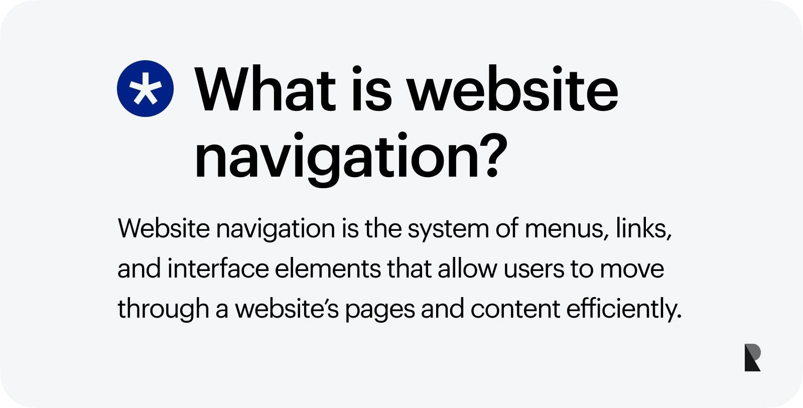
You do not have to be a professional user experience specialist to create a website that will provide your users with a comfortable environment. All you need to do is nail one small yet crucial detail – website navigation.
Surprisingly, website design navigation always comes as an afterthought since people tend to believe that it is just a table of contents, which does not make any difference. However, in practice, it is one of the most critical elements of the interface that stands behind the overall success.
According to studies:
- More than 90% of consumers say your website must be easy to navigate, or they leave and never come back.
- Almost 90% of consumers are less likely to return to a site after a bad experience.
- 75% of consumers judge a brand's credibility by website design, paying particular attention to good-looking and properly functioning website navigation.
- 50% of users cannot use a menu with typical labels correctly and effectively locate content that they are after.
Therefore, even though, in essence, it is a table of contents, you still need to ensure you have the best website navigation whatever niche you are working in.
Let us walk through the basics of good website navigation design to understand how it influences user experience and brings some substantial benefits to the company, like amplifying conversions. On top of that, we will dive into a collection of website navigation examples whose solutions and tricks you can steal for your project.
What is Website Navigation Design?
According to Wikipedia, website navigation is much like a road map. It guides users along their exploration of website. It gives them explicit directions on how to explore website and discover different areas. In simple words, it is a table of contents presented as an unordered list.
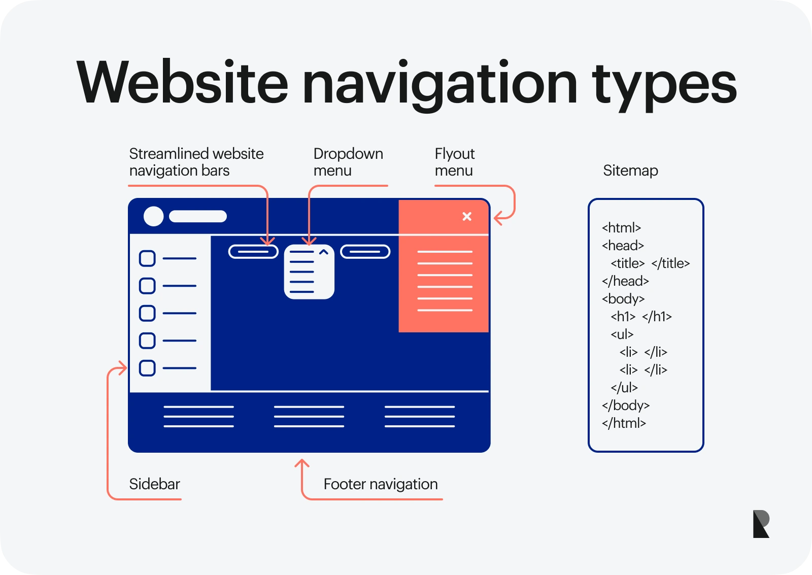
The website design navigation can be divided into three big groups:

That is not all. Stylistic solutions also break website design navigation into separate groups. Let us consider some popular types of website navigation from this point of view
What makes a good website navigation?
- Sitemap
- Streamlined website navigation bars
- Dropdown menu
- Sidebar
- Flyout menu
- Footer navigation
Types of Website Navigation
Traditionally, there are several types of website navigation:
1. Sitemap
It is one of the oldest types of website navigation that occupies a separate page where content is organized hierarchically. It includes links to all pages of a website accessible to crawlers and users.
2. Streamlined website navigation bars
This is another classic type of website navigation; however, it is located on every page of the website, unlike the sitemap. It covers links to the top-level pages or most important pages. It can also include such crucial elements as a search bar, CTA, social media icons, icon to the shopping cart, and, of course, brand identity.
As a rule, it has a horizontal orientation and occupies the top of the design. Quite often, it is sticky and follows the users along the way.
3. Dropdown menu
It is a complex yet still handy and compact UI control element. It is a home for links to all pages, call-to-actions, search bar, images, and even such interactive components as sliders, galleries, and even videos.
4. Sidebar
It is one of those types of website navigation that was particularly popular seven years ago. It is located on either the left or right side. Some websites use dual sidebars. Although this type of website navigation sees a drastic decline in popularity nevertheless, there are still brands that benefit from it. Much like website navigation bars, it covers links to top-level pages and crucial components like brand identity, search bar, and social media icons.
5. Flyout menu
This type of website navigation perhaps is the most popular these days. Numerous brands capitalize on a duet of hamburger icon and a slide-out menu; even small web design portfolios use it. In a word, it is a hit. As a rule, it has a vertical orientation. It may also include other essential UI details for improving navigation like the search bar or call-to-action button.
6. Footer navigation
Website footer design has changed a lot since the dawn of the web. Today we witness multilevel content-heavy footer menus populate modern interfaces. This trend is increasingly popular in the e-commerce sector. At some point, it reminds sitemap since it includes almost all links, including those that are necessary for meeting local and worldwide regulations like Privacy Policy, Cookies, etc. In addition, it features other UI components, including galleries, videos, and, of course, subscription or contact forms.
Many factors may influence your decision towards one or another type of website navigation. For example, website navigation content may vary between users who logged-in and users who are logged out; design may dictate its own rules; your target market may feel more comfortable with a particular style; digital marketing campaign may require you to add some specific elements, etc. Therefore, there is no guideline.
However, some best practices and time-proven tips and tricks may help you choose the proper type of website navigation and keep your brand from falling into a list of bad websites.
Last but not least, bear in mind that you may and certainly will use several types of website navigation simultaneously. For example, the sitemap is obligatory to add to make your website friendly to Google crawlers. The footer menu is highly recommended for content-heavy projects, whereas the slide-out menu is a must-have for mobile-first projects. Therefore, you may end up with the top navigation, footer navigation, and sitemap within one project.
How to handle them properly and not ruin everything? Follow the best practices. When assessing web design firms, prioritize teams that can tie navigation decisions to user journeys and measurable outcomes. Though, before moving any further, let's find out why website navigation is important and why you need to invest your money and efforts into it.
Website Navigation Importance
According to new research conducted by a leading marketing agency - Tank Design - featured in Forbes, website navigation may cost you a loss of fortune if it is done poorly.
The deal is using the same generic navigation labels on the websites leads to no differentiation for either potential customer. It turns out that for people, generic titles all sound interchangeable. To make matters worse, if the navigation does not meet their expectations or cannot be found within seconds, they will leave and never come back.
What's more, according to research conducted by famed website usability expert Jakob Nielsen, the average web page visit lasts less than a minute. Therefore, if website navigation fails its mission, you will not have a chance to prove to your potential clients that your company and product are worth their time and attention.
Using poorly done navigation, we create space for failure and miss an opportunity to create clarity around your brand and product. If users fail to find the content they are looking for due to poor website navigation, they will go to your competitors. As a result, you will lose.
Some more factors prove that website navigation is important:
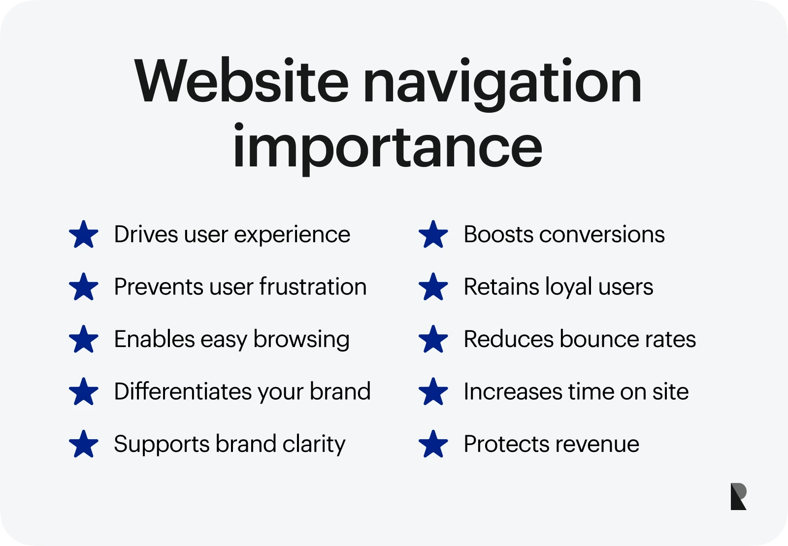
- It is a heart and soul of an excellent user experience.
- It offers a clean way to navigate the website regardless of the page where users landed in the first place. Visitors could shift between pages or move wherever they need to without frustration.
- It includes a search bar that comes in handy in lots of scenarios.
- It may include a call-to-action button that may drastically increase conversion rates.
- It may include a sign-in or sign-up button that is critical to keep your loyal customers happy with your platform.
- It keeps people on your site to explore further.
Poor navigation may cause such problems as:
- increase in bounce rates,
- reduce time on site,
- a decrease in conversion rates,
- loss of revenue.
Having a clear menu structure is a way to create a great user experience that stands behind the financial success of your business. Therefore, it is vital to invest money and effort into website navigation to make it handy and helpful for your customers.
It may sound a bit difficult; however, follow these website navigation best practices, and you will easily instill all these qualities into your menu.
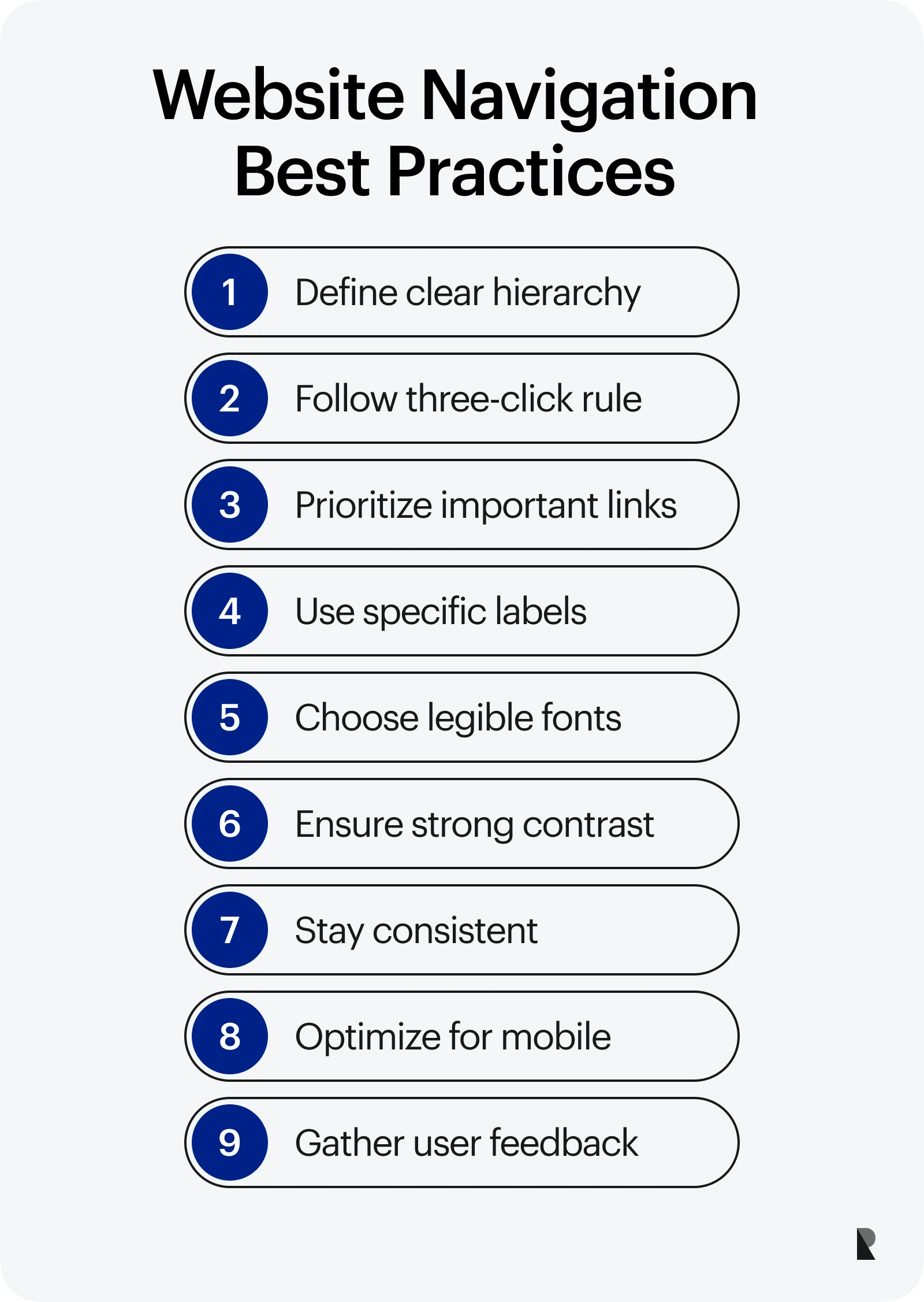
- Start with defining the hierarchy in which information should be displayed. Plan website navigation down to the last detail on the paper first. Use sitemap, diagram, Excel spreadsheet, or whatever you find comfortable to work with.
- Stick to the three-click rule. This rule is elementary and imposed by many UX specialists. Its principle is, no inner page in the website should be deeper than three clicks away. This will remove roadblocks on user's journey, shorten their path to the destination, and raise satisfaction level without much sacrifice.
- Thought-through position. Put important links at either the beginning or end of your website navigation. Due to the serial position effect that is the tendency of a person to remember the first and last items in a series best, anything that comes in the middle may have a less significant effect on a user. Therefore, crucial links should be on either end of the navigation. For example, UX specialists recommend making "Contact" the last item on the list.
- Make labels as specific and clear as possible. Choose navigation labels that make sense from a user's perspective, even if they are not the same terminology used internally. Avoid generic terms and format-based navigation like "Services" or "Videos." This will help visitors to understand where to move in order to locate the required piece of information. Besides, it may score some good results in search engines.
- Use no more than 5-7 links, especially when it comes to streamlined website navigation bars. The deal is people cannot efficiently hold in their short-term memory more than seven items simultaneously. Therefore, 5-7 are ideal numbers for website navigation to keep your users focused on context. If you need to add more than that, group items into chunks and use formatting to make everything easily digestible.
- Use a typeface with legible letterforms. Do not use handwritten, curly, or crafty fonts: they make it difficult to perceive and scan data.
- Ensure optimal contrast ratio (preferably 7:1) between the menu labels and backdrop. However, remember that text with high contrast may be hard to read.
- Be consistent in format, style, and design. The website navigation should stay the same throughout the website.
- Optimize for mobile and other screen sizes. Remember that on small screen size, the font should be at least 16px. On top of that, links, much like buttons, should be easily tappable.
- Be careful with dropdowns. Although dropdowns may provide you with additional space to cover a bulk of useful getaways, nevertheless they have quite a bad reputation. First, visitors may find it difficult to manage. Second, users are prone to skip important pages when using dropdowns. Finally, search engines do not like them. If you still need to use a dropdown, make it big and reliable, like all those mega-menus in popular retailer websites.
- Always indicate where you are. Leave no room for confusion by highlighting the menu item.
- Use web conventions. Although conventions do not work for labels, when it comes to placement, order, extra details, or using styles for highlighting menu items, it does magic, making the user experience smooth and hassle-free.
- Align website navigation with marketing strategy. If you need to place a call-to-action or special offer, choose a website navigation design that will perfectly cover all the information and still stay handy and clean.
- Listen to your customers. To create website navigation that resonates with your users and provides a comfortable user experience, you need to meet user's requirements. Do A/B tests and collect feedbacks to define the best option.
Last but not least, if in doubt, always address this issue to a professional web design agency. Working in different niches, the team of web design professionals is perfectly aware of what structure and type of website navigation fit the project best. Whether you are up to a SaaS website design or website design, they will find the best solution for you and your audience.
Collection of the Best Website Navigation Examples
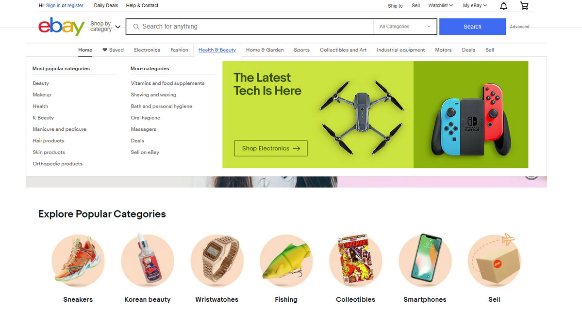
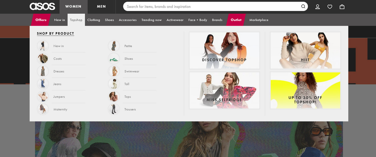
1. Asos
While mega menus are not appropriate for every site, still some niches cannot leave without them. One of such niches is eCommerce. Here mega menus stand behind an excellent navigation experience for a user. Asos is vivid proof of that.
It is hard to imagine how the web design team could manage such a huge amount of navigation links without a mega menu. It is just destined to be here. However, there is a catch. It is not a traditional dropdown menu; it is a revised version taken to the next level with proper formatting, grid layout, and skillful use of images.
Each primary menu item has its dropdown block that uncovers the category in all its glory, providing customers with an intuitive way to move around. Images with trendy items instantly catch the eye and give quick access to things that are in demand, meeting expectations. Grid layout along with some time-proven design solutions creates order out of chaos, making information easily digestible. Although the menu is enormous, it is still handy.
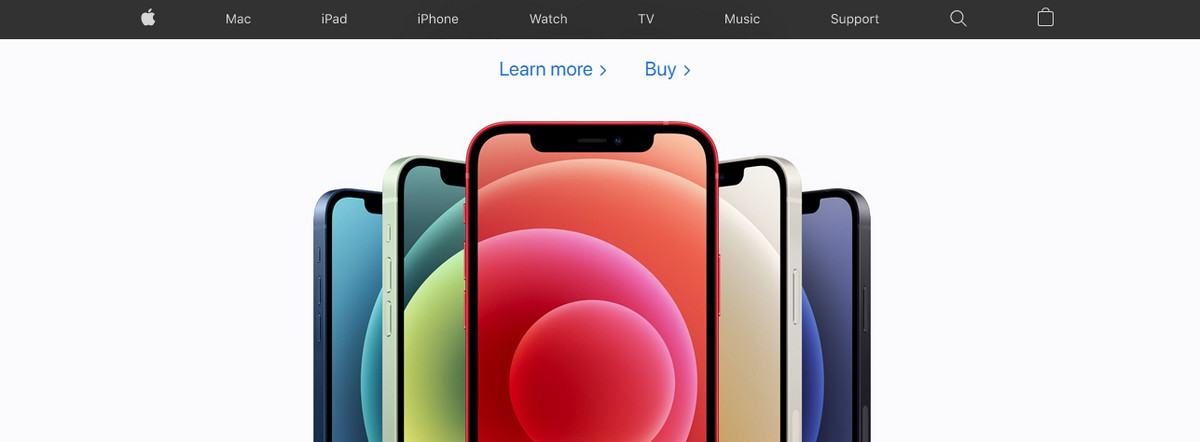
2. Apple
Another big name in our collection of the best website navigation examples. However, this time, we are going to explore representatives of the classic, streamlined website navigation bars and mega footer menus that work together quite effectively.
As expected, the first one sits on the top and follows users along the way by being fixed to the upper part of the browser window. It is centered on the products, featuring seven menu items.
Note two things. First, at the end of the list, you will see the search icon and shopping cart icon. Second, the first link leads to a home that is crucial to every website out there. Three important components are in place.
Even though the navigation bar is narrow; nevertheless, you can easily locate the desired product.
As for the mega footer, it covers a ton of links to inner pages supporting the main website navigation bar. Even though it deals with lots of content, it is still pretty easy to use thanks to four-column structure, hierarchal organization, and, of course, basic formatting.
Apple adopts a time-proven approach with minimal stylistic options that work perfectly.
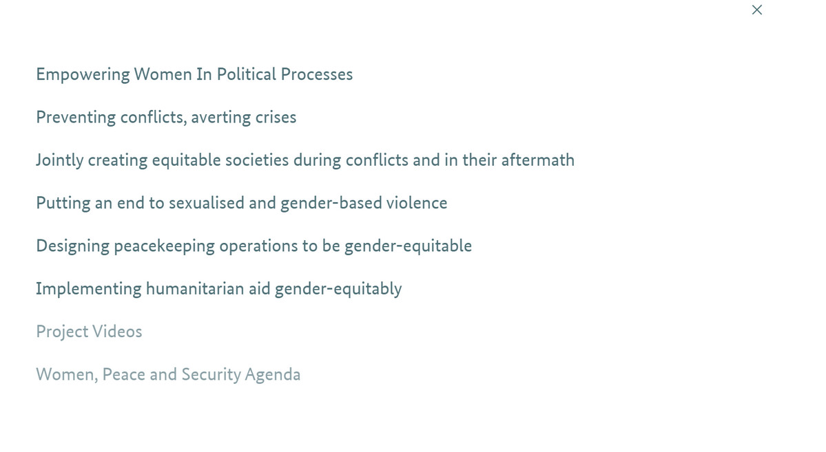
3. No Women No Peace
No Women No Peace features a typical flyout menu hidden behind the hamburger button. When it is open, it occupies the entire screen, focusing overall attention on the website navigation.
There are several important takeaways:
- First and foremost, labels. They are descriptive and meaningful. Although some of them feel a little bit "TL;DR," nevertheless, it is much better than general phrases. So, no confusion whatsoever.
- Second, the menu is responsive, mobile-friendly, and accessible.
- Third, each item is interactive. Hover over each link and see a small effect that indicates its status. Nice and meaningful.
The website navigation is simple yet effective and, most importantly, meaningful.
4. Krause Studio
Krause Studio gives us some clues on how to take the traditional sidebar menu to the next level and make it look incredibly stylish.
- First, place it on the right side and align the text to the right.
- Second, occupy the entire height of the browser screen and almost a third of the width, even if you do not have many menu items.
- Third, add a logotype, catchy slogan, or brief welcome message.
- Fourth, ensure your background creates a good base for the text to stand out.
- Finally, spice up everything with some stunning effects.
As a result, the website navigation feels modern and extravagant, yet it is still handy and useful.
5. Newest Americans
Perimeter navigation is going to end our collection of the best website navigation designs.
Corner navigation (another name for this type of website navigation) is increasingly popular nowadays. The idea behind it is to arrange menu items around the hero area. Look at Newest Americans to see how it can be done.
Their website navigation includes only four items. Each one has its place under the Sun. Although they do not occupy corners (they occupy sides), the menu still makes quite an impression and gives a website a particular spice, to say nothing about providing instant value to the audience.

Conclusion
The website navigation is one of the main pillars of a good user experience that ensures loyalty to the brand, high conversions, retention, and revenue. Therefore, it should be your top priority.
To nail it, start with planning everything down to the last detail. Do it on paper first. Having a well-thought-out structure for your website navigation is the first step to create a well-organized website. If you have a content-heavy website, then define what types of website navigation work best together.
Remember, be explicit, not redundant.
Second, always listen to your audience: define their preferences and behavior patterns, stick to conventions and design solutions they are used to, meet their expectations, and be meaningful in your navigation.
Third, follow the best practices to ensure you have a great start with your website navigation. Even if it fails in some aspects, it will still have a solid foundation to introduce improvements.
Fourth, remember the fragile balance between providing handy navigation for humans and providing helpful navigation for search engines.
Finally, do A/B tests. Come up with various options of website navigation to find the one that resonates the best with the audience.

Creates insightful, strategy-driven content that translates complex design and branding concepts into accessible knowledge, supporting Ramotion’s mission to elevate digital experiences.