
UI design guidelines serve as the backbone of a good user experience. These guidelines not only define the key principles that govern the overall process but also ensure that the final products and services are user-friendly, consistent, and helpful.
Well-designed interfaces are not just visually attractive or aesthetically pleasing. Instead, good interfaces, based on comprehensive user interface design guidelines, minimize confusion and frustration and provide an overall satisfying experience.
When designers align their work with these guidelines, the resulting UI designs help the target audience and contribute to the business's success. UI design guidelines ensure that every part of the interface serves a purpose, is meaningful, and makes users' lives easier.
In this article, we will discuss UI design guidelines and why they matter. We will also introduce the key types of UI design guidelines and 10 important principles, along with some helpful tips for designers.
Read along as we enter the world of UI design guidelines.
Defining UI Guidelines
UI guidelines are standards and best practices that define how products and services can be designed effectively. Following UI design guidelines is essential for delivering a well-designed interface and a satisfactory overall user experience.
UI guidelines outline the visual and interactive best practices that help designers create intuitive and friendly user interfaces. These guidelines ensure that every component, such as buttons, typography, and color palettes, is chosen and designed to support clarity, efficiency, and usability.
It is important to note that UI design guidelines are not just about the aesthetics of a product or service. The standards set in these guidelines ensure that the designs deliver a consistent cross-platform experience.
Additionally, UI guidelines help deliver a consistent experience and present a unified brand image. By defining how visual elements are designed and presented, they ensure the brand’s tone and style are consistently presented to users. This, in turn, increases customers’ trust in an organization.
Why UI Guidelines Matter
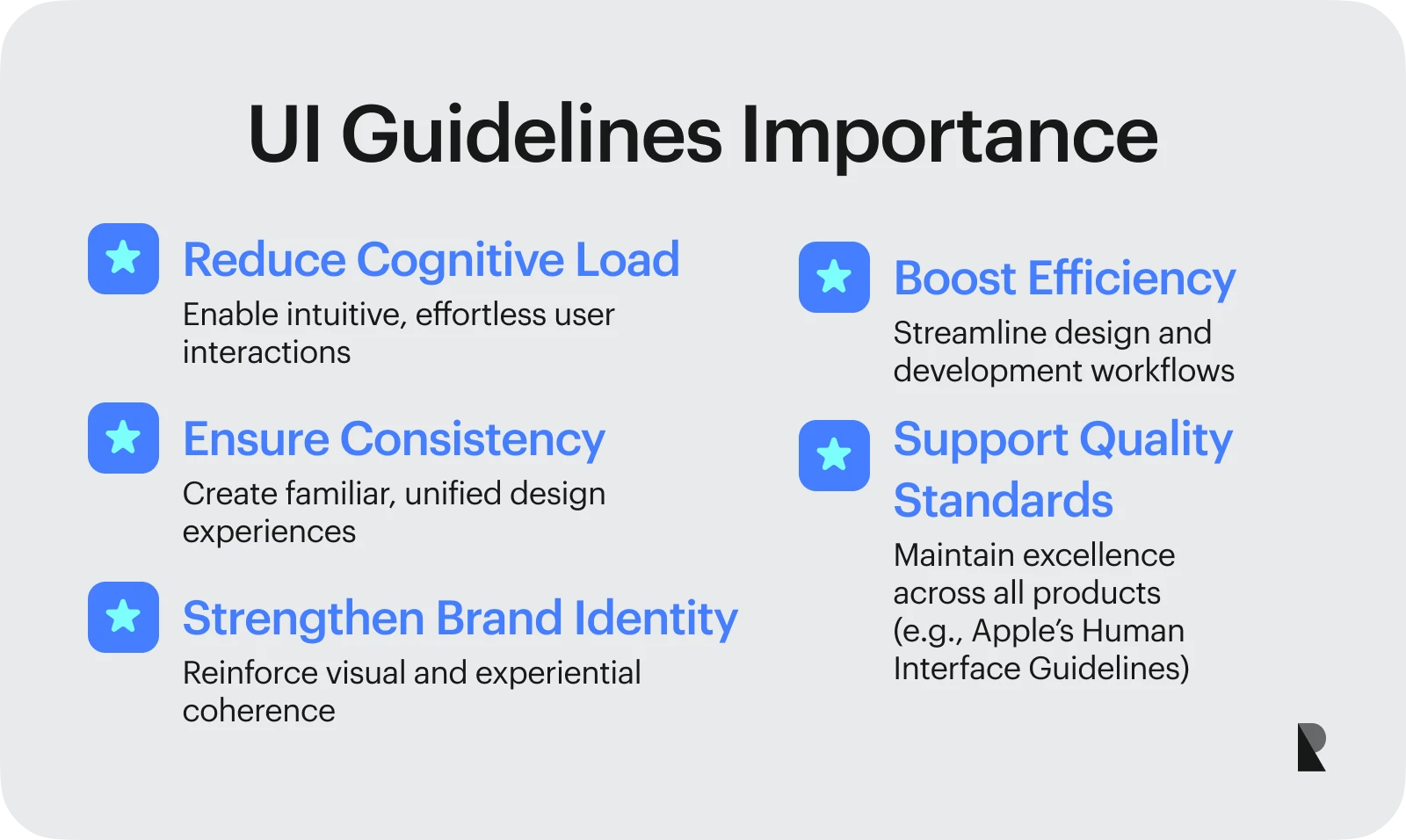
When carefully designed, UI guidelines can significantly reduce users’ cognitive load when interacting with a product or service. UI guidelines help create familiar and consistent experiences where users do not have to think much and can interact with designs intuitively. These guidelines, drawing from the basic principles of UX design, also make sure that the overall experience and goals of the users are not compromised, thus increasing user satisfaction.
Another key benefit of UI guidelines is that they can streamline the design and development process. When everyone in the organization, especially the design team, has a standard set of best practices to follow, there is little back and forth. Therefore, products and services can be designed much more efficiently with reduced disagreements and less rework. The quick turnaround time is significant when companies hire a UI design agency, making UI guidelines a key factor in the success of design agencies.
The visual aspects of these guidelines also strengthen brand identity and develop a strong relationship with users. This is why many big organizations have their own user interface design guidelines. Apple, for example, has human interface guidelines that play a key role in delivering good quality, consistent experiences.
Types of UI Guidelines
UI guidelines can be divided into several important categories. This categorization is based on the aspects of interface design that a guideline serves and the impact on different elements of user experience.
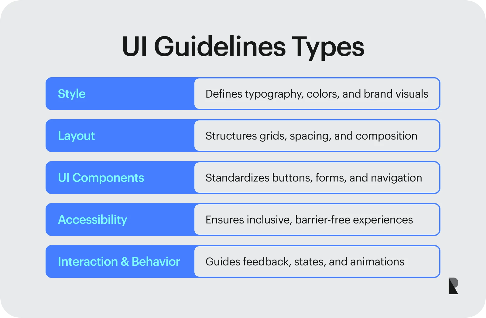
From typography to accessibility, UI guidelines cover almost every critical touchpoint of the user journey. Below are some essential types of UI guidelines.
Style: typography, colors, branding
Style is an essential aspect of design and a crucial category of UI guidelines. Some critical design aspects of an interface, such as typography, choice of colors, brand identity, and visual design, fall under this category.
Comprehensive UI guidelines must include standards and best font and color choices practices. These principles help deliver a well-designed and visually consistent product and ensure that the brand identity is presented professionally and coherently.
Layout: grids, spacing, structure
Along with choosing and selecting fonts and colors, it is also important to organize, structure, and present the design effectively. This is where the layout aspect of user interface design guidelines comes in. The guidelines dealing with layout typically include the organization and structure of UI elements, the spacing between elements, and the effective use of grids.
A neat and clear structure is essential for a good user experience. The guidelines focusing on layout help provide that structure by ensuring that the designers are consistent with the choice of spacing and that the information is presented logically. A good structure also helps reduce clutter and cognitive load, thus creating a pleasant experience where readability and user comfort are prioritized.
UI components: buttons, forms, navigation
UI guidelines can also prove helpful in choosing practical UI components, such as buttons, input fields, forms, icons, and navigation. The guidelines covering these aspects fall under the Ui components category.
Standardized UI components help improve the usability of products and services. Such a practice would deliver users a consistent and familiar experience, making the entire interaction intuitive and predictable. Therefore, the users are not surprised or overwhelmed when interacting with the design. Instead, the overall interaction is both natural and satisfying.
UI component guidelines typically include rules and best practices on the size of elements, color choices, and placement. For example, primary buttons may have specific color standards, while navigation menus might maintain particular spacing between fields.
Accessibility: inclusive, barrier-free design
Accessibility is another crucial type of UI guidelines. In most cases, accessibility is considered a short-term solution where specific fixes at the end can fix the design. This, however, is not the right approach. UI guidelines ensure that accessibility is built into the design process and that inclusivity is always considered.
UI accessibility guidelines ensure that users with different cognitive and/or physical abilities can interact with the product or service. These guidelines help create an inclusive experience where the focus is not just on compliance but truly on delivering an equitable experience to a diverse audience.

Interaction and behavior: feedback, states, animations
A comprehensive set of UI design guidelines also includes rules and standards on incorporating interactive design elements. This is where aspects such as animation, feedback, and changing states of the interactive elements come into play.
Clarity and responsiveness help users understand the design better and increase their level of satisfaction with the experience. Designers must ensure that the interactive elements add to the quality of the experience and provide immediate feedback to users.
Nielsen and Molich’s 10 UI Design Principles
Jakob Nielsen and Rolf Molich developed a set of UI design principles or usability heuristics, which were quickly adapted as global standards for user interface design. Both Nielsen and Molich are recognized as leaders in the field of UI/UX design, and their work is significant for designers.
The purpose of these 10 UI design principles or heuristics is to help create intuitive, predictable, familiar, and user-friendly interfaces. These heuristics are discussed below.

Show system status clearly
Users should always know what is happening within an interface. This means that the interface itself should be designed to give users timely feedback on their actions and ongoing changes.For example, when filling out a digital form, a progress bar is designed to indicate how far along the user has come. This progress bar clearly shows the system status and keeps users informed.
Match system to real-world language
A good UI design will only work if it provides a relatable experience to users. This is possible if the design of an interface matches the real-world experiences and mental models. In his book The Design of Everyday Things, Don Norman writes about mental models and how familiarity in design helps improve the overall user experience.
Designers must use real-world language and metaphors and build on familiar experiences when designing the interface to improve the usability and user experience.
Give users control and freedom
Another critical user interface design guideline, from Nielsen and Molich’s 10 heuristics, is to give users control over their actions and interactions. When users interact with a design, they should be free to choose, explore, and perform the tasks they desire.
Users should not be afraid of making mistakes. Instead, they should have control over undoing and redoing their work. Similarly, they should be able to navigate the design freely without any irreversible errors.
Maintain consistency and standards
Consistency is a key aspect of all designs. Designers must maintain uniformity in visuals and adhere to certain standards when creating products and services. The choice of UI elements, the use of language, the incorporation of animations, and the overall layout of the design should be consistent across platforms and devices.
Consistency ensures familiarity in the interaction and makes it more intuitive. When the learning curve is smooth, users are more satisfied with the experience.
Prevent errors before they happen
When users interact with a design, errors are bound to happen. However, designers must ensure that they can prevent errors and provide as much help to the users as possible. Some wise design choices, such as confirmation messages when users are about to delete something, can help prevent critical errors and save them from frustration.
Favor recognition over recall
Users always favor a design that reduces cognitive load. This is where the UI design guideline of recognition over recall comes into play. When users interact with a design, they should not have to rely on their memory to make the right choices. Instead, the design should leverage the users’ familiar experiences and help them recognize the right options.
Recognition in UI design can be achieved by using familiar icons, placing elements in a familiar pattern, and making actions visible.
Support flexibility and efficiency
Good user interfaces cater to the needs of a diverse audience. Whether the users are beginners or experts, and whether they have any physical or cognitive disabilities, the design should create a welcoming and satisfying experience for them.
Designers can ensure flexibility and efficiency by considering the use of assistive technologies, shortcuts, keyboard navigation, and control over the interface layout.
Keep design minimal and focused
Minimalism is also an important user interface guideline. Minimalist designs are clear, free of clutter, and easy to understand. Designers and developers must ensure that the interface is not overwhelming and that users can comprehend the elements without exerting too much mental effort.
Every element in the interface should serve a purpose. No text, visual, or dynamic element should distract users and hinder them from accomplishing their goals quickly.
Help users identify and fix errors
When users encounter roadblocks or errors, the interface should be smart enough to help them diagnose and recover from that situation. This means the error messages should be unambiguous, and the users should get the required guidance at the right time.
Error messages written well and presented effectively can save users’ time by helping them quickly identify and resolve issues.
Provide help and documentation
Good documentation and helpful resources are essential for a design to be fully functional and successful. Therefore, designers should always accompany their products and services with helpful materials like instruction manuals, quick guides, tooltips, and accessible documentation.
By following these 10 user interface design guidelines, designers and developers can create interfaces that are easy to understand and pleasing to use.
Practical UI Design Tips
Beyond Nielsen and Molich's core design principles and standards, some practical UI design tips can help create effective real-world design solutions. These rules of thumb help designers refine their processes and interfaces.
Thinking about essential design aspects, such as layout, font choice, and visual hierarchy, goes a long way toward creating quality interfaces. Many businesses pay attention to these details when choosing UI/UX design companies for their projects.
Some important UI design tips to consider are as follows.
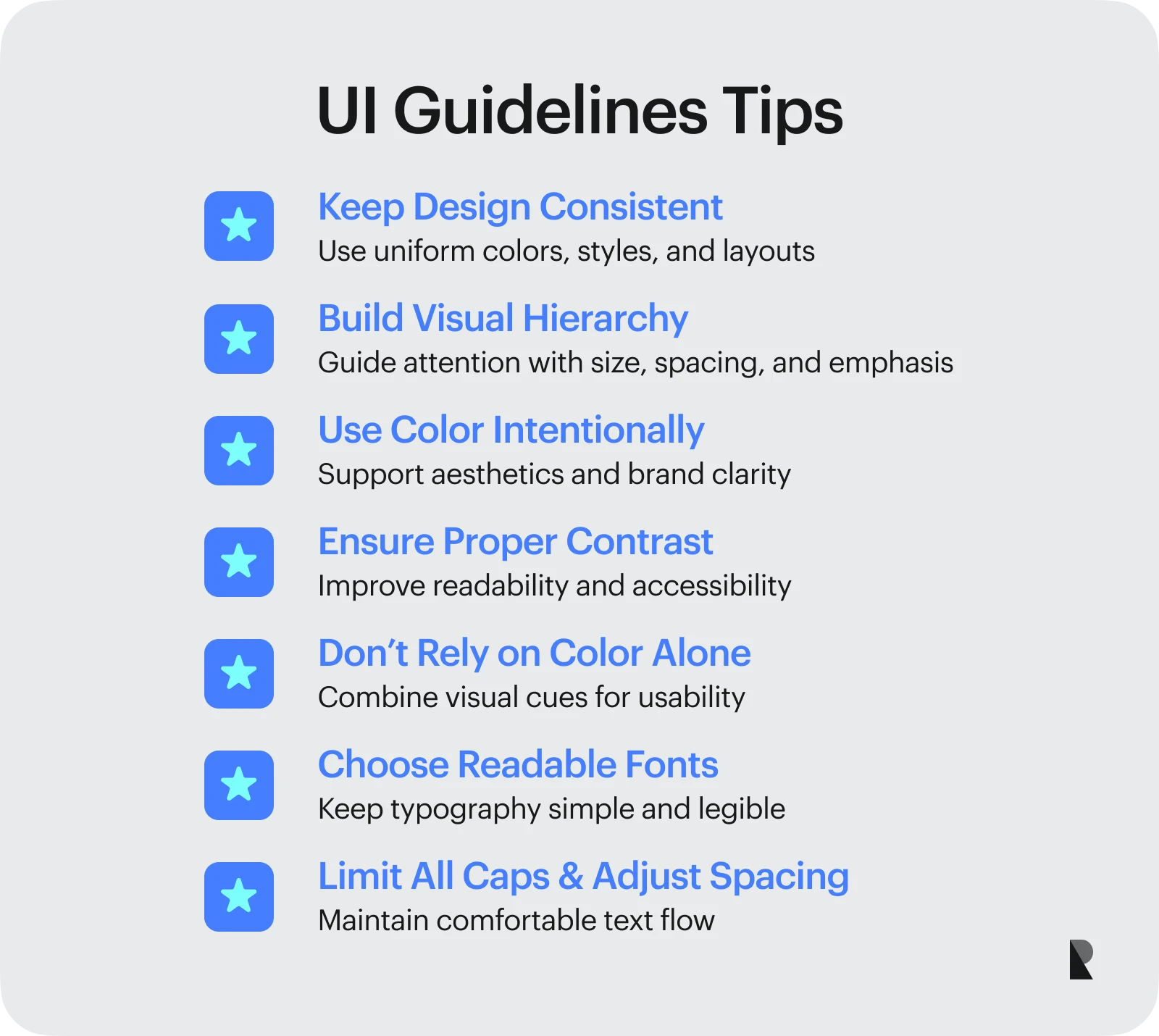
Keep design consistent
Consistency in design is the key to creating usable and functional interfaces. Uniform colors, consistent styles, and a standard layout deliver a familiar interface to users on all screens, thus enhancing their overall experience. A well-designed and consistent interface is professional and reliable, promising to ensure a smooth user journey.
Build a clear visual hierarchy
A clear visual hierarchy helps users distinguish between different UI components on the screen. A well-defined hierarchy also ensures that the users pay attention to the content that matters. Designers can leverage visual hierarchy to provide the correct information to the right audience at the right time in the proper manner.
Use color intentionally
When it comes to the visual aspects of design, color is a critical element. Colors convey significant messages, help draw users’ attention to elements, and ensure pleasing aesthetics in the layout. Therefore, designers should always use colors with care and thought to enhance the experience and present a consistent brand image.
Ensure proper contrast for accessibility
Good color contrast in an interface can strongly impact its accessibility. The choice of text color and background, as well as the ratio of contrast between them, should be such that it is easy to distinguish and understand all the content. Proper contrast is not just for compliance; it is, in fact, a critical UI design principle.
Don’t rely on color alone
While color is essential in design, it is not everything. Along with colors, the text and other UI elements, such as buttons, icons, and navigation, all come together to deliver a good user experience. It is important that color cues are paired well with other UI elements to improve a design's usability.
Choose readable, simple fonts
When it comes to text, choosing simple, readable, and accessible fonts is extremely important. In any interface, the chosen fonts should be legible and understandable. These fonts should also align with the brand’s image and the overall theme of the design.
Limit all caps and adjust line height
Excessive uppercase text, primarily relying on all caps, can harm the user experience. Capitalized text can feel aggressive and unwelcoming. Designers should use capitalization sparingly and with great care. Similarly, adjusting the line height and spacing helps the readers’ flow. Therefore, line height and spacing should be consistent and appropriate throughout the interface.
Conclusion
Strong and comprehensive user interface guidelines hold immense promise. These guidelines help create a cohesive and unified brand image and deliver user-friendly products and services. Consistency and familiarity help users interact with designs on different platforms and devices without relearning the interface.
UI design guidelines also standardize work in an organization. Their clear framework allows UI guidelines to streamline the design and development process, thus saving valuable time and effort. The result is a standardized and robust workflow that benefits designers and users alike.
Overall, UI design guidelines lead to better usability and improved levels of user satisfaction and trust. When design teams and organizations follow well-structured guidelines, they develop quality products and services, thus delivering thoughtful and professional experiences that make everyone happy.
Oct 28, 2025

Creates insightful, strategy-driven content that translates complex design and branding concepts into accessible knowledge, supporting Ramotion’s mission to elevate digital experiences.