When we look at successful digital products and services, one common aspect emerges: they feel consistent and easy to navigate across different platforms. Creating such intuitive and seamless experiences requires a structured approach to design. This is where design systems come in.
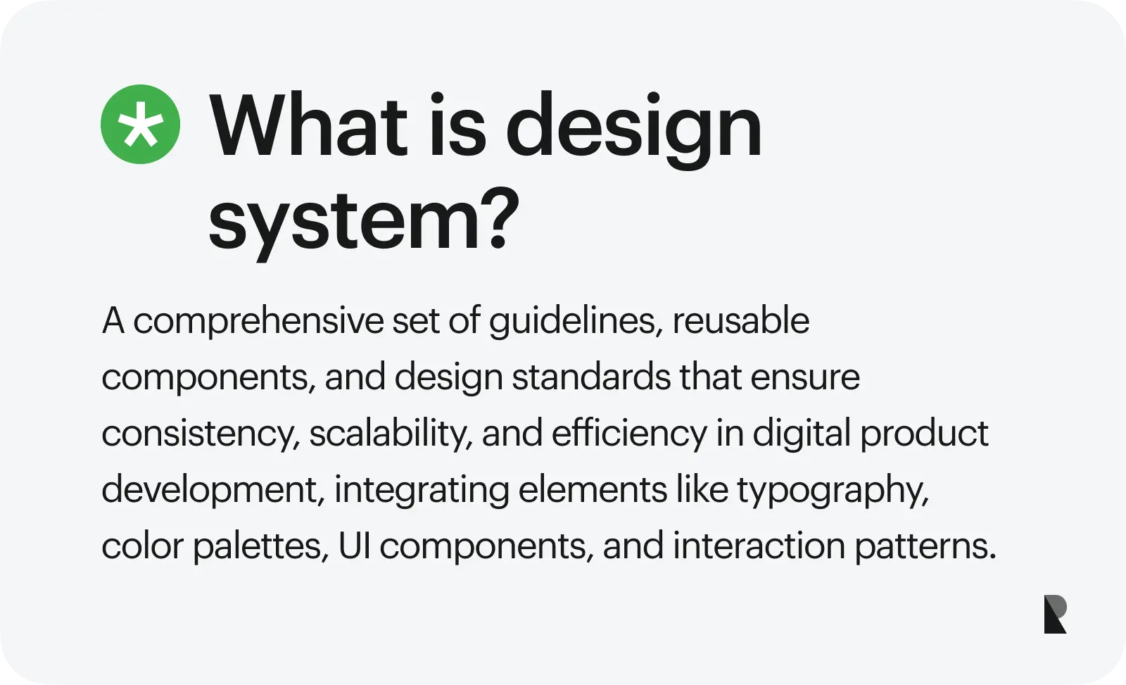
So, what is a design system? A design system is a collection of components, guidelines, and standards that ensure consistency across UI/UX design products. A design system serves as the shared vocabulary between designers and developers, helping teams create quality designs in an efficient manner.
The focus on design systems is increasing because modern products and services need to scale quickly without compromising their quality. As design teams grow and platforms expand, maintaining consistency can be a little difficult. Design systems can resolve this concern by standardizing workflows and reducing repetitive work.
Beyond improving workflows, design systems also help teams manage complexity as products evolve. These systems create a foundation that supports collaboration across roles, making it easier to align design decisions with business and user needs. This makes design systems not just a tool, but a growing asset for long-term product development.
In this article, we introduce design systems, their utility, and core components. We also bring real, functional examples along with some best practices for building a design system.
Read along as we discuss how to ensure consistency in designs with the help of design systems.
Design System Definition
Design systems are not just about building assets and UI components. While that is one utility, design systems focus more on formalizing the design process while maintaining efficiency and consistency in products and services over a long time. In other words, design systems provide a structured framework that guides both design and development across teams.
A design system is not just a UI kit. It is, instead, a combination of principles, standards, and reusable UI components coming together to build an entire design infrastructure. While a UI kit focuses on visual elements, a design system provides guidelines and standards on how to use these elements. The broad scope of a design system ensures that the decisions align with the product goals and company vision.
Another way to think of design systems is as the single source of truth for design and development teams. Since design systems are comprehensive, they help guide development decisions, reduce ambiguity, and ensure clear communication. This central hub for design decisions helps designers, developers, managers, and stakeholders streamline collaboration.
Core Components of a Design System
A design system can be better understood by thinking about its key components as layers working together to support consistent design and development. These layers typically include design principles, visual style, UI components, interaction patterns, and documentation.
Each layer in the design system plays an important role in bringing consistency and coherence. These distinct layers ensure that changes in one area do not disrupt the overall system. The layered structure also makes it easier for teams to adopt and scale the system across different products and platforms.
Layers of a Design System
| Layer | Purpose |
|---|---|
| Design principles | Define the product’s design philosophy and guide the decision-making process |
| Visual style | Establish consistent use of visual elements, such as themes, colors, typography, and iconography |
| UI components | Provide reusable UI elements like buttons, forms, and cards |
| Interaction patterns | Standardize common user flows and interaction behaviors |
| Documentation | Explain how to use all elements clearly and consistently in the design and development of products |
Important layers or components of a design system, along with their significance, are discussed below.
Design Principles
Design principles are the guidelines that reflect product philosophy and company vision. These principles provide a broad overview of the user experience goals that can lead to useful and effective designs. Some important design principles include simple layout, clear visual hierarchy, and accessible design choices.
Principles like these act as a framework that can lead to consistent, intuitive, and coherent designs. These principles not only focus on the finished products but also ensure that the philosophy does not get overlooked throughout the design process.
Visual Style (Colors, Typography, Icons)
The visual style layer in design systems is concerned with the look, feel, and appeal of a product or service. This aspect focuses on the choice of themes, color palettes, typography, brand identity elements, and visual hierarchy rules. Visual style is a critical component of design systems as it creates a recognizable identity and ensures consistency in designs.
Visual style is also concerned with the rules related to white space, color contrast, and layout consistency. By standardizing visual elements, teams can significantly reduce redundant design work. Designers can rely on predefined styles instead of reinventing them, thus speeding up workflows and strengthening cohesion.
UI Components
UI components play a critical role, particularly when design choices and elements are meant to be reusable. These components include buttons, forms, cards, navigation bars, modals, and icons. Carefully designed and clearly defined UI components can be a real strength for design systems, making their implementation and adaptation easy across products and platforms.
When designers reuse UI components, they save a lot of time and resources, thus making the process efficient. Additionally, this approach ensures consistency across designs and simplifies the management of UI elements. Now the designers and developers have to fix errors at a higher level instead of resolving minor issues in each design.
Interaction Patterns
In any design, interaction patterns and key user flows hold significant value. Interaction patterns define how users navigate a design and complete their tasks. These include common flows such as navigation structures, onboarding sequences, and search interactions.
Design systems can help standardize these patterns, thus ensuring predictability and familiarity in user experiences. Users can seamlessly engage with products and services without having to go through a steep learning curve.
Documentation
No design system is complete without proper documentation. The design choices, philosophies, and guidelines must be documented to ensure maximum utility. Good documentation provides clear guidelines on how to use UI components and develop interaction patterns.
Documentation also includes implementation details and examples, helping teams create consistent designs. Accessible and well-structured documentation ensures that both designers and developers can easily adopt the design system. It reduces confusion, supports quick onboarding, and keeps everyone on the same page.
Real Examples of Design Systems
We see several notable examples of design systems in the real world. Leading technology companies have built comprehensive design systems to scale their products and services and apply them for multiple use cases. By doing so, these organizations are able to standardize design and reuse components across designs.
These design systems prove to improve efficiency by reducing duplication of work. At the same time, they ensure consistency in designs irrespective of the platforms they are designed for. Designers and developers can, thus, streamline the process without compromising the quality of products and services. Some of the popular design systems are as follows.
Google Material Design
Material Design is one of the most widely adopted design systems. It is used across Android applications and web platforms. The comprehensive nature of Google’s Material Design provides a strong framework consisting of design principles, UI components, and accessibility standards, making its application easy and effective.
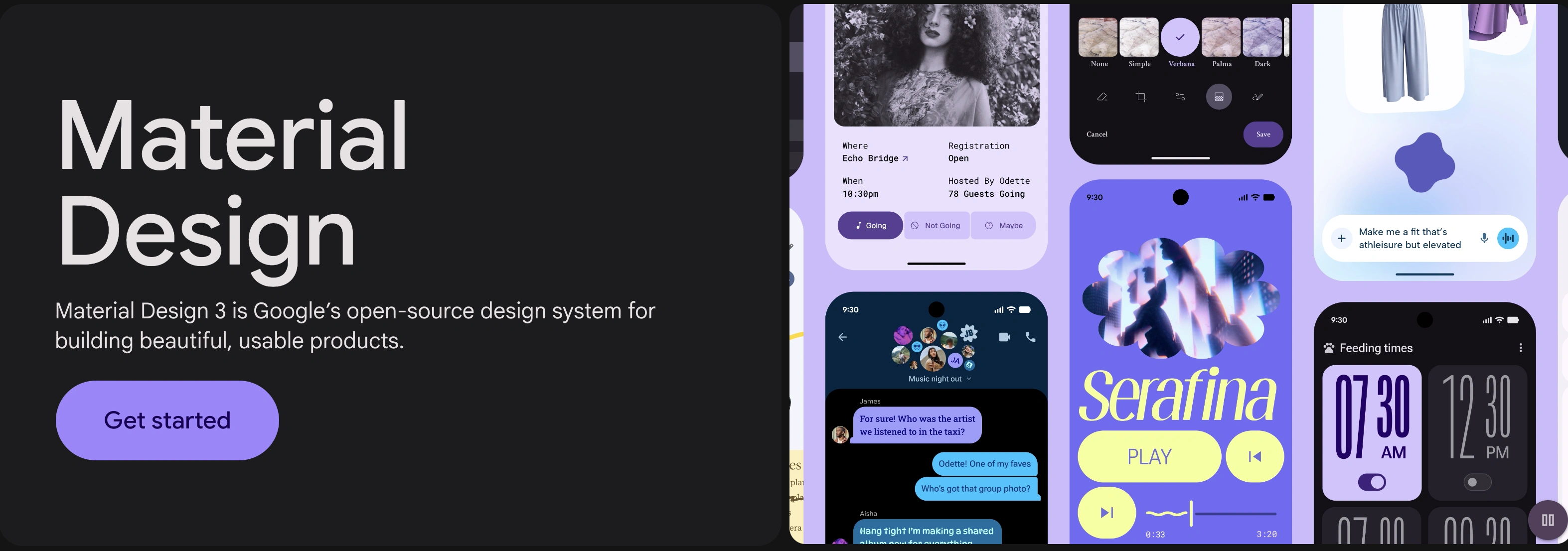
Google Material Design (Image Source)
A notable strength of Material Design is the depth and quality of documentation, including clear implementation guidelines. Design and development teams can adopt its components and principles with room for customization.
IBM Carbon Design System
IBM’s Carbon Design System is designed primarily for enterprises. This system is developed to support a large ecosystem of products, such as the massive portfolio of IBM. The main purpose of this design is to handle complex use cases, particularly when it comes to handling data-heavy applications and complicated software.
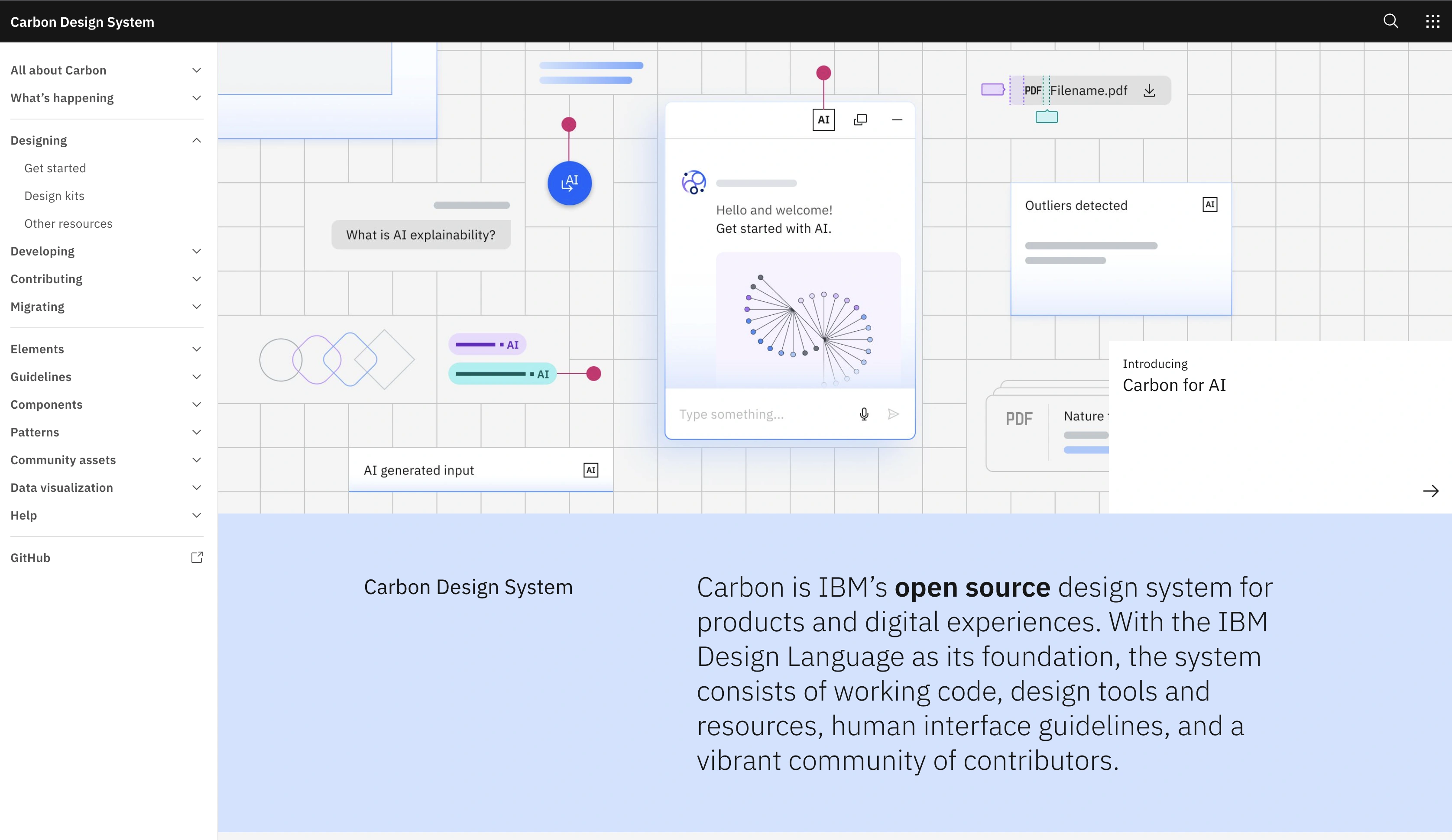
IBM Carbon Design System (Image Source)
Carbon Design System plays a critical role in unifying IBM’s product and service interfaces. The standardization of components, patterns, principles, and language ensures consistency in user experience while keeping an eye on scalability.
Salesforce Lightning Design System
Another important example of an effective, functioning design system is the Salesforce Lightning Design System. This design system does an excellent job of standardizing UI development across the different platforms for Salesforce. Lightning Design includes a robust set of components, design tokens, and guidelines that help teams create a consistent experience in an efficient manner.
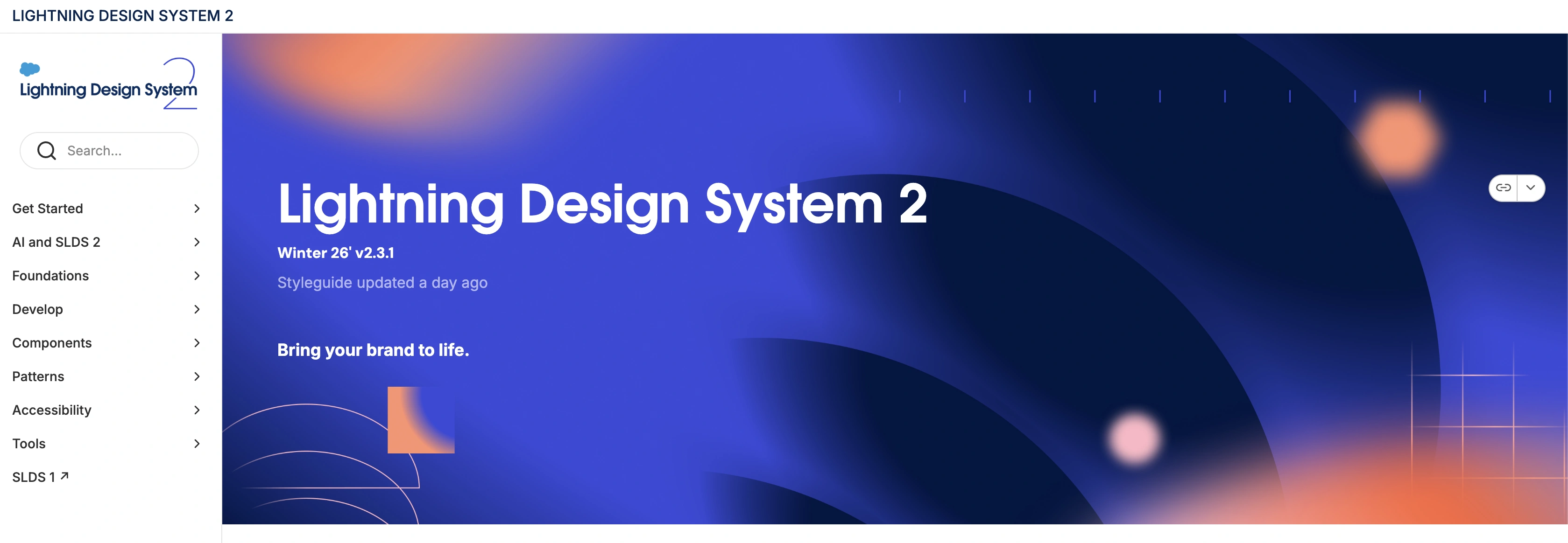
Salesforce Lightning Design System (https://www.lightningdesignsystem.com/2e1ef8501/p/85bd85-lightning-design-system-2)
One key strength of the Salesforce system is the speed and efficiency it brings to the design process. By providing reusable and ready-to-use UI components with clear guidelines, this design system enables teams to create quick iterations while maintaining a consistent experience.
How to Build a Design System?
Building a design system is not a one-time project. It is an evolving process that grows with products, services, teams, and expertise. Therefore, teams need not create everything at once. Instead, applying an iterative approach focused on small improvements can help build effective design systems.
In practice, design systems start by conducting a comprehensive audit, followed by defining principles and components, and then documenting the process and guidelines. Such a sequential and strategic approach helps create useful design systems.
Audit Existing Designs
The first step in building a design system is to analyze the existing assets, interfaces, and design patterns. This is where designers conduct a design system audit to review the layouts, UI elements, and principles. The goal is to understand what is working well and to identify the gaps.
In this step, teams also focus on noticing inconsistencies in designs, such as the visual elements, typography, and component usage. These gaps, issues, and inconsistencies lay the foundation for building a new design system.
Define Design Principles
After conducting a comprehensive audit, the next step is to develop a set of guiding principles for the design system. In this step, designers build on the findings from the audit, focusing on addressing the gaps and issues. Additionally, they keep the brand’s image and the organization’s values in mind to ensure the alignment of design principles with the overall goals. The goal of this step is to clearly define the foundational design principles. These principles are rooted in the product goals and UX strategy, which can then be made part of the design system.
Create Reusable Components
After the audit and definition of principles, the next step is to build a library of reusable components. These UI components typically include elements such as buttons, forms, cards, modals, and navigation patterns that can be incorporated in or adapted for multiple designs going forward.
When designing UI components, the focus should be on flexibility and scalability. The goal here is not to create UI components for a single product. Instead, the components should be general enough that different designs can utilize them. This core library of components can ensure consistency in future designs.
Build Documentation
Documentation is another critical step in building a design system. It is the process where designers list, define, and explain the design choices. Documentation of a design system also includes guidelines on using UI components, examples of applications, and code references.
Well-organized documentation must be easy to navigate and update as the system evolves. It is important to note that documentation is not a step in building the design system. Instead, it is an ongoing process where designers are creating and gathering helpful information at all times.
Maintain and Evolve the System
Once a design system is built, the work doesn’t just end there. Like any design practice or process, building a design system requires continuous maintenance, assessment, and improvement. A design system needs to be updated as the products, teams, and organizations grow.
Design teams should regularly update components, refine guidelines, and remove outdated patterns. This is where feedback from designers, developers, and users can be helpful. By adapting to new requirements and use cases, the design system remains a valuable resource.
Conclusion
Design systems play a crucial role in creating consistent, scalable, and efficient products. Carefully built and comprehensive design systems not only document the key design principles but also provide reusable components and shared standards. These elements reduce inconsistencies and improve the overall quality of designs, positively impacting the user experience.
Along with consistency, design systems also make teams and organizations more efficient. With the help of design systems, companies can scale products without compromising speed of coherence. Reusable elements, design principles, and clear guidelines save designers from repetitive tasks, where they can then focus on creativity and solving critical issues.
It is important to note that design systems are not built at once. Instead, it is a gradual process that is refined over time. Designers and researchers should always keep an open mind when building a new design system and iterate as products grow. A well-maintained design system becomes a living resource that grows alongside the product and the team.
Dec 28, 2020

Creates insightful, strategy-driven content that translates complex design and branding concepts into accessible knowledge, supporting Ramotion’s mission to elevate digital experiences.