
Ever wonder how, with dozens of tabs squeezed into the browser bar, we still manage to find the page we want? That’s the favicon at work—a tiny symbol that identifies a tab at a glance. But not all favicons are built the same. A well-designed favicon speeds navigation, boosts brand recall, and even lends a touch of credibility.
Ready to make one that works? Let’s start with the essentials—what a favicon is, the formats you’ll need, and best design practices.
Defining favicon
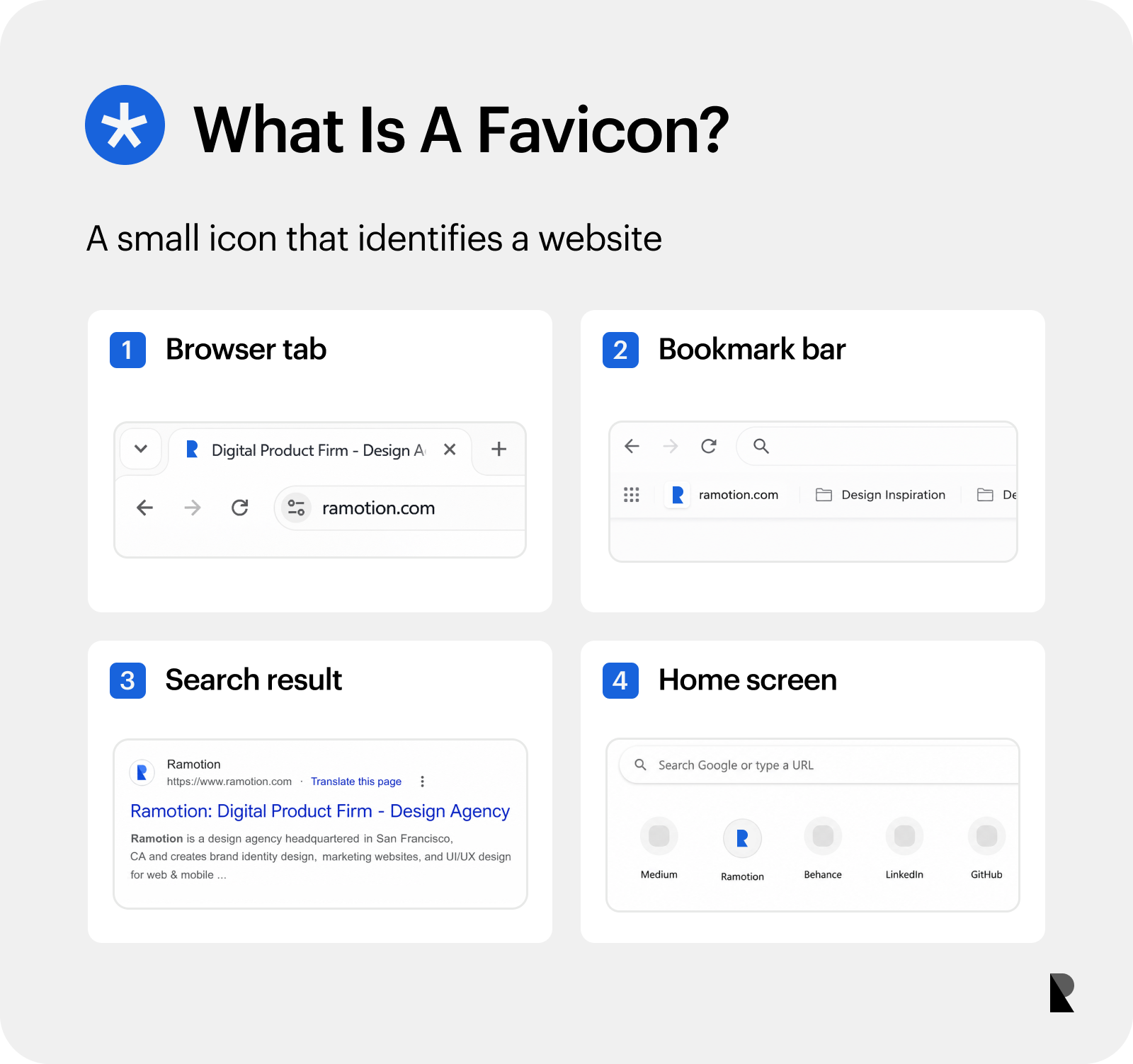
A favicon is a small visual identifier for a website.
The favicon (favorite + icon) is a small symbol that appears in browser tabs, address bars, bookmarks, search results, and history lists. It must communicate clearly at very small scale, relying on simple shapes, bold colors, and minimal details. A well-crafted favicon strengthens recognition and makes navigation feel effortless.
Where do Favicons appear?
Users are constantly exposed to favicons, whether they’re consciously aware or not. It appears in the browser tab, address bar, bookmarks, history, search engine results, mobile homescreen shortcuts, and start page.
- Browser tab: It sets your site apart from other tabs, making it easy for users to return to your page.
- Address bar: It sits next to the URL, lending credibility to your site. A generic icon can raise doubts about whether the site is official.
- Bookmarks and Favorites: A visual shortcut users can rely on to find your site at a glance.
- Browser history: Users are more likely to remember the favicon than the URL.
- Search engine results: It appears next to your listing, helping it stand out from the rest.
- Mobile home screen: It serves as an app-style icon, making your saved website easy to access with just one tap.
- Start page: It aids quick navigation without typing the names of frequently visited sites.
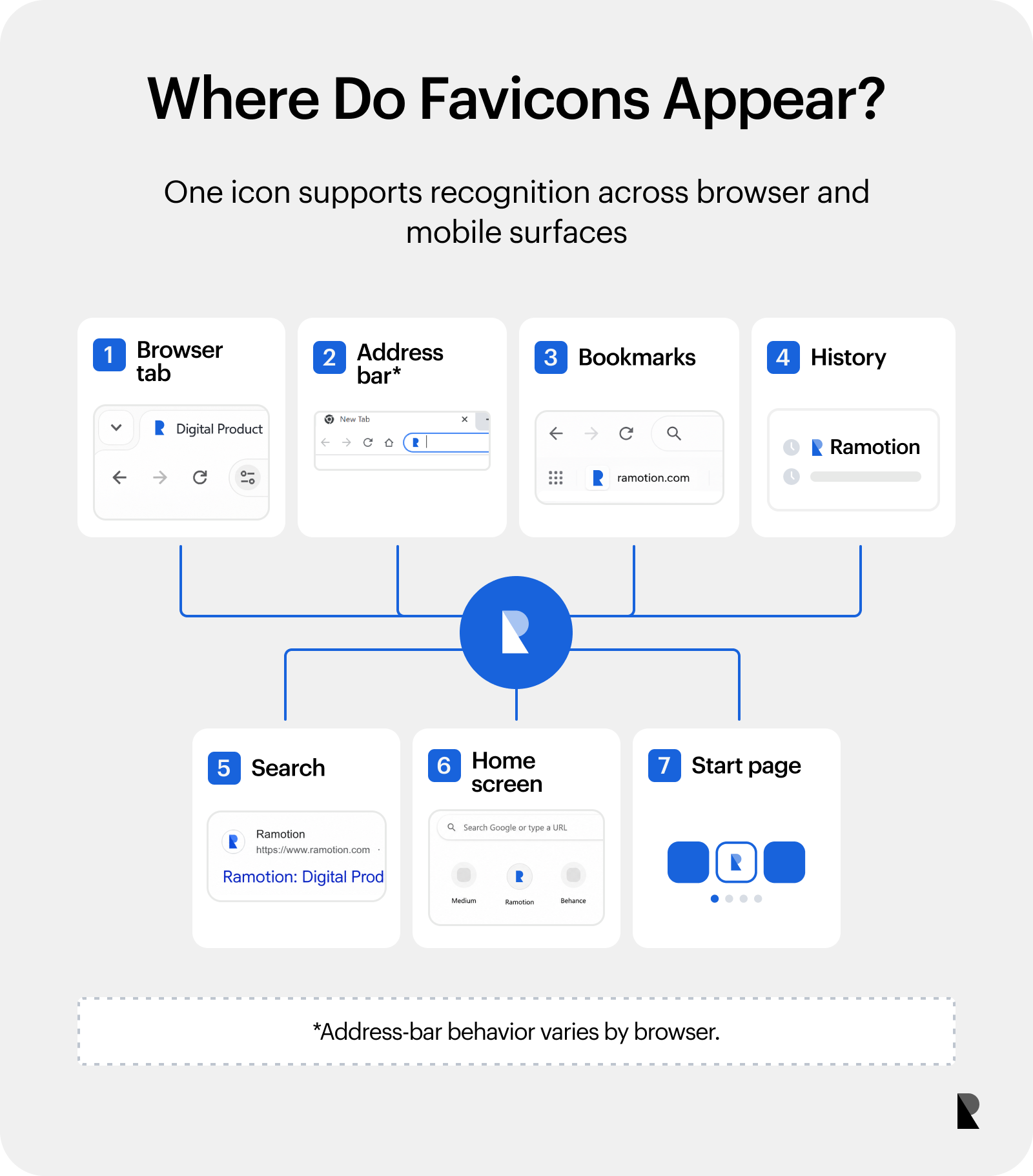
Favicons support recognition across browser and mobile interfaces.
Why Favicons Matter
Favicons matter just as much as brand logos. Aside from ensuring quick navigation between sites, the repeated exposure to a favicon compounds over time, strengthening brand recognition and more. Below are the main benefits of a well-designed favicon you may not want to miss.
- Instant orientation: It reduces the time users spend looking for your site’s tab.
- Stronger brand recall: It reinforces memorability of your brand.
- Subconscious credibility: A well-designed favicon shows competence in the minds of users.
- Reduced cognitive load: Users do not have to guess, making every interaction smoother.
- Higher click-through rates: A recognizable icon draws the eye faster than plain text.
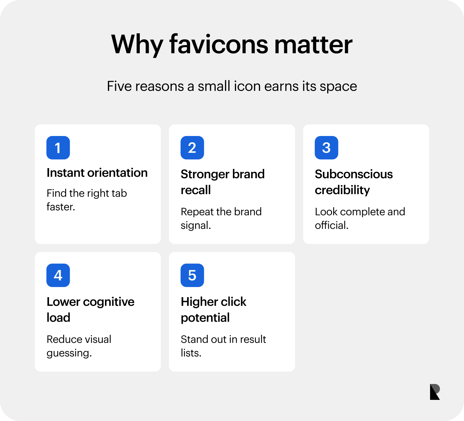
Favicons improve navigation, recognition, and perceived completeness.
Favicon Sizes and Formats
Favicons come in different sizes and formats. Let’s go over the most common ones, so you know exactly what to use and why.
Common favicon sizes
Sizes vary depending on where and how the favicon will be used. Provide your favicon in multiple sizes to cover legacy browsers, modern desktops, Windows taskbars, and iOS and Android mobile shortcuts.
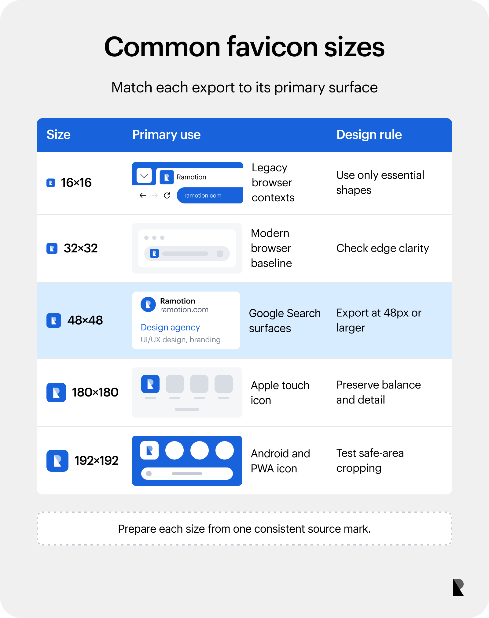
Common favicon exports serve different browser, search, and mobile contexts.
16x16 pixels
The traditional favicon size was 16x16, which remains a standard reference point. Some older browsers and certain low-res environments still request this size directly. At this size, fine details disappear, and text becomes unreadable. While you should still include a 16x16 version for legacy compatibility, do not rely on it as your primary favicon.
32x32 pixels
As screens became more modern and higher-DPI, 32x32 pixels became the new baseline. The higher resolution prevents pixelation, making way for sharper details and a more recognizable shape.
48x48 pixels
Google updated its favicon documentation in 2024, recommending a size of 48x48 pixels or larger to ensure favicons look good across various surfaces. It maintains clarity and visual appeal, which can improve click-through rates.
180x180 pixels
180x180 is the primary recommendation for Apple devices. It is the key favicon size used when someone saves your website to the homescreen of an iPhone or iPad, resulting in a crisp, high-quality icon. It allows a more faithful representation of your logo and finer details that convey quality.
192x192 pixels
Android and Chrome use this size when users pin your site to their homescreen or app drawer. Android encourages more dynamic designs and requires higher-resolution icons than Apple. This gives you ample resolution to represent your brand with fidelity.
Best Favicon formats
Your site is viewed on different devices, each running different operating systems and browsers. The result is a fragmented landscape that requires specific favicon formats.
ICO
Designed by Microsoft, this is the original favicon format, which can hold multiple sizes in a single file. It is primarily used for legacy compatibility with older browsers, but remains useful for Windows desktop shortcuts and taskbar pins. It provides general support across all major browsers and is simple to implement. However, it cannot hold high-resolution sizes needed for modern mobile devices.
PNG (portable network graphics)
No quality is lost when the file is saved or compressed in this format. It can display millions of colors, making it ideal for detailed icons. All modern browsers widely support PNG and, because it allows lossless compression, it can serve as a source file for generating other favicon formats.
SVG (scalable vector graphics)
SVG is a vector-based image format that allows for easy scalability without loss of quality. It is ideal for responsive and high-DPI designs because SVG favicons can adapt to any size. However, they are not supported by older browsers and other mobile devices.
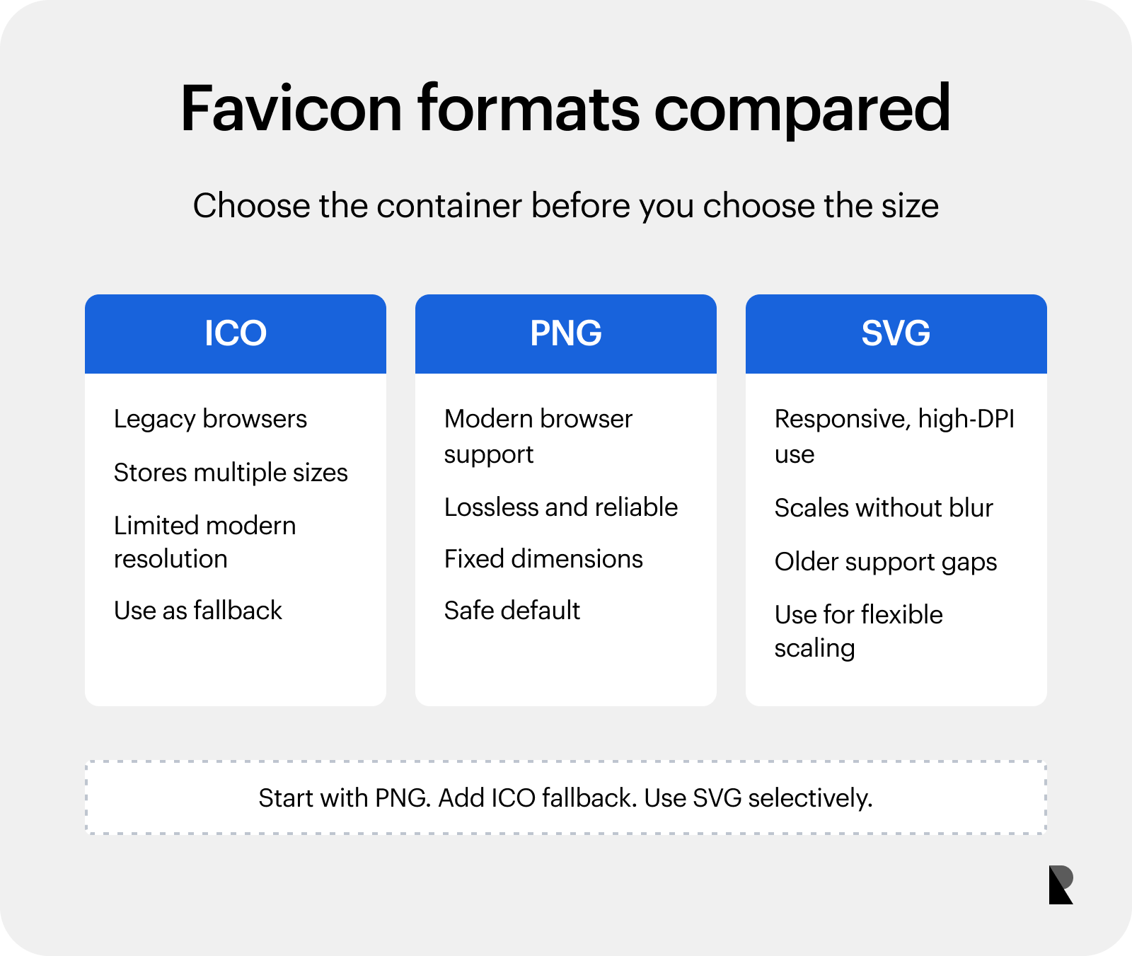
PNG is the safe modern default, with ICO and SVG serving specific needs.
Since PNG is the modern standard, start with this format as it works on every modern browser. You can then add a 48x48 ICO as a backup for users on older browsers and Windows shortcuts. If you are targeting mobile users, don’t skip creating a 180x180 Apple Touch Icon for iOS and a 192x192 PNG for Android.
Good Favicon Designs
A good favicon design requires optical balance and the strategic use of negative space, so the icon remains recognizable even at a glance. Color and distinction matter, too, for better legibility and recognition.
Distinctive design
An effective favicon stands out among other tabs. Its visual elements should be unique enough that a user can spot it instantly without reading the text. Trello’s favicon exemplifies this, filling the entire space with two cards that represent the platform’s interface, making it distinctive and tied to the brand. Pinterest’s iconic “P” and Dropbox’s open-box shape achieve the same level of instant recognition.
High contrast design
A favicon must remain legible against light and dark browser themes. High contrast ensures the icon does not disappear despite its tiny size. Netflix’s bright red “N” on a dark background, Slack’s colorful criss-cross pattern, and Evernote’s green elephant silhouette all demonstrate effective contrast.
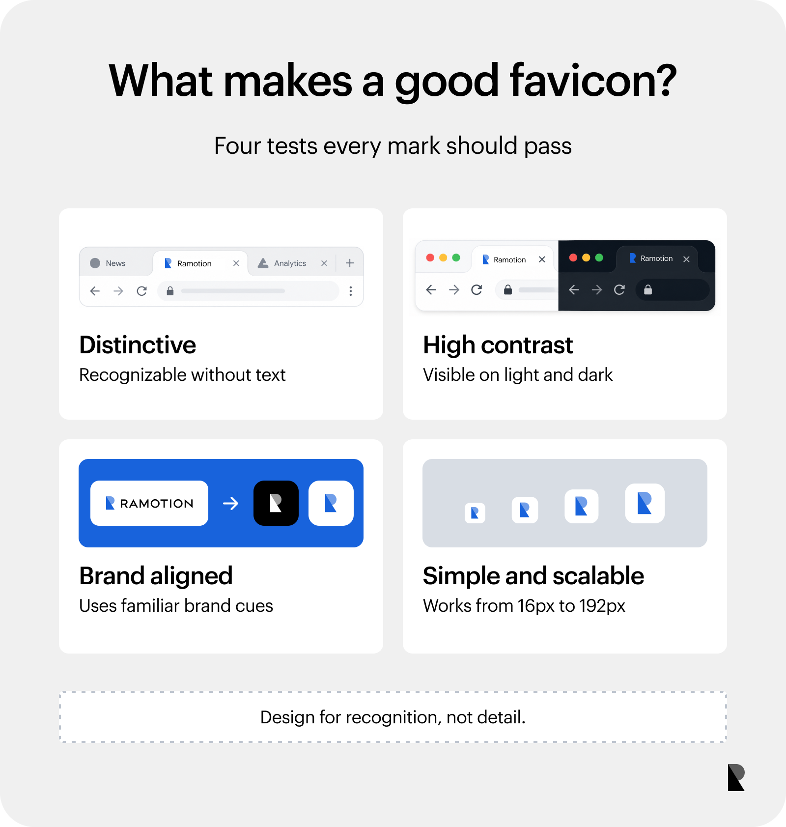
Strong favicons are distinctive, visible, brand-aligned, and scalable.
Cohesive, brand-aligned design
A favicon should not feel like a separate asset, but be instantly recognizable as belonging to the same brand. Borrowing the same colors, shapes, or visual cues from the primary logo bridges the gap between the tiny icon and the full brand experience.
Adobe’s stylized “A”, Amazon’s arrow, and Chase’s blue octagon all carry their brand’s DNA into the favicon, creating consistency that reinforces trust.
Simple and scalable design
A modern favicon can work in multiple sizes, from the smallest (16x16) to the biggest (192x192) without becoming blurry or messy. We see this in Google and Facebook’s use of single letters that remain recognizable across all sizes. YouTube’s red play button triangle is also bold enough to survive any size.
Common Favicon Mistakes
Designing a favicon may seem straightforward, but many brands still commit the following mistakes.
Designing complex images
Overlapping shapes, multiple colors, illegible text or typography, and intricate logos—these are just some ways a favicon design can become unnecessarily complex. It happens often, driven by a misunderstanding of what a favicon should do and a fear of losing brand identity. But complexity undermines the favicon’s purpose. It confuses viewers and weakens brand recognition.
Design Tip: Start with the basics. Strip away all details, textures, and secondary elements. Design at a small size first to ensure you include only elements that remain visible in the favicon’s smallest form.
Relying on default favicons
A default favicon is a generic placeholder—often a gray globe, a document outline, or a blank page. But using default favicons may be seen as careless branding, which can affect perception.
Design Tip: Create a custom favicon. Even the most basic branded favicon tells users that you care about their experience. You can always render a better version as you solidify your brand identity.
Inconsistent shape language
When a brand’s logo features curves, but its favicon uses sharp angles, the disconnect is immediate. Users hesitate and may briefly do a double-take to confirm they are on the official site. The inconsistency makes the brand feel less polished and less trustworthy.
Design Tip: Let the favicon take its cues from the brand’s existing visual language.
Skipping the squint test
The squint test involves stepping back from the screen or squinting until the details blur. If the favicon remains recognizable even when squinting, the design is successful. It’s a simple test that can save brands from design flaws, yet designers often overlook it.
Design Tip: Make the squint test a mandatory step in your design process. If it fails the squint test, then it will surely fail your users.
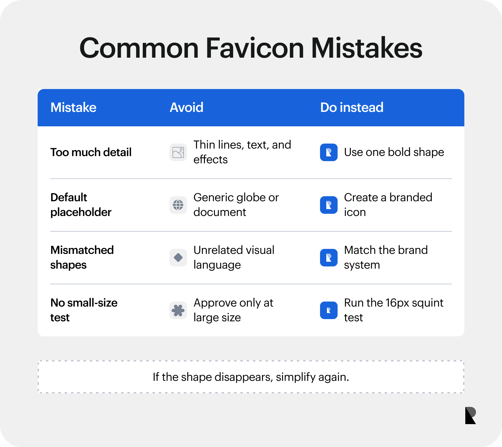
Simplification and small-size testing correct common favicon problems.
Work with one of the top companies for brand identity design to avoid these mistakes.
How to Create a Favicon in Three Steps
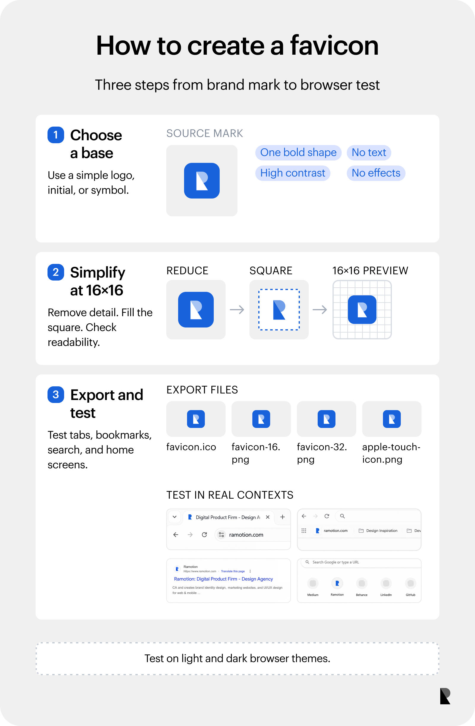
Choose a base, simplify it at 16 pixels, then export and test it.
1. Choose your base.
Your favicon’s base should be a simplified version of your logo, wordmark, initial, or symbol. This allows fluid translation into a favicon, requiring only minimal changes. For instance, Nike’s swoosh logo is also its favicon. It’s simple, recognizable, and scalable.
Here are qualities to look for in a favicon base:
- Single, bold shape
- High contrast
- No text
- No gradients or shadow
2. Create a square version and test readability at 16x16.
A 16x16 frame size limits what you can include in your favicon. So, simplify and bolden your chosen base, remove outlines, close any gaps, and remove any internal details that are not essential to recognition. Center what’s left of your base within a square 16x16 canvas and fill the frame as much as possible. A favicon that is too small or poorly positioned will look insignificant.
3. Export and test in an actual browser.
Once your design is finalized, export it in the correct formats and sizes. Remember that different screens, browsers, and devices have unique requirements, so name each file clearly.
Upload the files and test how browsers handle them. Check how they appear in the tab, address bar, bookmarks, home screen, and search results. Test contrast on light and dark browser themes, too. If your favicon does not appear or looks blurry, review the size, quality, and file path.
How to Add a Favicon
There are two ways to add a favicon to your website: the HTML method and the platform-specific method.
Add a Favicon via HTML
The HTML method involves uploading the favicon to your site’s root directory and adding a link tag in the head section of your HTML. This approach is generally preferred because it gives complete control over every aspect of your favicon implementation. However, it requires coding skills, which makes it ideal if you are a developer or have technical expertise.
Add a Favicon via platform-specific methods
You do not have to know how to code for platform-specific methods. Website builders and CMS platforms handle resizing, format conversion, and the behind-the-scenes coding.
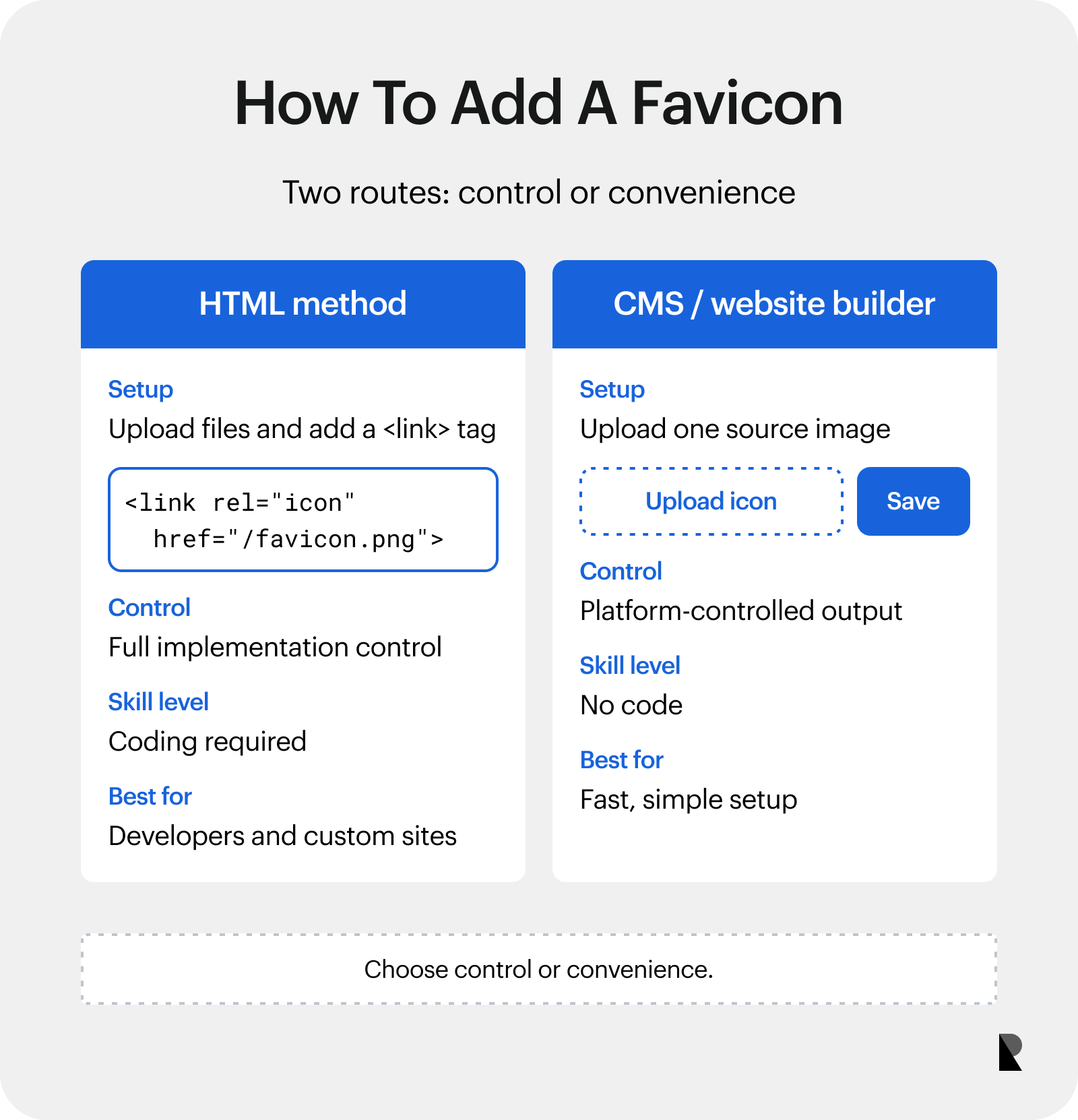
HTML provides control, while a CMS provides speed and simplicity.
<link rel="icon" href="/favicon.png">While this method is easier, especially for non-tech users, its customization options are limited. Most platforms only accept a single image file and automatically generate the sizes and formats they support. Hence, this method is ideal for those who prefer simplicity and speed over total control.
Favicon: Tiny Icon, Big Impact
Favicons are among the most underutilized assets in web design. Yet this tiny symbol appears dozens of times per session more than any paid ads or content, successfully reinforcing recognition, building trust, and guiding users back to your site. When utilized well, it completes the brand experience, showing the brand’s attention to detail at every scale.
In a competitive landscape where every interaction matters, creating a favicon is a worthy investment. One that pays out every time a user opens a tab, scans a bookmark, or saves your site to their home screen.
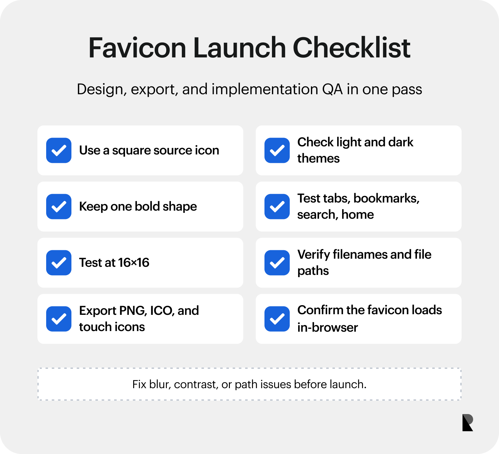
Use this checklist before publishing a new favicon.

Creates insightful, strategy-driven content that translates complex design and branding concepts into accessible knowledge, supporting Ramotion’s mission to elevate digital experiences.