Glassmorphism is a modern UI design trend that creates the illusion of glass, featuring translucent, frosted, and layered effects. It blends background blur, transparency, and soft lighting to create depth and hierarchy in digital interfaces. The style gives users a sense of looking through layers of glass, where objects feel tactile and dimensional rather than flat.
The term gained prominence in 2020, when designers began experimenting with blurred panels and semi-transparent cards on vibrant backgrounds. Glassmorphism is “a visual-design trend gaining popularity since 2020” and has since become a core aesthetic in Apple and Microsoft’s design systems. But while it can beautifully establish visual hierarchy, overuse can also compromise accessibility — making thoughtful application very much essential.
Defining Glassmorphism in UI Design
At its very core, glassmorphism is about visual depth. It uses transparency, blur, and layering to mimic the optical properties of glass. Designers often apply this effect to cards, modals, and buttons, allowing backgrounds to softly show through while maintaining readability.
Unlike Flat Design, which eliminates dimension, or Neumorphism, which simulates depth with shadows and highlights on solid surfaces, glassmorphism feels more fluid and alive. It introduces translucency and light to create separation without rigid boundaries, giving UI elements a floating or suspended appearance.
This approach supports a more human visual perception — users can intuitively distinguish interactive layers and background contexts. It also resonates with current UI design trends emphasizing materiality and motion, aligning digital interfaces closer to the physical world.
Glassmorphism in Design Systems
For design teams, glassmorphism isn’t just a visual flourish — it’s a systemized design language. When incorporated into a design system, its rules define how transparency, color, shadows, and blur are consistently applied across products. This helps teams maintain clarity and visual harmony as they scale interfaces across their various platforms.
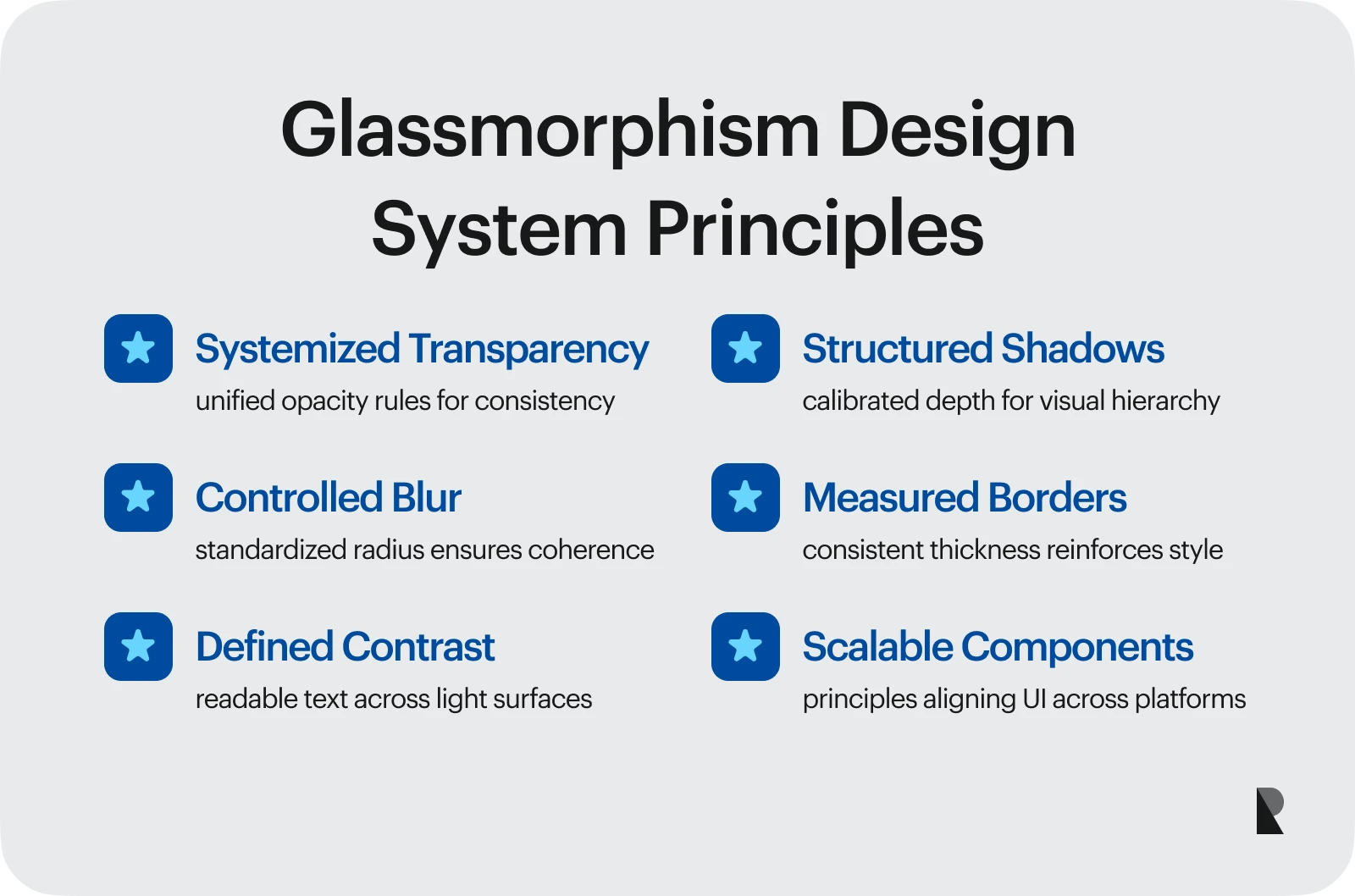
These parameters bring structure to what could otherwise feel like a purely aesthetic trend. It’s a practical evolution of component thinking, much like when teams differentiate between a component library and a design system.
Integration with Component Libraries
Integrating glassmorphism into a component library enables designers to reuse and modify elements that adhere to unified transparency and blur properties. This modularity makes it easy to extend the aesthetic across buttons, input fields, menus, or overlays.
When implemented correctly, a glassmorphic design system acts as a single source of truth, ensuring that every layer, background, and gradient aligns with the brand identity and UX goals. This significantly supports visual consistency and accelerates collaboration between designers and developers.
Consistency across platforms and devices
Glassmorphism looks best when it feels seamless across environments. From mobile apps to web dashboards, consistent opacity, light, and shadow behavior reinforce a unified visual identity.
Apple’s 2025 Liquid Glass update embodies this principle. As Apple’s Vice President of Human Interface Design explained, Liquid Glass “combines the optical qualities of glass with a fluidity only Apple can achieve,” introducing translucency across elements like sliders, buttons, and sidebars. The result reflects a brand-wide commitment to the glassmorphism aesthetic — one that is subtle, cohesive, and responsive across every interface.
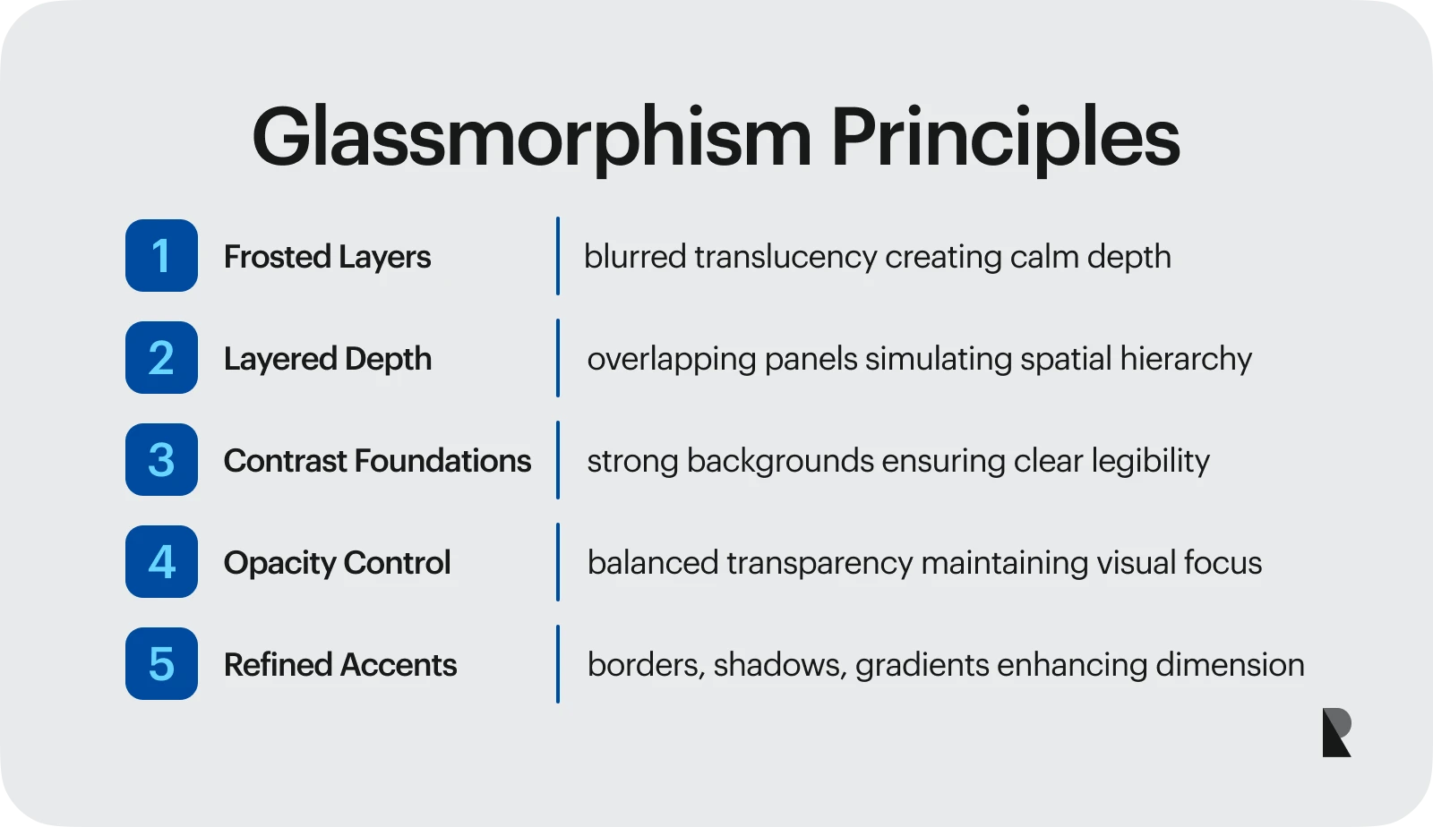
5 Key Principles of Glassmorphism Design
Before applying glassmorphism, designers should understand its foundational elements. Each plays a role in creating balance between realism and usability.
1. Frosted glass effect
The hallmark of the trend is the frosted glass effect, achieved through a combination of background blur and translucent layers. This softens the content behind an element without hiding it completely, creating both depth and visual calm. Designers often apply a moderate background blur to maintain focus on the foreground. When used in moderation, this glass-like translucency conveys a modern and sophisticated aesthetic.
2. Multi-layered depth
By overlapping transparent layers, designers can simulate physical space in a two-dimensional layout. These glassmorphic elements can appear to float above or sink behind others, depending on light and shadow. A glassmorphic design achieves balance by contrasting sharp edges with diffused transparency, evoking structure and fluidity simultaneously.
3. Backgrounds and contrast
A strong background enhances the impact of glassmorphism. Vivid gradients or softly animated backgrounds help accentuate the translucent surfaces. Yet contrast remains essential — without it, users may struggle to differentiate elements. A high contrast background lets frosted panels and text stand out clearly. This connection between contrast and legibility also plays a critical role in accessibility.
4. Opacity and blur control
A key skill in glassmorphism lies in controlling opacity and blur. Too much transparency and the content behind becomes distracting; too little and the visual depth disappears. Most designers find a range of 10%–40% opacity to be effective, depending on the brightness of the colors and the surrounding light. Adjusting these values within a design system allows flexibility while preserving a consistent look across all screens.
5. Borders, shadows, and gradients
Fine borders help separate translucent layers from their surroundings. Soft inner or outer shadows reinforce dimension, while gradients introduce warmth or motion. These subtle touches prevent the interface from appearing sterile. Many modern designers pair glassmorphism with gradient-rich backgrounds that shift hues dynamically — bringing the illusion of real material interacting with light. This visual richness links directly to the psychology of color in UX, where hue and tone influence how users emotionally interpret digital spaces.
Best Practices for Designing with Glassmorphism
Glassmorphism requires careful restraint. It’s easy to overuse blur or transparency, which can hurt readability or slow down performance. A few best practices help preserve clarity and user comfort.
Designers should first define which elements truly benefit from the aesthetic — such as cards, containers, or key interactive elements — rather than applying it everywhere. Keeping the background vibrant yet soft supports depth without overwhelming the senses. Most importantly, text must always remain legible, especially in low-light environments or over busy backgrounds.
Step-by-step guide to glassmorphic UI
When building a glassmorphic UI, start with composition. Identify which layers need translucency and which stay opaque. Then, apply blur selectively: foreground cards should have slightly higher opacity and stronger shadows than secondary layers.
Within a design system, document these values so your UI elements stay consistent. This modular structure resembles principles from an atomic design system, where each component fits logically into a scalable hierarchy.
Choosing color palettes
The color palette in design systems has a significant impact on the success of glassmorphism. Bright, saturated tones behind translucent panels create contrast, while soft neutrals produce a calm, sophisticated visual experience. When combined with the strategic use of light and shadows, colors define both mood and usability. For readability, avoid pairing light text with light backgrounds or vice versa.
This balance between vibrancy and usability distinguishes good glassmorphic designs from purely decorative ones. Even subtle tints, such as a faint blue or pink glow, can make the glass feel more realistic without overpowering the composition.
Improving UX with transparency
Glassmorphism is more than a visual style; it enhances usability when transparency is used purposefully. It helps users understand relationships between elements by layering depth and focus. A frosted sidebar, for example, subtly suggests it’s part of the same surface as the main window, while a blurred card draws the eye toward priority content.
This spatial logic mirrors how people perceive the physical world; close objects feel clearer, distant ones fade into translucency. When designers translate that into digital form, navigation feels instinctive. But transparency should always clarify, not distract. The best glassmorphic design creates hierarchy and calm through controlled blur and light.
Accessibility and readability
Glassmorphism brings its own distinct accessibility challenges. Its defining traits are transparency, layering, and blur. It can also reduce text contrast and strain readability if used excessively. So, while glassmorphism enhances visual hierarchy, overuse can lead to accessibility and usability challenges). To balance beauty with function, designers need to prioritize clarity by keeping text layers more opaque, strengthening shadows or outlines, and using simple backgrounds behind type.
Color choice is also crucial here. High contrast ratios maintain legibility, while soft gradients and neutral tones preserve the frosted glass effect. Following the principles of accessibility in UX design helps make interfaces inclusive without compromising their aesthetic. Testing across different lighting conditions and screen sizes helps ensure that what looks elegant in the design file will also perform well in the real world.
Best Glassmorphism Examples in UI
Some of the best examples of glassmorphism can be found in major operating systems. Apple’s macOS and iOS (2025) use blurred panels for Control Center and widgets, creating the feeling of looking through soft layers of light. Microsoft’s Fluent Design System employs transparency and shadows to achieve a similar level of realism, enabling interfaces to feel tactile yet fluid. Both use glassmorphism to enhance usability rather than as decoration.
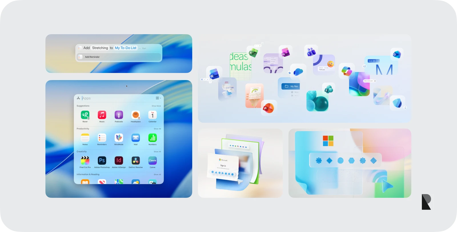
In digital products, designers apply glassmorphic design to dashboards, e-commerce sites, and fintech platforms. A weather app might use blurred cards that evoke a foggy atmosphere, while a finance app applies translucent surfaces to make dense data more approachable. These glassmorphic elements convey a sense of lightness and order, qualities that make digital experiences feel more trustworthy.
A glassmorphism example from branding or marketing design often pairs translucent panels with vivid colors and subtle light play to signal innovation. For design teams, it has become a shorthand for modernity: a way to visually represent openness and depth in a brand’s digital identity.
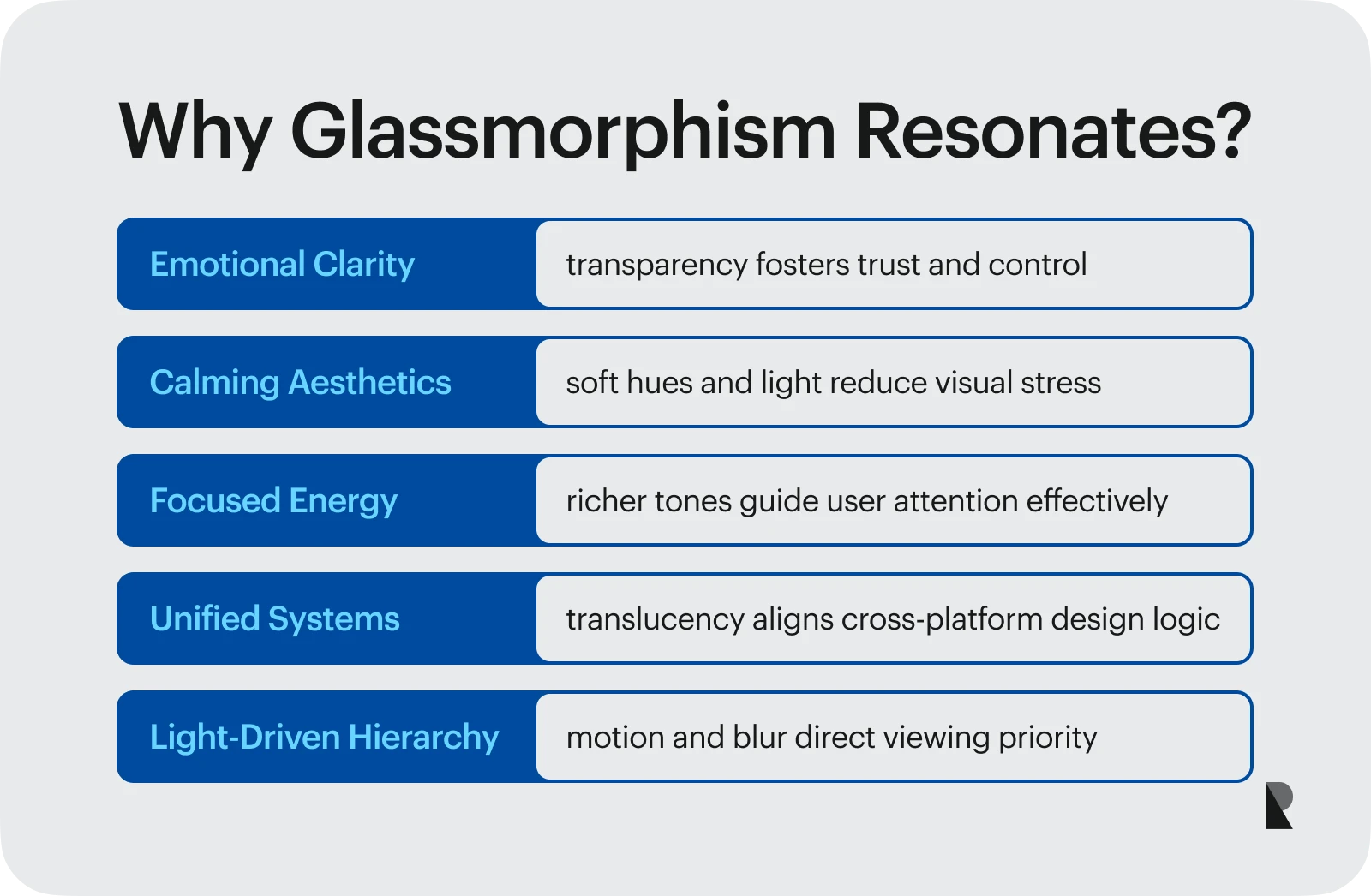
Why glassmorphism works
People respond emotionally to transparency. Seeing through layers gives users a sense of clarity and control, like understanding what lies beneath a surface both figuratively and literally. This aligns closely with the psychology of color in UX, where soft hues and diffused light create a sense of calm, while richer tones add focus and energy.
The concept also fits naturally within evolving design systems. Both Apple and Microsoft have integrated translucency as a foundation for visual hierarchy. Fluent Design and Apple’s Liquid Glass use motion, blur, and depth to unify ecosystems across screens. The result is a shared visual language where light guides attention, rather than sharp lines.
Future of glassmorphism
As digital interfaces move toward augmented and mixed reality, glasses, as well as other wearable devices, will only grow in relevance through glassmorphism. Transparent layers already feel native in 3D environments, where context and depth matter. Adaptive transparency, where opacity adjusts based on content or user action, is likely to become a standard in interactive design.
For scalability, teams can define transparency values, shadow depth, and gradient styles directly within their design system, allowing for seamless integration. Structuring these as reusable tokens aligns with the atomic design system model and guarantees consistency across UI elements. The best visual practices, however, will always remain timeless: clarity before complexity, usability before trend.
Conclusion
Glassmorphism has transformed the way we perceive digital surfaces. It merges art and function, turning light, color, and transparency into tools for effective communication. When done right, it gives interfaces a distinctive, emotionally engaging look while maintaining clarity and usability. It bridges emotion with precision, inviting users to experience depth, movement, and focus in ways that feel intuitive and modern.
Whether used for product dashboards, OS layers, or marketing websites, the glassmorphic approach signals innovation and trust. It’s both an aesthetic and a philosophy — design that feels alive, layered, and human.
For brands seeking to integrate this trend into cohesive systems, partnering with a specialized UI design agency can bridge creative vision with functional execution. To find trusted partners, explore the top UI/UX design companies that create glassmorphic experiences, balancing elegance with accessibility.
Nov 7, 2025

Creates insightful, strategy-driven content that translates complex design and branding concepts into accessible knowledge, supporting Ramotion’s mission to elevate digital experiences.