What makes your company instantly recognizable in a sea of similar offers? Simple - logotype. Believe it or not, this tiny detail can make all the difference in distinguishing your brand from the competition and making it memorable and recognizable. According to studies, almost 75% of consumers identify a brand by its logo.
Logotype is a visual brand mark that reflects the company's personality, vision, values, and mission through smartly combined stylistic options. It could be text-based, purely graphical, abstract, dynamic, and interactive. It plays a crucial role in a company's success, as it builds trust, creates a powerful first impression, supports the company's marketing and advertising efforts, and helps customers recall the brand.
Indeed, professional logo design has become critical for companies these days. It assists them in achieving their goals, such as reinforcing their position in the market or fueling their growth. Here is our brief guide on the logotype, with step-by-step instructions for creating one for your company.
In many cases, developing a strong visual symbol that fully embodies a company’s vision requires professional guidance. Partnering with a brand identity design company allows businesses to translate their values, mission, and personality into a cohesive logo system that feels authentic and memorable. It help brands uncover their visual voice, define color systems, typography rules, and scalable design assets that reinforce recognition and trust.
A lot has been said about logo design; still, it is important to understand its concept. It is the cornerstone of a company's visual identity, primarily responsible for brand recognition and overall customer engagement and trust.
Logo is a visual unity – a graphical representation of the company's vision, mission, values, and philosophy. It reflects the brand's personality and charisma through graphical design, style, and sometimes wording. It is used to create the correct associations with the business, deliver the key brand message, make the right impression, separate the company from the competition, and tie together all its communications across multiple interaction points.
What Is Logo Design?
Logo design is a technical process of combining brand values and mission with the company's personality and charisma in a visual unity. It is a strategic and creative stage of a company's development.
A final design must meet quality criteria and modern tendencies and perform vital tasks like reinforcing the company's position in the market, resonating with the target audience, or supporting marketing and advertising endeavors.
This conceptualization is more than just a drawing or creating a visual or graphic design. It is an artful embracing of the company's key identity elements based on thorough research, analysis, concept development, high-end execution, testing, and improvement.
Main Types of Logos
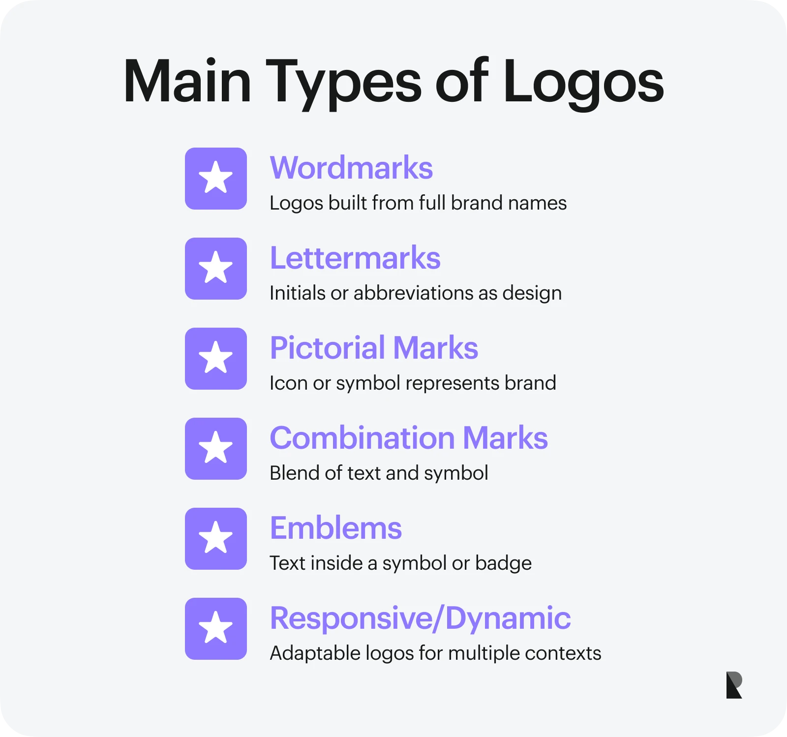
As every company's personality is unique, every designed logo is one-of-a-kind. Coming in all shapes and sizes, they accurately shape and reflect different individualities. However, despite their diverse appearance, style, and emotional content, designed logos could be categorized. In general, there are six types of brand marks:
- Wordmarks,
- Lettermarks,
- Pictorial marks,
- Combination marks,
- Emblems,
- Responsive and dynamic logos.
Wordmarks (logotypes)
Wordmark is a visual unity that uses letters and words to represent the company's identity. In general, the company's name displayed through typographic and stylistic choices reflects its personality, archetype, and emotional spectrum. The designed logotype does not have any images, icons, or pictograms; instead, it uses color psychology and a brand staple typeface.
This type of logotype works best for companies with short, distinct, strong, timeless, meaningful, or versatile names. Good examples are Google, Coca-Cola, and Nike.
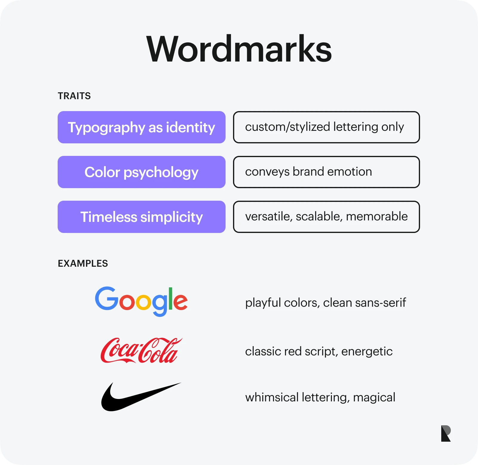
Coca-Cola (image by Jenna Hamra)
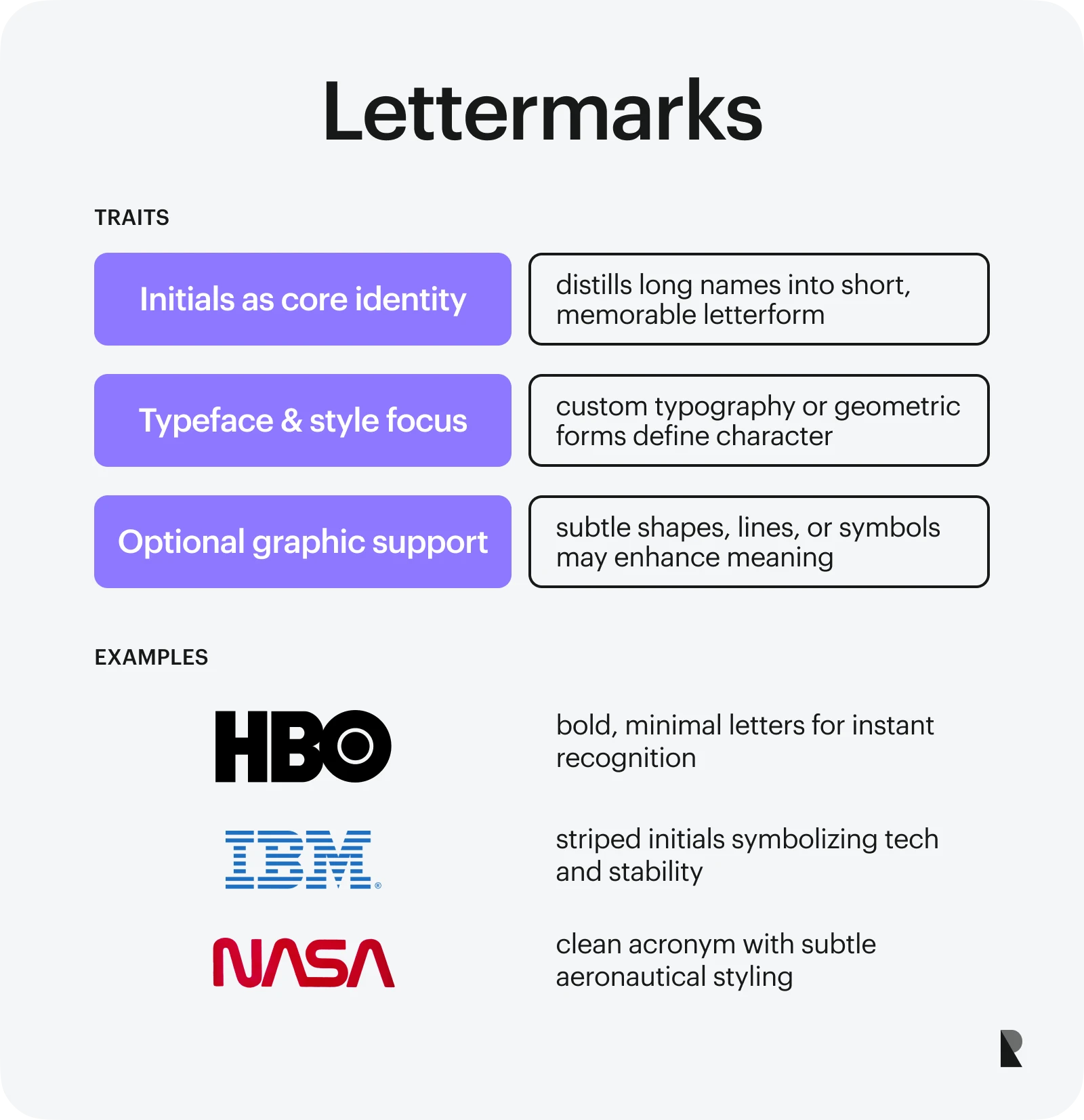
Lettermarks (monograms)
Lettermarks or monograms are also text-based visual unities. However, unlike a wordmark - a logo featuring words, they leverage initials or abbreviations to describe a company's individuality. It could be only the first letter of the brand name or a string of the interwoven initials of the company's lengthy or complex trademark. While it strongly relies on typeface and color scheme, it might still employ graphical elements, like icons or pictograms, to support the meaning.
Monograms are well-suited for personal brands, businesses with lengthy and complex names, hand-made goods, or digital services. The good examples are HBO, IBM, and NASA.
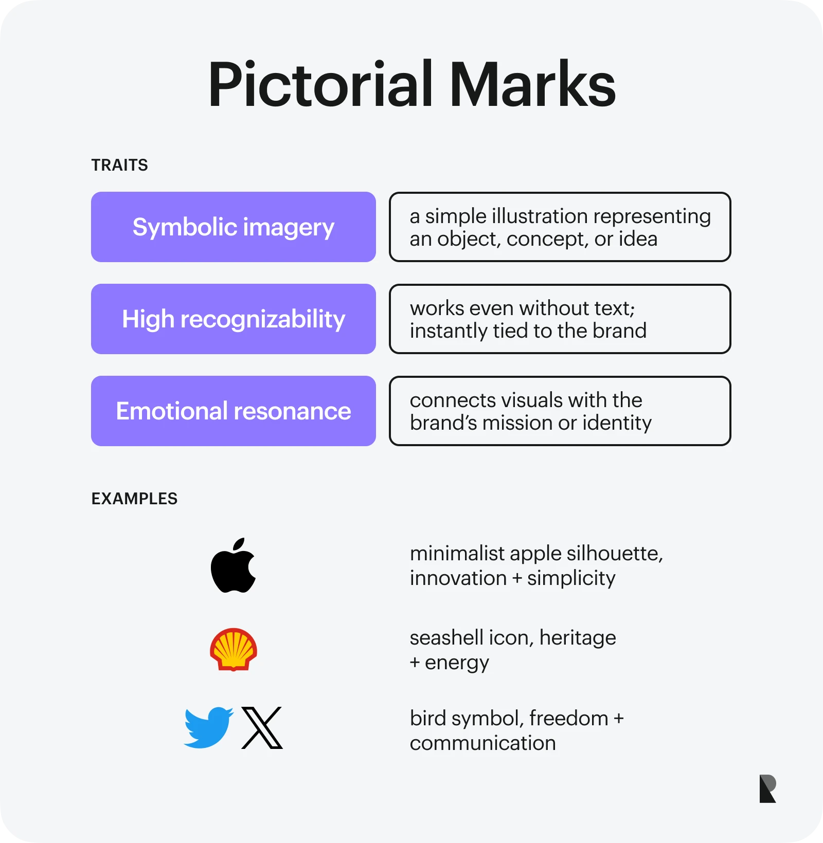
Pictorial marks (icons)
Pictorial marks are one of the most recognizable and popular types of custom logo designs. They are graphical elements that employ the powers of stylistic choices, typography, coloring, shapes, and even wording. They might represent real objects, divines, or concepts. In most cases, they are simple yet meaningful and memorable illustrations that aim to convey the company's connection with a unique vision or mission.
Icon logotypes are popular with companies that have strong visual associations, meaningful names, or identities connected to the real world. Notable examples include Apple, Shell, and Twitter.
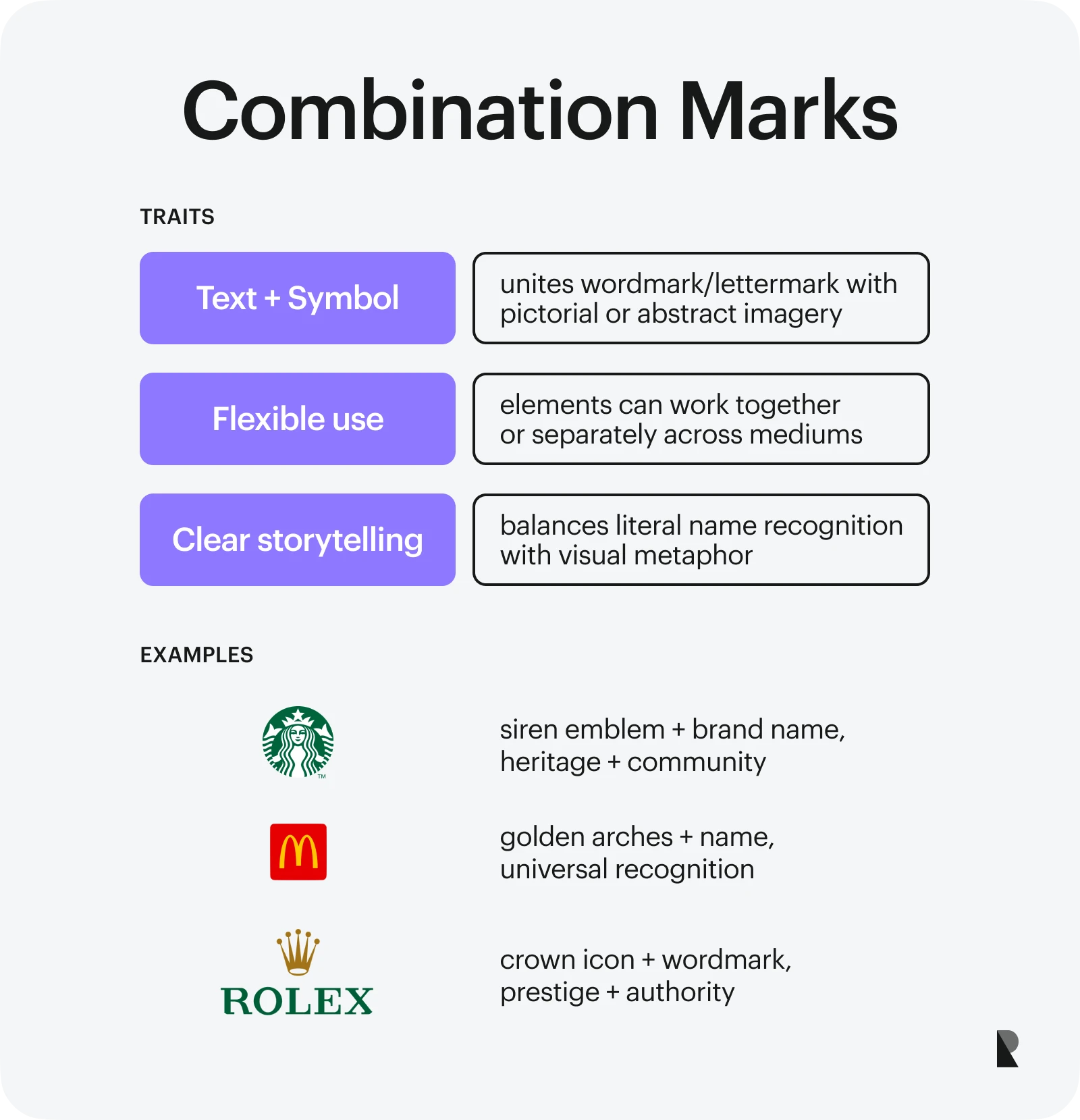
Combination marks
A combination mark is a child of two worlds. This logo design takes the best from wordmark and pictorial mark to communicate the company's vision accurately and engagingly. It might feature letters, words, abstract concepts, graphics, illustrations, icons, and play with colors and typefaces to represent a name or a metaphor.
Memorable, meaningful, and versatile abstract logos unlock their potential for businesses across industries. The good examples are Starbucks, McDonald's, and Rolex.
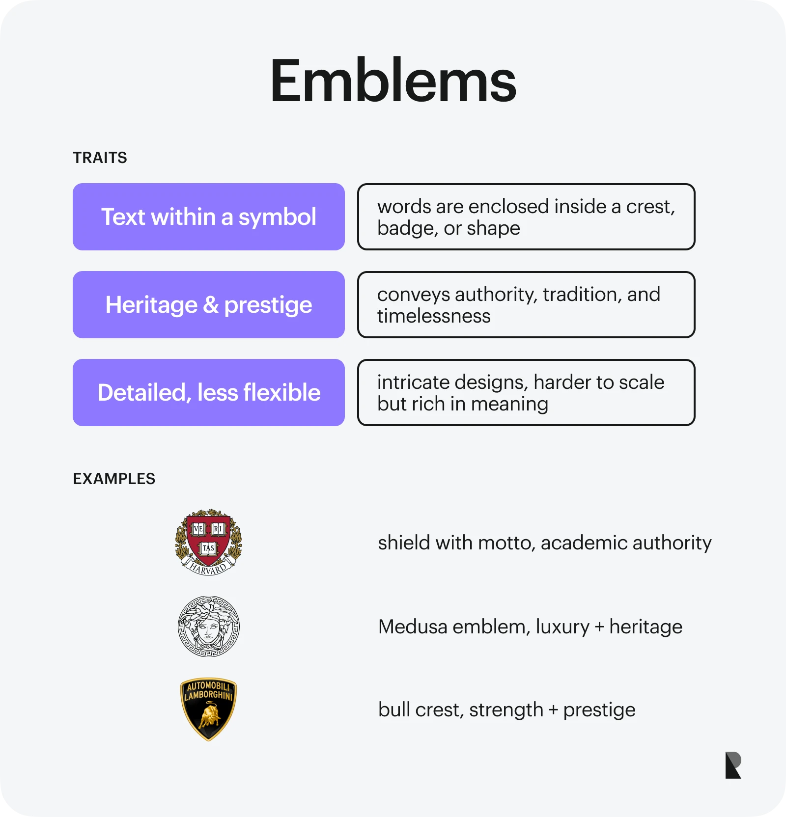
Emblems
An emblem is a heraldic element usually presented as a symbolic object or an illustration with a motto. Originally used to present noble families, nations, and well-established institutions like universities, it has become a tool to demonstrate organizations' vision and mission.
In the business arena, an emblem combines shape and text, with the latter often enclosed inside the symbol. It embodies the company's essence and reflects its personality. Due to traditional associations, heraldic badges excel at creating a sense of heritage, prestige, and authority that is vital for luxurious and educational niches. The good examples are Harvard, Versace, and Lamborghini.
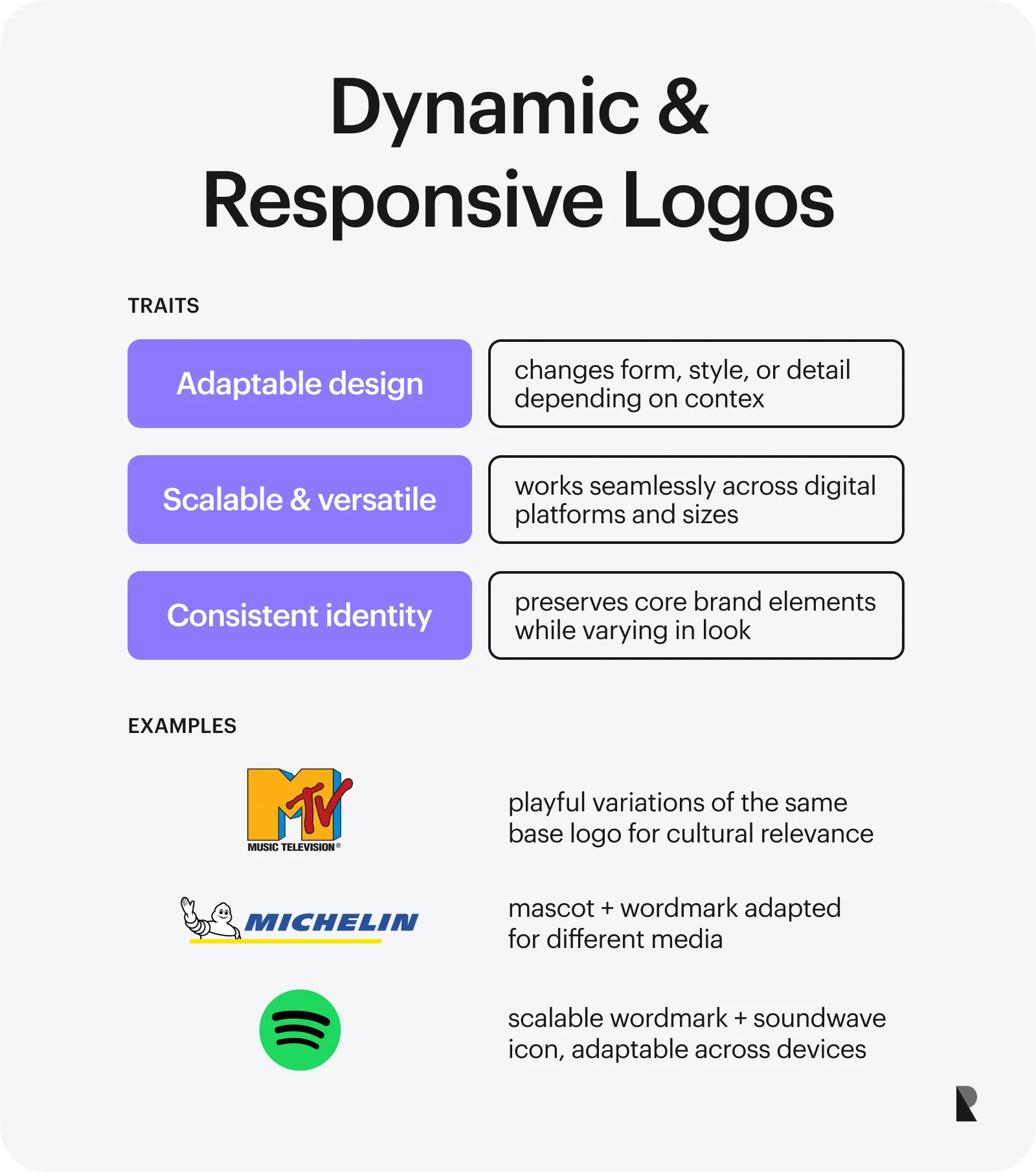
Dynamic and responsive logos
Dynamic brand marks are relatively new types of logotypes. They are responsive, flexible, and agile visual elements that adapt to various technical environments to ensure consistency in the company's personality representation. They might change by context to support marketing, advertising, and branding endeavors across systems.
As designed logos must consider infrastructure, they are scalable without compromising quality and meaning. As a rule, they often alter their appearance yet preserve the key elements of brand identity.
Responsive logos are essential for digital brands and products that must deliver their message consistently across multiple platforms, social media, communication channels, and interaction points. The good examples are MTV, Michelin, and Google.
What Are the 6 Principles of Effective Logo Design?
Logo design can be challenging, as it must ensure the final logo across its versions meets the company's goals and high-quality standards. Fortunately, it could be easier if you approach it with a professional design agency and solid knowledge about the fundamental principles of effective visual identity that everyone must follow: simplicity, memorability, versatility, scalability, relevance, and timelessness. Here is a short description of each practice and its importance.
| Principle | Description | Importance of branding |
|---|---|---|
| Simplicity | It implies using only the essential elements and stylistic choices to reflect the company's personality. It strips away clutter and unnecessary details to ensure clarity. | It makes it easy for first time users to understand the brand, remember it, and recall it. It naturally conveys the key message and inspires trust and credibility. |
| Versatility | It implies adaptation to various infrastructures and a project's requirements without compromising the quality and meaning of the designed logotype. | It stands behind flexible, adaptable, and accessible visual unity that flawlessly adapts to various companies' and markets' requirements and preferences. |
| Scalability | It implies that the visual identity evolves with the company without compromising the performance and efficiency of delivering the message. | It supports the growth of the company across various directions: marketing, advertising, and branding. It boosts efficiency, minimizes operational costs, and fuels conversions. |
| Memorability | It is the ability of logo designs to be easily remembered and recalled after a certain period of time due to a minimum learning curve or unique features. | It stands behind brand recognition and users' retention, dramatically contributing to emotional connection, trust, and satisfaction with the brand. |
| Relevance | It is a correct connection between the appearance and feel of the brand mark and its intended context and meaning. | It underlies meaningful associations with the brand, delivering the key message, value, personality, and mission aligned with the company and its target audience. |
| Timelessness | It ensures the designed logotype remains relevant, meaningful, and attractive across generations, cultures, and market segments. It fuels longevity, durability, and value of the brand identity. | It underlies the stability of the company's presentation and position in the market, fostering a deeper connection with the audience regardless of their age, gender, culture, and preferences. |
How to Design a Good Logo - Step by Step Guide
Designing a logo is a strategic process that requires the company's total commitment to the cause. Every routine stage must be perfected to ensure the visual unity clearly reflects the company's personality, aligns with core values, meets the six principles of effective logo design, delivers the message to the target users, and separates the company from the competition. Here is the standard step-by-step routine.
Step 1 - start with a design brief and brand audit
The discovery stage is the first stage in every production cycle, and the logo design process is no exception. As with anything, the fundamental phase establishes the right direction and underlies overall success.
The best branding companies use it to collect crucial information about the company and its personality, character, archetype, vision, mission, value proposition, and short—and long-term goals. They usually devise a strategic plan to create visual unity that meets the company's requirements and provides an effective instrument to support its marketing, advertising, and branding efforts.
Step 2 - conduct research and analyze competitors
The second phase involves the brand agency conducting thorough research of the client's target market segment and competition landscape, along with a detailed identity audit. This information is crucial for making the right decisions and perfecting the strategy devised earlier.
The knowledge obtained from the research provides the agency with relevant insights for the ideation stage and a general understanding of the brand's central theme, environment, and requirements that must be met to ensure the logotype serves its purpose and goal.
Step 3 - brainstorm ideas and sketch concepts
Brainstorming is a creative process that involves several people collaborating to generate novel concepts based on knowledge from previous research. They seek inspiration and explore design trends to devise solutions that address the problem or achieve the goal. They prioritize quantity over quality to create various possibilities and options.
As a rule, during this stage, you might see rough sketches without criticism and judgments that encourage new ways of looking at existing ideas, fuel creativity, and underlie evaluations for finding promising avenues.
Step 4 - design digital drafts and variations
Digitizing sketches is the next preliminary stage and continuation of the brainstorming phase. It is marked by the shift from the physical brand mark representation to the digital one. Again, you will not see the final draft of the logotype yet. Still, you might enjoy different variations of the well-designed logos brought to digital life with professional software like CAD, Photoshop, or Illustrator. Professional designers must also test, modify, and improve ideas based on feedback during this stage.
Step 5 - choose fonts, colors, and style
Selection of typography, colors, and styles is one of the most critical stages in the design process, as a tiny mistake might cause incorrect interpretation and disharmony. This trio is the tools of the trade. They help designers shape their ideas and enable them to generate emotions, communicate the brand voice, evoke specific moods, and ensure key qualities such as readability, responsiveness, accessibility, versatility, and scalability. Therefore, every tool must be chosen thoughtfully and according to the strategic plan, goals, and well-established standards.
Step 6 - gather feedback and refine
At this stage, logo designers have already chosen the concept and brought it to life. This version meets the company's requirements, essential principles, and quality standards. However, the work is not done.
The next step is to gather and analyze constructive feedback from fellow artists, stakeholders, and the target audience to gain fundamental insights into the newly designed logotype's potential. Designers usually assess the sustainability and effectiveness of their concept, reiterating the information they receive to adjust and improve their version.
Step 7 - deliver final assets in multiple formats
The final stage is a delivery phase. The client has approved the logo design. It was made using best practices, aligned with the company's strategy goals, and refined based on constructive feedback.
During this phase, designers create a brand identity package that includes a style guide, essential color variations of the brand mark (full color, black, white, and monochrome), detailed and simplified versions, different sizes, and vector and raster formats so the designed logotype can be put to use for digital and print purposes.
What Are Common Mistakes in Brand Logos Design?
With users who have the shortest attention span in history and a dramatically overserved market, logotypes do not have the right to mistakes. Everything must be perfect to deliver the brand's vision, create a proper association, and leave a long-lasting impression that empowers recognition and recall.
Unfortunately, companies still commit errors that undermine the power of their logo design and cost them their position in the market, recognition potential, and customer loyalty. Here are the most popular blunders you must avoid during the logotype design stage.
Overcomplication
While complex solutions allow businesses to express their unique personalities thoroughly, they also pose challenges for maintaining those details, which are conceivable and recognizable at every size and dimension. In addition, more details mean more data, which in turn means more effort and time to process, causing information overload.
Poor scalability
Scalability is essential for modern designs as the brand must deliver its message across multiple screen sizes, dimensions, and operating systems without compromising quality. This requires well-thought-out logo designs, including details and graphical elements that easily and naturally adapt.
Bad font or color choices
Color and typeface can influence emotions and perceptions. They might easily distort the image, cause confusion, overwhelm viewers, and even destroy trust when poorly chosen. The choice of these instruments must be aligned with the brand's identity and target audience.
Generic templates
Generic solutions, whether entire templates or individual logo design traits, inherently compromise the brand's image quality and fail to convey the company's unique identity and characteristics.
Plagiarism
Plagiarism always has dire consequences, especially when promoting a company's identity. Even a tiny detail that betrays falsification or piracy can lead to significant repercussions, including loss of trust, damage to reputation, and even legal fines.
Conclusion
Logo design is not just a visual symbol or mark – it is a strategic tool that supports a company's formation as a strong brand with unique values and personality. It is directly involved in numerous marketing and advertising campaigns, ensuring consistent and coherent presentation and reinforcing the correct associations with the business and its products or services.
As a visual representation of a business's identity, it makes the communication between the company and its customers meaningful and relevant, inspiring trust and loyalty. It is also instantly recognizable, which fuels brand recognition and differentiation from similar offers in the overserved market.
Of enormous importance, the logo design cannot be taken lightly. It must meet several key criteria: be aligned with the company's identity, remain relevant to the target audience, look coherent across various platforms, reinforce position in the competitive landscape, meet high-quality standards, and accompany the company's future efforts. Therefore, inform yourself about logo design, decide what type fits your vision best, and follow our step-by-step instructions to create the best logo design for your business.
Aug 26, 2025

Creates insightful, strategy-driven content that translates complex design and branding concepts into accessible knowledge, supporting Ramotion’s mission to elevate digital experiences.