Call to Action Examples For Every Marketing Campaign
If you've ever spent a reasonable amount of time exploring different websites online, chances are you've run into the phrase "call to action," also called CTA.
Calls to action (CTAs) encourage visitors to take a specific action on a website. They typically include a brief explanation informing visitors of the action and its significance. When written properly, CTAs can be a great way to grab attention and lead more users to click through.
Website designers and marketers use call to actions (CTAs) for their brand to guide users toward specific actions and improve conversion rates. According to a report by HubSpot, personalized CTAs perform 202% better than generic ones, based on an analysis of over 330,000 CTAs over six months.
This shows how effectively a call to action—particularly when customized and clearly written—can help achieve pivotal marketing goals like increasing click-through rates, turning visitors into customers, and improving retention.
To help you create the perfect call to action for your business, this article will cover the different types of CTAs, why they matter, the key elements of a compelling call to action, best practices for writing and designing them, and real-world call to action examples you can get inspiration from.
Defining Call to Action (CTA)
What is Call to Action (CTA)?
CTA is a call to action—a prompt or instruction designed to encourage users to take a specific action, such as clicking a button, signing up, or purchasing.
A call to action, or a CTA, consists of short, direct phrases encouraging users to take a specific action. Whether clicking a take action button, signing up for an account, or downloading a resource, a CTA helps guide visitors toward a defined goal.
CTAs can appear in a web page's essential sections, including headers, footers, and vital content areas. They’re frequently used in emails, online advertisements, and social media to increase interaction and direct people toward a desired action.
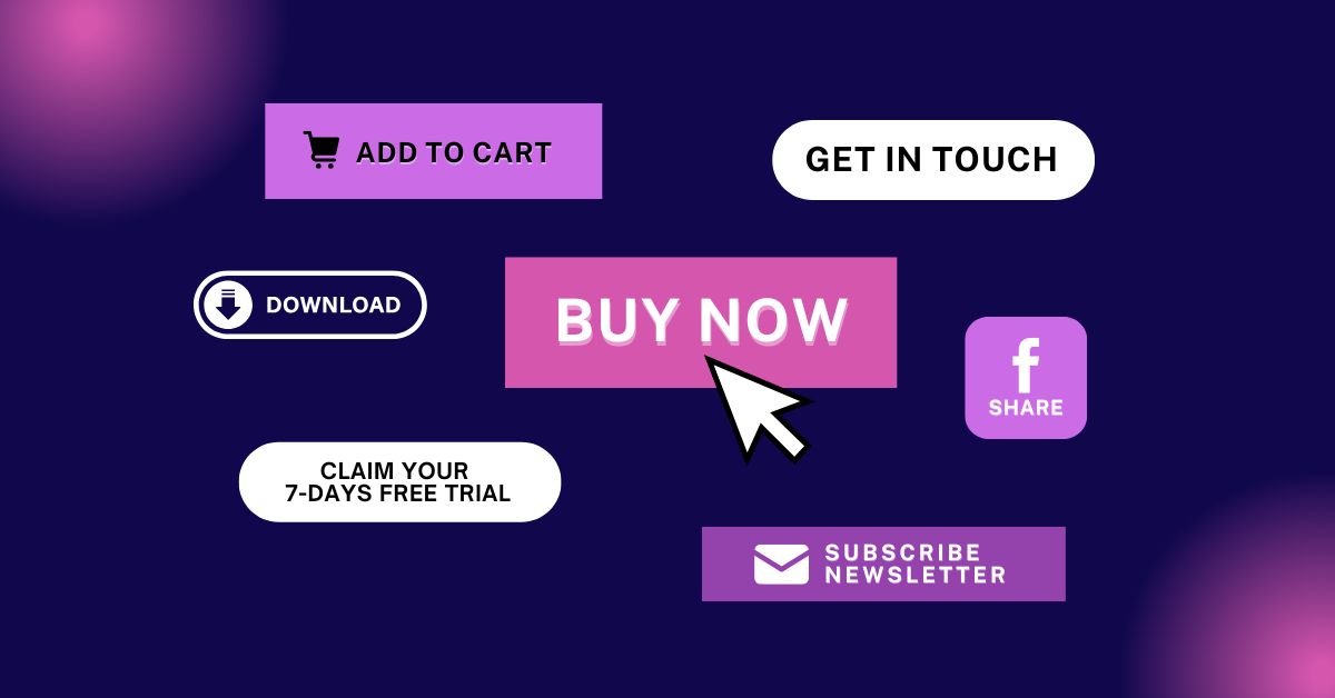
A call to action can take different forms, such as:
- Buttons
- Text links
- Images
- Icons
Why CTAs Matter?
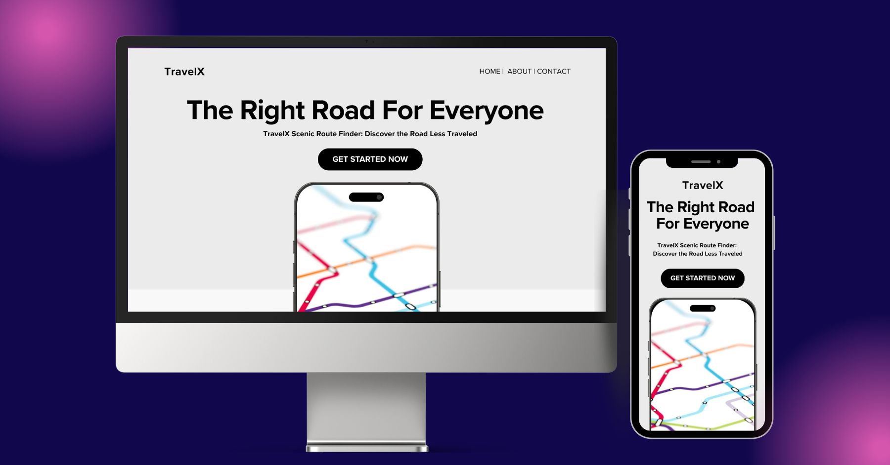
Even the most visually stunning websites can fall short without clear and compelling call to actions (CTAs). It offers direction, triggers psychological responses, boosts engagement, guides users through the funnel, and eventually increases conversion rates. (Image Source)
CTA buttons play an essential role in both website design and digital marketing.
A good call to action (CTA) can significantly impact user experience and influence behavior throughout your site. The best CTAs use compelling action words that prompt visitors to engage rather than simply browse and leave.
Even the best-looking websites can fall short if they don’t have clear and compelling CTAs. When website visitors land on your page, check out your content, or come across a promotion, they might not know what to do unless you point them in the right direction. This is where you use action phrases and a beautifully designed call to action to ensure a clear user path toward the next step confidently.
Good calls to action can offer several key advantages, such as reducing confusion and guiding the user on the journey. Here's why it matters:
Provides clear direction. CTA buttons tell users exactly what to do next with straightforward prompts like “Book a demo,” “Contact us,” “Get started,” or “Start a free trial.” Users are far more likely to engage when there's no friction or uncertainty.
Improve online engagement. Rather than just having people read your content and move on, a good CTA button encourages visitors to take the following action. It motivates engagement with the brand, whether it’s clicking a link, exploring another page, or signing up for something.
Stimulate psychological responses. A well-written CTA button can tap into psychological triggers like urgency, curiosity, or FOMO. Phrases such as “Limited time offer” or “Expires soon” create a sense of immediacy and encourage users to take action immediately. These cues are perfect for time offer-driven promotions or lead generation campaigns.
4.** Supports User Flow and Funnel Progression**. Whether on a landing page or a whole website, a good call to action can be a signpost that guides visitors through the next steps in the sales funnel.
- Increase conversion rates. A call to action is one of the best ways to turn visitors into leads or paying customers, helping you get the most out of your marketing efforts. A strong call to action can reduce bounce rates and improve your overall ROI (ROI).
Key Components of an Effective CTA
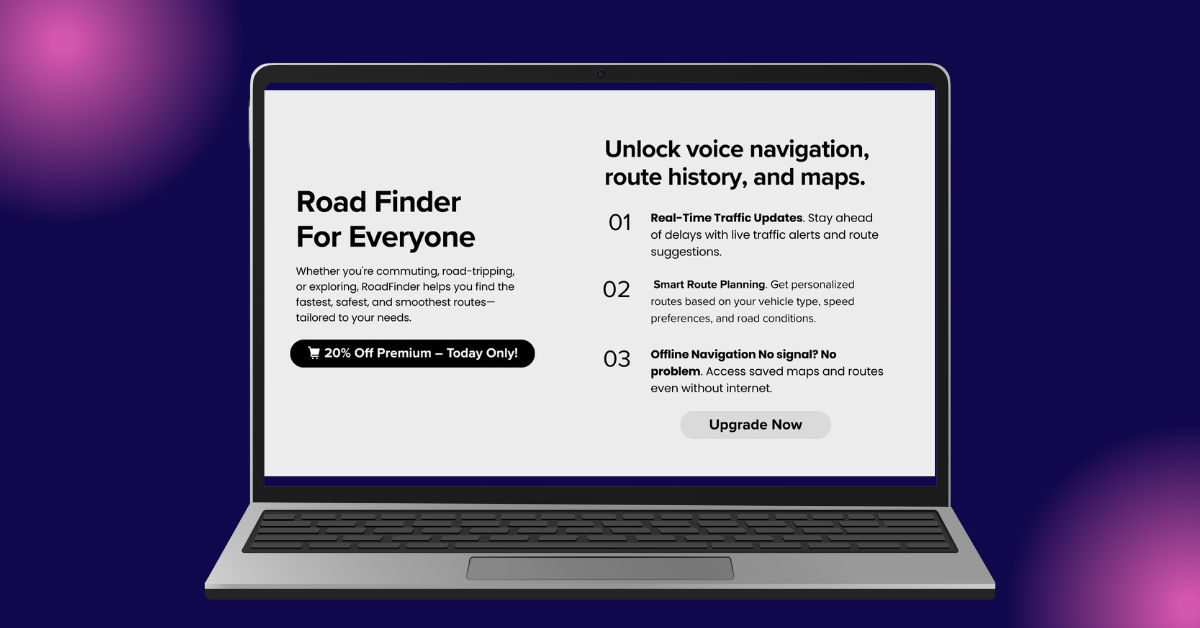
Compelling calls to action combine several key elements including strong visuals, clear and actionable text, a relevant offer, psychological appeal, and strategic placement to grab attention and encourage users to take the next step (Image Source).
Compelling calls to action combine key components that help capture attention and encourage users to move on to a particular action. The call to action CTA gives users enough reason to click without sounding pushy or overly sales-focused.
Now that we’ve covered why a call to action matters, let’s examine the key components that make a CTA button work efficiently.
Pro tip: If you're inexperienced but want to create the perfect CTA button for your website or marketing campaign, consider hiring a professional website design company. These experts specialize in creating effective CTA designs with compelling copy and strategic placement that drive results.
1. Strong visuals
CTA buttons should be one of the first things visitors notice.
From the color choice to the font style and shape, each design element helps make the CTA buttons stand out on the page.
2. Clear and actionable text
A compelling call to action uses simple, straightforward language that tells users what to do, based on the nature of your business and what you offer. This is very important as if users get confused, they’re less likely to click the button. A good CTA avoids complex terms and keeps things short and easy to understand.
Here are a few good CTA examples of actionable text:
- On digital product-based landing pages, call to actions with phrases like “Get lifetime access now,” “Send me the product,” and “Add this to my cart” clearly tell users what to do next.
- For newsletters or social media campaigns, good CTA button phrases like “Join the conversation,” and “Get weekly tips straight to your inbox,” help drive engagement and encourage users to stay connected with your brand.
3. Relevant offer
Call-to-action buttons should always match the page's content and the offer being presented. The words, design, and placement of each button need to align with what visitors are reading and what they’re likely expecting.
For example, if you're offering a lead magnet titled “SEO tips,” a CTA button like “Grab our SEO checklist” is far more effective than a generic “Download.”
4. Psychological appeal
One of the best ways to generate leads and increase sales is by tapping into psychological factors like urgency, scarcity, and risk reversal. The enthusiasm and feeling of rushing to get something will likely persuade the visitor to take action immediately without hesitation.
For example, if you’re running a product sale, a call-to-action button that says “Get 20% Off X product—24-hour offer only” is far more engaging than a generic “Buy now.”
In some cases, adding reassurance phrases on your CTA buttons, like “30-day money-back guarantee,” can also reduce hesitation and increase trust among first-time buyers.
5. Placement
According to a study by Grow & Convert, welcome gates have achieved conversion rates between 10% and 25%, primarily due to the strategic placement of CTA buttons on the page.
While the button color, shape, and copy matter, the call to action must also be strategically placed to be seen and drive results. You should always ask yourself: Should you use it in a hero section, sidebar, end-of-post CTA button, or popup?
The proper placement depends on your content and user flow.
Type of CTAs
There are various types of call to actions, each serving a distinct purpose based on your business model and marketing objectives. These include CTAs for lead generation, sales conversion, subscriptions, social sharing, and user engagement. (Image Source)
Calls to action can serve various purposes depending on your business model and marketing goals. Each is effective when matched to a specific landing page, target audience type, or marketing funnel stage.
Below, we list the most common types of CTAs and share the best CTA examples of how each can be used effectively.
1. Lead generation CTAs
The most common use of a call to action is to convert visitors into leads.
These types of CTAs are often used to collect information like email addresses or phone numbers in exchange for something valuable, such as a free guide, discount, or exclusive offer. This strategy helps build your email list, nurture potential leads, and increase future sales.
You’ll often find these CTA buttons on resource download forms or limited-time promotional offers.
Here are some good lead generation CTA examples:
- "Claim your 7-Days free trial"
- "Send me the 3-Step growth guide"
- "Join our exclusive X product newsletter"
- "Start my 5-minute website audit"
2. Sales conversion CTAs
After leads have been nurtured, the next step is to encourage them to make a purchase or sign up for a service. That’s where sales-focused CTA buttons come in—to turn interested prospects into paying customers.
These CTAs are usually found on product pages, pricing sections, or throughout the checkout funnel. They aim to close the deal and move the user toward transaction completion.
Some of the best examples of sales-driven call-to-action buttons include:
- "Buy X product now"
- "Add to cart"
- "Sign up today"
3. Subscription CTAs
This CTA button is a good choice for boosting conversions if you offer subscription-based products. It prompts users to sign up for ongoing access, whether to a newsletter, membership plan, or recurring digital content.
You’ll often see these CTAs on blogs, SaaS websites, and online service platforms.
Below are some good examples of subscription CTA buttons:
- "Subscribe to our newsletter"
- "Become an X product member"
- "Get your premium access now"
4. Social sharing CTAs
Another type of call to action is the social sharing CTAs, which encourage users to share your content with other social media users and build a solid following for your brand.
These buttons effectively increase customer engagement and build a loyal audience, leading to increased repeat traffic and future sales.
These call-to-action buttons are often integrated with platforms like Facebook, X (formerly Twitter), and Instagram.
Here are some good lists of Social Sharing CTAs:
- "Repost on X"
- "Share on Facebook"
- "Follow us on Instagram"
5. Contact/engagement CTAs
Not all call to actions are designed to push for a purchase or subscription.
Contact or engagement CTAs encourage users to contact the brand, whether to ask a question, request more information, or leave feedback. This type of CTA is one of the best ways to open a line of communication between the brand and its customers.
Below are some of the common CTA examples of contact-based:
- "Contact our support"
- "Get in touch"
- "Book your strategy call now"
Here’s a simple comparison table outlining the different types of CTAs above, including their purpose, best placement, and their best use cases:
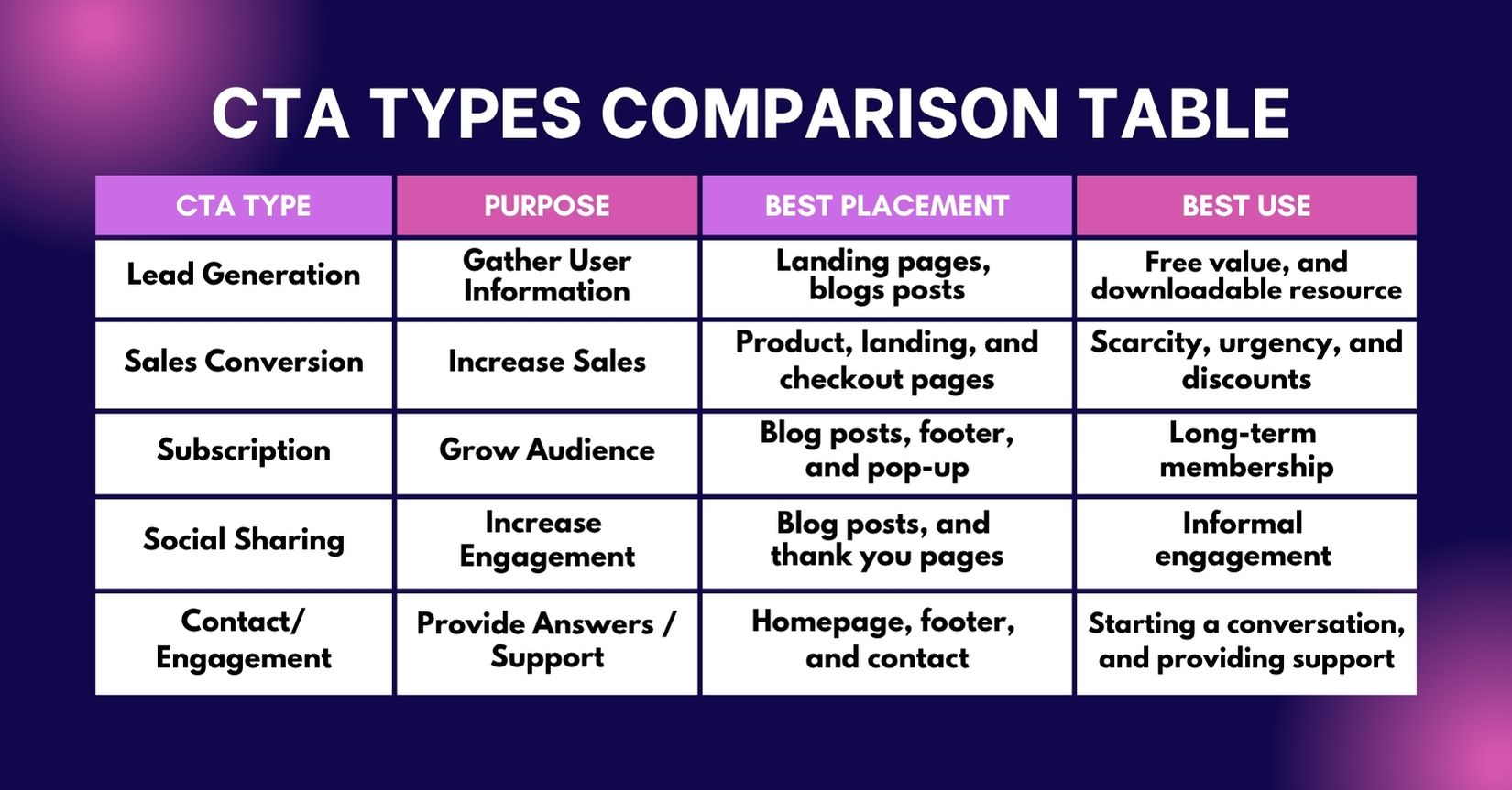
The table provides a comparison of different types of calls to action, including their purpose, ideal placement, and best use cases. (Image Source)
Best Practices for CTA Design and Copy
There’s no real bullet-proof formula for creating the perfect call to action, but one thing is clear: your success requires more than just a good-looking button.
Here are some proven best practices for building effective call-to-actions on your pages.
1. Use descriptive action oriented words/phrases
As the phrase suggests, a "call to action" triggers users to take action. That’s why your CTA should use strong, direct action verbs that are clear, purposeful, and give users a sense of accomplishment when clicked.
For example, if someone wants to download a specific resource and your CTA button says “Click Here,” they’re far more likely to click.
According to CXL, even small copy changes like tweaking CTA text can be a good practice in increasing conversion rates. The difference between a low-performing CTA and a high-converting one often comes down to just a few well-chosen words.
Pro tip: Use action verbs that create a sense of urgency and highlight the benefit to the user. Words like "Get,” “Start,” and “Unlock” can be strong openers, but they’re usually more persuasive when paired with descriptive text that underline the value of the action.
Example usage:
“Get a personalized quote” “Download our free guide” “Unlock your instant access now”
2. Use high-contrast colors
A strong contrast between your CTA button, its text, and the surrounding background makes it stand out. Color alone can be a good deciding factor in whether or not a user notices and clicks your call to action.
A study by CXL shows that red is a high-energy color tied to urgency, excitement, and bold decisions. Brands like Coca-Cola, and Target use red on their website and resources as it can quickly grab attention and has a substantial visual impact. But pairing red with bold colors like green or blue can backfire, as the clashing hues may hurt readability and overall visibility.
In general, when it comes to a primary CTA and secondary CTA, contrasting colors such as bright red, bright blue, and bright orange can help them pop, which looks especially good on dark or white backgrounds. However, the best combination often depends on your overall site design, so testing is key!
Here are a few good high-contrast combinations that work well for CTA buttons:
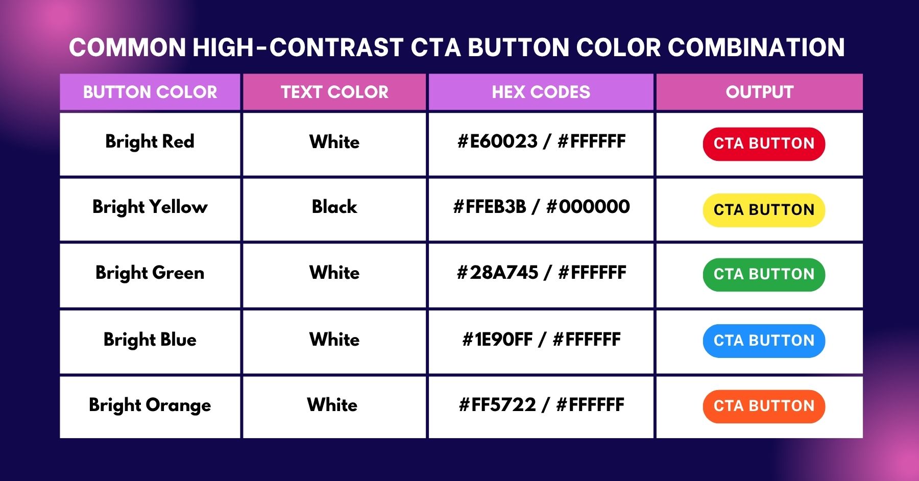
The table shows the common high-contrast color combinations that work well for CTA buttons, indicating the button color, text color, their hex codes, and how they appear together. (Image Source)
3. Use readable fonts
When used with a CTA, colors and font choices should consistently complement each other. Even with the right shape, colors, and icons, a good call to action becomes ineffective if the font is hard to read or poorly styled.
According to Figma, Roboto, Arvo, and Sora are some of the most commonly used and readable fonts for CTA buttons. These fonts are known for their clean lines and high legibility across devices.
Pro tip: If you want to test font pairings for your design, consider using tools like Fontjoy, Font Pair, or Font Combiner.
4. Place your CTA above the fold
Your CTA's location can significantly affect how often it gets seen and clicked. One of the most effective positions is above the fold, where users land before scrolling.
According to a study by the Nielsen Norman Group, users spend 80% of their time above the fold. After that, attention drops off quickly as users scroll. This means call-to-action buttons positioned higher on the page are far more likely to attract clicks.
Pro tip: To better organize your content and decide where to place your CTAs, consider using the AIDA model recommended by HubSpot. This classic framework helps map out the user journey so you can guide visitors step by step toward conversion.
5. Include magnet phrases
Descriptive action words tell users what to do, but magnet phrases focus on what they’ll get. These value-loaded words make the offer more appealing and challenging to ignore.
Phrases like "Free," "Limited Time," "Instant Access," or "Exclusive Offer" can make your CTA button far more clickable
Example usage:
"Free Download: 5-Minute Home Workout Plan" "Limited Time: 50% Off Annual Plan Ends in 24 Hours" "Exclusive Offer: Free Stock Market Guide For Subscribers"
6. A/B test your CTAs
The best way to determine whether your CTAs are working is to create multiple versions and test them through A/B testing (also called split testing).
This approach is one of the primary reasons many businesses collaborate with the best web design agencies for their projects. These design firms understand how to blend the right colors, copy, and design strategy, while continuously testing and providing feedback to ensure CTAs drive results.
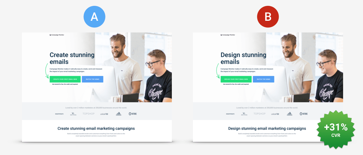
ConversionLab saw a 31.4% increase in conversions after a 77-day test using Unbounce’s Dynamic Text Replacement (DTR) feature. (Image Source)
A good example of successful A/B testing is the 31.4% lift in conversions achieved by ConversionLab. While they were already running well-optimized PPC campaigns for Campaign Monitor, they saw an opportunity to improve the landing page experience and make it more relevant to user search intent.
The solution? Over a 77-day test period, they used Unbounce’s Dynamic Text Replacement (DTR) feature. This feature allowed the landing page content, especially headlines and CTA buttons, to adjust automatically based on the visitor’s search terms.
Pro tip: You can use A/B testing tools like Convert, Unbounce, and Instapage to test your CTAs and your whole design.
Top 12 CTA Phrases
Below are some of the most widely used CTA phrases found on websites, sales pages, and landing pages:
Get Started Add to Cart Buy Now Get Offer Sign Up Free Act Now Claim Your Discount Download Learn More Join Now Reserve Your Spot Shop Now
Real-World CTA Examples and Success Stories
After reviewing the best practices for CTAs, let's examine some real-world examples of top brands and learn how to gain insights for your next project.
1. Hulu
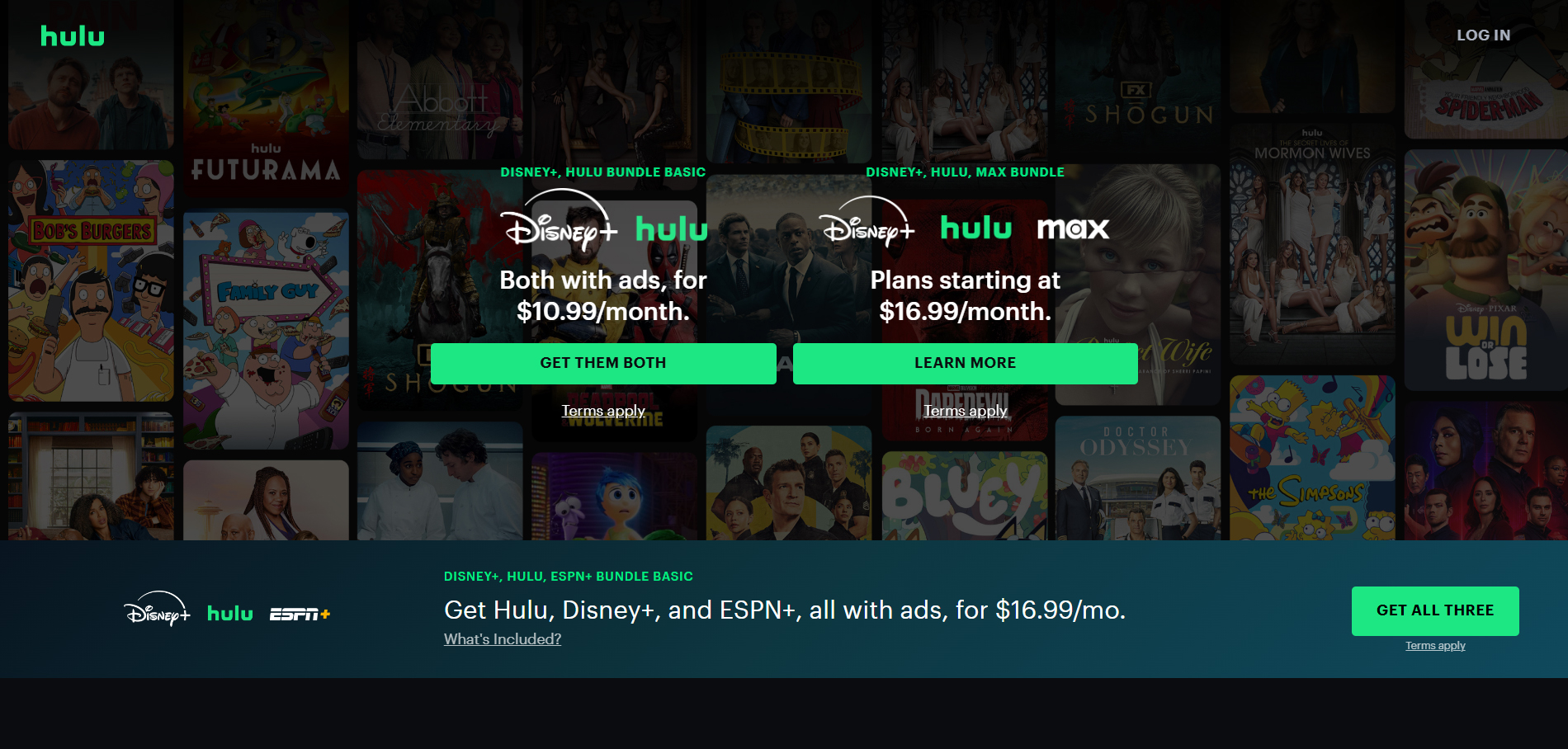
Hulu uses magnet phrases like 'Get them both,' 'Learn more,' and 'Get all three' as CTAs to communicate the value of the action being offered. These call to action buttons, styled in Hulu's signature light green, stand out against the rest of the page content. (Image Source)
Streaming platform Hulu is a great example of how to use CTA buttons with clarity and value. Phrases like “Get them both,” “Learn more,” and “Get all three” are simple magnet phrases that clearly express the benefit of the intended action. These call-to-action buttons, styled in Hulu’s signature light green, stand out against the rest of the page content.
The dimmed background featuring Hulu’s movie and TV show posters creates a strong visual contrast, making the CTA buttons stand out clearly on the page.
2. Netflix
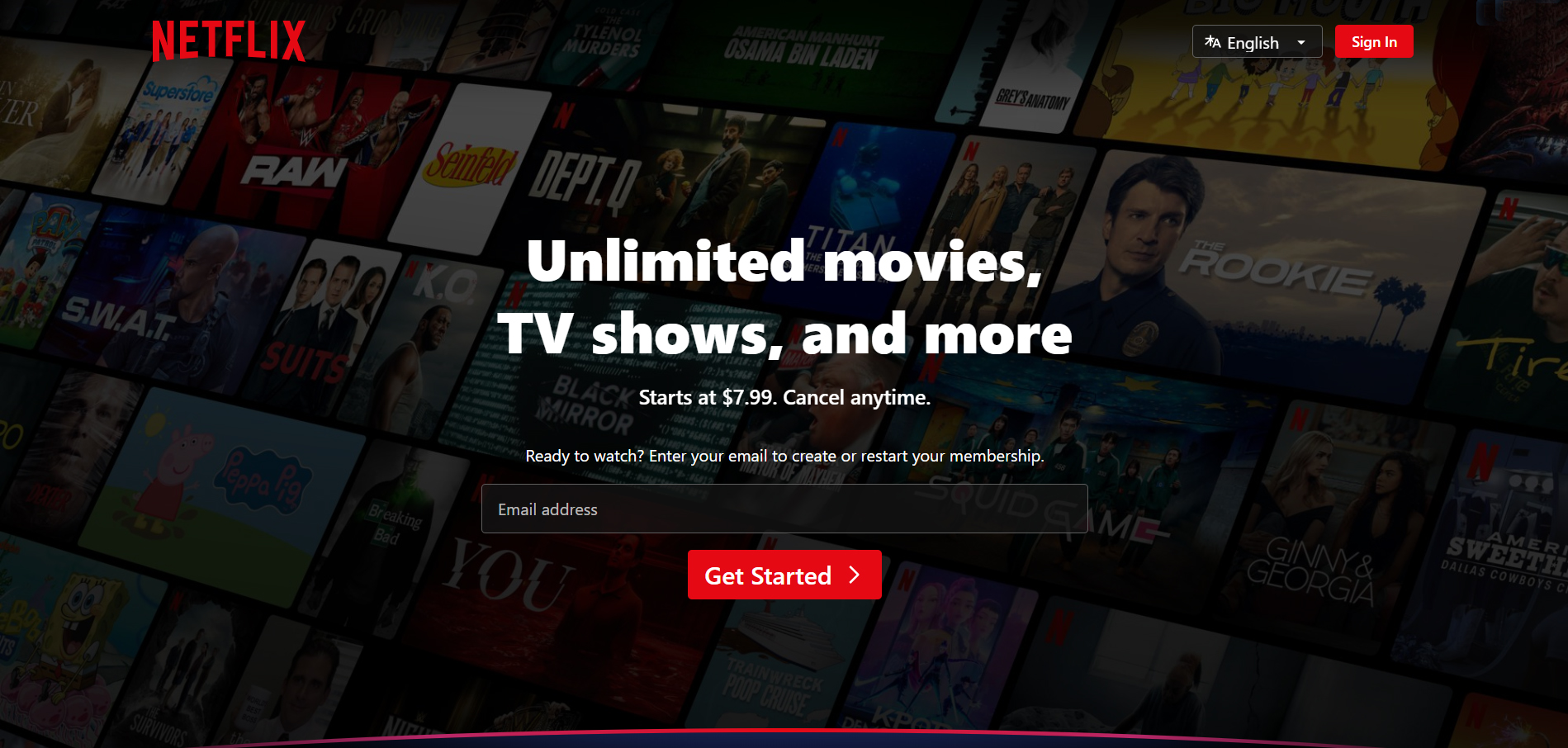
Netflix features descriptive, action-driven CTA phrases like the 'Get Started' button, placed against a dimmed black background filled with show and movie thumbnails. This design choice makes the red CTA button stand out and instantly grab attention. (Image Source)
Netflix, the world’s most popular streaming platform, excels at using descriptive, action-oriented CTA phrases. One good example is the “Get started” button, which stands out noticeably against a dark background.
Like Hulu, Netflix also uses a dimmed black background featuring thumbnails of shows and movies, which helps the red CTA button pop and draw immediate attention.
Another strong element on the homepage is the supporting message: “Starts at $7.99. Cancel anytime.” This simple phrase adds reassurance by addressing pricing concerns upfront and removing the fear of commitment, two common friction points for new users.
3. Prezi
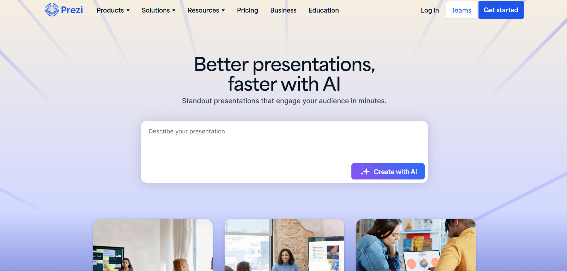
By highlighting inviting CTAs like 'Get started' and 'Try Prezi for free,' Prezi tells visitors what to expect. The buttons are set against a simple blue and white layout that makes them easy to notice while maintaining a minimal design. (Image Source)
Prezi uses clear and inviting CTAs such as "Get started" and "Try Prezi for free". These phrases tell visitors exactly what to expect, with the word “try” signaling that it’s easy to use and comes with low commitment or risk. Offering a free trial upfront helps users understand what the platform provides before asking for payment.
The CTAs are placed on a clean blue and white interface, allowing the buttons to pop visually without overwhelming the page. This minimalist approach supports clarity and visual focus.
4. Domino's
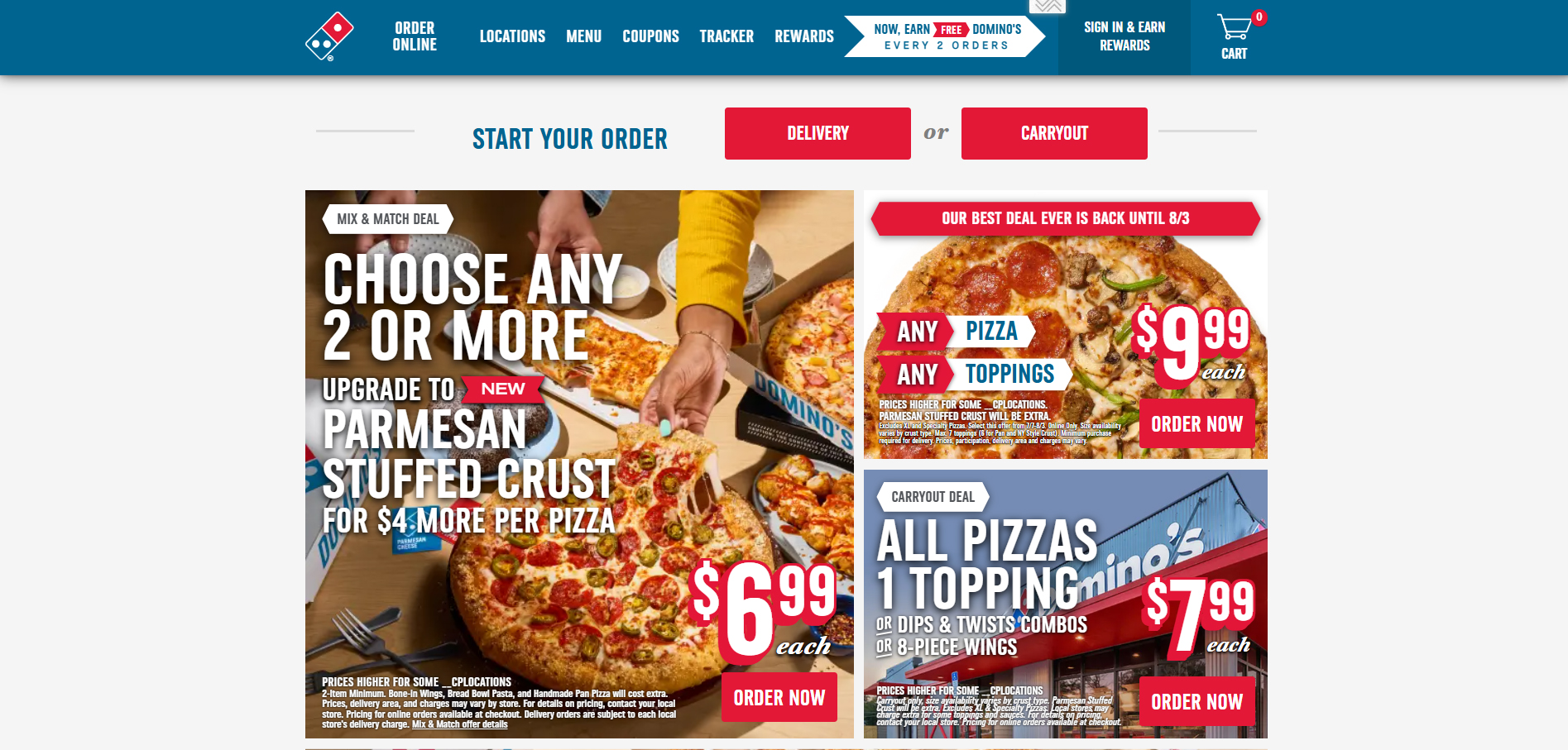
Domino’s streamlines the user journey with direct CTAs, such as 'Start your order,' 'Delivery,' and 'Take out,' catering to on-the-go users who want a fast and easy way to place an order. (Image Source)
Domino’s uses direct, choice-based words on its CTAs: "Start your order", "Delivery" and "Take out" to simplify decisions and speed up conversions, especially for hungry users browsing their homepage on their mobile phones. The “Order now” buttons also guide visitors to the checkout process on promotional campaigns, allowing them to place an order quickly without extra steps or clicks.
According to the 2024 company's annual report, over 76.3% of Domino’s orders come from digital channels, primarily through its website, driven by well-performed CTAs.
5. Zoom
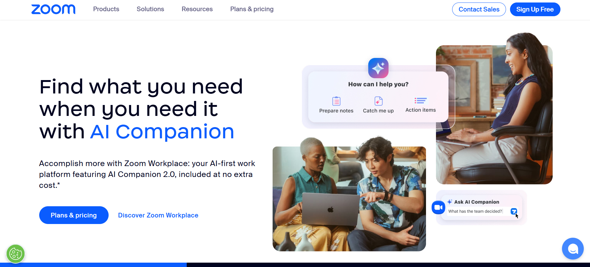
With CTAs like 'Sign Up Free,' 'Plans and Pricing,' and 'Discover Zoom Workplace,' Zoom provides a seamless user experience. The clean blue CTA buttons complement the white background, which makes them both attractive and readable. (Image Source)
Zoom's latest homepage showcases magnet-driven CTAs such as "Sign up free," "Plans and pricing," and “Discover Zoom workplace." These phrases invite users to explore at their own pace by offering clear paths for free and paid plans.
The clean blue CTA buttons fit nicely with the white background, making it easier to notice and read.
Zoom has also introduced an AI Companion using a well-written copy as a leading video conferencing platform: “The AI-first work platform for human connection.” The CTA "Discover the possibilities" sparks curiosity and will likely lead to exploring the potential of the new AI features.
6. Patagonia
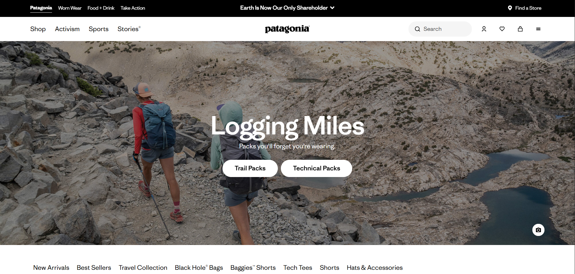
Patagonia uses clean white 'Trail Packs' and 'Technical Packs' CTA buttons, which are categories that many users are actively searching for. The homepage's minimalist black-and-white color scheme helps these buttons stand out clearly on the page. (Image Source)
Patagonia simplifies the browsing experience by using clean, white CTA buttons such as "Trail packs" and "Technical packs", which are categories most users actively search for.
The homepage features a minimalist black-and-white color scheme, which helps these buttons stand out while guiding visitors to top-level categories such as Men, women, kids, and babies.
Patagonia's activism page shares the history of its environmental mission since 1972, while encouraging visitors to get involved through a bold, action-oriented "Act now" CTA. This button leads to specific pages where users can learn more, volunteer, or donate in an ongoing environmental campaigns.
7. Slack
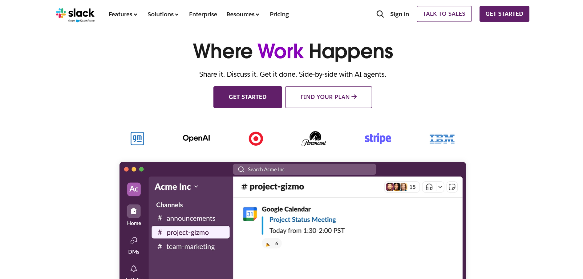
With CTAs such as 'Get Started' and 'Find Your Plan,' Slack effectively connects with its audience. The use of dark purple and white button backgrounds provides strong visual contrast, making the CTAs easy to notice and click. (Image Source)
Slack’s tagline: “Where work happens” resonates really well with its core user base. Widely used CTAs like "Get started" and "Find your plan" have contributed to a 30% conversion rate from freemium to paid users, according to a report by Encharge.
The dark purple and white button backgrounds create good visual contrast, making the CTAs easy to notice and click.
From Call to Action to Conversion
With the correct descriptive, engaging, and magnet-based phrases, combined with strong contrast, precise shapes, and proper placement, your CTA becomes one of the most powerful tools for driving user action and increasing conversions.
In this article, we’ve discussed the role of CTAs, their importance, and best practices to craft the perfect call to action for your brand.
Here's a few recap and key takeaways:
- Use clear, catchy, and action-driven words or phrases.
- Your font choice, button color, and good placement can impact visibility and readability.
- Study real-world examples from top brands, but test your own for more effective results.
- Conduct A/B Testing and continually optimize your CTAs, including colors, text, and position.
Aug 6, 2025

Creates insightful, strategy-driven content that translates complex design and branding concepts into accessible knowledge, supporting Ramotion’s mission to elevate digital experiences.