Card-based interfaces are becoming increasingly popular in modern digital products. Whether you’re using a streaming platform or an analytics dashboard, cards present information in a structured and organized way, while providing an improved visual experience.
Card UI design is a compact and comprehensive way to group information and simplify dense content. Good card design is one where each card focuses on a single idea, such as a product, task, or profile. The key benefit of card UI is that it allows users to quickly preview the information before making any decisions.
It is important to note that cards in interfaces are not just there for visual appeal. The functional benefits of cards add to the overall user experience, simplifying the user journey. However, cards are never the only solution in design. In certain cases, lists or tables can work better, especially when users need to compare information. This is why designers, including teams at the top UI/UX design companies, carefully evaluate when card interfaces can really improve usability.
In this article, we introduce the concept of card UI design, along with guidelines on where to use cards. We share the best practices to design scannable cards and some common mistakes to avoid in the process. We also share real-world examples to illustrate good card design principles.
Read along as we explore cards in UI/UX design.
What Is Card UI?
In simple terms, a card in UI design is a container that is used for one distinct object. This object could be a product, article, task, profile, movie, metric, or item. The goal is to group similar information and clearly separate one object from the other.
What is card UI design?
Card UI design refers to a modular pattern where similar information is grouped in containers. Cards could contain text, images, and action buttons, focusing on a single task. The design of better cards helps organize information while improving the visual appeal.
This presentation makes cards effective as grouped information is easy to scan. A single card may include a title, image, short description, and call to action, all arranged in a structured format. This approach to UI card design helps reduce clutter, thus aiding the users as they make sense of the content and accomplish their tasks.
The success of card designs is based on the extent to which they are scannable. The designers’ job is to ensure that users can quickly preview and understand the information in a card before deciding what to open, save, or compare. Whether browsing products or reviewing content recommendations, cards support fast decision-making without overwhelming users.
When Cards Work Better Than Lists
Cards work particularly well in interfaces where the users are expected to browse the feed. For example, when scrolling through feeds, product catalogs, dashboards, user profiles, and curated collections, cards can present information in simplified chunks. In all of these use cases, the users can quickly explore the options available to them without feeling overwhelmed.
One of the key strengths of card design in an interface is that it creates a structure that can help users decide what deserves more attention. Designers typically combine cards with visuals, labels, and short descriptions to provide enough context for quick decision-making, thus ensuring an efficient and satisfying user experience.
Cards are usually compared with lists and tables, and designers often have to choose between lists, tables, and cards. Lists and tables have their utility in specific circumstances. For example, they work best when users need to sort information, follow a sequence, compare prices, or scan one parameter across many items. Therefore, when designing an interface, it is important to consider the users’ goals.
How to Design Scannable Cards
Good card design requires careful consideration of the basic principles of UX and the needs of the target audience. In card-based design of an interface, readability, hierarchy, and action work together to help users make quick decisions. If designed and employed correctly, cards can serve as powerful decision-making tools.
What are the best practices to design scannable cards?
Here are some best practices to design effective and scannable cards.
- Use one subject per card
- Follow a clear card structure
- Prioritize key information
- Keep card actions simple
Some of the best practices to design easily scannable cards are as follows.
Use one subject per card
One of the most important principles of card design is to ensure that each card focuses on one specific subject. A card should always represent a single entity, whether it is a product, profile, article, or movie. This focused approach makes it easy for users to scan and understand the content without the unnecessary cognitive load.
It is also important for designers to avoid mixing multiple concepts, actions, and data in a card. When users see a lot of information packed in a single card, they can feel overwhelmed and lost. Additionally, unrelated details can move the users away from the tasks they want to accomplish.
Follow a clear card structure
Similar to the design of a product or service, a familiar and simple structure is important for good card design. Effective card UI designs have a predictable structure where the interface includes an image or icon, a title, a short description, metadata, a status indicator, or a call to action. The organization of information depends on the context and use case, but the overall structure should be familiar to the users.
Clear and Consistent Layout Source
When designing cards, it is critical to focus on the UI elements that the users actually need. Including unnecessary information can make it hard to scan the cards, thus impacting overall clarity.
Prioritize key information
Another best practice for good card design is to provide the most important information up front. The nature of this information can vary. For instance, in some cases, the price of a product might be the key information, while in others, a chart or graph might be more important. Depending on the context, the designers should prioritize the right information for their audience.
Highlighting key information does not mean ignoring secondary pieces of content. Instead, the secondary details should be presented in a way that they do not compete for attention. This is where visual hierarchy can play a crucial role. Additionally, decorative elements, such as badges and icons, should never overpower the core message or distract users from important information.
Keep card actions simple
More often than not, when users are interacting with a card, they are going to perform a certain action. A good card can make the next action, such as a click or tap, feel obvious. Clear action buttons and good labels can improve the user experience.
It is also important to limit the number of secondary buttons and controls on a single card. Too many equally prominent buttons or actions can make decisions harder, thus leading to a bad user experience.
Card Layouts in Grids and Feeds
Designing a single card is important. However, cards do not stand alone in an interface. Individual cards are only one part of the experience. The overall layout of cards in the form of grids, feeds, dashboards, and responsive interfaces determines the user flow. The organization of card-based interfaces is impacted by important decisions, including spacing, visual hierarchy, consistency, and rhythm. Some of these decisions are discussed below.
Keep card groups consistent
When multiple cards are presented in the form of a grid or feed, consistency in design becomes critical. Titles, metadata, status indicators, and actions should be consistent in all the individual cards in the group. This consistency will create a predictable layout, making scanning faster and more efficient.
Consistency is not just about the content in a card. This concept also extends to spacing, proportions, and content order. While the content on each card might be different, a familiar presentation and layout are important.
Use spacing and size intentionally
White space between cards in a grid is important for several reasons. On the one hand, it reduces clutter and visual noise. On the other hand, it also leads to a more aesthetic design. Designers should use card spacing carefully and intentionally, where each card has enough room to stand on its own while still feeling connected to the surrounding layout.
Another connected idea to consider is to ensure that card density is managed in a way that the layout feels scannable and browsable. Different sizes of cards may be used to highlight priority. However, the size variation should not cramp the interface.
Design states and sccessibility
One strength of cards in UI design is how they communicate actions and feedback with different states, such as hover, pressed, selected, disabled, and loading states. The designers should clearly define and distinguish these states to provide a consistent, familiar, and interactive experience.
A good card UI should also be accessible. The users should be able to interact with cards with their keyboards, screen readers, and other assistive technologies. This is also where the fundamental accessibility principles, such as contrast, alt text, and motion, play their part.
Common Card UI Mistakes
Now that we know about card UI design and the best practices to design and present cards in an interface, it is worth understanding some of the most common design mistakes. The following issues can reduce usability, slow down browsing, and prevent users from getting a satisfying experience.
What are some common card UI mistakes?
Some common card UI mistakes are as follows.
- Using cards for comparable data
- Adding too much content
- Breaking group consistency
- Overusing motion and effects
Using cards for comparable data
Cards make it easy for users to scan the document, and they also look visually pleasing. However, cards should not be used when the goal is comparison. For example, when users need to compare prices, product specifications, rankings, or large sets of information, individual cards can make comparison difficult and overwhelming.
Lists and tables are more effective in such cases because they align similar data in rows and columns, thus allowing direct comparison. This familiar and predictable structure allows users to scan one feature across multiple items or products, whereas variable card layouts can slow the process down.
Adding oo much content
One of the most common card design mistakes is adding a lot of content. This happens when designers start treating cards as mini landing pages and overload them with content. Cards with long descriptions, excessive metadata, multiple badges, and competing buttons make it hard to understand the content.
This is where it is important to keep the purpose of card UI design in mind: quick scanning before making a decision. Designers should remove unnecessary details and help users in the decision-making process.
Breaking group consistency
Consistency is a key design principle, and it applies to card design as well. A group of cards, organized in the form of a grid or feed, needs to be consistent. This means that all the cards in a group should follow the same structure and design rules, such as title placement, metadata order, button position, and image ratio.
Inconsistencies among cards lead to slow browsing and a poor user experience. Designers should always avoid inconsistent card design to ensure a familiar and satisfying experience.
Overusing motion and effects
Animation, when used in card design, should not just serve a decorative purpose. Instead, animation should support feedback and transition between content. It is also important to ensure that all the motion elements and UI animations are subtle, so they do not end up overshadowing the content.
Animations, such as hover effects, pop-ups, and motion graphics, should always be used with care. Typically, animations tend to draw more attention, and if their excessive use can slow the users down.
Best Card UI Examples
There are several good card design examples found across digital products. Many modern digital products and services are switching to cards because they provide a good browsing experience to the audience. The best cards stick to key design principles and prioritize the needs of users. The following examples highlight some of these examples that can be used for inspiration.
Pinterest card UI
Pinterest is one of the best card UI design examples, where a lot of content is organized for quick, visual browsing. The masonry-style layout of Pinterest works perfectly well for images of different heights, where each card can stand out alone and also appear to be a part of the feed.
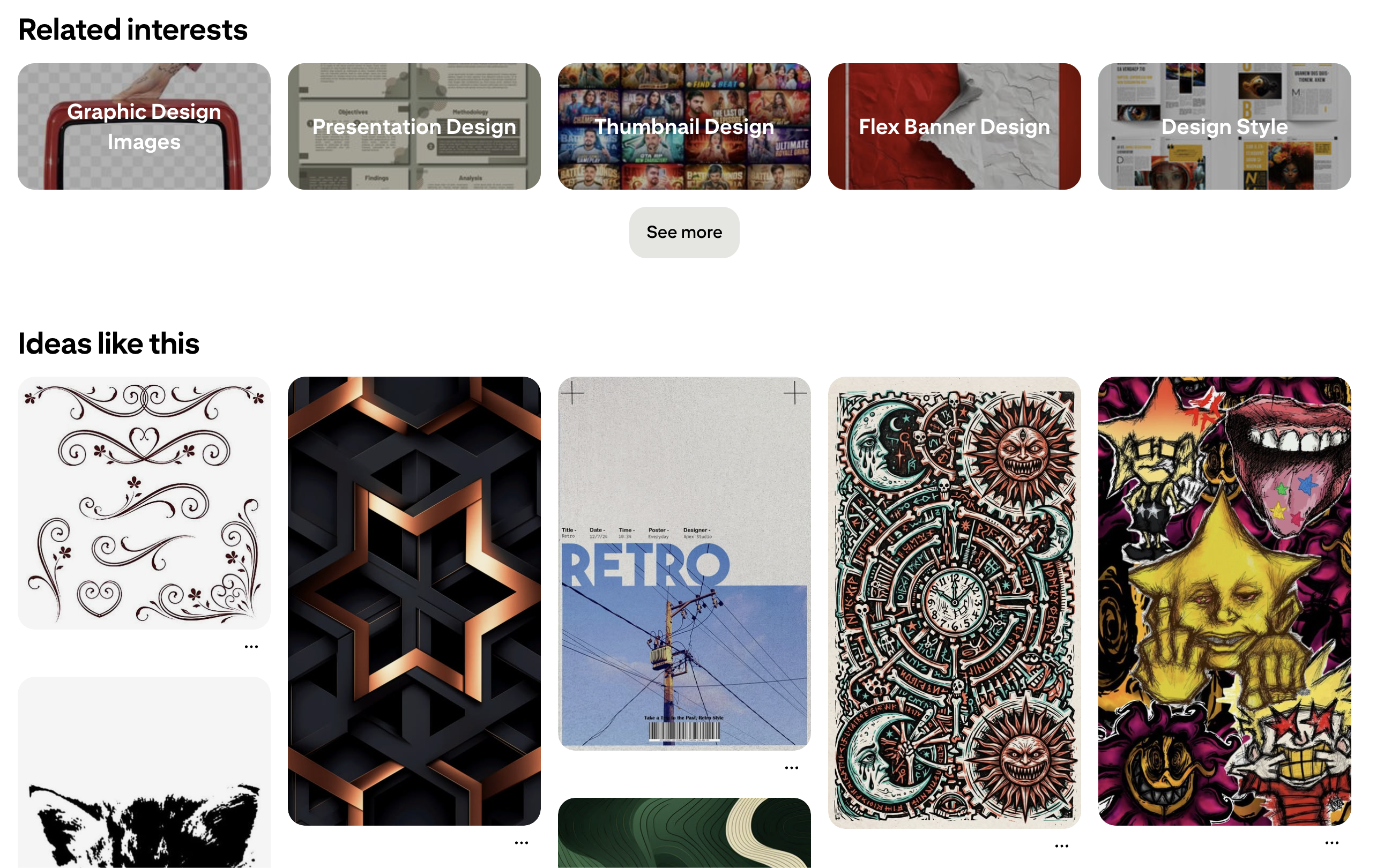
Pinterest and Visual Browsing (https://www.pinterest.com/)
One of the key things to note in Pinterest’s cards is that the content in all cards is not necessarily identical. This highlights that card design can be made engaging, effective, and pleasing without enforcing strict uniformity in content.
Salesforce dashboard cards
Salesforce provides an example where the value of different data types is enhanced by applying good card design principles. In a typical Salesforce dashboard, different types of information, such as metrics, charts, reports, and widgets, are organized as distinct units, helping users make sense of information.
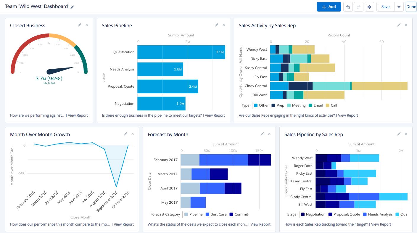
Salesforce Displaying Data (https://galvintech.com/effectively-manage-sales-pipeline-using-7-powerful-salesforce-dashboards/)
This approach works particularly well when the content types, such as charts, are not homogeneous. Good card designs, therefore, have the capability to accommodate different types of data without overwhelming the audience.
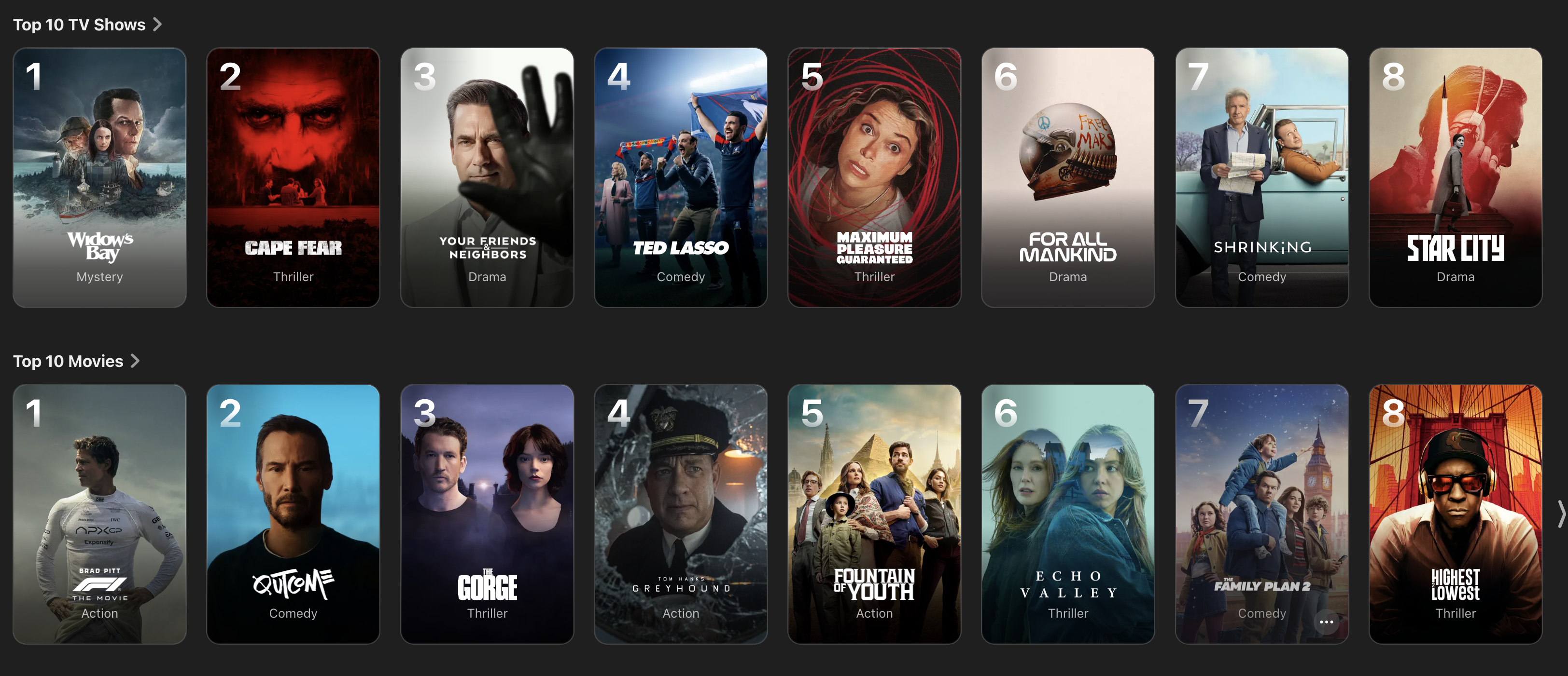
Netflix content cards
When it comes to media, such as movies and TV shows, Netflix is an important example to consider. The design of its UI shows how cards can support fast, effortless media browsing by highlighting important yet minimal information. Large thumbnails and clear titles help users scan several options without feeling frustrated.
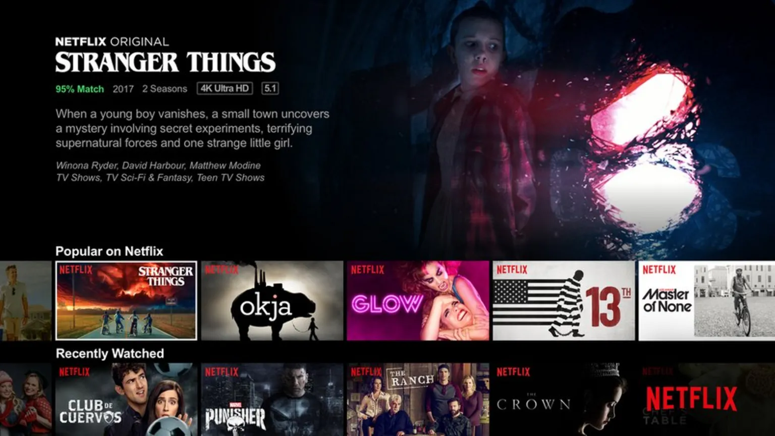
Netflix and Cards for Media Browsing (Image Source)
Another key thing to note in the design of Netflix UI is the hover preview. As users hover over a card, they can quickly see the preview without leaving the main window. This helps them in the decision-making process.
Apple TV+ card design
Apple TV+ is another leading example in card design for media and streaming platforms. The thoughtful design and polished visual hierarchy are the unique features of Apple TV+ UI. Each card presents titles and supporting information in a balanced visual manner, allowing users to quickly scan several cards at the same time.
Apple’s Visually Pleasing Cards (Image Source)
Apple TV+ cards also highlight that consistency is key for a refined interface. Neat and rounded corners, along with generous spacing and good visuals, make the experience enjoyable. The motion elements are there, but they are subtle enough that they do not cause hindrance in the user journey.
Trello task cards
Trello provides an example of card UI design from the world of productivity and project management. Trello task cards function as active work objects, instead of just previews of the content. Each task card on Trello’s dashboard stands alone while maintaining its place in the larger project. The cards contain valuable information, such as deadlines and updates, regarding the task and project.
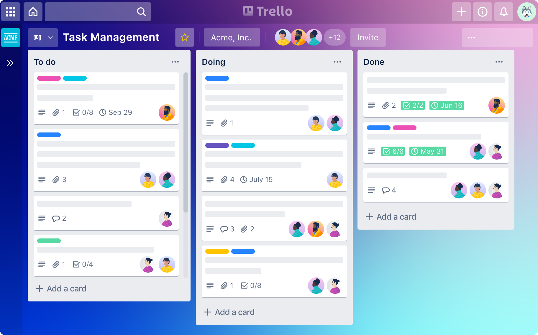
Organizing Tasks with Trello Cards (Image Source)
One important feature of Trello is that the cards support direct interaction. Users can drag and drop cards between lists to change the status of a task. The surrounding cards provide context to the users, thus creating a healthy workflow.
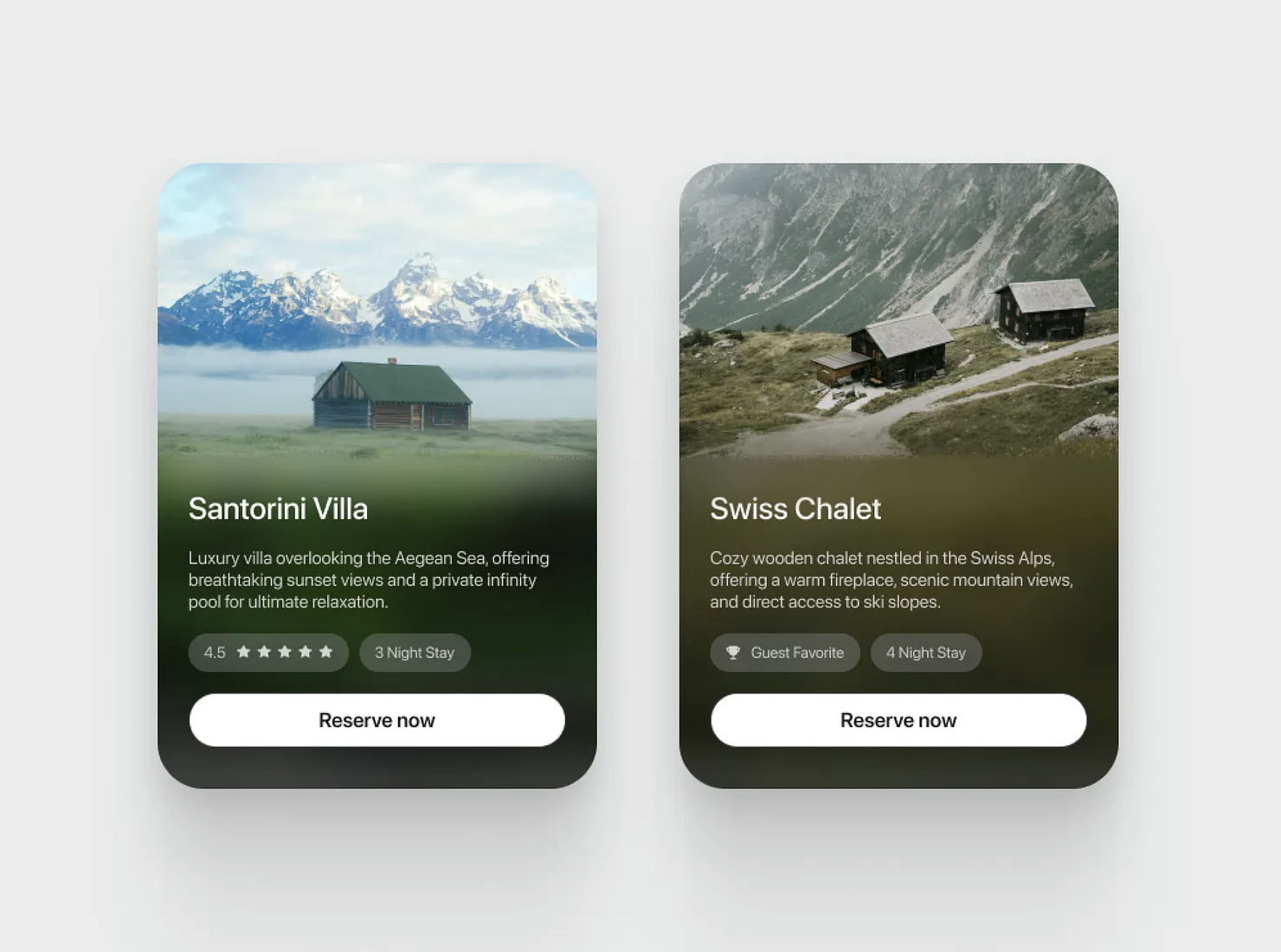
Profile card UI
Profile cards are used by several platforms. These serve as an excellent example of card UI design, where a lot of information is packed in a small design element. Profile cards can be used to represent experts, consultants, specialists, and team members. These cards present key details, such as name, role, profile photo, rating, availability, or area of expertise, in a compact format.
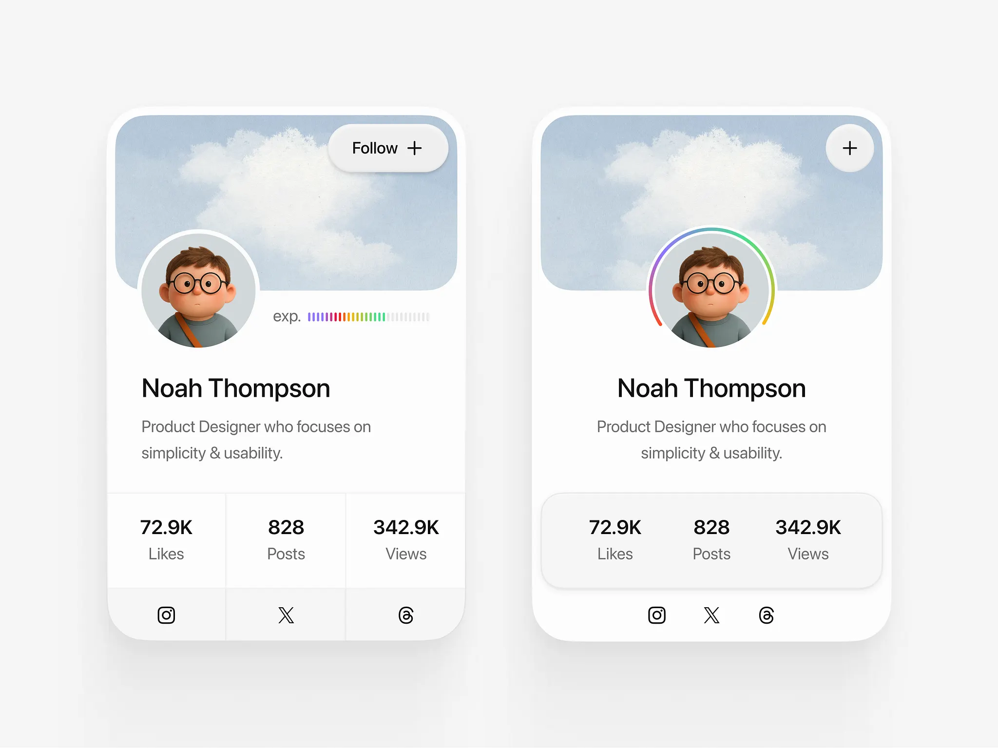
Simple and Effective Profile Cards (Image Source)
Good profile cards provide all the necessary information while helping users in the decision-making process. For example, clear calls to action, such as “View Profile”, “Book Noan Appointment”, “Reserve Now”, or “Contact”, guide the users toward the next step while ensuring quick and easy browsing.
Conclusion: What Good Cards Do
Well-designed cards can play a significant role in the user journey, where they help the audience scan and understand information quickly before making a critical decision. Cards provide means to preview content and guide action in a way that is simple, clear, and hassle-free.
When designing cards, it is important to consider the basic principles of design. Strong cards are the ones that make the lives of users easier by providing familiar, consistent, and simple experiences.
The best use of cards in UI is when the goals are browsing and discovery. When the users are looking for comparison, cards might not be the way to go. They should not replace lists or tables simply because they are visually appealing. Choosing the right layout for the task always leads to a more usable and effective interface.

Creates insightful, strategy-driven content that translates complex design and branding concepts into accessible knowledge, supporting Ramotion’s mission to elevate digital experiences.