When discussing contrast in design, we mainly talk about the differences between various visual elements—differences that make them feel distinguishable and memorable. Contrast is often why we can separate text from a background or understand which element is the headline and which is the fine print. The contrast design principle is one of the most critical tools in any designer’s toolkit because it guides the eye, builds hierarchy, and adds meaning without explanation.
Strong contrast sharpens the user’s visual senses. It clarifies what’s important, where to look next, and how to feel about the experience. From a practical perspective, contrast in design affects everything from readability to emotional tone, making it essential in user experience and branding work.
Companies that understand this, and prioritize good design — including the principles of contrast — show up to 32% higher in revenue growth than those that don’t. This kind of data proves the power of visuals done right. And contrast sits at the heart of that work.
Understanding Contrast in Design
Contrast is the visual difference between elements in a composition. It’s what makes a call-to-action pop or ensures a logo remains readable in any setting. At its core, contrast means differentiation — and it’s applied to all kinds of visual elements.
- Color: Bright vs muted, complementary hues, or dark on light
- Shape: Rounded vs angular, geometric vs organic
- Size: Big next to small
- Texture: Smooth beside rough
- Lightness and darkness: A key element in grayscale or monochrome
These characteristics help deliver functional, accessible, and emotionally resonant experiences. Whether you're designing a brand identity, a mobile app, or product packaging, contrast in your designs brings clarity to the complex.
You’ll see contrast in designs used across branding systems, digital interfaces, illustrations, editorial spreads, advertisements, and product packaging. It works at micro and macro levels — from a single button to an entire layout.
Why Contrast Is the Key to Effective Design?
The contrast design principle improves design in four critical ways.
| Readability | Clear contrast between foreground and background elements ensures that text, icons, and visuals are legible. Without enough contrast in your designs, your work becomes visually noisy or hard to decode. |
| Emphasis | Contrast lets you draw attention where it matters — like a signup button, a new feature, or a key stat. By creating contrast in design, you’re assigning importance to certain elements in the composition. |
| Hierarchy | Through contrast in size, shape, or color, designers communicate order. Users understand what’s primary, what’s secondary, and what supports the rest. |
| Emotion and tone | Using contrast helps reinforce brand identity — bold, high-contrast palettes can feel confident and energetic, while softer contrasts may feel calm and understated. |
This is why contrast isn’t optional. It’s fundamental to how we perceive and interpret visual information. When done right, it guides users intuitively. When ignored, it leads to friction, confusion, or missed connections.
5 Contrast Types in Design
There are several ways to build contrast into your designs — and knowing when to use each kind creates visual interest and clarity. Each type can exist independently or combine with others to build powerful design compositions. Let’s break them down.
1. Color contrast
Color is the most immediate form of contrast in design. Our eyes respond instinctively to variations in hue, brightness, and saturation. This makes color contrast especially powerful for drawing attention and evoking emotion.
Designers often rely on contrasting colors — think complementary colors like blue and orange — to generate immediate visual pull. You’ll also see examples where light text is placed on a dark background, or vice versa, to ensure high legibility.
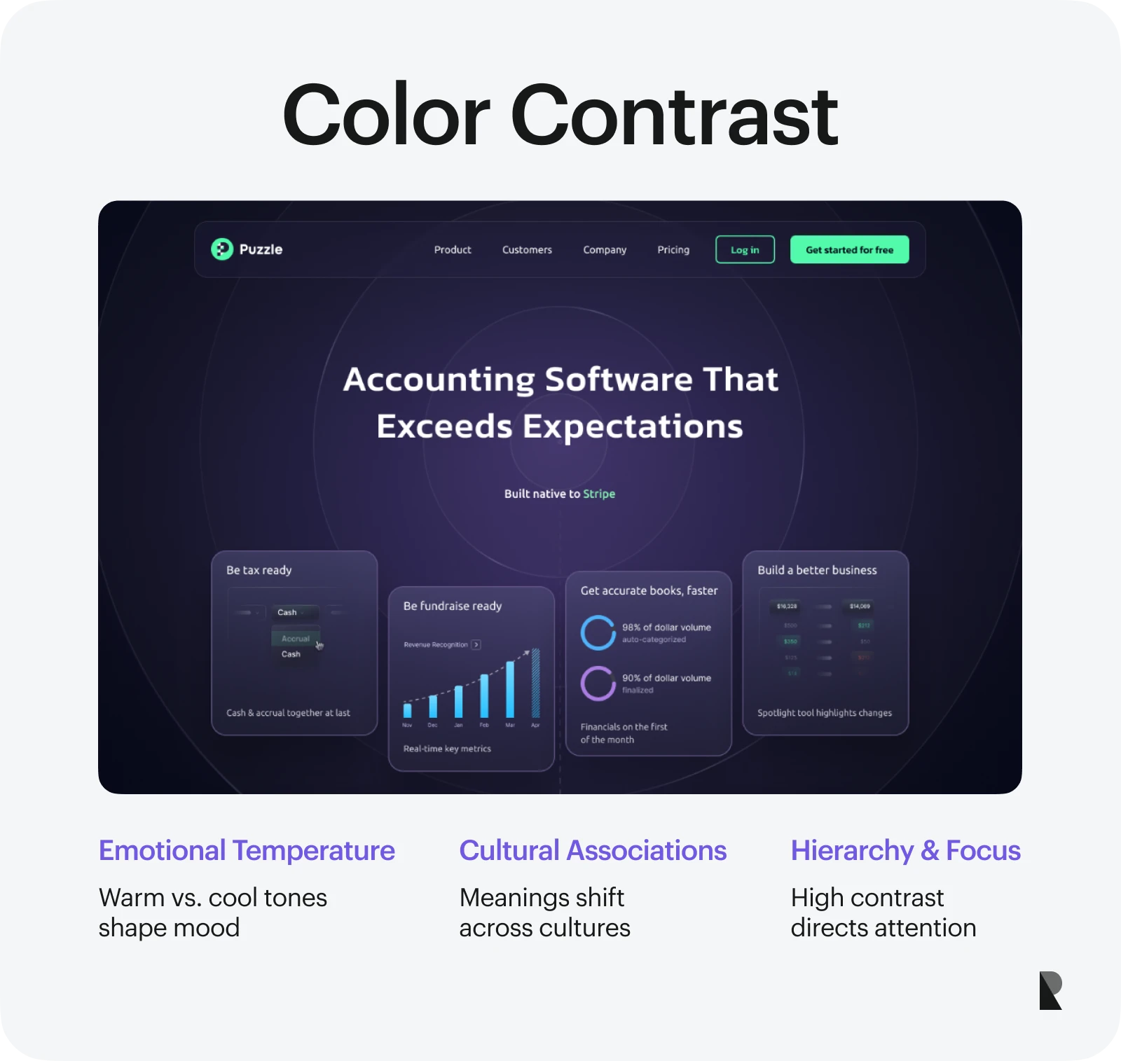
When using contrast in color, it’s essential to test how it performs across devices, lighting conditions, and accessibility needs. Poor color contrast isn’t just a visual miss — it can exclude users with visual impairments or color blindness.
And yet, when done well, color contrast isn’t just practical. It’s emotional. Think about the warm/cool contrast in a wellness brand, or the jarring vibrancy of red on black in a music app. These aren’t just aesthetic choices. They speak to the personality of the brand.
2. Size and scale contrast
Changing the scale of visual elements is a straightforward way to create emphasis and hierarchy. Significant elements draw attention, while smaller elements fall into the background. This dynamic tool is used in typography, layout, and illustration alike.
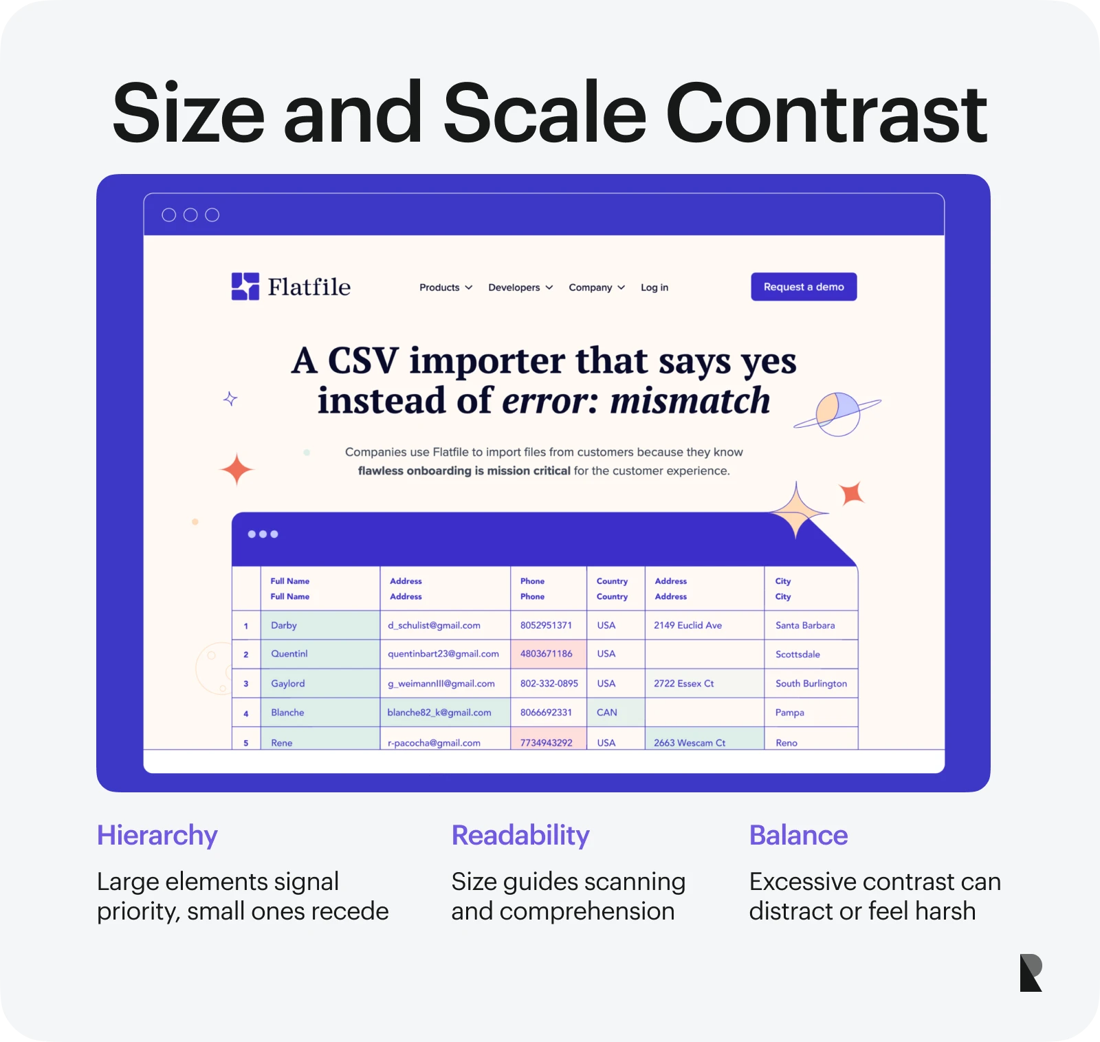
Designers use size contrast to help users scan information — especially in digital contexts. This becomes critical in user interface design firms, where clarity and attention guidance can make or break product usability.
Too much contrast between sizes, however, can overwhelm or feel aggressive. Striking the right balance is key. Start with the message: what matters most? Then scale accordingly.
3. Shape and form contrast
Contrasting shapes can add expressiveness, energy, and edge to your composition. Pairing geometric shapes with organic forms — or soft, round elements with sharp, angular ones — creates visual tension that pulls the eye.
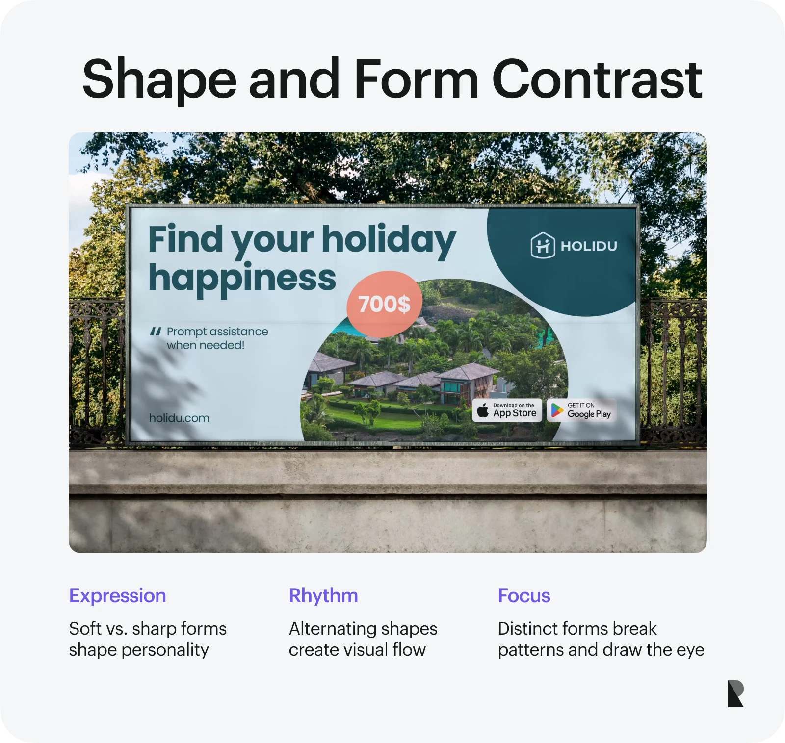
This type of contrast adds both rhythm and personality and shapes perception in subtle ways. Rounded shapes feel friendly, while angular ones feel assertive. Creating contrast in shapes unlocks a deeper layer of storytelling in your visual language.
The same applies to layout design. Grid-based systems may rely on square structures, but inserting a bold circle or an irregular form can help break the monotony and add focus.
4. Texture and pattern contrast
Visual texture adds tactility — even in flat digital designs. A matte texture against a glossy surface, or a smooth background behind a rugged pattern, introduces depth. This contrast works exceptionally well in branding and packaging design, where physical materiality matters.
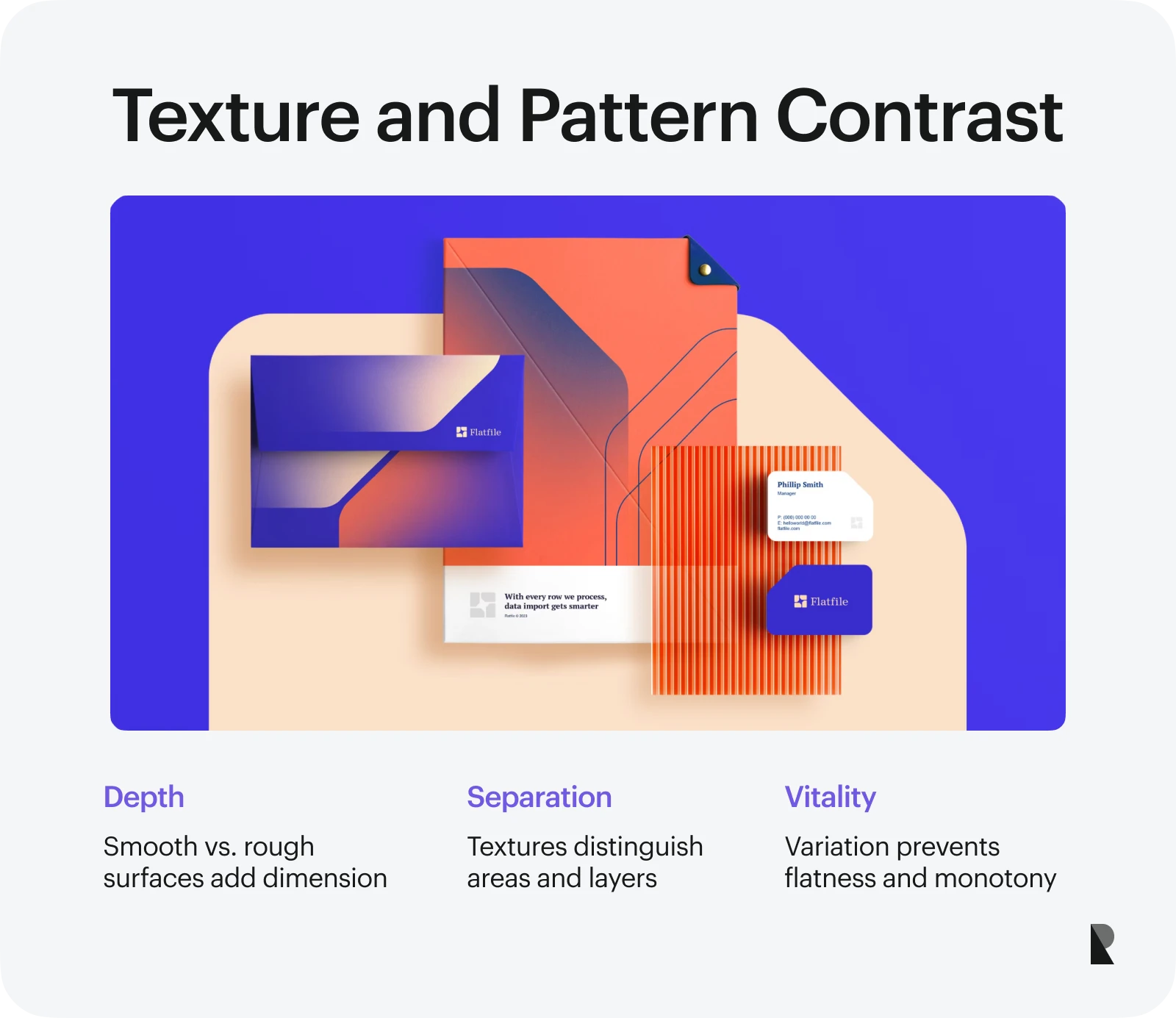
In graphic design, texture is often implied through patterns, image treatment, or background detailing. These techniques help distinguish sections, create layers, and lead the eye — even without physical interaction.
Texture contrast is also a way to break visual uniformity. When all surfaces look the same, designs fall flat. Mixing textures allows designers to build compositions that feel more lifelike and layered.
5. Light and dark contrast
Contrast between light and dark is one of the oldest principles in visual art. In design, it adds dimension, creates mood, and ensures readability. A classic example is white text on a black background — high contrast, high impact.
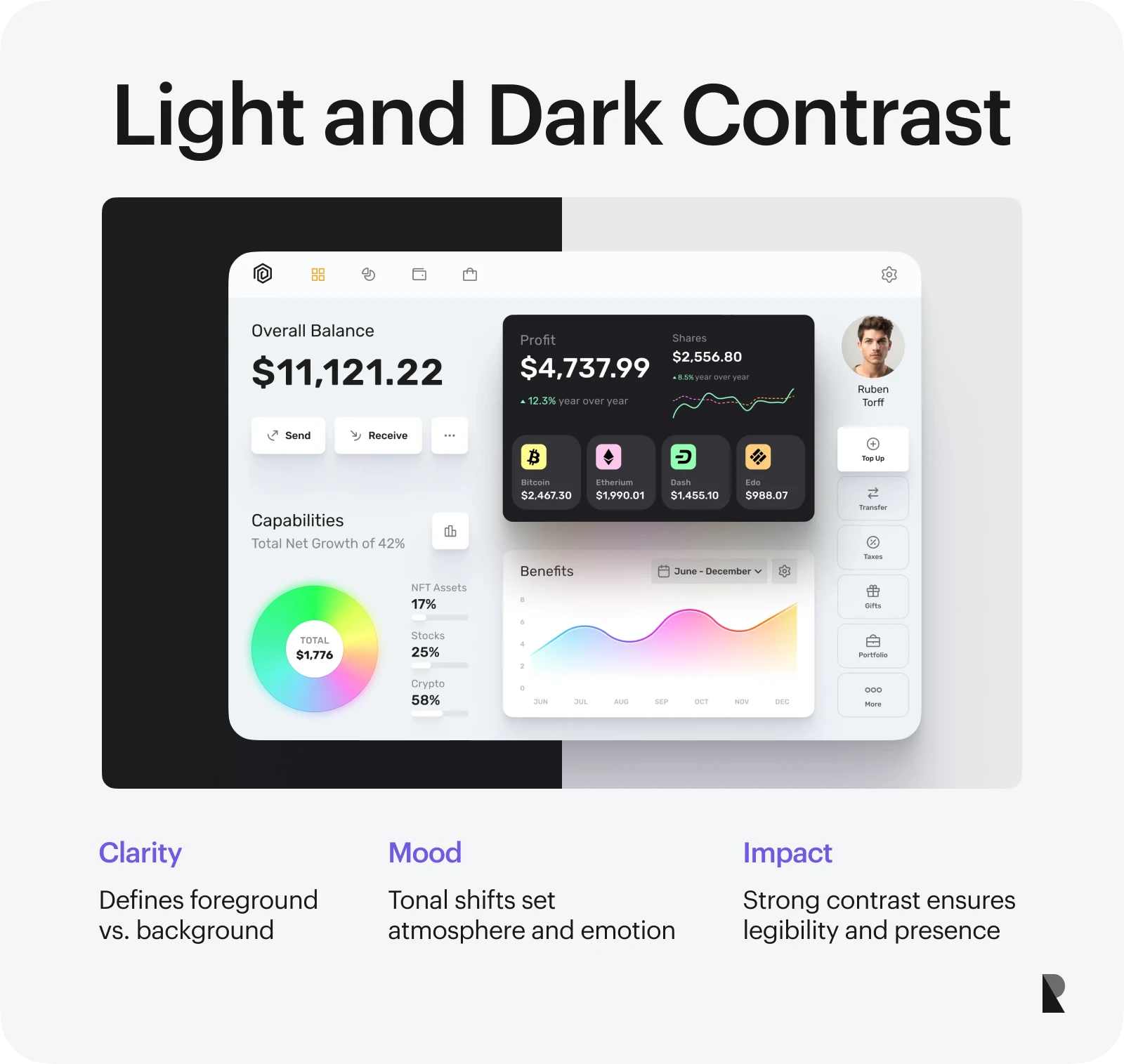
Light/dark contrast helps define foreground and background relationships. It clarifies what’s interactive and what’s supportive. It reduces cognitive load and allows users to navigate efficiently when used correctly.
You’ll also find this principle applied in graphic design for posters, magazine spreads, and branding. Black and white photography, monochrome layouts, and chiaroscuro illustration techniques all rely on strong tonal contrast to stand out.
How to Use Contrast in Graphic Design?
Contrast works best when it’s deliberate. Random variation might grab attention for a moment, but it won’t hold it. To use contrast best, you need to approach it with intention, clarity, and balance.
Let’s look at a few best practices for applying the contrast design principle in modern graphic design. From color palettes to testing, each tactic contributes to more readable, more effective compositions that help users navigate — and act.
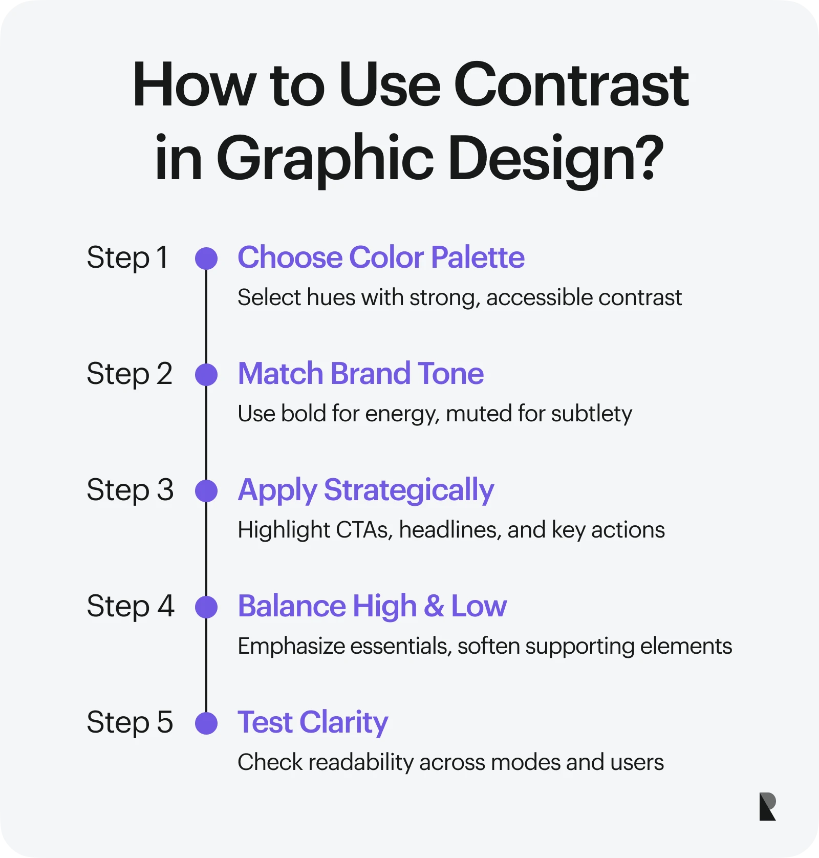
Choosing the Right Color Palette
Color choices are foundational to visual identity, beginning with selecting combinations that create strong contrast. Designers often use tools like color wheels or accessibility checkers to ensure that there is enough distance between hues, especially for primary actions and navigation.
Start with the brand’s emotional tone. Bold, high-contrast colors often signal energy and modernity. Muted palettes with subtle contrast may feel softer or more editorial. Regardless of the mood, contrast in design helps give the audience clarity.
Use contrasting colors strategically — for example, a white font on a bold green CTA button — to drive the eye where you need it. That said, you must also ensure your palette is functional across light and dark modes, print and digital, and for users with varying visual abilities.
A strong palette doesn’t just make things look good; it makes them clear. If there's too much contrast, it becomes jarring. If there’s too little, things blur together. Balance test early.
Balancing High and Low Contrast
Not everything on a screen or page should scream for attention. Part of using contrast effectively is knowing when to dial it back. High contrast helps emphasize key actions, messages, or headlines. Low contrast supports flow, spacing, and harmony.
Consider high contrast as punctuation — you want it at the right spots, not everywhere. Use it for CTA buttons, error messages, or major headlines. That’s where you want sharp visual separation.
Low contrast, on the other hand, helps avoid visual fatigue. It supports backgrounds, secondary copy, and supportive visuals. By pairing both types thoughtfully, you make the composition more straightforward to navigate — and nicer to spend time with.
The best UX/UI design agencies excel at this balancing act. They know when to turn up the contrast for impact and when to let the interface breathe. This is a big reason companies turn to outside design partners — to create systems that communicate well without feeling heavy-handed.
Using contrast for call-to-action (CTA) elements
Few things matter more than how your CTAs perform. That’s where contrast in your designs becomes a conversion tool. Use clear size contrast (a button should be bigger than its label). Use strong color contrast (the button should stand out from the background). Use shape contrast (if the layout is primarily rectangular, a pill-shaped CTA will pop).
These aren’t just aesthetic decisions — they’re usability choices. Users shouldn’t have to search for the “Sign up” or “Buy now” button. Strong contrast in design makes the path obvious. And don’t just guess. A/B test different versions to see which draws more interaction. You’ll often find engagement improves naturally when you use contrast thoughtfully.
Testing contrast for better user experience
Contrast doesn’t exist in a vacuum. The best designs consider how contrast functions for different users, screens, and environments. Testing is the final step that separates good intentions from great execution.
Use online tools to test color contrast ratios and accessibility standards, especially if your product serves a broad or global audience. Simulate color blindness or low-light conditions to see how contrast behaves. When testing CTAs or visual hierarchy, gather real feedback. Do users naturally find the information they need? Are key actions easy to see and understand?
These tests are part of what separates good from great design. In fact, many companies work with a user interface design firm specifically to handle this level of detail — blending aesthetic skill with usability research. Even something as simple as adjusting contrast in a menu or footer can improve conversion and navigation metrics. The more intentional you are, the better the experience becomes.
Conclusion
The contrast design principle is a quiet powerhouse. It helps your work communicate before a single word is read. It establishes order, creates emotion, and adds clarity — whether you’re building an app interface, a billboard, or a brand identity. By paying close attention to contrast in design, you improve how things look — and how they work. Whether you’re adjusting color, size, shape, or texture, your design becomes easier to use, feel, and trust.
The most effective designs aren’t just clever. They’re clear. They understand the human eye, the visual senses, and how we process information. Contrast is what guides that connection. And if you want your brand to resonate across platforms, audiences, and screens, this design principle is crucial to getting right.
If you're looking for support bringing visual differences to life — in a way that works for both brand and user — explore what our team at Ramotion has created. Our work blends brand identity, user experience, and development into design systems that do what contrast is supposed to do: clarify, elevate, and connect.
Sep 3, 2025

Creates insightful, strategy-driven content that translates complex design and branding concepts into accessible knowledge, supporting Ramotion’s mission to elevate digital experiences.