
Online competition is fierce. You’re expected to drive rapid results while still delivering a great user experience. That tension—speed versus quality—plus relentless performance pressure, makes small deceptions tempting and often routine.
Vague wording, hidden fees, pre-checked boxes, and fake countdown timers are deliberately designed to push users toward choices that benefit the business. Manipulation becomes a strategy, and everyone seems to do it that it starts to feel normal. But these seemingly small design tactics carry real risk to the users and your brand.
This article breaks down what dark patterns actually look like in UX, why they’re so dangerously tempting, and how to spot them before they become part of your product.
What are Dark Patterns?
Dark patterns are deceptive interface designs that push users toward decisions favorable to the company. They can be as simple as making one button significantly more prominent than another, or as complex as requiring multiple steps to reject an offer. They can also present as confusing language that preys on user vulnerability, who are more likely to skim than to read every word carefully.
Where dark patterns appear online
Dark patterns are alarmingly ubiquitous across the digital landscape, seamlessly integrated into the majority of websites and mobile apps we interact with daily across different industries—SaaS, fintech, gaming, etc. They have become the norm rather than the exception, with over 75% of companies employing them in their strategies.
They appear in virtually any digital interaction, including:
- Purchasing flows
- Subscription and trial signups
- Account deletion menus
- Pop-up checkboxes
- Cookie banners
So, why do brands keep implementing unethical UX practices? Because they work.
Why Dark Patterns Work
Dark patterns lean on inherent psychological tendencies—appealing to cognitive biases, triggering FOMO (Fear of Missing Out), and fabricating social proof. Designers manipulate visual hierarchy and use misdirection to control how users process information. Language is deliberately structured to confuse or shame users into decisions that reward the company. And humans naturally choose the path of least resistance, making pre-checked boxes for subscriptions go unnoticed.
But these short-term wins come with a price.
How Dark Patterns Harm Users and Brands
While dark patterns can boost conversions briefly, they erode long-term trust and value. The costs are significant.
Erode trust and reputation
Dark patterns leave customers feeling taken advantage of, tricked into paying for unwanted add-ons or subscriptions. These techniques disproportionately exploit vulnerable populations, such as older users or people with low digital literacy who may not recognize the signs of unethical UX. Once customers realize they’ve been manipulated, trust and brand credibility suffer. Often permanently.
Decision fatigue and lower engagement
Many dark patterns trap users in exhausting loops or complex flows if they refuse to choose options favorable to the business. While this may increase short-term conversions, users experience frustration and fatigue. Tricked users are less likely to return.
Loss of data privacy autonomy
It’s easy for brands to hide questionable practices under confusing and often very lengthy privacy and terms pages. Small print, dense legalese, or buried disclosures can lead users to unknowingly allow wide data sharing with third parties without the knowledge of users.
Deceptive patterns are normalized over time
When many companies use dark patterns, the practice normalizes and pressures others to follow. This increases user cynicism and harms the broader digital economy as people become hypercautious about online offers.
Hefty fines (we’re talking millions to billions of dollars!)
Regulators worldwide view dark patterns as consumer fraud. Brands face massive class-action lawsuits with hefty regulatory penalties—sometimes in the millions or billions—plus the added cost of rebuilding reputation and trust.
Hire one of the best UX design agencies that can integrate and execute ethical UX practices and build your brand for success.
Examples and Types of Dark Patterns
Regulators, like the FTC (Federal Trade Commission), and consumer groups have identified multiple dark pattern types. Below are common categories with real-world dark patterns examples.
1. Sneaking
Sneaking happens when companies add unexpected charges—mandatory fees, auto-renewal terms, or extra-cart items—after users are already committed. This exploits the sunk cost fallacy and commitment bias.
Hidden costs & drip pricing: crunch fitness annual fee
Crunch advertised low membership prices, but an annual fee of $59 appeared at checkout and wasn’t clearly disclosed up front. It also doesn’t say when the annual fee would be charged. Critical pricing details were gated behind extra clicks and fine print.
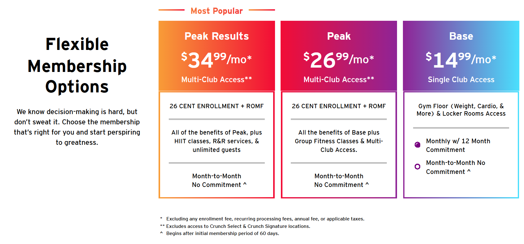
Tiny fine print of exclusions at the bottom of the page via Crunch Fitness
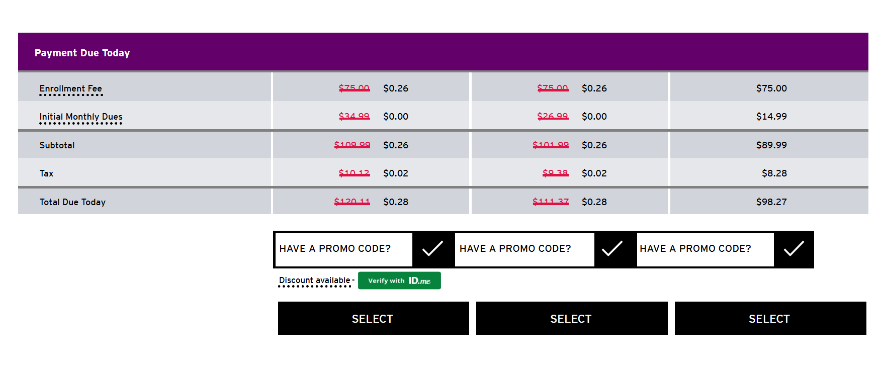
Membership cost breakdown on the pricing page via Crunch Fitness
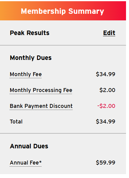
Membership cost breakdown upon checkout via Crunch Fitness
Hidden subscription terms: Adobe early termination fee
Adobe was flagged by the FTC for an early termination fee that wasn’t stated clearly. Some customers who canceled within a month were charged steep fees (reported around $300), which were disclosed only in dense clauses that users had to find.
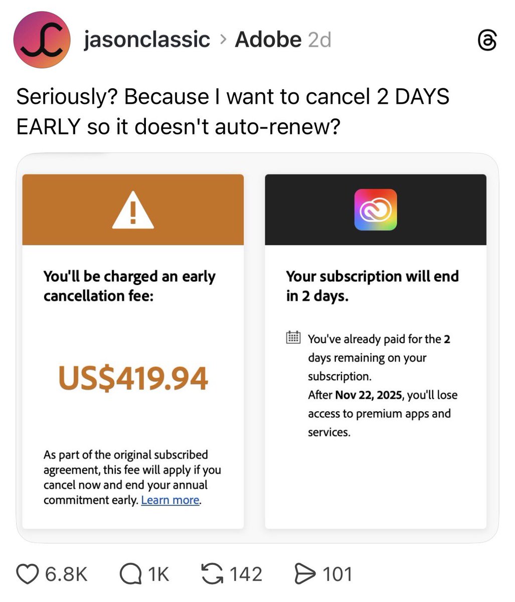
Sneaky early termination fee. Image via X
2. Interface interference
This includes unclickable buttons, tiny text, default opt-ins, hidden cancellation paths, and deceptive wording. Interface elements favor the company’s preferred action while making alternatives harder to use, exploiting status quo bias.
Visual interference: Savage X Fenty
Reports showed that an obscure pricing option defaulted customers into a VIP auto-renewal plan unless they selected the normal price option. Customers faced difficulties due to complex flows. The class-action lawsuit filed against the brand resulted in a $1.2 million fine.
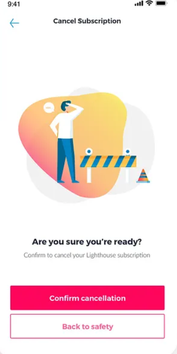
Clearly visible cancellation button. Design via Dribbble
Misdirection/trick questions
The use of double negatives or ambiguous words can confuse users who are scanning quickly. For example, “By checking this box, you agree to our Terms of Service and consent to receiving daily updates and promotional texts from our affiliates”. It removes the ability to opt out of marketing while opting into the legal agreement.
3. Forced action
Forced action blocks a functionality or feature until the user completes or provides unnecessary information. It manifests as forced registration, requiring an account just to read an article. Or as a gated feature, forcing users to share on social media to access it.
Amazon Prime: forced registration
The FTC alleged Amazon’s interface enrolled consumers into Prime without clear consent and made cancellation difficult. filed a case against Amazon for its unethical practices of designing its interface to enroll consumers into Prime subscriptions without their knowledge. The matter was resolved with a $2.5 billion settlement in 2025 to cover over 35 million consumers who were deceived by Amazon’s dark patterns-filled UI.
According to FTC Chairman Andrew Ferguson, “The evidence showed that Amazon used sophisticated subscription traps designed to manipulate consumers into enrolling in Prime, and then made it exceedingly hard for consumers to end their subscription. Today, we are putting billions of dollars back into Americans’ pockets, and making sure Amazon never does this again…”
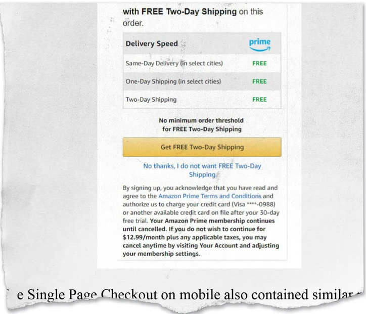
A special clause that states the subscription automatically continues after the trial. Image via Fast Company
Locked feature: LinkedIn paywalling visitor data
LinkedIn notifies users that someone viewed their profile, but blurs identities unless users subscribe to Premium. Critics, like Noyb, argue that this practice restricts users’ reasonable access to their own data and can conflict with General Data Protection Regulation principles.
LinkedIn cites data protection rules in not allowing free users to access who viewed their profiles. But this is contradicted by the fact that data access is allowed to premium users.
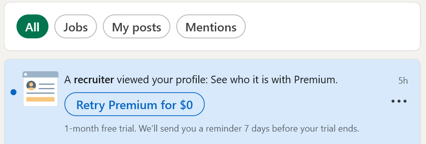
‘Who’s Viewed Your Profile?’ notification via LinkedIn
4. Roach Motel
This type of dark pattern exploits the effort justification, where users can easily get into a situation (subscription, feature), but cancellation is intentionally difficult—often buried in multi-step, confusing flows.
Hard to cancel: Uber one subscription
Uber, an app that prides itself on providing convenient services, was under fire for the cancellation flow of its Uber One Subscription. The brand was flooded with complaints from customers unable to find the cancellation button. In fact, a user even created a YouTube video on how to navigate the maze-like interface—23 screens and as many as 32 clicks—just to unsubscribe.
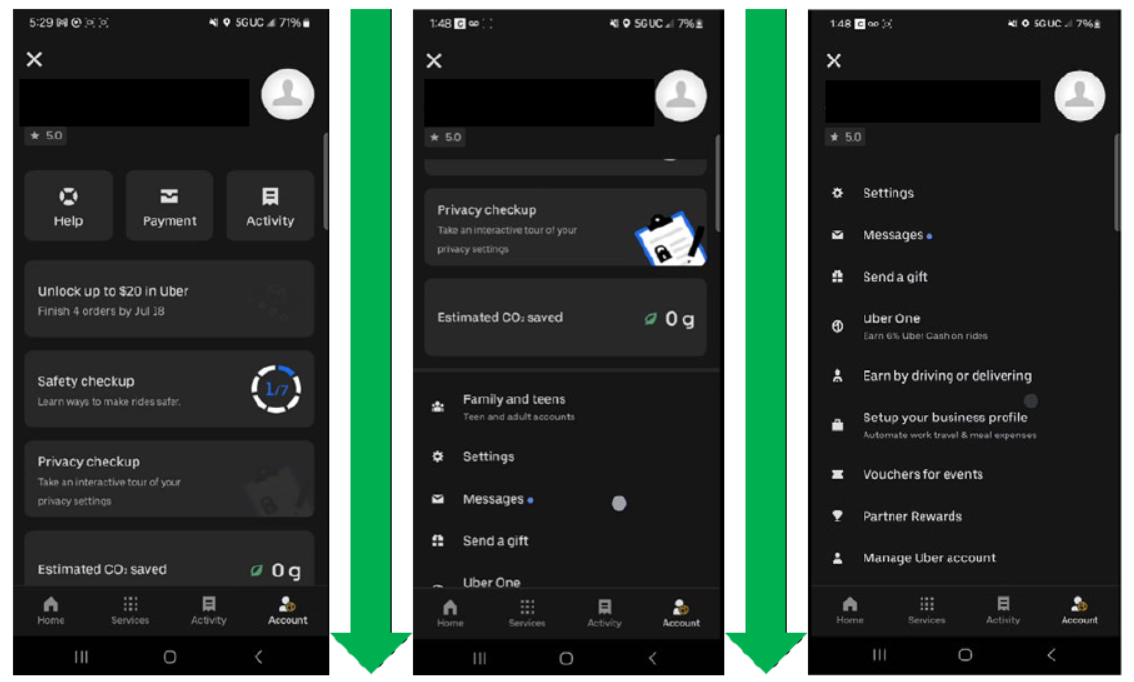
Screenshots of multiple pages the user needs to go through just to cancel the subscription. Evidence images via FTC
5. Emotionally-driven pressure
These patterns manipulate emotions to override rational decision-making, triggering scarcity, urgency, or guilt.
Fake urgency and fake scarcity: ecommerce countdown
Singapore-based online retailers—Origin Sleep, Light In the Box, and Seager Inc. —were found to have employed deceptive tactics to pressure consumers into hasty purchases. The Competition and Consumer Commission of Singapore says that these tactics included fabricated visitor counters, countdown timers, and artificially inflated discounts, all generated without any underlying real data to support their claims.
These actions constitute fake urgency and fake scarcity; two emotionally-driven dark patterns designed to override rational decision-making by manufacturing artificial pressures.
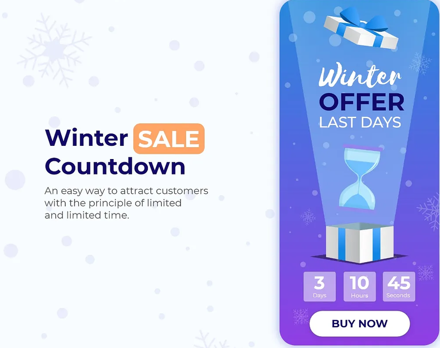
Sample sales countdown design via Dribbble
Confirmshaming: guilt-driven copy
Copy that aims to trigger guilt or shame can manipulate users' decisions. For example, the option “No” or “Decline” is worded in an insulting or guilt-inducing way, shaming users into accepting the offer to avoid being perceived as irrational or uncaring. Confirmshaming’s psychological impact is coercive, exploiting the user’s desire for social approval.
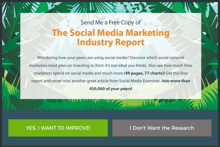
Confirmshaming example via tumblr
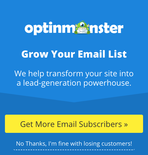
Confirmshaming example via tumblr
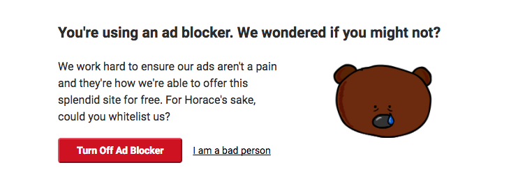
Confirmshaming example via tumblr
6. Privacy zuckering and friend spam
Designs that default privacy settings to public, harvest contacts, or push contact-syncing that leads to mass outreach or data collection. Friends of users suddenly receive marketing emails, sales calls, etc., akin to spamming. These patterns make it difficult for users to know what data will be shared or how it will be used, and can prey easily on users who rarely change preset options.
Default over-sharing: press gazette click inequity
When a cookie banner only gives you two options: “Accept All Cookies” or “Cookie Settings”, the website is using a “Reject All” maze where it takes only one click to give consent, but multiple clicks to manually uncheck tracking categories. Designers know that users are often in a rush to access content, so this method forces them to consent to data sharing so they can move on quickly.
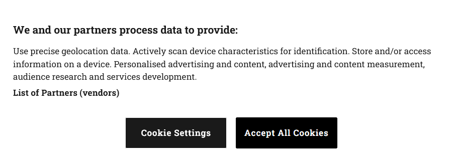
Cookie banner via Press Gazette
Contact harvesting: Facebook and Cambridge Analytica
Facebook’s earlier permissions model allowed third-party apps wide access to user and friend data. That vulnerability was exploited by Cambridge Analytica, covertly scraping over 80 million users to influence elections. This sparked major regulatory action, leading to a $5 billion fine by the Federal Trade Commission in 2019.
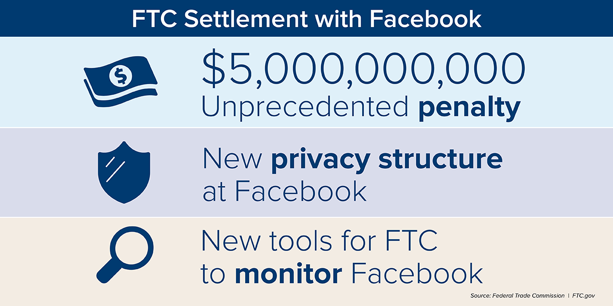
Settlement agreement between Facebook and the Federal Trade Commission. Image via FTC.gov
Pre-selected contact spam: WhatsApp
The onboarding flow of WhatsApp forces new users to agree to “Contact Syncing” so you can see which of your friends are on the app. However, WhatsApp did more than that, systematically scraping and storing the phone numbers of people in their address book who did not use WhatsApp.
The Irish Data Protection Commission fined WhatsApp for ~$267 million in 2021. The company was mandated to completely change its privacy policy to clearly explain how it processes data and limit what it does with non-user information.
7. Nagging
Repetitive prompts interrupt the user’s primary activity until they comply just to stop the interruptions. These could be app install nags, rating prompts, subscription pop-ups that reappear after being declined. Nagging can be likened to harassment, impairing the user’s freedom of choice.
Repetitive prompts: app download, app rating, subscription invites, and more
Many sites and apps repeatedly prompt users to download an app, rate a product, or subscribe, creating cognitive fatigue that increases compliance.
How Companies Can Avoid Dark Patterns
1. Balance how you present fair and profitable options
Make it a formal product requirement that the number of steps and the level of friction in your cancellation flow must be equal to or less than the number of steps and the level of friction in your signup flow. No forcing of users to call support to cancel or to wait for a certain number of days before account deletion. Use transparent pricing, labels, and terms that can be easily understood by users.
It also helps to test-run design features with potential users, including the non-tech-savvy. If they hesitate or are confused about how your flows operate, then assess for UX/UI gaps.
2. Run a UX ethics check
Assign a person or a team in charge of reviewing every design feature or flow before launch. They have final veto power over any UI that can be considered deceptive. Ideally, they report directly to the CEO, not the growth team.
3. Mandatory legal review for every checkout/ cancel flow
Fines can be hefty if the FTC and other regulatory boards sanction you for implementing dark patterns. Defer to your legal team to ensure dark patterns are avoided, especially if they risk legal liabilities, like consumer fraud.
4. Create and publicly publish your ethical UX policy
It’s easier to violate policies if they are internal only. Making them public can lead to a PR disaster if broken. Be transparent and keep these policies accessible on your website so users can call you out.
5. Change the metrics you reward
If you only measure conversion or revenue, your team will optimize that, even if it means using dark design patterns. To prevent this, set a formal policy that any experiment or feature that shows short-term gains but could risk brand trust must be rejected. Tie bonuses to metrics like 90-day retention and Net Promoter Score, not just acquisition.
Ethical UX Builds Trust
Ethical UX is not a PR stunt. It’s a commitment to protecting consumers that must be taken seriously and implemented consistently. It’s something you build into every product decision and design review.
The temptation to cut corners is real; investors are impatient, and growth targets are unforgiving. Sure, dark patterns can get you there, but they sacrifice the reputation of your brand, putting long-term success on the line.
If you want results that endure, practice ethical UX. Trust keeps users longer, makes them spend more, and turns them into advocates. And when you make mistakes (and you will), trust is the only thing that protects you.

Creates insightful, strategy-driven content that translates complex design and branding concepts into accessible knowledge, supporting Ramotion’s mission to elevate digital experiences.