The emphasis design principle is making specific parts of a composition stand out, guiding viewers toward the most critical information. But it’s more than visual decoration — it’s a deliberate choice that shapes how people perceive and interact with a design. From a bold headline on a billboard to a single call-to-action button on a website, emphasis determines where the eye goes first and how the message unfolds.
In visual communication, human attention is a scarce resource. People take in images and layouts in milliseconds, often creating their first impressions before reading a single word. By emphasizing purpose, designers influence these first impressions, ensuring that the audience notices, understands, and remembers what matters most.
Now, we’ll explore emphasis in design, why it matters, the different ways to create it, and how it applies across various creative disciplines. Whether you’re working on web design, branding, or product packaging, emphasis can make your work more effective, persuasive, and memorable.
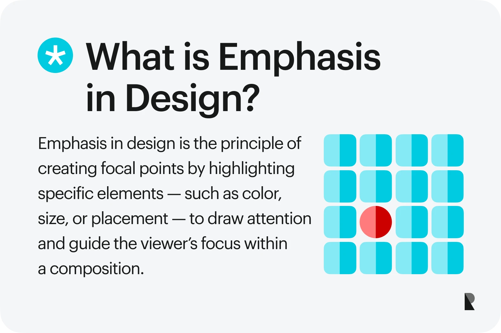
What Is Emphasis in Design?
Emphasis in design refers to creating a focal point that draws the viewer’s attention to a specific part of a composition. This can be achieved through several key factors influencing how the audience experiences the design.
| Size | Larger elements naturally attract more attention than smaller ones. A headline in 48-point font will dominate over body text at 12-point. |
| Color | Bright, saturated, or high-contrast colors immediately stand out. A vivid red button on a neutral background invites action. |
| Shape | Unique shapes catch the eye in a field of uniform ones. Think of a circular badge in a grid of rectangles. |
| Contrast | Placing light against dark, textured against smooth, or intricate against simple makes one element visually pop. |
| Placement | Items placed at the center or in areas of high visual weight tend to be noticed first. |
These elements can be used alone or in combination to create emphasis. For example, a designer might combine bold typography with a contrasting color on packaging to instantly recognize a product name.
The Importance of Emphasis in Visual Communication
Emphasis is not just about making things eye-catching — it’s about communication efficiency. A strong focal point speeds up how people process visual information, letting them identify what’s most important without thinking about it.
When emphasis is well-placed, it also enhances emotional resonance. A minimal poster with one striking image can move more than a crowded collage. A single well-highlighted quote in a brand’s campaign can also stick in a viewer’s mind long after they’ve scrolled past it.
Research supports this. Visual hierarchy (the arrangement and organization of design elements) influences how visitors naturally gravitate toward the most critical parts of a layout. By adjusting the position, color, or size of specific elements, designers guide users toward completing desired actions in an intuitive and enjoyable way.
Why Emphasis Matters
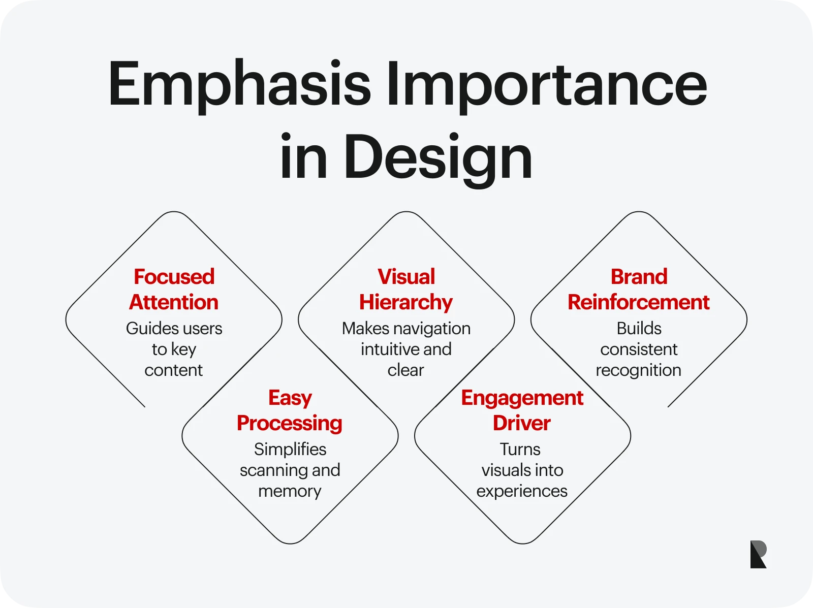
In professional branding and visual storytelling, emphasis is a fundamental tool for many things.
- Directing attention toward the most valuable content.
- Creating a clear visual hierarchy that makes navigation intuitive.
- Reinforcing brand identity through consistent, recognizable design choices.
- Making content easier to scan, process, and remember.
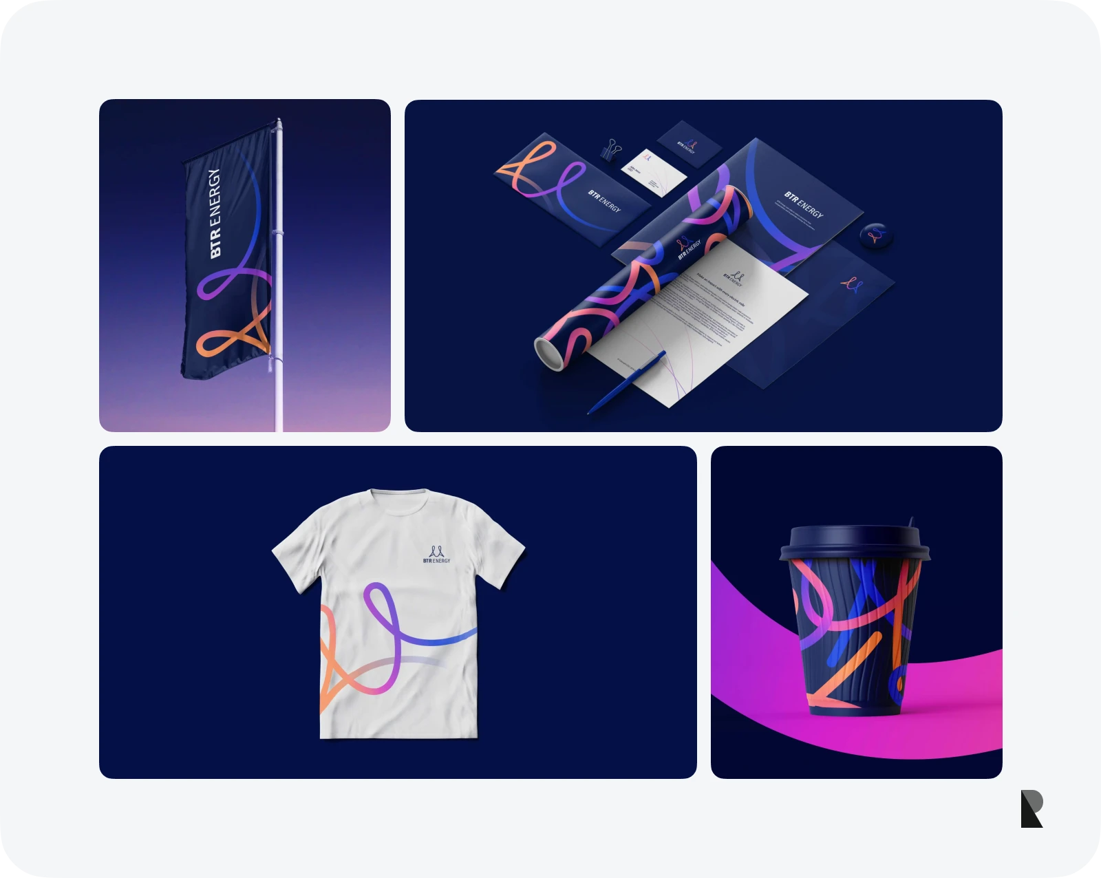
For a brand design firm, emphasis can be the deciding factor between a visual identity that looks polished and actively drives engagement. For teams evolving complex digital products, collaborating with a UX/UI design agency can help translate those emphasis decisions into interfaces where every screen, flow, and microinteraction consistently supports the brand story. When applied strategically, the emphasis principle of design turns static layouts into dynamic, audience-centered experiences.
3 Key Emphasis Techniques in Design
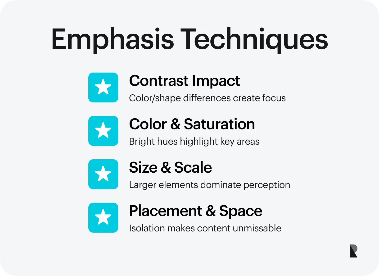
There are many ways to apply emphasis, and most professional branding agencies adapt these methods to fit their clients’ needs and brand personalities. Let’s break down the most common techniques designers use to guide attention.
Using contrast for visual impact
Contrast is one of the most straightforward yet most potent tools for emphasis. High contrast between elements — color, shape, size, or texture — creates an immediate point of interest. Black text on a white background is a classic example.
In branding, a sharp contrast can help a logo stand out against varied backdrops. In advertising, a single product in vivid color placed in an otherwise monochrome scene naturally becomes the focal point.
Applying color and saturation
The use of color can transform the entire feel of a design. Saturated hues demand attention, while muted tones disappear into the background. Designers often create emphasis by strategically adding bright colors to key areas — like a “Buy Now” button in red or orange.
An example of emphasis through color could be a nonprofit’s donation page, where the only vibrant element is the donate button, making sure it stands out from all other content. Leveraging size and scale.
Scale directly influences perception. Increasing the size of one element relative to others makes it dominant, while reducing its size can make other parts feel secondary. Large hero images at the top of a website, oversized product photos in e-commerce, or bold main headings in editorial design demonstrate emphasis through scale.
Optimizing placement and white space
Strategic placement combined with space around an object can make it impossible to ignore. This is where white space plays a critical role — it frames essential elements, giving them room to breathe and separating them from visual clutter.
In UI design, isolating a call-to-action button with enough spacing helps ensure that it doesn’t get lost in the interface. For example, a high-end fashion ad might feature a single model placed centrally, with nothing else competing for attention.
Emphasis in Different Design Fields
While the fundamentals of emphasis remain consistent, how it’s applied changes depending on the medium. Understanding these nuances helps ensure the principle of emphasis is effective across all types of creative work.
Emphasis in graphic design
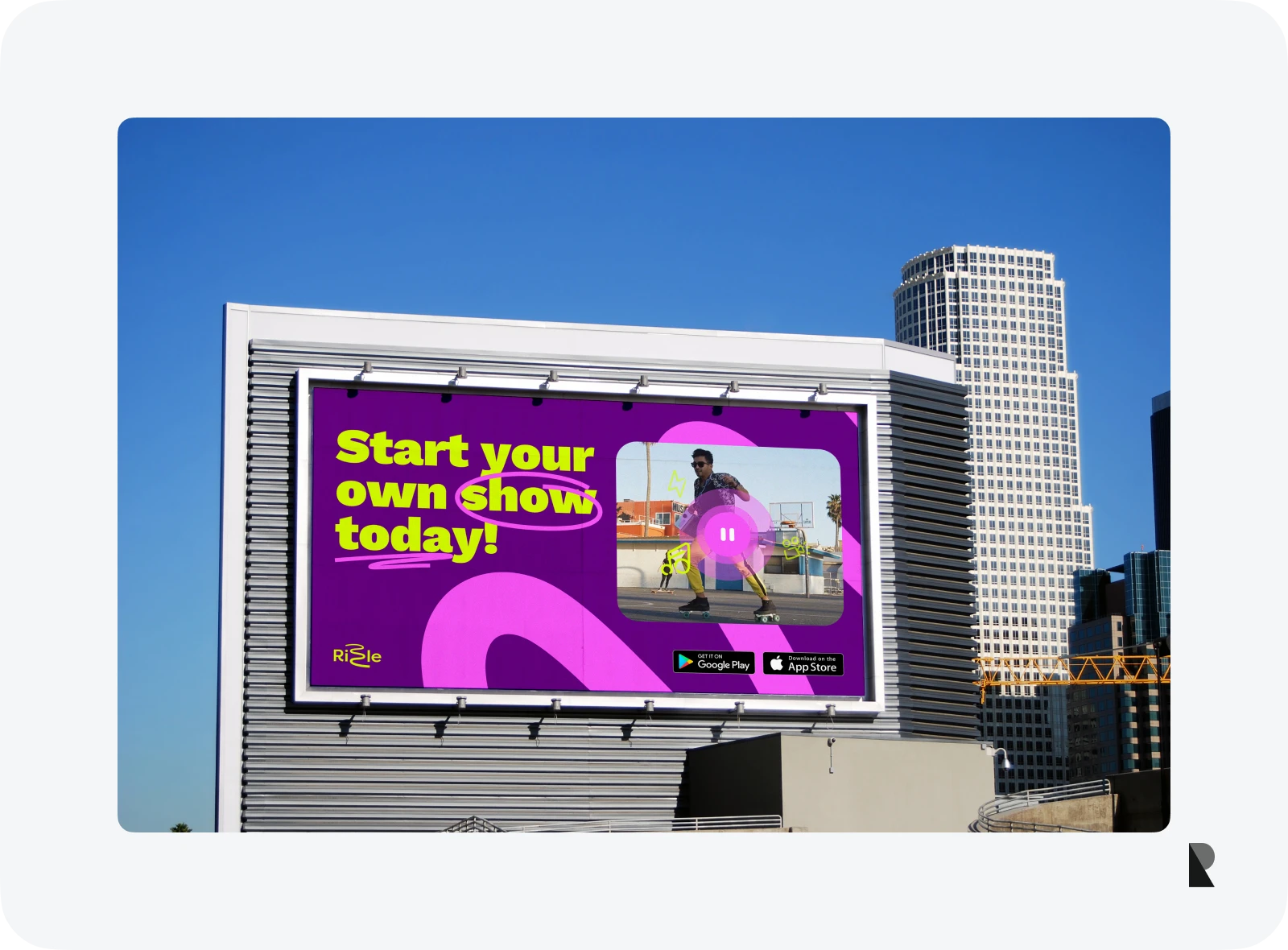
Graphic designers often use emphasis to make messaging immediate and memorable. Posters, magazine covers, and advertisements rely heavily on visual hierarchy to grab attention in a fraction of a second.
Bold headlines, high-contrast imagery, and asymmetrical layouts are common ways to make key elements pop. An example of emphasis here could be a music festival poster with the headline act’s name dominating the layout, while supporting acts are presented in smaller type. In brand campaigns, a single striking photograph paired with minimal text can anchor the design, making the message unmistakable.
Emphasis in web and UI design
In digital environments, emphasis directly affects usability and conversion rates. A well-placed, clearly designed call-to-action button doesn’t just draw the eye — it guides the user toward completing the desired task.
This is where professional branding agencies often combine visual design with behavioral insights. They ensure buttons, forms, and interactive components stand out without disrupting the overall flow of the interface. Placement, color contrast, and animation can all call attention to the next step a visitor should take.
An example of emphasis in UI could be a checkout page where the “Complete Purchase” button is brightly colored, centrally placed, and surrounded by generous white space, ensuring it’s the most noticeable element on the screen.

Emphasis in packaging and product design
On a crowded retail shelf, emphasis can mean the difference between being picked up or ignored. Packaging designers emphasize that the first things shoppers notice are brand names, product benefits, and unique selling points.
Techniques include vibrant color palettes, distinctive typography, unusual shapes, or tactile finishes that create a sensory connection. For example, a luxury skincare product might use a minimalist white bottle with a single metallic accent to communicate purity and sophistication. In contrast, a children’s snack might use oversized playful type and bright illustrations to create emphasis and appeal directly to younger audiences.
How Emphasis Can Support Your Brand Identity?
In brand design, emphasis is not only a tool for communication — it’s a tool for differentiation. A brand design firm will often study competitors to see where emphasis is placed and design a system that stands out. This could mean spotlighting a brand mascot, highlighting a distinctive tagline, or using a signature color consistently across all touchpoints.
When emphasis is aligned with the brand’s voice and values, it becomes part of the identity. Think of the way Tiffany & Co uses its signature blue box. The color is so tightly tied to the brand that it is a focal point even without a logo.
Balancing Emphasis with Other Design Principles
While the emphasis principle of design is crucial, it doesn’t operate in isolation. It works best when balanced with other design principles like proportion, alignment, and rhythm.
- Proportion affects how emphasis is perceived — a massive headline on a postcard feels very different from the same headline on a billboard.
- Consistent alignment helps the focal point feel integrated into the composition rather than floating awkwardly.
- Rhythm and repetition can lead the eye toward the emphasized element, making the journey feel intentional.
The skill lies in making the highlighted area dominant without overwhelming the rest of the composition. Overuse of emphasis can create visual noise, making it hard for viewers to know where to look first.
Using Emphasis to Guide Action
Ultimately, the emphasis is on leading the audience toward a specific outcome. This could be making a purchase, signing up for a newsletter, or simply remembering a brand. The most effective designs make this journey feel effortless.
When emphasis is applied with strategic intent, it becomes a subtle but powerful way to influence behavior. By controlling where the eye goes first, you can lead people step-by-step toward completing the desired action. Many successful campaigns begin with clearly understanding what the audience should do next.
Conclusion
The emphasis design principle is one of a designer's most effective tools. By making deliberate choices about size, color, contrast, placement, and spacing, you can create work that is eye-catching and strategically aligned with communication goals.
Whether you’re highlighting a product feature, a brand value, or a single call to action, the principle of emphasis ensures your audience sees what matters most and remembers it.
For brands, mastering emphasis can improve recognition, boost engagement, and create designs that resonate deeply with audiences. It’s a chance for designers to combine creativity with precision, turning every project into a purposeful visual experience.
If your brand needs a team that understands how to use emphasis to communicate clearly and memorably, explore the work of Ramotion. As a professional branding agency, we combine strategy, visual design, and technical execution to ensure that every detail works in your favor — starting with the focal point.
Sep 15, 2025

Creates insightful, strategy-driven content that translates complex design and branding concepts into accessible knowledge, supporting Ramotion’s mission to elevate digital experiences.