Fintech platforms have expanded access to financial services but continue to face trust gaps compared to traditional banks. Explore fintech website design examples to show how the right UX strategies build credibility, simplify complex financial products, and convert casual visitors into loyal clients.
What Makes a Good Fintech Website
A good fintech website can do four things:
- Strengthen customer trust. Show regulatory badges, transparent pricing and data usage, and human-centered security cues so users feel confident in entrusting their money with you.
- Simplify complex finance. Break complex products into guided steps anchored on behavior-driven personalization.
- It anticipates user needs. Fintech websites designed around customer behavior, industry trends, and competitors create a seamless experience that meets and even surpasses customer expectations.
- Anticipate user needs. Design the site based on user behavior, industry trends, and competitor gaps, prioritizing relevant features and effectively driving users to action.
Best Fintech Website Design Examples and UX Takeaways
We picked seven fintech websites that excel at one or more high-impact UX strategies so you can see how they apply in real life. Analyze their approaches and note what resonates with your goals.
1. Stripe: offer beginner-friendly processes
Stripe targets developers, ecommerce owners, and other enterprises that need easy-to-use APIs. With a broad market, the website keeps everything easy to understand with a modern minimalist UX design and strong use of information hierarchy.
Key highlights
- Purpose-oriented aesthetics. Every element encourages users to focus on actionable content or data without distracting them.
- Transparency in pricing. Stripe publishes everything included in its fees, which may be seen as complex. But at least they don’t hide them behind a “Contact Sales” button. The custom pricing section also explicitly states factors that may influence quotations.
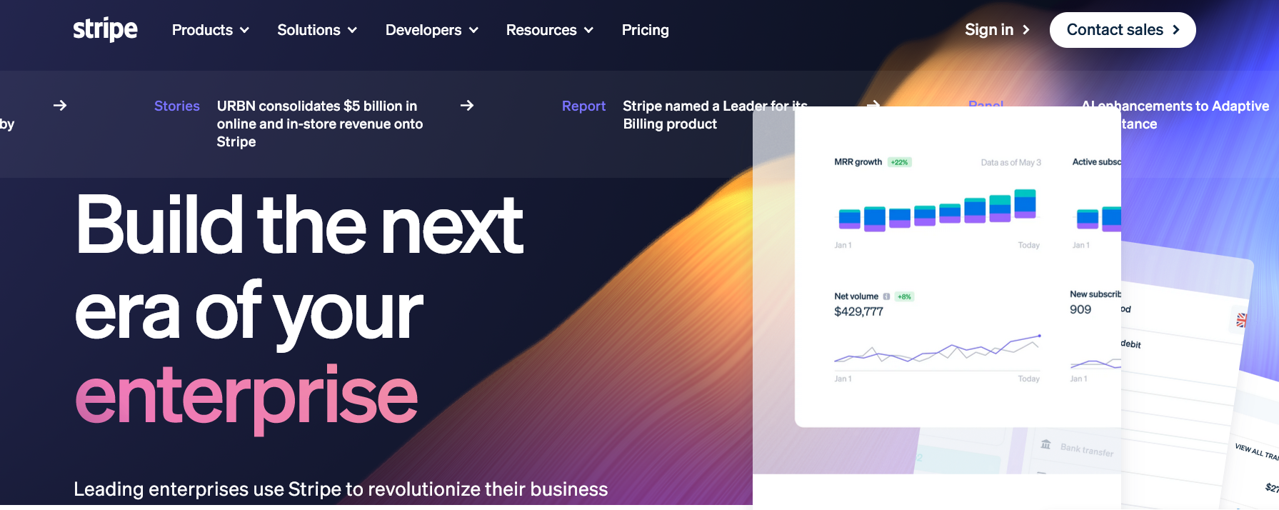
Solutions for enterprises page via Stripe
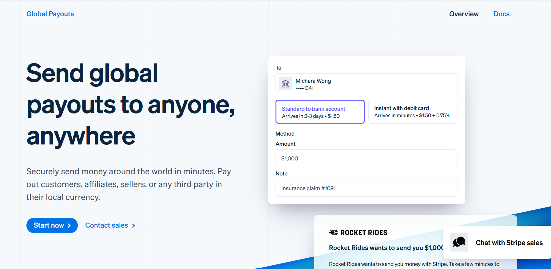
Action-oriented language via Stripe
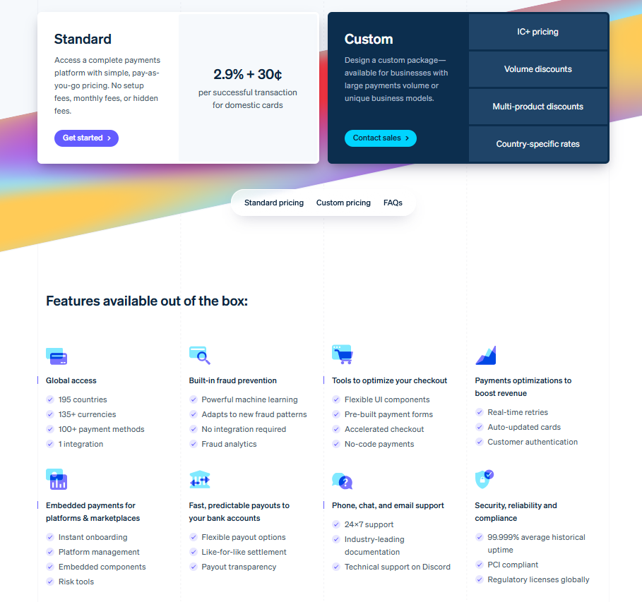
The fintech platform has over 10 comprehensive payment packages. Image via Stripe
Takeaway lesson
Progressive disclosure and clean design create a seamless experience. But transparency is what makes your platform trustworthy—a crucial element to closing deals. Balance all three, and you'll have a solid competitive advantage.
2. Revolut: avoid multiple products overload
Revolut is a digital banking app that allows international transfers in over 100 currencies, plus investment tools and subscriptions for personal and business accounts.
Key highlights
- Card-based product menu. A dashboard of card modules and a beginner-friendly nav make discovery effortless.
- Real-time, transparent information. Real-time currency conversions and fees appear without extra clicks, encouraging engagement.
- Gamified experience. Reward badges for using features or reaching savings goals ease anxiety and reinforce positive habits.
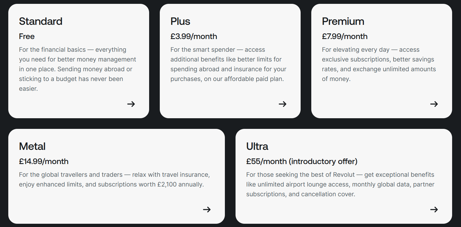
Financial packages menu via Revolut
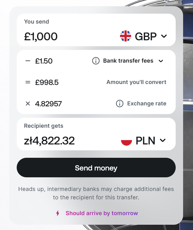
Real-time currency conversion. Image via Revolut
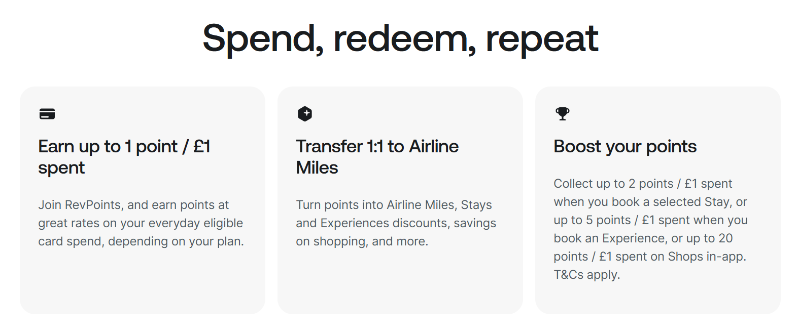
Users can earn RevPoints via Revolut
Takeaway lesson
A mishmash of finance jargon, numbers, and charts overwhelms users. Calm the chaos with simple layouts, clear discovery paths, and micro-interactions that guide and reassure clients.
3. Wise: use transparency to drive conversions
Wise moves and holds money across borders, favored for its cheap, transparent, and modern international transfer services.
Key highlights
- Upfront cost. Users see current exchange rates and fees immediately, dismantling hidden-fee models.
- Single-goal process. Wise avoids cross-selling during transactions, keeping focus on the transfer and reducing errors.
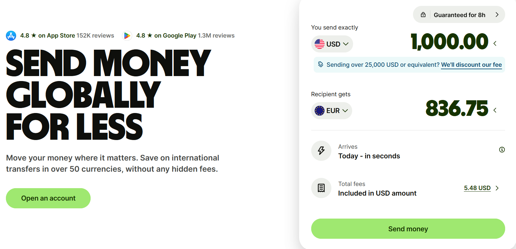
Conversion calculator via Wise
Takeaway lesson
Customers stay engaged when you are transparent with pricing and outcomes immediately, not buried in fine print. Fintech web designers should emulate this clarity to build trust and boost conversion.
4. Ramp: get B2B buyers to value fast
Ramp offers spend management solutions developed by CFOs and other finance experts for organizations upgrading their finance systems. It automates low-risk payouts, curbs out-of-policy spending with corporate cards, and supports international payments.
Key highlights
- Quick onboarding. You have less than a minute to capture a user, and Ramp does it well by ensuring signups take only two minutes.
- Guided tours over FAQs. Personalized, AI-powered live tours let users watch and learn rather than read help docs.
- Surprise rewards. Targeted incentives boost engagement and identify high-potential leads.
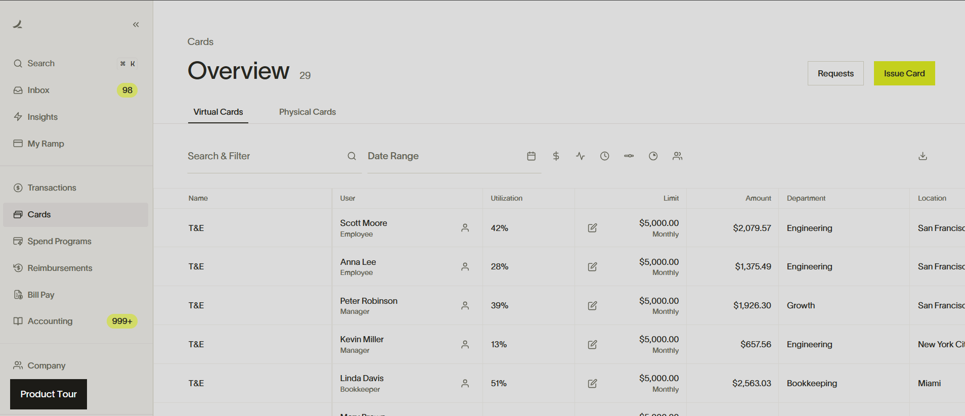
Product tour via Ramp
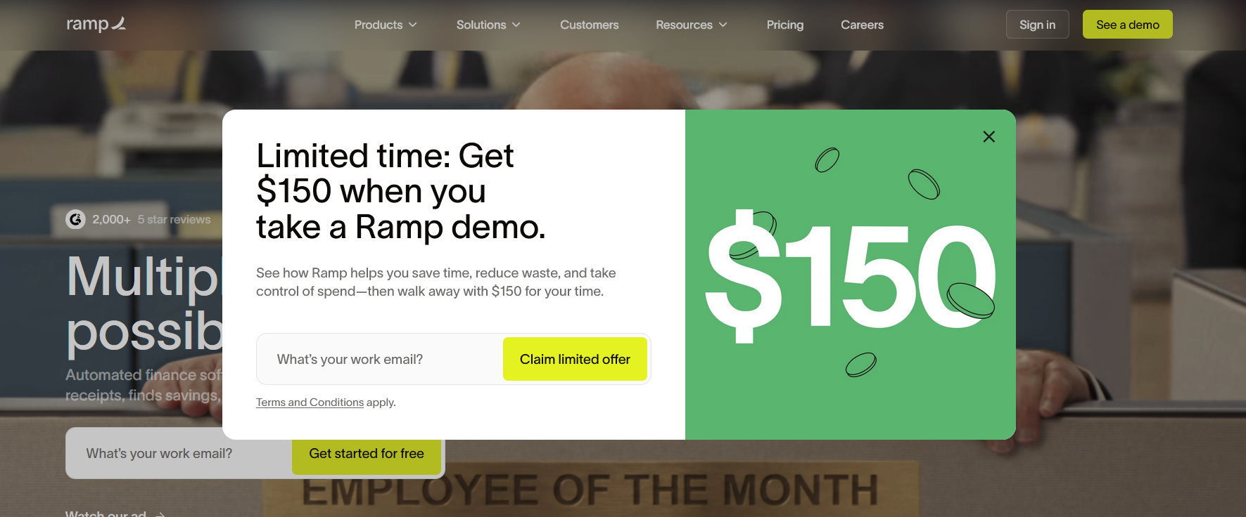
$150 virtual card reward to entice new leads to sign up via Ramp
Takeaway lesson
Complex products can be confusing. Reduce churn rate with thoughtful defaults, beginner-friendly language, and interactive walkthroughs that explain value without finance jargon.
5. Mercury: position for a narrow, high-intent audience
Mercury combines online banking, credit cards, bill pay, and accounting tools into one clean dashboard, so users don’t juggle multiple logins.
Key Highlights
- Demo dashboard for B2B. Prospective clients can test a fully interactive demo account preloaded with $5M and workflows tailored for startups, commerce, and agencies.
- Rapid account setup. A clear promise of a 10-minute bank application and consistently promoted smooth onboarding.
- Speak the customer’s language. Copy and features are targeted, humanized, and free of hidden fees.
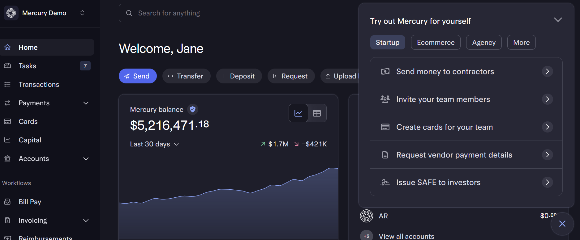
Interactive demo dashboard via Mercury
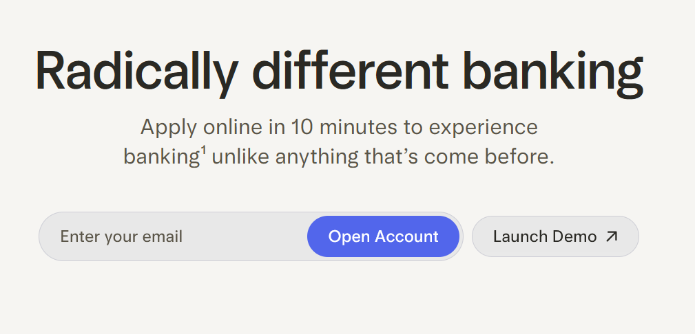
Quick onboarding via Mercury
Takeaway lesson
A public demo is one way to quickly build trust. Mercury lets users judge its products immediately; no strings attached. This shows Mercury’s confidence in what it offers.
6. Plaid: prove invisible infrastructure
Plaid bridges your bank to the apps you want to use—Venmo, Chime, Dave, Paysend, Western Union, and more—without waiting for bank transfers or uploading PDF financial statements. It helps businesses set up payment systems, handle maintenance, detect fraud, and standardize data across connected banks.
Key highlights
- Everything is quantified. Plaid makes quantifiable claims, such as ‘12,000 banks’ and ‘25% higher conversion,’ cementing the platform’s credibility.
- Solutions according to use cases. Users can easily find the right product according to use cases and industries. This lessens cognitive overload when deciding how to proceed.
- API demos via Sandbox. Users get free access to a live virtual environment where they can test now, not later, boosting conversion.
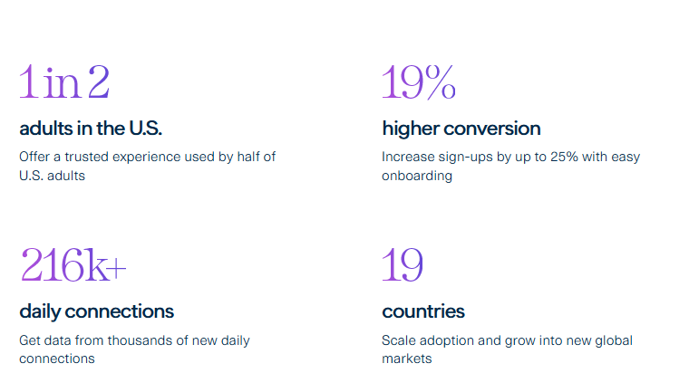
Quantifiable data via Plaid
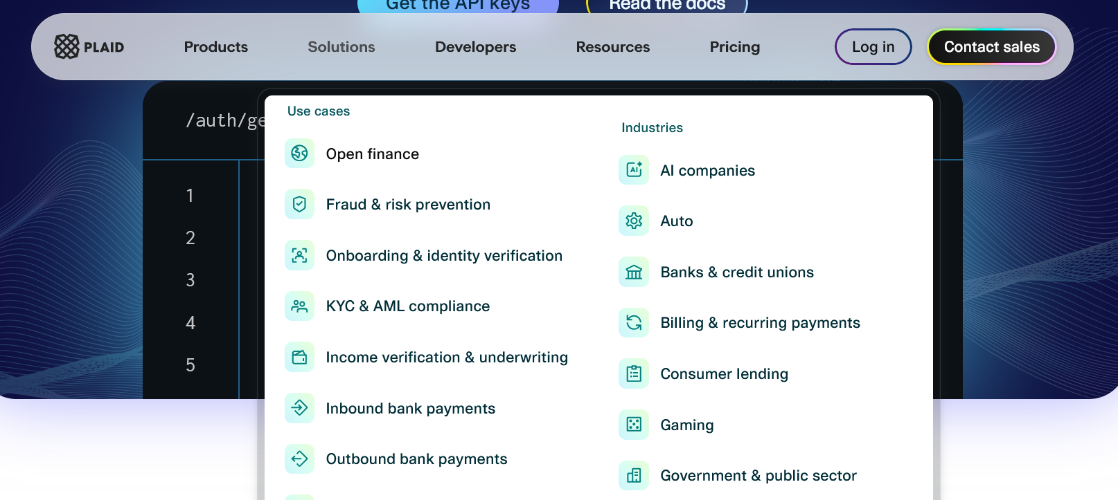
Solutions specific to use cases and industries. Image via Plaid
Takeaway lesson
You cannot design for everyone. Choose one user and serve them completely. Plaid is clear about whom it wants to talk to. The language and design are intended for engineers or product managers who are familiar with how APIs work.
7. Brex: balance enterprise trust and storytelling
Brex pairs virtual and physical cards with bill pay, automated expense workflows, deep accounting integration, and ROI-focused analytics so companies can manage payments, cash, and reporting from one place.
Key highlights
- Specific outcomes. The website explicitly indicates what users can gain from the platform, including numbers. These predicted results—“Up to 3.70% yield,” “99% policy compliance,” and “4,250 hours saved per year”—make concrete promises to users while holding Brex accountable.
- Problem-solution format. Every page addresses problems that Brex’s solutions quickly resolve. Name it, and your product feature becomes a relief rather than just a capability.
- Not a bank claim. Aside from legal compliance, it ensures only the right customers engage with the brand. Wrong customers stop reading.
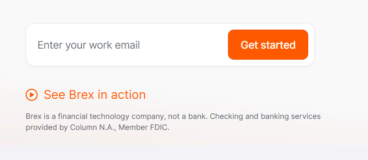
Clearly stated disclaimer via Brex

Predicted results for clients based on past performance history. Image via Brex
Takeaway Lesson
While it may be counterintuitive, especially for fintech startups, be upfront with your real numbers and limits, even when it costs you a sale. It filters customers and builds trust faster than any feature page.
Fintech Website UX Checklist
Work with one of the best website design companies and create the best fintech website that delivers results by applying the right UX strategies. Meanwhile, let’s go over some UX must-dos below.
Messaging: lead with benefits
Cut to the chase by stating the immediate benefit of your platform in a concise and emotionally resonant way. Swap claims (e.g., “No more juggling five bank portals”) for outcomes people feel (“Friday nights are yours again”).
It also helps to build a benefit ladder, where each page ends with relief, control, or growth. Let the homepage sell the overarching outcome, while the Products, Solutions, and Resources pages explain how specific features deliver that outcome. This keeps messaging consistent by answering the “Why should they choose you” and helps prospects emotionally connect before they evaluate features.
Navigation: organize by persona
Simplify menus by labeling and grouping items by role or use case. Put priority features—those that let a visitor do their job immediately—into primary navigation. Anything that doesn’t enable immediate progress belongs to secondary navigation, like pricing, case studies, FAQs, etc.
Moreover, create separate navigational paths for buyers (company) and end-users (engineers, finance team). They care about different things and need different information.
CTAs: one primary action per screen
CTAs (Call-to-action) guide users to the next step. For instance, it tells them to sign up, start a free trial, or download the app. Because people can focus on only one intention at a time, limit each screen to a single primary CTA, with other actions as secondary links for exploration.
Present the primary CTA clearly so users aren’t distracted by competing choices. One focused CTA reduces confusion, accelerates decision-making, and increases the likelihood that visitors will complete the desired action without adding extra cognitive load.
Forms: shorter, safer, clearer
You make a form safer and clearer by making it obviously transparent.
Request only essential details to fast-track users and avoid cognitive load. And customize the length to intent, where early-stage gated content should ideally be limited to three fields.
Explain why you ask for specific data with a brief helper line beneath the field for transparency. Provide inline validation and immediate error messages so users can fix their mistakes before submitting. Finally, don’t forget to test and iterate your forms periodically based on customer feedback.
Mobile UX: fast, readable, thumb-friendly
Websites designed for desktops have a different context than phone or tablet use. Desktop users read, compare, and engage with denser information. They have more time to explore. Mobile users are often on the move and scanning web pages between tasks. Here’s how you can optimize your website for better performance:
- Compress images without sacrificing quality.
- Lazy load below-fold content.
- Implement autofills in forms.
- Place primary actions within reach of both thumbs.
- Test mobile layout for portrait AND landscape.
Accessibility: meet baseline standards
Digital accessibility builds trust, broadens reach, improves performance, and proves commitment to inclusive design.
Start with semantic HTML, descriptive alt text, and ARIA (Accessible Rich Internet Applications) attributes so assistive technologies work reliably. Maintain consistency in navigation to avoid confusion, especially for users with visual impairments.
Use fonts that are readable and scalable. Finally, offer customizable settings so users can personalize their experience. For instance, some non-essential animations can trigger a seizure. Allow users to turn it off.
Performance: ship speed, not weight
A fast fintech website is the first proof that your technology works. It builds trust, lets users move money with confidence, and does not crash mid-session. The experience is simple, and the core actions take only three taps or fewer to complete.
This brings us to speed.
It signals that you use the best technology under the hood, that you are competent, and that you can be trusted. Below are strategies to optimize your fintech website’s speed:
- Minify JavaScript responses to ensure crucial pages load instantly.
- Use images and animations only when necessary and compress them without sacrificing quality.
- Your demo page should load blindingly faster than your homepage.
- Preconnect to third parties to make verification feel seamless.
- Defer to modern system fonts over custom typeface for general texts to speed up page loads.
Trust: make security and data handling obvious
Fintechs are often met with skepticism and confusion, making it extra difficult to sell what you’re offering. That said, your website’s primary job is to build people’s trust.
Prominently place trust signals, like certificates that prove your company complies with all regulatory and legal requirements. You should also be upfront about the status of your company. If you’re not a bank or you are using a partner bank, say so clearly above the fold.
Be transparent with how you intend to use data collected from users. You can even create a separate page that includes controls, practices, and data ownership.
Conclusion
Many fintech websites still face two linked problems: user distrust and product complexity. While UX can’t replace a solid business model that delivers results, it removes barriers that stop people from engaging with your website.
Benefit-led messaging, transparent pricing, focused CTAs, and guided workflows all help customers make decisions easier. Accessible pages and visible trust proofs reassure users that their money is in good hands. Demos let people test products without a hard commitment. Applied consistently, these UX strategies simplify complex products and amplify performance, making it easier for users to understand and use fintech services responsibly.
Experiment, measure outcomes, iterate on web design, and see how UX improvements can lead to massive gains over time.
Feb 13, 2026
