A strong homepage gives people a clear first read of a brand. It is the main entry point for many first-time visitors, and it has only a few seconds to explain where they are, what the company offers, and why the next click is worth their time. Good homepage design creates that moment of orientation with focus, hierarchy, and restraint.
This guide starts with structure because structure shapes how people understand a page before they admire it. Then it moves into essential elements, premium cues, common mistakes, and real references that can help teams review their own homepage and wider website with more confidence.
What Visitors Should Understand First
The core job of the homepage is simple: make the brand understandable. A visitor should quickly grasp what the company is, who it serves, what it offers, and why it deserves attention. When the page answers those questions early, the rest of the website feels easier to explore.
This matters because people rarely arrive with full context. They may come from search, a referral, a social post, a sales email, an investor deck, or a product mention. Homepage design has to welcome those different levels of awareness without becoming a dense explanation of the entire business. It should create a clean starting point.
For brand-led companies, the page also carries an emotional responsibility. It has to make the company feel credible, current, and intentional. The visual appeal of a homepage can strongly shape how trustworthy people perceive the website to be, and pages with human imagery were rated as more visually appealing than similar pages relying only on logos.
How to Structure a Homepage
Homepage design should guide people through the brand, rather than compress the entire website into a single screen. The best structure helps users scan, understand priorities, and move toward the next relevant place.
Write one clear main message
The hero section should explain the offer instantly. A specific headline does more work than a broad statement about innovation, growth, or transformation. It should name the value in plain language, then use short supporting copy to add audience, category, or outcome.
A cybersecurity company, for instance, might lead with protection for cloud-native teams instead of a generic promise about safer digital futures. A branding studio might describe the kind of companies it helps and the outcome it builds toward. The point is clarity. A visitor should not have to decode the page before they understand the business.
A strong call to action belongs close to that message. It can invite people to view services, book a consultation, explore case studies, start a trial, or request pricing. The label should feel direct and useful, rather than overly clever.
Arrange information in logical order
After the opening message, the homepage should move from meaning to proof to navigation to action. That sequence helps visitors understand the company first, then believe it, then choose their own path. A useful order might introduce the offer, show who it is for, add proof, preview services or product areas, explain a differentiator, and close with a confident next step.
Random blocks weaken trust. A testimonial, a feature grid, a founder quote, and a pricing banner can all be valuable, but they need to appear in a flow that makes sense. When each section answers the question created by the section before it, the page feels intentional.
Make the next step obvious
Every homepage needs a primary path. For a services firm, that may be exploring capabilities or scheduling a call. For SaaS, it may be booking a demo. For ecommerce, it may be browsing a category. For a marketplace, it may be searching by location or need.
Secondary paths can still exist, especially for different audiences. Even then, the homepage should make the most important action visible and repeat it where the decision naturally builds. A clear path lowers effort. Visitors should always know what they can do next, even when they are only scanning. These best practices often separate a polished visual from a page that helps users move.
Key Homepage Elements
The strongest pages usually rely on a small set of essential blocks. These elements shape UX, messaging, and conversion more than decorative details do.
Headline, support copy, and CTA
The headline positions the brand. Support copy adds specificity. The CTA turns interest into movement. Together, these three parts form the first meaning layer of the page.
The headline should be short enough to absorb quickly and specific enough to carry real information. The support copy can clarify the audience, the offer, the outcome, or the market context. The CTA should use language people recognize, that would be things like “View work,” “Explore services,” or “Book a demo.” This first layer has to give enough certainty for the visitor to continue.
Navigation and internal paths
Navigation should help people move deeper into the website without confusion. Menus, preview blocks, footer links, and contextual CTAs all help users understand where they can go across the website.
Strong navigation uses labels that match user intent. “Services,” “Work,” “Pricing,” “Customers,” “About,” and “Contact” are often clearer than branded terms that require explanation. The homepage should orient, then release. It should help people find the page that answers their question in more detail, rather than trap them in a long scroll with no clear exit.
Trust signals and proof
Proof should support the message quickly. Logos, measurable results, testimonials, awards, reviews, press mentions, certifications, and customer numbers can all help, as long as they reinforce the main claim.
A homepage for a young company may use founder credibility, early customer quotes, or product adoption metrics. A mature company may use enterprise logos, category leadership, or years in the market. The right proof depends on what the visitor needs to believe before they act.
Proof works best when it is close to the claim it supports. If a page promises speed, show a time saving. If it promises quality, show recognized clients or outcomes. If it promises trust; show security, compliance, or long-term relationships.
Offer overview blocks
Short overview sections help visitors understand the scope of a product, service, capability, or use case. They should give enough detail to clarify the offer without turning the homepage into a full catalog. For a consultancy, this might mean capability cards. For software, it might mean product pillars. For hospitality, it might mean destinations, experiences, and membership paths.
These blocks are most useful when each one leads somewhere. A short description, a clear label, and a relevant link give the visitor control while keeping the page concise.
What Makes a Homepage Feel Premium?
A premium impression comes from clarity, control, and confident brand presentation. High-end pages usually feel composed because every visual and verbal choice has a job.
Prioritize clarity over decoration
A premium page starts with readable hierarchy, generous spacing, strong typography, and an easy scanning rhythm. Visual simplicity often creates more confidence than a crowded interface.
Effects, animations, and unusual interactions can add character, but they should never compete with comprehension. If the visitor has to work too hard to understand the offer, the page loses authority. A clean layout gives the brand room to breathe, while a consistent layout gives the user space to think.
Use brand elements with purpose
Color, type, motion, imagery, and illustration should support the page story. A serious enterprise brand may need a calm structure. A consumer lifestyle brand may need warmer imagery. A fintech brand may need confidence, accessibility, and security cues.
Brand elements should feel connected to meaning. A color system can guide attention. Photography can reveal an audience or aspiration. Motion can show progress or product behavior. Illustration can simplify an abstract idea.
Keep copy tight and controlled
Premium copy usually feels calm. Headlines are direct. Captions are useful. Microcopy removes hesitation. The page does not explain the same idea three times.
Controlled content density matters. Long paragraphs in early sections can slow momentum. Empty slogans can make the brand feel vague. The strongest approach is to say the important thing once, then support it with structure, proof, and action.
Common Homepage Mistakes
Strong visuals can not rescue weak messaging or a scattered structure. These mistakes often look acceptable inside of a presentation, then fail when real visitors try to use the page.
Starting with vague messaging
Many brands open with polished language that does not explain the business at all. Lines about redefining the future, unlocking potential, or building what comes next may sound elevated, but they often leave visitors unsure.
New users need a direct answer first. What is this? Who is it for? Why should I care? Once those answers are present, the brand can add emotion, personality, and ambition. Vague messaging is especially risky for companies in complex categories. If the offer requires education, the website should reduce ambiguity as early as possible.
Giving every block equal weight
When every section looks equally important, nothing feels important. Visitors need hierarchy to understand what to read first, what to trust, and where to go next.
Equal-weight sections often happen when many internal teams request space on the homepage. Product wants features, sales wants proof, recruiting wants culture, leadership wants vision, and marketing wants campaigns. The result can feel like a collection of competing priorities.
A strong page makes editorial decisions. It highlights the most important story, supports it with the strongest proof, and sends secondary needs into deeper web pages where they can be explored properly.
Relying on visuals without direction
Beautiful imagery and smooth motion can create attention, but attention needs direction. A page still needs a clear flow, usable structure, and CTA logic.
Visual-first pages often struggle when the visitor asks practical questions. What does the company do? Where should I click? Which offer fits me? Why should I trust this brand? If the page cannot answer those questions quickly, the visual system becomes surface-level. Aesthetics work best when the underlying structure is already strong.
Making navigation too hard
Weak labels, hidden menus, unclear links, and fragmented paths create unnecessary effort. Visitors should be able to understand the website path quickly.
This is especially important for a website with multiple products, audiences, or regions. The more complex the business, the simpler the navigation should feel. Good labels and clear internal routes can make a large website feel manageable. Navigation is also part of brand perception. A confusing path makes the company feel harder to work with than it may actually be.
Homepage Examples for Inspiration
References are useful when they are treated as starting points, rather than templates. The goal is to identify a practical takeaway from each example and adapt the lesson to the brand’s own strategy.
Slack
Slack is a strong example of a clear value proposition, visible hierarchy, and an obvious first action. The headline quickly communicates the product’s role in work communication, while the surrounding structure directs attention toward trying the product or learning more.
The takeaway is focus: personality becomes stronger when product value stays easy to understand.
Airbnb
Airbnb is a useful example of simple flow and obvious next steps. The page centers on user intent, then makes the action feel immediate.
The takeaway is user-first clarity. A website homepage can feel emotional and still give people a direct path into the experience.
Dropbox
Dropbox balances clean branding with readable structure. Its page often relies on simple messages, clear sections, and straightforward pathways that make the offer feel approachable.
The takeaway is polish through restraint.
Lemonade
Lemonade uses simple presentation, a light visual style, and digital-first branding to make insurance feel more accessible. The brand experience feels friendly while still moving people toward action.
The takeaway is tone control: a complex category can feel simpler through clear language and a lighter visual system.
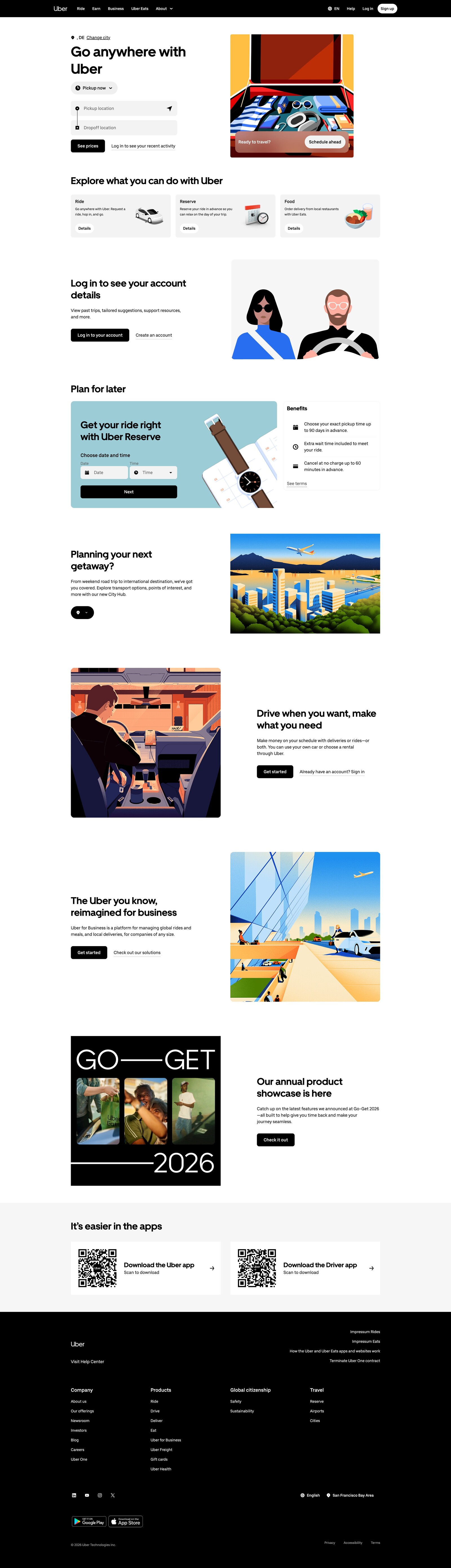
Uber
Uber is a practical example of clear entry points and straightforward user logic. The page has to serve riders, drivers, businesses, and other use cases, so structure matters more than decorative complexity.
The takeaway is structural coherence. When one brand serves several needs, the homepage should separate paths quickly.
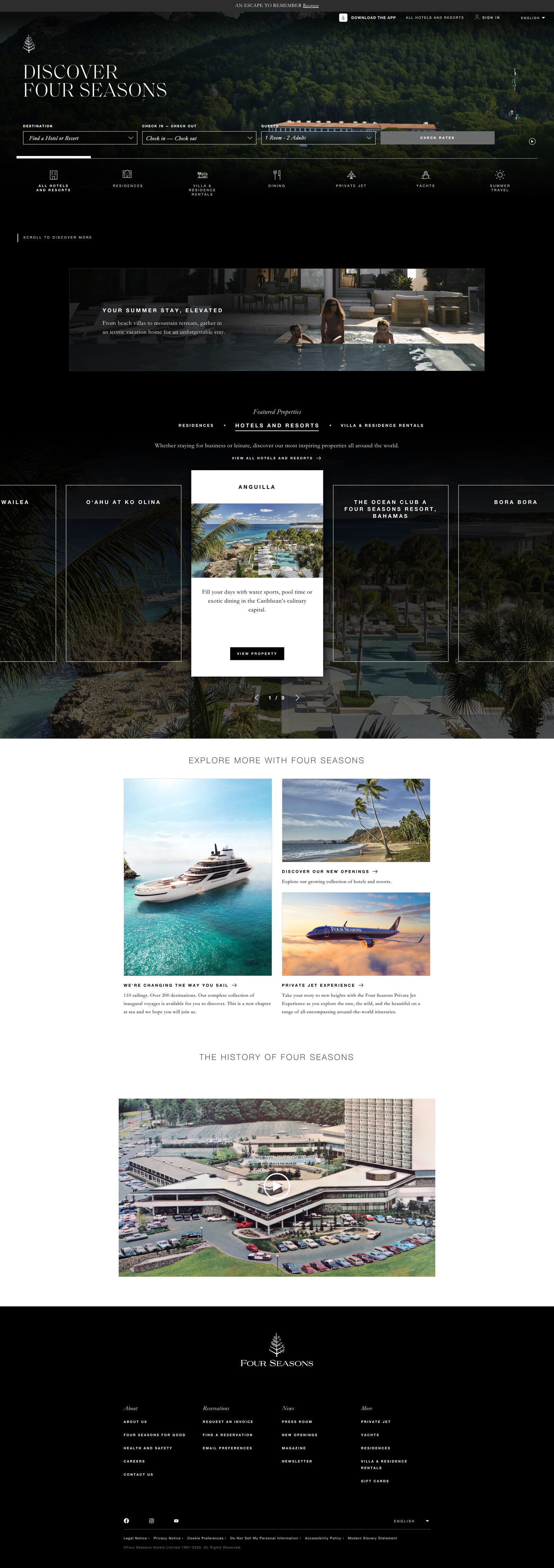
Four Seasons
Four Seasons shows how luxury branding can preserve usability. Premium imagery, refined typography, and calm pacing support the brand world while keeping key actions accessible.
The takeaway is controlled aspiration: luxury pages should inspire while still helping visitors search, compare, and book.
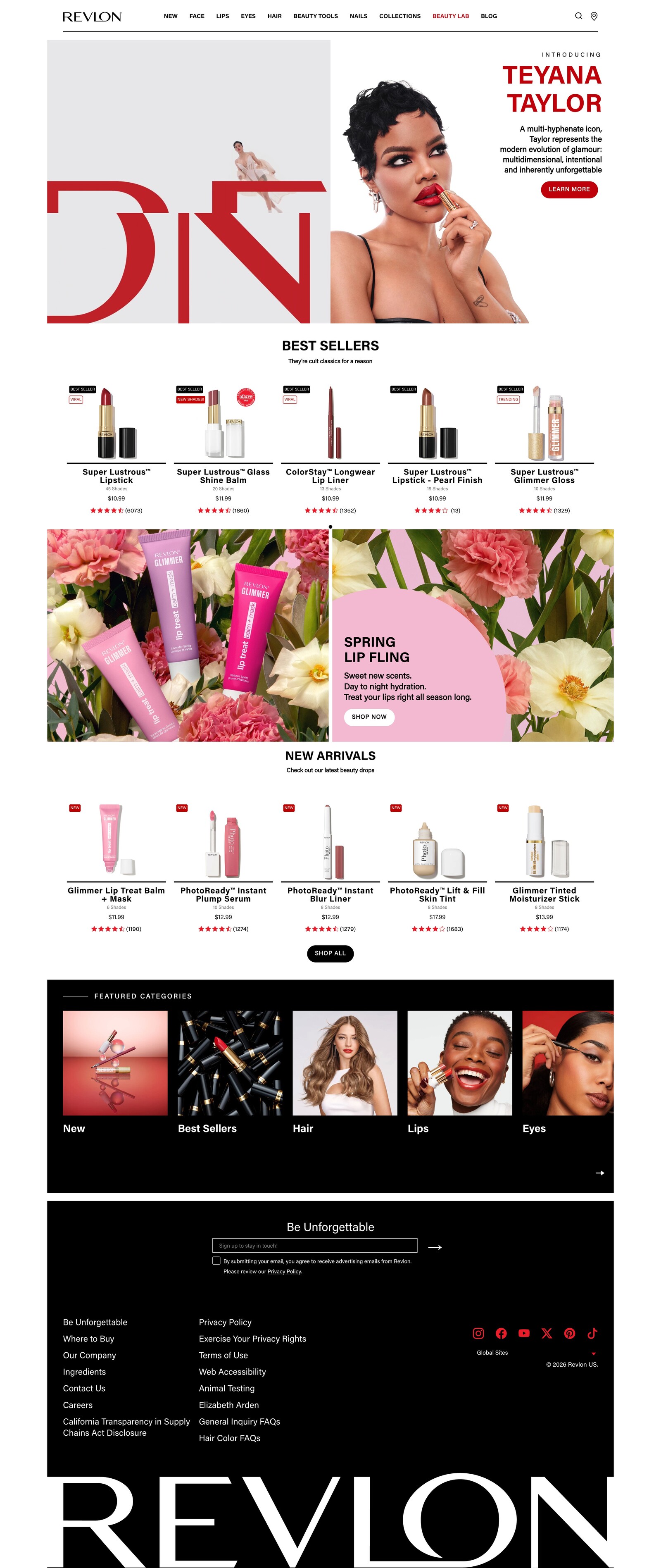
Revlon
Revlon is an example of expressive branding that can still guide the user. Strong color, product imagery, and campaign energy give the page personality while clear sections keep shopping and discovery within reach.
The takeaway is balance. Visual personality feels stronger when readability and movement stay intact.
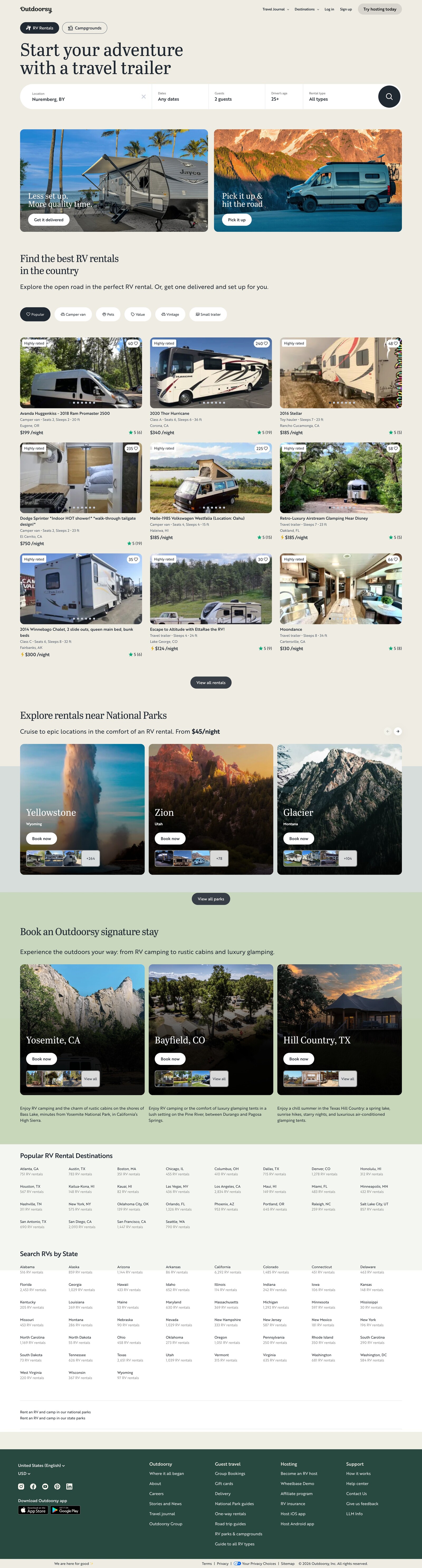
Outdoorsy
Outdoorsy combines inspiring visuals with practical navigation and clear user flow. The page has to sell emotion while helping people search and evaluate options.
The takeaway is emotional utility. Travel and lifestyle brands can build desire, then help visitors act on it.
Conclusion
A strong homepage explains the core offer quickly, sets priorities, and guides users forward. It gives first-time visitors a confident starting point and helps returning visitors find the path they need.
The best pages are built through clarity, structure, and disciplined delivery. That is why homepage design should be treated as a strategic brand and business decision. Companies with strong performance in this discipline grow revenue and shareholder returns at nearly twice the rate of their industry peers, which shows why investment in the first digital impression can support a larger customer experience strategy.
In conclusion, teams evaluating the best website design companies should look for partners who can create more than a beautiful first screen. The right partner should understand message hierarchy, user flow, proof, brand expression, and conversion. A homepage works hardest when it says the essential things clearly and gives people a reason to keep moving.

Creates insightful, strategy-driven content that translates complex design and branding concepts into accessible knowledge, supporting Ramotion’s mission to elevate digital experiences.