Icons may seem like minor decorations on a website or an app, but iconography design is anything but trivial. Since ancient times, icons have broken barriers, conveying thoughts and ideas at a glance before words were even invented.
Iconography design is significant across cultures, guiding human interaction in in-person and online settings. When iconography is part of a wider identity evolution, working with partners who think in systems—not just screens—can speed alignment; this overview of top agencies for brand identity design offers a useful snapshot of teams operating at that level. It has become crucial in creating an intuitive, memorable user experience, with businesses investing in strategic iconography design systems.
Read on to understand what it takes to create beautiful yet functional icons for apps, websites, and other digital products.
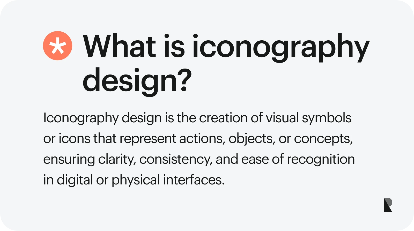
Iconography Design: What Is It and What Does It Do?
Iconography design uses geometric shapes and symbols to represent ideas, instructions, or actions without using words. For example, a light bulb icon represents an idea or helpful information. It is recognized and understood worldwide, conveying a single, clear message.
Iconography design has evolved. From its appearance in ancient religious and cultural contexts, iconography has transformed into an established art form, thanks to the work of art historians Warburg and Panofsky. Today, icons are on our screens, guiding users through websites and apps. Iconography design has become integral to delivering a successful user experience across various platforms and purposes.
The Importance of Icons in User Experience (UX)
Understanding the roles of icons in user experience is the next step to mastering iconography design.
Icons make navigation much easier
Icons simplify actions into buttons that users can engage with. They provide users with suggestions on how to explore the content.
A home icon brings users to the front page, toggles activate certain features, a hamburger icon opens up a navigation menu, and a magnifying glass activates search. All of these are done without needing lengthy explanations for users to understand.
These visual cues provide intuitive shortcuts for navigating content.
Icons minimize user errors
Colors, shapes, and symbols of icons can communicate their purpose to users. A red colored button suggests a stop, cancel, or adverse action. A green-colored button represents a go-ahead, positive, or affirmative action.
The shape of an icon also provides clues to its functions. A trash can communicates the action of deleting something. A back arrow indicates going back to a previous step or page. A play button universally signals the start of a video or audio.
Our brains have learned to associate certain visual elements with specific actions or outcomes. In effect, icons reduce confusion and miscommunication, thereby minimizing user errors.
Icons create an emotional connection
Think of icons as UX shortcuts that signal to our brains and connect to our hearts. Our brains process images faster than text, and icons tap into emotional triggers and cultural associations to guide behavior.
Common Types of Icons in Iconography Design
An effective icon set adheres to a consistent template, making complex design concepts easier to grasp. Explore which of these icon design types best suits your needs.
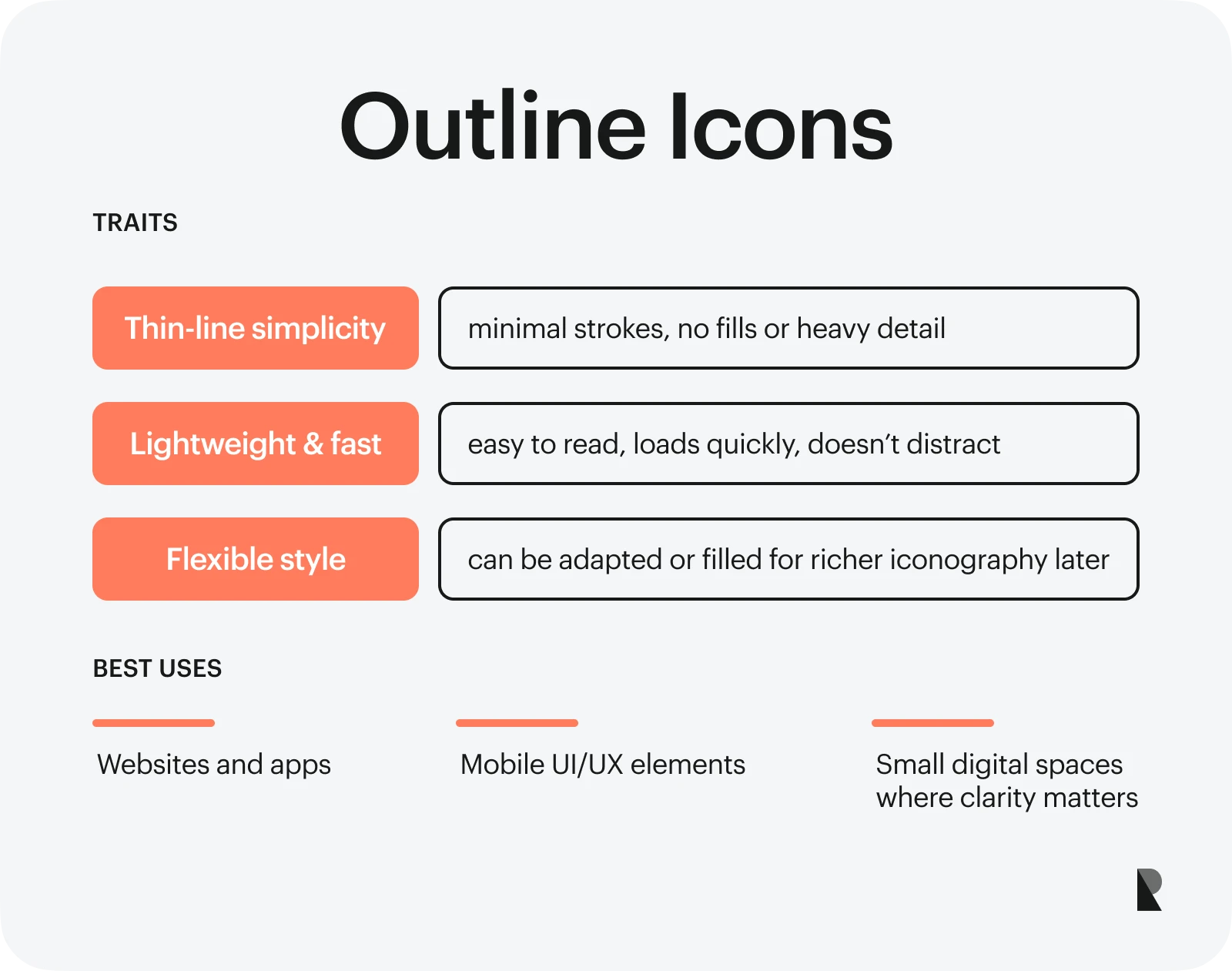
1. Outline icons
Outline icons are composed of thin lines with no elaborate details. They look like empty shapes waiting to be colored. This simplicity has made outline icons a favorite among designers looking for a clean aesthetic. Due to its lightweight design, it doesn't distract users and loads quickly.
Outline icons are also flexible, as you can personalize them easily should you decide to switch to a more elaborate iconography style. Outline icons are best used for websites, apps, and other digital interfaces where space is limited and clarity is a priority.
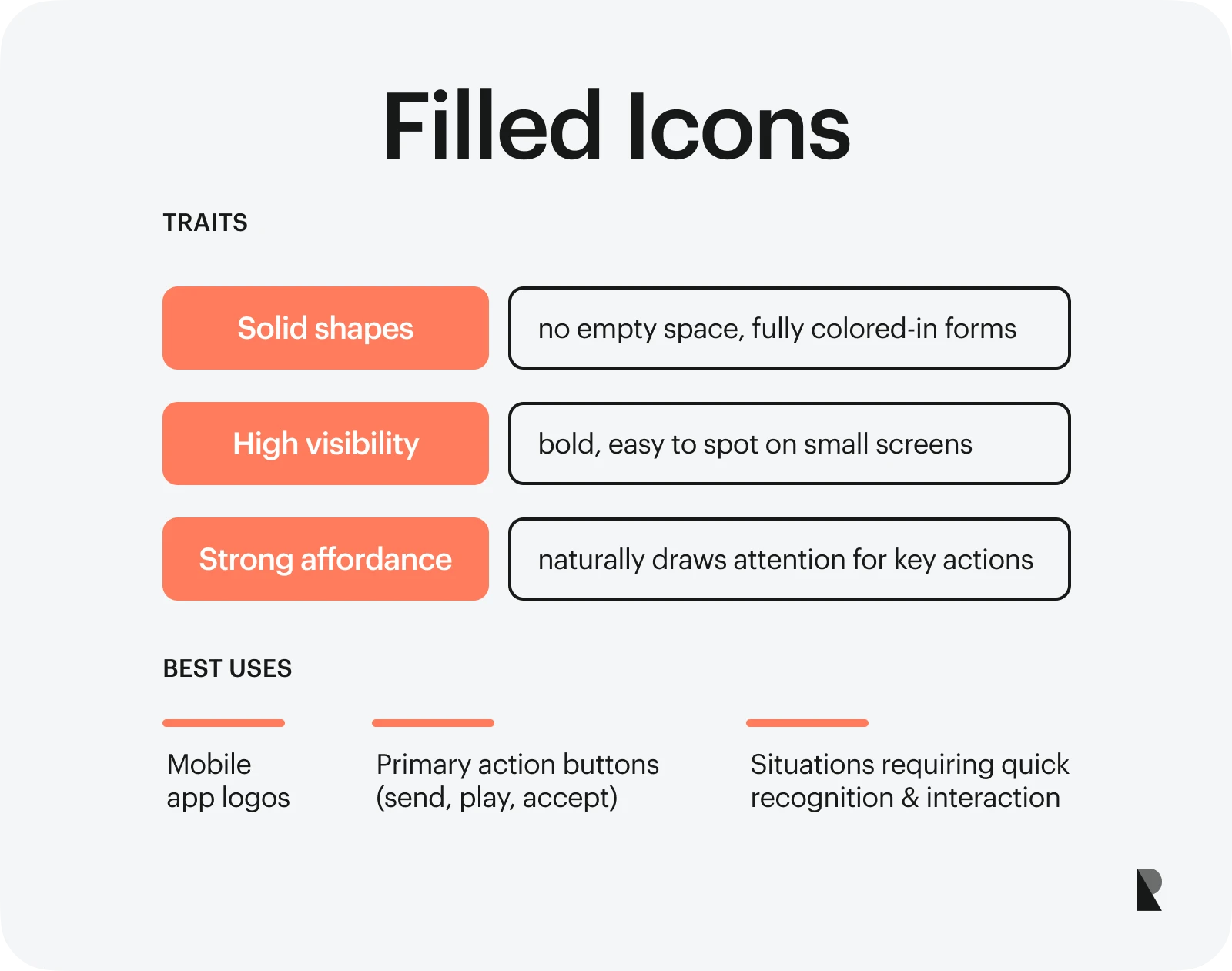
2. Filled icons
Filled icons are the opposite of outline icons. They are fully colored in, meaning there are no empty spaces inside. Filled icons look bolder, making them easy to spot. That's why many mobile app logos adopt such a design style. They stand out amid a gallery of icons on small screens.
Filled icons are ideal when you want a user to decide quickly and click on an option. You can use them for necessary actions, like 'send,' 'accept,' or 'play.'
3. Flat icons
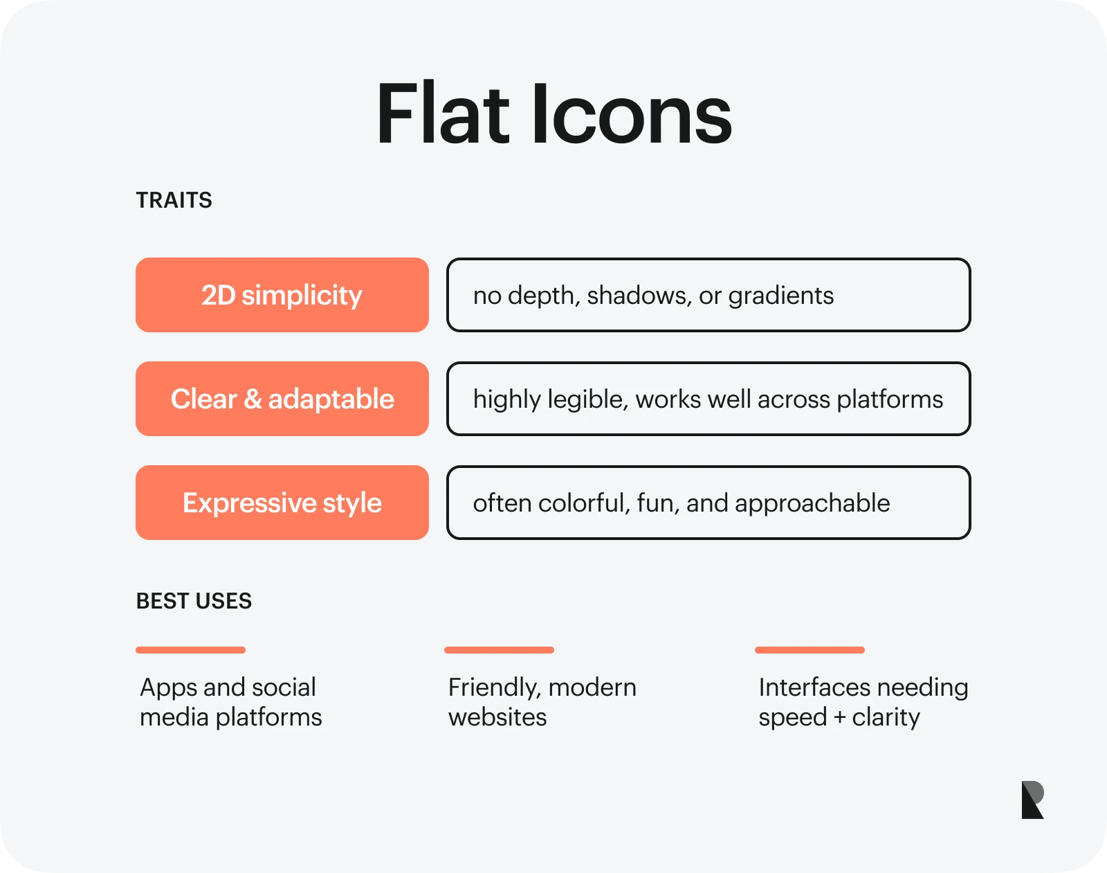
Flat icons are two-dimensional shapes and symbols without shadows or elaborate gradient colors. They offer the clarity, speed, and adaptability needed for modern and straightforward concepts.
These features made flat icons popular in 2012, notably when Microsoft incorporated flat design principles into its products. The cartoonish style makes this set of icons look fun and expressive, which is beneficial for apps and websites that aim to evoke a friendly vibe, such as social media sites like Facebook and Instagram.
Designers who want to experiment with various concepts often opt for flat icons due to their versatility and simplicity.
4. Duotone icons
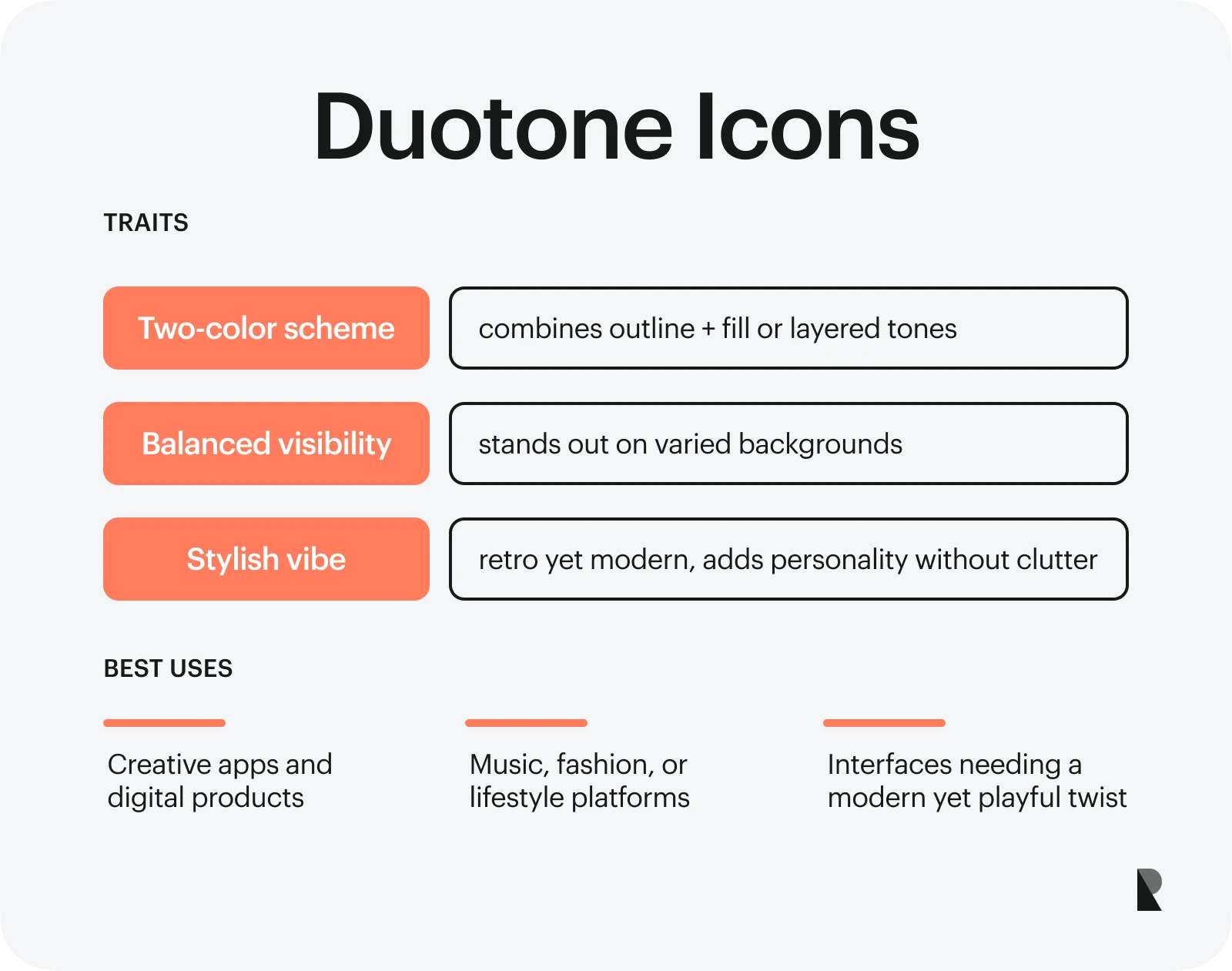
Duotone icons use two complementary colors. They are divided into two layers—for example, outline and fill—and colored differently. For instance, the outline will be lighter, while the filling will be bolder.
Two-toned icons also maintain visibility against different backgrounds. This style enables designers to add a dash of personality without the icons looking too busy alongside other graphic elements. Some find duotone icons retro with a touch of modern. If this is the vibe you're going for, then this icon style is for you.
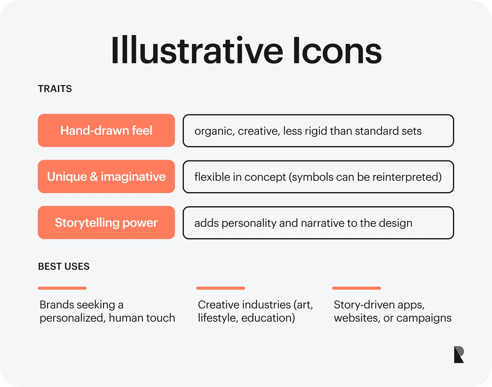
5. Illustrative icons
Illustrative icons feature small, hand-drawn elements that help people understand concepts. They look less rigid than other styles, making them a great icon style for brands looking to incorporate a more personalized approach.
Illustrative icons allow you to stretch your imagination and be creative, enabling you to create unique designs. For instance, instead of a trash bin icon, a designer can create a hand-drawn broom, a trash bag, or a dump truck to symbolize 'delete.' Illustrative icons also allow for compelling storytelling.
Five Principles of Effective Iconography
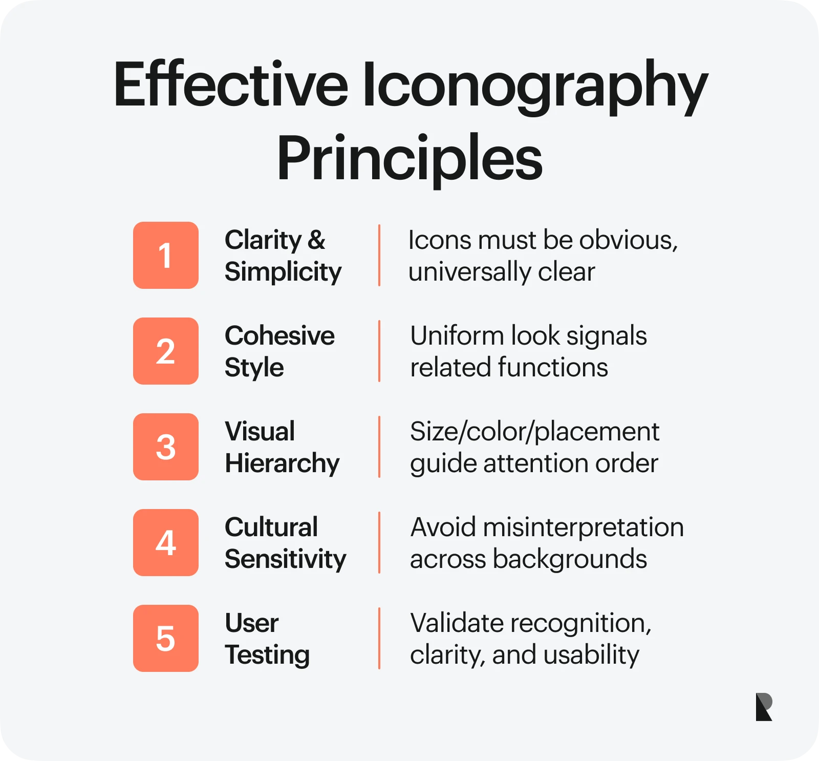
1. Effective icons are clear and simple
Icons should ease processes, not overcomplicate them. Hence, it is vital to design obvious icons that can be understood across cultures. For example, the heart symbol on social media denotes the approval of other users of your content.
2. Cohesive icon style matters
Aside from maintaining an aesthetic appeal that looks balanced and uniform, observing a cohesive icon style helps people understand which icons function together and know what to expect. For example, you will typically see play, pause, and forward buttons arranged with the same stroke style and color.
3. Factor in visual hierarchy
Visual hierarchy dictates which icons to notice first, second, and last. You can manipulate the order in which your icons are displayed using different sizes, colors, and placements. When you have a well-designed icon, you establish a clear visual hierarchy that prevents user confusion.
4. Observe cultural sensitivity
Some icons can have different meanings in other cultures. That's why you must carefully choose icons that do not upset or confuse people from various backgrounds. A good example is the home icon, which is broadly understood as a metaphor for a starting point or the first page. Another example is the paper plane, which perfectly represents sending a message.
5. Always conduct user testing
The final design principle in creating icons is testing them with potential and existing users. This allows you to assess whether everything is up to code, on-brand, and interpreted and used as intended. You wouldn't want users to confuse the Save button with the Delete button.
When running a user test, check for the following:
- Can people recognize the icons without needing descriptions?
- How easily can they spot the icons?
- Do they understand the action each icon set represents?
Regular user testing helps deliver a seamless and practical user experience.
Five Core Elements of an Icon
Now that you know which style of iconography design to use, let's tackle the core elements of an icon you need to consider.
Size

Determining the appropriate size of an icon set heavily relies on its purpose and the design elements you want to incorporate. For instance, opt for a small size while maintaining high resolution when designing icons for mobile phones or tablets.
Large icons appear sharper and are easier to recognize, making them ideal for more detailed designs. In contrast, smaller icons should be simple to avoid appearing messy or confusing. If you are working with multiple platforms, it's best to test your icon by shrinking it and seeing if you can still recognize it.
Grids
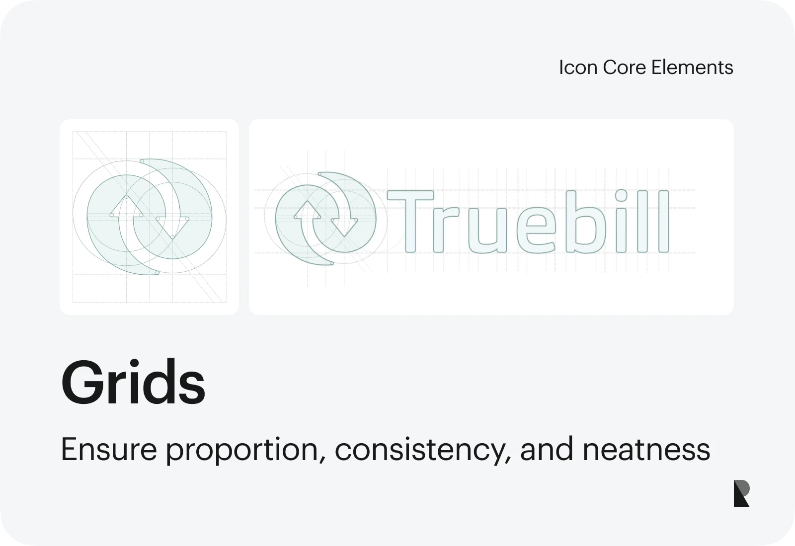
Pixel grids serve as guides when making icons. The invisible frame ensures that each icon is drawn neatly and consistently, creating a proportionate look regardless of the screen on which it is viewed.
Similar to choosing icon sizes, consider the platform's design system, the corner radius, and the details you want to include when deciding on the grid size and where your icon will be used. You can collaborate with your web developer to select a grid that meets the project's technical and visual requirements.
Color
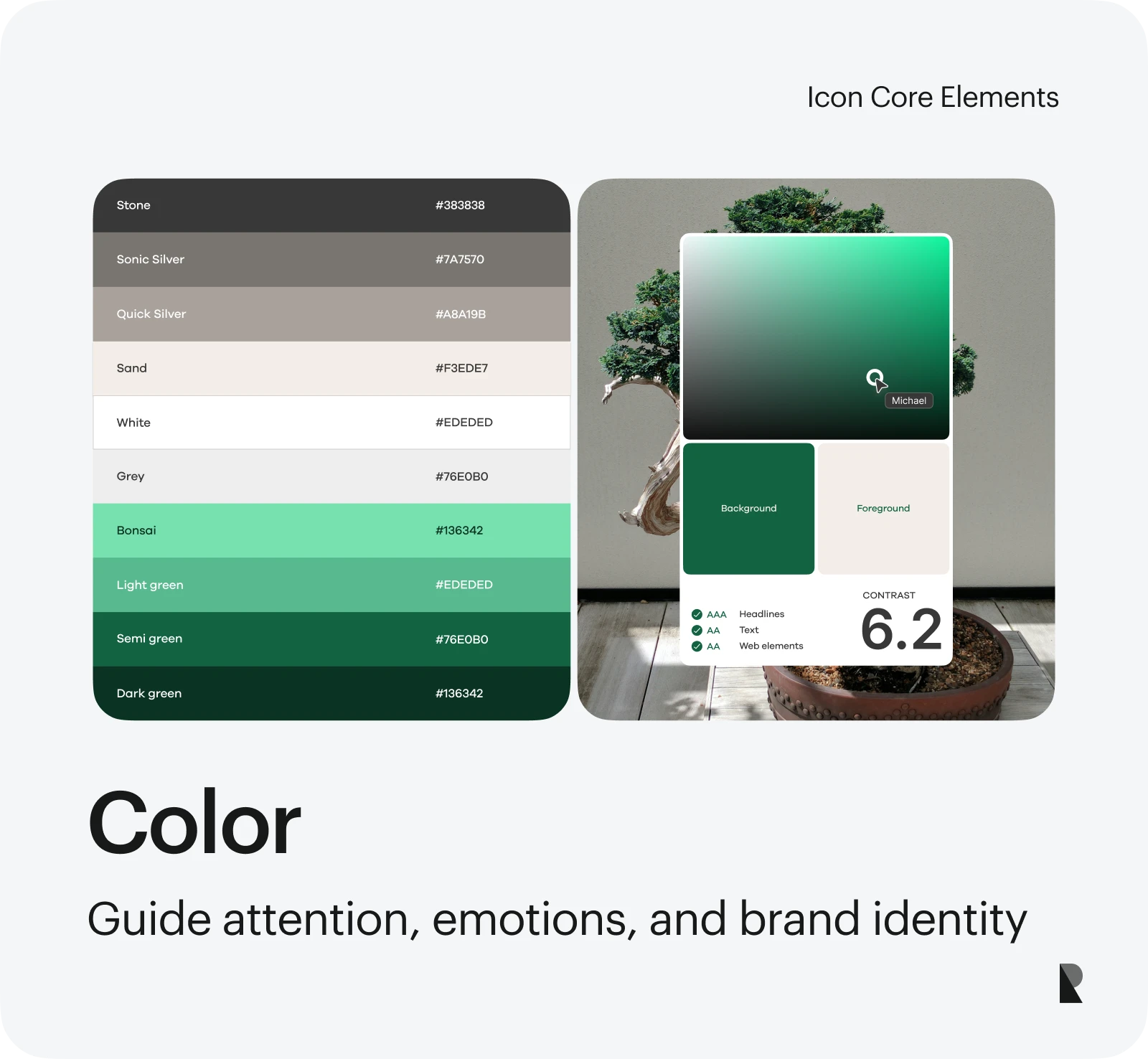
You can bring icons to life with colors!
But first, think of your goals, like grabbing attention, evoking emotions, and facilitating easy user navigation. You must also consider branding by leveraging brand colors to reinforce your identity.
Icons that use only one to two colors are easier to spot, as this prevents visual clashing. Consider how the icons contrast against colored backgrounds, which can be helpful for users with visual limitations.
Finally, color psychology influences users' emotions. Blue signals calmness, security, and reliability, which is why banks, hospitals, and other businesses that rely heavily on customer trust use this color. That said, choose colors wisely to guide users subconsciously toward the intended experiences.
Style
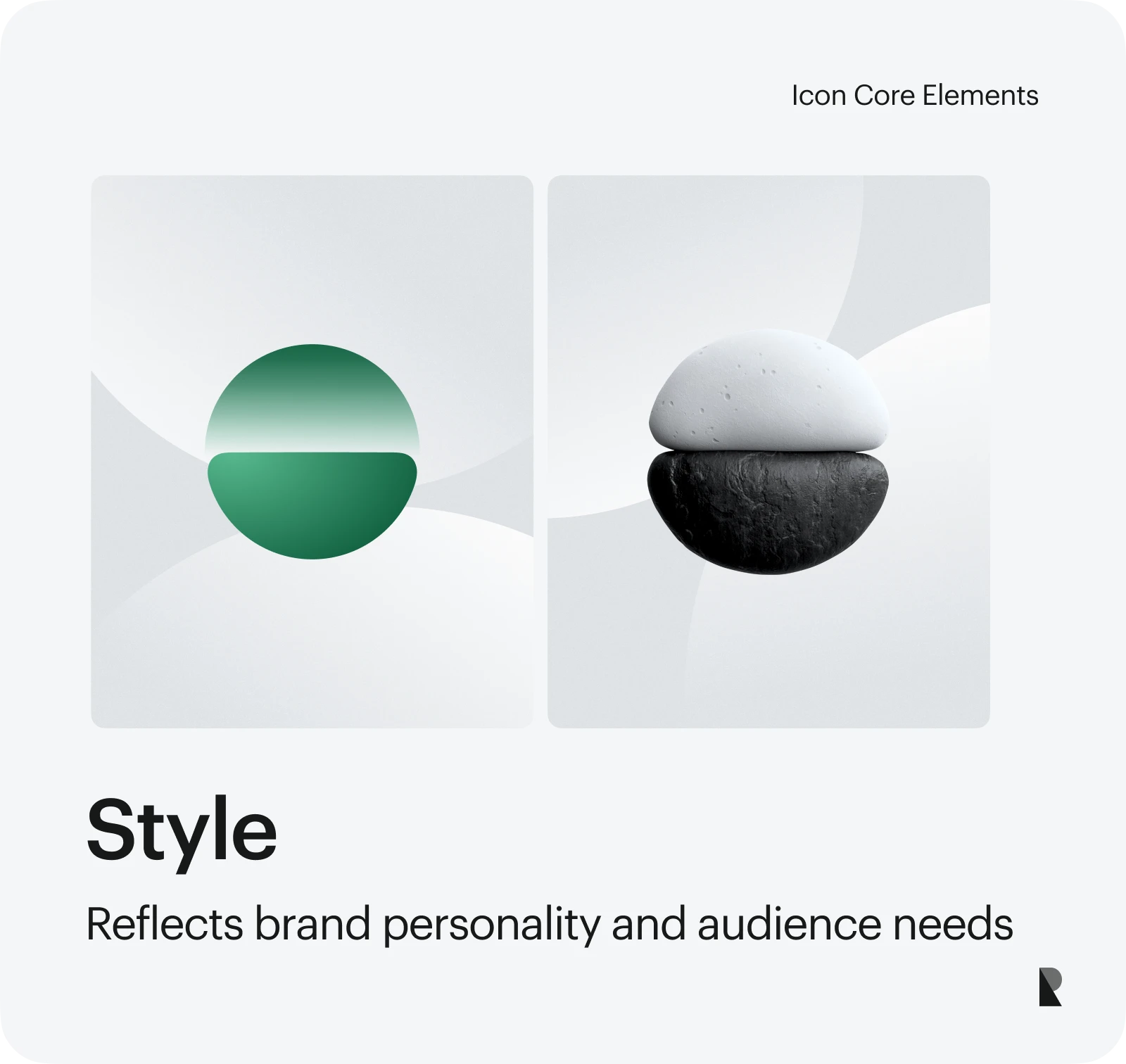
Express your individuality by choosing an icon style.
Design styles can make icons look fun, serious, or modern, affecting how users perceive and recognize your brand. So, be thoughtful and intentional when picking the right icon style.
Consider your audience's interests and needs and your brand's personality. For example, a gaming app for kids would benefit from bright and playful icons, whether in filled, 3D, or flat styles, to grab attention and encourage engagement.
Strokes and fills
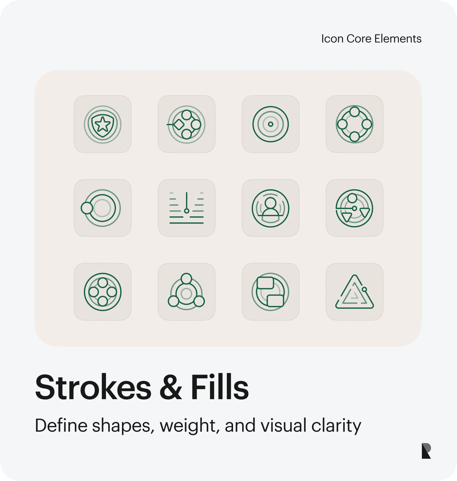
The stroke of an icon refers to the border or outline of a shape, while the fill refers to the pattern or color inside that shape.
Fills turn strokes into solid shapes. Due to their visual weight, filled icons are easily identifiable and recognizable. Depending on the stroke weight used, strokes can create a more defined icon.
Thinner strokes can appear cleaner but are barely visible, especially when the icon is small. Heavier strokes provide a more defined outline and a bolder appearance. While there is no standard rule for stroke weight, a stroke thickness of 2 pixels is ideal for a balanced look.
How to Build an Icon Design System in Five Steps
There is no single process for building an icon design system, but here are some fundamental steps to consider before hiring a design system company. For organizations that need expert support in structuring scalable and brand-consistent systems, partnering with a specialized design system agency can help ensure visual cohesion and technical precision from the outset.
Step 1: conduct a thorough icon audit
The first step in building an effective icon design system is to audit your icon usage. This involves a comprehensive review of all the icons currently used across your digital platforms and products.
During the audit, ask questions like:
- How well do these icons communicate their intended functions?
- Do the icons share a cohesive visual style and brand aesthetic?
- Are there any redundant or overlapping icons?
- Are the icons sized and positioned consistently?
This audit aims to identify pain points, remove redundancies, and establish a clear understanding of your current icon landscape. This lays the groundwork for developing a user-friendly icon system.
Step 2: set icon grid and style rules
After the audit is complete, you can establish rules and guidelines for your icon system, including grid and style. This ensures that your icons maintain aesthetic balance across platforms, are on-brand, and have easily understood meanings.
Decide on the optimal icon grid system to ensure visual alignment and proportionality across all your icons. Select a core set of colors and shapes that resonate with your brand identity. Document other relevant guidelines for easy reference.
These rules will help maintain consistency once you implement your icon design system.
Step 3: build a centralized icon library
An icon library serves as the central hub for all the icons in your system. This is where you'll house all the approved icons your team can access and utilize. The icon library also serves as a space to source inspiration for future icon design projects.
Start by researching and collecting icons you already like or use. These can be emojis or symbols that appeal to your audience. You can also organize them as you go, grouping similar icons so you can find them fast.
Make the icon library easily accessible to your team through a design system management tool or a custom-built platform. Provide clear instructions on how and where to download the icons properly.
Step 4: draft usage guidelines
It can be overwhelming to figure out how to use hundreds of icons in your library effectively. So, leverage usage guidelines with dos and don'ts that your team can easily refer to.
Include side-by-side visualizations of icons used correctly and incorrectly, and provide examples for exceptional cases, like when icons are placed against a dark background. Match your visuals with simple instructions that even non-designers can understand. List all icons with detailed metadata, including name, size, color codes, and a brief description of their intended use.
Step 5: maintain, test, and iterate the system
Maintaining an icon design system is an ongoing process. That said, assign a team that will oversee the management of your icon library. Among their tasks is organizing icons into categories and flagging problematic icons that need fixing or should be removed.
Testing is also important in ensuring an icon design system runs smoothly. This entails placing your new icons on your app and website to assess how they appear and function alongside existing icons.
Remember that visual language evolves as user behavior and needs, cultural contexts, and design goals shift. Therefore, continuous refinement is essential to maintain your icons' on-brand, fresh, and relevant status.
Resources for Iconography Designers
Iconography design varies greatly depending on your goals, target audience, and the overall user experience you aim to deliver. But you must balance form, function, tradition, and innovation. If you wish to expand your knowledge in iconography design, here are some resources to explore.
- Icon libraries: Flaticon, Font Awesome, and Google’s Materials Icons.
- Iconography books: ‘Signs and Symbols’ by Adrian Futiger and ‘Iconism’ by Wang Shaoqiang
- Iconography tools: Figma, Adobe Illustrator, and Sketch
Aug 12, 2025

Creates insightful, strategy-driven content that translates complex design and branding concepts into accessible knowledge, supporting Ramotion’s mission to elevate digital experiences.