An informational website helps people access, understand, compare, or use content. It may explain a topic, organize research, publish resources, guide decisions, or help someone check a claim. Its job is simple: move users from question to answer with as little friction as possible.
Strong information website design depends on structure, navigation, readability, and trust. Visual polish matters, especially for a brand-led business, but polish cannot save a confusing content system. The design needs to make the brand feel clear, competent, and human while helping users find what they came for.
Informational websites often carry the weight of expertise. They may hold guides, articles, case studies, glossaries, documentation, research, or policy pages. That scale creates a challenge: the more useful the library becomes, the easier it is for users to get lost. This guide focuses on practical choices that make complex content feel organized, calm, and usable.
Why Structure Shapes the Brand Experience
For a branding agency, the work also sits at a strategic level. The design should express the brand’s character without turning every page into a campaign moment. A calm research hub, a confident education center, and a technical knowledge base can all feel distinct, yet each one needs the same discipline: clear paths, useful labels, readable pages, and a content model editors can maintain. Good design gives the organization a recognizable voice while giving users fewer reasons to hesitate.
The strongest teams also plan governance early. They decide who owns each content type, how updates are reviewed, when pages expire, and how new topics enter the system. This prevents the library from becoming a collection of one-off decisions. It also protects the design over time, because editors have rules for headings, summaries, cards, links, and calls to action. Without those rules, even a polished launch can drift. With them, the site can keep growing while still feeling intentional.
That structure also gives internal teams a shared language. Designers, writers, strategists, and developers can make better decisions when they understand how each page type should behave. The result is a website that feels consistent from the outside and easier to manage from the inside.
There is also a financial case for this level of care. Every $1 invested in experience design can generate a $100 return, while companies investing in customer experience see a 32% rise in cross-selling and up-selling. Those numbers make the case for treating clarity as a growth asset, not a finishing touch. Clarity has commercial value. Half of customers are more loyal to companies that lead with design, and 80% are willing to pay more for a better user experience. For informational websites, the takeaway is direct: structure is part of the brand promise.
What Users Need First
Users usually arrive with a goal. They are not wandering through the website to admire the sitemap. They want to find an answer, understand a topic, verify a source, compare options, save content, or decide what to do next. A strong website quickly shows where content lives and how it is organized. The homepage, menus, category pages, search field, and article templates all need to answer one silent question: “Am I in the right place?” When the answer feels obvious, users relax. When the answer feels buried, they lose confidence.
This is where brand and usability meet. A trusted brand behaves predictably. It respects attention. It names things clearly. It guides people without forcing them to decode internal language. The best informational experience feels generous because it helps the user move before they need to ask for help.
How to Structure Information
Structure is the logic underneath the experience. Visual style sets the mood, but content logic decides whether the website can grow without turning into a maze. Categories, navigation, search, filters, tags, and internal links create the system users rely on.
Clear content categories
Content categories should reflect how users think, not how a company is organized. A random article list may work for a small blog, but it breaks down when the library expands. User-focused categories give the website a stable frame.
Start with real questions, tasks, and topics. What does the audience need to learn? What do they compare? What terms do they use? What decisions are they trying to make? Those answers should shape the category model.
Avoid mirroring departments, service lines, campaign themes, or marketing labels when they do not help users. Internal language often feels tidy to the business and vague to everyone else. A strong architecture translates company expertise into a system the audience can understand.
User-focused navigation
Navigation should guide people by intent. Menus and subcategories need to reflect what users are trying to find, not what the organization wants to promote first. On a large information website, navigation has to carry both breadth and confidence.
Good menus use plain labels. They avoid clever names when clear names work harder. They also support people who enter through search, social, email, or a direct article link. Most users will not begin at the homepage, so every page needs orientation.
Internal links create the next step. A broad guide can point to a specific answer. A glossary can connect to a tutorial. A category page can pull together the most useful resources. Every key page should make progression feel natural.
Search, filters, and tags
Search becomes a core path when the content library grows. Users who know what they want often prefer a search field to a menu. That makes search quality part of the user experience, not a technical detail hidden in the background.
Filters should be simple, predictable, and limited. Too many filters slow people down, especially when labels overlap. The strongest filters match clear user decisions: topic, content type, audience, date, product, location, or difficulty level.
Tags should clarify relationships between pieces of content. They should connect meaningful topics, not create clutter. A small tag system can help users discover related pages. A sprawling tag system becomes another layer of noise.
Related content links
Related content keeps users moving without forcing them back to the main menu. Related articles, next reads, topic clusters, and breadcrumbs help users go deeper while preserving context.
This matters because people often learn in steps. They may start with a broad overview, then need a comparison, then a glossary definition, then a more detailed guide. A useful website supports that path. It treats each page as part of a connected experience, not a dead end.
Readability and Trust
Content-heavy pages must feel clear before they feel impressive. Users judge credibility through writing, but they also judge it through layout, speed, hierarchy, and tone. A crowded page can make accurate material feel harder to trust.
Poor experiences carry a real cost. More than half of consumers say they would stop buying from a company after several bad experiences, and nearly one-third would leave because of inconsistent experiences. Meaning that, for informational websites, confusion can turn into churn.
Readable layout and typography
A readable layout starts with restraint. Comfortable line lengths, strong headings, spacing, and visual breaks help people scan before they read. Long-form content needs visible structure so users can decide where to focus.
Typography affects usability directly. Small text, weak contrast, tight spacing, and overloaded pages make the website feel tiring. Good typography creates rhythm. It helps the eye move from heading to paragraph to list to next section without strain.
Lists still matter, but they should support the writing. Use them for steps, comparisons, requirements, or quick groups of examples. Use paragraphs when the idea needs context or emotional weight. The best design choice is the one that makes the content easier to use.
Page templates by content type
Different content types need different templates. Articles, guides, glossaries, category pages, landing pages, resource hubs, and documentation pages do not serve the same purpose. One rigid layout will weaken at least some of them.
An article may need a table of contents, author details, related reads, and update dates. A glossary page may need concise definitions and cross-links. A category page may need filters, featured resources, and an overview. Templates should make those jobs easier.
Still, the templates must belong to one design system. Consistent spacing, type styles, component behavior, and navigation patterns keep the experience coherent. Flexibility should give editors room to publish well without making the site feel fragmented.
Trust signals and source context
Users need reasons to trust what they are reading. Author names, credentials, update dates, expert reviews, source links, editorial notes, and factual context all help. These signals matter most when the subject affects health, money, safety, law, or business decisions.
Trust also comes from transparency. Users should understand who published the content, when it was reviewed, how sources were chosen, and where to go next. A strong publishing website does not make people hunt for credibility.
For brands, trust signals are part of identity. They show care, discipline, and accountability. They also protect the brand from looking like it publishes content simply to fill search results.
Mobile and accessible reading
Most users will touch the site through a phone at some point. Pages need to work on small screens without zooming, cluttered sidebars, or sticky elements that block the content. Tap targets should feel easy. Menus should open cleanly. Search should remain visible enough to use.
Accessibility supports everyone. Strong contrast, clear headings, alt text, keyboard navigation, readable link text, and logical structure all make the website more usable.
Accessible design also signals respect. It tells users the brand has thought about more than the perfect desktop screenshot.
Common Mistakes with Information Websites
Strong content can fail when the system around it is weak. These mistakes are common because they grow slowly. A website starts clean, then new pages, campaigns, categories, and features pile up until users can no longer see the structure.
Internal-first structure
Company-centered categories confuse users because they ask people to understand the business before they can find an answer. A department name may mean a lot internally and very little to a new visitor.
Navigation should reflect user needs, questions, and tasks. Test labels against real queries. Ask whether a person outside the company would know where to click. If the answer is uncertain, the label needs work.
Too much content, no system
More content does not automatically make a site useful. Without a system, growth creates an archive. Users may see plenty of pages and still struggle to find the right one.
Weak categorization, inconsistent templates, thin search, and poor linking all make content harder to use. Build the system before scaling publication. Define categories, templates, naming rules, metadata, and review cycles early, then let the library grow inside that structure.
Visually heavy pages
Banners, pop-ups, crowded cards, sidebars, and competing calls to action slow users down. On an information website, the content should remain the main focus of the page.
Visual restraint is discipline. Whitespace, hierarchy, and selective emphasis help the user see what matters. A refined design can still feel expressive, but it should never make the user fight for the answer.
Outdated content that looks current
Old content can damage trust when it looks current. Users need to know whether the material still applies, especially when details change over time.
Visible review dates, update notes, and freshness indicators help. So does a clear editorial process. If the site covers topics that change quickly, review schedules should be built into the content operation.
Information Website Examples
The strongest examples show that structure and personality can work together. Each website below has different goals, but each offers a practical lesson for brands that publish complex content.
Wikipedia
Wikipedia shows the power of consistent templates, internal linking, and topic-to-topic navigation. Its pages look familiar even when the subject changes. That familiarity helps users move through a massive content library without relearning the interface.
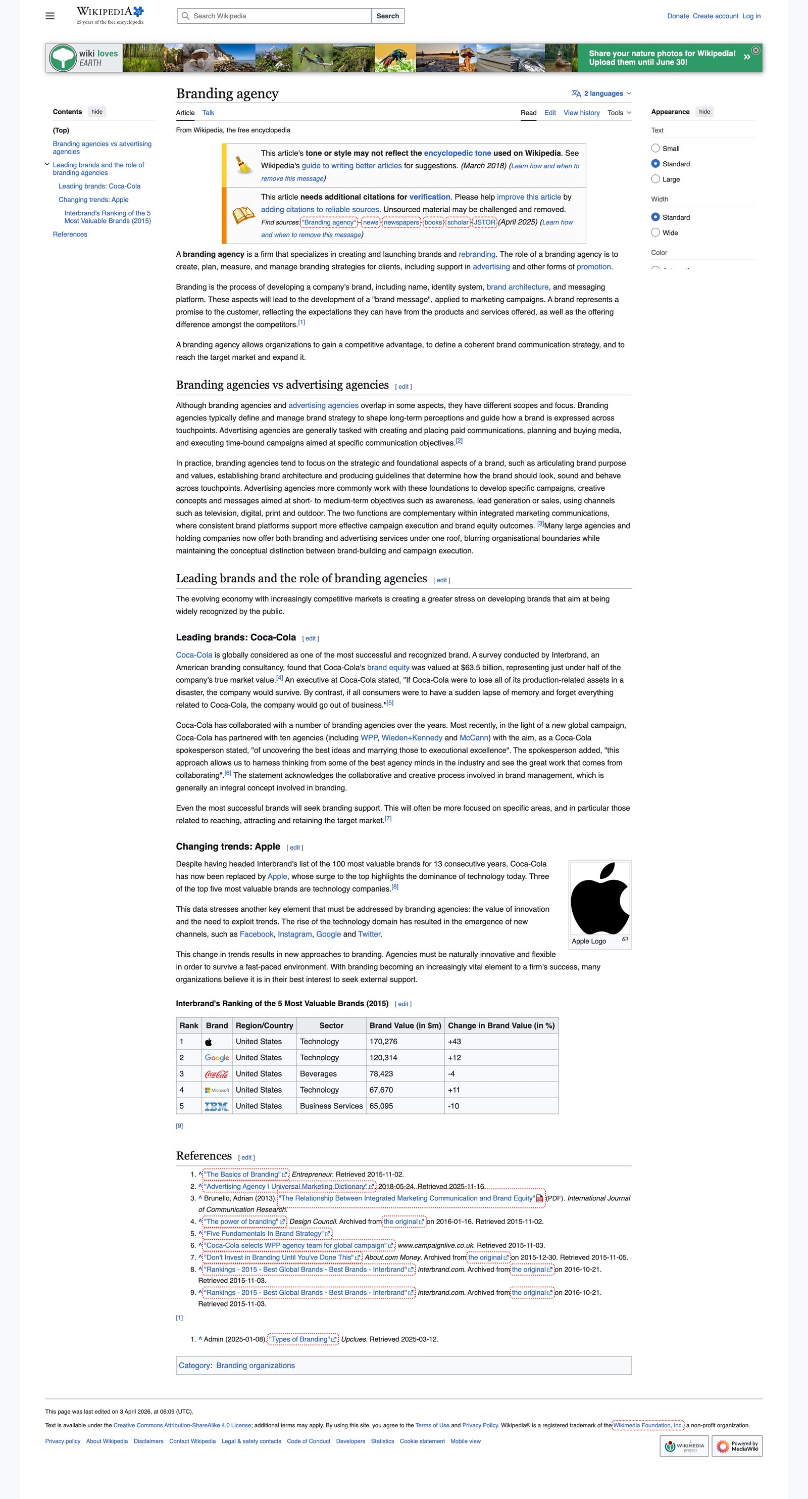
What can we learn here? Scalability. When templates and links stay consistent, a huge website can still feel usable. Structure does the heavy lifting. That discipline reduces decision fatigue for readers and for editors. It gives every page a job, a place in the larger system, and a reason to exist.
MDN Web Docs
MDN Web Docs is a strong benchmark for technical content. Its documentation categories, search, related resources, and page templates help users move from concept to syntax to implementation.
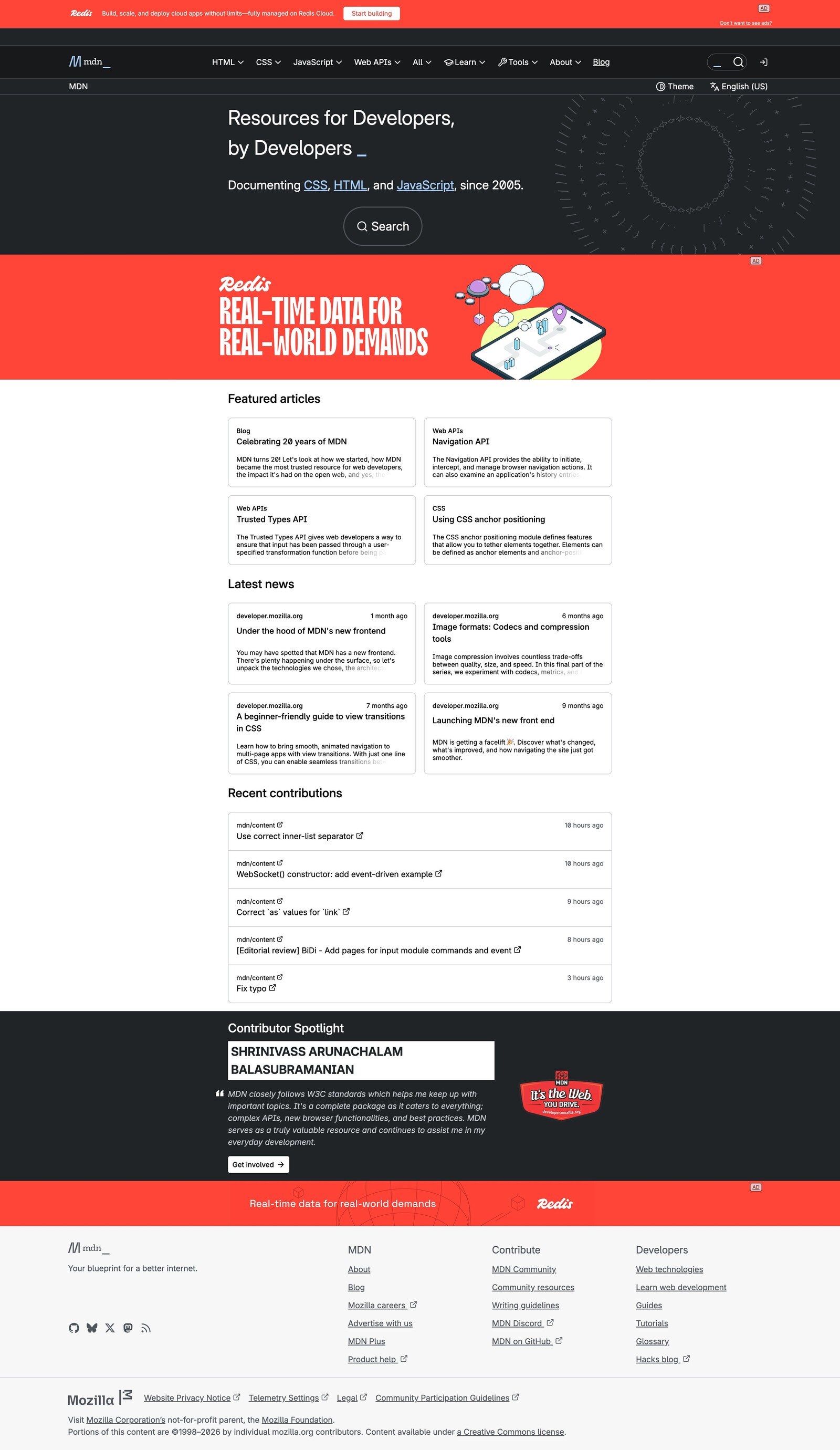
What can we learn here? Depth without chaos. Technical material can stay detailed when the structure is clear and the next step is easy to find.
Mayo Clinic
Mayo Clinic handles complex topics with careful sectioning, search, and visible credibility. Health content requires a higher level of trust because users may arrive worried, rushed, or uncertain.
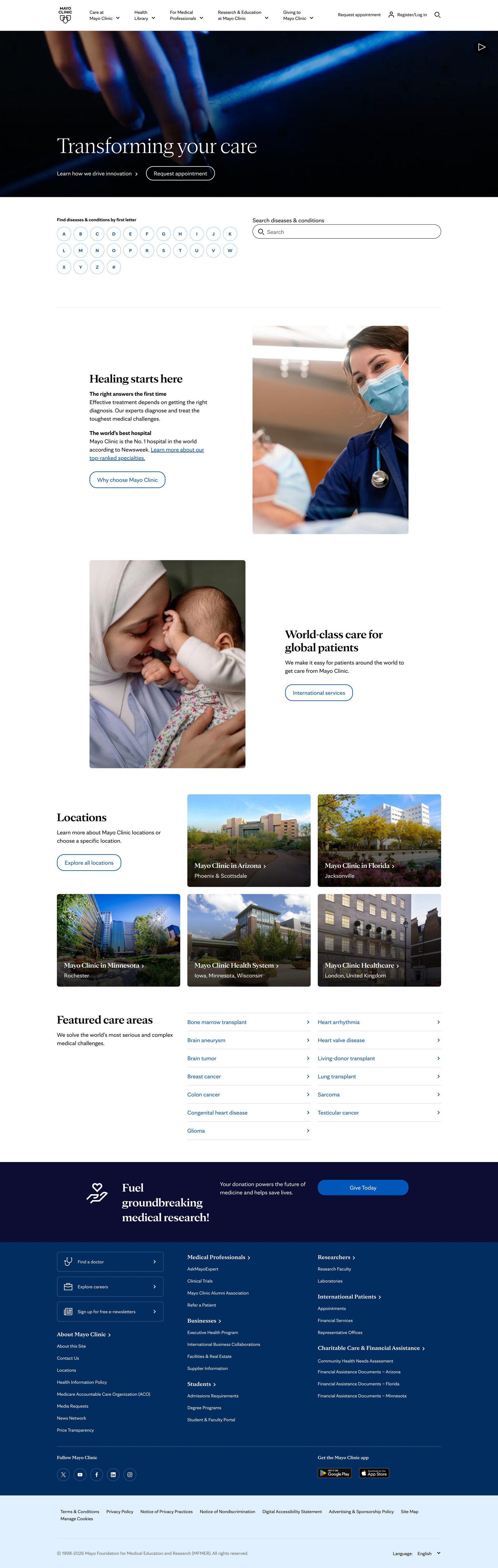
What can we learn here? Calm authority. A high-stakes website should make complex material feel understandable without flattening its meaning.
Nielsen Norman Group
Nielsen Norman Group shows how expert-led articles, research categories, and internal links can build authority over time. Users can read one piece, then move into deeper research around the same subject.
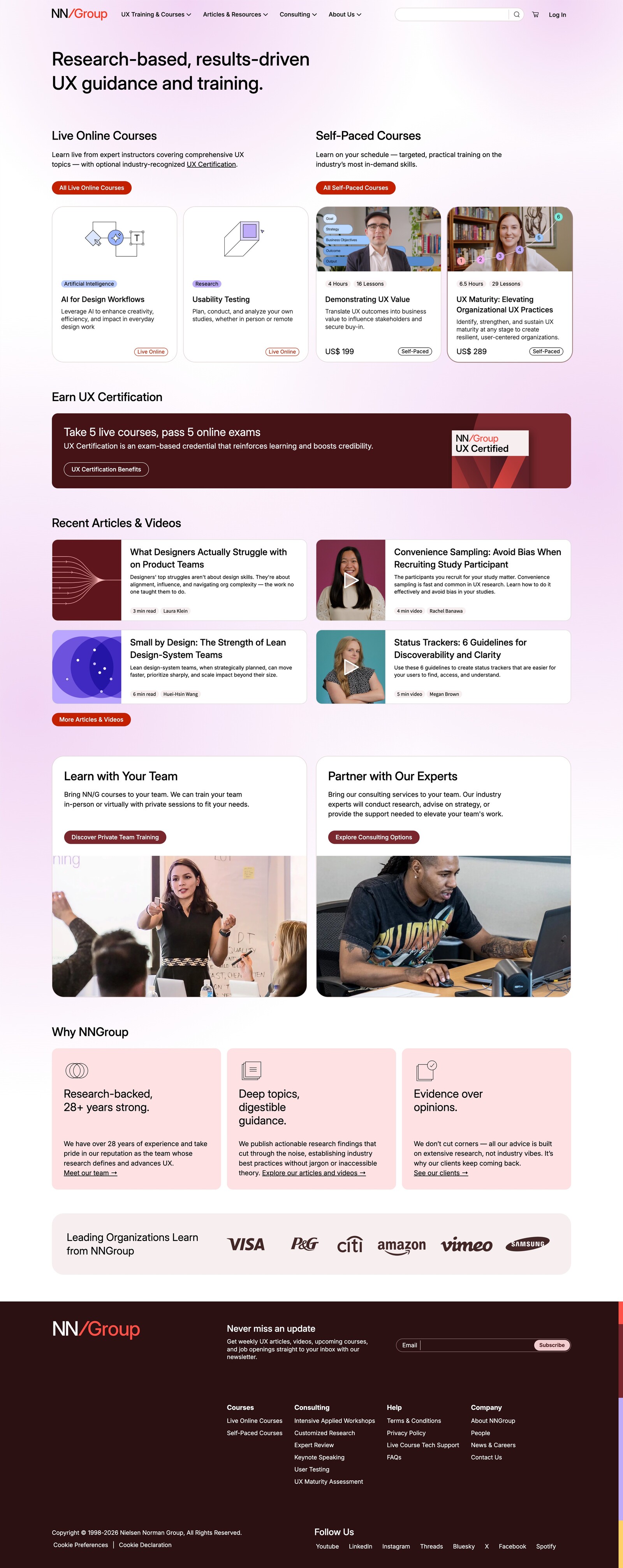
What can we learn here? Editorial depth. A focused content library becomes more valuable when every page connects to a larger body of expertise.
National Geographic
National Geographic balances visual storytelling with editorial structure. Strong imagery draws people in, but the structure supports the narrative instead of replacing it.
What can we learn here? Balance. Visual appeal can lift informational content when it serves the story and helps people understand the subject more fully.
Healthline
Healthline shows how consumer-facing health content can feel accessible while still using author context, medical review signals, updates, and related resources. The pages are built for readers who need clarity quickly.
What can we learn here? Approachable trust. Clear writing, strong structure, and visible review signals can make sensitive topics easier to use
Conclusion
A good resource website helps users find, understand, and use content quickly. It turns a large library into a guided experience. It makes categories clear, navigation useful, search reliable, templates consistent, and trust signals visible. For a brand, that clarity matters. Every page teaches users what the organization values. A confusing website says the brand has not fully considered the user’s time. A clear website says the brand is thoughtful, capable, and ready to help.
When teams look for the best full-stack website development companies to build this kind of experience, they should look beyond visual polish alone. The right partner should understand content strategy, information architecture, UX, development, accessibility, performance, and brand expression as one connected system.
Design should support the content rather than compete with it. The strongest informational websites out there use structure, readable layouts, restrained visuals, and credible context to make complexity feel manageable. When that happens, the website becomes more than a place to publish. It becomes a brand experience people can trust.

Creates insightful, strategy-driven content that translates complex design and branding concepts into accessible knowledge, supporting Ramotion’s mission to elevate digital experiences.