Most medical websites read like medical textbooks—technical and hard to follow, especially for people who are already anxious and looking for clear answers. With the right web design strategies and UX principles, you can turn a site into a tool that educates visitors, builds connections, and converts them into patients.
This article explores practical medical website design practices and case-study lessons from real medical organizations.
Medical Website Goals
An effective medical website does three things well:
- Educates visitors clearly about services and care pathways, which builds credibility.
- Guides visitors to the next step, like booking, sending inquiries, or signing up.
- Reduces anxiety by centering the patient experience.
A medical website is more than a list of services. Most visitors come with worry and limited disease understanding, so design and copy must adjust to that. The goal is a patient-centered platform that informs, reassures, and directs people to clear outcomes.
So, how do you create a patient-centered medical website?
Medical Website UX Strategies: Clarity, Calm, and Trust
Your medical website’s success hinges best on the user experience it delivers. Its ultimate goals are to provide clarity, evoke calm, create connection, and establish trust.
Simple Hero Messaging
The hero (top-of-homepage) message should quickly answer the following:
- What problem are you solving?
- How can you solve it?
- What steps should be taken next?
Avoid overly wordy or technical messaging and use plain language that matches how patients talk. Keep it simple!
For instance, a pediatric clinic’s hero messaging aims to target parents looking for convenient and gentle care for their kids. Here’s how you can format your hero messaging.
Headline: “Expert pediatric care that fits your busy life.” Sub-heading (supporting sentence): Get 24/7 access to doctors because childhood illnesses don’t follow a schedule. CTA (call-to-action) button: ‘Schedule Same-Day Visit’.
Keep the hero focused with one primary headline, one supporting line, and one clear CTA.
Stress-Free Navigation
Navigation should reduce cognitive load and help visitors act quickly. Practices that improve navigation are:
- Easy-to-use menu minus medical terms. “Otolaryngology” is labeled as “Ear, Nose, and Throat,” or “Kidney Care” instead of “Nephrology”.
- Trail links to guide users. It’s a text-based navigation aid that helps users always know exactly where they are within the site’s hierarchy. E.g., Home>About Us>Specialists.
- Highly visible primary actions. Don’t force users to scroll back to the top.
Important buttons should be easy to locate at all times. A 2024 study by JD Power on the US Healthcare Digital Experience study reveals that 42% respondents reported issues while using health insurance websites. So, simplify navigation to avoid frustration.
Easy Booking and Contact
Make booking and contacting prominent and straightforward. For instance, the “Book Online” button is always present on every page, either as a fixed or a Floating Action Button (FAB) that follows as you scroll the page. There should also be a confirmation page and the appointment automatically syncs to patient’s calendar.
Finally, provide alternative contact channels—phone, email, chat—and clearly expected response times. Design booking flows to minimise steps and uncertainty. Doing so shows a clear sign of competence even before you meet your patients in person.
Trust-Building Design and Content
Trust is earned through design cues and transparent content. Feature real patient stories and testimonials, and leverage credential badges (certifications, hospital affiliations, accepted insurers). It helps to state privacy and security practices plainly (HIPAA compliance and data encryption).
Additionally, create an FAQ page and clear communication channels. Use authentic imagery instead of staged stock photos. When your website is designed to be forthcoming, honest, and accessible, users are more likely to be receptive to what you offer.
Essential Medical Website Features
There’s no single formula for creating a medical website. But the best ones possess three foundational features.
1. Clear Services and Providers
Structure service pages according to patient need, ensuring each page answers who it’s for, what to expect, and the next step. Humanize provider profiles with credentials plus a short philosophy of care. Some examples include, I treat the person, not the disease (holistic approach), I care for my patients like they’re family (family-centered), etc. And inject personality through friendly photos or intro videos.
2. Accessible Mobile Design
Data shows that over 50% of web traffic comes from mobile users. But for many medical websites, half of the visitors exit due to a poor mobile web experience.
A mobile-first medical website doesn’t mean a shrunk version of the desktop site. It means the website has a dedicated mobile design where the layout automatically adjusts to different phone screen sizes, content remains high quality, pages load as quickly, and icons, buttons, and menus are touch-friendly.
Done right, mobile-first websites lead to better experiences, more engagement, and higher conversion rates.
3. Helpful Content and Search
A wealth of medical information and resources is always best, but only if they are relevant to your audience and are easy to find. This is where information architecture—how you organize, structure, and label content—comes into play.
An effective information architecture possesses the following:
- Clear content segmentation according to users (patients, doctors, partners).
- Top-down content hierarchy, where broad service pages branch into specific specialties.
- Inclusive architecture that makes content accessible to people with disabilities. Use of consistent, non-medical language for navigation labels.
Work with one of the best professional website development companies to help you realize your goals.
Healthcare Website Design Examples
Learn how these web design strategies and features are applied across health organizations.
Athenahealth
Athenahealth is an all-in-one platform that provides professional handling of electronic health records, billing, and patient communication for other health organizations. It presents AI-powered solutions centered on reducing paperwork and faster payment processing, among others.
What Works:
1. Simplicity in healthcare website design
The pages are filled with short explainers and prirotize data points to increase engagement and boost credibility. White space is abundant, forcing focus onto a single CTA per screen.
2. Clear value proposition
Athenahealth conveys a single message, which is to simplify workflows in the health industry with its user-friendly solutions. Case studies with real results are presented to support the message.
3. Dominant cues to guide users
Each page follows a consistent conversion path, which is for users to learn the benefit and then request a conversion. With CTAs like ‘Schedule a Demo’ or ‘Talk to an Expert,’ the website moves readers from education to consideration.
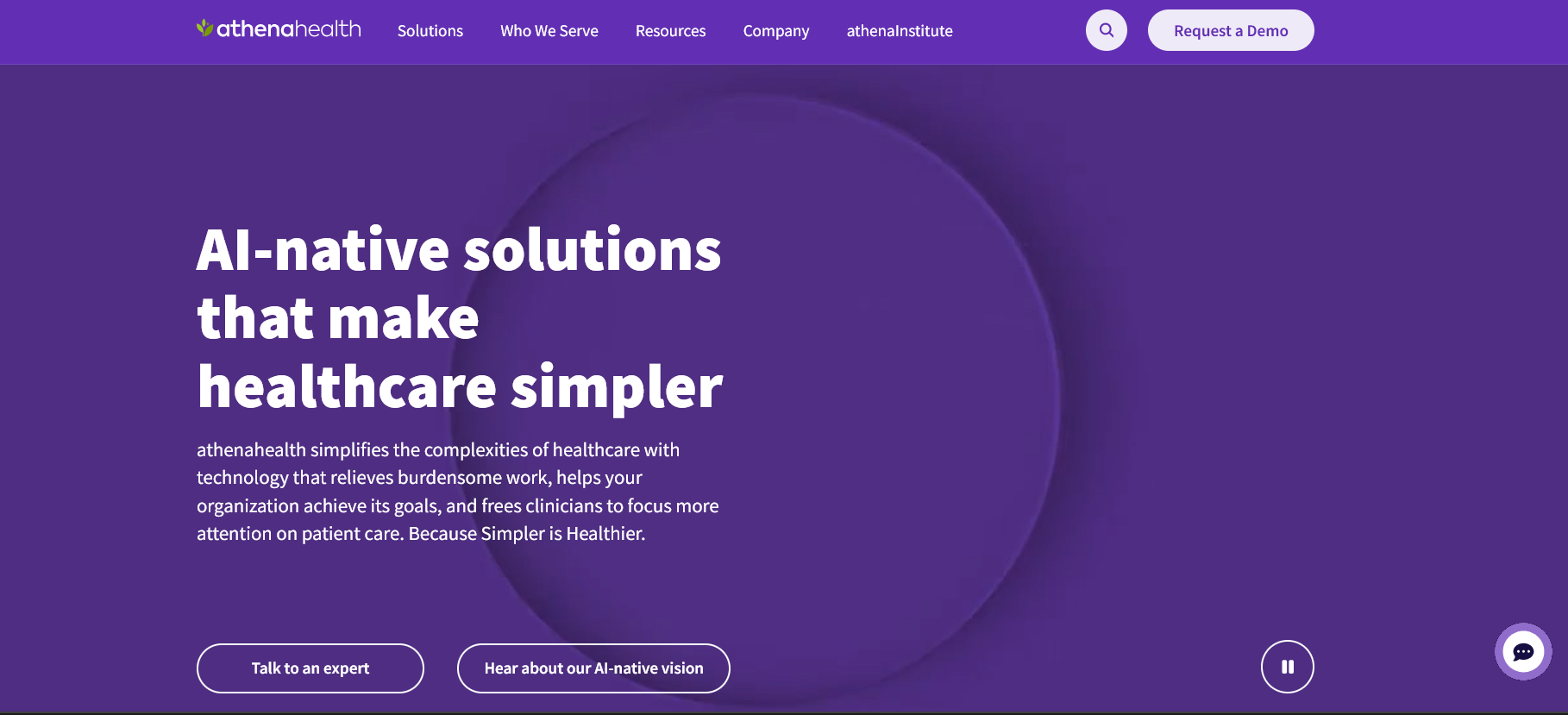
Minimalist homepage with clear value proposition. Image via athenahealth
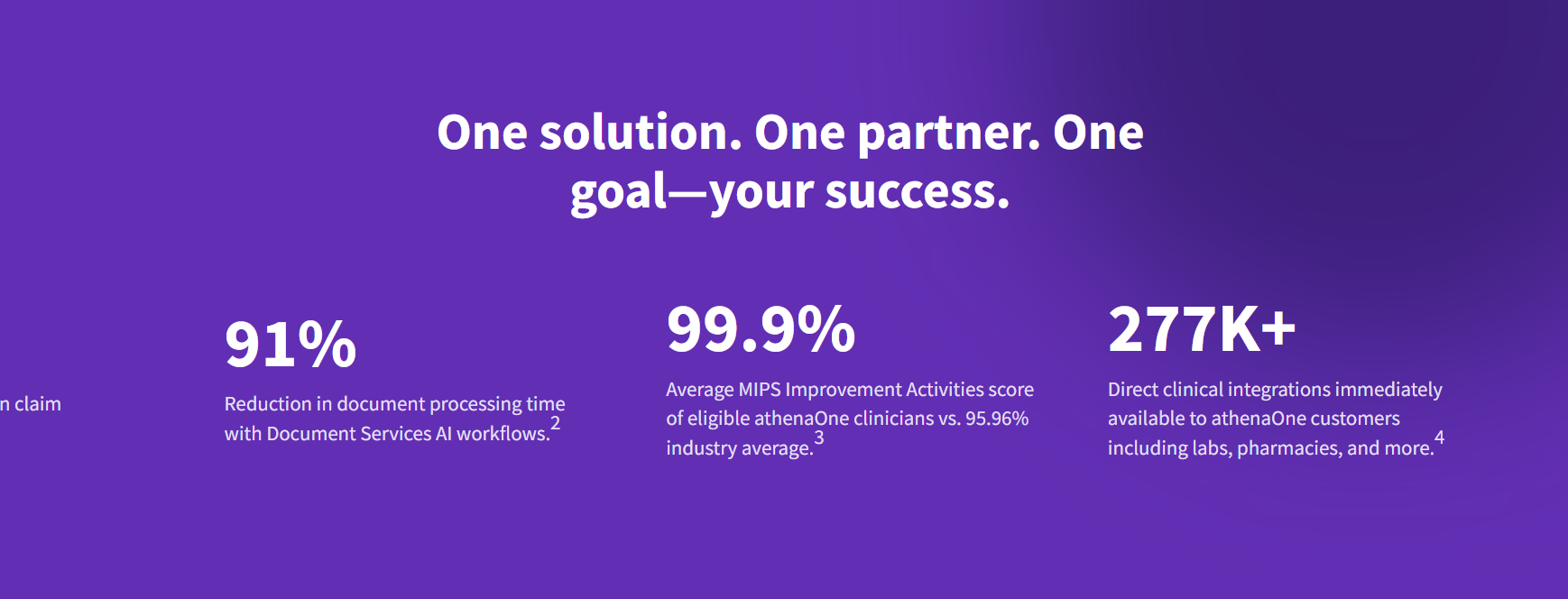
Claims are supported by numbers. Iage via athenahealth
Mayo Clinic
Mayo Clinic is an academic medical center known for treating all types of conditions worldwide. The organization serves patients seeking answers and medical professionals seeking to refer patients or access research.
What Works:
1. Letter-based search navigation
The website allows users to find diseases or symptoms with letter indexing, reducing guesswork. This works because a user often knows the name of a symptom (“M” for migraine) or a disease (“A” for arthritis) but not its medical category.
2. Robust health content library
The content helps establish expertise and builds trust. With authoritative content, search engines prioritize the website. For instance, a user in Poland searching for a specific heart condition is more likely to land on Mayo Clinic, not a local hospital’s website.
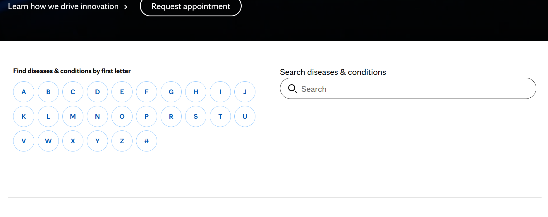
Letter-based search menu via Mayo Clinic
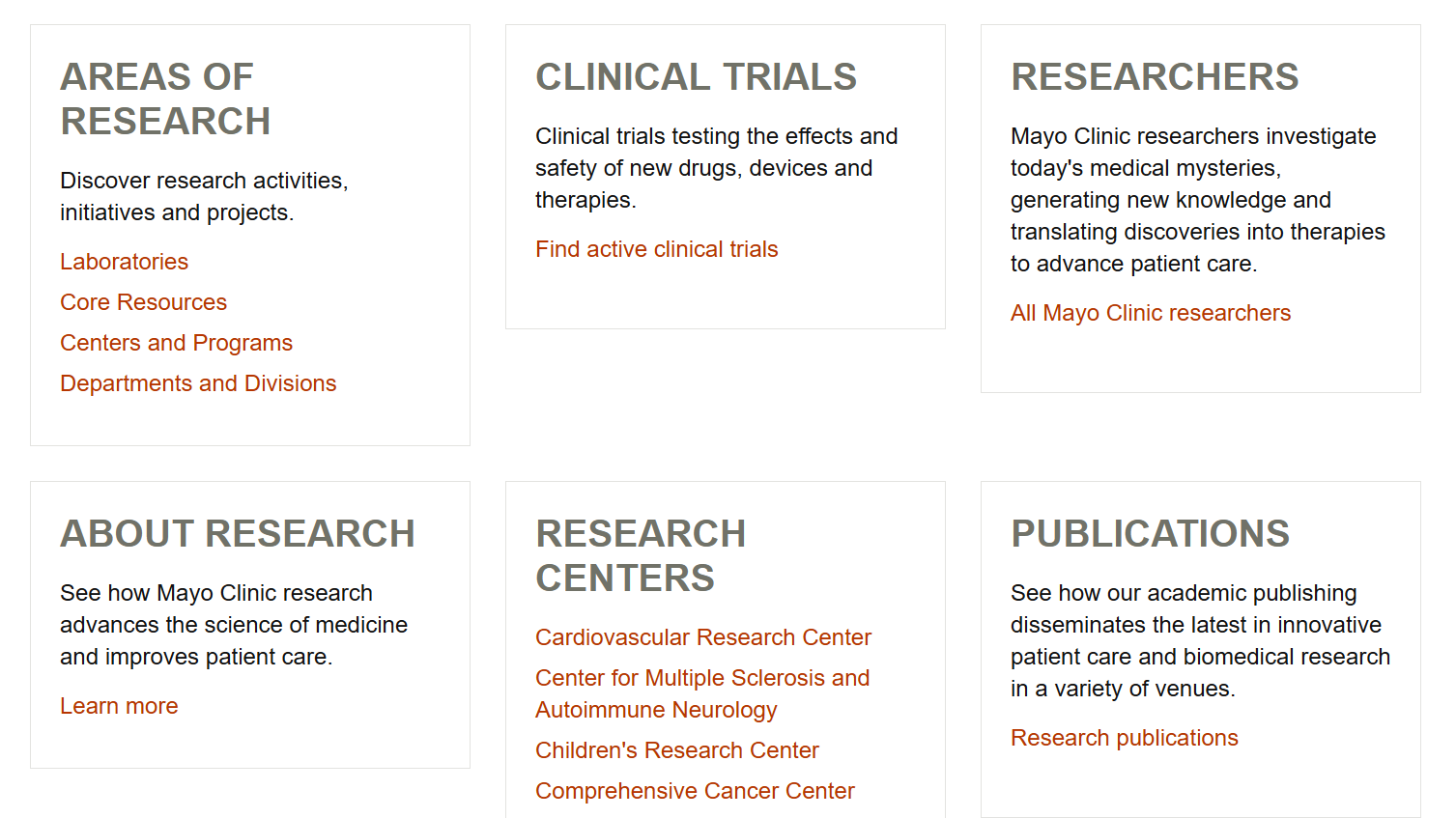
A comprehensive research page establishes credibility. Image via Mayo Clinic
Maven Clinic
Maven Clinic is a women and family-focused organization that provides 24/7 access to specialists, fertility, maternity, parenting, and menopause. Unlike Mayo Clinic, their services are supplemental to the existing care of patients looking to build families.
What Works:
1. Genuine, friendly imagery
Maven’s website veers away from the usual healthcare sterile look. It features images of real-looking, everyday people across all ages, creating a warm, happy, and inviting experience. Not doctors in white coats or picture-perfect models.
Although the website caters to different audiences (employers, individuals, etc), the visual system remains cohesive in conveying how person-centered the organization is.
2. Relatable Member Journeys
Short member journey stories that highlight problems and outcomes follow an easy-to-scan format. It creates a more engaging and well-guided experience that calms an anxious mind.
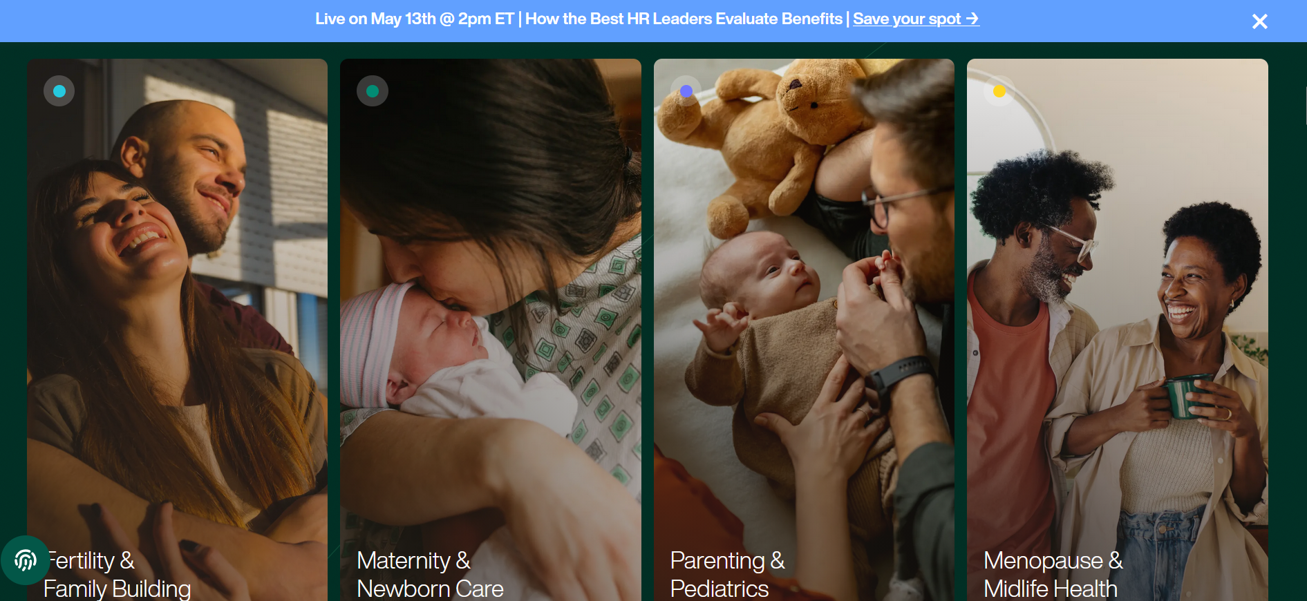
Warm, happy images create a welcoming vibe. Image via Maven Clinic
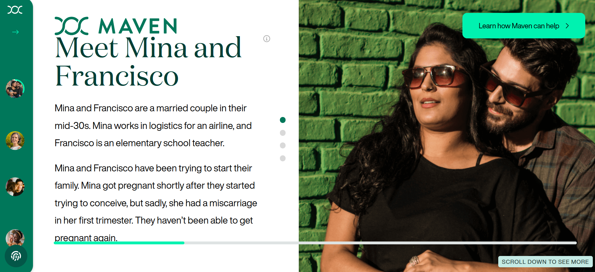
Interactive member journey page via Maven Clinic
Cleveland Clinic
Established in 1921, the Cleveland Clinic is one of the best, flourishing academic medical centers in the United States. It provides in-person and virtual care across a global network of hospitals and clinics, connecting patients and healthcare professionals to a specific service at a specific location.
What Works:
1. Easy-to-follow, functional interaction paths
Visitors can find what they need by following several paths: ‘find a provider,’ ‘find a location,’ ‘services,’ and ‘health library.’ Each path has clear-cut search navigation tools so users can find what they need in a few clicks.
2. Patient-centered healthcare UX
The website acknowledges that visitors may be unfamiliar with medical terms, so it has listed out hundreds of specialty filters alphabetically. The CTAs also use action-oriented words, like “Schedule,” “Manage,” and “Get Care,” informing visitors of their options moving forward.
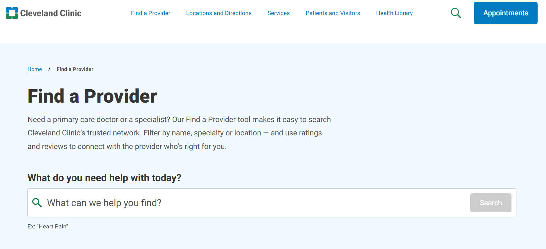
Straightforward navigation paths via Cleveland Clinic
Boston Children’s Hospital
The pediatric center, Boston Children’s Hospital, treats patients from birth through young adulthood for all medical conditions. The website caters to parents seeking care for a sick child, healthcare professionals referring patients, and researchers.
What Works:
1. Simplified explanations
Every condition is explained in simple terms so visitors understand them immediately. When technical terms are needed, they are accompanied by short definitions. This establishes trust through transparency.
2. Gaining trust through badges and certificates
Prominent badges and rankings build trust. Community-driven efforts, like Best in Care Program, where patients (and their parents/family) can nominate a staff member for recognition, also furthers the emotional bond.
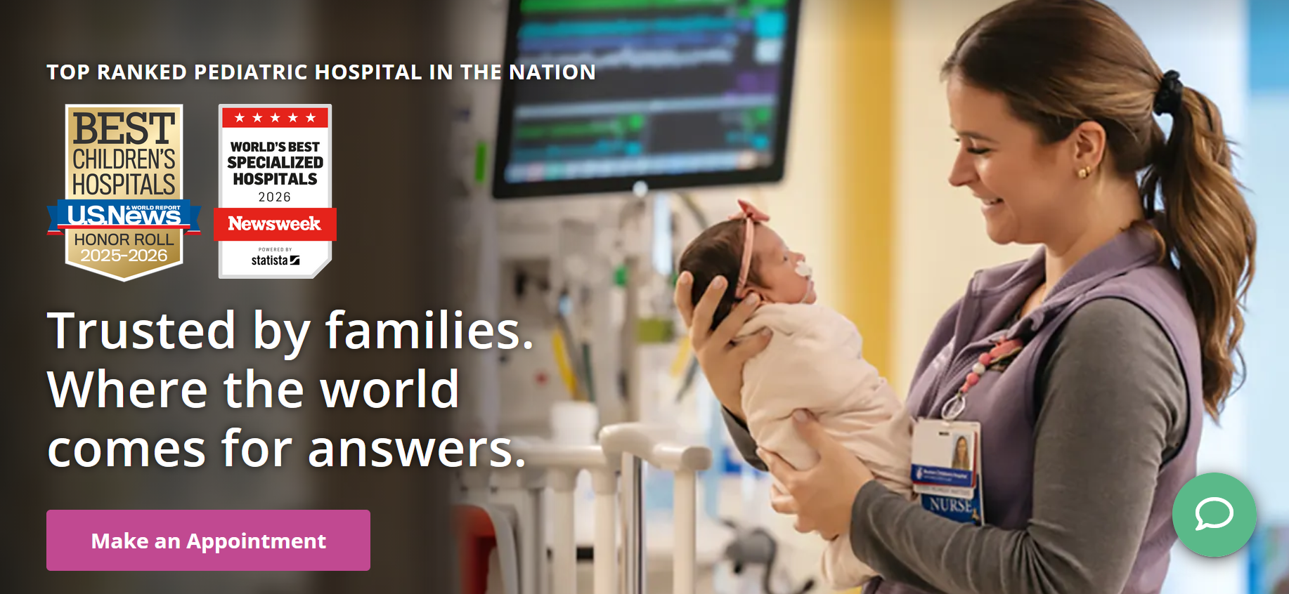
Trust badges via Boston Children’s Hospital
One Medical
One Medical is an Amazon membership-based primary care platform that provides care in-person and virtual care through the app. For an annual membership of $99-199 on top of insurance, it provides convenience that traditional care doesn’t have.
What Works
1. Audience-specific language and segmented content
The website segments its content according to audience: adults below 65, seniors, kids, and medicare agents.
For the general users, the language targets the frustration of traditional care, like long waits, no after-hours access, and unclear costs. For parents, the keywords validate exhaustion and guilt when it comes to childcare. And for seniors, the language addresses the fear of navigating a complex system too advanced for them alone.
Across all pages, the same services are delivered with a tone that is patient and reassuring.
2. Showcasing trusted partner companies
The business page showcases familiar organizations across tech and other sectors. The impact is validation through association. If a respected company trusts One Medical, the individual user’s perceived risk drops.
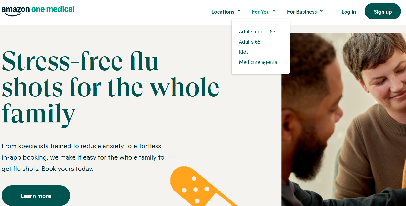
Parent-oriented copy via One Medical
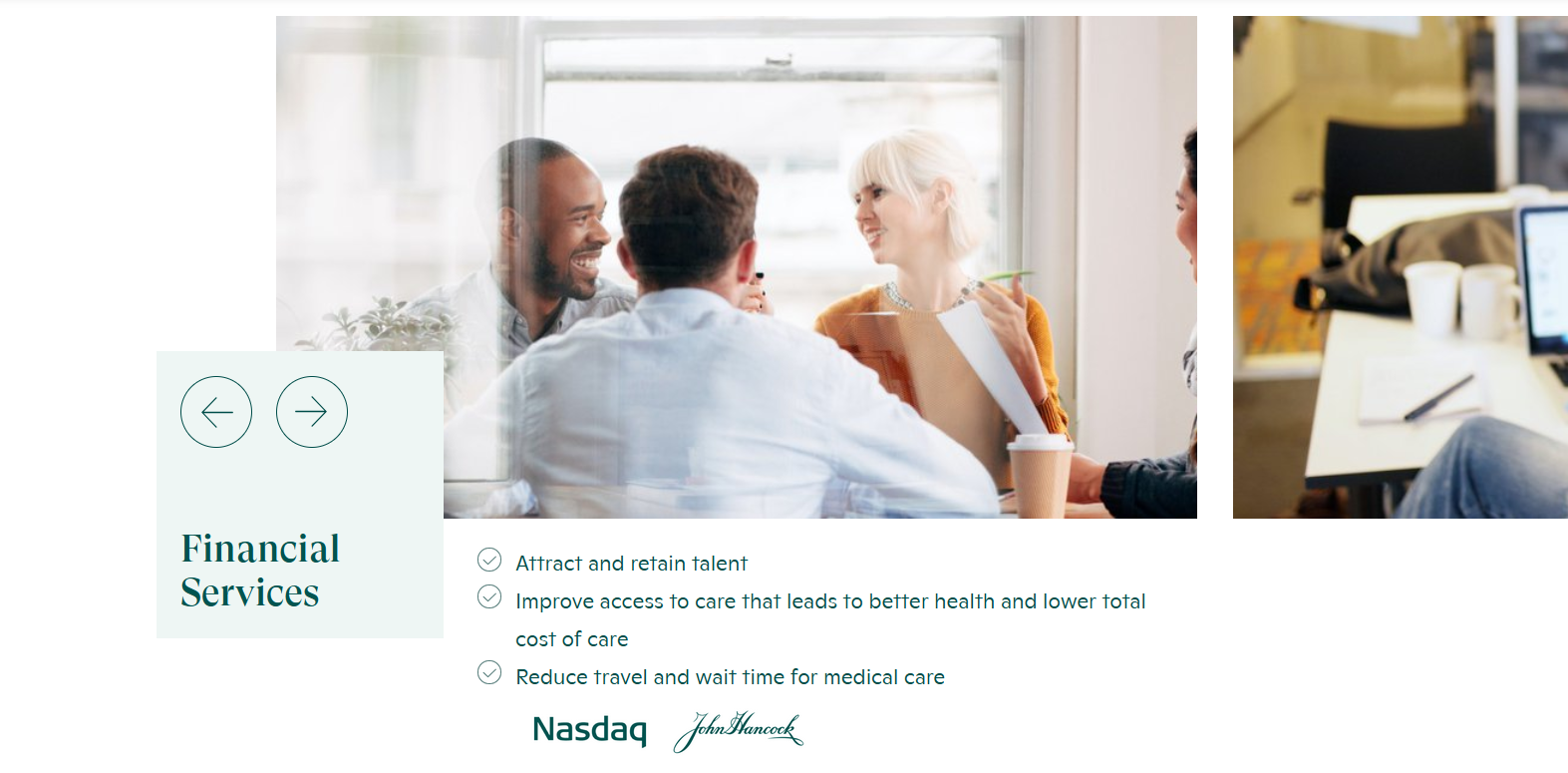
Major business partners in the financial services sector. Image via One Medical
American Diabetes Association
The American Diabetes Association funds research, provides education, and lobbies for policy change to accommodate the needs of diabetic patients. The website, unlike previous examples, does not deliver clinical care, but information, community, and advocacy as diabetics go through different stages of the disease.
What Works
1. Using verified numbers instead of chunks of text
The homepage is filled with statistics that highlight how much impact diabetes has on Americans. This works because it visualizes the problem, delivering emotional shock that then persuades visitors to want to know more.
2. Low-barrier actions
The website features quick tests for users worried about diabetes. They usually do not want to read exhaustive details before checking if they even fit the bill. So, the test helps frame where they are in their journey.
The free recipe database called Diabetes Food Hub highlights how lifestyle management is the treatment. The cooking classes are live, creating commitment. It aims to provide skills, not just information.
These web design features move users from personal concern to collective action. Each of which either educates, supports, or mobilizes, which is crucial for niche medical websites.
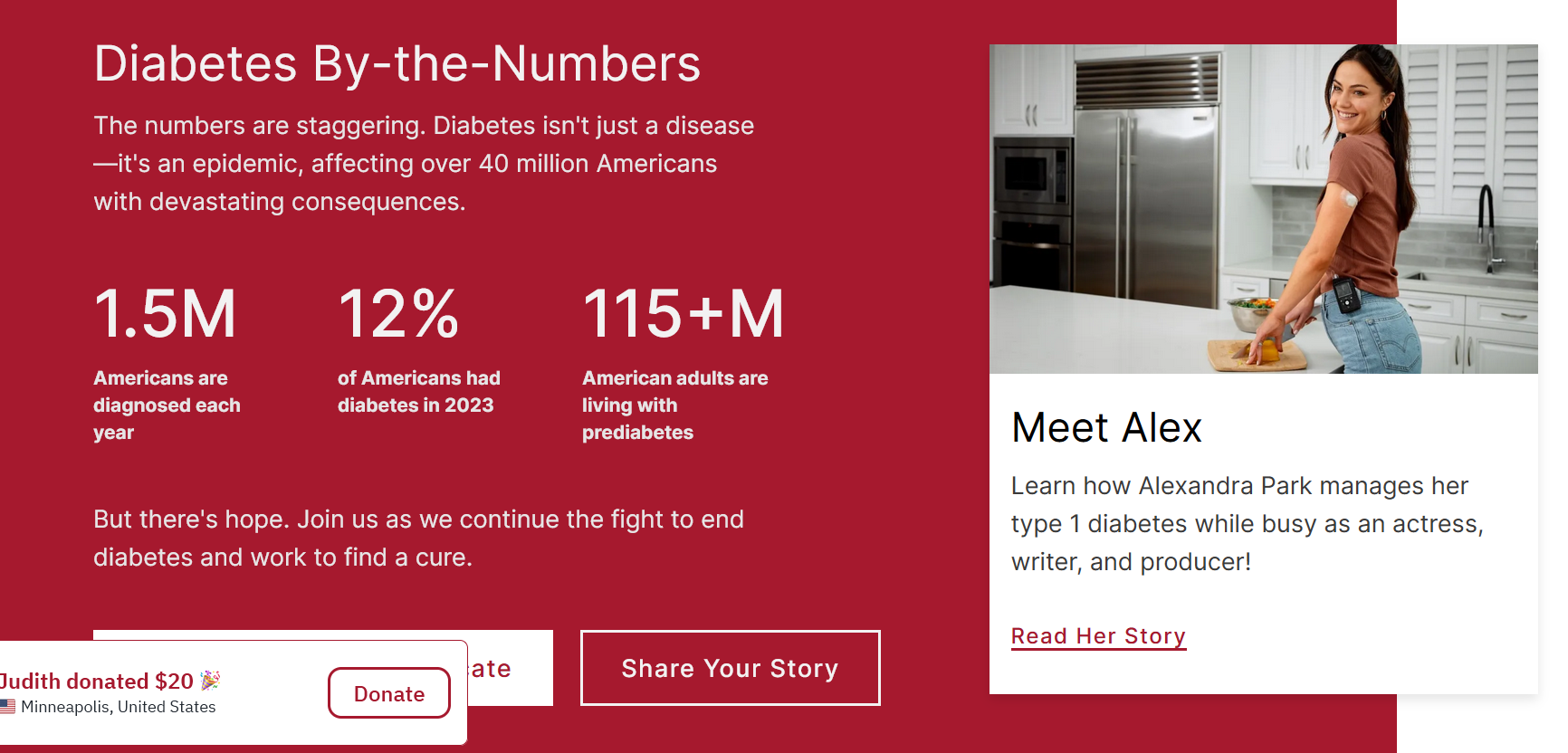
Diabetes by the numbers via American Diabetes Association
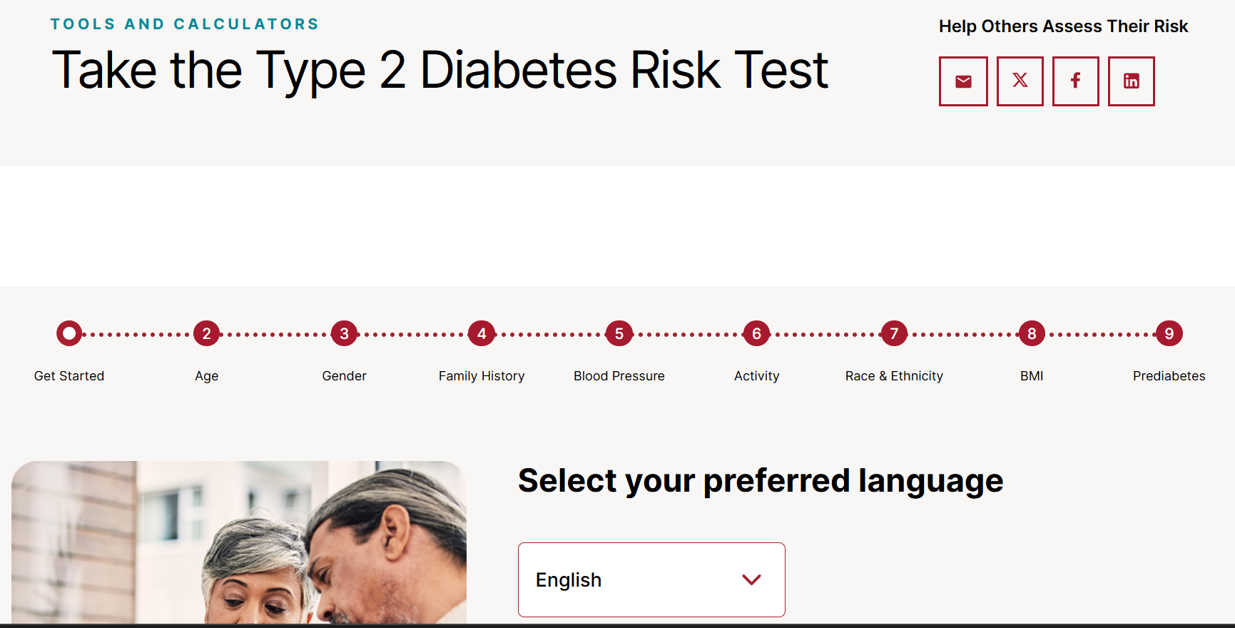
Interactive risk test via American Diabetes Association
Medical Website Mistakes to Avoid
Overloaded first screen
A homepage that is too noisy, filled with multiple CTAs, several claims, and overwhelming imagery, is one of the major drivers of poor UX. Lack of hierarchy also confuses users on what is primary or secondary information.
With only a few seconds to capture attention, less is more.
Solutions:
Single primary CTA. The above-the-fold section should only have one CTA button. Remove secondary CTAs for better focus. Establish clear hierarchy. Apply differing sizes or colors to guide users. Headlines are bold and large, while subtexts are smaller. Use accent colors for CTA buttons. Leverage whitespace. Leave space around key elements empty to reduce cognitive load.
Hidden booking or search
Weak or hidden navigation tools can lead to a frustrating website experience. Instead, adopt a “glance and act” design by making the key elements visible and search options viable.
Solutions:
Always-visible search bar. Place search tools on the top right or the header of the website for easy access. Use action-based labels. Use words like ‘explore,’ ‘search,’ ‘book an appointment,’ etc., to inform users what they can do. Auto-suggest and defaults. Make search functions more efficient by suggesting related keywords according to user behavior. Keep key search categories visible; secondary goes under hamburger menus. Always test your navigation system. Test with real users before launching to ensure functionality and accessibility.
Generic stock design
Stock photos can be convenient and cheap, but they may come off as insincere and staged. In sectors like healthcare, finance, or education, authenticity is a huge asset in conveying credibility and empathy.
Solutions:
Incorporate user-generated content. Feature real customer photos from social media or reviews. Replace stock with illustrations. If you don’t have real photos, use custom drawings or illustrations instead of generic scenes. Match imagery with human-first copy. Avoid buzzwords and speak like your audience. Diversity matters. Represent real demographics and show your actual customer base.
Poor mobile and accessibility design
Non-responsive web layouts that fail to adjust to different screen sizes, especially mobile, can limit accessibility to your website. Tiny touch targets increase inaccuracy when tapping buttons. Non-optimized visual assets for mobile lead to slow loading times. And broken forms with small fields can frustrate users.
If you want to create an effective medical website, a mobile-first design is non-negotiable.
Solutions:
44x44 px touch targets. Buttons, links, icons, and form fields must be thumb-friendly. Mobile-first layout. Design for the mobile screen first, rather than shrinking the desktop version for phones. Optimize media. Compress visual assets without sacrificing quality to improve website performance. Test web design on real smartphones before launching.
Medical Websites Should Reduce Stress
A medical website is not just an information platform. For a worried parent, a clear page on fever care can replace midnight panic with a simple next step. For a newly diagnosed patient, an approachable specialist profile can instill confidence trust.
That said, every medical website must focus on integrating UX design principles that ease their worries and lessens confusion. The impact is holistic. It increases appointment volume, reduces no-shows, and simplifies operations. Patients who understand what to expect after visiting your website come prepared and are more likely to follow care plans to a tee. A trusted website also increases referrals and improves conversion.
If you’re ready to create a medical website that works, start with the elements that deliver the biggest effect fastest. Learn how with the help of a reliable web design agency.

Creates insightful, strategy-driven content that translates complex design and branding concepts into accessible knowledge, supporting Ramotion’s mission to elevate digital experiences.