If you’re seeing more product complaints, development cycles slowing, and users sticking to the same limited set of features, you may be due for a product redesign. A true product redesign goes far deeper than changing how a product looks. It’s not about tacking on a feature here and there. It’s a strategic effort to reinvent offerings by realigning them with what users actually need today.
In this article, we’ll explain what a product redesign is, what it involves, and why you should consider one. We’ll also cover product redesign case studies from well-established companies and share practical strategies you can apply to achieve your goals.
What is Product Redesign?
A product redesign overhauls an existing product’s looks and functionality to fix problems, improve aesthetics, and elevate the user experience. It can include restructuring navigation for a more intuitive flow, updating the user interface to reflect current trends, or adding the most requested features. A redesign is about solving root causes that prevent the product from meeting user needs and business goals.
Why Companies Redesign Products
A product redesign becomes necessary when the current product no longer aligns with strategic direction or business goals. It’s not a sign of failure but a proactive move to keep the product driving growth, serving evolving customer needs, and staying competitive.
Here are specific reasons you may consider to jumpstart a product redesign:
Outdated UI
An outdated interface lacks modern aesthetics—typography, color palettes, icon styles, etc—and makes navigation and key features difficult to find and use. Older UIs often perform more slowly than modern ones, which hurts UX. Eventually, users disengage, and conversion rates decline. An updated UI restores clarity, performance, and trust.
UX debt
User experience (UX) debt accumulates when products are built with features that are “good enough” and launched quickly to meet deadlines. These design shortcuts create user frustration, dropped conversions, and slow development cycles. When UX debt grows, a more comprehensive redesign is often needed to resolve systemic issues.
Prevent demographic aging
Products built for older interaction patterns (e.g., desktop-first applications) can become less relevant as user behavior shifts toward mobile and different interaction styles. A redesign helps you meet users where they are by integrating modern flows, updated interaction patterns, and features that match current expectations.
Unify product ecosystem after M&As
Simply slapping a logo on newly acquired products after mergers and acquisitions only creates visible seams. Product redesigns help establish a cohesive design system and consistent experience across the portfolio. They also simplify technology integration and can create a combined offering that delivers more value than the parts did independently.
Repositioning and elevating pricing power
Companies redesign products to change how customers perceive them. A redesign can justify higher prices because customers buy into a new idea rather than just a commodity. If a brand wants to attract high-paying customers, redesigning the product into a premium experience can support that repositioning.
Whatever your reasons, don’t redesign for the sake of redesign. Changes without clear, data-backed rationale can provoke user resistance and damage brand perception.
What Makes a Product Redesign Successful
A successful product redesign typically aims to achieve one or more of these goals: increase Customer Lifetime Value (CLV), lower operational and engineering costs, and expand the product redesign. Below are the metrics tied to each goal to measure success.
Customer lifetime value
A successful redesign makes customers more valuable over time. They buy more, stay longer, and recommend your product to others. If you aim for longevity, this is the ultimate goal.
- Conversion Rate: Increases in signups, purchases, and upgrades indicate a more satisfying user experience.
- Retention Rate: Continued use after a redesign shows the product meets user needs better than the old version.
- Net Promoter Score (NPS): A higher NPS means customers are more likely to recommend your brand.
Lower operational and engineering costs
A redesign that reduces unnecessary complexity lowers costs. The team spends less time fixing issues and more on strategic development.
- Customer Support Ticket Volume: Lower support ticket volume often indicates fewer friction points.
- Bug Fix and QA Cycle Duration: Fewer errors and shorter QA cycles indicate a more stable, efficient product.
- Customer Effort Score (CES): A higher CES score means users find it easier to complete tasks.
Expand market reach and competitiveness
Product redesign can reposition a brand, attract new audiences, and keep the product competitive.
- Organic Search Traffic: Steady or growing traffic, high click-through rates, and more indexed pages receiving impressions show attraction and retention of organic audiences.
- New User Acquisition Rate: A product redesign can improve first impressions, which potentially grows the number of first-time users.
- Feature Adoption Rate: High adoption rate confirms that added or optimized features are valuable to actual users.
- Referral Rate: Strong word-of-mouth referrals reflect a satisfying user experience.
Other markers include reduced legal and regulatory risk and increased product-led growth (PLG). Work with one of the top UX design agencies to guide you through a successful product redesign.
Product Redesign Examples to Learn From
A product redesign optimizes the user experience around root problems and creates measurable business impact. Below are examples to inspire and inform your own redesign efforts.
1. Airbnb redesigns for a more collaborative experience
Airbnb moved from a simple home-rental marketplace into a travel and lifestyle platform focused on immersive experiences.
The problem
Groups planning trips had to rely on external chat links and spreadsheets to vote on rentals. The platform also needed to stay relevant with younger, mobile-first travelers seeking shareable, experience-driven stays. In short, the app felt designed for single users only.
The solution (What changed?)
- Group Threads Tab: Users can create group chats to plan details in one place.
- Consolidated Trip Hub: Accepted group chat invites push Wi-Fi passwords, check-in rules, and directions to each guest’s home screen.
- Shared Wishlists: Multiple users can compile and rank homes to book together.
- Icons: A new category highlights exclusive events and unique stays, like in an ‘Up’ movie-inspired house, an iconic museum, or celebrity-hosted spaces, among others.
Takeaway
A strategic product redesign can expand a marketplace into a broader platform by adding features informed by feedback, data, and trends.
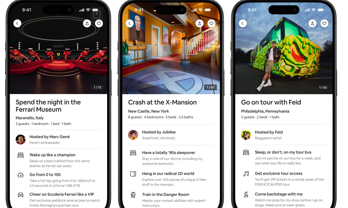
Icons experiences via Airbnb
2. Slack redesigns for better focus
Slack continually adjusts to user needs through iterative redesigns.
The Problem
Slack had many productivity tools (good!), but required users to juggle too many things at once (bad!). As communication volume rose, users needed help staying organized and focused.
The solution (What changed?)
- Single Dashboard for All Channels: View channels across workspaces without switching between them.
- Dedicated views (Activity, Later, More): Categorize tasks to support uninterrupted work.
- Easy access to tools: Frequently used tools are more prominent and require fewer clicks to access.
Takeaway
The redesign reinforced Slack’s core goal of helping users stay organized and more focused by simplifying workflows and navigation.
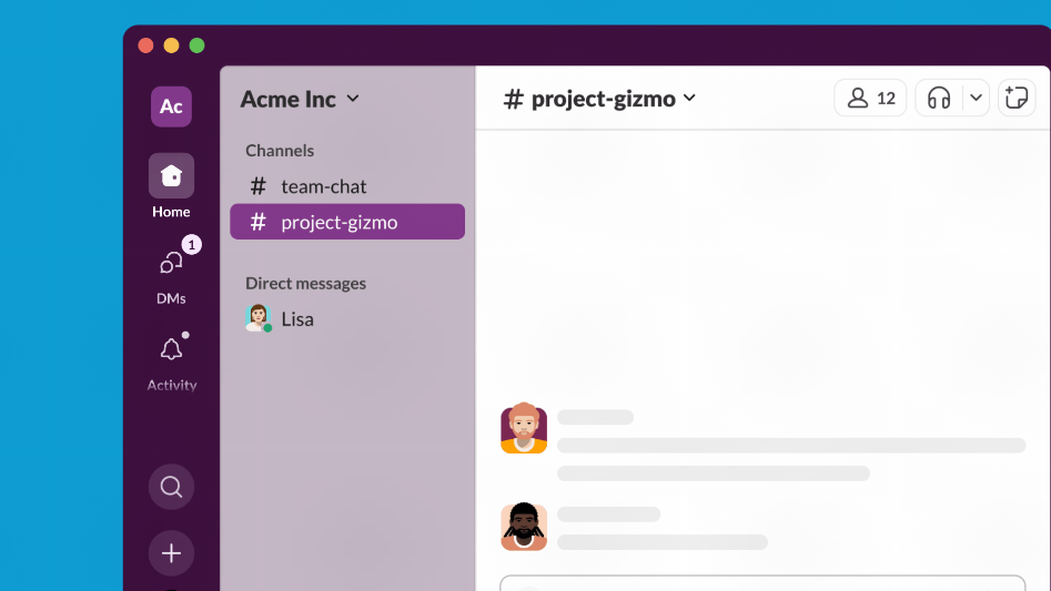
Easy access to all channels via a unified screen view. Image via Slack
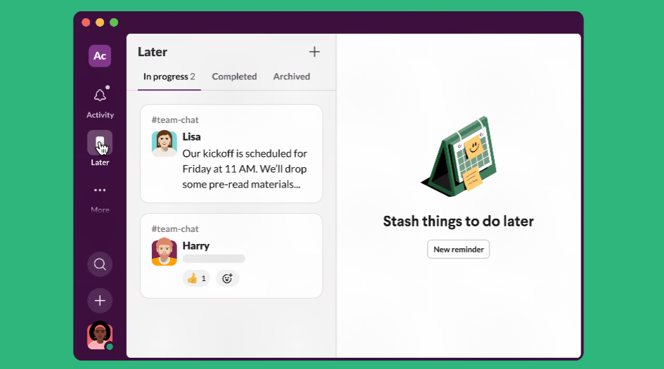
Categorize activities for better focus. Image via Slack
3. Wikipedia
Wikipedia is a massive, multilingual “encyclopedia” run by volunteers and supporting many sister projects (e.g., WikiCommons).
The problem
The outdated interface may feel unfamiliar and unwelcoming to newcomers expecting something more modern. The website needed to evolve its presentation while preserving the community practices.
The solution (What changed?)
- Optimizing for Navigation and Readability: The table of contents moved to a prominent sidebar; base font size increased and link colors clarified to guide users.
- Flexible Architecture: A more structured information architecture makes it easier to add features.
- Establishing Design Tokens: These tokens enabled user-requested customizations, like dark mode, easy to implement.
Takeaway
Thoughtful product redesigns allow a product to modernize without alienating longtime users.
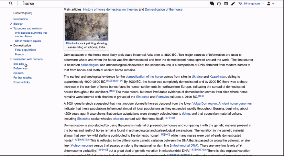
New table of contents. Image via TechCrunch
4. Spotify redesigns for seamless music discovery
Music streaming platform Spotify expanded from personalized playlists to broader discovery across music, podcasts, and audiobooks.
The problem
The app felt like a stagnant playlist player, with different content types competing for space and attention on the home screen.
The solution (What changed?)
- Introduction of the Discovery Feed: The algorithm tracks what a user has seen and engaged with, then shows new content that appeals to their tastes.
- Smart Shuffle: Premium users get personalized recommendations that match a playlist’s vibe and can save or reject suggestions.
Takeaway
Redesigning around emerging user behaviors improves engagement and helps a product remain relevant.
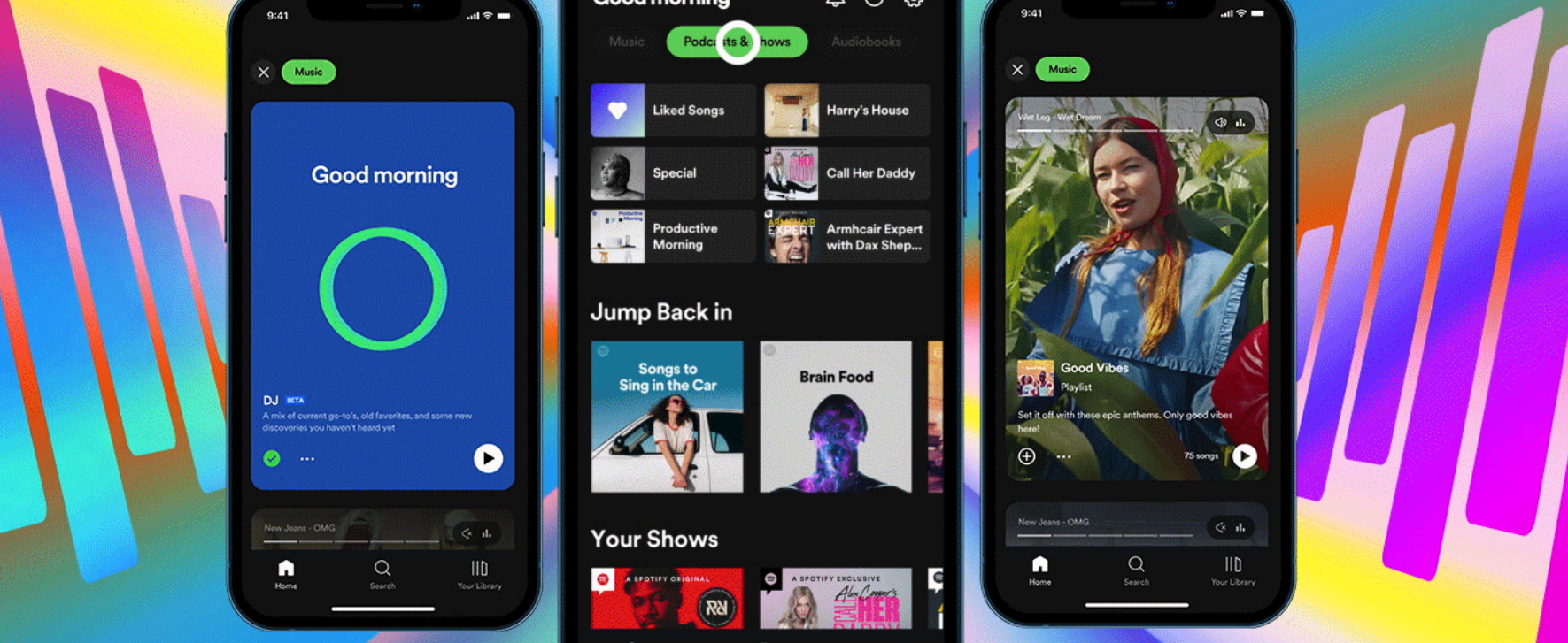
All types of content can be previewed on the homescreen. Image via Spotify
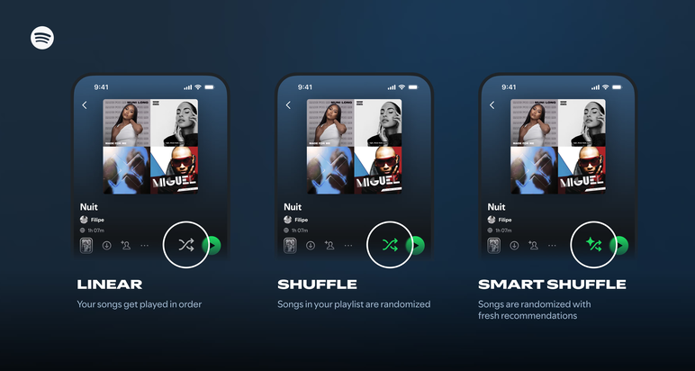
Smart shuffle via Spotify
5. Instagram redesigns as a video-first app (2020)
Instagram shifted from a photo-sharing app to a video-and-entertainment platform.
The problem
The rise of TikTok drove interest in short-form videos, and Instagram struggled to keep up. There was also the growing pressure from Instagram’s parent company, Meta, to prioritize monetization.
The solution (What changed?)
- Reels Tab: A dedicated section for short-form videos increased content discovery and engagement.
- Shop access: Shoppable videos created ecommerce opportunities through tagged products linking to merchants' sites.
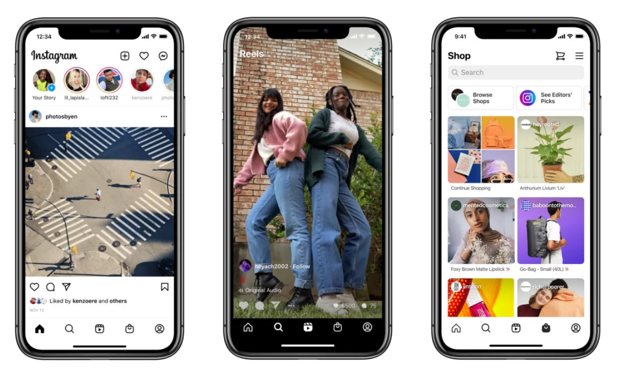
Instagram’s new UI launched in 2020. Image via Mashable
Instagram drew backlash, so it added options to switch back to a chronological feed.
Takeaway
Sudden design improvements can feel like a threat to loyal users. Preserve elements that users love when adding new features.
6. Mailchimp
Mailchimp, an email marketing platform, was ready to expand its services and become an all-in-one marketing platform. The overhaul was marked with a playful, humanized visual identity.
The problem
Mailchimp was still perceived mainly as an email service. Its quirky identity was also becoming less distinctive as other brands adopted similar styles. The challenge was to evolve its identity to reflect its maturity and wider audience without erasing the quirky quality that had defined it.
The solution (What changed?)
- Holistic Visual Identity Overhaul: The brand mascot, Freddie, was simplified and the wordmark refined. It dropped the capital “C” (MailChimp vs. Mailchimp), solidifying the idea that the brand is no longer just an email service.
- Flexible Design Framework: Playful illustrations and plain, friendly language humanized the brand while supporting consistency.
- Brand Repositioning: Mailchimp became a resource center and broader marketing platform.
Takeaway
A product redesign can help B2B brands create a cohesive and unique identity that resonates across audiences.
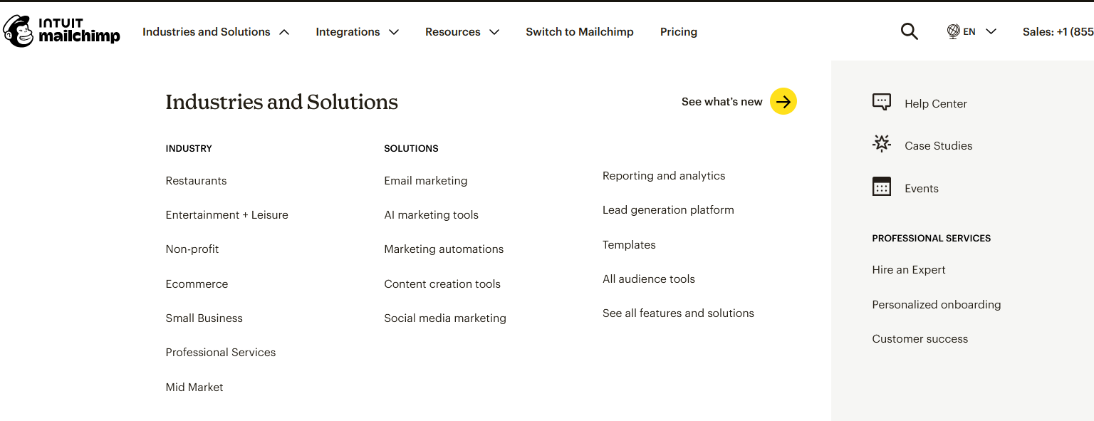
Broader marketing services offered via Mailchimp
Brand mascot and logo via Mailchimp
7. Mixpanel redesign within a rebrand
Mixpanel helps businesses track and understand how users interact with their websites or apps, so the companies can answer questions about user behavior and improve their products.
The Problem
Mixpanel’s existing interface couldn’t keep up with the speed at which the platform adds new features. Navigation was also cluttered and confusing, which slowed users down. Mixpanel was long overdue for a redesign.
The Solution (What changed?)
- Intuitive Navigation: The brand assessed how users interacted with its product and restructured the navigation to improve efficiency.
- Scalable Interface: The new interface was designed with future features in mind, enabling growth.
- Modern Visual Identity: Mixpanel refreshed its identity, modernizing its look.
- Progressive Rollout: Mixpanel ran several tests before product design and feature rollouts. It helped the brand track what’s working and iterate in real time to avoid user pushback.
Takeaway
Guide users through changes and roll out redesigns progressively to mitigate risks and get faster feedback.
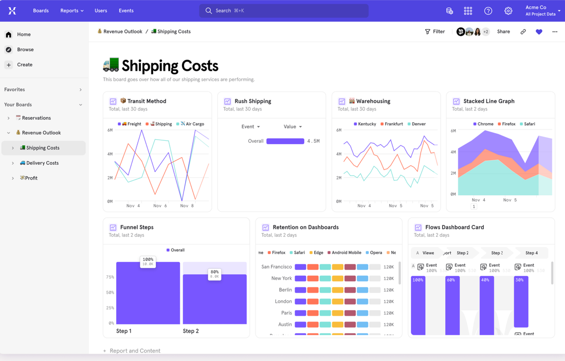
Old dashboard navigation via Mixpanel
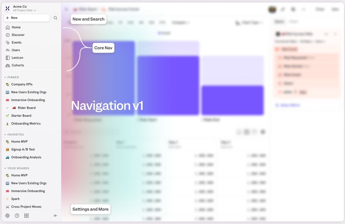
New navigation via Mixpanel
Redesign Solves Product Problems
Product redesigns have the power to deliver clearer user journeys, stronger market positioning, and lower long-term operational costs when they are rooted in addressing root causes, not shallow reasons. Treated as a strategic initiative, redesign can encourage business growth, increase Customer Lifetime Value, and restore brand trust. On the flipside, a mishandled product redesign can alienate customers and waste resources.
Your objective should be measurable impact—solving UX debt, aligning features to evolving user behavior, and creating a scalable design system that future-proofs your product. Think long-term and back your decisions with real data. Product redesign is an investment that can make your company more resilient and competitive.
Before you begin your product redesign project, do the following:
- Prioritize urgent and measurable problems. Focus on two or three aspects you want to improve, and gradually iterate on your product.
- Create flexible solutions that you can roll out progressively.
- Test performance and ask for feedback at every stage.

Creates insightful, strategy-driven content that translates complex design and branding concepts into accessible knowledge, supporting Ramotion’s mission to elevate digital experiences.